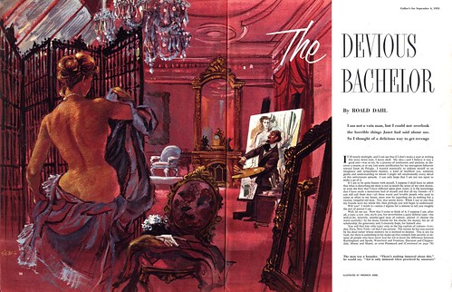
... and most of all, I love Siebel's portrayal of the artist. I've wondered if it was in some way a Fritz Siebel self-portrait.
I believe our character - our personality - is reflected to some degree in our work, but considering the tremendous range of styles and techniques we've looked at this week, its hard to determine if Frederick Siebel was a carefree creative spirit...
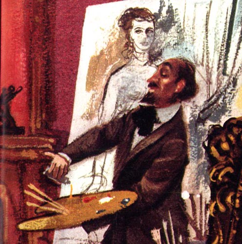
...or a buttoned-down commercial arts professional.
Yesterday, the picture of Frederick Siebel began to come into sharper focus. Out of the blue, the following email message arrived:
"I just sent a link of your Fritz Siebel post to my family. What a great surprise for us. I am his son (same name) and I want to reach out. You have works we haven't seen in years. Did you know he was the original conceiver and designer of the Mr. Clean icon?
I hope to hear from you.
Kind regards, Fritz Siebel"
Isn't the Internet amazing? I sent an enthusiastic reply and hope to hear back soon. When I do, I'll post it here so we can all learn a little more about this amazing artist.
Meanwhile, another email message arrived from Pablo Medrano in Barcelona. Pablo writes, "Is it possible that Frederick Siebel signed his late works as “Fritz Siebel”? I found some references on the web about a Fritz Siebel illustrator, specialized in children books on 60s and 70s."
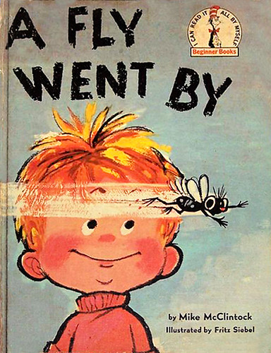
Pablo sent along a list of children's books illustrated by Fritz Siebel... and I was stunned and delighted to see that one of them has long been a family favourite in the Peng household: Mike McClintock's 'A Fly Went By'!
I can't begin to tell you how many times I read this book to our boys at bedtime when they were little. Not to mention, I can still recall pouring through this book in my school library back in grade 3, and being captivated by the outrageous shenannigans Siebel portrayed in his vigorous cartooning style.
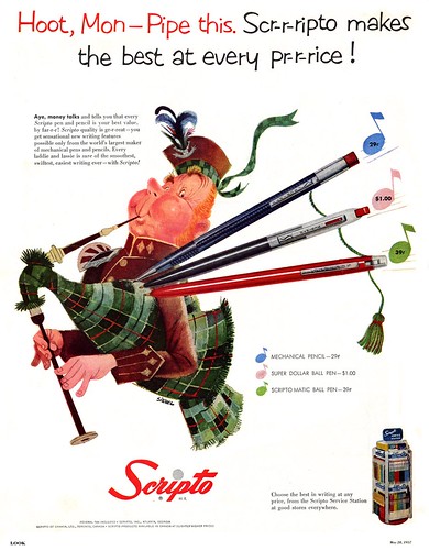
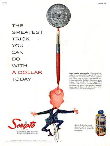
Take a look at the two Siebel ads above, both from 1957, and the cover of the book below, published in 1958, and its not hard to imagine that they are by the same artist.
I've often said that Siebel's work struck me from the moment I first saw it. I just hadn't realized that moment was nearly 40 years ago!
* My Fritz Siebel Flickr set.
A Fly Went By! I loved that book. I remeber belonging to a children's book club and getting Disney and Seuss books all of the time. A Fly Went By Was my favorite. I remember thinking even then how strikingly different the illustrations were from the other books from the club.
ReplyDeleteAs usual, a terrific account of a great, talented artist, Leif! Great job in honoring this guy's work. Yes, the internet IS amazing -- I hope you get some more feedback from Siebel's family.
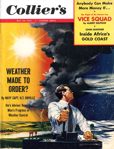
ReplyDelete"Weather made to order?"
ReplyDeleteWhat a rendering: Hot and cold, orange / blue. The "weathermaker" sits in between them.
Great contrast. Great realization of the theme.
is there a Siebel book available covering his output? I love his surreal dream material
ReplyDeleteSadly, anonymous, no such book exists.
ReplyDeleteHello, this is a wonderful discovery. I am the second oldest child of Fritz Siebel and I was looking over his shoulder while he worked from a very young age.
ReplyDeleteAbout a week ago the AOL news, quite the scandal sheet, had a list of the most famous logos, icons, and Mr. Clean was around 3rd from the top. Not bad, but my father was not given credit for it. According to family lore, he signed away all rights to it with an agency and that was that. From Mr. Clean's inception, as long as he was doing commercial illustration, Fritz Siebel was the man. I was very young when it started, and remember the first layout ideas, all stamped TOP SECRET, and the fun we had clowning about that. An artist neighbor, Harry Rosen, did a clay portrait of Mr. Clean when my father needed to portray him in profile or 3/4 view as opposed to the original full front view. There was a run of full page scenes for Sunday magazine sections, and once it was teenagers cleaning the attic. He called all my teenage friends and took photos of them in various scrubbing and sweeping poses, and in the ad they were fully recognizable! it is no coincidence that he faintly (faintly?) resembles Eisenhower...
He did many surrealist illustrations for magazine stories, pharmaceutical ads, Vogue... can't recall them all. He worked very hard. When people asked if he had hobbies he told them his work was his hobby, and it was true. He was a giant, with the strengths and weaknesses of giants. I am gratified to read all these appreciations of him. Maybe I can send you scans of some of his non-commercial paintings in my house.
Katherine Siebel Kunhiraman
Hi Katherine; Thanks so much for leaving your comment - and for sharing these great anecdotes from your childhood! I have recently corresponded with Gretchen Siebel, who told me some similar details, but getting your perspective is equally interesting and very helpful in terms of telling a more comprehensive story of your dad's career.
ReplyDeleteI would greatly appreciate seeing any examples of Fritz's work you are willing to share with me. I can be reached at leifpeng[at]gmail[dot]com - and again, many thanks! :^)
glad to see you found the family!! yea.
ReplyDelete