
I know now that that's too broad an observation... but I do sincerely feel that there's something here that deserves closer examination. W. David Shaw's work reminds me of a certain kind of imagery I saw in the background paintings of old cartoons and the ink styles of old comic books, magazines, newspapers and textbooks when I was growing up.
It reflects that space-age, jet-propelled modernism seen in 1950's diner signage and automobile tailfins...
So just who was this W. David Shaw?
Did he originate or somehow perfect this distinctive, iconically 1950's style? He was not included in Walt Reed's Illustrator in America book - and everyone I contacted who might know only vaguely recalled his name or work -- if at all. My research lead to a mention of an article in the October 1955 issue of American Artist magazine.... an issue that proved to be maddeningly elusive... until this past weekend, when my friend, Jaleen Grove, made a special trip to the New York Public Library to shoot the pages for me in their bound volumes collection.
Yay, Jaleen!

Right away we learn that, by the mid-1950's, W. David Shaw was very busy indeed. Author Ernest W. Watson reports that Shaw is so sought-after that he has not had to solicit work in 5 years.

On the morning of Watson's visit to Shaw's downtown New York studio (on the 10th floor of a building on 48th Street, across from the Waldorf-Astoria) Shaw is rapidly executing a small ink drawing.

He explains to Watson that when he gets a small rush job such as the one he is completing, he calls the messenger service, sits down with his drawing board propped against his knees and the edge of a table, and by the time the messenger arrives he is usually done.
Watson describes how Shaw's studio is so spare it verges on barren. A few essential pieces of office furniture, some art materials in "a taboret of his own design", nothing on the walls but a poster and one framed watercolour, and a folding chair "brought out for chance visitors."
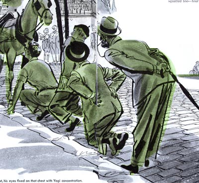
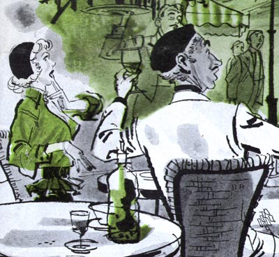
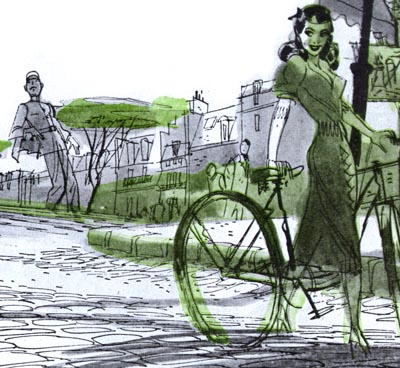
If an artist's surroundings reflect his personal style or philosophy (and how could they not?) it sounds like W. David Shaw's studio was a sort of physical manifestation of his drawing style: modern and unencumbered by slavish detail or clutter, focusing only on the essentials.
With only this brief description and these few examples as our introduction, I hope you find the work of W. David Shaw as intriguing as I do. This week, we'll learn a little more about the man and his work.
My W. David Shaw Flickr set.
I have liked his work for a long time and have thought of him as the great spot artist. I know he did more full page illustrations but the way he did spots was copied more than others.
ReplyDeleteHe had a way of drawing impossibly perfect lines in wonderfully simplified art.
I will be glad to know more about
this excellent artist.
Hi Leif - crazy week, I finally have time to check up... It's great to see this posted now. I sure wish libraries had special lighting booths and copy stands for shooting stuff! Shaw's work really sings in the details. His rapid linework reminds me of Russell Patterson's facility with brush and pen.
ReplyDelete