Monday, March 31, 2008

William A. Smith: "A fine painter" - Robert Fawcett

About the only thing I like better than sharing examples from my collection of mid-20th century illustrators with you is when you return the favour. That's why I was so pleased when Charlie Allen, whose career we learned about last September, began emailing me pieces by illustrators he admired and had clipped for his own reference and inspiration back in the day. Like these three beauties by William A. Smith.


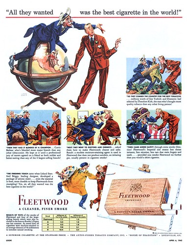
Some of Smith's illustrations (the few I'd seen) reminded me a little of Robert Fawcett's work. So I particularly enjoyed this anecdote Charlie related to me about meeting Robert Fawcett:

"May have told you this, but about 1950 or '51 Haines Hall and Chet Patterson asked me to join them for dinner one evening at one of those old but posh SF eateries. The lure, RF would be joining us. Believe Stan Galli and Bruce Bomberger were there too. With no warning, they sat me next to RF (Haines' brother-in-law). In a lull, I ventured a question to the great one....'Do you know William A. Smith?' He did a double take, turned to Haines, and gesturing to me, said, 'who's this?' I think his actual words were 'who the hell is this?' Haines explained ( I was the favored new kid on the block), and RF reluctantly turned and said, 'yes, Bill is a good friend....and he's a fine painter'. He did not say 'illustrator'. That was the only conversation from him for the evening, with me at least. At the time I naturally was in awe of RF, but was also an admirer of Wm. A. Smith."


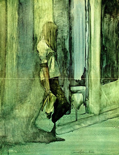
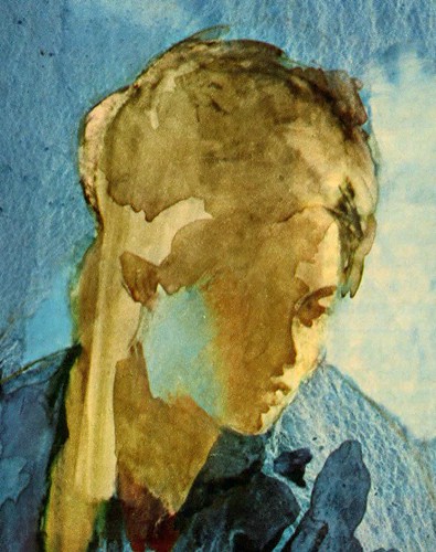
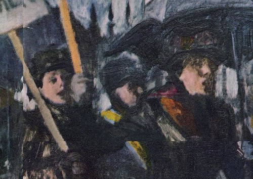
About these images, Charlie wrote:

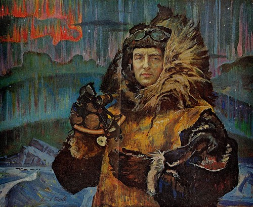
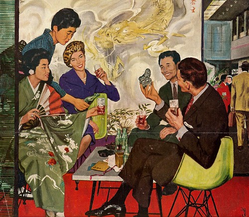
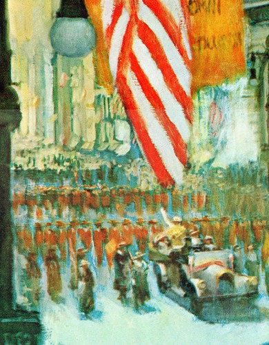
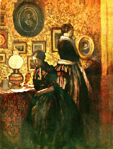
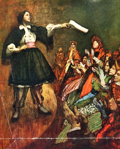
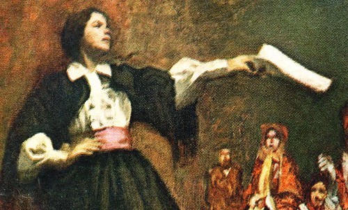
"Smith had a heavy painterly hand....but could be oh-so subtle when the character or scene needed it. I could tell he had to 'behave himself' on the Coca Cola ad [above] ...had to hold back some of that 'horsepower' he possessed. He was not as inventive in style and technique as, say, Briggs, Parker, Fawcett, etc.....but he was rock solid on dramatic presentation."


Charlie went on to say, "He seemed a mystery....never heard much about him or his career, etc." - which I was unable to help with, since what I knew about the artist was no more than what was available in the short bio you can find in Walt Reed's "Illustrator in America".

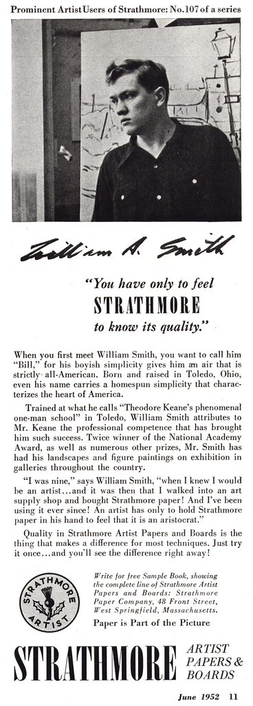
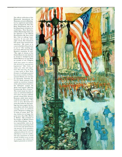
Then, in one of those coincidences that make me think "there are no coincidences", a package arrived in the mail: a recent acquisition from ebay... two bound volumes of American Artist magazine, 1952 and 1953. And what should the June 1952 issue contain but a six-page article on William A. Smith!

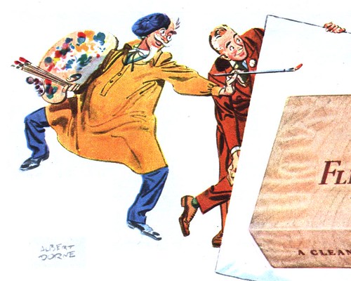
That same issue contained this ad below, so now you know what the artist looked like around the time he painted these pieces.


With the generous assistance of Charlie Allen, who has provided virtually all the scans I'll be presenting, and with the benefit of the information in the American Artist article, it looks like we will get to spend this week learning about "a fine painter", William A. Smith.

Friday, March 28, 2008

Daniel Schwartz: "Bold innovative illustration style"

Tom Watson conludes his look at the illustrations of Daniel Schwartz.

This final day of observing Daniel Schwartz’s bold innovative illustration style, emphasizes the consistent quality he displays in every assignment. Schwartz the fine artist, and Schwartz the illustrator, effectively unify without conflict or incompatibility.


The above illustration, probably done around 1960 or 61, for a story in McCall Magazine, is one of my all time favorites of Daniel Scwartz. For me, it has all the ingredients... interesting composition, nice mix of warm and cool colors, mood development and exciting surface texture. His soft overall color scheme, with a woman deep in her own thoughts, sets the mood for this intriguing illustration. Schwartz uses his effective combination of thin oil washes and opaque lighter values to define shape and form in a collection of nostalgic elements. Notice the very loose sketchy treatment to those elements, while the figure is given more clarity and importance. During the 1950’s and before, this would more likely be the appearance of the color rough submitted for final approval. But, Schwartz uses his fine art influence and experience, in making it work as the finish. One of the radical changes in illustration was an evolution from accurate defined literal interpretation, to spontaneous expressive brushstrokes, enhancing the mood, and giving it a poetic atmosphere.


This was a courtroom assignment for Life Magazine in 1971 for the military hearing of Lt. William Calley Jr’s account of the Mylai massacre, during the Viet Nam War. With his varied capabilities as a fine artist / illustrator, it is not surprising to me that Schwartz was selected to illustrate these hearings. This becomes an ideal assignment for an illustrator, since photographers and video cameras are generally not permitted. This was a very high profile hearing, and obviously the assigned illustrator cannot purposely inject his personal feelings into the illustrations. The challenge is to be objective, and record the essence and general mood, transporting the reader to the event.


These transparent watercolors became the defining technique that Schwartz adopted, in the late 60’s. I don’t recall other high profile illustrators using this particular technique at that time, and if there were some, they put their own spin on it. The first illustration is quite complex, depicting the whole court room, displaying the key players... then shown above, he uses a vignette depicting profiles of six officers to hear the accounts. The well defined features, with astringent expressions, reflect the seriousness of the hearings. Schwartz artistically allows his paint to drip off the bottom edge of each illustration... an effect that was virtually not seen in illustrations, to my knowledge, prior to 1959 or 60. The drips effectively break up the hard edge bordering the illustration... a technique, not uncommon with fine art watercolor painters.


The illustration above is a good example of Schwartz’s ability to sketch on the spot, with a combination of accuracy and artistic flair. This is journalistic illustration at its best, in my opinion. As depicted in yesterday’s posts of the “Fallen Angels”, Schwartz was no stranger to sketching on location, and from what I gather from very good sources, he preferred that direct contact. His use of color in these last 2 spot illustrations, is limited but quite effective. They remind me of graphic sketches of the old masters, with their casual sepia tone washes... which no doubt Schwartz was quite aware of.

After the 70’s, I don’t recall seeing his illustrations in magazines, but he is currently doing easel paintings for galleries, and it appears he has gone back to oils, depicting less detail. Click the URL below, and you can see examples of his work today: Daniel B Schwartz.com

Thursday, March 27, 2008

Daniel Schwartz: ‘An Artist And His Fallen Angeles’

Tom Watson continues his look at the illustrations of Daniel Schwartz.

‘Observing the scene around him in Greenwich Village, where he lives and works, painter Daniel Schwartz was struck in 1965 by awareness that adolescents were beginning to look quite different. “ Everything was changing under my eyes,” he says, “and it all burgeoned into a movement.” They dressed differently, behaved differently, even “created a new body type.” Schwartz spent the next three years taking what he calls a “long, slow look” at teenagers, and the results show in these subdued and sensitive paintings that appear on these pages’.

That was the lead into a 1969 Fortune magazine article called ‘An Artist And His Fallen Angeles’. I find it interesting that Schwartz, who was inducted into the Illustrators Hall of Fame, is referred to as an artist and not an illustrator, and his illustrations are referred to as simply paintings. Could it be that at that time, being recognized an “artist” or “painter”, may have carried more prestige?


The painting above was the only oil painting in the series that ran in Fortune magazine. At first glance, it is an interesting mosaic pattern of abstract shapes and colors. A second look reveals suggestions of bodies in various positions of carefree repose. Some are relating to each other and some are not. In most of the heads, Schwartz leaves out features, and some heads are merely a silhouette. He captures the first glimpse or impression of the scene, as though he were painting it quickly on location, before they began to depart. The soft range of colors suggests a warm sunny day, on perhaps a campus lawn or a park setting. At this point, he does not show us individual personalities, but a mass of young people in their own social environment.


Perhaps this is where Schwartz switched his medium from oils to watercolor... could it be that watercolor was faster, or maybe these paintings were done directly from life, and watercolor was more practical. Also, he now focuses on the individual personalities of his subjects. Each portrait has it’s own color theme, and each conveys a candid spontaneous gesture, that suggests little concern that they are being visually examined and recorded by the artist. They seem to be deep in their own thoughts, perhaps reversing the tables, and analyzing and examining an older stranger, capturing their image. After all, it was New York City, and Schwartz started painting these “fallen angeles”, as he called them, when he was about 33 years old... a much older man, from their perspective. This was the beginning of the Hippie generation, and Schwartz may have been the first to portray, in a national magazine, this early period of the Hippie movement, which soon exploded into a full blown social revolution.


These three figures grouped together, are nearly abstract shapes with only a suggestion of literal representation. The foreground figure and guitar, become one massive shape, with a more literal profile face. Like most of Schwartz’s watercolors, they are mainly monochromatic in hue, and in this case, there are muted variations of subtle gray tones... which might suggest an overcast day.

There is a feeling of aimlessness to these figures... a sense of just living the moment. As a witness to the transformation of these young people, I think the style Schwartz has developed is quite befitting to the subject. He shows little or no animation to his figures. They are mannequin like, and seem to be looking for something to become a part of, which is ultimately what happened... they became a part of a social phenomenon that ultimately swept the whole country.


Is this perhaps just a school girl waiting for a bus to take her home to her family? In the article, Schwartz said ‘some were ordinary middle class students, but most were hippies, “fallen angeles in mini skirts and too tight pants”, he calls them... who come to the Village to cling together’. Using the same transparent watercolor technique, Schwartz was probably inspired by the casual relaxed gesture, with her long straight blond hair nearly hiding her watchful face.

This reminds me a little of Edward Hopper’s paintings of stark lonely city people during the depression, usually in an all night diner or a cheap apartment or hotel. I think we will interpret these paintings, from our own experiences and point of view, and maybe that is what Schwartz really wants us to do.

Tomorrow: we will see how Daniel Schwartz illustrates the 1971 military court hearing of the Mylai massacre, during the Viet Nam War.

Wednesday, March 26, 2008

Daniel Schwartz: "Freedom... any illustrator would relish"

Tom Watson continues his look at the illustrations of Daniel Schwartz.

Schwartz displays an even looser and more Expressionistic style, as we look at different assignments from different publications.


Schwartz did this dynamic illustration for Fortune Magazine in 1963, and it shows how he changed from a more traditional painterly style just 2 years earlier, to energetic sweeping brush strokes of diluted oil paint washes.


Schwartz has taken a very complicated scene of heavy construction equipment and masterfully suggested detail through value and simplified shapes. Once again he sets the mood with golden monochromatic hues and a hint of blue accent in the sky. The use of opaque light values are almost non existent here... the entire illustration technique is virtually transparent. I can only imagine that the art director of Fortune Magazine gave Schwartz nearly total freedom with this assignment... which I have to believe any illustrator would relish. In my opinion, this is an excellent example of where an expressive illustration is a far better choice than a photograph.


This illustration was done in 1969... for a story in Good Housekeeping Magazine, as I remember. This was 6 years after the Fortune illustration, and Schwartz was experimenting with transparent watercolor. As a fine artist, he worked in all mediums with the same degree of competence. Looking at the irregular runs and dripping effect of the lower background area, my guess is that he used a gessoed covered surface, which was very popular for many illustrators at that time. Gesso is a hard tough surface that is used to size canvas and is compatible with most all mediums. Again, Schwartz uses his strong fine arts influence in creating a very poetic thought provoking mood to this illustration.


Notice how Schwartz defines the face with simple yet accurately placed subtle detail. The blue reflection from the background into the side of her face, is a beautiful touch that connects the warm head tones with the cool background tones.

It seemed to me that the illustrator’s roll, from the 1960’s on, was to find effective methods of competing with the camera. Photographs could create a sense of mood through dramatic and innovative lighting, gesture and expression of the model, but the illustrator had to go beyond those boundaries. Schwartz found the solution in his expressive surface effects and painterly application. By the end of the 60’s many art directors seemed to be wide open for new and different approaches... in many assignments, they expected it. I think that Schwartz, like Al Parker, Austin Briggs, Bernie Fuchs, Bob Peak, Mark English, Robert Weaver and other pioneers continued to strive for a fresh new look to their work, which would go beyond the limits of photography. Unfortunately the magazine industry was struggling to survive, which ironically may have helped encourage a rapid dramatic change in illustration after the 50’s.

Tomorrow: we will see Daniel Schwartz, the fine art painter, capturing a sudden changing youth movement in America’s cities.

Tuesday, March 25, 2008

Daniel Schwartz: "blending...easel painting with illustration"

Tom Watson, guest author here on the TI blog, continues his look at Daniel Schwartz, fine artist / illustrator.

Schwartz blended both the methods and freedom of an easel painting, with the standards and discipline of an illustration, without entering into full Abstract Expressionism... at least not in this assignment. For some assignments, you will observe later, that he did push the envelope depicting much more Expressionist energy to his illustrations... depending on the assignment.


What attracted and inspired me to the illustrations of Daniel Schwartz, was his combination of thin washes of oil paint, in broad brushstrokes for the dark masses and middle values, accented with thicker opaque passages for the light values, which is directed at the point of interest. This was not revolutionary in the history of illustration, but it definitely was not a common illustration technique in the 50’s or the very early 60’s.


This painterly effect is also apparent in the illustration above, depicting a wet overcast day in cool blues and grays... befitting of the hardships that confronted these tough minded dedicated women.


Schwartz used a cooler palette for this outdoor illustration, in contrast of several indoor scenes that reflect the amber glow from the gas lights of that period, giving a sense of historical reality to his illustrations.


The first illustration from yesterday’s post, of the woman writing a letter, is set in a quiet subdued tone, while the last illustration of the article above, is set in an energetic vibrant tone, depicting a parade in bright sun shiny colors, shown above.


It completes the story of the struggle of Woman’s Rights to Vote movement in America, changing the mood of this illustration, through color and energy. Schwartz creates the right mood for each illustration, rather than simply painting a series of historical pictures.

In 1961, this young illustration student, who saw something special in a relatively unknown illustrator, found his enthusiasm confirmed in 2002, when Daniel Schwartz was inducted into the prestigious Illustrators Hall of Fame.

Tomorrow: we will explore the changing looks, of Daniel Schwartz’s illustration style.

Monday, March 24, 2008

Daniel Schwartz: "Fine Artist/Illustrator"

*TI list member Tom Watson has generously agreed to takes the reins this week. Tom will be telling us about Daniel Schwartz and is providing all the scans you'll be seeing. Many thanks, Tom, for all your hard work in preparing this topic - and for giving me a little vacation!

When I was an illustration major in art school, I began a routine of checking the major magazines of the day for inspiring illustrations. Both magazines and editorial illustration were becoming fewer and fewer, and the future of illustration was no longer clear for anyone.


In 1961, while thumbing through an issue of McCall magazine, I was stopped dead in my tracks at the golden tones and traditional style depicting two Victorian women shown above... one quietly sitting at a table writing a letter.


It reminded me of a Degas, a Sargent or a Bonnard painting, whose reproductions, I was introduced to, when I started my illustration training. “WOW!, who did this?”... I asked myself. On the adjacent page was a photo of a campaign button, that read “Woman’s Suffrage”. Above the title it read, Paintings by Daniel Schwartz. Normally it would simply say 'illustrated by', and the illustrator’s name. But, after quickly checking out the remaining 5 paintings, it occurred to me that they were more than just illustrations for a historical editorial story, they were all painted in a style that might be seen in our metropolitan galleries and museums across the country.


How appropriate, I thought, for an important true historical event, to be illustrated in a style that represented paintings reminiscent of the period.


I had never heard of Daniel Schwartz, but he became a much more familiar name from that point on. He actually did his first magazine illustration in 1958. As I would come to find out, while following his work, he had various styles that changed over the years . His illustrations were more of an easel painting or fine art painting approach, reminiscent of early 1900’s illustrators.


Actually, Schwartz started as a fine art painter, and in his biography it states, “Believing that illustration was an extension of his serious preoccupation's, he became a pioneer in the wider use of quality art by magazines. His own illustrations were cited for their high degree of human involvement and emotional impact”.

Tomorrow: we continue with Schwartz’s illustrations for “Woman’s Suffrage”, and take a look at his painting method, and why this series of paintings work so well as illustrations.

Friday, March 21, 2008

NCS Luminaries: Al Dorne

"My formal education got me as far as the seventh grade in elementary school," Albert Dorne says in Ashley Halsey Jr.'s book, Illustrating for the Saturday Evening Post.

"After which,"
Dorne continues, "I immediately became a high-powered business executive."


Albert Dorne was not only the 1947 president of the Society of Illustrators, he was also a member of the National Cartoonists Society.

His biographical 'sketch' on the NCS website reads in part, "In 1930 I started one of the first advertising strips - Lifebouy's B.O. campaign - turning out three or four a week. I created 'Mr. Coffee Nerves' for Postum and did advertising strips for Post cereals, Camels, and many others."


For those of us who are sometimes overwhelmed by our inner artiste's yearning to get out and express himself, consider these words from Albert Dorne, one of the most prolific, successful and famous illustrators of the 20th century:

"Very early in what I like to refer to as my artistic career, I built up an immunity to complicated techniques that call for (a) reading a lot, (b) experimentation, (c) making a mess of the job because I couldn't handle the medium, and (d) having to do the whole thing over."

"All of this may sound like an attempt to excuse my lack of technical knowledge. It is."


"As far as art is concerned," says the man Halsey, Jr. describes as "a hefty, extrovert, cigar-smoking business man", "I have no training whatsoever. As a matter of fact, the very first time I ever saw an art classroom was when I went into one to deliver a lecture on how to be an artist."


My Albert Dorne Flickr set.

Thursday, March 20, 2008

NCS Luminaries: John Prentice

A year before National Cartoonist Society member John Prentice began his 43 year run on the newspaper comic strip, Rip Kirby, he illustrated the story below for Coronet magazine.


You can find Prentice's biographical "sketch" at the NCS website, but I hoped to find some additional anecdotal material... and the Tom Heintjes article I referenced yesterday about the Johnstone & Cushing studio mentions that around the time that Prentice did these pieces, he and On Stage creator Leonard Starr were sharing an apartment while both men worked for J&C.


Starr recalls:

"John and I would cover for each other. [J&C Art Director] Al Stenzel would call to ask where I was with an overdue job, and I would be standing next to John while he told Al that I had left 10 minutes ago to turn in the job. Stenzel would yell, 'Don't give me that shit! I know he's standing right there!' "


Knowing that TI list memberDavid Apatoff is a huge fan of Leonard Starr's work, I asked him if he might also know some additional details about Starr's old friend, Prentice. What I never expected was that David would speak with Leonard Starr himself!

So today, thanks to David, we are privileged to have Mr. Starr's personal recollections of his friend, John Prentice:


Johnny and I shared an apartment in Manhattan-- it was a dreadful little place-- but we were living "la vie Boheme," making a living as artists (although not a very good one. Whoever received the last check paid for the groceries). We worked for Johnstone and Cushing and other places, but I was shopping around some comic strips to syndicates (including On Stage). Then one day, we got word that Alex Raymond had been killed in a car crash. I received a call from Sylvan Byck, the cartoon editor for King Features. He told me that Raymond had only worked two days ahead, and the syndicate was in a panic.

Could I come right over and take up Rip Kirby where Raymond had left off? I thought about it... Rip Kirby was a sure thing, and it was very tempting, but I decided to take a chance and try my luck with my own strip a while longer.


So I told Sylvan, "You don't want me, but the very best guy in the world for the job is sitting right next to me." Sylvan responded, "send him right over!" And that's how Sylvan met Johnny and Johnny got the Rip Kirby strip.


It turned out, that same day, the head of the Chicago Tribune Syndicate was on a train reading a newspaper, saw that Raymond had died, and got off the train at the next stop to send me a telegram confirming that I would be doing On Stage for his syndicate. He figured that King Features would be looking for a replacement for Raymond. So Johnny and I each got our strips at the same time, and took off from there.

Johnny was a meticulous artist, and when he started doing Rip Kirby he carefully set up his compositions on tissue paper first. I watched him doing it, and I said, "Johnny, if you don't start working faster, you're going to starve to death." To this day, I still don't know how he managed it. But those first strips he did were beautiful.


Johnny was a Texan, and although he had a very slight build, he had a Texan's confidence. One day he came outside to find that his car was blocked by a big truck that was double parked. Johnny called up to the driver to move the truck, but the driver said, "my partner will be out in a minute." Johnny said, "I don't feel like waiting a minute. You're either going to move that truck or I'm going to yank you out of there and move it myself." The driver moved the truck.


My thanks to David - and to Leonard Starr for sharing with us these great personal recollections of his friend, John Prentice.

* There is a tribute page to John Prentice at Keefe Studios.com

My John Prentice Flickr set.

Wednesday, March 19, 2008

NCS Luminaries: Dik Browne

Another past president of the National Cartoonists Society, Dik Browne, is probably best known for his long running Hägar the Horrible newspaper comic strip, as well as for his co-creation of Hi and Lois with Mort Walker. But Browne had another long affiliation; with advertising comic strip studio Johnstone & Cushing.

It was at J&C that Dik Browne produced "The Tracy Twins" and many other comic strips for the studio's Boys' Life magazine account.

It boggles the mind that Browne had the time to draw a daily nationally syndicated comic strip and still produce material of this calibre for J&C, something he managed for many years.

And Boys' Life was only one of many J&C accounts Browne would have worked on. He created untold numbers of advertising comic strips on top of his already astonishing workload.


I don't know if Browne is responsible for the Lipton Tea ad below, but its a good example of the sort of advertising strips that were very popular during the 40's and into the 50's, and the similarity of style certainly indicates that someone of Dik Browne's calibre would have been much in demand for all sorts of lucrative advertising assignments.


In fact, Tom Heintjes, in his seminal article on the history of the Johnstone & Cushing studio, writes,"Browne was one of the company's most prolific artists. (He was renowned for his ability to draw without looking down, the better to carry on conversations.) Among many assignments, he created the Chiquita Banana symbol and gave the Campbell's Soup kids, originally done in 1905 by Grace Drayton, a contemporary look. He also created ads for Mounds candy bars, one of which caught the attention of Beetle Bailey creator Mort Walker."


According to Heintjes' article, Dik Browne described his time at Johnstone & Cushing as "some of the happiest of his career. "I have more funny stories about Johnstone and Cushing than about any other part of my life," he said in [an] interview. "That was the funniest place, we were all young and gay, and none of us were making a great deal of money at one time, and then some of us made a great deal of money."


Fellow NCS member and J&C regular, Gill Fox once said, "Dik was my hero. I would stay late at the office, when no one else was around, and I would pull out Dik's portfolios just to look at and study his work. I learned so much from Dik. We all knew how good he was, and we all knew he would hit it big. We just didn't know how he would hit it big."


My Dik Browne Flickr set.

My Comic Strip Advertising Flickr set.

Tuesday, March 18, 2008

NCS Luminaries: John Cullen Murphy

Past president of the National Cartoonists Society (1979-81), John Cullen Murphy, in his own words from the NCS website:

"Born in N.Y.C. 1919, raised in Chicago. Studied at Art Institute age 9. Moved east 1930, studied with Booth, Rockwell, Bridgman, Dickson, etc. Did covers for Liberty, Collier's. Spent 6 years in army, '40 - '46."


"After war, illustrations, covers for Sport, Holiday, Look, etc. Started 'Big Ben Bolt' with E. Caplin '49."

John Cullen Murphy, in his own words from an interview in The Comics Journal #253, when asked why he switched from magazine illustration to comic strip art:

"I saw that most of the advertising dollars were being pulled from magazines and going into television. The strip work was steady income."


When interviewer Brian M. Kane asks how he approaches black and white illustration, Murphy replies, "I look for the drama in the panel. It's like being a stage director. You're competing for the reader's attention so you need to get in some good blacks -- some high contrast."


Kane asks, "What would you say is your trademark? If someone looked at a John Cullen Murphy pen-and-ink piece, how would they know immediately that it's yours?"


Murphy replies, "I would hope it to be that the drawing's all there -- the figures, the hands, the faces, the emotions."


You'll find a thorough interview and plenty of art by John Cullen Murphy at Keefe Studios.com

My John Cullen Murphy Flickr set.

* An addendum to yesterday's post on Hank Ketcham:

Jason Chalker discovered a rare old WWII U.S. Navy newsletter with some very cool early Hank Ketcham cartoons on it. Many thanks to Jason for sharing these with us... he has posted the scans here.

Monday, March 17, 2008

NCS Luminaries: Hank Ketcham

I spent quite a bit of time at the National Cartoonists Society website over the last few days... you see, I found out on Friday that I've been accepted as a member of the Society. If you could see me right now, you'd find my expression remarkably similar to the one on the face of the lady below. I'm absolutely giddy about this - at the same time, I'm also feeling a little stunned.

Unlike Groucho Marx, I would like to be in a club that's willing have me as a member - especially this club!


So this week, I'd like to express my gratitude to the NCS by showcasing the work of some of its luminaries, beginning with one of my favourite cartoonists, Hank Ketcham.


I've come across quite a bit of Ketcham's work in the pages of my old magazines, and every once in a while something really cool crops up - like this very familiar looking kid, who predates Dennis the Menace by about a year. In The Merchant of Dennis, Ketcham describes how he "hauled out the shoebox where[he] stored [his] gags, picked out a dozen kid ideas and feverishly translated them into rough pencil sketches" when he first got "the spark" for the mischievous tyke. Perhaps this kid was one of those that Ketcham referenced.


And check out this Minute Rice model who bears a remarkable resemblance to Dennis' mom, Alice Mitchell. The strip had been running for only a year when Ketcham created the artwork for this ad.


But most startling of all was this four panel gag from October 1951, a year after Dennis "was born". How in the world did Ketcham and Collier's magazine comics editor Gurney Williams manage to slip this one into print?


I mean this might have been perfectly fine for Esquire magazine or Argosy... but Collier's? You'd think Ketcham would have been asked to strategically draw some bubble bath foam into this rather, erm, tittilating panel.


My goodness, I have so many false impressions of what the acceptable public standards of decency were back in the 50's, based on old episodes of Leave It to Beaver...

My Hank Ketcham Flickr set.