Friday, October 31, 2008

Willard Mullin's Advertising Art

When Norman Kent interviewed Willard Mullin for the Summer 1957 issue of American Artist magazine, he asked if some sports are easier to cartoon than others.

"Yes," responded Mullin. "Take boxing... that's a natural; its full of action and, as such, practically draws itself."


"This is true of baseball, hockey, basketball, and football."


"Rowing, auto and harness racing are more difficult."


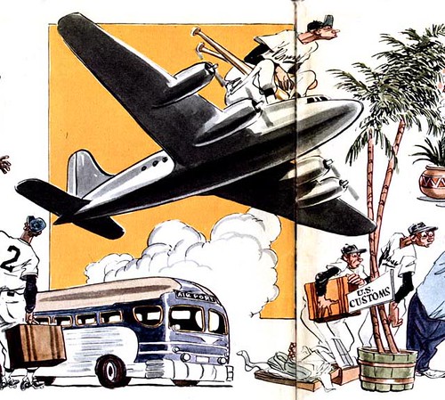
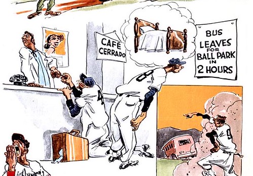
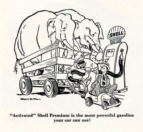
Mind you, looking at the auto-related ads Mullin drew (below), its clear he had no trouble investing even the most rigid and mechanical of objects with that special Willard Mullin sense of plasticity and motion.


Kent describes Mullin as having done "the occasional advertising drawing" and its true that he did not seem to have produced the volume of ad work some other 50's cartoonists did. Thanks to Pau Medrano, of Barcelona, Spain, who contributed the Fisk Tire ad above and the Shell Oil ads below, we have more than just my small collection of Pal Injector Blades ads to enjoy today.


Pau, who who has been researching American historical tire advertising for his Master's Degree in Graphic Design, writes:

"Did you know that Mullin is included into my Thesis? Yes! He illustrate a few ads for Fisk Tires in the “Fisk Facts” 1950 campaign. Another nice coincidence.

The art of Mullin always reminded me in the master Jay Norwood “Ding” Darling (who, as a secret discovery in my Thesis, illustrated extenses campaigns in 1916 for Michelin Tires drawing an amazing Michelin-man).

Mullin was also very active on advertising (my field of interest), as you can see in the attached images. I’m interested if someone has more information about the campaign for Fisk Tires, also if someone has other different Fisk ads images from the same campaign.

Also if you or other of your contributors have more advertising commercial art by Mullin."


My thanks to Pau for contributing his scans and information! If anyone reading this post can help Pau with his research, you can contact me and I'll forward any info to him.

* My Willard Mullin Flickr set.

* Also, Harry Borgman has begun a second blog! Drop by Hairy Blogman to see what else harry Borgman's been up to lately.

Thursday, October 30, 2008

Willard Mullin's Editorial Art

Willard Mullin might have been best known for his sports cartooning, but he did some editorial/political cartoons as well. I'm not familiar enough with the entire body of his work to say for sure how much, but he was a frequent contributor to American magazine in the late 40's and early 50's.


Its kind of fun to look at these old political commentaries from half a century ago. If nothing else, they certainly confirm that the more things change, the more they stay the same!

But to truly appreciate Mullin's engaging artwork, you'll want to see the full size versions in my Willard Mullin Flickr set.

Wednesday, October 29, 2008

Willard Mullin Draws "The Brooklyn Bum"

In the spring of 1957, American Artist magazine editor Norman Kent paid a visit to the home studio of Willard Mullin. The magazine had requested to witness the artist at work for a step-by-step article for their summer issue. Specifically, the editors had asked Mullin to do for them a drawing of his most famous recurring character: "The Brooklyn Bum".


Twenty years earlier, during the 1937 baseball season, Willard Mullin was leaving a Brooklyn Dodgers game. He had just watched the team split a double header. By winning the first game the Dodgers had climbed into the upper half division, but by losing the second they fell back where they had been. Mullin was climbing into a cab bound back to Manhattan when the cabbie inquired, "Well, how did our 'bums' do?"

It was, for Mullin, an epiphany.


In the pages of the Scripps-Howard newspapers that ran his cartoons, Mullin had already characterized (with affection) the Dodgers as a clown - and now, with a little refining, he decided to recast the team as a 'bum'. Twenty years later the lovable "Brooklyn Bum" was still going strong, his expressions and attitudes, his circumstances and situations, rising and falling in conjunction with the Dodgers' fortunes.


While the step-by-step doesn't reveal anything unexpected (Mullin's technique and materials were, as Norman Kent described "simple in the extreme"), its still always fun to see the process of a talented artist's work taking shape.


One interesting note is that Mullin credits his early experience working in the sign shop of an L.A. department store as providing the beginnings of his skill at lettering.


The drawing, an actual assignment for the New York World-Telegram, was begun at 11:00 a.m. that day under the watchful eye of the AA photographer and interviewer Norman Kent.


Kent describes the events of the day unfolding, "over a period of the next two hours, interrupted by conversation, photography, and a pleasant break for luncheon."


"With the final lettering added to the 'balloons' and the papers in O'Malley's pockets, the drawing was finished. after a few minutes of critical appraisment, Willard added a few penciled notes to the engraver in blue pencil, rolled up the drawing, encased some folding money under a rubber band, and dashed off to the railroad station - a block away."

"As the 3:50 train for New York pulled in, he handed the drawing to the conductor, who happily removed the 'fee'. On arrival in New York, the conductor would take it to Western Union in Pennsylvania Station."


"A few minutes thereafter, the drawing would be delivered by messenger to the engraving department of the paper to be 'shot' for next day's edition. It appeared on schedule in the World-Telegram and Sun on Friday, April 12, [1957]."

* My Willard Mullin Flickr set.

* Also, don't forget to stop by Charlie Allen's Blog for the latest installment of the CAWS.

* And be sure to visit Harry Borgman's new blog for his latest post!

Willard Mullin: Some Biographical Details

Looking at this 1951 basketball illustration from Collier's magazine, its no wonder Willard Mullin has been called the greatest sports cartoonist of all time.


With his remarkable ability to imbue the human face and form with a sort of expressive elasticity that enhances action and motion to the nth degree, Mullin provided a template for a legion of cartoonists to follow. One friend commented recently that surely the great Jack Davis, for instance, must have found inspiration in Willard Mullin's work. No doubt!

In the book, The Complete Guide to Cartooning, author Gene Byrnes accurately described the artist's ability to portray "violent action" as being "in a class by itself".


Willard Mullin was born on a farm in Franklin, Ohio in 1902. His family moved to Los Angeles when he was just 6 years old and he went to work in a department store sign shop immediately upon finishing high school.


He stayed for just two years before quitting to take a job with a construction firm. One day on the job he fell from a dam and nearly broke his neck! After his injuries healed he decided he wanted to be an artist after all.


Mullin found work at The Los Angeles Herald newspaper, where he learned a variety of graphic arts skills - those too menial for others in the department to bother with. Gradually, he worked his way up to photo retouching - but not with an airbrush... Mullin learned the more traditional (and far more difficult) manual fashion of painting in thin layers of wash.


He insisted that this meticulous training under the pressurized environment of a daily newspaper deadline gave him his facility with a brush and the ability to work fast.


Mullin stayed at The Herald for twelve years, developing his cartooning abilities at night after putting in a full day at his regular art department chores.


When he finally left for new York, it was at the invitation of Joe Williams, executive sports editor of the World-Telegram. There he produced 6 cartoons a week, month in and month out, and never missed a deadline, even while doing advertisng illustrations and pieces like these for Collier's and other national magazines, on the side.


In spite of the astonishing volume of work he produced, Mullin, the consumate professional, found his job got easier and easier over time. In a 1957 article for American Artist magazine, he told interviewer Norman Kent, "One builds up a background over the years of witnessing sporting events. The unexpected often happens and personalities in sports are always grist for my mill."


My Willard Mullin Flickr set.

Monday, October 27, 2008

Willard Mullin: "Tops in Sports Cartooning!"

A note arrived a few weeks ago from a TI list member... "Seeing today's Robert Bugg post with sports illustrations made me think of the great Willard Mullin. To me, his drawings--so full of vitality, character, and humor--ARE baseball in its golden age (1940s and 50s). How about doing a feature on him?"


I am only too happy to oblige. I've been setting aside pieces by Willard Mullin for quite a long time now. What I know about sports could fill a thimble... but I do love great cartooning - and Willard Mullin certainly was a great cartoonist!


As luck would have it I recently acquired a terrific article on Mullin that will provide some very interesting background on the artist - and show us step-by-step how he did his thing.


And although I don't share our reader's passion for baseball, I did happen to hear that the World Series is currently underway - so what better time to highlight the work of this remarkable cartoonist?


Besides, if the above article from the October 1949 issue of Look magazine still holds true, these posts might be as close as anyone's going to get to a front-row seat at the big game!

* Bob Staake has a wonderful tribute to Willard Mullin at his website - go check it out.

* My Willard Mullin Flickr set.

Friday, October 24, 2008

Fritz Siebel: Coming Into Focus

Here is one of my favourite pieces by Frederick Siebel. I love the rich colours and sumptous environment, the energetic technique Siebel used, the zaftig model - her curves so lovingly defined...


... and most of all, I love Siebel's portrayal of the artist. I've wondered if it was in some way a Fritz Siebel self-portrait.

I believe our character - our personality - is reflected to some degree in our work, but considering the tremendous range of styles and techniques we've looked at this week, its hard to determine if Frederick Siebel was a carefree creative spirit...


...or a buttoned-down commercial arts professional.


Yesterday, the picture of Frederick Siebel began to come into sharper focus. Out of the blue, the following email message arrived:

"I just sent a link of your Fritz Siebel post to my family. What a great surprise for us. I am his son (same name) and I want to reach out. You have works we haven't seen in years. Did you know he was the original conceiver and designer of the Mr. Clean icon?

I hope to hear from you.

Kind regards, Fritz Siebel"


Isn't the Internet amazing? I sent an enthusiastic reply and hope to hear back soon. When I do, I'll post it here so we can all learn a little more about this amazing artist.

Meanwhile, another email message arrived from Pablo Medrano in Barcelona. Pablo writes, "Is it possible that Frederick Siebel signed his late works as “Fritz Siebel”? I found some references on the web about a Fritz Siebel illustrator, specialized in children books on 60s and 70s."


Pablo sent along a list of children's books illustrated by Fritz Siebel... and I was stunned and delighted to see that one of them has long been a family favourite in the Peng household: Mike McClintock's 'A Fly Went By'!

I can't begin to tell you how many times I read this book to our boys at bedtime when they were little. Not to mention, I can still recall pouring through this book in my school library back in grade 3, and being captivated by the outrageous shenannigans Siebel portrayed in his vigorous cartooning style.

Take a look at the two Siebel ads above, both from 1957, and the cover of the book below, published in 1958, and its not hard to imagine that they are by the same artist.


I've often said that Siebel's work struck me from the moment I first saw it. I just hadn't realized that moment was nearly 40 years ago!

* My Fritz Siebel Flickr set.

Thursday, October 23, 2008

The Fanciful Fred Siebel

For several years in the late 1940's Fred Siebel illustrated a fanciful series of ads for Textron. One of those ads made it into the 1948 Art Directors Annual.


The male-oriented Textron ads were often pretty hoaky and personally I've never given them much regard. But as I compiled a bunch for this post, I had to admit they are worth a closer look.


Siebel tucked a lot of interesting and amusing details into the backgrounds of these ads.


The Textron ads aimed at women were another thing entirely. Can you believe that the same artist who did the Collier's cover of Stalin we looked at on Monday did these?

Frankly, Siebel's Textron ads for women never much appealed to me at all. Again, it wasn't until I began preparing them for this post that I gave them closer consideration.

You get a new perspective when you've scanned something and accidentally see it cropped and close up. It struck me that Siebel really succeeded in evoking a wonderful mood in these dream-like scenes of femininity.


Sometimes its the simple sublety of a breeze wafting through a deep, leafy forest...


... or a foot dipped in the cooling waters of a seaside pool...


Other times its the amusing kitchiness of cartoonish cupids...


... but it could also be the wonderment...


... of a magical midsummer night's dream.


Like so much of what Frederick Siebel did, these ads represent only one tiny facet of his remarkable range.

* My Fred Siebel Flickr set.

Tuesday, October 21, 2008

The "biting witty 'Fritz' Siebel"

Long-time reader's will remember Anita Virgil's moving recollections of her late husband Andy's life. During that series of posts, Anita mentioned that one of the other artists who also worked at Rahl Studios (where Andy began his professional career) was Frederick Siebel. Anita called Siebel "Fritz" and fondly described him as "biting witty" and one of the artists whose company Andy enjoyed.


The only ad I've ever come across for Rahl Studios is this one, from the 1942 Art Directors Annual. Siebel isn't listed among the studio's staff of artists, suggesting he was either not yet in the business, working elsewhere, or in the service, like so many other illustrators.

Below, a 1945 ad from the Saturday Evening Post, illustrated by Fred Siebel. Clearly already very accomplished and doing work for national accounts, Siebel must have been at least somewhat established as a professional illustrator.


Later, he would become a regular contributor to Collier's as a story artist, contibuting covers and interior art in a variety of styles. Here once again, we see Siebel trying something different that reminds me a little of Denver Gillen's work. Funny though, his success there never translated into any editorial assignments for the Post.


Perhaps Siebel's refusal to stick to one style made him too much of a wild card for the Post's editors. Generally speaking, Collier's tended to embrace a broader range of stylized artwork.


Finally for today, a Siebel painting for the long-running American beermakers "Beer Belongs" series. Some of the best illustrators in the country regularly received these assignments: Haddon Sundblom, John Gannam, Douglass Crockwell and others, a prestigious group for Frederick Siebel to have been associated with.


* My Fred Siebel Flickr set.

* Also, be sure to visit Charlie Allen's Blog today for a 'spaced out' installment of the CAWS!

Monday, October 20, 2008

Frederick Siebel: The Versatile Illustrator

On October 20, 1951, this issue of Collier's hit the stands sporting a remarkable cover by Frederick Siebel. Fifty-seven years later, on October 20, 2008, we begin a week-long look at the work of this versatile illustrator.


Not much information is available on Siebel. The paragraph below from the contents page of that same issue very nearly sums up everything I've been able to find.


Frustrating, because Siebel was tremendously prolific. Flip though almost any major mid-century magazine and you're likely to come across his signature on ad or editorial art -- or both! Thank goodness Siebel regularily signed his work, because you just never know which style (always appropriate, of course) he'd choose to employ for any given assignment.


Siebel was equally adept at literal realism, exaggerated (cartoony) realism, caricature...


... even storybook styles! How many illustrators can boast that sort of diversity?

Its actually kind of surprising that Frederick Siebel was so successful. The business does not generally reward those among its ranks who do a lot of different things, even if they do them well. Most art directors tend to want to pigeon-hole artists as much as most artists want to specialize in one personal 'look'. Think of all the illustrators whose work you know well, who landed high profile assignments on a regular basis, and try to name five who did work as diverse as what you see in today's post. Try to name three!


I've been setting aside examples of Siebel's work for a very long time, hoping to discover an article about him, or hear from someone who knew him. No such luck. Perhaps someone who knew him will find these posts and tell us more about this artist I find both appealing and intriguing -- the versatile Frederick Siebel.

* My Frederick Siebel Flickr set.

Friday, October 17, 2008

David Stone Martin: "Bending a wire"

David Stone Martin, writes Henry C. Pitc in the April 1950 issue of American Artist, "is a superb draftsman. He has a penetrating interest in human beings and the ability to reveal character. He has technical mastery. All this is sparked by physical energy and mental curiosity."


"He has tried practically every pictorial tool, but one of his favorites is the crowquill pen-point. He uses it like a brush, freely, but deliberately. At times he allows it to produce the thin whisper of a line that it is so well fitted to do; then, when he needs emphasis, he applies pressure, the nibs spread to their maximum and a line of about one eighth of an inch appears. The crowquill was never meant to withstand this treatment - they usually live a short but expressive life in Martin's hand."


In his introduction to the book The Art of Drawing with Pen, Pencil and Brush, DSM himself said, "Searching out a line is like bending wire... volume, modeling, shape and motion can all be said in line and wash..."


"... or even more simply by line drawing alone."


Pitz wrote that Martin rarely made sketches unless they were requested by the client. He preferred to work directly in ink.


"He gives a great deal of preliminary thought to his problems, allowing the conception to take shape in his mind's eye."


"Then he attacks the picture directly often working from the model, sometimes from memory, seldom from photographs."


"Not many pictures are discarded, in spite of this direct approach."


"In his studio in Roosevelt, New Jersey, David Stone Martin is safely removed from metropolitan pressures. He has an agent to handle the routine and business side of his work; he can concentrate on the creative solutions of the problems that come to his drawing table."


"All he asks is that the problems be many and challenging."

David Stone Martin is represented in the Museum of Modern Art, the Metropolitan Museum of Art in New York, the Art Institute of Chicago, the Smithsonian, and in the collections of large corporations and private collectors. He died in 1992.

* My thanks to Harold Henriksen who provided most of today's and some of yesterday's scans.

* My David Stone Martin Flickr set.

Thursday, October 16, 2008

David Stone Martin: "...unusual pictures, vitalized by many strange textures"

Norman Granz has rightly been credited with fomenting David Stone Martin's status as the premier visualizer of the mid-20th century jazz scene in America. Similarly, William Golden, art director at the CBS Network, should be recognized for nurturing DSM's success in magazine illustration.


Golden, who worked with DSM in the Office of War Information in the early 40's, was an avid supporter of Martin's post-war freelance career. He frequently commissioned artwork from DSM for the CBS Network's expansive, high-profile print campaigns.


Those ads, which often mimicked the format of a typical double-page spread story layout, went on to win many awards from the New York Art Director's Club -- and likely led some (more daring) magazine art directors to consider DSM for story assignments.


Likewise, credit must go to Martin's rep, Lester Rossin, who never passed up an opportunity to use DSM's work on the promotional pieces distributed to clients. In conjunction, David Stone Martin's work secured a consistent presence in a market described by Henry C. Pitz, author of an article on DSM, as mostly "rigid and inflexible".


"Smugness and complacency has crept into the make-up of most of our mass magazines," wrote Pitz in April 1950, "built around a great similarity of layout; a too great reliance upon the close-up, with a resulting loss of compositional invention; a parade of stereotyped characters; and an insistence upon a literal and uninspired brand of realism."

From our perspective a half-century later, we may look back on this period with a nostalgic fondness, but Pitz makes a good point - the appeal of the classic 'boy/girl' set up and professionalism of the standard commercial art style of the day may have projected a comforting familiarity...

But familiarity breeds contempt.


Pitz writes, "The newness of David Stone Martin's visual impact is not a matter of mere novelty. It goes deeper than that. He seems to have in him a union of forces which is becoming visible in other talents and in other fields. It is a true union, natural and without artificial compulsion, of the old and the new - of modernism and tradition."


Again, Pitz nails it: the beauty of David Stone Martin's successful entrée into the mainstream is that he understood how to balance the avante-garde qualities in his work with the classicism the public (and the clients) were comfortable seeing.


In doing so, he opened the door for other younger mavericks to walk through in the ensuing years. Remember that artists like Robert Weaver, Phil Hays and Jack Potter arrived on the scene about five years after it became normal to see DSM's work in a broad range of mainstream magazines alongside more typical fair from the Cooper Studio and the Sundblom Circle. Because as Pitz explains, "The large men of the beginning years are gone or are going; they have been replaced by disciples and the disciples of disciples. A vision has been contracted into a formula - a small formula that can be readily practiced by thin talents and that is confining as any invented by an academy."

But, writes Pitz, "a younger generation of artist is maturing, a generation that has grown up accustomed to the idioms of modernism, that finds no strangeness in it, but dares to question."


If that generation had been even more readily embraced, might things have turned out differently? As Walt Reed wrote in The Illustrator in America, "by the mid-sixties the traditional family magazine bases for illustration had shriveled as one after another of the major magazines died. Liberty was the first to go in 1950. Crowell-Collier, with its flagship, Collier's, succumbed in 1956. the mighty Saturday Evening Post was discontinued in 1969.

The Post had finally begun granting assignments to David Stone Martin, as in the 1962 example below -- but by then it was too late. And besides, Martin was no longer really creating cutting-edge work. Others were leading the look of illustration... and searching for new markets.


* My David Stone Martin Flickr set.

Wednesday, October 15, 2008

David Stone Martin: For the Record

Look around the internet for David Stone Martin images and you'll find no shortage of his album cover art. Especially among jazz enthusiasts, DSM (along with Jim Flora and a few others) defined the look of jazz with his signature 'nervous' line style and modernistic sense of graphic design.


In an article in American Artist magazine from 1960, Robert Jones, art director of RCA Victor Records writes, "A consistently exciting and esthetically rewarding marriage between American art and industry flourishes in the phonograph record business. This country has been the leader in making an artistic success as well as a potent selling tool of what originated as a mere protective package for recordings."


Ten years earlier in another AA article, this one focusing specifically on David Stone Martin, author Henry C. Pitz points out, "[Martin's] designs for record album covers have probably received more publicity than any other phase of his work."


In fact by the time of that 1950 article, DSM had, according to Pitz, already produced "over a hundred brilliant designs for Mercury, Disc and Dial record albums." (From my research on the net, it appears that DSM went on to create approximately 400 album covers!)


In 1951, Pitz again praised David Stone Martin's album cover artworks, writing, "One of Martin's many entries [in that year's Art Director's Exhibition] has received a medal award. It is his album cover design for 'Women Blues' in the series of Disc records. It is typical of the many album designs he has done during the past decade and reminds us of the debt the field owes him for repeatedly demonstrating how much can be accomplished by two or three beautifully integrated line plates.


In spite of Martin's obvious importance as an iconic creator of jazz album cover artwork, detailed information about this aspect of his career is almost nonexistent. Several websites make passing reference his long relationship with record producer Norman Granz, but I was unable to find any recounting of how they met or what lead to Granz commissioning album artwork from DSM, apart from a mention that the two men were long-time friends.


What has survived is the artwork which, over time, has become highly collectable, greatly admired, and often imitated.


Despite the obvious success of DSM's album cover work, the artist felt that some of his best efforts had gone into his story illustrations. Tomorrow, we take a closer look at that aspect of his career.

* Many thanks to the Fox Music Company for generously providing all of today's scans. You'll find many more in their David Stone Martin Flickr set.

Tuesday, October 14, 2008

David Stone Martin: Early Days

David Stone Martin was born in 1913. He had no formal art training, but his passion for picture making was so intense that as a boy he spent endless hours in the galleries of the Art Institute of Chicago. There, in high school, at home and through whatever intermittent art classes he could find, Martin devoted all his free time to learning about and practicing his craft. One of his first jobs was helping to execute some of the large murals decorating the buildings of the 1933 Chicago World's Fair.


He worked on a W.P.A. mural project during the Great Depression and in 1935 accepted an invitation to join the Tennessee Valley Authority in Knoxville as a staff artist. During WWII, Martin joined the Office of Strategic Service as a graphic designer and eventually settled into the Office of War Information as an art director. Here he first met and worked with Ben Shahn, whom he assisted on several mural projects, and several others who were important to Martin's development and growth as an artist: Henry Koerner, Bernard Perlin, William Golden and Henry Koeller. The exchange of ideas and the opportunities for diverse projects, including a stint as an artist-correspondent for Life magazine and Abbott Laborotories made this period extremely stimulating for the young artist.


As the war was drawing to a close, Martin joined the Associated American Artist group where he began doing commercial art projects. He illustrated ads for Lucky Strikes, Abbott Laboratories and other clients. A war bonds poster for abbott Labs was his first truly commercial assignment and shortly thereafter, he began his free-lance career.


One early project, a hospital book DSM designed and illustrated for the Federation of Philanthropies, won a medal from the Art Directors Club. It was only the first of many awards that quickly followed. Martin won an Award for Distinctive Merit in both '47 and '48. He had 6 pieces accepted in the 1948 Art Directors Annual alone. The publicity propelled him to the top of the business.


Somehow in the midst of all this activity, DSM found time to teach as well - at the Brooklyn Museum School of art in 1948-49, and at the Workshop School of advertising and editorial Art in New York in 1950, the same year he did this piece for Esquire magazine.


At some point in the late 40's, I'm not sure exactly when, he began his long association with his representative, Lester Rossin Associates. His rep clearly appreciated that they had a trophy in Martin. he produced many promotional pieces for them and his work appeared prominently in all their ads. In the example below, you see the style and subject matter that became synonymous with the name David Stone Martin. His jazz album covers are what he is best remembered for. Tomorrow, we'll take a closer look at some of them!


My David Stone Martin Flickr set.

Monday, October 13, 2008

David Stone Martin: Modernism meets Traditionalism

This one's been a long time in coming. Ever since David Stone Martin's work was first brought to my attention a few years ago, I've been under his spell.


Looking at the broad spectrum of work being done in the field of illustration during the mid-20th century, David Stone Martin, with his signature ink line style and his powerful sense of graphic design, seems somehow to have successfully forged his own path.


For the period in which he was most prolific, when he regularly received the most high-profile assignments, David Stone Martin was a genuine maverick. He brought to the field of illustration a hybridization of fine arts modernism and commercial art acceptability.


Other illustrators trod the safer ground of classical or contemporary literal realism (what I have called the Old School and the New School) but time and again, I've come across pieces by those illustrators that suggest they were seeing Martin's work and incorporating elements of his style in their own.

I would not hesitate to say that even such titans as Noel Sickles and Austin Briggs must have found inspiration in DSM's work and used it as a starting point for their own experimentations.


What's surprising is that there's very little written about DSM, in spite of how influential he was and the many awards he received from virtually the beginning of his illustration career (continuing right up to his induction into the Society of Illustrators Hall of Fame in 2000).


Recently I came across a 1950 article on DSM in American Artist. I was elated! At last (I thought) I have the material that will provide me with the insight I'd been hoping to present in conjunction with DSM's work. And don't get me wrong, that article certainly provides a good amount of biographical material... but there are no quotes, and no anecdotes - no real sense of who David Stone Martin was.


So while we will learn quite a bit this week, I feel we still will not come away satisfied that we have come to know David Stone Martin.


Hopefully though, through these words and this work, we will at least begin to know him.

My David Stone Martin set.

Friday, October 10, 2008

The (Cover) Art of British War Comics: Day 5

Today's entry rounds up work from some of the other notable artists who worked on the British war Picture Library comics .

Nino Caroseli


Like his fellow Italians Caroseli moved on from movie posters to war comic covers commissioned through the Milan based D’Ami studio . His earliest British work was for the detective series Sexton Blake but he soon moved over to the war titles and ended up painting almost 200 of them . His painting style was polished and slick like DeGaspari but perhaps without the same sense of the dramatic . On occasions though he could come up with a real classic, like the example here . He would appear to have drifted away from comics in the mid 60’s and I believe he moved over to fine art .


Graham Coton


Not all the cover artist were Spanish and the most prolific of all was a Brit – Graham Coton . Coton started out as a comic book artist in the early 50’s and developed an incredibly detailed pen and ink style . Machines and vehicles were his speciality and he drew numerous strips featuring racing cars or aeroplanes . In the early 60’s his covers began appearing on Air Ace though at this stage he was using thin watercolour washes , By the end of the decade he had changed over completely to thickly troweled on oils , painted on enormous sheets of masonite , board or wood. His later covers – of which there must be well over 1000 are typified by grizzled , dirt encrusted soldiers and vast monolithic war machines, gesturally painted in a style that always reminds me of the great John Berkey. Coton was there until the end in 1984 and continued to turn out vast numbers of pictures for Look And Learn magazine and the fine art market .

Jordi Longaron


Best known in the states as the artist of the Friday Foster newspaper strip Jordi Longaron was a much more versatile artist than most people are aware . From the late 50’s to the late 60’s he was absolutely the top Romance artist in Britain providing countless strips the S.I agency to titles such as Valentine and Marilyn . In fact he so dominated the genre that his sleek , pared down style and knack for drawing pretty girls set the style of the genre for over two decades . In between the romance strips he squeezed in over 30 war covers in an ultra – dynamic , gritty style more reminiscent of Jordi Penalva than his own comic work . After Friday Foster was cancelled in the mid 70’s he turned primarily to western paperback covers which combine elements of his war covers with the realism of a Robert McGinnis . I’ve long believed that Longaron ius one of the giants of illustration but sadly his work is almost totally forgotten these days – it’s high time for a revival !

Ian Kennedy


A legend in British comics, the Scottish artist Ian Kennedy has had a long and varied career but his passion remains aeroplanes. Throughout the 50’s and sixties he drew numerous strips about cowboys , ballerina’s or spacemen but he really came into his own in the pages of Air Ace. His comic work was staggeringly detailed and precise and he revealed a masterful grasp of drawing dynamic hardware of all sorts from the most detailed cockpit control panels to rampaging Tiger Tanks , ships , jeeps or planes. In the mid 60’s he began to paint covers in the same tight, precise style that typified his comic work often employing a vibrantly bright palette. In the 70’s he jumped over to Commando and almost forty years laters he’s still there and still creating new masterpieces each month every bit as beautifully as he had in his youth. Kennedy remains one of the most popular artists amongst British comic fans with one of the most recognised styles in the business .

Oliver Frey


The final artist this week is the Swiss-born , but London based Oliver Frey. In 1969 the 21 year old Frey was studying in film school when he approached Fleetway hoping to pick up some easy money to live on. They loved his samples and he went away with a script . After a short while he began painting the covers to his strips and eventually became primarily a painter – his film career long forgotten. Freys work in this period is perhaps less realistic than his peers but he more than makes up for that with a real – in your face – sense of the dramatic and many of the most memorable 70’s covers are his. He went on to paint numerous covers for science fiction and video game projects and has amassed quite a following amongst British fans .

So ends our week peering into the dim and dusty past of British comic books – I hope you’ve all enjoyed it .

* Many thanks to David Roach, British comics artist of Judge Dredd, author, comics historian, and long-time TI subscriber for providing this week's enlightening series of posts! All this week's images are mostly taken from the original art and can be found in David's latest book, "The Art Of War" published by Prion books in the UK. An earlier volume "Aarrgghh It’s War" came out last year and each contain over 1000 of the best war comic covers.

This week's images are © IPC Media.

Thursday, October 09, 2008

The (Cover) Art of British War Comics: Day 4

After 3 days of Italians today's war artist is a Spaniard – or a Catalan to be precise – Jordi Penalva.


His first British work (and if I’m honest , the first of his work that I’m aware of anywhere) appeared in Cowboy Picture Library from 1959-1962. When that title was cancelled he transferred over to the war comics where he would go on to paint over 200 covers. I like to think of Penalva as the Spanish Frank Frazetta as the pair both have a fantastically rugged and dynamic approach to painting.


Penalva’s covers are invariably full of finely chiselled , extremely handsome heroes (apparently modelled by the artist himself) set against a background of orange or crimson explosions. Unlike the Italian artists who usually painted on board Penalva painted on canvas, usually roughly primed with Gesso , which gave his covers an excitingly textured look. More than any other painter in British comics I think Penalva had a pulp- feel to his work and I think he would have fitted in nicely alongside the likes of Norman Saunders or Norm Eastman in the notorious 'Men's Sweat' magazines of the 50’s and 60’s .


Penalva’s war covers were commissioned through the Belgian A.L.I agency which represented a number of Spaniards, but he was simultaneously working through the Anglo-Spanish Barden agency which had strong ties to the Scandinavian market. So in addition to the (at least) one war cover a week he was painting for Fleetway, Swedish readers could find his romance illustrations in womens magazines and covers for collections of James Bond, Modesty Blaise and Juliette Jones comics. In the seventies he moved over to Fleetways arch rivals D C Thomson where he painted 100’s of covers for their war comic Commando.


Of all the artists I’ve covered this week Penalva is probably the most familiar to American readers since in addition to his British work he painted some superb covers for Warren comics such as Eerie and The Rook, Marvel's Dracula Lives and numerous science fiction and romance paperbacks. In recent years he seems to have found work painting collectors plates (that’s porcellein rather than metal printing plates ! ) which I must admit is somewhat outside my area of expertise – but they do look nice.


* This week's posts are by David Roach, British comics artist of Judge Dredd, author, comics historian, and long-time TI subscriber. All this week's images are mostly taken from the original art and can be found in his latest book, "The Art Of War" published by Prion books in the UK. An earlier volume "Aarrgghh It’s War" came out last year and each contain over 1000 of the best war comic covers.

This week's images are © IPC Media.

Wednesday, October 08, 2008

The (Cover) Art of British War Comics: Day 3

Our third Italian is Allessandro Biffignandi – a name which may be familiar to some readers, but not necessarily for his war illustrations.


Biffignandi was born in 1935 in Rome and after a period training with the artist Averado Ciriello he joined the Favalli studio to paint movie posters. Interestingly, almost all the Italian painters seem to have had similar career trajectories and like DeGaspari and Nino Caroselli (to come on Friday) he moved to Milan to join the D’Ami studio in 1960.


While typically these would have been 'jobbing' artists (moving where the work was) at least Biffignandi had a love of comics (which is what the D’Ami studio specialised in) and did in fact draw a few strips. Through D’Ami he immediately started work on war covers for Fleetway eventually painting over 400 by the decades end – a fearsome workload by anyone's standards though he was also doing other British and Italian work in addition to this – did he never sleep?


Biffignandi’s earliest war covers very slick and richly painted and were almost indistinguishable from DeGaspari’s work. However, as the decade went on he developed his own unique style where he built up his pictures through lots of little brush strokes or dots – a modern version of Seurat’s pointiliste technique. His originals got progressively smaller as well going from colossal in the early sixties to a comic art sized page at the end. In this period the D’Ami studio genuinely was a studio with its artists all working in the same building. This meant that Biffignandi was working next to comic greats such as Tacconi and D’Antonio and he often based his covers on panels from their strips giving them a great sense of Drama and action.


By the end of the sixties he decided he needed a complete change of career – he’d had enough of painting soldiers, instead he wanted to paint pretty girls (and who can blame him?). Linking up with the Italian company Edifumetto he began to paint covers for their vast line of Sexy Horror comics such as Sukia, Wallestein, Zora and Biancaneve (a very adult retelling of Snow White). These comics were by and large wretchedly drawn inside but have amassed a huge cult following recently almost solely because of Biffignandi’s covers. The ComicArtFans website has a great selection of these covers which are incredibly sleazy, yet also beautifully painted in vibrant almost dayglow colours. Since 1995 he has concentrated on romance covers for the U.S., a connection he made through his good friend Pino D’Angelico.


* This week's posts are by David Roach, British comics artist of Judge Dredd, author, comics historian, and long-time TI subscriber. All this week's images are mostly taken from the original art and can be found in his latest book, "The Art Of War" published by Prion books in the UK. An earlier volume "Aarrgghh It’s War" came out last year and each contain over 1000 of the best war comic covers.

This week's images are © IPC Media.

Tuesday, October 07, 2008

The (Cover) Art of British War Comics: Day 2

Pino Dell’orco was an aeroplane-obsessed schoolboy who grew up in Rome reading the comics of the legendary German/Italian artist Curt Caesar.


Dell’Orco was something of a prodigy and as a teenager he became an apprentice to Enrico DeSeta before joining the Favalli studios to paint movie posters. Dell’Orco had absorbed DeSeta’s style so completely that he could (and indeed did) paint entire posters in his style, which DeSeta would then sign! In the late 50’s Favalli died and the studio broke up with most of the artists relocating to Milan to join the D’Ami studio.


Dell’Orco, on the other hand, moved to London where he joined the Bryan Colmer agency. After a few years painting paperback covers Colmer approached Dell’Orco about the possibility of creating war covers for Fleetway and he jumped at the chance, going on to paint over 300 of them throughout the 60’s. As it turns, some of his fellow cover artists were his old colleagues at the Favalli studio -- Allessandro Biffignandi and Nino Caroselli, now based in Milan, though bizarrely the fact that they ended up working on the same comics was pure coincidence .


Pino Dell’Orco’s paintings were invariably masterpieces of design and this is particularly true of his many covers for Air Ace. Working on artboard roughly the size of a U.S. original comic book page he had a far more minimalist approach than DeGaspari. His paintings often employed quite thin blocks, even using the bare surface of the board as a background colour and employing quick flicks of the brush, charcoal or pencil for details. They have a dynamic immediacy that flies off the page - but even more than that - it is their composition that really makes them stand out. Dell’Orco’s covers are all about overlapping shapes, negative space, clashing colours, extreme perspective and vertiginous angles. The cover to Air Ace #156 is a terrific example of his extremely angled aeroplanes criss – crossing each other – indeed, they are almost abstract cover designs, beautifully complemented in this case by the classic early 60’s lettering.


After my first book came out last year, several comic artists chatted to me about it and Dell’Orco was invariably their favourite. Looking at a picture like his cover to War #158, I think you can see why – his placing of the figure and orchestration of shapes is quite masterful. At the end of the sixties, the Colmer agency broke up and Dell’Orco returned to Italy where he still works today, with one of his most recent projects being a museum display devoted to – of course – aeroplanes. One of the nicest surprises of my first book was the fact that some of the original artists surfaced after years of (for me anyway) total obscurity. Pino had never had any recognition for his covers – and in fact absolutely no one even knew his name – but now he has at least some of the recognition he so richly deserves, which I find immensely satisfying.


And having chatted to him on the phone he turns out to be a terrific chap as well!

* This week's posts are by David Roach, British comics artist of Judge Dredd, author, comics historian, and long-time TI subscriber. All this week's images are mostly taken from the original art and can be found in his latest book, "The Art Of War" published by Prion books in the UK. An earlier volume "Aarrgghh It’s War" came out last year and each contain over 1000 of the best war comic covers.

This week's images are © IPC Media.

Monday, October 06, 2008

"A warehouse full of art - dear God!"

Back at the beginning of this summer I received a note from David Roach, British comics artist of Judge Dredd, author, historian, and long-time TI subscriber. David had the most incredible story to tell me, and has agreed to allow me to share it with you:

"I was trying to track down some 70's IPC strips for a Spanish company and rang round everybody I could think of, finally speaking to someone in licencing who mentioned 2 warehouses - one with bound volumes in it and another with the art. A warehouse full of art - dear God!"


"I went along soon after (this is early 2005 I think) to a very rough part of London called Canning Town and found stack after stack of comic pages and covers stretching back to the 50's - just as I always dreamed might happen but never thought actually would. Just think of the end of Raiders Of The Lost Ark and you'll get a good picture of the scene. It turned out that they had no idea what was there (or even which comics they'd published!) so I suggested I do an inventory for them which I duly did throughout that summer."

All told there were about 26,000 (yup, that's right) comic book pages from girls and boys comics as well as about 10,000 Nursery pages. Around 1400 war covers had survived, the best of which are in my books. My chum Rufus (currently drawing Tank Girl) helped and has said on several occasions that it was the best summer of his life - and you can bet the same goes for me - I was in heaven."


"At some point an editor from Carlton books was in IPC's offices and saw a few covers which had been moved there. He was so inspired by them he decided to put out 2 collections of them whereupon I was drafted in as the only person in the country who could actually identify the artists and could write about them. As a fan I was thrilled to see how the first one came out - the reproduction was incredible so I'd have bought it myself if I hadn't written it."

David agreed to share with us some examples from this astonishing treasure-trove, and has provided his expertise about the artists and the publications for which they worked. If you reside in North America, I suspect much or all of this material will be entirely unknown to you, as it was to me. It is with great pleasure that I invite you to join me on this week's journey of discovery of the long-forgotten cover art of British war comics, with my sincere thanks to David Roach for being our guide...

The (Cover) Art of British War Comics: Day 1

All the artwork this week comes from the British war comics War , Battle and Air Ace which ran in the UK from 1958 to 1984.


To put things in context, by the mid-50’s, British comics were undergoing a period of vast expansion with numerous publishers flooding the newsstands with mostly weekly titles of all shapes and descriptions. While I admit I don’t have any research to back this up, it’s very much my belief that in this period, say 1955-1975, Britain was the biggest comic-producing country in the world... and the company variously known as Amalgamated Press, Fleetway and IPC was its powerhouse. We were printing so many comics that there were simply not enough artists in the country to fill the demand for artwork so, from the mid-50’s, agencies from Italy, Spain, Belgium and Argentina began supplying art. The talent pool was immense and I know of at least 75 Argentinian, 150 Italian and 350 Spanish artists that plyed their trade in the UK.


War, Battle and Air Ace were 3 titles published in the digest-sized Picture Library format, which also included such legendary (and now highly collected) comics as Thriller and Super Detective. Typically, a Picture Library comic featured one long black and white 64-page strip behind a full-colour painted cover. Amongst the giants of world comics that Fleetway brought in to draw these comics were Hugo Pratt, Alberto Breccia, Jose Ortiz, Fedinando Tacconi, Dino Bataglia, Luis Bermejo, Victor DeLaFuente, Gino D’Antonio and Arturo Del Castillo – and let's face it, it doesn’t get much better than that! For covers the company initially used British talent before bringing in the Italian D’Ami studio around 1958 which is what this week's blog is concentrating on. Amongst their top artists were Giorgio DeGaspari, Pino Dell’Orco (below), Allesandro Biffignandi and Nino Caroselli and we’ll also be featuring the astonishing Spanish painter Jordi Penalva.


Most of the first 100 issues of War Picture Library sported covers by Giorgio DeGaspari (examples at top and below) who was already a legend in Italy by the time he started work for the UK market.

Throughout the 50’s he seems to have worked primarily in illustration with the odd movie poster thrown in for good measure. As the paintings reproduced here show he was a highly accomplished artist with a great knack for mixing dynamism with extreme realism – in a way similar to, say, James Bama. DeGaspari’s originals could vary from relatively small (the U-boat cover to War #475, for instance, is little bigger than a magazine like Heavy Metal) to quite large -- but this is never apparent from the printed image. Stylistically he was probably the most painterly of the Italians mixing quite gestural, seemingly loose brush strokes (like John Gannam), occasionally vibrant colours and even glazes to great effect. He had the knack, like all great illustrators, of knowing how to paint for reproduction and when they were reduced his covers possitively shone.


For the great train wreck cover to War #45 he employed a startling palette of yellows oranges and browns and the bafflingly elaborate mangled undercarriage is deftly illustrated by some surprisingly loose daubs of paint. He manages the neat trick of detailed realism with a looseness that prevents it from becoming sterile and lifeless.


Between 1958 and 1962 DeGaspari painted around 150 stunning Picture Library covers before moving on to more mainstream illustration work – including Readers Digest Illustrated Books- and he currently resides in Venice.

All this week's images are mostly taken from the original art and can be found in my latest book, "The Art Of War" published by Prion books in the UK. An earlier volume "Aarrgghh It’s War" came out last year and each contain over 1000 of the best war comic covers. It is unlikely that any copies will come over to Canada or the U.S., so this is probably your best chance to see these illustrations.

* This week's posts are by David Roach, British comics artist of Judge Dredd, author, comics historian, and long-time TI subscriber. This week's images are © IPC Media.

Friday, October 03, 2008

Al Parker Paints a Mother and Daughter Cover

When the editors of the Famous Artists Magazine asked Al Parker to paint a mother & daughter cover it was not without precedent - Parker's long run of "Mother & Daughter"-themed covers for Ladies Home Journal had become a familiar and much loved mainstay of the magazine and the significance of their influence as a popular culture reference point (especially for the female half of the population) cannot be understated.


From the introduction to the Parker step-by-step article in the Winter 1958 issue of FAM:


Just twenty years ago, Al Parker painted two cover girls that really started something. They appeared on his first "Mother and Daughter" cover for the Ladies Home Journal in 1938. American women immediately made them part of the family, copied their clothes and their hairdos, flooded Al Parker and the Journal with fan letters. "Mother and Daughter" fashions became a national rage - and the greatest of all cover series began, by popular demand. With apologies to the Journal, we can't help adding, "Never underestimate the power of an artist!"


A noted art director once said that Al Parker's "ever-increasing interest in illustration that involves creative thinking and planning is inspirational. The search for something that will give his drawing 'the Parker touch' goes on endlessly."

These talents went into his Mother and daughter covers. And they were an expression of his philosophy of what the cover of a magazine should be.


"I believe the cover of a magazine should be simple in design, especially if it is to be displayed at newsstands," says Al Parker. "Too many shapes or colors tend to clutter it and cause it to disappear in the maze of covers on display. The pretty girl has been featured on covers for years-but I feel she should be more than just a pretty girl. A pretty clotheshorse or, more often, a pretty hathorse is not enough. But if the artist paints a truly beautiful girl, honestly characterized, he will have no difficulty selling his painting to a magazine."


His Mother and Daughter paintings fill another Parker cover requirement: they are cover designs, not editorial illustrations. Why? Because they are complete in themselves. Nothing is left unsaid. In a story illustration, you don't tell all, but leave the reader guessing the outcome -- intriguing him into reading the story.


The success of the Mother and Daughter covers is also the result of knowing and working for a definite audience. "Some magazines cater to a sports audience; others have a strictly human interest or chic fashion approach," explains Al Parker. "But the various approaches can be incorporated to a lesser degree in a women's magazine cover: the pretty girl can be wearing fashionable clothes, the mother and daughter can enter into sports. The human interest these two characters exude is obvious."

*My Al Parker Flickr set.

* Some of today's images come from Charlie Allen, who has his own excellent blog - many thanks, Charlie! Others are courtesy of The Norman Rockwell Museum, from Ephemeral Beauty, the exhibition book the NRM released in conjunction with their Al Parker show last year. The book is still available from the Museum's website. The book is a steal at just &7.95, packed with beautiful and rare artwork, interesting essays and biographical information. I highly recommend it to anyone with an interest in Al Parker or mid-century illustration.

Now the legal:

Ladies Home Journal covers by Al Parker from the Al Parker Collection, Department of Special Collections, Washington University Libraries ©1945 and 1949 by the Meredith Corporation. All Rights Reserved. Used with permission of Ladies' Home Journal and the Norman Rockwell Museum

Thursday, October 02, 2008

Al Parker Step-by-Step: Part 4


* This article originally appeared in the Famous Artists School magazine in 1958. For those interested in finding out more about school, I've added their website link to my sidebar.

* My Al Parker Flickr set.

Wednesday, October 01, 2008

Al Parker Step-by-Step: Part 3


* My Al Parker Flickr set.