
It is not unusual for one or more partly completed or even completed paintings to be discarded before the obstinate Briggs standard is satisfied.

Some of his friends think that he is too exacting and that some of his best work finds its way into the wastebasket. Actually, in spite of the dogged pictorial battle he fights, he draws with great ease and spontaneity. His line is swift and sweeping and alive. it is perhaps something of a pity that, in the process of painting to completion, the spring and simplified strength of his line tends to be obscured.
The Briggs pictures bear the stamp of his personality but it is not a rubber stamp. There is no set Briggs composition,

... no repetitive Briggs types,
... no formulated color scheme. On the other hand, they are not full of violent surprises. The differences between pictures are noticeable but unobtrusive. They are the work of a man who is still investigating; who realizes that discovering oneself is a continuing process and is only too willing to consider it a lifework.
Excerpted from the October 1950 issue of American Artist magazine, written by Henry C. Pitz
*Thanks to Charlie Allen for contributing all the scans above!
Some final thoughts from Leif:
Over the course of the past year I've been acquiring Art Directors annuals from the mid-century period and now have about half of the 1940's volumes and the entire 1950's decade; that is to say, a fairly good sampling of the period discussed here. So I checked these volumes and found something interesting: compared to that group of 'Famous Artists' with whom I most often associate him (i.e. Dorne, Helck, Fawcett, and Parker), Briggs does not receive a single mention in any of my 1940's volumes ('41, '42, '46, '47, and '48). All these others of his peers do, with multiple annual listings. I found that odd, considering that Briggs had been illustrating for the Saturday Evening Post (among many others) since 1944. It would almost be a given that he would at the least have had work included in these annuals, even if they were not award winners. Did Briggs enter into the competition and never have anything accepted? Or did he choose not to enter at all, perhaps feeling he was not yet worthy to have his work recognized alongside his peers?
Whatever the case, Briggs received an Art Directors Club medal in 1951. He had two piece accepted into the 1952 edition of the annual, one being the beautiful and interesting composition above.
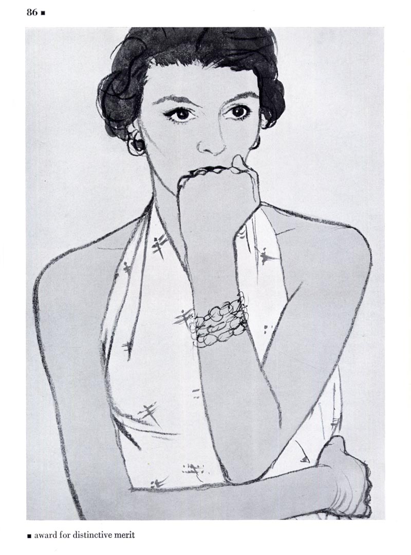
In both 1953 and '54 he won an award for distinctive merit.
It would seem Austin Briggs had arrived. His long years of searching for his own point of view, his struggles to satisfy the "obstinate Briggs standard" seem to have come to fruition during the 1950's. Certainly these examples, which are indicative of the sort of work we Briggs fans love, show the merit of the artist's determination to "learn how to draw."
As a final thought, I'll conclude with one earlier quote from Briggs:
"It was only when I began to look at the idea from my own point of view that I started to get any place. It was better if I didn't try to figure out what Parker or Von Schmidt would do and realized that it was my problem, and that from my point of view my experience was just as good as theirs."
* My Austin Briggs Flickr set.
Amazing stuff! I love the rich almost graphic colours.
ReplyDeleteA couple of things in today's posts of Ausin Briggs' illustrations, really caught my attention. The beautiful pensive woman in an orange dress and pearls, has a very interesting light treatment on her face. It appears Briggs was exploring light effects, and it is very effective.
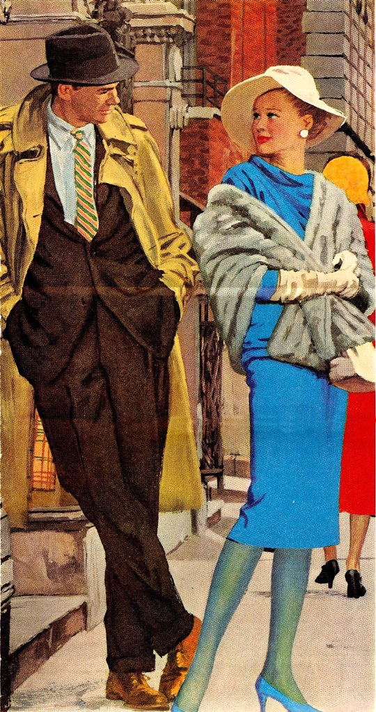
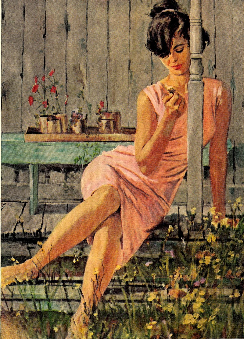
ReplyDeleteThat stylish woman in the blue dress and blue nylons is strikingly sexy in my opinion. Notice how he adds another woman in a red dress behind that blue, which intensifies the blue even more. It is an eye stopping electric blue, and the woman is also definitely an "eye stopper". Speaking of eye stoppers, the woman sitting on the porch in a peach dress, also has great appeal. Her natural "un-posed" gesture, and Briggs' amazing control over his values, defines a sculptural effect to the form... very dimensional and very appealing.
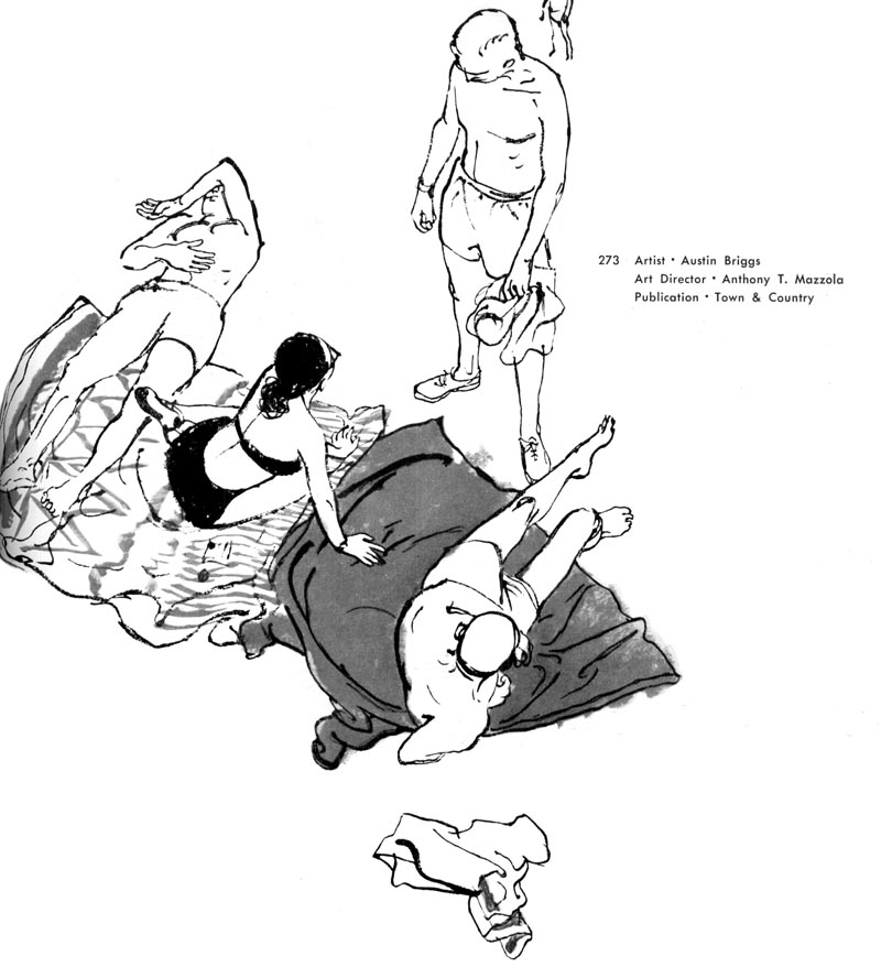
And the line and wash drawing of the woman with her fist in front of her mouth is another example of Briggs' sophisticated draftsmanship. Many illustrators would not attempt to draw a hand in that position, because of the difficult foreshortening and a tendency to look like a blob. Briggs however aces it, with careful draftsmanship. He also cleverly draws the hand on her waist slightly smaller than her fist at her mouth., which is closer to the viewer... giving a subtle sense of depth to a flatter technique.
I think Briggs had the same sophisticated elegant taste that Al Parker and Coby Whitmore had. Briggs could also do mystery, drama and true grit subjects. That put him on my short list 50 years ago, of great mid-century illustrators, and these examples confirm it once again.
And, as always Leif, very astute and Inspirational insight on Briggs this week.
Thanks,
Tom Watson
Thanks for sharing, Leif!
ReplyDeleteWere any comic strip artists ever mentioned in the AD annuals back then? In the mid 30s he continued the Raymond strip "Secret Agent X-9" and later "Flash Gordon," until the late 40s. That might account for his ommission. It wouldn't surprise me.
ReplyDeleteWho's talking about awards?
ReplyDeleteIt seems TIME is the ultimate award awarder!
History seems to repeat itself: be it Van Gogh's pleas to his brother to help him finance some color tubes, or Rembrandt who at a ripe age had to resort to his daughter's piggy bank to cover his expenses etc...
Thanks Leif once more for all your research.
Absolutely amazing blog. These old illustrations really help me going in my own work. I just added it to my Google Reader.
ReplyDeleteA great week of posts Lief, thanks !
ReplyDeleteAs much as I love his paintings I would have to say that I like his drawings more. I think in some ways they are more distinctive and sophisticated than his paintings - certainly more spontaneous - very inspiring.
P.S: Probably I was a bit exaggerating in my comment about history repeating itself.
ReplyDeleteShould have remembered Mark Twain who said:
"History doesn't repeat itself; but it rhymes"
db;
ReplyDeleteIn the 1940 Art Directors Annual there is an entire section devoted to what they called "Continuities" - essentially, comic strips - but only those in the service of advertising. There are no examples of *actual* comic strips being recognized, but I suspect that its not likely any were ever submitted in the first place.
As Roy Doty described in a post last year, there was a distinct separation between the illustrator and the cartoonist camps (and in Roy's case, neither would have him for several years into his professional career!)