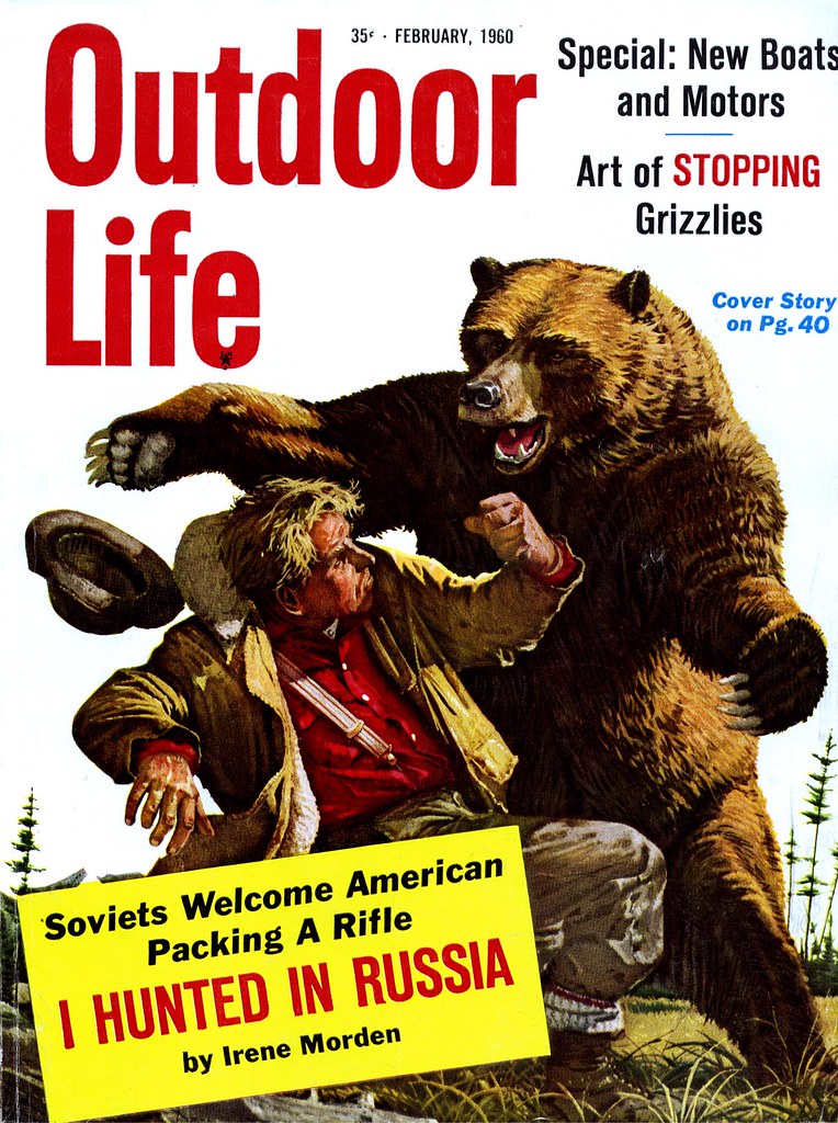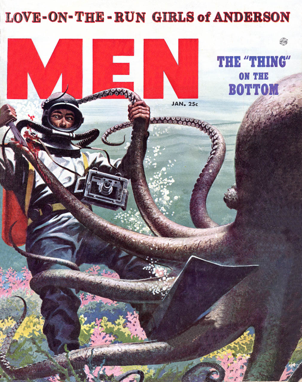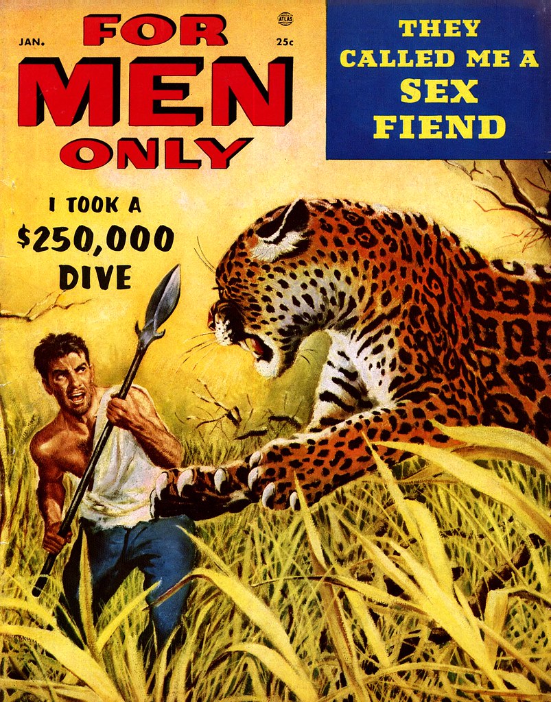
"The great majority of contemporary magazine illustration is devoted to fiction and concentrates, for the most part, on the romantic boy and girl theme," writes Kent. "True magazine publishes no fiction, however; its stories are written primarily for a male audience and are illustrated in full color. And because they are true stories they must necessarily be as convincing graphically as photographs. By this I do not mean that our illustrators are asked to imitate photography. Quite the contrary; we demand that the painted illustration be unmistakably graphic, since about half of our pages are normally documented with photographs. But since the readers of this magazine form a highly critical audience, well versed in the arts of hunting, fishing and other manly pursuits, there can be no slighting of important detail; no vague passages to cover uncertainties. For this reason numerous illustrators, highly respected for style and imagination so perfectly related to the mood and mode of today's fiction, are unsuited to the exacting technical authority demanded by True."

Sounds pretty lofty. Clearly, Norman Kent wanted to establish that True represented the high watermark of men's magazines and that only the best illustrators were worthy of delineating the "manly pursuits" chronicled in its pages. I can't speak for the writing, but based on the production values and paper quality of True, the status of the many national brands advertised in the magazine, and the top-notch artists who Kent regularly commissioned, I would have to agree. But sharing that top tier were two competitors: Argosy and Outdoor Life. many of the same artists worked for both of these other magazines illustrating largely the same type of articles.

Kent lists some of those illustrators who "are able to meet this test of accurate reporting while they carry over into the area of their commercial commissions the very qualities that mark them as individual artists" :
Warren Baumgartner, Mario Cooper, Henry C. Pitz, John Gannam, Peter Helck, John Pike, William A. Smith, Fred Ludekens, Robert Fawcett, Stan Galli, Bruce Bomberger, Glen Grohe, Tom Lovell, Bill Reusswigg, C.E. Monroe, Jr., and Harold Von Schmidt ( among several others). There's no denying that these really were the exceptional top rank among illustrators most often called upon to interpret scenes of manly action and adventure in the pages of more mainstream, family oriented publications like the Saturday Evening Post and Collier's.
You're unlikely to have found work by any of these artists in the more down market 'men's sweat' magazines, although they were very similar in content (not to mention intent). Recently we spent a week looking at how the editors of Bluebook felt the need to contemporize the look of that magazine. I believe it was their attempt to keep up with competitors like True and Argosy.
As we saw, there was a lot of terrific artwork being done in Bluebook - but the poorer production quality, cheap newsprint, and lesser status of its artists would have made that task daunting. The lack of decent national brand advertisers in Bluebook tells the tale.

Even further down the ladder were the truly lurid men's magazines. Some even sported really great cover art by well established pro's, like this great piece by Frank Soltesz. But generally the interior art, if any, was second rate.

Here readers were less likely to read about hunting and fishing than to linger over crime scene photos of mob hits and tragic domestic disputes. I doubt you'd ever find any of our top tier illustrators even considering an assignment from these mags.

I've taken the time to go into all this background because, despite what might seem at a glance like a negligible degree of distinction among these publications, there was clear hierarchy in the men's magazine market - both in terms of quality and status.
This week, with the help of Norman Kent, we will take a closer look at the True nature of the best in manly illustration.
* And speaking of the best, you'd best be getting on over to Charlie Allen's blog for this week's CAWS!
Hi Leif,
ReplyDeleteNow you're getting closer to the dimly lit corners of the pop culture illustration world where I troll for cheap thrills.
Don't get me wrong, I love the "up market" stuff too but hey, how can you beat giant octopi and headlines like "They Called me a SEX FIEND!"?
In any case, thanks for everything you do. I am amazed at your dedication to this awesome blog!
Huw Evans
EYECATCHER Graphics & Design
http://www.eyecat.com
Thanks Huw - I'm glad that even the dimly lit corners of pop culture illustration are being so enthusiastically appreciated. And you're absolutely right... you can't beat giant octopi or sex fiends... unless you happen to know a story about giant sex fiend octopi! ;^)
ReplyDeleteLeif, like so many of us that grew up in the 40's and 50's, I loved those literal, detailed illos of gut wrenching true "manly" stories, usually in the rugged outdoors. My dad was a former Marine, expert marksman, a gun collector and a skilled woodsman, hunter and fisherman. True, Argosy and The Saturday Evening Post were always on the coffee table for us to look at. My mom preferred the S.E.P.
ReplyDeleteThen when I started art school, the focus in my illustration classes was on beautiful, elegant, stylish, fashionable, ideal women and prosperous looking, handsome, business type men, usually in an interior setting.
How extreme is that? I had to change my whole way of thinking, and it wasn't easy. Frankly, I had imagined myself illustrating war stories or adventure stores, but glamorous love stories for women's magazines was a real stretch for me back then.
It was only my determination to do what I had to do to make a living as an illustrator, that kept me from throwing up my hands and drive a cab for a living. My dad was OK with my decision.. not to choose a career driving a cab. ;-)
Tom Watson
The man shooting at the buffalo on the first picture! These opponents one sees embedded in that grass and those herbs. A vegetation drawn with such accuracy and finesse. It almost makes my head reel - what a display of patience here.
ReplyDeleteHey Leif. don't be too hard on the second tier illustrators (As a concept guy,I'm one of 'em!) that take almost any job to keep food on the table.Kids gotta go to college, you know. I used to be a purist about it but reality can be a real eye-opener. We all aspire to the A-list but ya gotta eat! A few of the greats did their pulp work under pen names, according to informed sources. Great stuff, keep goin'.
ReplyDeleteChris;
ReplyDeleteForgive me if I came across as less than complimentary to the illustrators who weren't considered A-List. This blog has always been about celebrating all those who came before us in this business, not just the giants. Many of the artists I've written about have never had any other recognition other than the posts you'll find here on their careers.
As you know, I'm a storyboard guy myself, so I get the need to take anything and everything that comes my way better than many. In fact, I've championed that attitude in recent posts.
And by the way, looking at your stuff Chris, you're A-list all the way in my books, buddy. :^)