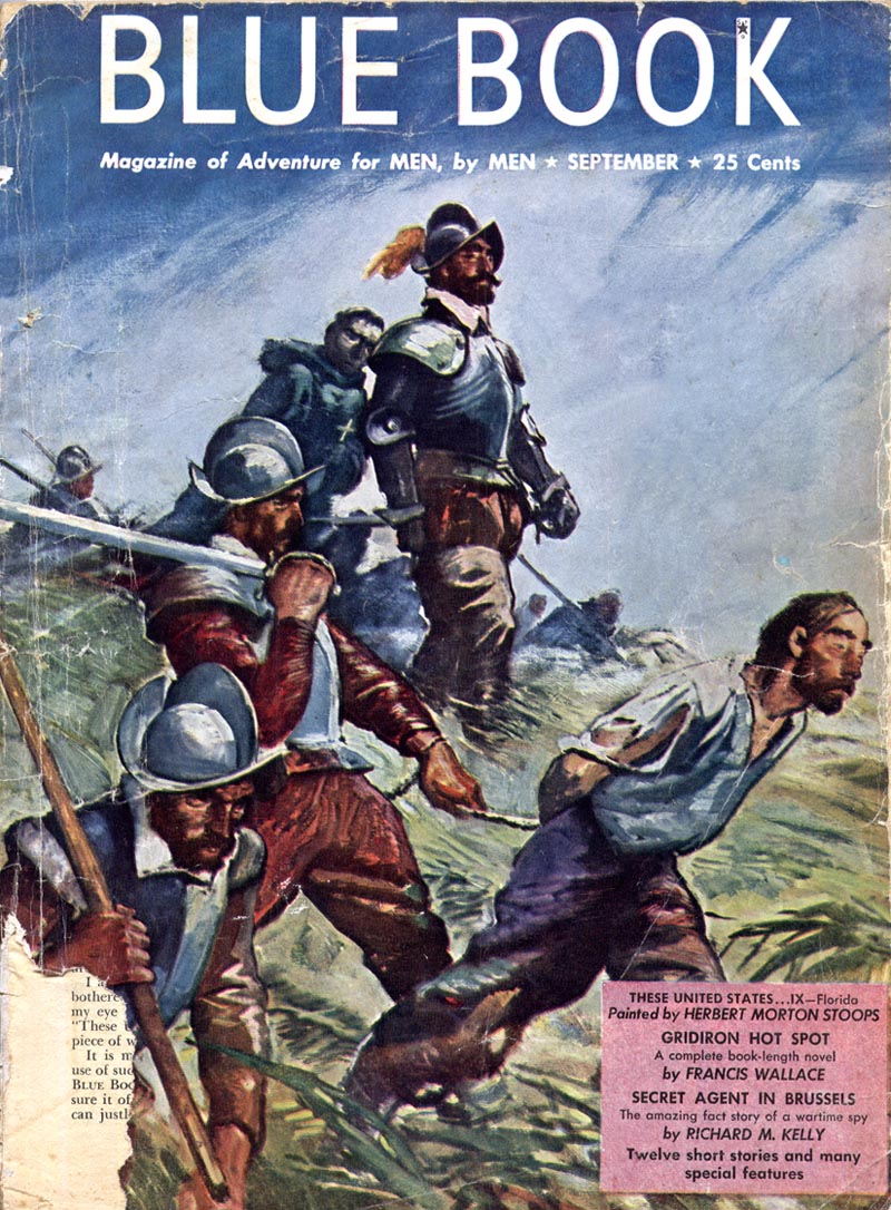
A 'new look' cover by John McDermott, from May 1952 - 4 months into the redesign...
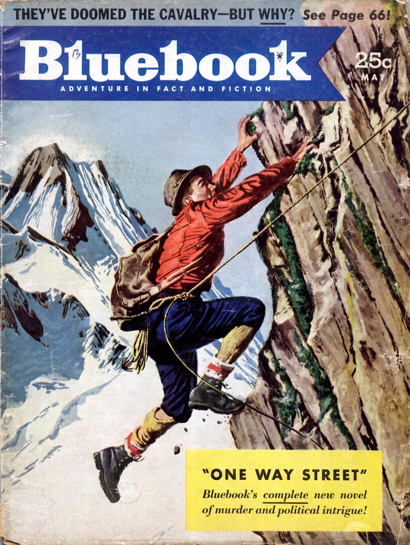
By the time this issue hit the stands Blue Book had received hundreds of letters which "ranged from outraged indignation to almost lyrical ecstasy," according to that month's editorial column.
"There seems to be just one thing that a few veteran Bluebook subscribers tend to overlook," wrote the editor, "namely, that a magazine that doesn't change with the times, that isn't - like a prizefighter - constantly forward on its toes, soon will find itself lost in the parade of progress."
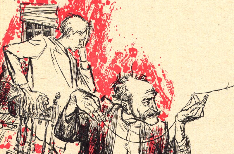
Spearheading that change, Bluebook's new AD, Len Romagna, immediately began assigning stories to modern stylists like Dave Stone...
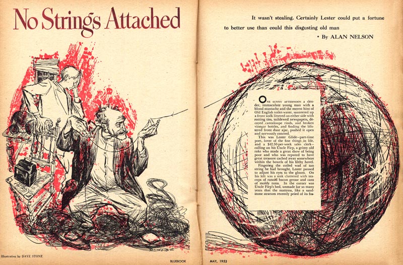
... Howard Willard...
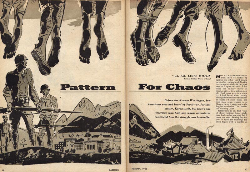
... and W. David Shaw.

Literal realism was not abandoned -- but the illustrators we've looked at all week disappeared. Replacing them were artists adept at rendering a more contemporary version of realism, artists like Bill Baker...
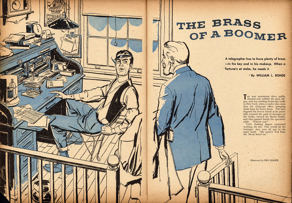
... and Frank Lacano (remember this post?)
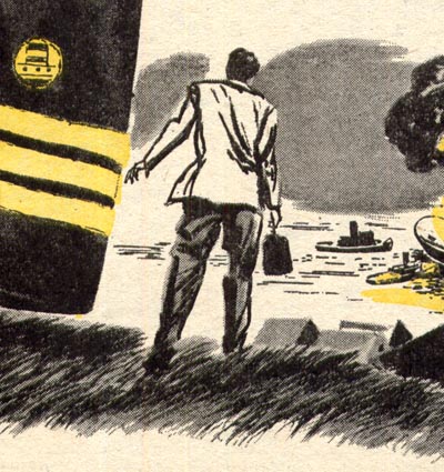
Notice also that Romagna seems to have looked to the "Seven Sisters" and other more mainstream magazines for the new Bluebook's page design.
Typographic elements, framing devices and illustration were now being blended together to form a complete visual in a manner typically seen in Cosmopolitan, Good Housekeeping and so on. Rather than have the visual be strictly a 'storytelling picture', Lacano was allowed to use the shape of the jacket as a graphic design element in a way you would never have seen in the old Blue Book.

Another new development: fewer historical and period piece stories. A greater emphasis on crime and detective fiction...
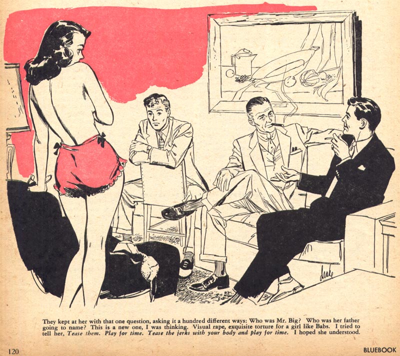
... and a distinctly more prurient bent.

Not everyone was thrilled with the new Bluebook:
"To the Editor: Today I received my favorite magazine, Bluebook, in its familiar wrapping. With favorable anticipation I opened it, only to be startled, discouraged and disgusted to find someone had changed the old faithful Bluebook, with its sketches, pictures, line drawings and simple pleasant colors, and made it into something I wouldn't read in a dentist's office."
Please let's go back to the layout that has been so popular for so many years."
"To the Editor: You have gone berserk! It was nice knowing you..."
"To the Editor: You've lost a reader..."
"To the Editor: I am outraged..."
"To the Editor: I was shocked..."
"To the Editor: You have stabbed Bluebook in the back..."
"To the Editor: Change it back, please!"
"To the Editor: If the next issue doesn't improve, I shall cancel my subscription..."
"To the Editor: If the March issue is the same, you can crawl back under your damp rock..."
I can't help but wonder if John Fulton, Maurice Bower, Benton Clark and all the rest who had toiled in Blue Book's pages for all those years ever read those letters, and perhaps took solace in the sentiment expressed by those loyal readers...
In the 20's and 30's these artists had graced the covers and pages of some of America's most popular magazines. In the 40's they had had to lower their expectations, as younger artists and changing trends had pushed them aside. Blue Book had at least given them a place to continue doing fine work. Their somewhat dated styles still suited the nature of the stories told in "The Magazine of Adventure for MEN, by MEN".
But now even that door had been shut.
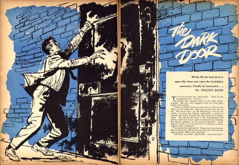
"Bluebook has no intention of eliminating the great writers who have made Bluebook famous, " reassured the May '52 editorial.
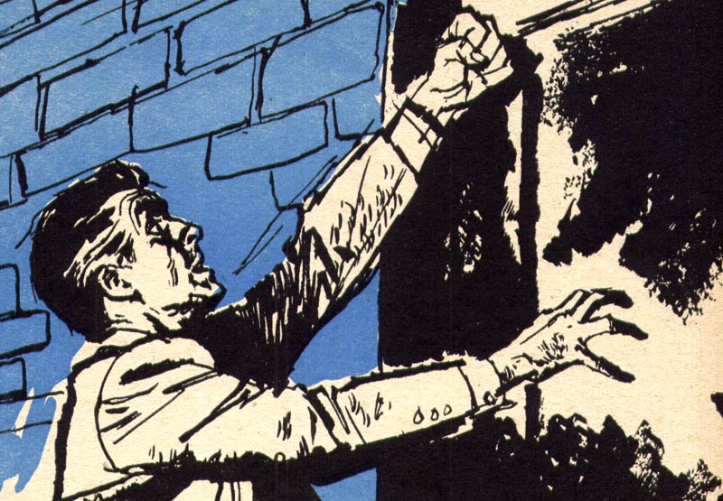
No such luck for the illustrators.
I love that piece by Dave Stone. I wish he worked today so he could illustrate a graphic novel. I'd buy that!
ReplyDelete"a magazine that doesn't change with the times... will find itself lost in the parade of progress."
ReplyDeleteThat's probably good advice for magazines like Wired or Popular Mechanics, but it always seems odd to me when people carry that approach over to aesthetics. The idea that beauty needs updating could only come from a mind that didn't understand beauty to begin with. The best art, clothing, cars, faces, typefaces, buildings, et cetera from decades past continue looking great, today and forever.
Beautiful work. Thanks for sharing these.
ReplyDeleteJesse Hamm, you are absolutely right, and you expressed it perfectly. It appears that in spite of all the updating, changing illustrators, styles, formats and the jockeying around, the magazine industry couldn't save themselves from a growing lack of interest in storytelling through the traditional medium of the magazine. By the 60's television was stealing a healthy share of the advertising dollar, and photography was stealing a healthy share of the illustration.
ReplyDeleteAfter reading the reactions from the loyal Blue Book readers over the illustration changes, perhaps the frenzy to change illustration in the magazines, may have accelerated the demise of its once grand industry.
Tom Watson
2 great points from Jesse and Tom, do we know if the revamp had any effect on sales,or was it it a case of rearranging the deckchairs on the Titanic?
ReplyDeleteHhhmmm... well guys, as much as I admire (and agree with) your boosterism for timeless art, the point I hoped people would take away with them is that 'change is inevitable'. I'm not sure who needs to learn and live this maxim more - the young illustrator coming up, or the old pro who sees his former popularity with clients fading out.
ReplyDeleteWhether the redesign of Bluebook was a success or failure doesn't matter - the point is, Fulton, Bower, etc. were out and the new guys were in. Why? Purely superficial reasons of surface technique -- but that's life, and when you need to feed a family and what comes out of the end of a pen or paintbrush is what puts food on the table, you better learn to adapt or die.
A story from the 90's when I was in-house at O&M: My friend Dan was working away in his studio one day, redrawing some absolutely gorgeous comps done by someone else. I mean gorgeous, rock solid drawing and rendering skills. I asked Dan, "why?" He replied that the AD thought the people looked dated... he didn't feel confident that they reflected the youthful "feel" he wanted to present to the client - and it wasn't just the hairstyles and clothing - there was a visibly dated look to the way in which the artist had drawn the people.
Many of you who grew up reading comics during the 70's will know what I mean: when one of those great old-time comic artists tried to draw "hippies" - or really, any sort of young person... it was almost laughable - very skilled, mind you - but it looked hoaky. While the work of younger artists who drew the same subject matter somehow looked "cool".
Such is the fickle nature of public taste... and our clients reflect that same attitude. This week's series was intended to be a lesson. And a warning.
Leif,I'm going to have to disagree with you here.I would argue that as a commercial enterprise the decision to change Blue Book would be made on financial not aesthetic grounds.Just as your AD felt the chances of success would improve if the comp had that 'of the moment' look that advertising seems obsessed with.I think most of us understand that change is 'inevitable' in the commercial world but I think this is a reflex linked to 'updating the product' in the belief/hope that sales would improve.
ReplyDeleteLiterary magazines such as this were dying left and right so it stands to reason that they would do a major shakeup for a new identity (blame TV if you like.) Artists have always been more distinctly associated with a "look" than writers, for obvious reasons. It could very well have been that their previous stable of artists WERE capable of "change" but just weren't asked back. It's often not just a matter of changing your style, but how and where you market yourself. Those artists had hitched themselves to a sinking ship.
ReplyDeleteI find the "disgusting" samples here not at all lacking taste.
ReplyDeleteAnother thing is the "prurient bent". The puritan influence is still very much alive in the USA, compared to European standards. How must it have been back in those times then, when the Blue Book managers discovered that "sex sells"?
Bandito and DB;
ReplyDeleteAs always I thank you for your thoughtful comments.
Bandito, I don't think we disagree on the basic premise here. You're absolutely correct that the change would have been motivated by a desire to boost sales and revenue. The key to those increased sales was determined by the aesthetics. I didn't quote the entire editorial but for the sake of clarification:
"...old-timers who can recall The Golden Book, Smart Set, Judge, Munsey's or The Literary Digest will recognize them instantly as great magazines whose faithful readers would have dragooned any upstart who'd come in and attempt to change them in any way. Yet where are those great magazines today?"
"We've said before that Bluebook occupies a position that is unique in the publishing world, the oldest and most respected magazine of adventure for men in business today. But it knows it can't survive on respect alone. That's why now, while Bluebook is still in its enviable position at the top, your editors are shifting with the parade of progress and making such changes as will guarantee our maintaining our position and, at the same time, constantly adding new, young readers who are going to keep Bluebook leading the parade for another fifty years."
Do you see where their thinking was at? To return to comics, we've seen similar strategies during the Image years and the co-opting of manga styles. Old-timers were sidelined in favour of younger artists with contemporary styles. You can argue whether the new kids could or couldn't draw as well, but it really doesn't matter - the publishers hoped to appeal to the next generation of young readers and made aesthetic changes for financial reasons.
For us as illustrators, ultimately its as much about finances as aesthetics - we are, after all commercial artists, and I need only point to our own Charlie Allen as a prime example of someone who intrinsically understood this.
Go to his blog and take a look at how he adapted to the changing times. Many illustrators fail to recognize this need. Whether the old time Blue Book artists were capable of change or not is up for speculation, DB, (I personally doubt it) but the example still serves to demonstrate the quandry of the illustrator who finds himself falling out of fashion.
"such changes as will guarantee our maintaining our position and, at the same time, constantly adding new, young readers who are going to keep Bluebook leading the parade for another fifty years."
ReplyDelete"we've seen similar strategies during the Image years and the co-opting of manga styles. Old-timers were sidelined in favour of younger artists with contemporary styles."
As Leif's examples demonstrate, chasing trends is bad business. Bluebook's predicted "fifty years" of success ended three decades early, with the magazine's demise, and Image's failure to embrace the skills of experienced artists nearly sank the comic industry, as readers abandoned the poorly drawn comics in droves.
Meanwhile, Bluebook's competitor, The New Yorker, continued to prioritize it's long-term stable of cartoonists, and is still a force to be reckoned with. And while Image occupies a quiet little corner of the comic industry, the heavy hitters -- Marvel and DC -- continue to dominate sales with experienced talents like John Romita Jr. and George Perez.
There's always a quick buck to be made chasing a trend, and there's always the client who finds quality alone insufficient, but those trends and those clients won't keep you afloat in the long run. Legends like Bernie Fuchs and Jack Davis are living proof that success doesn't depend on bowing to the young and shallow.
Well put, Jesse;
ReplyDeleteBut let's be clear: I strongly believe that artists - most especially illustrators - should be aware of changing trends and be adaptable to those changes. that doesn't mean being a hack or a sell-out.
Ideally, one would hope that by the natural inclination to keep growing and innovating - endlessly exploring one's creative potential - that the illustrator would be leading the trend, not chasing it. Of course its impossible to always be the leader, and everyone can't lead, otherwise we'd all be flying off in different directions.
But to return to the comics industry example (and its a good example since its pretty much the last corner of the print industry that uses massive quantities of illustration) -- Marvel and DC are so successful because they didn't stay the course with strictly their old school talents. They embraced change. Its nice that older talents like Perez and Romita can still find an audience within comics, but the next generation of readers (strike that - not readers, *consumers*) aren't interested in their styles.
Image Comics' current situation is irrelevant - during their high point they were empire builders and their downfall has more to do with a failure of management than aesthetics.
(Let's not forget that Marvel almost collapsed in bankruptcy and that also had nothing to do with art style trends)
Where I really strongly agree with you is in your final remark that being simply trendy won't keep you afloat in the long run - too many illustrators have been lulled into believing they were something bigger or better than the 'flavour of the month'. We've seen them come and go. Bernie Fuchs and Jack Davis are great examples of stick-to-your-guns long-term success. But they are iconic exceptions. For every Bernie Fuchs there are a thousand journeyman illustrators, all very talented, who must do their best to change with the times if they hope to remain employed in commercial art.
One final example from the field of comics to drive home the point: Don Heck. A wonderful, talented, dedicated journeyman comic artist who struggled mightily to adapt to the 'Kirby method' of drawing super hero comics. Heck was a student of Caniff-style adventure cartooning and on one occasion even offered to pay John Buscema to teach him how to better draw in the dynamic manner Kirby had pioneered. Eventually he was pushed out because his style looked too old-fashioned.
I'm not saying we should all jump on whatever style is the flavour of the month, but the Blue Book story, the Don Heck story and countless other stories in this industry are important reminders we ignore at our own peril.
Well, I've gotta disagree with much of that.
ReplyDeleteImage's downfall, and Marvel's '90s bankruptcy, were due to chasing surface trends that readers eventually saw through and abandoned. They were lured back by Marvel's return to relatively sound drawing and storytelling in the early millenium.
Perez and Romita Jr are still winning new fans on the industry's biggest selling titles.
To my knowledge, Heck was never pushed out. According to Mark Evanier, Heck suffered setbacks in the '70s due to illness, but whenever he was replaced on a book, sales plummetted, and later editors sought him out to recreate the style of his sixties' work.
By contrast, '60s artist Herbe Trimpe adapted his style to the Image look in the early '90s, and for his efforts he was pushed out. (Recently he was invited back to do more work again -- in his original style.)
I think a journeyman's best bet for success is to follow the example of Fuchs or Davis: stake out a stylistic territory and make it his own. There were a thousand artists who drew as well as Dr. Seuss, but there was only one Dr. Seuss. Had he constantly tried to adapt to trends, he would be forgotten today with the rest of them.
But perhaps we don't really disagree about the big picture; I guess it depends on what you mean by adapting to trends vs. selling out. What would be an example of what you mean by adapting?
Thanks for your honest and principled opinion, Jesse; I admire your determination to do good work and follow your own path.
ReplyDeleteFor what its worth, Don Heck's situation at the end of his career comes first hand from a close friend who spoke with him just a couple of week's before he died. He was bitter and depressed that his long-time employers at Marvel and DC had uncerimoniously shoved him out the door and and was struggling to find work of any kind. Heck was pencilling a Nascar comic that my friend was inking for a small independent Toronto publisher called Vortex Comics.
Trimpe may have attempted to adapt and been pushed out because he failed... I don't know.
I already gave the best example I could hope to of adapting without selling out : Charlie Allen. If Charlie had attempted to stick to his 1950's painting style in the following decades he would have been standing on a corner selling pencils from a tin cup in the 1970's. Instead he was still one of the most respected, best paid and most sought-after literal realist illustrators in San Francisco three decades after he entered the field.
Another example: me! I have managed to find creatively satisfying and lucrative work in a wide variety of fields, from book and magazines publishing to package design to television pre-production for twenty years as a journeyman illustrator by constantly adapting to changing trends while simultaneously experimenting with style and technique. I know I'll never be Jack Davis or Bernie Fuchs (or Dr. Seuss) but I've been paid well to draw in the styles of all three artists you referenced. I don't feel I'm a hack or a sell-out (others may disagree) ;^)
I have watched friends and acquainences fall by the wayside because they lacked the ability to adapt (or refused to do so). One is now a mailman. Another works in a deli. Several more are now teachers at art college. Frankly, I'd rather draw for a living.
In case someone is tuning into "more comments" this weekend, I'll add a few more cents to the cash register.
ReplyDeleteGreat comments, all of them. Some interesting points have been raised and kicked around the old sand lot... sorry, couldn't resist. I can't speak for the comic book industry and their illustrators, since I haven't really followed them, but I am very familiar with Charlie Allen and his long illustration career. In my humble opinion, Charlie's illustrations held up over time because of several major factors. His superb drawing and academic rendering skills were/are outstanding, which gave him the tools to convincingly and impressively adapt to styles and trends that he even admits on his blog, were not always in his comfort zone. He has a keen sense of good taste and design that most illustrators never develop. He never became greedy by going after big name magazine assignments, which that industry eventually fizzled out. He was satisfied with being one of the best illustrators in the San Francisco advertising market, as Leif pointed out. And, he hooked up with Patterson and Hall, the top studio in S.F. and maybe west of the Mississippi... and he stuck with them decade after decade, even after most illustrators were freelancing because they didn't want to split their fees with a studio or rep. Eventually, the studios faded and P&H was one of the few that survived.
I can't really speak for today's market since I am happily retired from illustration... no, more accurately from the illustration market. I'll always proudly be an illustrator, even when I do an easel painting. But, I can only say that from the early 60's until I was forced to retire in 2000 for health reason's, I didn't loose work or die on the vine because my illustrations looked dated. In fact, through the 80's and 90's, it was my original academic traditional realistic style of illustration that kept me busy, not the stylized, trendy techniques and various airbrush computer illos, that came and went with the whims of the hip crowd.
Maybe there is no one answer for every illustrator, and I'm not sure we can truly solve longevity as an illustrator, by looking at past history. Perhaps good instincts, develop the best possible skills and do a lot of NETWORKING, will work as they did for me and others I knew
Tom Watson
Confession time.I have to admit I did some lookalike illustration work for a smallish Ad Agency that didnt want to pay enough for the original illustrator.Total dead end.Yes you make some money but you cant put it in your folio because its not you,it never looks as good as the original artist and you feel like a fraud for copying someone else because they have a style and you dont.The more you do it the more you sell yourself out.
ReplyDeleteLook,I'm so ashamed I cant even bring myself to sign this.
I've been working in the video game industry for about 20 years now, and showing a range of styles has been very benefitial to me.
ReplyDeleteA single game company typically produces titles in many different genres, from kid's cartoons to violent shoot-em-ups, and their artists will get moved around from one to the other constantly. If my portfolio doesn't reflect that diverse experience then my chances of getting hired are lessened.
It's different for illustration directors or some concept work where they're shopping for a particular style. If I know what that is ahead of time, I can stuff my folder with examples that stick to a singlular genre, but demonstrate that I'm versatile enough to them to be flexible and yet maintain a degree of compentency. The focus I try to present is on quality. I'm not selling a look, I'm selling ability. Some directors can't figure that out, unfortunately, but that's not my fault.
Um... o-kay... I'm glad you got that off your chest, anonymous, but I think we're getting a little off track here.
ReplyDeleteMaybe my original point has gotten a bit muddled in the course of the discussion. I'm not encouraging anyone to ape the style of another more successful illustrator, I'm pointing out that times do change and as members of the commercial art industry, its our job to change with them - or risk being left behind.
Certain illustrators have inspired the look of a generation of their peers: Al Parker in the 50's, Bernie Fuchs and Bob Peak in the 60's and 70's, Brad Holland in the 80's. That doesn't mean you can't or shouldn't pursue your own vision, but you'd be foolish to stubbornly refuse to adapt to changing trends in an industry that is constantly looking to renew itself.
This is what the Blue Book artists were incapable of doing (or refused to do). Ten years later, the same fate befell the Cooper Studio artists. Ten or fifteen years later, same thing again for all the swishy oil wash "rainstorm" artists.
Tom Watson writes that it was his original academic training that kept him busy during the 80's and 90's, but Tom has also commented in the past that when he entered the field in the early 60's, no one wanted the traditional 1950's gouache painting style he had been taught at art college (and which filled his portfolio) -- every AD was looking for the Bernie Fuchs/ Bob Peak swishy oil 'rainstorm' style. Like Charlie Allen (and hundreds, perhaps thousands of other illustrators) Tom had to adapt - or risk being left behind.
This is what I'm talking about, folks. Of course there were many others who chose their own distinct path - some were wildly successful (for a time)... but we only hear about the successful ones. How long can you continue working in a manner that no one wants, clients passing you over for those with a newer look, until the mortgage absolutely has to be paid and you accept that your style - as honest and personal and principled as it may be - simply isn't going to keep a roof over your head?
Since I began this reply dbclemons has added a comment that I think supports my position with good concrete anecdotal examples.
Once again, its about adaptability, not selling out or shame or crushing your artistic soul. I mean, please.
D-errr.What I'm saying is if you keep using your 'versatility' to concoct or copy different styles then you dont stand a chance of becoming the next Jack Kirby,Gene Colan, Kevin Nowlan etc.You become a 'jack of all Trades' spending your entire career being an 'also ran' if settling for that kind of mediocrity is your life's goal that's fine by me.
ReplyDeleteOkay 'anonymous' - The "D-errr" and "fine by me, Mr. Mediocre" remarks tell me your feeling were hurt by my comment. My apologies. As I said to Jesse Hamm above, I admire your (and anyone else's) principled position to choose your own path and pass on the opportunity to earn a living while you struggle toward the noble goal of becoming a leader among illustrators.
ReplyDeleteIt wasn't an option for me - and I still find time and opportunity to do - but I don't regret a single job I've ever done "in the style of" ... whatever illustrator a client asked for. Actually, its fun and challenging and creatively stimulating to work in a wide variety of styles!
One last time, I'm talking about being flexible, adaptable... my comment wasn't meant to disparage you. Hopefully, you'll feel comfortable participating in these discussions again... with your 'real' name.
Leif.Too many assumptions my friend.I am a family man and in my early 40s I've spent the last 15 years struggling along taking this job and that to provide for said family.I now find that my 'versatility' and 'adaptability' has worked against me.I could carry on down this path as a journeyman artist or I can make an effort to try to do something so that when I look back on my career I don't just see a mish-mash of different styles or copycat work.I said what I said as a warning to other younger illustrators so they might avoid this dilemma and ,yes,there was an uncharacteristic patronising tone to your response that annoyed me.I chose anonymity because of the confessional nature of my post not to hide behind while saying unpleasant things.
ReplyDeleteI wouldn't throw around words like "mediocrity" here, but I do agree with the points made by the anonymous poster. The examples of adapting which Leif provided are hard to criticize, since they're "so close to home," but it's worth noting that there aren't any famous artists among those examples. I like Charlie Allen's blog and respect his skill, but when I try to picture his style, all I can come up with is a combination of other artists' styles.
ReplyDeleteLeif is probably right that his artist friends could have picked up more work by aping popular artist's styles, just like there are always "lookalike" films cashing in on the success of a blockbuster. But that's feeding on leftovers; it doesn't seem like the surest foundation for a career. I myself am no stranger to aping styles upon request, but I wouldn't elevate that approach above originality as a career goal. It's a temporary concession, not a rule to live by.
Sorry to learn things were hard for Heck toward the end. Perhaps his problem was that he never asserted his own voice; trying to imitate Kirby in the '60s and Buscema in the '70s left him without the "brand identity" he needed. People who praise him today typically bring up the more distinctive work he did early in his career. Sounds like his versatility worked against him, as it did the anonymous poster above.
"examples of adapting which Leif provided are hard to criticize, since they're "so close to home,"
ReplyDelete*Ouch* I think I've just been insulted.
Fwiw, I only mentioned Charlie and myself because those were top of mind - you asked for "an example" - I gave you two - I didn't realize I was going to have to come up with a top ten list of 'famous artists'.
I suppose if 'fame' (an amusing notion in regards to illustrators) is what primarily motivates you in your career, then being versatile and adaptable to changing trends might not be on your radar.
"Leif is probably right that his artist friends could have picked up more work by aping popular artist's styles..." - actually, I specifically said "I'm not encouraging anyone to ape the style of another more successful illustrator...".
Your final point about Don Heck's versatility working against him - I'm sorry, but here you're dead wrong. It was Heck's ability to adapt to Kirby-style storytelling that kept him employed for all those years in a field he loved. Had he 'asserted his own voice' and continued to work in a Caniff-influenced style he would have had to fight for the 7-page assignments in that ever-diminishing war/romance/western/adventure segment of comics instead of getting steady, monthly, full-issue superhero work.
Once more, I applaud and encourage your (and anonymous') determination to forge your own path - by all means, go for it and good luck - but your attitude toward the efforts of literally thousands of talented and worthy commercial artists (myself included) and your dismissal of the idea that adaptability and versatility are valuable qualities for a professional illustrator to have is really beginning to annoy me.
Leif,
ReplyDeleteI'm not sure how "so close to home" could be an insult, but it certainly wasn't intended to be. My point was that I'm reluctant to criticize artists like you and Charlie whose blogs I frequent. It's easier to discuss artists in the abstract when they are farther from home: public figures like Leyendecker or Rockwell, who passed on decades ago. I'm sure you'll understand why I expected your examples to occupy that category, given the usual subjects of this blog.
I'm also not sure what you think my attitude is, or why you're annoyed by our differences of opinion, but if that's the case I'll forego further comment on this thread.
Hi Leif,
ReplyDeleteI think you've been the paragon of diplomacy while explaining and clarifying your perspective. This is certainly a tough issue and I can understand each side of it. In my own case I had no hesitation on mimicking or borrowing other styles of illustration, but then maybe that's why ended up in another field!
I'm a little late to the discussion, but had to say - great selection of images, Leif, really cool stuff! Thanks for sharing!
ReplyDeleteI am gonna go with lief on this one. I am reletively new to the illustration field, and last year had a pretty sweet job with a newspaper as an editorial illustrator. When the economic downfall hit (as it was called back then), the newspaper cut down all the casual hours to nill (and since I was a casual, bye-bye sweet job). This left me scratching my head going "what now?" Partly this was my fault for taking my job a little for granted and not looking for more work outside of the newspaper, so I had nothing to fall back onto. While this had nothing to do with stylistic trends, it really pointed out to me the need for adaptability (which I think actually goes beyond visual style, and into the whole of life).
ReplyDeleteIf you want an example of how sticking to a once popular style can be a bad thing, J.C. Leyendecker is a good example. Artists who are in demand don't have much of a reason to change, but if you look at most of them, including Kirby, you'll find several style changes throughout his career, even when he was at the top of his game. In his case it was more like an evolution, I believe. Personally, I'm happy to sell my soul if necessary and put the ego in the back pocket. Whatever gets me the job is good, in my opinion.
ReplyDeleteAs Matthew said, you never can depend on things staying good forever, and that's true of any job. I don't have a problem looking back over a successful career, however I got there. My life goals go far beyond the work I make for a living. The art I make for MYSELF is a different matter.
I've been following this excellent blog for a couple of years now,and I would hazard a guess that Al Parker, Bernard Fuchs.Bob Peak,Noel Sickles etc would be among the most popular illustrators featured here.Now I dont doubt for one minute that these giants could adapt to different styles (Al Parker famously did in Good Housekeeping)
ReplyDeletebut what makes them great is that they found their own style to delight and excite readers ,then and now,and had the courage to push ahead. They weren't prepared to be background players and we now admire them for their vision.
While I'm here Mr Clemons, if you read the book on Leyendecker you will find it was the diastrous management of Leyendecker by his boyfriend Charles Beach that was responsible for Leyendecker's decline.
ReplyDeleteIf you're speaking of the Cutler book on Leyendecker, Lawrence, I have read it, as well as Rockwell's account in "My Adventures as an Illustrator."
ReplyDeleteAww, I hate seeing illustrators wounding each other - stop it!!
ReplyDeleteThere's only ever been two tactics, and only two, for ilustrators' careers: specialization or versatility. And guess what - you don't actually have to choose.
There are plenty of examples of top names in both categories (look at Bob Peak's evolution, on this blog for an example of the latter). I think it's really pressure from that old bogeyman Fine Art that has put the pressure on illustrators to come up with some sort of signature style. The debates among illustration educators are divided on this like crazy: force the students to make a style-based portfolio (and shut down their organic creative searches) or give them a multitude of skills and approaches because gawd knows what the future holds for them? Of course in a perfect world we want all original art all the time but hey, part of being visually legible is using existing language.
There's a time to riff on existing work, and a time to go out on a limb. As one old guy illustrator told me, riffing is inevitable - it's part of the apprenticeship tradition. Don't be ashamed - but don't just be happy with a good copping - improve on it.
Always the voice of reason, Jaleen; thank you. :^)
ReplyDeleteYou are so interesting! I do not believe I’ve read through something like that before. So wonderful to discover another person with unique thoughts on this subject. Really.. thank you for starting this up. This web site is something that is needed on Studying in the UK, someone with a bit of originality! We TreatAssignmentHelp is a team of experts professional academic writers who provide the best assignment writing service with Online Management Assignment Help, Business Environment Assignment Help UK, MBA Assignment Help In UK for students in the UK. Now you can get professional writing help with all your academic writing easily! For more services:-
ReplyDeleteTreat Assignment Help
Causes Morning Awakening And Night Sleeping
fight against COVID-19
Treat Assignment Help
world best assignments in Australia
Coursework Help in UK By OliviaBaker
Treat Assignment Help at velovert