... and this is Murray Tinkelman...
... and this is Murray Tinkelman too.
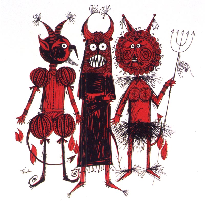
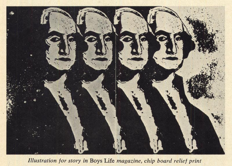
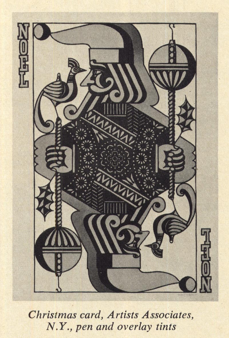
All these examples, taken from the first two decades of Tinkelman's career, suggest that the restless illustrator rarely settled twice on the same visual solution to any given problem.

That is to say, Tinkelman took the notion that success could result only from working in one style and turned it on its head.
But, some might protest, wouldn't art directors shy away from an illustrator working in so many styles, fearing that they might get unpredictable results when he delivered his assignments?
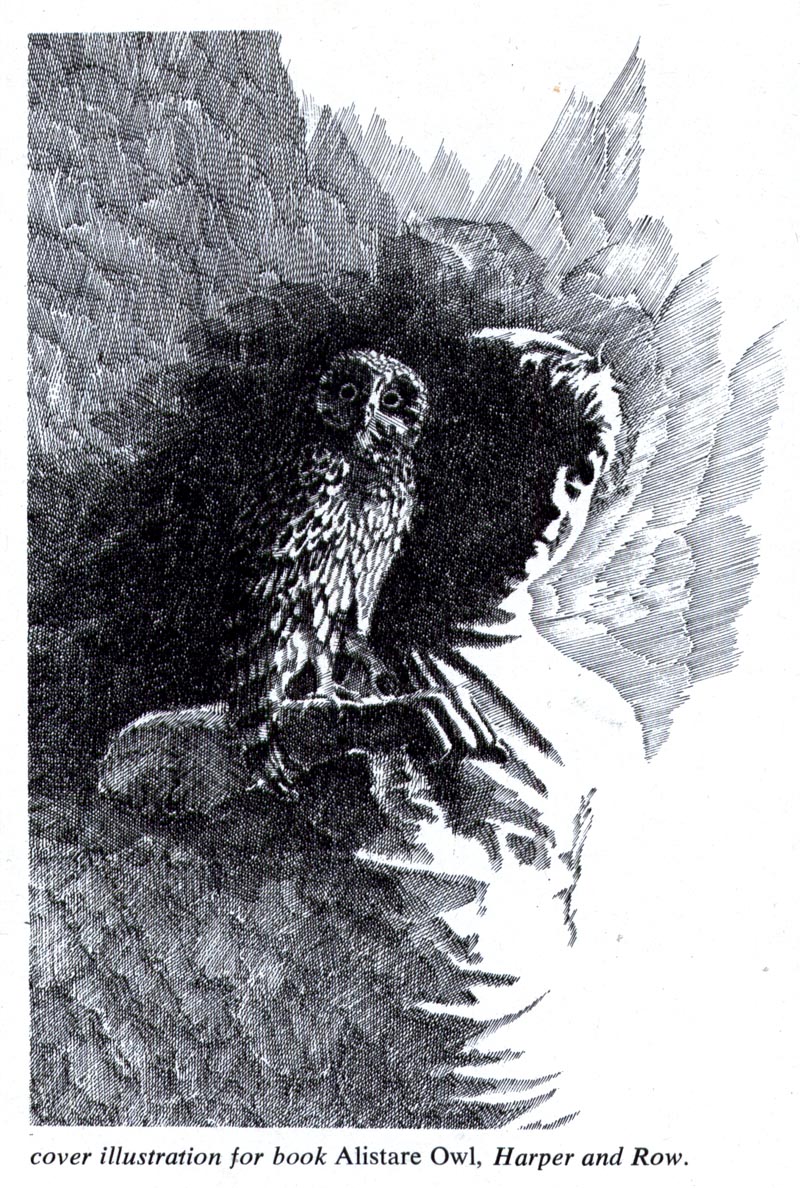
In fact by the time Murray Tinkelman discovered what would become his 'signature style' (below) he had already won a gold certificate and twenty-seven certificates of merit from the Society of Illustrators and an award of merit from the New York Art Directors' Club (among many others) through his stylistic explorations.
"I enjoy variety and I try to use style in the same way a typographer uses type faces," said Tinkelman in a 1970 interview in American Artist magazine. "The style is not dictated by whim, nor by the art director, but by the problem the job presents."
This is just a taste... Murray Tinkelman will be the subject of a week of posts on Today's Inspiration in the near future. For those who can't wait, Murray has already been interviewed by Neil Shapiro in Illustration Magazine #16 and by Dan Zimmer in IM # 23, both available here.
* My Murray Tinkelman Flickr set.
EXCITING stuff!
ReplyDeleteLove that first illustration of the devils and the design of the cookbook cover.But I'm surprised he chose to pursue the style of the Boy and Owl image as, to these eyes, it looks like a fairly average copy of a posed photograph.I won't prejudge though till we see more of his stuff.Thanks for the work Leif,you're doing a great job there.
ReplyDelete"I enjoy variety and I try to use style in the same way a typographer uses type faces" is a fantastic quote I´ll use from now on!
ReplyDeleteThis comment has been removed by the author.
ReplyDeleteMurray's pen work is out of this world. I am a big fan of his classic monsters! Outrageously good!
ReplyDeleteAlso he's involved with a Master's Degree Program for Illustration that looks really impressive.
Click Here
Murray is not only a terrific guy, he is a fountain of information about the field of illustration. His erudite lectures are like an earlier generation's version of Today's Inspiration. You two must share a gene.
ReplyDelete"I enjoy variety and try tu use style in the same way a typographer uses type faces."
ReplyDeleteParticularily liked this quote here. I'd like to emphasize Murray's "ENJOY"...enjoying variety. Not two snowflakes are exactly same.
Guess illustrators are very well versed in typography. They have a great knowldge of lettering and letters, even if they mostly didn't do the lettering job themselves.
"The style is not dictated by whim, nor by the art director, but by the problem the job presents."
That's it, probably. What does dictate the lettering style in Leif's blog? What letters does he use? Impact? Comic Sans? Arial Black? Webdings...ore the script here...shnept...to verify my word?
No! Probably Leif's typing here is dictated by the problem the job presents.
WOW....Just WOW! Thanks for the continuing education, Leif.
ReplyDeleteI had Murray for History of Illustration during my Masters in Illustration studies at FIT. His course was entertaining, informative and even amazing.
ReplyDeleteHe rarely spoke about his own works, but I love his illustrations and the variety of styles, especially the 1950-60s works.
I love Murray and his wife Carol. Thanks for sharing and I will look forward to seeing more on Murray Tinkelman.
The owl illustration by Murray Tinkelman is remarkable not so much for his illustration,
ReplyDeletefor the background...which extends the pen and ink sketch outwards like the feathers of, well, an owl. How deliciously appropriate.
Well, thats what struck ME anyway.