At one point in the discussion, Blake tells interviewer Rob Stolzer, "One of the things I made a little money on was selling roughs to the Saturday Evening Post, among other places. I didn't sell many, but I sold some. In other words, you did a little rough drawing that you think would be cover material and you rather hope that they'll say, "Oh, fine sonny, why don't you do this and we'll run it as a cover." But they never do. They would say, "Who should we give this to?" It always killed me. They'd give it to Gordon Utz or somebody. I did one of the railroad station at Red Bank, N.J. There was a train full of commuters with their hats and stuff. And running down the platform in her nightie was an obviously young wife, holding up her husband's briefcase. The drawing I made showed the inside of the train, with all of the smoke and gloom. And out of the window was the wife, really the star of the piece. So they changed it around and showed her in the front instead. Maybe he was right. Maybe he was wrong. But they paid me $150, so swell. I can't complain."

I read that interview last year and wished I could get a look at Blake's sketch that was ultimately executed as an SEP cover by 'Gordon' (sic) Utz. Months later, by a stroke of luck, I stumbled upon the November 1957 issue of American Artist magazine that contains the Thornton Utz article I'm using for this week's posts.
So what we see above must be the sketch Blake referred to!
Now comes the (frankly, astonishing) process, as explained by Utz, of how Blake's sketch evolved into something other than what he submitted. Utz begins, "Whenever I see humorous situations or episodes which suggest cover ideas I make up a bunch of thumbnail sketches and send them in. Friends often give me ideas, too. In most instances, they are returned 'rejected' by Ken Stuart, the Post's art editor, but with them may come several of his ideas which he thinks are my type of subject and the request that I do roughs on those I like best. These ideas are either in the form of cartoons or type-written suggestions. That's the beginning of a Post cover."
The article continues, The idea for this cover came to Utz from Ken Stuart in the form of a colored sketch which visualizes the episode as it would be seen by a person in the railroad car. Looking over the heads of commuters reading their papers, we see the frantic female through a car window.
Before the actual work was done, this interior viewpoint was discarded as less legible and dramatic than an exterior view. "Anyway, a girl is nicer to look at than a bunch of 'semi-Yul Brynner-type' commuters."
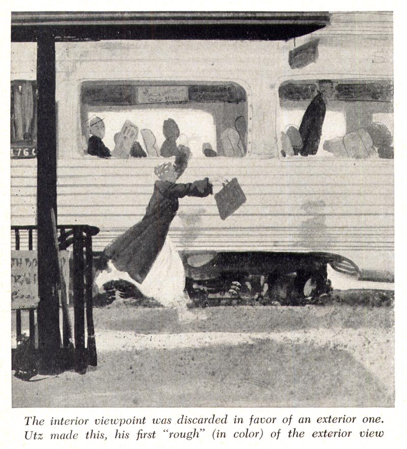
The first trial composition of this outside viewpoint (above) shows the car in direct side view, the girl running alongside.
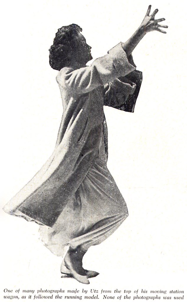
Utz did considerable work on this, including many photographs of the running girl. "These were taken," he explained, "from atop our station wagon. Nancy Warden (Miss Sarasota), the model, ran for blocks wearing her heavy coat in the 90 degree temperature of that morning. Louise (Mrs. Utz) was driving, and I used two cameras shooting twenty-four pictures (Rolli), then reloading and starting over."
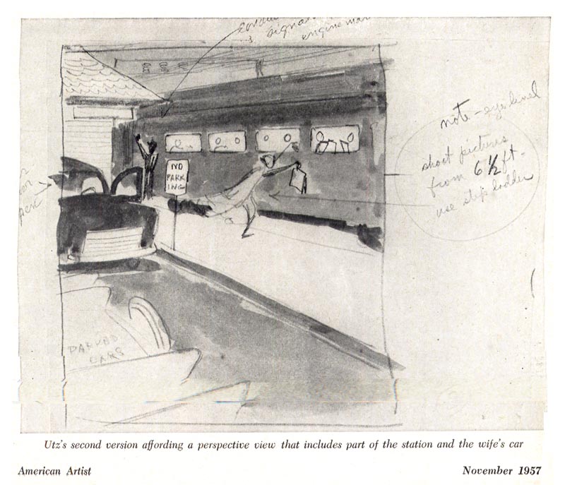
Dissatisfied with this presentation of the idea, Ken Stuart asked for another viewpoint with a perspective angle that included a part of the station and the wife's car standing with door open.
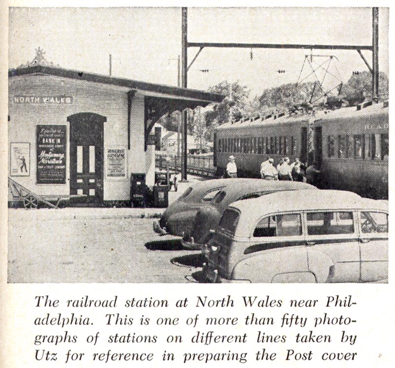
Then came the search for just the right railroad station. Thornton made many shots of stations on the New Haven and Reading lines but none seemed to be acceptable. The art director again generously got into the act. Ken Stuart, using the artist's rough sketch, arranged to block off stations near Philadelphia on a Sunday and, under his direction, a Philadelphia photographer got a picture that Utz finally used in his painting.
The streamlined train of his first sketch was discarded in favor of older cars which would be more generally identified as commuter trains.
Next came several line drawings (not shown here) from the photographs to project the action into the foreground, adjust the perspective to it, and bring the picture into suitable proportion for the cover space.

All of these changes, especially the great amount of photographic research, consumed so much time that the painting was completed too late for a summer issue for which it had been planned. It became a winter scene: snow replaced warm sunlight on the platform.
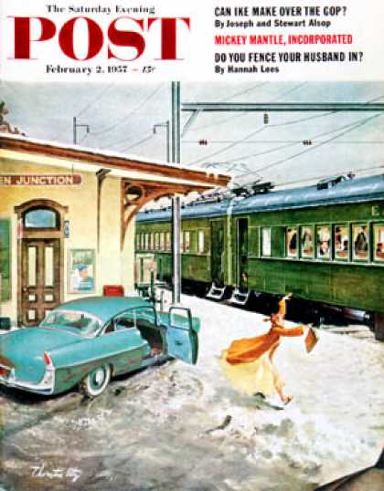
I didn't have a copy of this particular issue of the Saturday Evening Post in my collection so I 'borrowed' this colour scan from the amazing website, coverbrowser.com. If you've never visited that site, I suggest you go check it out - its pretty incredible.
* My Thornton Utz Flickr set.
Wow !
ReplyDeleteThat sure seems like a lot of work. I'm not sure I can really see how all that effort is better than the first rough Utz submitted. How can the station take on such importance when the story is all about the girl and the train ?
Nice cover nevertheless.
I completely agree, Larry, but isn't it fascinating to see what was gone through in those days to complete a really high-profile illustration? It really shows you what a different time it was, and how the importance of so many things and people have changed (read diminished): the status of the illustrator and the magazine. Imagine going to all that time and effort today - its unheard of. And I was so excited to discover the connection between Bud Blake and his anecdote about doing the rough sketch and then discovering the Utz article that shows Blake's sketch and then the steps beyond by Utz.
ReplyDeleteAmazing blog, and an amazing story. Again pretty much reinforces my decision to stay west in those days. Cannot believe the financial compensation to Utz for a Post cover justified that many exchanges, comps, ideas, and concepts. Dedication to excellence, yes....but practical....not. Great history, though, and thanks, Leif, for retrieving, educating, and entertaining us with your continuing reviews of the 'good ol' print age.
ReplyDeleteI am stunned to see the amount of work that went into that one piece! Great detective work in piecing together the history of that story. What a great glimpse of the process.
ReplyDeleteI'm wondering what the connection to Red Bank, NJ is? I lived there for 14 years and commuted from that very station. Never saw a girl in her nightie though!
Bud Blake was a brilliant artist. he always worked wonderful compositions into his Tiger strip, year after year. And I have to agree with Larry and Leif, I thought the SEP went through a whole lot of trouble to modify a lay out that was probably superior to begin with.
ReplyDeleteLeif, I was surprised that the publication date slipped to winter. Without that snow on the ground to silhouette the young wife, that new lay out would have been a disaster.
Thanks for another great post.
What a fascinating study!
ReplyDeleteThanks for showing us all these steps. The last step, or the last evolutive mutation, with the snow covering the post cover...it knocked me off!
Great work Leif, thank you for the research and post. Thornton was my great uncle through his second marriage and a great man and uncle to me – always welcoming, kind hearted and in great spirits. I would visit him yearly growing up and always enjoy the visits inside his studio. His artwork always fascinated me and I enjoy that others still hold an appreciation of his work.
ReplyDeleteI could often see the level of detail that goes into a final portrait however, I never got to see the detail that goes into the Saturday Evening Post covers he did. Thank you for this insight and helping to keep his work appreciated.