"New born baby!"
Huh?
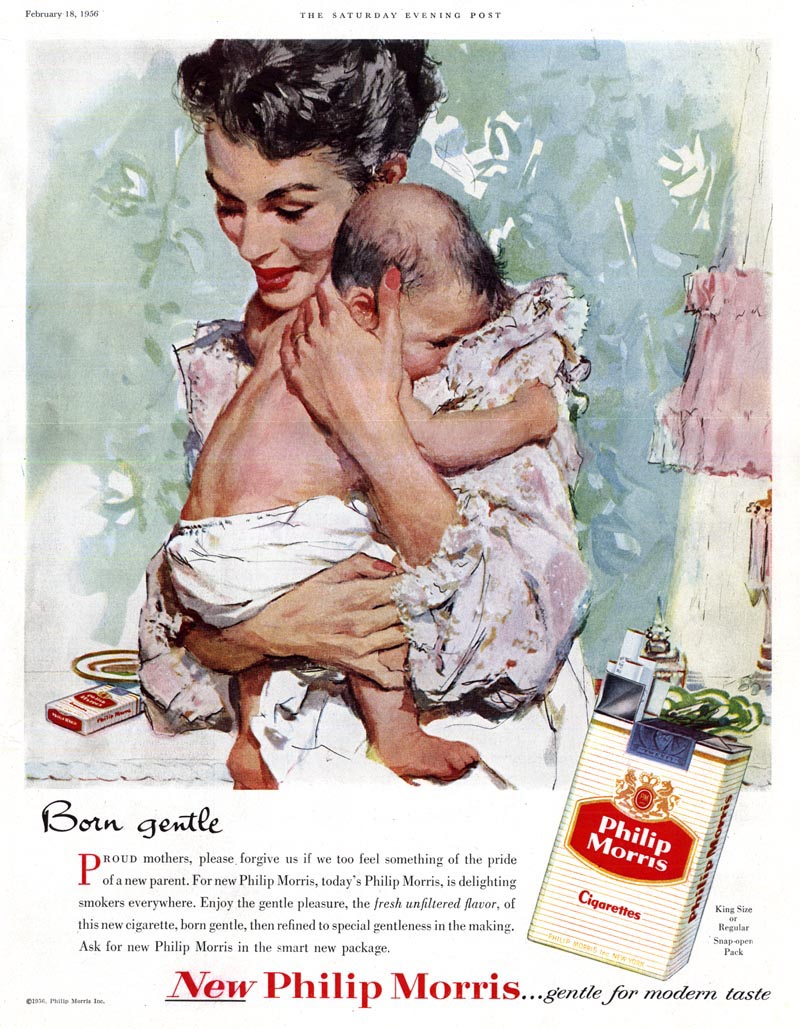
Never has an illustration of mother and child looked so right ... and a concept for a cigarette ad looked so horribly wrong as in this Phillip Morris ad, beautifully executed by Joe De Mers.
Here's a passage from a long-ago correspondence with Barbara Bradley (who occupied the studio next door to De Mers at Cooper's):
Joe de Mers ( Incidentally, Joe pronounced his name de Marz)... My take is that his work previous to Cooper's had been so very different that, as it evolved, it became closer to Coby [Whitmore's]'s for a while. Then, his style began to reflect more and more his watercolor background, the paint became more transparent and the brushwork looser.
As for advertising work, I don't think he minded at all. Joe always seemed so jovial, casual, and laid-back. Any time an advertiser selected one of the "big boys" it was because their illustrative style was wanted so it wasn't such a great jump. Quite a few of them did ads for Pall Mall [and Phillip Morris] Cigarettes. One of Joe's, which I often show my students, (as a study in social history as much as art), features a mother holding her baby in the nursery. On the child's dresser is the ash tray and cigarette. The heading reads, "Oh so Gentle". That's hard to believe today.
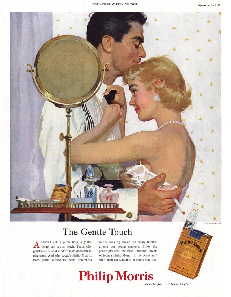
Below, another Phillip Morris "Gentle" ad (this time, thankfully, sans baby!) I think this is by another cooper Studio giant - Joe Bowler.
In the same email excerpted above, Barbara wrote:
Now, Coby's work changed a great deal, I think far more than Joe de Mers', but Joe Bowler's also changed tremendously. During my years at Cooper's, Joe Bowler's work was very similar to Coby's: in genre, composition, technique, procedure, and in the loveliness of their women. Bowler had been very young when he was hired as an apprentice at Coopers and Coby must have been his mentor. They became great friends. After I left, I followed their work and saw a growing divergence.
His technique changed, as his medium changed. He had an exciting green period and another golden period when loose stroke filled washes covered most of a page. The biggest change came with his McCall's series of portraits of the Kennedy women and of children in fashion. They were gorgeous and led to his eventual FA work of portraits and commissioned work.
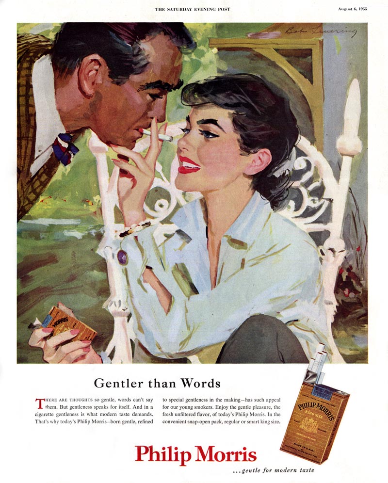
To round out this grouping, another Phillip Morris "gentle" ad, this one by Bob Levering, also of Cooper Studio.
damn - sick. unfiltered, too. I know of several women of previous generations that smoked through pregnancy, and the kids were OK, but sheesh - just seeing the marketing for it makes me cringe. beautiful renderings, though. such is life in the commercial world...
ReplyDeleteAaaiiieee!!! My eyes are BURNED OUT! That's SO wrong! That's so funny, worse than even yesterday's! But the artist has so beautifully and perfectly captured a mother cwtching her baby, little torso tucked in tight, little fists gripping her clothing, it's a gorgeously rendered and very evocative piece, really stunning. And the presence of the product is nicely subtle, she's not smoking, there's no smoke, no cigarette visible, just the pack and the dish in the background, it might not even be an ashtray, just an innocent dish. I immediately felt/smelled/recalled my own babies holding me just like that. Amazing.
ReplyDeleteThanks all for your comments (and for those that ended up on the previous day's post but address the material presented in this one).
ReplyDeleteHere's something to ponder: David Apatoff wrote a thought-provoking post recently called "Selling Out":
http://tinyurl.com/mbhzg6
I think this controversial ( by modern day standards ) piece by De Mers is a great example of what many critics would consider selling out. I made a point of including Barbara Bradley's quote that De Mers didn't mind ad work at all - and probably didn't mind applying his considerable skills to painting a scene showing mother, child and cigarettes. He probably wouldn't have painted a scene like that for an editorial piece... I think even back then when smoking was not looked down upon as it is today, any person with common sense would have considered such a scene not entirely appropriate.
So does the fact that De Mers did his part to normalize the idea by participating in the creation of this ad make him a sell out?
As a commercial artist I've created tons of artwork for a variety of largely unhealthy products targeted at kids. But most of us draw the line at some point (for me it would involve ads for cigarettes or guns targeted at kids (uh... the ads, not the guns)). But that's from a 21st century perspective. Personally, I can't fault De Mers for something I think I would have done without hesitation had I been working in the 1950's.
Perhaps one has to look at it from a somewhat historical perspective.
ReplyDeleteAfter World War II here in Germany a black market with cigarettes as a most valuable currency established itself.
These ads were nearer to those times than to ours. Near to the times of those "duck and cover" movies which taught us to protect ourselves from the pernicious effects of devastating atomic bombs.
My mother was smoking during my and my sister's gestations, in the '50s....we are the smallest of five siblings.
ReplyDeleteHowever, we are also considerably smarter than the nicotine-free three. Eh???
Seeing various cigarette advertisements in this post made me think of smoking and taking care of loved ones, like an infant. People give different ideas and opinion on the effect of the advertising photos presented here, so it's safe to focus on the way the renderings or paintings were made. I think the second photo is subtle. It made me remember a cousin who uses digital volcano vaporizer because cigarette smoking is a thing of the past for him.
ReplyDelete