-- Al Parker, 1964

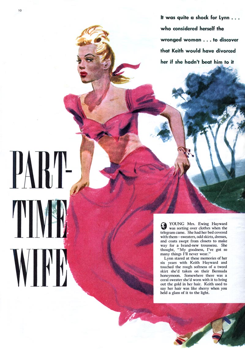
"The magazines of the early 1940s concentrated on new formats for entertaining their most important reader: the young housewife and mother. The need was met in editorial art by depicting an idealized world peopled with handsome men and gorgeous women."
-- Al Parker

"Prettiness prevailed, and warts and all were a no-no."
-- Al Parker

"Art involves a constant metamorphosis . . . due both to the nature of the creative act and to the ineluctable march of time."
-- Al Parker

"The old style was dead and the problem was not of finding a new one to supplant it, but one of somehow breathing life into the inert gesture."
-- Al Parker

"While one gleans from his output so many escapists pictures, with an air of consciously-sought charm and a craftsmanship to the point of prodigality, these escapist illustrations had ideas of quality that are echoed in the work of today."
-- Al Parker ("[writing] in defense of himself, using the third person as if describing another")

This is the 999th post on Today's Inspiration. Tomorrow, some thoughts on the first thousand and (hopefully) the next thousand.
* The third and fifth images are courtesy of Marvin Friedman. The other four are courtesy of Charlie Allen. Many thanks to both gentlemen for generously sharing these images from their personal files with us.
* The Al Parker quotes are taken from the program book of the NRM's 2007 Al Parker exhibition, "Ephemeral Beauty" (which is still available at a very reasonable price) and from the exhibit text reproduced at the Traditional Fine Arts Organization website.
* My Al Parker Flickr set.
Leif, on the cusp of your 1,000th post, the highest praise I can offer your wonderful blog is that it consistently lives up to its title: the art that you select for us is inspiring, the thoughts you provide about the art are inspired, and most of all, your boundless energy and devotion for these wonderful artists (and their remaining families) is an inspiration to all of us. You do a terrific job assembling this information from the most unlikely places and you put it together in a firm, methodical way that will serve as a reliable foundation for art historians of the future. It is always a treat to come here.
ReplyDeleteIllustrator Murray Tinkelman poetically summarized the views of many when he said, "I don't know how Leif finds the time to take a piss." Leif, on the occasion of your 1,000th post, you have our permission to take a quick bathroom break but be sure to come right back.
Yeah, Leif, and hurry up! Amen, and second the motion, to D. Apatoff's eloquently worded thanks and tribute. And....we need 1000 more TI's at least! Congratulations and just plain thanks for all the pleasure and education you've provided to all who are even slightly interested in art, artists, and illustration. And thanks for posting the scans this week I'd sent along, and for all the others. I will never cease being amazed by the towering talents and versatility that Al Parker displayed in his career. A true privilege to read and see examples come alive again in your inspirational blog. Thanks ain't enough!
ReplyDeleteI totally agree. Keep up the great work you do!
ReplyDeleteYou have certainly convinced me that Al Parker is one of the best illustrators of all time. Some (most!) of those are so good it hurts.
ReplyDeleteCongrats on your upcoming 1000th.
Thanks so much for this great blog, if "blog" is the right description. It's something much more than a blog, from my perspective.
ReplyDeleteAnd that green and blue and yellow doorway painting by Parker is amazing, isn't it?
-Z
I'm also simply amazed by this nightly doorway illustration by Parker.
ReplyDeleteWhat's the difference between this one and Edward Hopper's lonesome "Nighthawks"?
Well, Parker's illustration I haven't ever seen before. Eduard Hopper's is world-famous. But I hardly can see any difference in quality between the two.
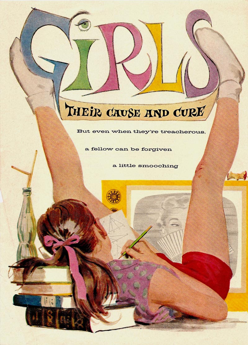
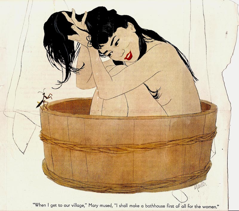
Another comment....can't resist on Parker. Most illustrators and artists have a style and recognizable technique. Like hand writing and a person's signature...they're inseparable. You could always recognize a Fawcett, Sickles, Ludekins, Briggs, Whitcomb, and the rest, immediately by the technique and approach. Not so with Al Parker. He was the only illustrator that tailored his illustrations to the story....the story determined his concept, technique, and totally original approach. On these examples....the illustration of Max Schulman's 'Girls' absolutely fit the age and hilarious Schulman humor. (Read 'Rally Around the Flag' if you haven't) On the lonely guy, and gal in phone booth....a full value, 'big city' illustration....as Rich says, every bit as good as Hopper on its' mood. Could be in oils, but probably gouache. Then the Asian young lady in the wooden tub.....delicate line and wash, a total adaptation in technique to the story....very much like a Japanese print....but better. Al Parker set the standard for what illustration should do....illuminate, and contribute, to what the author wants to communicate to his readers. What a truly great illustrator!
ReplyDeleteThanks for all the hard work Leif. This work was getting moldy in old bookstores before you, David Apatoff, and a few others helped make it widely available. I used to be thrilled to find even 5 examples of my favorite illustrator's work per year, after searching many dusty book bins and thrift stores. And the conversation was usually a few sentences per year with a fellow fan you'd run across. You've made it very easy to enjoy and discuss this stuff. You really are running a museum, in a way! Thanks for that.
ReplyDelete