"Al Parker is a great popular illustrator who deserves his success. He is one of a very small and elect company -- those who are applauded by both the huge American magazine audience and their fellow artists."
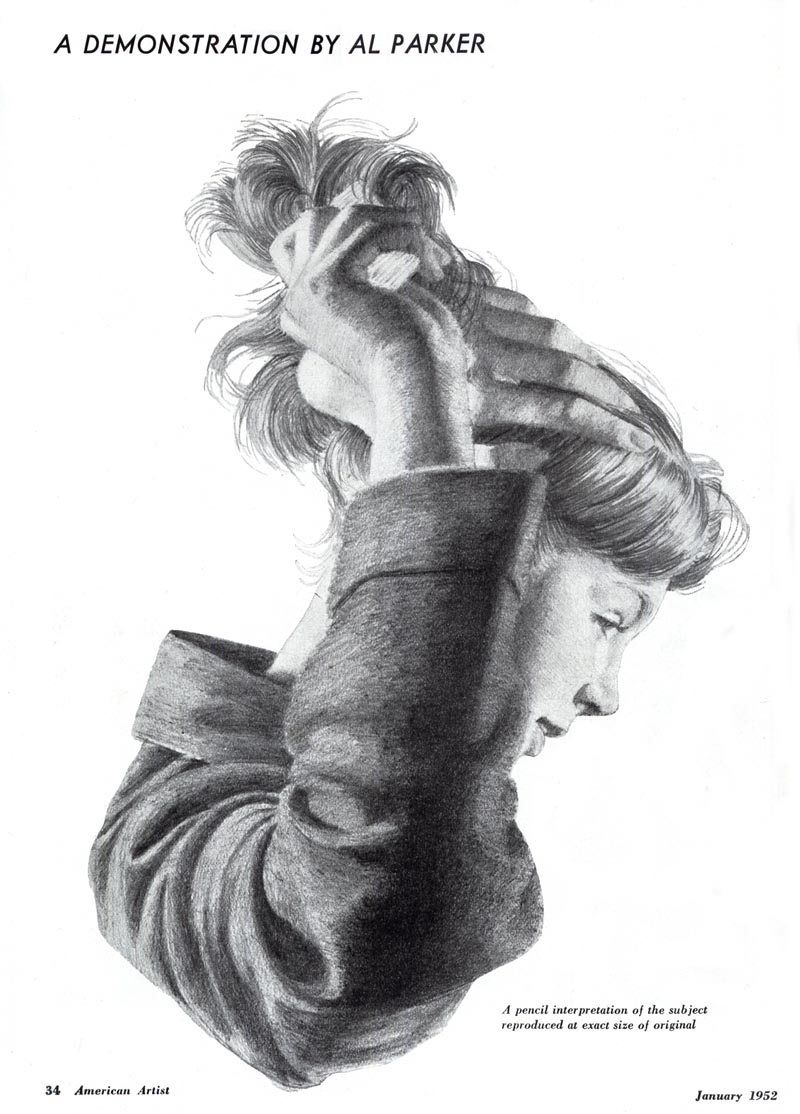
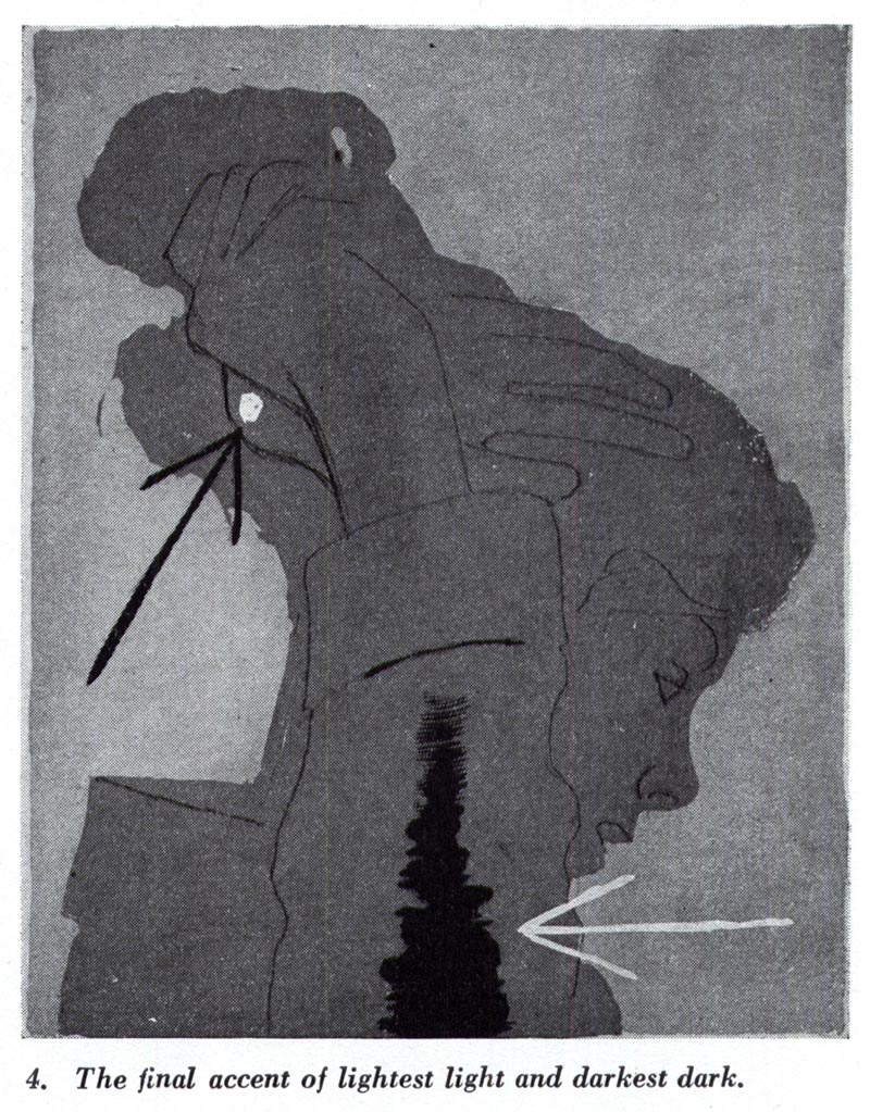
"The illustrations reproduced on the following pages show variations on a detail of a picture for Good Housekeeping magazine. They record the kind of orderly thinking and working which underlies all of Parker's illustrations."
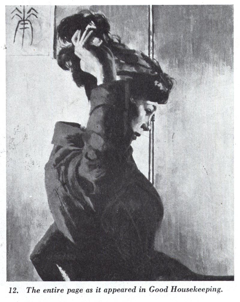
"The halftones (below) do not represent actual painting procedures. They were made as a part of a demonstration for his students."
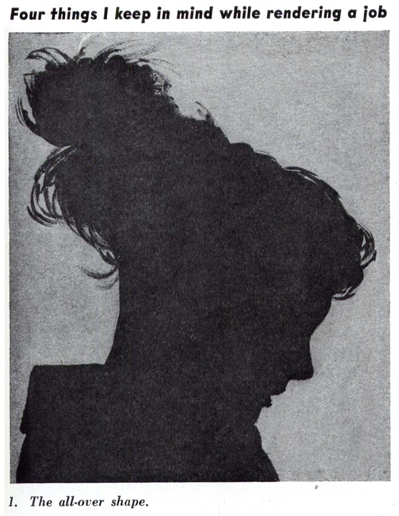
"Importance of silhouette is suggested in the first step. Even in Parker's most complicated pictures we can see how the figures and props have been designed so as to form a dramatic and pleasing silhouette pattern."
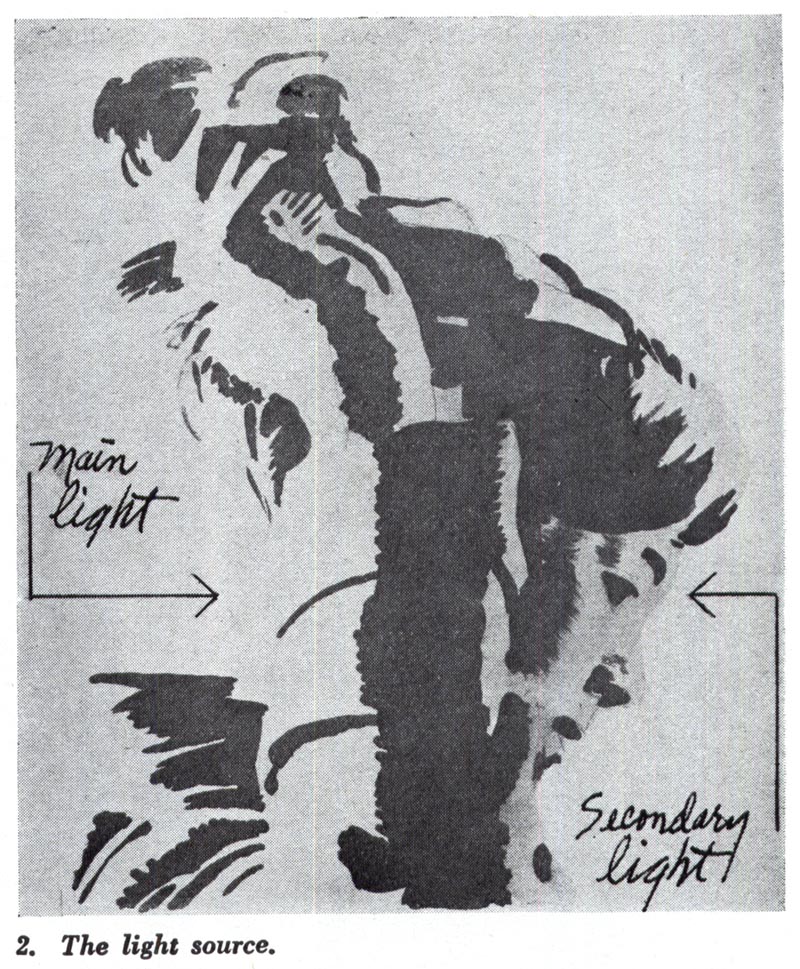
"The second step demonstrates the basic lighting treatment in simple flat areas that assure maximum form legibility. Naturally, these flat forms are broken up somewhat in the finished work by variations of color and the accidental play of light, but not sufficiently so as to impair the easy "reading" of the forms."
"In the third step we note yet another simple statement of texture analysis which, of course, has to be integrated with the light and shade aspect of the rendering."

"It will be noted, in studying the other procedure steps, how this analysis of form representation is applied in actual rendering with the brush and - in the final drawing - how the interpretative studies of silhouette, light and shadow, and texture have contributed to the realization of a unified and legible expression."
Continued tomorrow...
* the Modern Graphic History Library at Washington University in St. Louis is currently hosting an Al Parker exhibit, Double Exposure: Al Parker’s Illustrations, from Model to Magazine. which "explores the art-making process of magazine illustrator Al Parker. The display features original artwork and tear sheets from popular magazines published in the 1940s, 50s, and 60s. The illustrations are presented alongside photographic studies taken by Parker, depicting women, men, and children from various viewpoints and poses. Through the juxtaposition of these images, we catch a glimpse of Parker's creative process, from his compositions captured in photos to his interpretations realized in print."
The exhibit runs from July 6th to September 29th, 2009 at the Olin Library, Washington University in St. Louis
* My Al Parker Flickr set.
Oh, I would love to see this exhibition! Gotta see if I can swing the time! Great post, Leif!
ReplyDeleteIts my pleasure, Joe - you can't imagine how much I'd love to see this show as well... if you can get there, please let me know what it was like.
ReplyDeleteGreat post...I like what he said about getting the overall silhouette
ReplyDeleteThis comment has been removed by the author.
ReplyDeleteIn 1959, I had the honor and pleasure of chatting with Al Parker for 4 hours in his Carmel, CA studio.. while on my honeymoon! ;-) Fortunately, my wife was very understanding. Parker was very hospitable, showed me around his studio, and commented on his working methods. At the time, I was a young illustration student at the Academy of Art in S.F., and had just become familiar with who Al Parker was. Since then, I have grown to understand the historical importance and magnitude Parker had on illustration. But, as art students, we knew he was something special, and studied his magazine reproductions each month, with our mouth open in awe and a dose of envy. In art school, Rockwell was scorned and ignored, while Parker was praised and idolized.. even by most of the faculty! I suspect that Al Parker understood and admired Rockwell's work, even though they had different approaches and illustrated for different markets. In my opinion, they were both class acts, in their talent and as individuals.
ReplyDeleteTom Watson
Thanks, Tom.....interesting the story visiting Parker in Carmel Valley. Never understood that....he 'dug in' in retirement...to one of the most remote locations on the coast in Calif. Away from the frenetic East, even the ad centers in Calif.....ended almost in obscurity. I think he'd 'had it' with illustration, the pressures, etc. On the Rockwell/Parker comparisons.....there ain't any! Hey....which is the better horse? A huge, gorgeous Percheron work horse....or a gorgeous, streamlined, thoroughbred? After all, they're both horses. But there is no comparison....both are great for what they do!
ReplyDeleteWonderful post, I really admire Al Parker's clarity in his working method.
ReplyDeleteQuick question, is the '52 American Artist magazine article available in PDF, or can it be made available? It'd be great to see this article as it was originally presented too.
Thanks for all the great posts!
Brian; thanks - glad you've enjoyed this.
ReplyDeleteRegarding your question: No, I won't be providing PDFs of this or any other AA articles. As far as I understand, excerpting small amounts of copyrighted material for research, review or educational purposes constitutes "fair use" -- distributing entire chunks in PDF format does not.
But you can probably find your own copy of that issue on ebay or elsewhere. The NYPL has bound volumes, for instance... other libraries probably do as well.
Loving this article, I am sure I will be back to read this again in the future. watercolour_blog
ReplyDelete