Continuing Tom's analysis of Norman Rockwell's illustrations for Mark Twain's Adventures of Tom Sawyer...
Illustration #3
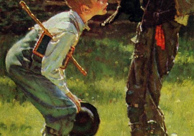
When I think of a Rockwell illustration, I think mainly indoor scenes, unless it was for a calendar, perhaps. Landscape paintings were not his specialty, and I suspect he may not have been as comfortable painting them. But, the background in this scene is rendered ideally for the situation. He has kept it simple and impressionistic, so it doesn’t compete with the literal detail in the figures. The scene is warm, inviting and just about everyone can relate to the atmosphere he has conveyed, either directly or indirectly... two boys, on a warm summer day in a grassy meadow, involved together in something very important to them.
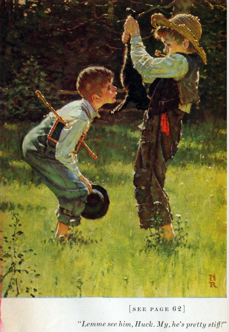
Rockwell echoes the poses and attitudes of the figures from the first illustration of the boys whitewashing the fence. Instead of overlapping them, he separates them facing each other, but both visually complementing each other, in virtually the same manner as the first illustration. Never the less, whether overlapping or separated, Rockwell created one large effective shape of both boys combined.
The lighting is somewhat unique for Rockwell, showing an edge lighting effect from the bright sunlight. For the most part, the figures are in the shade as well as the upper half of the background, which gives special emphasis to the sunlit areas.
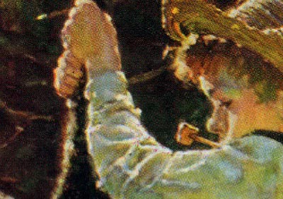
The dark shadows of the background counter changes the reflective light in the boys skin tones, their shirts and where the sun catches the edge of their forms.. dark against light and light against dark. Rockwell understood color and value relationships, and he masterfully created a mood and a sense of time and space.
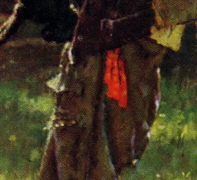
The green from the grass reflects up into virtually every part of the figures and their clothing, tying the color scheme together throughout the entire illustration. The red handkerchief is a nice complementary accent, and a relief to the various tints of green throughout.
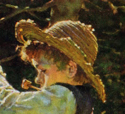
In his biography “My Adventures As An Illustrator”, Rockwell tells how he bought a tattered old straw hat off the head of a local farmer in Hannibal, Missouri, and I suspect the straw hat Huck Finn is wearing in the painting is that very hat.
Notice how Huck’s baggy ill fitting clothes add to the curved gesture of his body. Rockwell was able to include three props for Tom Sawyer, his hat, a chalkboard and a stick, and only show one arm and hand. That is vintage Rockwell, knowing how to add interest and credibility to his illustrations, and at the same time, strengthen the overall layout.
The spindly little foliage in the lower left corner helps direct us into the scene...
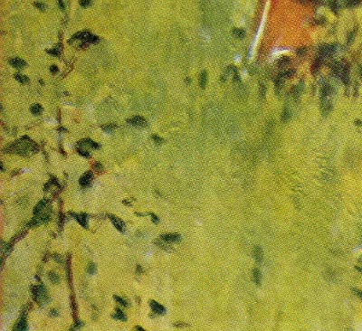
... and the wild flowers at Huck and Tom’s feet help anchor them to the ground.
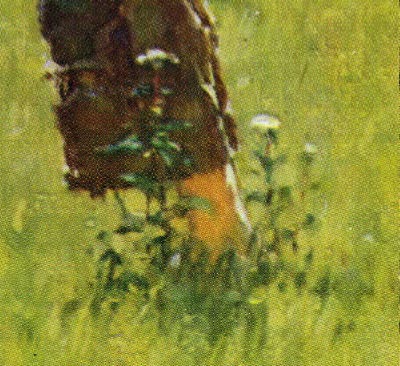
Even Rockwell’s initials “nr” are carefully planned in the composition for balance on the lower right side. The sense of depth between the figures and the background is achieved through sunlight and shadow shapes and faint suggestions of light catching limbs, and sunlight gleaming between the leaves.

Once again, you can’t move, eliminate or add to a Rockwell composition, without negatively effecting the whole illustration, which was always a carefully planned, fine tuned, well balanced design.
* Tom Watson is a retired West Coast illustrator, art director and educator. He has been a frequent contributor to Today's Inspiration and his storyboard work for film was a subject of a post on my other blog, Storyboard Central.
This week's images are © MBI/Heritage Press, Date (1936 or 1940) and are used with the permission of the Norman Rockwell Museum. This past weekend the museum featured the grand opening of a traveling exhibition, American Chronicles: The Art of Norman Rockwell.
Stephanie Plunkett, Chief Curator of the Museum would like readers to know that the Museum does travel an exhibition of signed lithographic prints from the Tom and Huck series to other museums and cultural centers. Stephanie writes, "We do have two upcoming bookings for that exhibition are listed below, so perhaps your readers will have the opportunity to visit if they live in the region."
Here is the information about the traveling exhibition:
Norman Rockwell's Tom Sawyer and Huckleberry Finn
Nova Southeastern University, Fort Lauderdale-Davie, Florida
November 14, 2009 through January 29, 2010
Averitt Center for the Arts, Statesboro, Georgia
March 12, 2010 through May 7, 2010
"It also might be interesting to note that the original paintings for the series are in the collection of the Mark Twain Museum in Hannibal, Missouri. The originals are beautiful. A study from the series will be on view in our upcoming exhibition, Norman Rockwell: Behind the Camera, which opens on November 7, 2009."
For all of the many great illustrators you feature on this blog, you've got to admit that Rockwell is the boss of them all. As mainstream and sentimental as he is, how can you argue his skills? His stuff has impact! Probably as a good a draftsman as there was, not to mention his stellar layout and coloring skills. A master among masters!
ReplyDeleteDeiter; Um, I don't know if I HAVE to admit that - but if you happen to feel that way, then great.
ReplyDeleteArt is too subjective to make concrete declarations like that, in my opinion (contrary to the typical discourse on my dear friend David Apatoff's excellent blog).
One man's "master" is another man's "disaster". That's just the reality of personal taste. (And I don't mean to suggest I'm not extremely fond of Norman Rockwell's work)
:^)
As you might suspect, I lean in Deiter's direction on this one. I'm not ready to admit that Rockwell was the single greatest illustrator that ever lived, but he certainly has to be in the top of the list. Like any other "Best of the Best' choices, it needs to be broken down into a few categories. Howard Pyle was one of the greatest illustrators of American history, N.C. Wyeth was unsurpassed at high adventure illustration, and Al Parker led the pack at contemporary romance illustration. I think lumping them all together, and try and select the "best of all time", will always be highly controversial, and can be debated endlessly.. sort of like picking the greatest NFL quarterback or the best professional fighter of all time.
ReplyDeleteWhether they wanted to admit it or not, I'll bet most of those 50's illustrators that Leif has been featuring, learned a lot by looking at Rockwell's work, and admired his great skills. But, the so called intellectuals in the illustration world, thought that if you weren't on the cutting edge of illustration, you were no longer valid and therefore obsolete. So, Rockwell became the "whipping boy" for sticking to his theme decade after decade, and I suspect that professional jealousy was a contributing factor in "snubbing him". I hope Rockwell smiled all the way to the bank, and not have been concerned with his critics.. who were lucky if they lasted much more than a decade.
Tom Watson