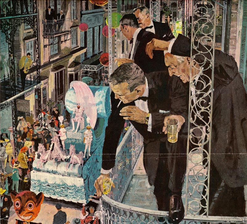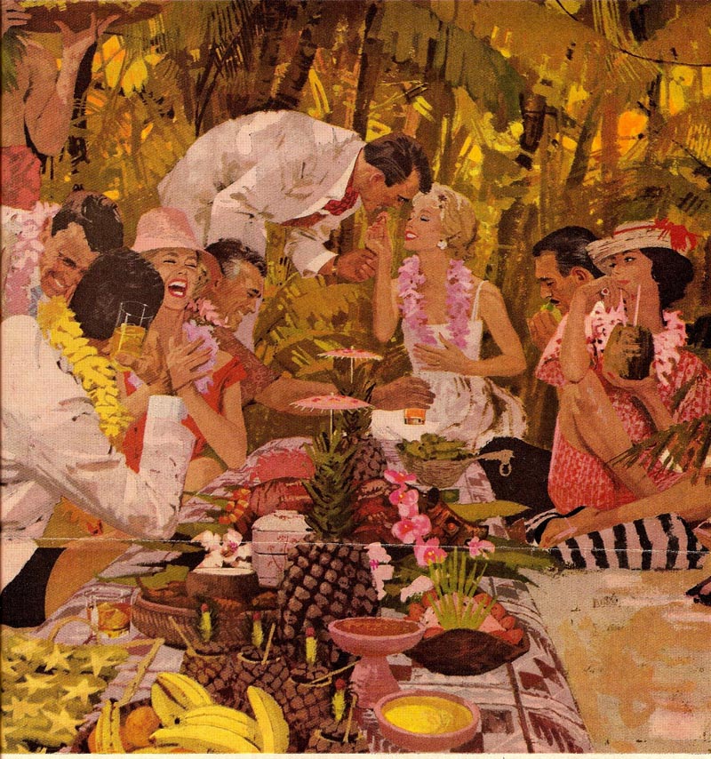
"His values and colors can be bright or subdued....but so carefully controlled and so important to each of his illustrations."

"One more comment on Bernie Fuch's amazing work," continues Charlie. "He not only juggled color, values, composition, and a marvelous paint technique better than anyone..."

"... but his seemingly effortless drawing of figures and objects was impeccable!"


"Every figure had 'an attitude'....doing something....life!"

"Austin Briggs, Al Parker, and some of the others started that trend....but Fuchs, again, raised the bar."
Many thanks to Charlie for his astute, succinct commentary - and for generously sharing so many great Bernie Fuchs scans this week. Be sure to drop by Charlie Allen's Blog to see the impeccable work of another master's "seemingly effortless drawings of figures and objects."
* My Bernie Fuchs Flickr set.
Those images are great! Thanks for sheering!
ReplyDeletebest regards,
Mariusz
These are some amazing illustrations, they have near perfection in style, color,drawing, & composition.
ReplyDeleteIn the Illustrators workshop in 1977 Fuchs related that the man in the lower right corner of the 1st illustration did not like being in a liquor ad at all and sued. Fuchs remembered the man and settled.
Leif, there is a hilarious story about Bernie and that first illustration of the racetrack. Bernie, who was still fairly new at the illustration business, went to the racetrack to take some reference photos. He brought them back to his studio and used them to paint the illustration you see. Shortly after it was published, some irate guy sued the company because he was recognizable in Bernie's picture and he had been exposed to the world as a guy who hangs around racetracks. (I believe it was the guy right up front with the hat). This supposedly did irreparable harm to his reputation.
ReplyDeleteWell, they went to trial and the company's lawyers coached Bernie on what to say. They told him, "there's no way that guy can prove this picture is of his face, just testify that there is some similarity but your painting was really a loose conglomeration of faces and the guy was imagining things." When Bernie got on the witness stand, as one friend recalled, "he was a skinny little kid who didn't look old enough to order a beer." He was also such a straight arrow he just couldn't lie under oath, so he admitted that he had painted the guy from his photo. The company was not happy.
Bernie never made that mistake when he painted faces again. It was an amateur mistake, but that's what happens when a squeaky clean kid who just stepped off the pumpkin truck from O'Fallon Illinois gets handed high profile, important projects immediately. He didn't have the slow seasoning process that normal mortals did.
Whoops, sorry, Harald-- I didn't realize you had already covered the lawsuit story.
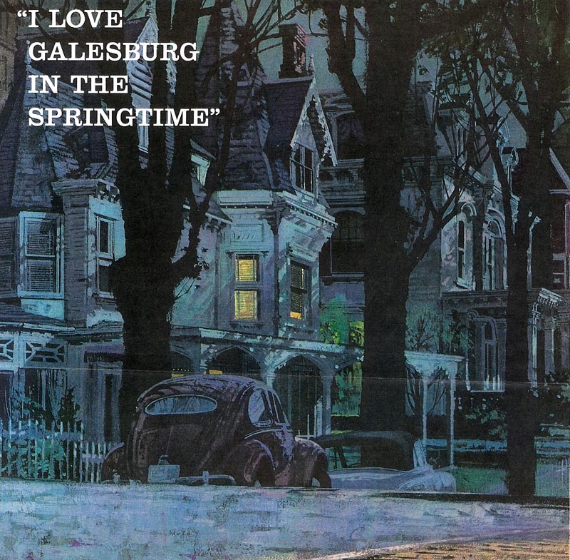
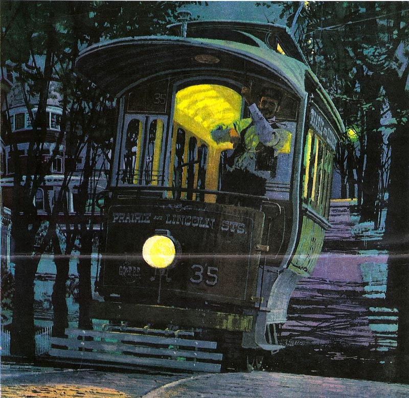
ReplyDeleteThen let me add a different anecdote: Bernie's training right out of art school was painting car advertisements in Detroit, and he quickly became a master of these highly technical paintings. What you see, in illustrations like the big "Galesburg" streetcar illustration here, is Bernie's car painting skills coming to the fore. In a lot of his pictures from this period you will see fabulously rendered cars parked on the street in the background just because Bernie knew how to do it.
I am fast becoming a big big fan of Bernie Fuchs-mainly the early stuff,not so keen on the rainy style.BUT, as with Briggs and most illustrators of this era everything was endlessly posed and photographed and then later assembled to create the final image. So lots of design and composition but I really don't see how his 'drawing' was so great given that he must have traced and projected like mad.As much as I would have loved to produce work like this,the laboriousness after the idea phase would have been too stifling for me.
ReplyDeleteFor 'real' drawing I'm inclined to favor pre Victorian artists who worked mainly by eye.Although I think Fawcett was a little more old shool in his approach.
great to see this work. When I saw the first piece, the fella in the bottom right caught my attention, I thought he really pulled the mood & focus away from the scene, and was an odd step for BF. Interesting to hear the subsequent story.
ReplyDeleteWhere were the Galesburg images taken from? Based on the text, it looks like some sort of magazine memoir.
ReplyDeleteI can't stay out of this one! First, the anecdotes from Harold and David Apatoff are marvelous....funny to an outsider but serious stuff to Fuchs. Pencil Squeezing came up with my reaction when I first clipped it. The guy looked out of place for the rest of the scene. Too bad Fuchs didn't put a mustache on him....or some minor change. Life's lessons! Must address Chad Sterling's critique. All illustrators used photo reference....it was imperative given the deadlines, requirements of complex subjects, and need for authenticity. Chad forgets....that reference in those days was black and white....the artist had to interpret value and color, and yes, a whole lot of good drawing to make it work. Photographs 'lie'! They distort, don't 'see' into shadows, don't even represent the right look the artist is trying to achieve. We've all seen slavish 'photo copiers' in art....booooring, and they never get anywhere. Trust me....Fuchs was a masterful draftsman. Have I said enough? Oh, Pete....the Galesburg double page spread illustrations were from one of the large women's magazines. Great stuff and I'll send some more.
ReplyDeleteCharlie, thanks for sharing these great images and your great insights.
ReplyDeleteYou are absolutely right about the reason for photo reference. Bernie Fuchs tells the story about how he first started out working at a small studio in Detroit where they rarely used photo reference. Then one day, an illustrator from the famous Cooper Studio in New York came to visit. He watched them work and laughed at how old fashioned things were in Detroit. He pointed to one of Bernie's illustrations and said, "I can tell that you painted these three figures from a model, but that you made up those other two figures over here. And if I can tell, you can bet the client can tell and your competition can tell. There's no way you will be able to survive in the big leagues that way. You can't possibly keep up." receiving advice from Cooper Studios at that time was like receiving an edict from Mt. Olympus. Everybody promptly started using photo reference the next day(and Bernie said, "you know-- he was right.")
As I said, I love the work of Fuchs and the other great illustrators of that era and I'm very aware of the necessity of reference in representational image-making especially with deadlines as a factor.But I also know the immediate autheticity a figure has when when traced.Even with a minimum of lines so much is established.Proportions, subtleties of gesture, perspective are all there with a minimum of effort. The fact that so many very skilled men traced and projected- and I'm NOT saying cheated- proves what an advantage it was.With regard to color, most artists would make their own choices anyway to suit the mood of the piece.David's anecdote supports this as the Cooper studio pro immediately saw the difference between Fuchs' 'traced' figurework and the figures he he either wholly or partially made up.
ReplyDeleteJust in the interest of ensuring no one feels picked on... there were some important illustrators who insisted on working directly from the model and/or on location ( Jack Potter, for instance ) or who insisted on getting it right in one shot or simply discarding a failed drawing and starting over ( Eric, W. David Shaw ). Then there's the case of Harry Beckhoff, who did tiny little thumbnail sketches that were so impeccably perfect that he would simply enlarge them and do his finished illustration over them!
ReplyDeleteBut I think its worth emphasizing that the approach used by the vast majority of mid-century commercial artists (including Fawcett, btw) was the shooting of photo reference. None of the really good illustrators used this as a substitute or crutch for top notch drawing skills, just as the use of a computer and graphic software is no substitute or crutch for good drawing skills today.
Technology in one form or another has always been just another way for the skilled illustrator to enhance his arsenal, but "to each his own" - and Chad, your choice is as valid as any other.
I think the bottom line in the case of Bernie Fuchs' choice is that, as an eager neophyte, he was advised as to what was succeeding in the market and, implementing that prescribed method, he kicked it up a notch. :^)
Thank you David for telling the story better. One of the guests at The Illustrators Workshop was Richard Gangel who said "Bernie paints light better than anyone in the history of art" I really miss seeing new art in every month in magazines.
ReplyDeleteAt the end of the day it's the end product that counts and these pictures are up there with the very very best... for ALL the reasons explained on this page.
ReplyDeleteI just wanted to add an important element to drawing from photos. I agree with Chad that ideally , it is better to draw and paint from the model if possible or practical.. especially as a student. Most illustrators prior to the 1940's used live models and not photos. But, as Norman Rockwell explained, unusual compositions, very high and low eye levels and unusual angles, encouraged the use of drawing from photographs. Also, models could make more money posing for photographs, and not work as many hours for one photo session. Bottom line, it became too expensive for many illustrators, and also too impractical and inconvenient to try and compete at a disadvantage. They were not painting for a salon show, and had to keep up with their profession. Those illustrators that spent the first half of their career painting from models, usually became better draftsmen (like Rockwell) than the illustrator that started out working from photos. IMO Bernie Fuchs was a rare exception. He seemed to have keen instincts for quickly learning to draw, design, compose, interpret, and paint. I watched his work develop from the late 50's on, and the transition in just a few years after Fuchs moved to N.Y. was truly amazing. Everything he did, including his drawing, just kept getting better and better.. by the month! And, his many top awards and accolades attest to that.
ReplyDeleteTom Watson