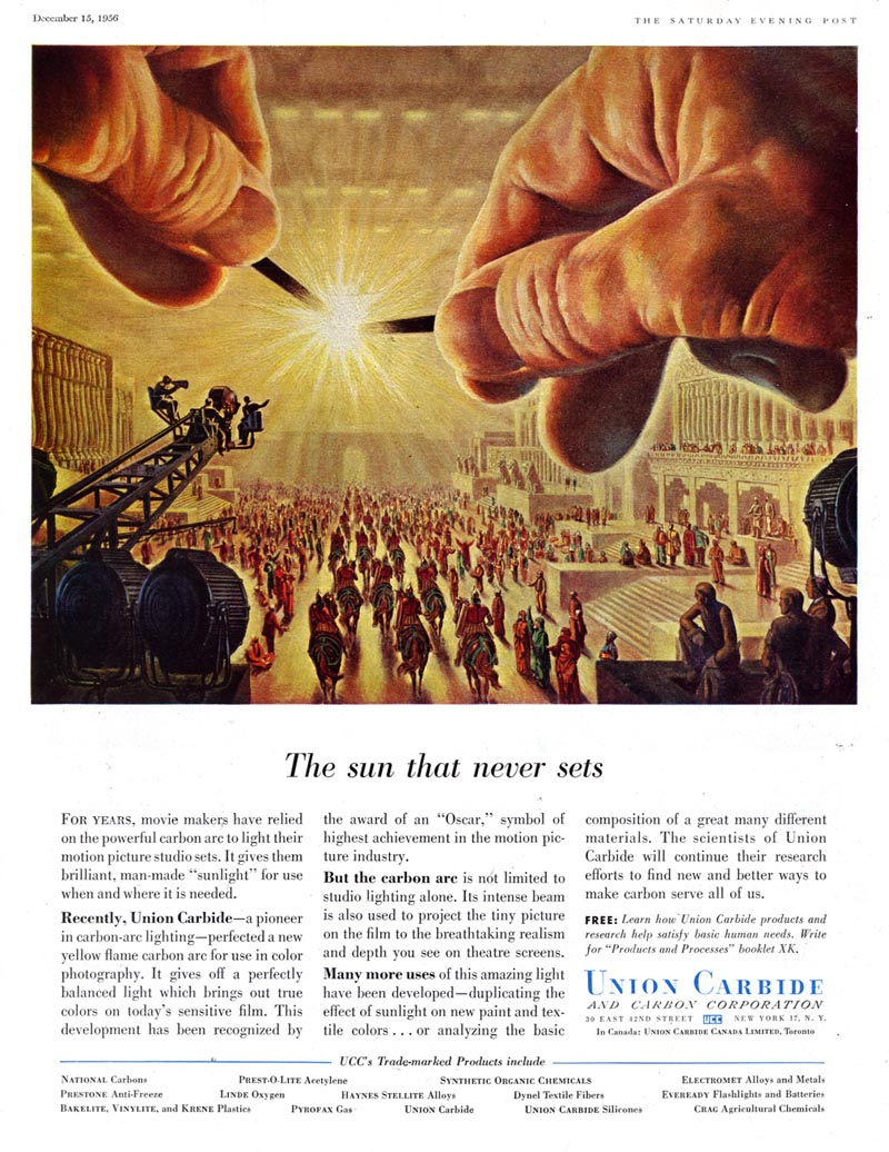
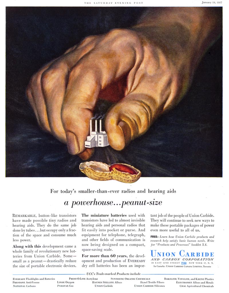
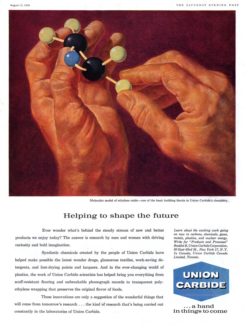
With these hands usually extending down from on high, emerging from a swirling ether, often assisting tiny humans in some industrial process or another, it doesn't take a degree in chemical engineering to appreciate the implication: the might of modern American industry rivaled the power of God.
Thus, as I have collected these ads over the last few years, I have (somewhat tongue-in-cheek) come to think of them as the "The Union Carbide Hand o' God" series.

Sometimes the Hand o' God is benign, gently sheltering a humble strawberry plant so it may better provide us with sustenance...

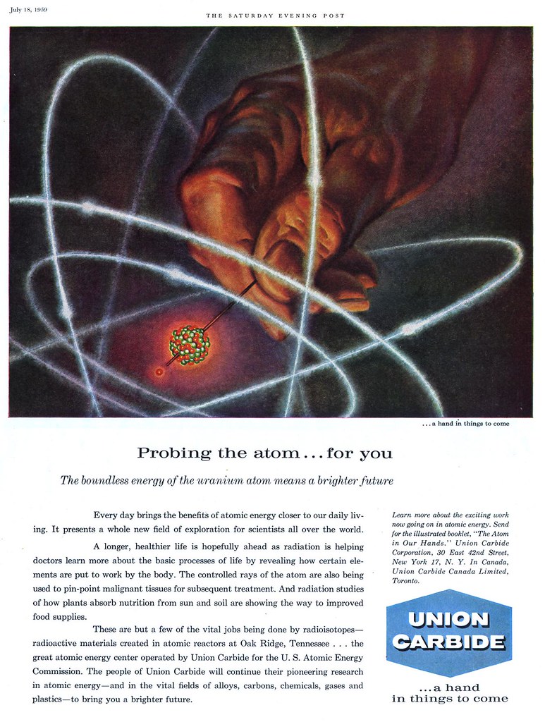
But sometimes the Hand o' God is vengeful... reminding us that Nuclear Annihilation is an ever present threat.

(Luckily, God's on our side.)
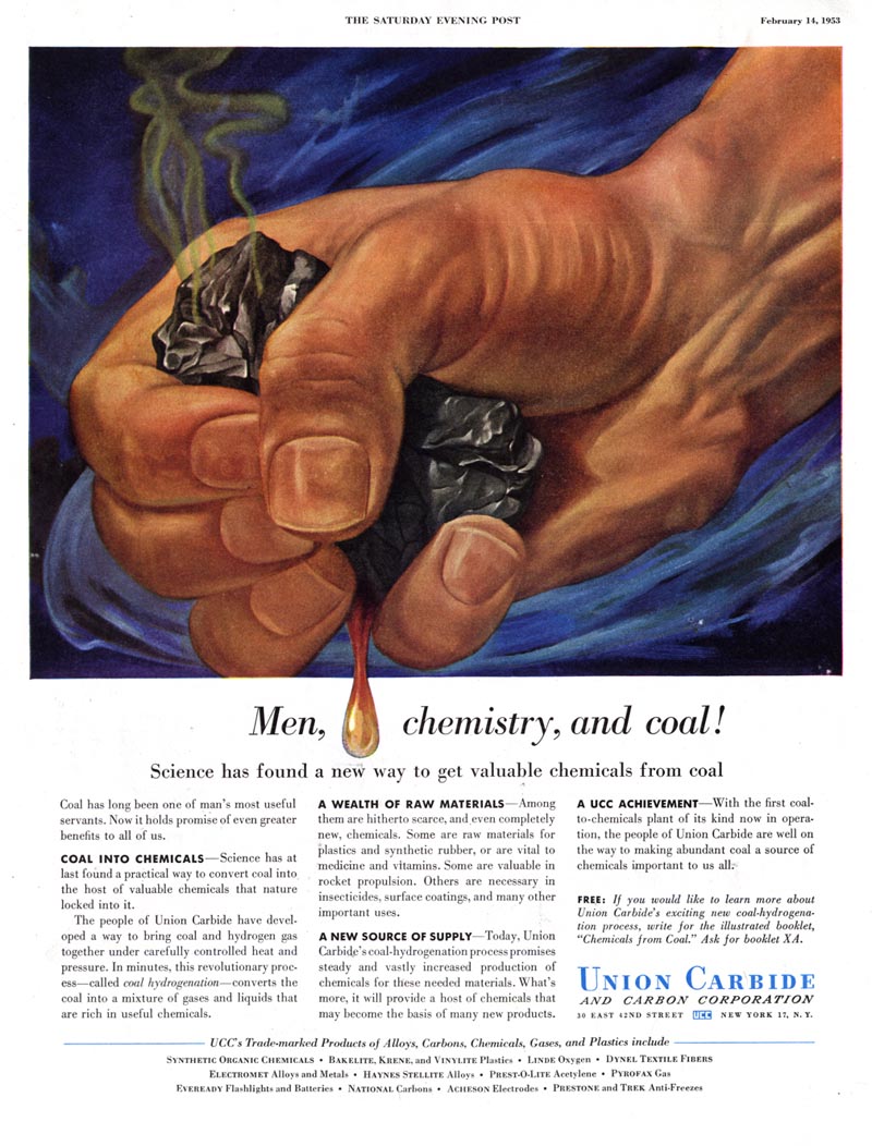
The Hand o' God demonstrates that the Earth's riches are plentiful, and ours for the taking...

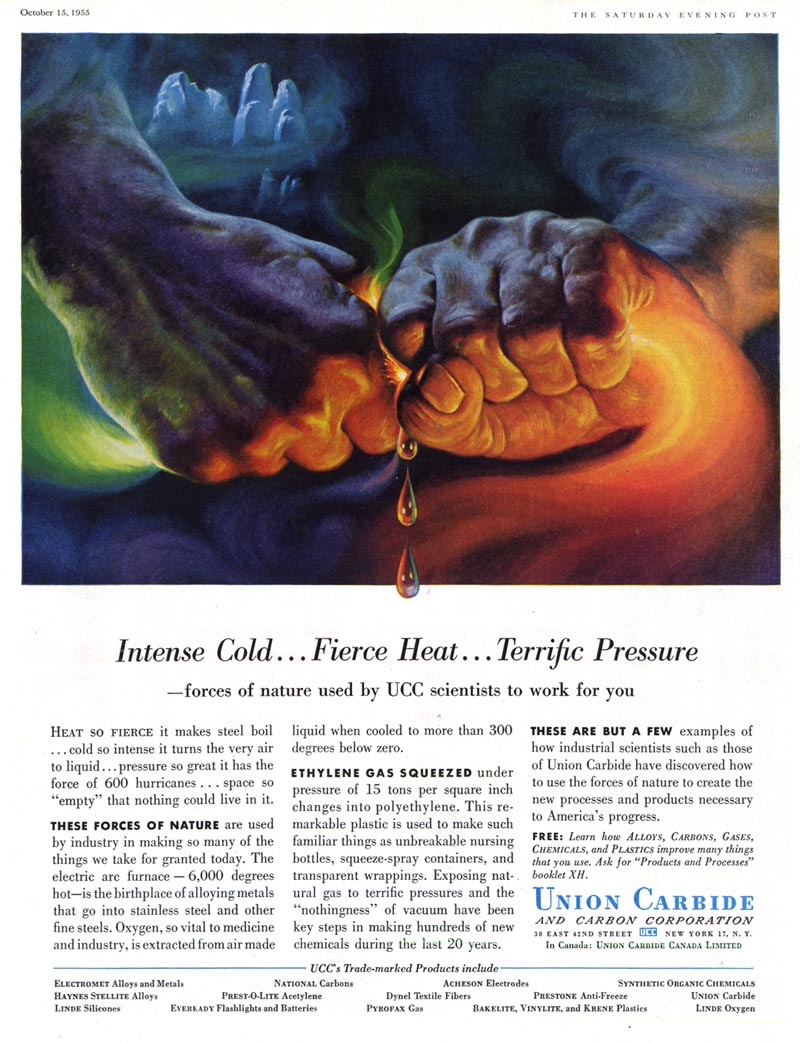
... and the mighty Hand o' God miraculously transforms these raw resources...
... into the modern conveniences that satisfy our every whim.

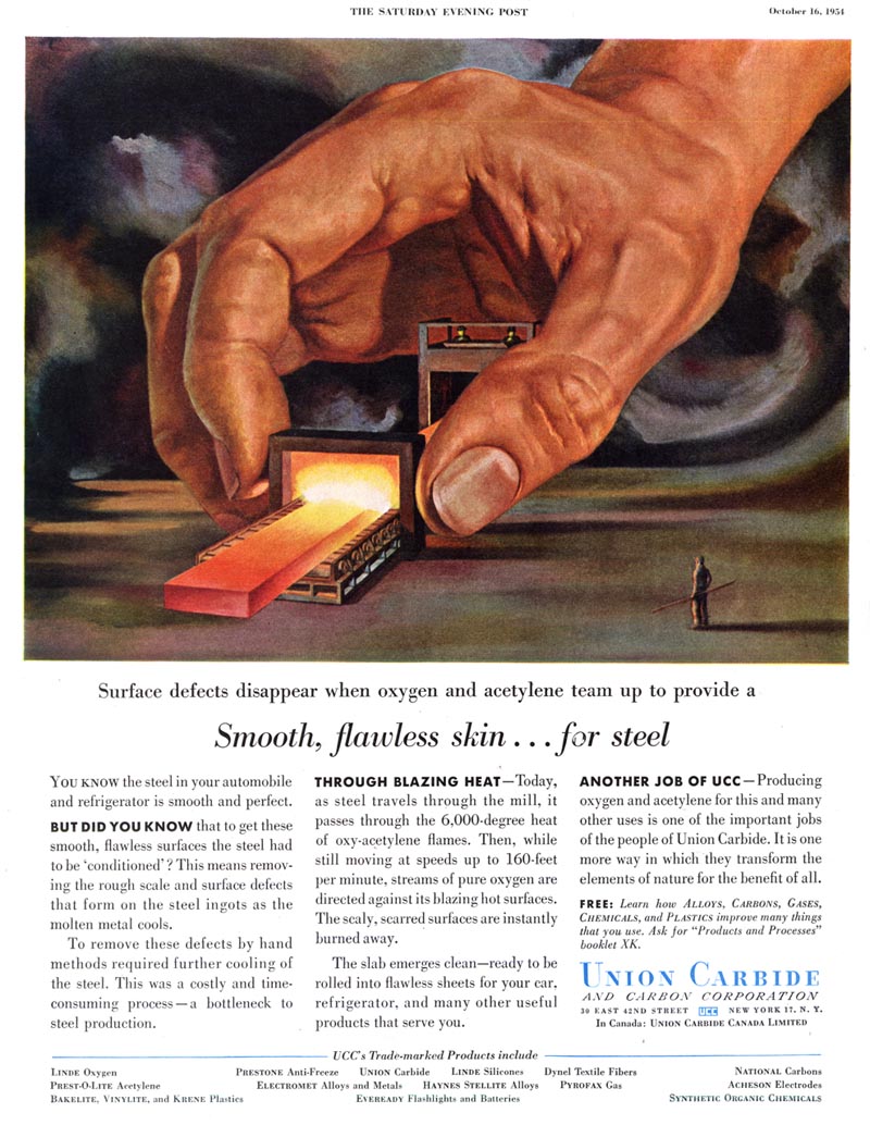
Yes the Hand o' God can move mountains! Which is great... unless you happen to live near the mountain...

But such concerns are beneath the notice of one who can turn liquid into solid and effectively "walk on water".

And when it seems that some things may be out of reach, even to the Hand o' God...

... rest assured that with the switch of a molecule here, the flick of an atom there...
Nothing; no secrets of the universe, will long remain beyond the grasp...
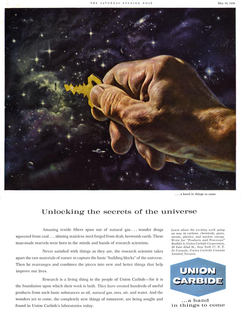
... of the Hand o' God!
* My Industry Flickr set.
There was also a tire company that portrayed giant hands "gripping" the road,with the asphalt rising up like hockey pucks between the fingers. I remember seeing those as a little kid and thinking they were so cool (Hadn't heard the word "surrealism" yet.) But no idea what company they were.
ReplyDeletehaha - nicely written.
ReplyDeleteI have always liked this campaign, but man, arrogant is right!
treplovski; I know of that campaign... it is a cool image, for sure. Lots of companies employed God-like 'power hands', as I've noticed in preparing this post... I may show a sampling of some others later in the week. :^)
ReplyDeleteMatt; thanks! And yes, from the distance of half a century and with the benefit of having seen the failure - as well as the successes - of corporate industry - these ads really are mock-worthy.
Of course there's also the Union Carbide "hand o'God" ad for their Bhopal factory. Hideously eerie when you think of what eventually occurred there.
ReplyDeletehttp://www.ultrabrown.com/wp-content/uploads/union-carbide-india-ad-1.jpg
Are you sure that's the "Hand o' God"? It looks more like Adam Smith's "invisible hand of capitalism" to me.
ReplyDeleteBesides, Leif, wouldn't God's hand have a wedding ring?
WOW....just wow! Don't know how, but missed that U.C. series when it ran. And, great commentary with it, Leif! Some of the art is average, but the first scan is amazing. Makes my Kaiser fist and hands holding mud quite pedantic. Out here, Jimmy Hansen was best at that....I'll forward a scan.
ReplyDeleteChris; *gasp* wow! I've never seen that particular Hand o' God ad - but yes, that's pretty chilling! Thanks for the heads-up.
ReplyDeleteDavid; I suspect that the good captains of the mid-century industrial corporations would have declared Adam Smith's 'invisible hand' and the Hand o' God to be one and the same. ;^)
ReplyDeleteCharlie; I can't believe you missed these ads the first time around! After admiring your paintings of hands for Kaiser Aluminum, I would have bet for sure that you had done one or more of the better Hand o' God illustrations for UC!
ReplyDeleteNice post.
ReplyDeleteYou can find another Union Carbide ad apparently from this series at http://www.flickr.com/photos/jon_williamson/3425488670/
I remember that series, as an art student looking back in early 50's magazines at the library for the illos.
ReplyDeleteOn the philosophical side, it seems to me that UC was symbolically showing the dynamic exploration of man, not God. Although, the American Industrial Revolution was mostly built by men of faith in God. As for the good and the bad of it all, I'm reminded of the fact that America.. and its flaws, has been the most generous country on earth, and the most tolerant of mockery and criticism.
I recall being told that many of the big dramatic hand illustrations at that time, were done by illustrators that specialized in hands (?). I could never find a signature, however.
Tom Watson
Another great series - thanks Leif!
ReplyDeleteThese illustrators really had some chops and of course your amusing ironic comments have also.
"Hands of the Titan" I'd rather have them dubbed.
Thanks Jon;
ReplyDeleteI did a quick search on Flickr and came across several more UC Hand o' God ads, including the excellent one you have in your collection. :^)
Tom;
ReplyDeleteI seem to have struck a nerve with you on this one and I'm sorry about that, but I think if you step back and imagine the casual observer's immediate reaction to seeing these ads for the first time, at least some give the immediate impression that God's hand is coming down from Heaven and "moving mountains" -- and I think if you can look at it objectively, you'll probably agree that it's likely the agency that conceived these ads intended to suggest that man had achieved the powers of God by way of the sort of business UC and other industrial corporations were engaged in.
As for America being the most generous and tolerant of mockery and that being a fact (and I say this as someone who has family, friends and business associates all over America and who loves all that is great about America and Americans and is happy to be a neighbour to America)...
Canada is more generous and tolerant - of mockery or otherwise. We're just not as good at tooting our own horn. ;^)
Rich;
ReplyDeleteThanks as always for your appreciative response to my efforts. :^)
Morning Leif,
ReplyDeleteI confess I've been reading your blog without signing up as a follower.
While looking at your "Hand o' God" images I was struck by how much they owed to the murals painted by Diego Rivera at the Detroit Institute of Arts in the 1930s, before Union Carbide and other corporations took over the imagry. In the DIA murals there are areas at the top of the walls that are painted with a variety of hand holding representations of the mineral wealth of the earth. [Look for an image in Google images files for Diego Rivera.]Its an interesting precursor.
Joyce K. Schiller
Norman Rockwell Museum
Joyce;
ReplyDeleteThanks for the education! I'm delighted and honoured to have another member of the venerable Rockwell Museum as a reader. :^)
Leif, perhaps we are reading from 2 different history books.. the Canadian version and the American version. ;-) And, I have no doubt Canadians are all also very generous. I also have friends and relatives (on Joan's side) who were raised in America and living in Canada, and some that were raised in Canada and living in America.. and I hear a lot of different points of view. Regardless, my friend, we can agree to disagree on whether it represents the hand of God or the hand of man. I will compromise and call it UC's "Helping Hand". ;-)
ReplyDeleteTom Watson
Right on Tom; Now there's an example of American generosity and tolerance worthy of high praise! :^)
ReplyDeleteGreat POst...Man those were some handy illustrators. I , like Tom , did not get the God thing right away. But then again....I guess our worldview color our perceptions.
ReplyDeleteWhen I was a kid I used to visit my Grandmother in Virginia and she had a ton of old Readers Digests and National Geographics with these ads in them. I was fascinated by them. I would draw them and try to copy the style. That was 30 years ago. Just recently, I was able to remember the company and find some ad pages on Ebay to buy. This post is a real treat and I am estatic to see great jpegs of these pieces. You just made my day. Thanks.
ReplyDeleteGlad you found us, Kevin - even happier that we made your day! :^)
ReplyDeleteCheck out Dial B for Blog and his awesome 5 part post on the Big Giant Hand as he appears on comic book covers You wont be disappointed.
ReplyDeleteAnybody know who the artist for this ad campaign was?
ReplyDeleteAnother different campaign has whacky gadgets of the not-so-distant future. I used to collect old Scientific Americans to get the ad on the back which featured these. I believe they were also Union Carbide.
Doug; They were done by many different artists - all anonymously - but I'm guessing the hand launching the fighter jet was illustrated by David Stone Martin.
ReplyDeletethanks, Leif.
ReplyDeleteI just did a quick search on David Stone Martin. I didn't recognize the name, but I definitely recognize his jazz covers with the black line and color patches style. Very reminiscent of Ben Shahn's work.
Doug - that's a good call! - DSM was Ben Shahn's assistant on some mural projects when he was first starting out. If you type 'David Stone Martin' into the blue 'search this blog' box near the top left corner of the front page, it'll call up all my previous posts on his career. :^)
ReplyDeleteLeif, I can't recall ever seeing an academic rendered illustration by David Stone Martin. If you have a sample of his literal academic style, I'd love to see it. I always associate his work with a jagged stylized calligraphic line and loose washes, but really didn't follow his work.
ReplyDeleteTom Watson
You know the one I'm referring to, Tom, is the one that's so distinctly different from all these others? Its the watercolour technique that makes me think that piece is by DSM. Take a look through my DSM set and you'll see similar pieces (similar, not the same). DSM also seemed to have been the go-to guy for illustrations of hands. I've come across several, but haven't scanned the all yet.
ReplyDeleteLester Rossin often used illustrations of just close ups of hands by DSM for their studio promo ads... and you know how literal ADs can be about that sort of thing:
("So who do we get for this illustration of a big hand?" "Hhmmm... Hey! - I saw an ad from Lester Rossin featuring a big hand! Let's ask them if their hand guy's available!")
Leif, after enlarging that UC hand, I agree with you. It is looser, and done in transparent washes in a much more free flowing style like DSM. Good call Leif, I think I need stronger glasses. ;-)
ReplyDeleteDo you have any ideas why they didn't show the illustrator's signatures on those illos, and other advertising illos? That has always been a question in my mind since art school. Seems like since they were using some of the well known illustrators at the time to illustrate their ads, they would be happy to feature their names. (?)
Tom Watson
Hey Tom;
ReplyDeleteNo... I have no idea... its very frustrating, considering how aften ad art was signed back then. I'm going to have a look through my 1950's AD annuals... maybe some of these ads were included in there - if so, they'll almost certainly include artist's credits.
Dear Leif or whoever has posted this blog which was just referred to me by our son, a videogame concept artist.
ReplyDeleteAs a teenager, I saw my father, Nat White, painting most of the images you have of the Union Carbide paintings; he was a humble but renowned illustrator working for Caulkins & Holden ad company, and savored doing these paintings from beginning to end. He was looking hard for the right hands to illustrate.
Then at "Hamburger Express" in Glen Cove, Long Island, I remember Dad whispering to Mom, "there they are, the hands!" Sure enough, a man sitting down the way had massive hands. He was a longshoreman in Brooklyn, and more than happy to come to Manhattan to have them photographed in a variety of poses.
Many years later, Dad came into a personal relationship with Jesus Christ. In his mind and ours, the utter hubris of the Union Carbide ads became a perfect vehicle for scriptural truths appropriate to each illustration. Yet even before his New Birth, he painted these " a hand in things to come" with genuine awe.
Sincerely, Christine White Jorgensen, Florida
Thanks, Leif, for highlighting some of my father's ads. I am Jan, his youngest daughter, and I spent my childhood looking at him do 120 of these. I never heard them referred to as 'hand of god', but like my sister, thought of the ad campaign as, 'The Hand in Things to Come.' I am so glad to see my favorite, the hand reaching for the moon. Some of his stuff was just so 'out there.'
ReplyDeleteI do vividly recall being allowed to watch occasionally in his studio, promising to be absolutely silent while he went from pencil on board to finished painting. I believe he did approximately one a month for 10 years. It usually took him a week to complete one, and I would stick my head in the door from time to time and ask if I could watch. Another one of my bests was the one that takes place in some paleolithic landscape, with an apatasaurus/brontosuarus in the background. That was one of those silent observations. I thought the dinosaur's neck was an elephant's trunk as he was drawing it, but couldn't say anything. We always met for breakfast at 6 or 7 a.m. on the weekends, and being just a kid, I was dinosaur crazy, and was able to finally share my excitement that it wasn't just a mundane elephant, but a BRONTOSAURUS! Dad was a nocturnal creature, sleeping only a couple of hours a night. He usually got up around 3 or 4 in the morning, and went down to his studio to take advantage of the quiet.
I do know that when '2001 a Space Odyssey' came out in 1967, I was all excited. He calmly told me he met Stanley Kubrick at the Plaza one day, and Kubrick wanted him to paint concept art for the movie while he found backers. It was a gamble, but my sister was in college, and he couldn't afford to do it gratis. Kubrick really liked the way Dad 'did stars'.
Dad and I also discussed the Bhopal explosion when it happened. This was years after the Union Carbide stopped the series. Papa was not happy over that. I remember when he painted that one, too, asking him, 'what's that?' and being told, 'a power plant Union Carbide is building somewhere in India.' I don't remember him even mentioning it was nuclear.
Also, most of the time he drew his own hand, and only resorted to models when he needed both hands in a picture. Often he would sketch his left hand in a mirror to get a right hand, and be drawing on the board at the same time with his right hand. At least one time my uncle was the model.
It really is a pleasure to see that some of this work is still being looked at. No one knows where the originals are. He was able to keep some of the original Crane drawings. I guess he was friends with one of the Daltons. I have one hanging on my wall right now. Sometimes he even signed them. But NEVER the Union Carbide paintings.
For Christine White Jorgensen, and Leif:
ReplyDeleteI have acquired two of your father's paintings;
"Chromium makes time stand still", and the other painting is "Promise of a Golden future". They were in my Dad's Attic, likely he picked them up during a move years ago (he was the manager of a moving company). zthe back of one reads "K Davies" on the wood frame..perhaps this was an employer at Union Carbide? Have you any of the others?
They are wonderful!
Jennifer
Hi--
ReplyDeleteI am Nat White's youngest daughter, Jan White, and when I saw there was another comment on this forum, I was so excited! My sister, Chris, lost her brave battle with cancer a few months ago, so she won't know the joy I am feeling about your find. I have to confess that I am so happy (and envious) that you have two of them. There were over 100.
You are very lucky to have some of my dad's pictures. I probably saw those being painted. We have tried for years to find them, and I suspect they have either been lost or destroyed, or are in someone's basement, attic, or even den.
I believe KDavies may have been one of his art directors.
Thank you for featuring the Union Carbide ad art: It has been an inspiration to me since I was 8 years old! And thank you LIFE and FATE that Nat White's daughters were directed here and able to give us such insights and comfortable remembrances of their father. Knowing the name of the artist for so many of these UC ads is yet another circle completed for me.
ReplyDelete