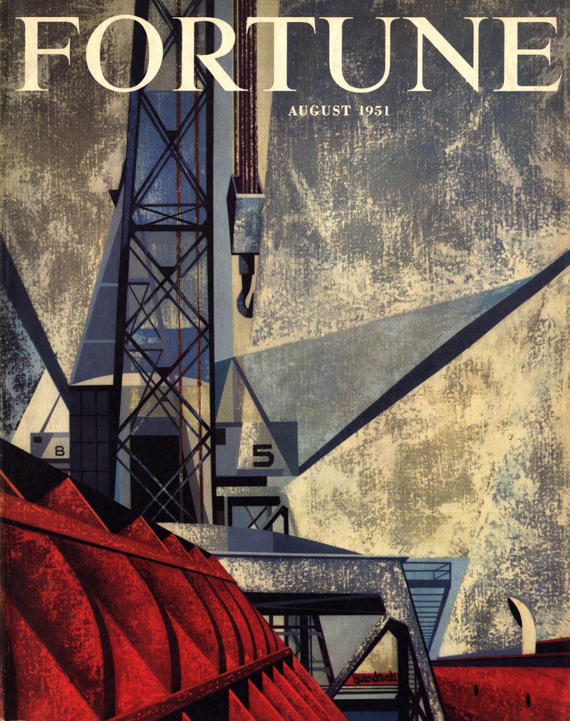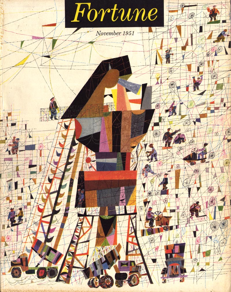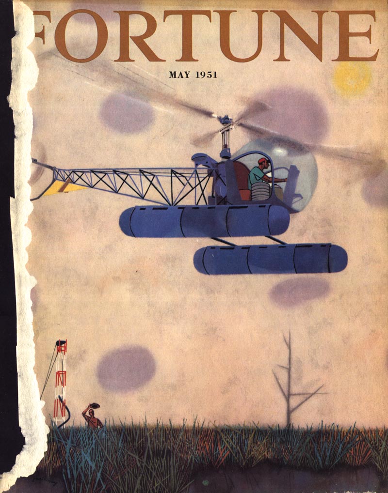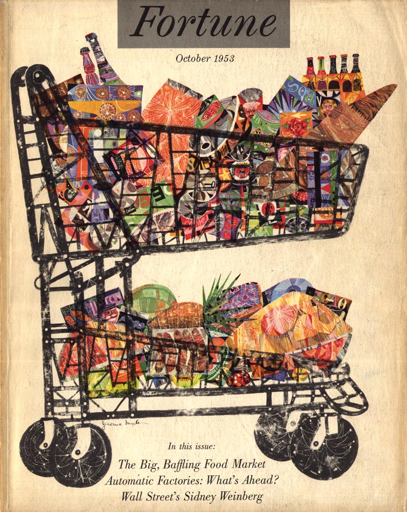
Leonni was at the centre of one of the most heated debates this blog has ever seen, back in February, when I showed a simple, child-like drawing he did in 1940 that won an Award of Distinctive Merit from the New York Art Director's Club.

Without revisiting that debate in detail, I'd just like to emphasize that, during a time when literal representation in illustration was king, the publishers and editors of the leading business magazine in America trusted Lionni to choose these and many other similar illustrations month after month for the covers of a magazine that (one could safely say) was being read by the most influential, powerful and conservative audience of the day.

These pieces would probably fit comfortably in the Museum of Modern Art, even today. But make no mistake: they are commercial art - commissioned for the purpose of selling a product - Fortune magazine - to the consumer, and it was Lionni's job to provide the kind of visuals that would increase sales. If he had failed he would have been replaced, but in fact he was Fortune's AD for well over a decade and only left in 1959 because he chose to quit the magazine business and pursue children's book illustration.

Whether you love or hate this kind of avant-garde approach to illustration, the fact remains that this magazine must have popped off the news stand. It was a great way to put a fresh face on the often dull topics of business and politics. Try doing a Google Image Search for "Fortune magazine' and see where we are sixty years later.
Photo after photo after photo of businessmen and politicians staring at the viewer. Very exciting. Ugh.

Art directors could learn a lot from a close study of what Leo Lionni accomplished half a century ago, in far less liberal times.

This guy had big balls and knew how to use them. ADs today need to grow a pair. The end.
Are you kidding? Please post more of these - completely and unbelievably amazing illustration. Many, many thanks.
ReplyDeleteThese are fantastic! Thanks so much for sharing them! I'm a huge fan of Lionni as a children's book illustrator but have never looked into this part of his illustration background. Wonderful!
ReplyDeleteP.S. I think the main reason that real illustration and design is dead in the editorial business is because there is no money to be had there anymore. With the takeover of television, film, and the internet in the second half of the 20th century, magazines have declined as a major source of disseminating information in our society, and thus their influence and revenues have shrunk. If you need proof, look up what some of these magazines were paying artists in their heyday, and compare it to what they are offering now. Because of this, all of the real commercial artists have moved on to more lucrative areas of the industry.
ReplyDeleteHi Leif,
ReplyDeleteI totally agree with you, Lionni was an amazing art director, I always admired his great work. I began working in the art department of an engraving company when I was fifteen years old. They subscribed to many magazines and Fortune was the one that I waited for every month to see what Lionni was up to.
Harry
Todd;
ReplyDeleteThat's a valid theory - and I think its one that holds water, at least for the first decade after the end of this "last golden age of illustration" we all love so much. But fast forward to today and I think the playing field has shifted by miles. From looking around the Internet at blogs, art forums, Flickr and so on, I see so much great illustration being done - much of it for no other reason than to participate in stuff like "Illustration Friday". That is, "for free"... "for the love of it".
I have had the good fortune to be hired over the years by some outstanding ADs who couldn't offer me much money, but gave me a ton of enthusiastic support and encouragement to do my thing - and fought their editors for the right to use my stuff over more of the same old crappy stock photography.
But I've also had the unhappy experience of working with ADs who seemed to not care any more. Maybe they have been beaten down by the management above them. Maybe they are overworked. Too often I've had ADs say, "let me see what the editor says" or "we don't want to do anything that might offend the advertisers."
The main thing (it seems to me as an observer with a vested interest) that's evolved over time (as a result of too much flawed marketing research and skewed focus groups) is this thinking that people will only buy a magazine with a photo cover, preferably of a celebrity, preferably a hot celebrity. Its broken logic because, as you point out, magazine sales are in the toilet thanks to the competition of tv, film, the Internet -- and a general decline in reading, I suppose.
But isn't that a wake up call to do something "different"? I tell you, its frustrating as hell looking at all that real estate on the news stands and seeing so much sameness. With so much illustration talent out there ( and so easy to access these days ) why wouldn't you jump all over these artists? I guarantee you they (we) would LOVE to do the cover of Fortune, Time, Maxim - whatever - even for today's relatively lousy rates.
And who knows? it might even get the attention of a distracted public and start selling a few more magazines each month!
Caryn; I'm glad you've enjoyed seeing today's images. I should emphasize, however, that Lionni was the art director, not the illustrator, of these pieces. Not sure if that was clear to you :^)
ReplyDeleteHarry; right on - I'm not surprised to hear that, based on your magnificent range of styles and relentless experimentation! :^)
ReplyDeleteWow, this was inspiring and saddening to read...What wonderful cover images! That first one is really great. It's lovely to think of a time when illustrations would have graced the covers of these big magazines, especially non-traditional illustrations like these! I am also a freelance illustrator, mainly doing magazine work, and it's true the state of the industry right now is not so great. It would be interesting to see what would happen if more illustration became prevalent in magazines, but at the same time I think the web has yet to be harnessed as a field for paying illustration...I've also worked in concept art in the videogame field, and it also has some of the same hang-ups as far as doing the same sorts of styles for each game...it wasn't particularly fun for me as an artist. The pay is better, but I felt like I had no soul. It's a difficult tradeoff. As you say, Leif, there's so much talent out there, and I feel like some sort of change has to happen in the future so we can harness it all.
ReplyDeleteI was looking at an archive of Vogue and Cosmo covers a while back and I seem to recall the shift to Celeb cover photos started at the beginning of the 70s, way before the incursion of 'new media'.From this I deduce the company accountants were responsible for this shift away from painted or graphic cover art.We have all sorts of excuses for why its not possible to use illustration these days but its no surprise that its based on a money man's fallacious belief that pictures won't sell a magazine like a photo will. Please check a magazine like Monocle for a contemporary magazine that goes against the grain.
ReplyDeleteKali;
ReplyDeletegreat comment - and thanks for giving us the benefit of your personal experience. I can certainly relate: most of my income now comes from advertising storyboards - a very mercenary niche market that's much more about craft than concept. If you love to draw for the sake of drawing, it can be rewarding to the soul, I think. But its far, far away from the editorial art so many illustrators (myself included) wish they could do full time.
Last spring I attended the National Cartoonists Society Reubens Awards in L.A. Among the weekend's events was a very well-attended panel discussion featuring a half-dozen or so major players in the print industry... cartoon syndicate presidents, newspaper editors, people like that. They all talked around the issue of "monetizing" the work of their artists on the web. Considering how influential these people are, I got no sense from them that they had a clue about how to do this.
Maybe at 45 I'm too analog to see that future, but I still have faith that print will be around for a long time - and that it can make good money (and therefore pay good money to illustrators). But its going to take some people with real vision to turn this ship around.
If I were boss of the world, the first thing I'd do is direct the Society of Illustrators to hire a good PR firm and have them turn the annual awards into an event the public knew about and cared about. I'd have them figure out how to turn illustrators into celebrities again, like they were in the first half of the century. That would get the attention of the print industry. If illustrators mattered to the public then they'd begin to matter to advertisers - and subsequently to art directors.
Our biggest problem is we're too quiet. We let the photographers hog all the glory because, typically, we just want to hide in our studios and draw pictures. If we ever want to see a return to the 'good ol' days', its not going to happen by accident -- we're going to have to organize and make it happen.
I wonder if the Fortune magazine' particular target of readers was a factor in addressing the concepts of its covers towards this kind of art.
ReplyDeleteOr if maybe it is to convey a more direct, more emotional idea as base of successful enterprising in general, like if success is fueled by genius before anything else.
The effect would be even more striking in a time when representative art was, as you say, the rule.
i mean, i don't know as i haven't read the magazine ever, but it came in mind easily by looking at those powerful, luscious images.
great post Leif!
Delightfull blog, intelligent, good written.
ReplyDeleteDear lord. These are amazing. I loved this guys books as a child, didn't know he was such an accomplished non-childrens illustrator.
ReplyDeleteJust to reiterate; Lionni was the art director of these images - not the illustrator. But I'm delighted that you like them, anonymous - thanks for adding your comment :^)
ReplyDeleteLeif-
ReplyDeleteDo you know who did that helicopter piece? It's quite good.
I've seen lots of Fortune Magazines from that time period. Beautiful stuff. Lionni even sent artists out on location to do reportage work! You barely hear about that type of work today.
Did you come across the work that Weaver did for Fortune at that time? It's great.
Daniel; The helicopter cover was done by Robert Gwathmey. You can find all these covers and their related artist IDs in my Flickr photostream:
ReplyDeleteStart here and click the left thumbnail to scroll through all six covers.
I haven't seen any Fortune covers by Weaver, but I'm not surprised to hear Lionni would have used him.
"Art directors could learn a lot from a close study of what Leo Lionni accomplished half a century ago, in far less liberal times".
ReplyDeleteLeif, your comment above got me thinking. From what I am hearing, today it's upside down. It's a more liberal time today, yet illustration was more diverse and abundant back then, when it was less liberal times. I would have thought the opposite (?) I too, would like to see quality illustration, like some of the bold Fortune cover illos., instead of a parade of celeb photos.. but don't know if the general public would respond to quality illustration or not (?) Not riled up, just food for thought. :-)
Tom Watson
Tom; you're question astutely strikes at the heart of the matter: as with the film and music industries, the print industry ( specifically magazine industry, for our purposes) has become 'politically correct' in modern times. This isn't directly linked to the fact that these are more liberal times and more liberal, left-leaning, sensitive types are worried about hurting people's feelings with "offensive" artwork... it has everything to do with (as Chad said above) the control of creative content by non-creative corporate decision makers.
ReplyDeleteIn film, music and print, media conglomerates have instituted vast hierarchies of middle-managers who rely on endless specious market research to try to find the formula for success -- a combination of focus group results and cost-cutting streamlining to standardize production.
In the first instance they dictate that "photos of hot female celebrities on the cover sell 25% more magazines therefore we will have hot female celebrities on our covers every month."
In the latter instance they have hired design consultants to devise templates for the production of the magazine. This may be a well-intentioned but mistaken belief that they are investing in a "signature look" that distinguishes their magazine from the competition.
It also hamstrings the art director.
I can't tell you how often I've had my suggestion to try something different with the page design be rejected by art directors who tell me they have a template for the page layout and need my piece to "fit a hole".
Its a sorry state of affairs, to be sure, and doesn't bode well for illustration if we illustrators are going to sit by complacently and be steamrolled. That's why I suggest that the SoI lead the charge and try to turn the tide.
The closest example of successful rebellion I can give is in television, where HBO and other cable networks have shown the big three how quality content can win awards and attract viewers (and ad dollars) while the cheap reality tv formula embraced by media conglomerate managers/decision makers sinks in the ratings.
In an age where visual content is king, print publishers whose sales are floundering need to wake up and find new, compelling content to attract readers/purchasers. I passionately believe illustration is the solution they're ignoring.
The covers I've worked on these days are far more art directed than twenty years ago. I think art directors like Soojin Buzelli at Plansponsor are trying and creating some very credible work right now in this economy. Which is no simple feat.
ReplyDeleteThanks for sharing that dugF; I was not aware of Soojin Buzelli or Plansponsor magazine - but this is exactly the kind of AD I'm looking for - she's awesome. Let's hope she inspires many others to follow her lead. Let's hope her art direction increases Plansponsor's circulation - that'll influence other editors and publishers more than anything.
ReplyDeleteI'm not sure what you mean by the covers you've worked on recently being much more art directed than 20 years ago. Is that something you regard as an industry overview or just your personal experience? Because if your talking anecdotally I'd say the opposite is true, so we'd cancel each other out.
It doesn't really matter to me if the art director takes a heavy or light hand ... my concern is that (IMO) the industry as a whole has diminished the authority of the AD over what appears on the cover of a publication. I look around at what's on the news stand and I see the print version of what I hear on mainstream radio: Sameness. Formula. Decision making by market research and focus group data. Photography is everywhere and illustration is virtually non-existent.
This situation only exacerbates the thinking of the ad industry, where illustrators could be reaping the financial reward of increased exposure on magazine covers.
Am I wrong in this impression?
This comment has been removed by the author.
ReplyDeleteOops sorry, here's trying again. Leif, my comment was based on my personal experience. As an example; I've done covers & interior work on and off for BusinessWeek for over twenty-three years. The role of the art director is definitely diminished. Powerful Art Directors like Malcom Frouman where made unwelcome, and eventually left in disgust from what I could gather. Also I've been asked repeatedly to brighten up my palette, even when the subject is dire. Keep it happy or light. In some ways I feel its like adolescent-pop-lite-neutral fare is the order of the day. In editorial it was the norm that I develop my own concepts, now the last few covers have been very preconceived/directed. I'm not against working with a concept that has been developed, but it strikes me as though the editors are trying to micro-manage the art departments now. Wordsmiths rarely are great visual directors. The power and elegance is undermined by a industry that has no understanding of the real strength of illustration. Suffering from it's own amnesia, the publishing word stumbles towards it's own demise. Mediocrity is king in a VERY commodified subscription frenzy for the perceived safe buck.
ReplyDelete