Clever,right? I thought so, too.

The only problem (I discovered upon perusing my near-complete run of 1950's issues of AA) is that almost all the covers from that decade suck.
Oh, the artwork is fine - sometimes even exceptional - but the covers are almost always so poorly designed that "designed" doesn't seem to be a word one could properly use to describe them. Small, awkwardly placed images incongruously cropped, surrounded by too much (and unbalanced) white space, haphazard typography slapped down with no attempt made to coordinate it with the artwork... to look at those covers one almost has the impression that no one thought about the cover until the day after the paste-ups had gone to the printer's: "Cover? I thought you were doing the cover!"

(Sorry, I'm not wasting my time scanning horrible looking AA covers -- you're just going to have to trust me on this one.)
What you see here today are the exceptions. A sampling of some of the mid-century American Artist covers that actually look pretty darn good... and a couple are actually really great. That's not just because they feature some beautiful artwork, but because they look like they were actually thoughtfully designed.

And I wonder if its only by coincidence that these are the rare covers of AA that feature the work of illustrators rather than fine artists.
One of the principle contributors at American Artist during the mid-century was the illustrator Henry C. Pitz. Pitz was often responsible for articles and interviews in AA featuring some of America's finest illustrators. Perhaps he made a point of overseeing the cover designs of those issues that featured his fellow commercial artists - many of whom would have been friends and acquaintances.

That's pure conjecture on my part. But it is a curiosity that a magazine by and about artists would so rarely have have this kind of visual appeal on its covers.
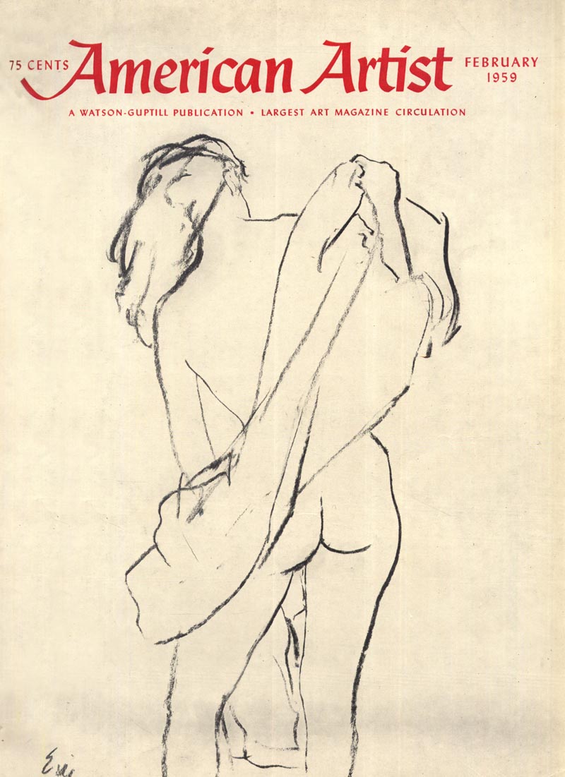
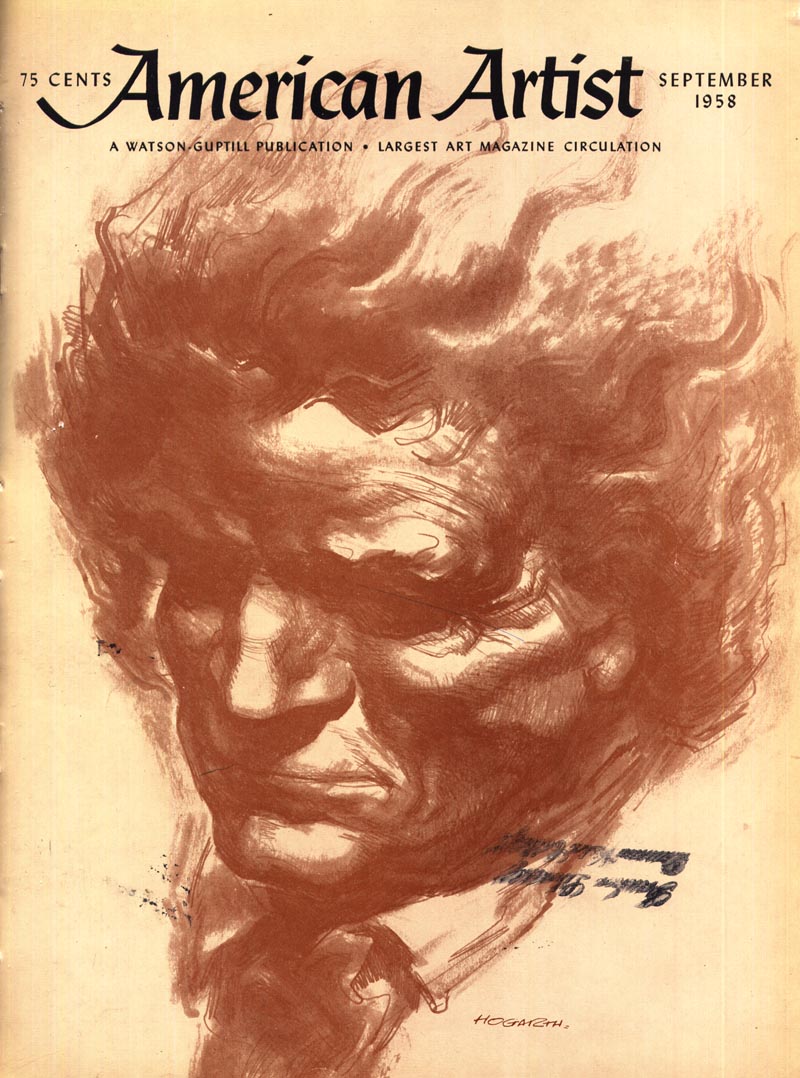
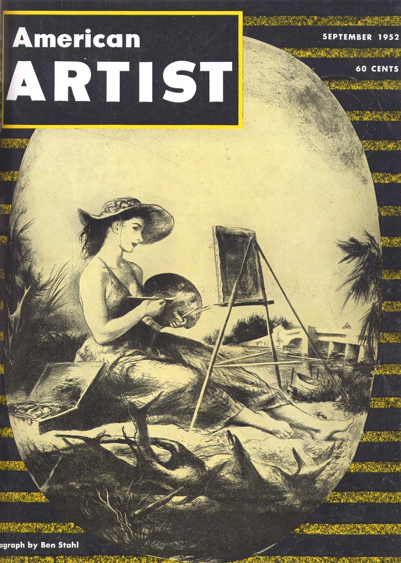
* In order from top to bottom: Franklin McMahon, Eric, Frederick T. Chapman, Burne Hogarth, Jan Balet, Ben Stahl, W. David Shaw, and Robert Fawcett.
American Artist was an interesting magazine to me because it gave equal regard to illustrators and gallery artists.I remember my commercial art instructor showing me an issue with a Frazetta cover and article.He thought I'd "get a kick out of it".I did.
ReplyDeleteThey also did an article on the Time magazine covers by Jack Davis.
Leif, I suspect that since AA, more or less, had the only game in town for the art enthusiast, they were more interested in the content of the magazine and not the layout and design features. They were not competing with the news stand mags of the day and probably relied primarily on subscriptions and ads. And, I can't think of who their competition would have been. However, point well taken that it is strange that a purely art magazine would lack above average progressive design, at least on the covers, since I doubt they had any restrictions compared to the other mags. Regardless, they kept us informed as to the players in the traditional art world.. especially when abstract art was being glorified and praised by the critiques, and traditional art was considered by many in the art world, as passe' and unimportant.
ReplyDeleteTom Watson
The last scan, Robert Fawcett? Hard to believe. I remember taking American Artist pre WWII....a great inspiration for a young 'would be' artist. My first intro to Fred Ludekins' work was the subject of one of the articles. I believe published by Watson-Guptill....but later sold to another publisher. Many years later, subscribed to AA for several years. Not only were the cover designs hideous, most of the inside articles were photo art, most badly done. Haven't looked at it since.
ReplyDeleteTom;
ReplyDeleteI've gotten so much benefit from my collection of 1950's AA's that I could never criticize them for their content - they were the only publication making an effort to provide in-depth articles on illustrators as far as I know. But their almost always supremely lousy cover layouts are inexcusable - competition or none - especially for an art magazine. If anyone should have set an example for all other publications it should have been the one that was for and about artists. If anything, those many embarrassing dog's breakfast covers reinforce the notion that just because someone's an artist it doesn't automatically mean they are also a good designer... although it seems the two should go hand-in-hand...
I guess posting a few of the better AA covers of the 50's probably wasn't the ideal accompaniment to my scathing criticism of the bad ones... I guess I'll have to scan a few of the worst afterall to better "illustrate' my point.
I'm in total agreement with you, Leif. I have seen some of those really bad covers. There was no excuse for such a lack of cover design, as you suggest.. and like Charlie pointed out, photo art began showing up in their magazine later on, plus going other directions that didn't interest me.. at which time I also dropped my subscription.
ReplyDeleteI think we're all on the same page with our opinions on this particular issue. ;-)
Tom Watson
Perhaps nowadays we tend to move in the opposite direction:
ReplyDeleteLots of first class layout and covers, but very little content to fulfill the promise.
A bit like being presented an exclusively wrapped and designed empty box for Christmas.
A bit off-topic, but I just wanted to say the blue cover with the street and the house in the middle reminds me very much of some of the Bugs Bunny cartoons, the ones with the witch, or Bugs in Transylvania, for instance. But it reminds me even more of a Spanish animated movie from 1966, "El Mago de los Suenos" (you can look it up easily on IMDb, there are also a few clips on Youtube) - as a child I watched it time after time and I absolutely loved the animation which changes from one story to another. I wonder if you know it, I think you might like it - the animation and the acting there are brilliant. :)
ReplyDeleteThat's a great story, Dajda; thank you - I'll certainly take a look for "El Mago de los Suenos". :^)
ReplyDelete