Four years after Norman Rockwell illustrated “The Adventures of Tom Sawyer” written by Mark Twain, he illustrated “The Adventures of Huckleberry Finn”, also written by Mark Twain and published by The Heritage Press in 1940. The following scans are directly from the pages of my original edition collection. I grew up seeing reproductions of Norman Rockwell illustrations in magazine ads, story illustrations, calendars, posters, a book on his life, both Mark Twain books and of course his Saturday Evening Post covers. His drawings and paintings were the major source of inspiration and influence on my early desire to be an illustrator. The illustrations below represent some of my favorite Norman Rockwell illustrations, and this is how I see them.
Illustration #1.
Norman Rockwell often used a more or less monochromatic color scheme (one major overall tone) for both his Tom Sawyer and Huckleberry Finn illustrations, adding accents of bright color in key locations.. and this illustration is no exception. Using oil paint on canvas, it appears Rockwell first stained his canvas with a yellow ochre or perhaps a raw sienna tone, letting it show through his thick over painting.. especially along the bottom edge. Establishing the overall warm amber and golden tones of the finished painting. He then allowed his brushstrokes to show where he loosely applied thicker paint. He resolved the character and enough detail of the two figures, but let the rest of the painting be more loose and suggestive.
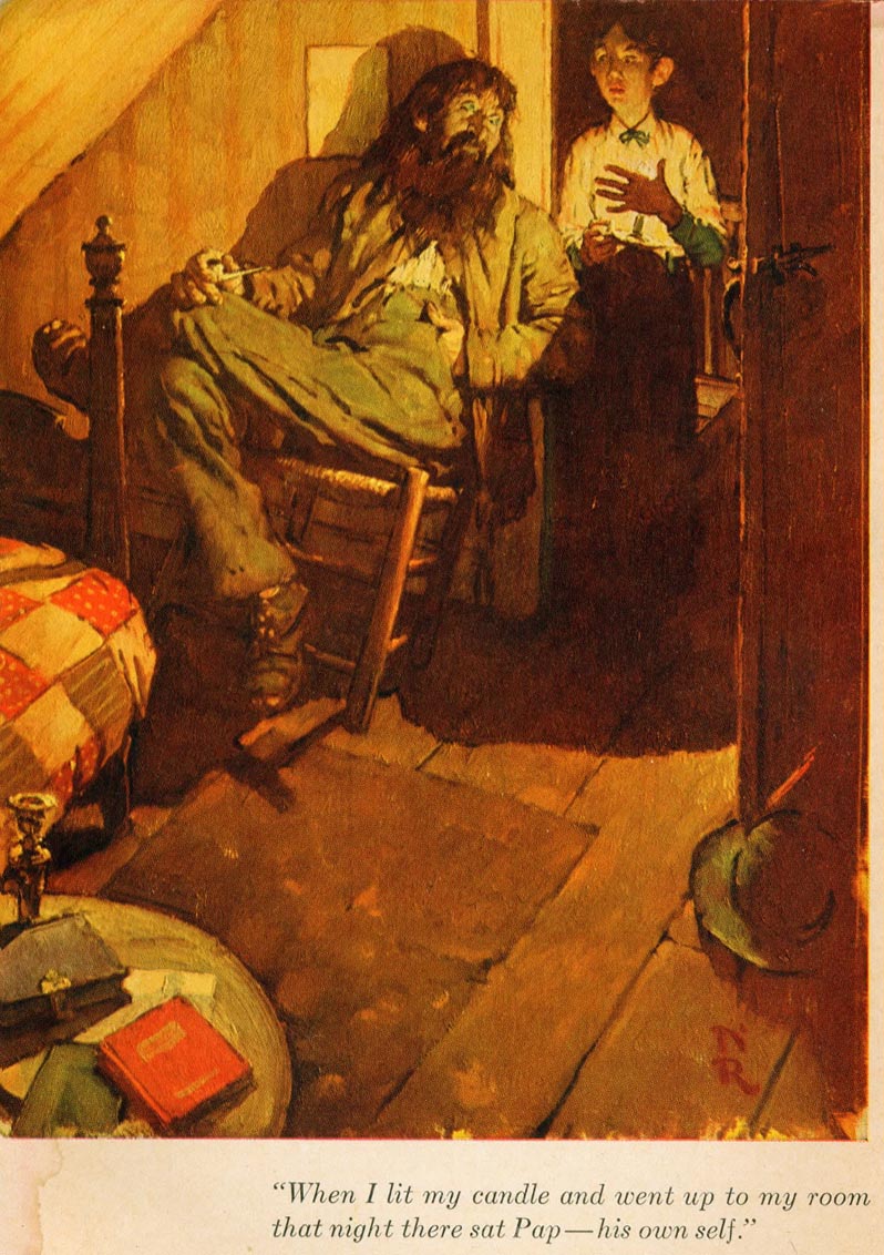
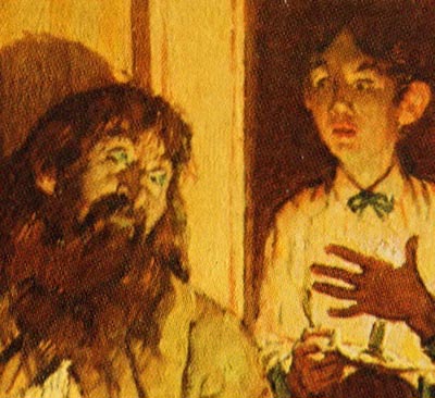
Huck tentatively enters his own bedroom, as his estranged father arrogantly awaits Huck’s arrival in a “confrontational mood”.
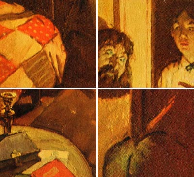
Rockwell shows a strong sense of depth through his composition.. the bed spread, the carpet and the floor boards lead our eye toward the two figures. The door and hat on the floor stop our eye on the right side, and the bedpost and diagonal ceiling stop our eye on the left side, directing our attention to the two figures. Rockwell was very clever at using props that greatly helped develop the composition and color accents, as well as create authenticity and interest.. like the round table with books, paper and candlestick, and the hand quilted bedspread. The hat on the floor and the book were mentioned in the story, but Rockwell chose where they would be placed to in the composition. Rockwell mentioned in his book “My Adventures As An Illustrator”, that illustrating Mark Twain’s stories were relatively easy for him, because Twain was very descriptive. This well connected and strongly organized composition leads us from the red book and the table top, up the candle holder to the bedspread, up the bed post and over to Huck’s father, who is also visually connected to Huck. We then follow the door down to the hat, which has a hint of a red feather (another color accent) in the band.
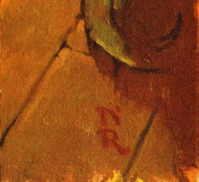
And then, almost as an exclamation point, Rockwell signs his initials below the hat, ending a nearly complete circle.
Every element of the painting, including the shadow and light pattern from the candle, is carefully planned and executed to create a strong visual story telling painting. Even the white framed rectangle on the wall helps contain Huck’s father’s head. The attitude and character of his father, slouched in the chair in a casual manner, is typical of Rockwell’s attention to attitude and gesture of his subjects. Rockwell always fleshed out the essence of the reality of his characters.
Illustration #2
.
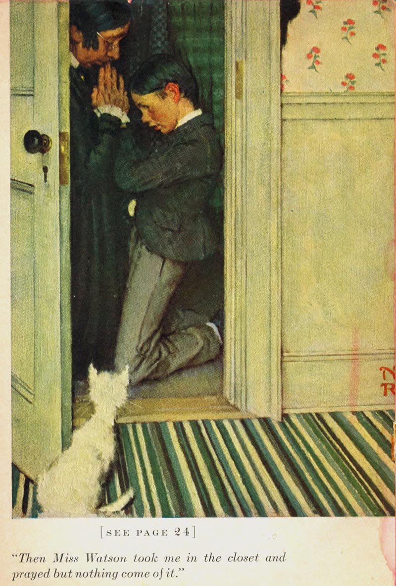
Almost every element and line in this composition is vertical, emphasizing the vertical direction of the page. With a similar approach as the first illustration, we look into a door opening at the center of interest. The light colored door on the left, and the door frame with a small portion of the wall on the right, isolate the two figures in contrasting dark tones inside the closet.
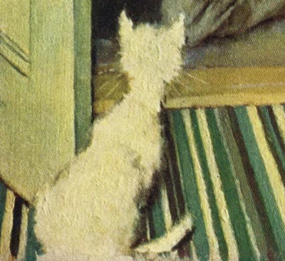
Rockwell effectively adds a white cat, curiously peering into the closet, with his tail curled around and pointing back towards the subject. He used dogs and cats, not only to add authenticity and charm, but as important design elements. The cat also compliments the profiles of the two figures, and gives an added touch of humor to the scene.
Rockwell had a motive for every choice he made in his illustrations, and applied intellectual logic to create his well thought out compositions. The strong diagonal lines in the carpet relieve the vertical and horizontal lines of the door, molding and wall. And, also helps direct our eye toward the two figures in the closet. The play of geometric (architectural straight lines) and organic (curved freeform) shapes are quite evident in this illustration. Notice the subtle decorative wallpaper design.

Again, he used a simple limited color scheme, blues and greens with a few soft complimentary red accents. A touch of white describes Huck’s shirt, and to a lesser degree his socks, and the woman’s sleeve and collar.
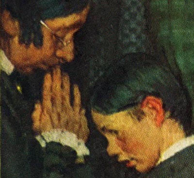
A life long student of the art of picture making, Rockwell used many effects he studied from the great old masters in museums. After the 1940’s, he was accused by some critics and artists alike, as being old fashioned and not “inventive” or “creative enough”. I smile when I witness the immense popularity, understanding and appreciation of his work today.. while virtually all those early critics have vanished with little trace.
* Tom Watson is a retired West Coast illustrator, art director and educator. He has been a frequent contributor to Today's Inspiration and his storyboard work for film was a subject of a post on my other blog, Storyboard Central.
This week's images are © MBI/Heritage Press, 1940 and are used with the permission of the Norman Rockwell Museum. This past summer the museum featured the grand opening of a traveling exhibition, American Chronicles: The Art of Norman Rockwell.
Stephanie Plunkett, Chief Curator of the Museum would like readers to know that the Museum does travel an exhibition of signed lithographic prints from the Tom and Huck series to other museums and cultural centers. Stephanie writes, "We do have two upcoming bookings for that exhibition that are listed below, so perhaps your readers will have the opportunity to visit if they live in the region."
Here is the information about the traveling exhibition:
Norman Rockwell's Tom Sawyer and Huckleberry Finn
Nova Southeastern University, Fort Lauderdale-Davie, Florida
November 14, 2009 through January 29, 2010
Averitt Center for the Arts, Statesboro, Georgia
March 12, 2010 through May 7, 2010
"It also might be interesting to note that the original paintings for the series are in the collection of the Mark Twain Museum in Hannibal, Missouri. The originals are beautiful. A study from the series will be on view in our upcoming exhibition, Norman Rockwell: Behind the Camera, which opens on November 7, 2009."
Thank you for sharing this post. I really enjoy Norman Rockwells work but did not think about the details...interesting and so beautiful...sharon
ReplyDeleteAnyone who is anywhere in the East coast area - RUN, do NOT walk, DRIVE at top speed - to the Rockwell museum in Stockbridge, Mass. Seeing the originals will CHANGE YOUR LIFE, artist or not. All the recent hoo haa about the 100 things to do before you die- this is one of them. And when your done there, go to Boston for Sargent and Abbey, and then to Chadds' ford for the Wyeths, and then Wilmington for Pyle. All doable in a few days vacation!!
ReplyDeleteThese are two outstanding examples of Rockwell's work. He really rocks well.
ReplyDeleteThanks for the show and your eloquent canvas or canvass.
Sharon, I'm glad you enjoy his work for its beauty. It's easy to overlook the core of why his illustrations are so solid, which makes them visually work so well. With all the books out on him, most focus more on his relationship to American social trends, and much speculation on what he was really trying to communicate to the viewer, etc. Unfortunately, the real merit of his work kinda gets lost in all the psycho babble.
ReplyDeleteScott, I couldn't agree more. Seeing originals by these great illustrators and fine artists is a breathtaking experience, and worth the time effort and expense. For those that have never been to these places, it will "blow your socks off"!.. as it did me. Watching them work on a painting, from start to finish, is my secret fantasy. ;-)
Tom Watson
Rich, more excellent Rockwell illos to come.. eight total for the Huck Finn novel.
ReplyDeleteTom
What to do when you got a rejection mail? Here is https://paper-writer.org/blog/rejection-email a few tips from me.
ReplyDelete