Illustration #5
I find it interesting that this is the only outdoor scene that Rockwell chose to illustrate. Perhaps it is because he may have preferred painting indoor scenes... it occurred to me that he seemed to have chosen to paint more indoor scenes during the bulk of his career. This illustration has a very theatrical feeling to the two standing figures. The tall thin gawky guy on the left is vintage Norman Rockwell. I have seen that gesture of the back arched and the fingers to the chin in many of his illustrations. It is a look of curiosity and wonder that is a difficult expression to suggest, but Rockwell was the master of expressions and gestures. Had he not been an illustrator, he probably could have become an actor or director, because he knew the visual aspect of the human emotion. Few illustrators had as clear an understanding of effective expressions and gestures in their illustration, than Rockwell. I believe it is one of the main ingredients that set him apart from other famous illustrators. He kept distilling down (editing) his concept, until he was convinced he had exactly the right facial expressions and body gestures.
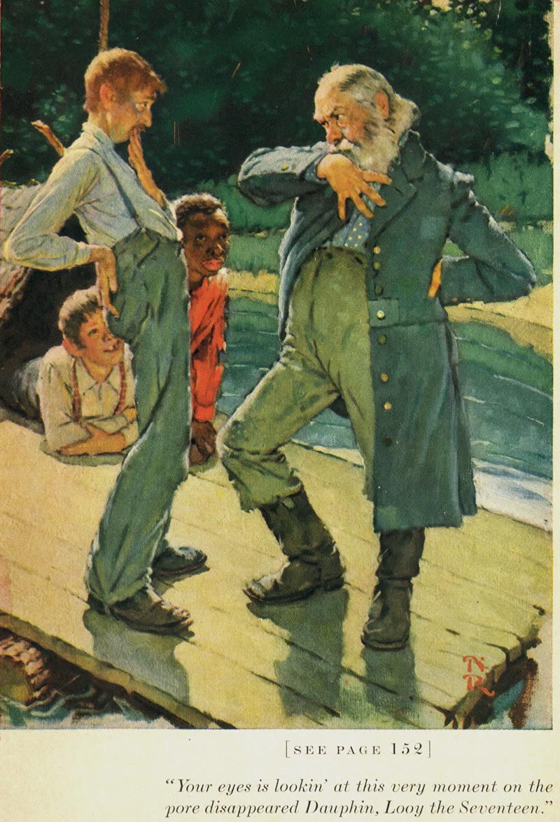
Depicting a somewhat exaggerated stylized effect, we look down on the raft, which is on a diagonal, giving a sense of forced perspective. Rockwell counter changed the lighter tones of the standing figure’s heads, from a very dark green tree shadowed background. He indicates just enough information to disclose a general location.. the raft, water, shoreline and foliage. The interesting period clothing is reinforced by the exaggerated gestures of the two men. The man with the beard is telling a ridiculously untrue tale to the other man. Rockwell depicts an effective overlap of figures.. showing only key parts of Huck and Jim, who are being entertained in the background. The color combination is similar to Rockwell’s last illustration, variations on blue greens with red accents.. an effective choice, and a compliment to each other on the color wheel. He would occasionally apply the latest scientific theories of color and composition to his illustrations, to try and avoid being stale.
Illustration #6
While attending an illustration class back in the late 50’s, I did a painting from a model dressed as a ballerina, sitting on a stool with a potted plant and a dress form next to her as compositional props. I left a lot of deep blue open floor showing in nearly half of the lower portion of the illustration (influenced by Degas ballerina paintings). When I thought I was finished, the instructor looked at my painting, picked up a letter size sheet of paper, walked over to the model stand and tossed the paper on the floor.. then turned to me and said.. “Now, suggest that paper in your painting, and your done”. I followed his lead, and it made a big difference in improving the overall composition. It was just the accent I needed, but didn’t know it until he pointed it out. Had I thought of this illustration with the pink blossoms on the open floor space, just maybe it would have sparked the idea of placing an accent on the floor in my painting.. regardless, it made me more aware of analyzing the ingredients and possibilities of a composition.
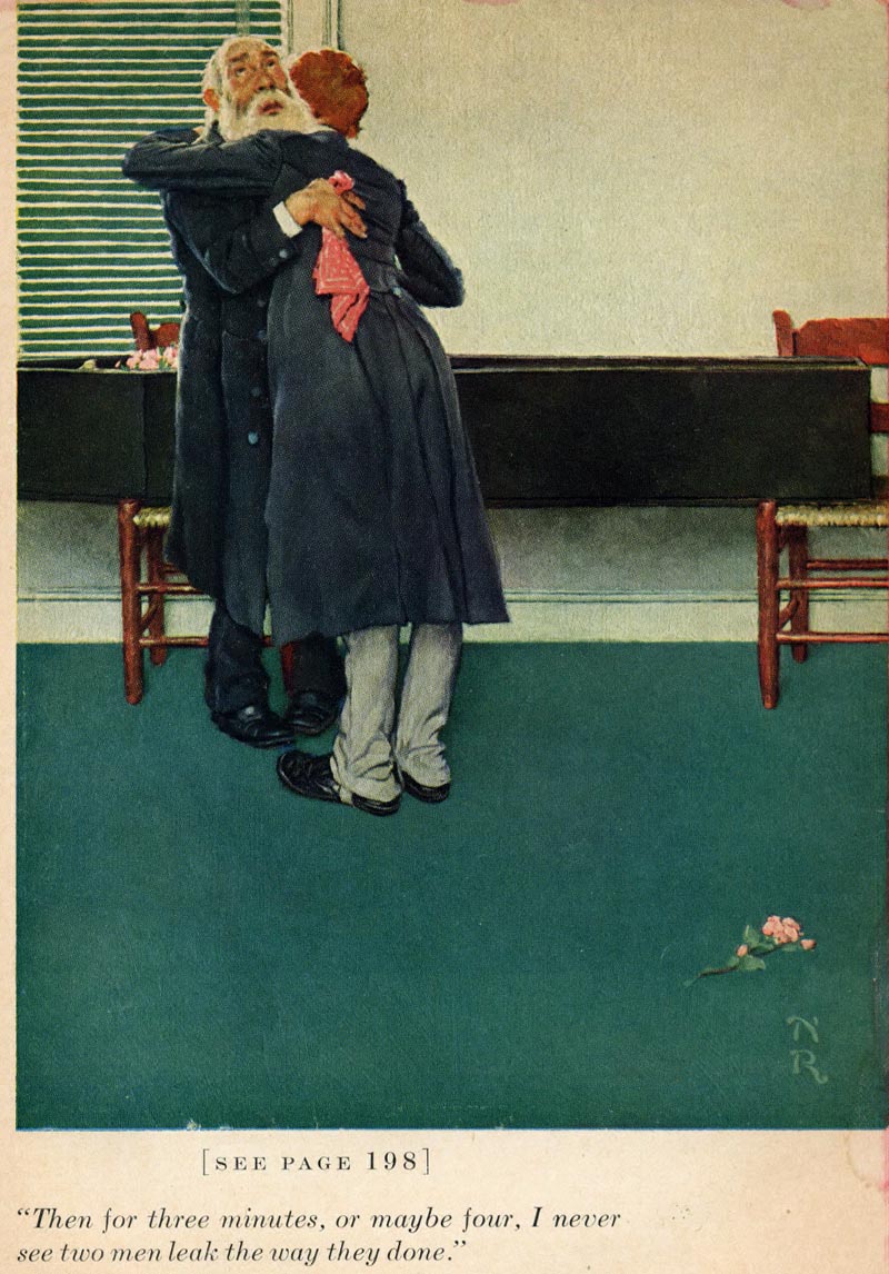
The pink blossoms on the floor, was the perfect accent for a large expanse of dark blue green carpet.

The geometric horizontal blinds, casket and molding, play very nicely with the organic freeform shapes of the figures. The blinds anchor the focal point of the two heads. The red handkerchief is an important accent, spotlighting the men.. and an indication that they are grieving.

spotlighting the men.. and an indication that they are grieving. The stark nearly white wall and light pants, are a nice counter change to all the darks. The two chairs add a sense of authenticity and also function as design elements. Rockwell effectively contrasts various shapes to create just the right mood and atmosphere for the scene.
Illustrated in 1940, it had a more modern approach to the composition, in spite of the period clothing. Rockwell was often more contemporary in his approach and solutions for his story illustrations than his Saturday Evening Post covers, or advertising illustrations, but he remained a life long literal illustrator and always paid attention to detail in his character development.
* Tom Watson is a retired West Coast illustrator, art director and educator. He has been a frequent contributor to Today's Inspiration and his storyboard work for film was a subject of a post on my other blog, Storyboard Central.
This week's images are © MBI/Heritage Press, 1940 and are used with the permission of the Norman Rockwell Museum. This past summer the museum featured the grand opening of a traveling exhibition, American Chronicles: The Art of Norman Rockwell.
Stephanie Plunkett, Chief Curator of the Museum would like readers to know that the Museum does travel an exhibition of signed lithographic prints from the Tom and Huck series to other museums and cultural centers. Stephanie writes, "We do have two upcoming bookings for that exhibition that are listed below, so perhaps your readers will have the opportunity to visit if they live in the region."
Here is the information about the traveling exhibition:
Norman Rockwell's Tom Sawyer and Huckleberry Finn
Nova Southeastern University, Fort Lauderdale-Davie, Florida
November 14, 2009 through January 29, 2010
Averitt Center for the Arts, Statesboro, Georgia
March 12, 2010 through May 7, 2010
"It also might be interesting to note that the original paintings for the series are in the collection of the Mark Twain Museum in Hannibal, Missouri. The originals are beautiful. A study from the series will be on view in our upcoming exhibition, Norman Rockwell: Behind the Camera, which opens on November 7, 2009."
No comments:
Post a Comment