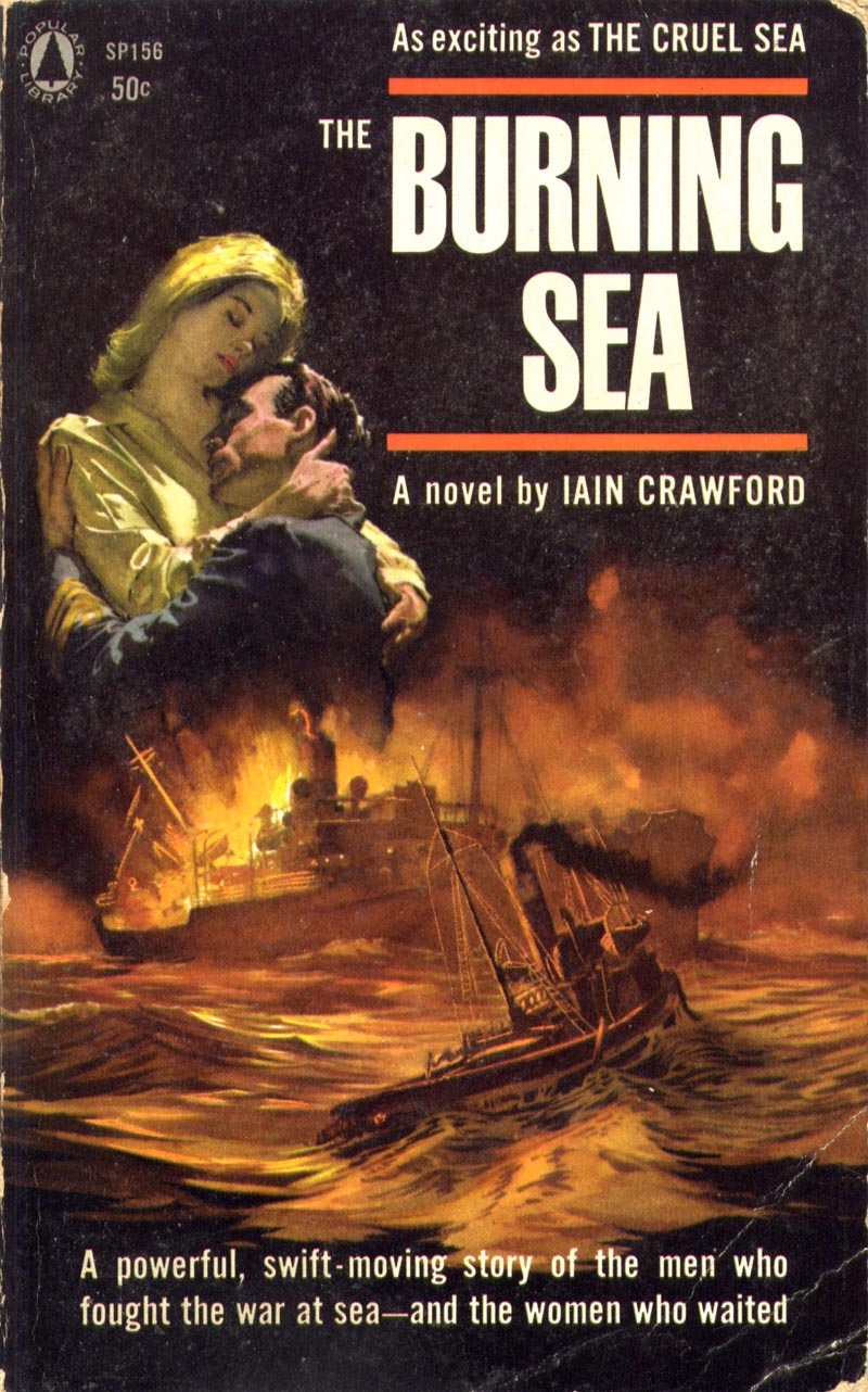
One reason I've largely ignored paperbacks is that they often have no illustrator credits. This frustrates the heck out of me. The cover above is gorgeous - but its could have been done by any one of dozens of talented illustrators of the mid-20th century. My OCD inclinations kick into high gear when I'm confronted by artwork I can't catalogue! Grr!

Another frustration is the lousy reproduction quality one often finds on old paperbacks. The images above and below seem slightly out of focus, don't they? That annoys me to no end. They would be a lot more rewarding to study if they were sharper looking.
The one below is signed "Barye", whom I've been discovering was Phillip Baryé, an illustrator of a million-billion paperback covers, almost every one of which featured at least one fetching gal in a state of semi-undress. If Barye's covers were taken as a snapshot view of history, one would have to conclude that manufacturers of women's clothing in the 50's had not yet perfected any type of button, zipper or clasp.
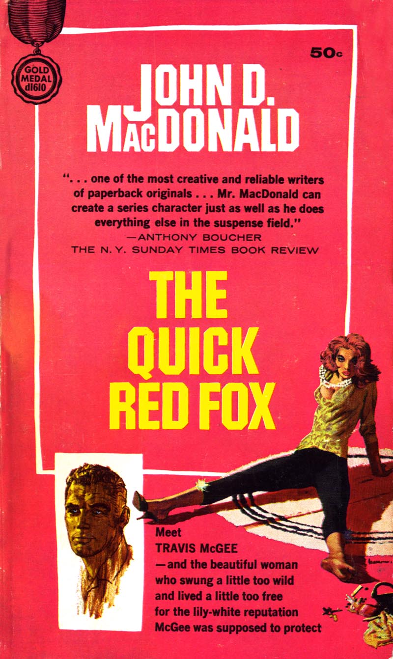
Here's another gem I found for a quarter. I think that tiny signature near the sprawling lady's bare foot says "McGinnis", meaning this would be by Robert McGinnis, who also did tons of paperback covers (often featuring ladies, sprawling or otherwise).
What's interesting is I found a similarly sprawling lady - definitely by McGinnis - on Flickr... and although that piece is from 2 years earlier, its painted in a much more sophisticated manner. Hhmmm.
And finally, the last of my fishing trip finds: a beautiful paperback cover by Sandy Kossin. This one's from 1960, but don't let the fairly traditional, literal style fool you. Sandy was not the sort of artist who got stuck in a rut when it came to style.

And that gives me the chance to re-present some of his other paperback covers we've looked at before...
Believe it or not, the cover below is also by Sandy Kossin - and from just one year later than the one above. If that isn't a little remarkable to you then I don't know what is!

When I asked Sandy about that cover he said, "I am constantly amazed at the new attention to my paperback covers, mostly emanating from your blog. THE LAST TEMPTATION OF CHRIST was done twenty five years ago or more for Bantam, of course, and the art director was Len Leonni, one of the few people with artistic taste and power. He agreed with my concept of using a technique borrowed from the Masters..."Just give me a great piece of art."
"I don't remember doing a color sketch of the piece. Probably not. I just find I can enjoy doing a spin-off like this, since I learn from concentrating on the artist and extracting enough information that allows me to do it my way. This was obviously Christ and Judas painted in gouache with background colors mixed with Elmers Glue or acrylic matte liquid. Yes, the editors and Leone loved it. (I hope your reproduction isn't as dark and dingy as shown here)"
One day, out of the blue, Sandy sent me the scan below - again, in a variation of style - and when I pressed him to tell me more about his influences he wrote back, "I do give a lot of credit for any drama and design I use to David Stone Martin and Shahn. Ben Shahn, who I never met, but was alive while I was in art school, opened my eyes to not only shape-making, but the use of 'layers' of color over underpainting, and the judiscious use of color."
"DSM was also alive back then, and was a great influence on my line, which emulated Shahn's line which had that same stop-and-go quality which was useful in keeping a drawing from being fast and slick. No, never met the man, but again, his use of line and design made him the icon he became. In fact, his clients would not let him "grow" and change his style, which eventually led to his dropping out of the business."
"Growing" and having the freedom to change one's style was obviously always an important facet of how Sandy Kossin went about making pictures. Its the key to why his paperback covers never became derivative or tediously formulaic. At the end of one message Sandy wrote, "Most other paperback houses knew what I did, so I was given a lot of leeway in my concepts. And I was lucky enough to be assigned their number one books."
"Any more questions?"

* Sandy Kossin wrote a long and lavishly illustrated article about his career in Illustration magazine #25
* My Sandy Kossin Flickr set.
* My Paperback Covers Flickr set.
That Shadow cover is fantastic!
ReplyDeleteI agree, that Shadow cover is superb, one of the best things I've seen by Kossin since the Bay of Pigs. Even that glowing green color on the title works well, against all odds. Nice!
ReplyDeleteHi, i don't know if you indicated in some old post, but i found this gallery about the record covers by David Stone Martin
ReplyDeletehttp://www.flickr.com/photos/12998963@N03/sets/72157607431774812/
thanks for your great blog!
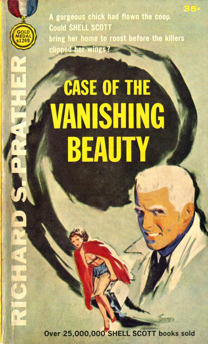
Love the white hair short hair cuts of the 60's. Shell Scott and Roger "Race" Bannon of Johnny Quest.
ReplyDeleteNot sure if I agree with the Shadow painting. I'm gonna always go with George Rozen or even the later paintings of Jim Steranko.
Praise for the little Things
ReplyDeleteYour title says it all. What else to say?
Just wanted to add that this "Christ and Judas" cover, using a "technique borrowed from the masters" "painted in gouache, loved by the editors", reminds me of Georges Rouault, considered to belong to the hall of fame of Fine Artists.
"The weed of crime bears bitter fruit -- crime does not pay!"
ReplyDeleteJust had to throw that in there; lovin' that Shadow pic!
Although Mcginnis is more well known and respected, I really like Bayre's stuff. Many of his have a nice balance of realism and impressionistic technique. He did an incredible number of covers. There was a style in the 50's and 60's for the pulps that many illustrators used -- sort of a deliberate unfinished quality. Pretty interesing. Nice.
ReplyDeletePS. Have you posted much re Robert Jonas? He's an unsung one of a kind.
Leif: I know how you feel about the artist credit thing. I run into the same frustration often on my comics blogs. Nothing pains me more than to leave great work uncredited. I always feel that I am cheating the artist somehow, or that - if I just look hard enough - I can find the artist. Even when I go with the "artist is uncredited" thing, I always feel like I've given poor service.
ReplyDeleteGreat post and great, great book covers. -- Mykal