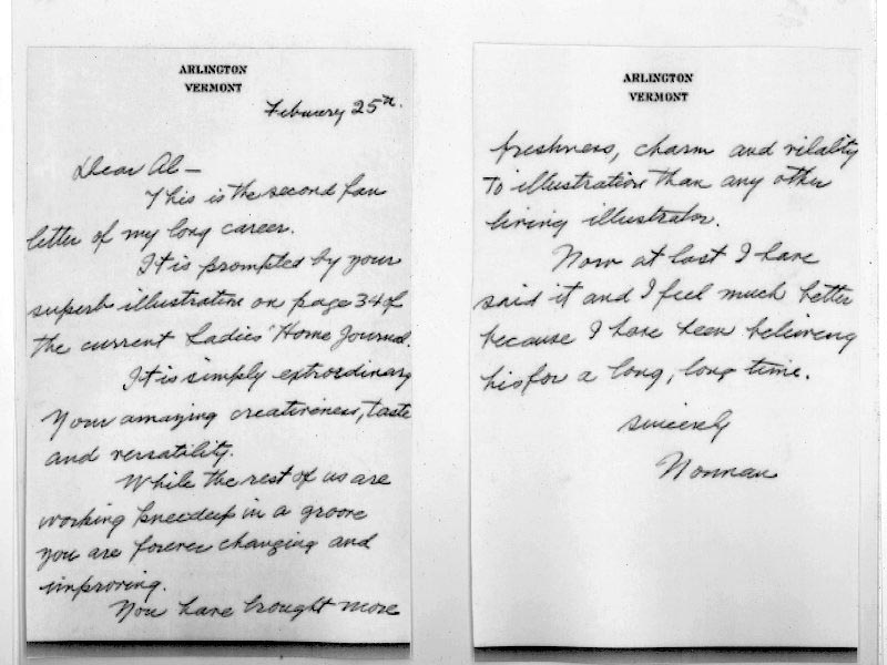
Little did I know that David Apatoff had enlisted the aid of the inimitable Jaleen Grove to hunt down that image at all costs. This past weekend I was surprised and delighted to receive the scans below, along with a note from David and Jaleen:
"Since you are the one who introduced me to the Rockwell letter and you raised the issue, it seems fitting to hand this image back to you to complete the circuit with your readers." wrote David.
"It is not at all what I expected, and I still want to think a bit about why this particular picture moved Rockwell to write. At a minimum, I give Rockwell credit for being more open minded than I would have supposed."
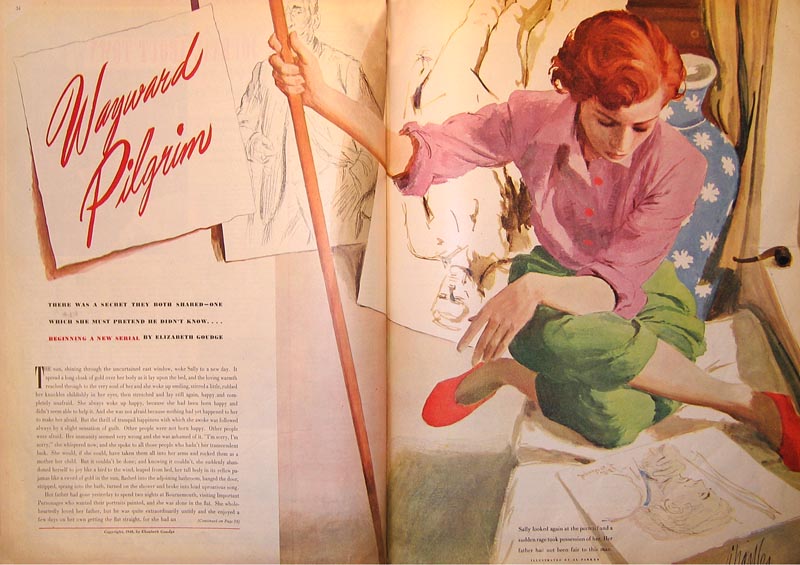
Jaleen added, "I too am wondering what exactly Rockwell was awed by. A strong composition, yes - I like the vase shape echoing the figure - and the radical angle of the pole, and maybe even the model's weird pose - but I don't think I would have paused in page-flipping had I not known about Rockwell's letter."
Jaleen, who has the great fortune to spend some time each month with Walt Reed at the Illustration House, happened to be there at the time of her writing:
"Walt just walked by," wrote Jaleen, "and I solicited his opinion."
"He figures Rockwell had been meaning to write Al for a long time and just found the issuing of this picture to be a convenient moment. Walt says he went to a talk Rockwell gave "quite a few years before" 1948, when Al was just starting out. There, Rockwell praised Al, particularly for the "small things he did" - like that pipe on the window ledge, the odd pose. Walt thinks it looks spontaneous enough to have been done from life."
David brought the discussion to a conclusion with this well-reasoned theory:
"After a little reflection, I guess I would refine my thoughts on the Rockwell fan letter as follows: By the time Rockwell wrote that letter he had spent nearly 40 years painting with oil paints on large canvases. He worked 6 days a week using a laborious, 15 stage progress with a variety of chemicals and drying agents. Despite Rockwell's magnificent achievement, he must have looked somewhat wistfully at the young Al Parker painting light, spontaneous, unconventional paintings with water based casein and gouache on small illustration boards. I'm sure Rockwell couldn't help but think about all the time he had spent waiting for paint to dry over the last 40 years, and all of the airy brush strokes, such as Parker's, that had been buried in layers of underpainting. The new world of illustration would be one where far less time was spent on implementation and far more time was spent on the imaginative and conceptual parts of the job. I'm guessing Rockwell understood the potential significance of that changing ratio. Parker didn't ask for permission to change the world, he took it. And I think Rockwell must have respected that, too. So perhaps this letter is symbollic of Rockwell's blessing for the future of illustration."
"It's all rampant speculation, of course, but Jaleen and I were both struck by the fact that Parker's illustration didn't seem like the kind of dazzling artistic performance that would inspire the second fan letter of Rockwell's life. On the other hand, if you look at the white space, the stream of pages that integrate the illustration by flowing from the background for the story's title into rough pencil sketches in the illustration itself, the unusual angle on the woman, the conspicuous brush strokes left in place-- Rockwell must have felt like the last neanderthal peering out of the woods at this strange new life form, the cromagnon man standing in the glen. I think it is a measure of Rockwell's quality as a person and an artist that he didn't think, "In my day, artists really had to work..." nor did he think, "If I were starting out today, I could be so much more prolific and have so much more fun...." He didn't even think, "how many brain cells have I lost by inhaling turpentine fumes for the past 40 years?" No, he thought, "what a wonderful, lively new aproach." That's someone who truly loves art."
How about you, dear reader... what do you think?
*ADDENDUM* Tom Watson sent a comment that requires a visual accompaniment, so for those who have been following th]e flow of the discussion, you might want to read the comments section first, then return here to read and consider the following...
Tom writes, "When I saw the Al Parker 1948 LHJ cover, it reminded me of the Norman Rockwell 1939 Saturday EP cover, painted over 9 years before Parker's cover. Both have vignette figures, and both have type designed around the figures. This was quite advanced for 1939, and I'm fairly certain Rockwell designed and lettered the type as he did on occasions for other illustration assignments."
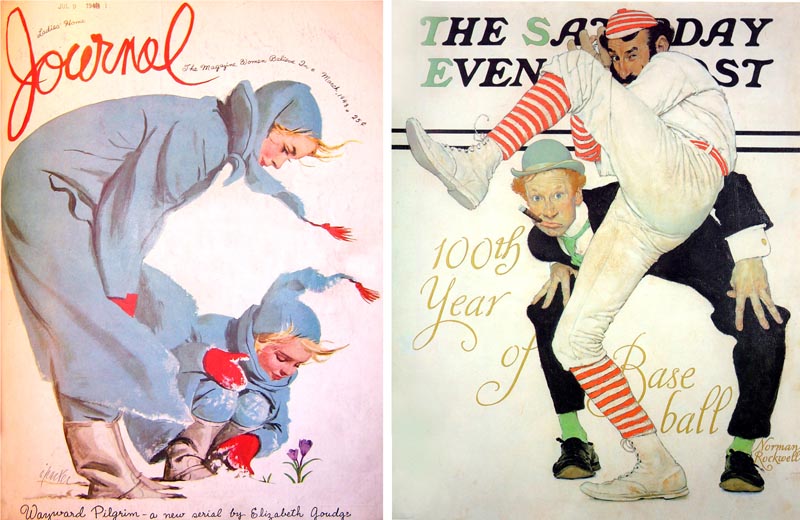
"IMO, it is as innovative in concept and well designed as Al Parker's version. I can't say for sure that Parker was influenced by anything Rockwell did, but this would be a remarkable coincidence, if he was unaware of Rockwell's innovative designing of figures and type, which was not just a one time shot. I think Chad Sterling was accurate in his assessment of Parker's LHJ cover- "The image of mother and daughter for example is very reminiscent of a Rockwell illustration in composition and spirit". I hope you agree with me, that in spite of Rockwell's corn-ball subject matter, his creativity wasn't so behind the times.. for a "Neanderthal". ;-) "
"I think posting the comparisons would be interesting to your viewers."
* There's more to see and read as this week's CAWS "goes wild" at Charlie Allen's Blog
* And the long lost artwork of a Toronto illustration legend is finally unearthed at Storyboard Central
* Finally, with Hallowe'en fast approaching, get in a ghoulish mood with Simon Peng's twisted tale, "Something Gory" at Leifdrawing 101
I think Rockwell admired Parker's economy of means. Parker says a lot with a few shapes and does it in a sophisticated, seemingly spontaneous manner. Rockwell was great but tended to employ brute force to render his ideas. He may have envied Parker's lighter approach.
ReplyDeleteWhen you mentioned Walt's memory of a lecture in which Norman Rockwell commended Al Parker's work, it made me think of an audio recording I had once heard. Below are some quotes from Rockwell's 1949 lecture at the Art Center College of Design. The audio recording these quotes derive from is a part of the archival collection here at the Norman Rockwell Museum.
ReplyDelete"Al Parker I believe, is the most creative illustrator we've had for many, many years now. I think he's got too damn many imitators, and I'm very sour about it too. I could give a whole lecture about what I think about people that imitate Al Parker."
"Al Parker has all this vitality and all this inventiveness and all this creativeness. I think he has the most of any illustrator maybe we've ever had. Geez-he's invented the close-up and all these things. He isn't following anybody else's funeral."
It was likely a matter of flattery that prompted Rockwell to note in his letter to Parker that it was "the second fan letter" of his life. He wrote letters of praise to other artists too-Ellen Pyle among them.
Not sure why the 'Journal' cover was the first scan....but thanks....it's one I'd never seen. All of Parker's work is just 'monster', and it's great to see something new. Walt Reed's and David Apatoff's conjectures are right on. Parker demonstrates again that 'change' I keep harping on. Sometime in the 40's he shook up the illustration world of the 20's, 30's, and early 40's....and kept shaking it throughout his career. The illustration of the girl, the odd position, the pole, etc. is a great example. Too bad (at least in the scan) the center gutter spoils the composition. I agree, Rockwell was no doubt moved to write by that, but also admiration for Parker's illustrative genius and apparent 'freedom'. Rockwell came along at a time when oils were the primary medium used by illustrators....and his work was always superb. But then gouache became easily available....and caseins, then acrylics. Thanks again, Leif, and to the many contributors who keep TI the interesting blog that it is.
ReplyDeleteI agree with Michael. The pose is amazing. Perhaps Rockwell simply understood how difficult it was to achieve what Parker had done in that illustration.
ReplyDeleteI've heard that same tape that CorryK mentioned, and I was amazed how many times Rockwell mentioned Parker--and what Rockwell called "the fine art men." Rockwell's own work during the late 40s shows an influence from Parker's compositional innovations--a lot of daring croppings and color treatments which perhaps ultimately derive from Degas.
ReplyDeleteAlthough Rockwell was a life long committed literal traditional illustrator, he was very aware of modern directions in both the illustration and fine art world. That included new theories of composition and color, and even the abstract movement. Although, with much reluctance, he used photography to stay current with methods and techniques in illustration of the day.. by the late 1930's. Many other illustrators refused to use photography, and considered it a sinful. The fact that he admired and acknowledged Al Parker as a great rising star, was no surprise if you've read Rockwell's autobiography and other recollections from those that knew him. Although he had a tremendous reputation since the 1920's, he was very humble about his success, and always worried about how long he could compete with each new direction in illustration. It is clear to me that in his letter, he knew his style of illustration was in jeopardy, along with other traditional illustrators, but felt Parker deserved his encouragement for changing the look of illustration. Rockwell was not the hopeless stuck-in-the-past, unsophisticated oaf that painted folksy subject matter because he didn't know any better, as some writings on him have suggested. I think that if Rockwell had tried to jump on the new wave band wagon that Parker and others were leading, it would have nearly ended his career in illustration, as it did with many that tried to become new wave illustrators.
ReplyDeleteTom Watson
It's lovely to see this post and the replies! I should clarify that these are not scans but snapshots with my camera, from bound volumes of the magazine, which is why the uneven coloration and the deep gutter. Best I could do at the NYPL, I'm afraid.
ReplyDeleteAnd another note related to what Walt says re: Rockwell's admiration of "the little things" - in the Famous Artists School lessons, Rockwell talks with characteristic modesty about how the satisfactory completion of his own work is due to the little details, and advises students to take note of them in their own work.
And I guess I want to point out that I think Parker was an amazing innovator, and my initial response to this picture was that I found it merely typical of his usual excellence, when I was expecting Extra Special innovative excellence, as I have seen in other pictures of his - which is by no means to say this one isn't good. It is. (boy, convoluted sentence! sorry. It's late.)
And thanks for the Wes Chapman link!!!
Leif, thanks for another great post. I've learned from the insights of your audience, particularly Mr. Gurney's observation that Rockwell did make some changes in the late 40s (which would make sense, as he was haunted by the fate of his predecessor Leyendecker who became obsolete before his time) combined with Tom Watson's point (with which I agree) that if Rockwell had tried to change too much it would have ended his career.
ReplyDeleteAlso, please allow me a moment of pride at how seamlessly the comrades of illustration combined the various pieces of this puzzle. You started the ball rolling by unearthing an obscure letter and posing the question to your audience; Jaleen did the hard work of tracking down the illustration, photographing it and circulating her photographs along with her insights to the larger group. Then Walt Reed added his unique contribution as the eyewitness who knew both Rockwell and Parker. Finally, you brought everything back together for your larger audience. (I of course played my customary role of innocent bystander.) Nice teamwork!
Great post once more, Leif!
ReplyDeleteTrying to find out what Norman Rockwell so much admired in these two samples by Al Parker...
well, that in itself is finest art education.
That letter is a part of Washington University in St. Louis' Modern Graphic History Library - I'm a senior there!
ReplyDeletehttp://library.wustl.edu/units/spec/MGHL/
I wonder if Rockwell recognised in Parker some shared vision of things and in a sense was anointing his successor.The image of mother and daughter for example is very reminiscent of a Rockwell illustration in composition and spirit. Clearly, Parker was the coming force, and was the future most palatable to the past master.
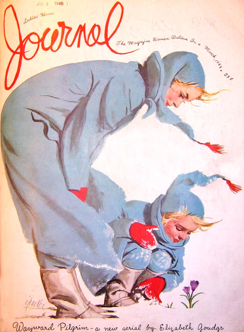
ReplyDeleteFirst of all,the cover art is beautiful,so it probably had an added effect on Rockwell.
ReplyDeleteI think he reacted to the people in the paintings,because his focus was
more on human interest than flash.I like the inside painting.It's well drawn,staged,composed,colored.The layout was modern without being overwhelming.Rockwell knew enough about that stuff to appreciate the integrity of the work.That probably combined with his long time appreciation of Parker's work.
You, Mr Apatoff? Innocent?? ;-)
ReplyDeleteI too really like how this collaborative post happened. I'm glad to see folks from the NR Museum here, as well as from St Louis. Which leads me to get on with proposing something I've been thinking of for a while.
The national Pop Culture Association conference is going to be in St Louis next year. How about people submit papers to the Visual Culture section, and see if we can't get enough of us together to have a panel of our own? St Loius, after all, has that excellent new graphic arts library...
http://pcaaca.org/
Jaleen, I must confess I was unfamiliar with the national Pop Culture Association but I followed your link to their web site and I see that they will have groups on "Fat Studies" (chaired by someone with an email address of "goddess"), Horror, Disaster, Tarot, Vampires, Punk Culture, and dozens of others. With variety like that to choose from, are you sure you want to propose this under the dry heading of "Visual Culture"? I am guessing you could lure more of Leif's readership with one of the juicier categories.
ReplyDeleteI'd take Rockwell at face value here: he admired what Parker did in "Wayward Pilgrim" because he couldn't do it himself. [Yeah I know I'm partially contradicting Walt here... but who else would try to get away with that?]
ReplyDeleteAren't we always most impressed by what we can't imagine being able to do?
Of all the extraordinary aspects of Rockwell's painting, he comes from the era of the stage-managed picture, indeed was always striving for the most telling pose, not the most natural one. The casual, candid pose (or the illusion of such) was something he couldn't do. At least, I can't think of a single one he did do.
Parker must have asked his model to get comfortable and she found that she would fall off the bench without the pole, so he let her keep it! What is it anyway, one of those poles models lean on? That's a nice twist: it must be deliberately posed after all. Or at least deliberately improvised.
Roger, when you said Rockwell didn't strive for the "natural" pose, it sent up a little red flag. ;-) My first thought was that pose looked to me to be anything but "natural".. casual looking and even spontaneous, maybe. Not only did it look unorthodox to me, but quite uncomfortable. I tried getting into that pose, and, although I am not young and limber like the model, I can't imagine anyone choosing to bend their legs like that, unless they are practicing the Lotus position, or doing stretching exercises. As an illustrator, on occasions I would ask the model to pose in a very uncomfortable position for photos, but it looked natural in the finished illustration.. so I understand what Parker was doing. My point is that Rockwell on occasion, actually did choose "normal" casual poses when he thought it would work best, as well as his typical exaggerated "stage managed" poses, which the latter contributed greatly to his immense popularity with the general public. However, there were skills that Rockwell did fall short- like mural painting, or certain decorative or stylized painting techniques, but IMO he was quite capable of painting "normal" casual poses, as I have found in a book I have, featuring all of his SE Post covers in color.
ReplyDeleteI think Parker extended the arm and added the pole as a design feature, to crop into the drawings hanging on the wall.. creating more interest, and a more effective composition.
Regardless, both illustrators certainly deserved the admiration and praise they received.
Tom Watson
This comment has been removed by the author.
ReplyDeleteWhile I lack the breadth or depth of either Roger Reed or Tom Watson in this field, and I certainly have the highest esteem for both Rockwell and Parker, I do agree with the notion that Rockwell tended to specialize in the archetypal, staged pose, while Parker (and Briggs and Fuchs) specialized in candid, impromptu positions. This doesn't mean that Rockwell's poses look unnatural-- in fact, they seem to be carefully selected as the theatrical embodiment of a natural pose, while Parker and his successors captured awkward slouches and casual, in-between moments that seem more-real-than-real.
ReplyDeleteThis evolution seems to continue a long trend that began in the 19th century when Manet and others abandoned the prototypical heroic poses of the academy and began focusing on the hired help in informal poses, causing the kind of ruckus that surrounded Manet's "Bar at the Folies Bergere." By the time the baton was handed off to Rockwell, artists had no trouble placing hobos and scullery maids at the center of pictures but Rockwell still seemed to believe that the picture should focus on a pose at the apogee on an arc, rather than some offhand moment on the way up or down that arc.
David, I think you make an excellent point, and your analysis is quite accurate. I would only add that for magazine covers, the message had to be crystal clear to communicate the idea. Story illustrations could be more vague and subtle. We don't have to know exactly what is happening in a story illustration, but it should function as a lure to seduce us into reading the story, which ultimately brings clarity to the illustration. Parker's cover illustration poses were never awkward or odd looking (that I recall), but not necessarily at the very top of the arc. I just want to be clear that I don't think one approach is better or worse than the other if done well.. different solutions for different venues, and "different strokes for different folks".
ReplyDeleteTom Watson
Tom, I agree with you 100% that one approach is no better or worse than the other, if done well. We are indeed fortunate to have this diversity of approaches to tickle our palates and, by contrasting one approach with another, to instruct us.
ReplyDeleteHmm Well I was just searching on Google for some Tarot readings of some Tarot reader
ReplyDeleteand just came across your blog, generally I just only visit blogs and retrieve my required
information but this time the useful information that you posted in this post compelled me
to reply here and appreciate your good work. I just bookmarked your blog