Those interested in reading the text should click on each image to see a larger version of the scan.


The Famous Artists School continues to this day! Please visit the school's website for details.
The school also hosts a page devoted to guiding faculty member, Bernie Fuchs on their site, which includes a biography of the artist and a gallery of his work.
Many thanks again to Matt Dicke for providing this week's scans.
* My Bernie Fuchs Flickr set.
It's interesting that the picture selection for Bernie Fuchs work here, though no doubt done by his hand, seems so far removed from the style I thought he was known for - the reductive, wash-heavy oil paintings like this one: http://www.askart.com/AskART/photos/ILL1161999/70.jpg
ReplyDeleteI'm pleased that you're neing introcuced to Bernie Fuchs' early work via my blog, Casey. You'll find many more examples in my Bernie Fuchs Flickr set. The style you know him for is a later development. What do you think of this earlier work by contrast?
ReplyDeleteIt's cool, I'm just surprised its so different. The compositional eye is still very similar, but the colors are so much brighter than later, when most stuff was washed over in those browns and reds. Idunno, haha! It's like looking at young Al Pacino and the older Al Pacino: in reality they're the same person, but if you didnt know that beforehand, they could easily be mistaken for different people.
ReplyDeleteAnyways, huge thanks to you for keeping up the blog, I've been a fan for a couple years now and hopefully for many more!
My pleasure - that's what its all about :^) I like your Pacino analogy! Personally I prefer both BF's and Bob Peak's early work. Not that they were resting on their laurels later, but there's a vitality, a sense of youthful experimentation, in their earlier work that really floats my boat.
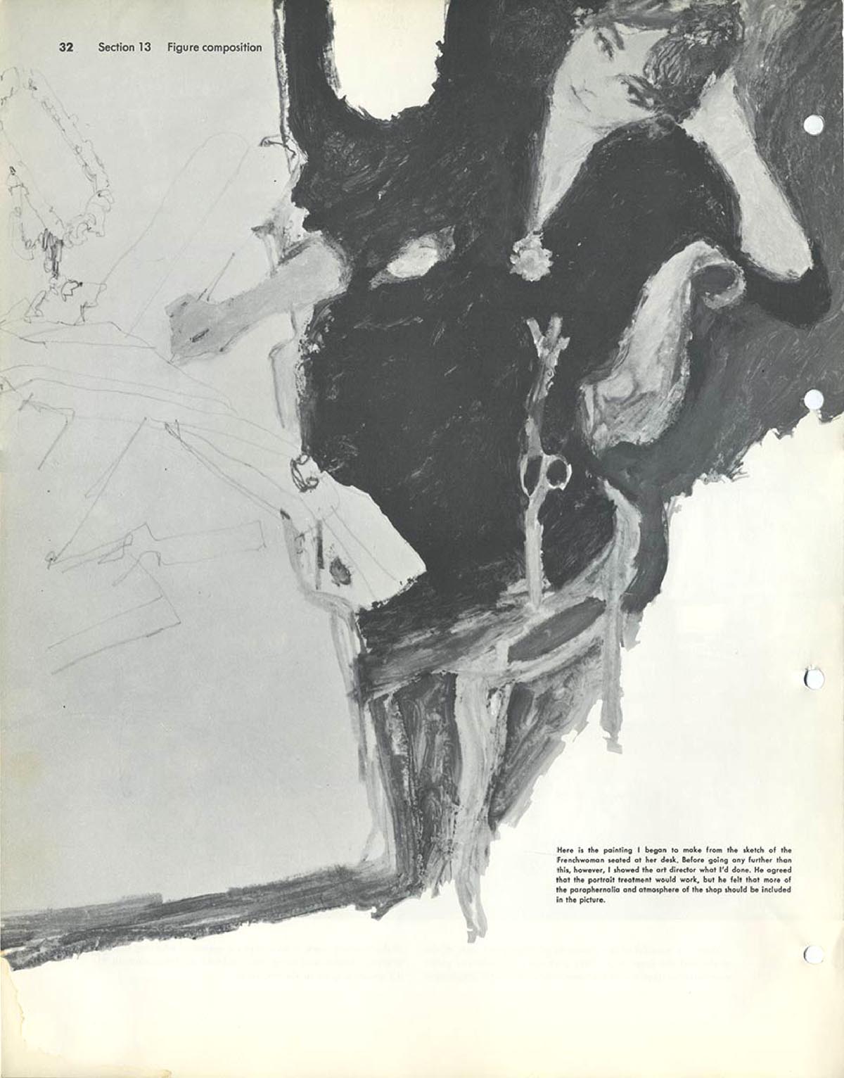
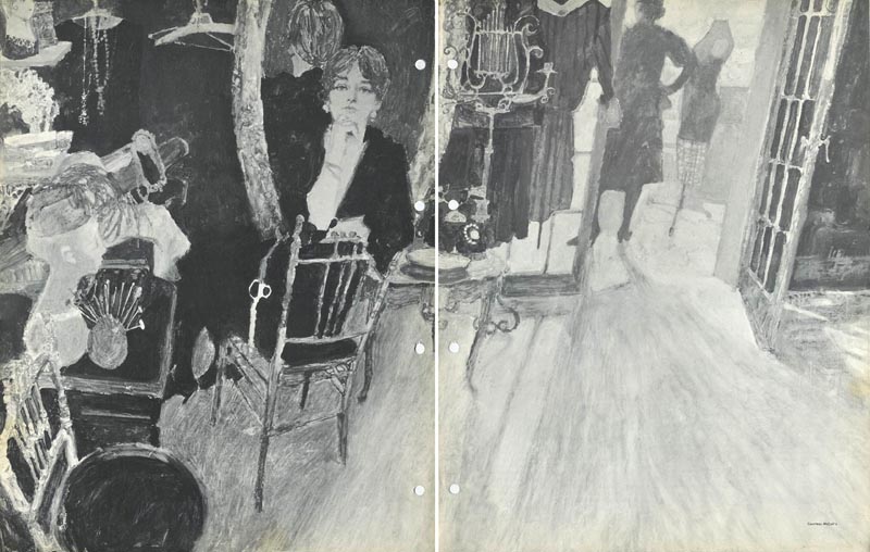
ReplyDeleteAhh, yes. "The Frenchwoman" was Bernie Fuchs at his best.. not that he ever did bad illustrations. But, this really shows how incredibly great he really was. No other illustrator IMO, had Fuchs' unlimited capacity to combine full range of ingredients.. skilled stylized draftsmanship, trend setting composition, subtle elegance, expressionistic brush work and color, and an amazing ability to logically and esthetically create a dynamic visually pleasing concept. 1960's or 2009, this is the top of the ladder for illustration.
ReplyDeleteThese explanations by Fuchs are great bits of behind the scenes information for anyone who appreciates high quality illustration. You are on a roll, Leif. ;-)
Tom Watson
Hi everyone. I am glad you are enjoying the Fuchs Fac as much as I do. I was familiar of Fuchs later work too but not a huge fan of his work till I picked up these FAC books. Fuchs early work blew me away and I have to agree with Leif "there's a vitality, a sense of youthful experimentation, in his earlier work" that is inspiring. Ironically I picked up these books to find more out about Bob Peak's early work and what I was introduced to was way better Bernie Fuchs 60's work. Don't get me wrong I still like early Peak but the compositions and graphic style of early Fuchs just has something more.
ReplyDeleteMatt Dicke
P.s. Yes I am scanning in that Peak FAC chapter and hopefully Leif will share it with everyone.