Friday, May 29, 2009

Remembering Jack Kamen

By guest author Tom Palmer:

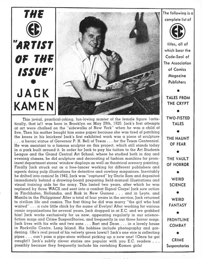
Friday, May 29th, 2009, would have been Jack Kamen's 89th birthday. Sadly, he is gone, passing last August 5th, 2008, this is my recollection of Jack and the enormous impact he had on me and my career.


I met Jack Kamen by answering an ad in the Sunday New York Times placed by a small advertising art studio on 40th and Madison Avenue in NYC looking for a freelance board artist.


It was a serendipitous moment, arriving at the studio for an interview and being introduced to Jack, I got lost in conversation with him about comic books and almost blew the position interview. Jack was at the studio as a freelance artist doing illustrations for his clients and the studio he had space in.


Jack left EC Comics and the field a decade earlier and had built a very solid career in advertising art.


I can only describe myself as young, idealistic, enthusiastic, and clueless about this new world I had entered into. I was going to art school at night and my only experience in the field was a short stint in a big advertising studio next to Grand Central Station where I was the classic apprentice and "gopher". I would "go for" lunch and "go for" job pick ups, but never had enough time in to be given a board to work at. I did pick up enough to understand how to do a "mechanical", a mainstay in ad production at the time, and I left the studio shortly after with enough knowledge to go out and secure a studio job. It was at this moment when I walked into the studio on 40th Street and met Jack Kamen.


Jack and I hit it off immediately, I was a wide-eyed fan who could not believe that I met a celebrity, a real life comic book artist, and for Jack, I was a gushing fan in a field where advertising illustrators were a commodity and his recognition was more from an art director's appreciation for good work on time, usually without credit in print, but Jack was a very successful illustrator by any other description.


Jack Kamen and I were kindred spirits in many ways, we were both enthused fans of illustration and illustrators past and present, only he had a much bigger cache of knowledge on artists I had never heard of, and in a personal way, our early lives were similar in that we both lost our fathers when we were young. That was ultimately our true bond, he saw himself in me and I found a surrogate father.


My time in that advertising studio on Madison Avenue was spent with my drawing board just six feet from Jack's, we spent our days talking, mostly me listening, and when I had a chance to break, I got up and looked over his shoulder as he worked. He did his share of small line drawings for his advertising clients, but he also worked on very large color pieces that I considered paintings but really were Jack's multi-media works of art that rivaled the best in the field. All the time I was being exposed to skills and knowledge that would surpass those skills I was acquiring in art school, not to diminish the latter, but I've found that artistic ability can go undefined without survival skills.


Jack started me on my illustration career while in that studio, passing along some of his small clients that he had outgrown. He was my mentor and guiding light at a time when I needed it the most, a good friend and always my surrogate dad until his passing in August, 2008.

In the last year of Jack Kamen's life I had the good fortune to interview him by phone at his home in Florida about that time we spent in the studio. Prompted by Leif, who thought it a worthy subject for his illustration blog, little did I know that our unfinished discussion would be our last with many more questions to be asked and now that opportunity forever gone.

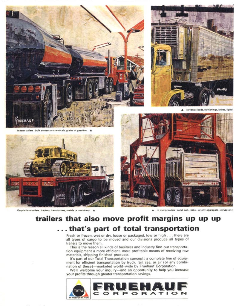
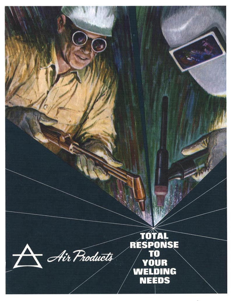
That initial interview with Jack Kamen is presented here where he discusses his unique approach to painting those magnificent large scale illustrations for Mack Truck and other well known clients.


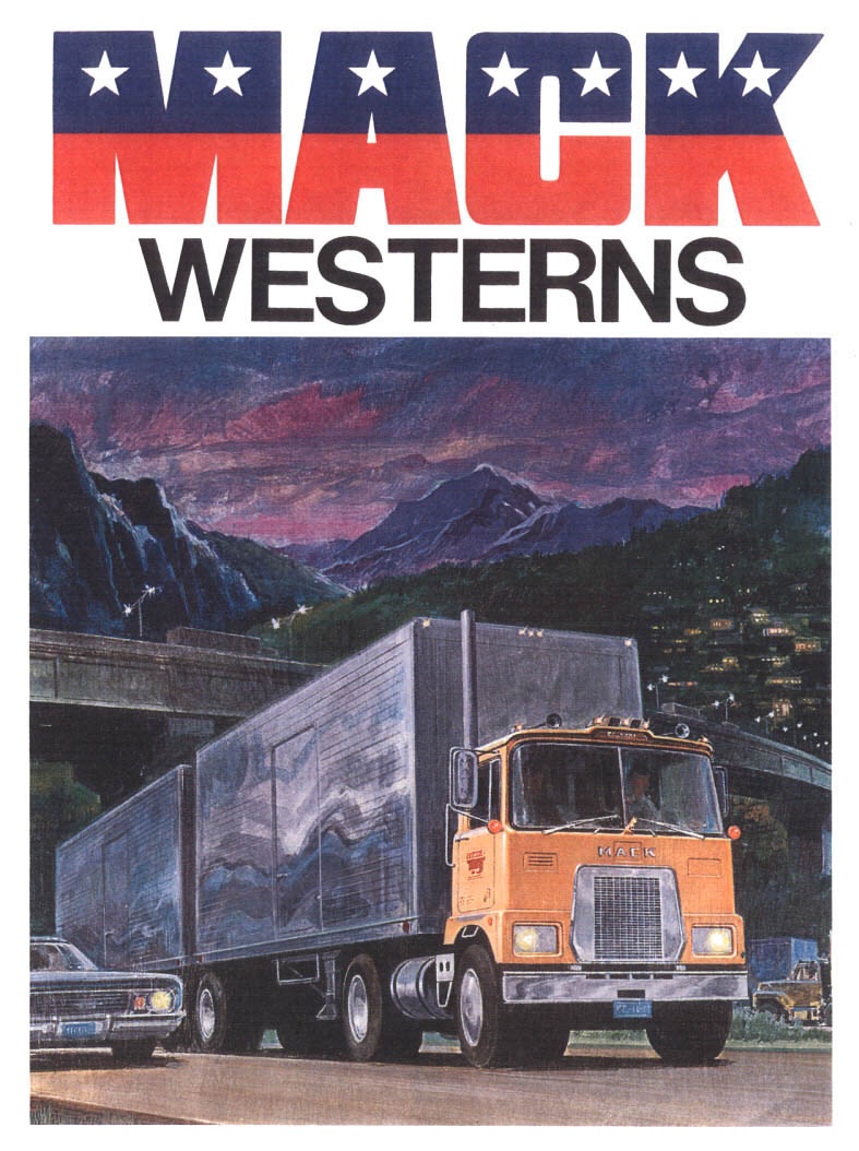
Jack Kamen mentioned years later that his painting method was an unorthodox hodgepodge of mixed media and the use of an electric eraser to create his paintings.

Jack: "Did you know I used Prismacolor pencils along with an acrylic paint wash to create my paintings? I would use a smooth illustration board and apply my basic color in a very watery wash of acrylic, and after it dried I would start rendering with Prismacolor pencil. Then I would take an electric eraser, with a particular eraser, that when you erased anything, before you got down to removing color, you could mix the color pencil very, very smooth, almost like an oil painting."


"For instance, I would mix a puddle of acrylic paint flesh color and put that down as a watercolor wash. As soon as it dried, I would add all the details in colored pencil. In areas that needed correction I would paint opaque white acrylic and then go back and do color pencil again. The electric eraser blended all the pencil into a smooth look."

"If you look at a painting of Santa Claus, the beard is opaque white acrylic, put down as a watercolor wash, then the shading and gray tones were added in color pencil, the electric eraser gave the fuzzy look to all that."


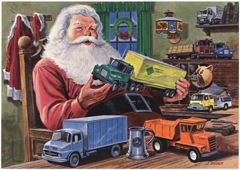
When prompted, Jack said he heard of another artist doing something similar but had forgotten his name. He tried it with modifications and it suited his approach to painting. He said he hated painting in oil in art school, found acrylic more enjoyable, the addition of Prismacolor pencil with it's wax base, and his application of that electric eraser after, his personal painting method. Looking at the illustration samples, who would have known!


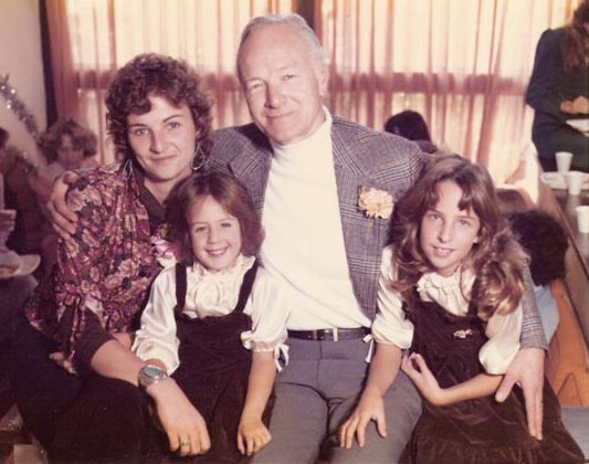
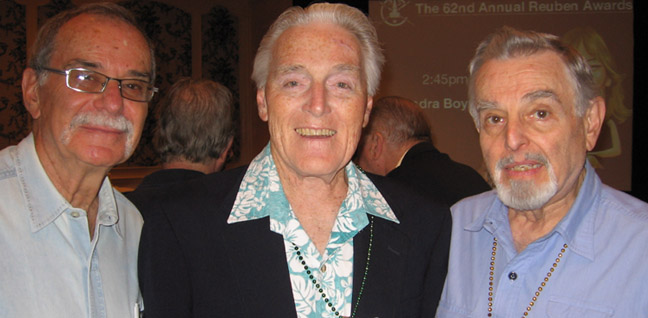
Many thanks to Tom Palmer for sharing his recollections of Jack Kamen with us. I have always had the greatest admiration for Mr. Kamen's work, and its a privilege to have hosted Tom's personal story of his friend and mentor here on Today's Inspiration.

* My Jack Kamen Flickr set.

Thursday, May 28, 2009

Stan Galli Remembered

Back in March I began corresponding with Tom Galli, son of West Coast illustrator, Stan Galli. I asked Tom to share some recollections from his childhood growing up in Stan Galli's home. Here's what he wrote:

There are some things from childhood that are not as fresh in my memory bank as should be, so I will just ramble on a bit...

I cannot speak for my brother Tim but I remember somehow taking Dad's illustrating for granted... Family friends were Fred Ludekens, Bruce Bomberger, Jack Dumas, Al Dorne, Stevan Dohanos, and many publications were all standard parts of our daily life. Dinner time often found us at the table looking at and discussing some illustration or other in terms of feelings evoked, color, shapes, forced, etc...


As Brooke posted on your blog, the entire neighborhood participated in most illustrations by way of posing for dad. I can now look at an illustration of dad's from way back and say oh, that is Peter or me or Tim or Jack Dumas.


Many times our school teachers would walk us up to our house to see dad and watch him work.


(Grammar school was only three blocks away in a very rural setting.) Most dads were off at work but my dad was always available at home so when a fire drill occured I thought it was time to go home. Of course I did not just go home quickly but sort of miandered up the creek from school to our house where it continued on to many of my friend's homes, so it was well past the time to reasonably go back to school.


I would go into the studio and dad would ask me why I was home so early- "they let us out early".

I was probably in the third grade or so before I noticed that not only were we a somewhat unique family but that we were growing up in a rather special neighborhood. Every one was a professional of high calliber and many of them were or became very famous. Haines Hall of Patterson & Hall lived up the street near Lawrence Halprin the famous Landscape Architect who lived close to Bruce Bomberger.


To this day we are very close friends to another neighbor and illustrator Dan Romano who lived near Joe Esherick the famous architect. The mother of one of my class mates was the Secretary Treasurer of the U.S.


One of the most unique experiences that dad's profession offered us was the ability for us to go on vacation anywhere and dad could still work.


It was not unusual for us to go to a ranch in New Mexico, rent a house on an ocean bay, to participate in a working ranch in the mountains for the entire summer. All this was considerable fun and very important in the lessons of life.


If there was anything to describe dad's success I would have to say his incredible ability to obseve and learn from it. Not just looking at everything but most importantly seeing what he looked at. The other thing about dad was his desire to expose himself and us to everything possible, not just art. My brother and I, at age 16 & 17, were sent to Texas to photograph freeways then on to New Orleans to visit dad's friends on our way to Clearwater, Florida to find and photograph a washed up palm tree on the beach... now that was an unforgetable experience!

Dad would always be 'scrapping' (tearing out pages of publications) from every source and on every conceivable subjuct. He was always studying everything from wildlife to clothing to plants to cars to ships to history to people, so that he could draw with accuracy and without future reference.


He can draw anything without reference material and at any scale and from any view point. The ceiling of my bathroom, to this day, is a scene of a giraffe and a monkey in amongst trees and grass. The entire wall of my son Tony's room was a Calvin and Hobbs scene by dad.


Dad is not a pretentious person so there was never any issue about what noteriety he may have achieved. He does not live in a big house and never drove fancy or expensive cars. He was constantly immersed in drawing. His loves in life are few: wife, drawing, family, not in any particular order. I sense that he now would like to have promoted himself for more recognition.

Sadly, Stan Galli passed away about a month ago.


Tom and I had begun these correspondences in the hopes of presenting a week-long look at his dad's career. I hope that we will still be able to do so some time soon.

* My Stan Galli Flickr set.

Wednesday, May 27, 2009

Frank Soltesz Remembered

"Some people are born with a natural talent that, when nurtured and developed through hard work and determination, not only provides them with a comfortable means of living but elevates them to a position of prominence and respect in their community and among their peers. Frank Soltesz was such a person; a small-town boy who loved to draw pictures and grew up to become one of the finest commercial illustrators of his time."


So begins the first paragraph of Frank Soltesz' biography as written by his son, Ken, on the website he built in 2008 to honour the memory of his father. Yes, there is now a Frank Soltesz website!

When I first wrote about Soltesz' remarkable cutaway illustrations for Armstrong's Industrial Insulations it set off a firestorm of interest around the Internet. But Soltesz himself remained a complete mystery. Out of the blue, this comprehensive Soltesz website appeared last year. I was so pleased to be able to contact Ken Soltesz and let him know how his father has a new generation of admirers. Ken wrote back:

"Thank you for your email and the very kind sentiments. I wish you had known my dad. He loved to "talk shop" with fellow illustrators."

"I may someday decide to redo the website - with a better presentation and more illustrations [especially more of his commercial work]. This was my first attempt at making a website, and it's a bit amateurish. When I do, I might like to see what you have. My dad saved examples of all his work, but one day he got tired of all the piles of magazines and he went through them, cut out all of his artwork, and pasted them into scrapbooks - using rubber cement. The glue seeped through the paper, badly discoloring the artwork. So now I have boxes of almost useless material."

"I've enjoyed your website; especially the pictures of other artists workspaces."

Best regards, ...Ken Soltesz


Armstrong Insulations was certainly one of Frank Soltesz' major advertising accounts during the late-40's... another seems to have been TWA Airlines. Usually Soltesz illustrated large single scenes as in the example above...


... but here's an interesting variation where the client utilized Soltesz' skill at rendering complex architecture...


... and his expertise with cutaway illustrations.


I encourage you to visit Frank Soltesz.com and read this lovingly presented story of an illustrator who produced some outstanding and singularly unique work.

* My Frank Soltesz Flickr set.

John Fulton Remembered

Not long after I spent a week on the artists of Blue Book magazine, the following email arrived:

Hi Leif,

I ran across your Blog on the Pulp Blue Book Illustrators and saw the article about "Gramps" (my grandpa) John Russell Fulton. It truly made me happy and I have to show it to my dad. Gramps did a lot of oil paintings, too, but I personally enjoy the thick scratchy lines of his illustrations.

Carol


Imagine my delight! Carol and I began corresponding about her Gramps. Here's her next note:

Hi Leif,

I'll see what kind of information I can gather from my dad or from the Fulton archives for you. (Gramps died when I was about 14, and although I could relate to you some facts about his career, they are a little vague.)


Next time Carol wrote, she confirmed some of the things I had surmised in my initial post about Fulton and the other 'old school' Blue Book artists:

...surrounding the "ousting" of this group of pulp illustrators from Bluebook... it jibes with what my dad can recollect/what I can find in the files we have. Because, -- in the brief phone convo. with my dad the other day (btw-- when I told him about you, he was happy that someone took note of his "Pop") he rambled in his grumpy old man voice about the "big jerk" at Bluebook (LOL) who was apparently behind the oustings/replacements, and mentioned another "real good guy" at the top who was friends with Pop, but unfortunately got ousted along with the illustrators.


This was really interesting to hear. The next time Carol visited with her dad, she sent even more detailed information about the situation her Gramps had had to deal with at Blue Book, which had been one of his important accounts at that time:


I just got back from a (not long enough) trip to my parents' house. My dad's memory is in a pretty bad state, and I needed to go through many papers and letters, etc.. myself and read and sift to get Fulton information. Luckily, my dad began a memoir-type thing about Gramps, and I was able to, with old bios, collect interesting facts. I have also been writing down things myself. When I put it together, along with my impressions of Gramps, I will send it to you.

A few things stuck out in my mind to tell you when I was searching:

-How important it is for an artist to document all their own work so their kids/grandkids have a record of what they did, and when they did it-- no matter how seemingly mundane the artist thinks the work is. (A lot of Gramps' illustrations have no date or record of for what magazine they were for-- yikes!--- and we grandkids (4 of us) have no idea in what magazine they appeared. There are names of products he designed for with no pictures and pictures of products; with no dates or where they appeared. I don't think Gramps thought of these as art, merely work.


-How right you are when you mentioned the importance of adapting your illustrations to the changing times and moving forward. Not sticking in one style, but progressing. And not merely *knowing* you have to, but doing it, no matter if it seems uncomfortable in the beginning. Although my dad said Gramps did his best work after the magazine illustration years (when he really found out what his capacity was as an artist), he always yearned for those good old illustration days in N.Y. and always wanted to move back.

-One of the Blue Book covers (the "Men of America" series, I think), had Mark Twain on the cover. (Mark Twain's cousin Cyril Clemens, wrote Blue Book a postcard to the editor (Kennicot?) to congratulate Gramps on his accurate rendition of the scene.) My dad said that the original cover oil-illustration was lost. I just found it being auctioned on AskArt.com. Huh.

-I also found this interesting letter written by my Grandma to someone about Gramps' friendship to Kennicot, and Kennicot's "sudden retirement" and the "killing of Kennicot's Blue Book", and she'd have to go into the "long story" later-- but the rest of the letter was missing!


Needless to say, although I gleaned much info., I also realized that, unfortunately, my dad only organized things part way, and there are lots of loose ends that need to be sorted, documented and dated.

Anyway, I will get back to you when I straighten out what I have.

Take care, Carol


Since that time, Carol has done an amazing job of researching her Gramps' career... and just today, by coincidence, she sent a wonderful assortment of scans that she and her brother prepared from the family's files. With all this material on John Russell Fulton ready to go, you can expect to see a week on the artist, guest-authored by his granddaughter, Carol, some time very soon!

* My John Russell Fulton Flickr set.

Monday, May 25, 2009

Pete Hawley Remembered

One of the nicest things about putting together Today's Inspiration is being contacted by people who have a personal connection to an artist I've featured. Often they will share with me some fond memories of that loved one whom we know only through the work we admire. This is always especially exciting for me! Its wonderful to learn a little about the person behind the art from someone who knew them as a teacher, friend, or family member. This week I'd like to share some of those correspondences with you.


A little while ago I receive an email from Shelley Nugent. In July of 2007 I wrote about her grandpa, Pete Hawley. Shelley offered to fill in some background details about his career. We began corresponding and I asked Shelley to tell me what she remembered about her grandpa. Here's what she wrote...

"My grandparents lived in Sedona and we lived in Phoenix (120 miles apart) so we saw my grandparents a lot. Actually, I was born in Cottonwood (15 minutes from Sedona, there wasn't a hospital there yet). My parents lived up there when my dad came back from Vietnam. I was born , the first grandchild on July 13th on my grandpa's birthday 5 weeks early. He used to like to say he got a pear tree and a granddaughter that year for his birthday. I'll be 41 this July."


"We saw them a lot. My dad was very close to his parents. He never missed a Mother's or Father's Day with them. He has an older sister Susan who still lives in my grandparent's house and a younger sister Jane. She died in 1993. She was my favorite Aunt. My grandpa had a studio off the kitchen with it's own bathroom. It had windows all the way around it. When you'd open the door, you'd have to step down 2 steps. It always smelled like old man Old Spice and paint."


"He would take pictures of neighbor kids or us kids to use for his drawings. He used his kids a lot when they were little, they were beautiful kids. He had this black & white Polaroid camera that spit the pictures out and they smelled really bad until they dried. I don't know exactly when he retired, my dad might know. I remember him working until I was in my teens I think."


"When I was little I would bring him his cookies and Instant breakfast at lunchtime and stir his water bowl (where he'd rinse his brush) and make all his cigarette ashes come back to the top. (He smoked for a little while) Unless he needed my help with something, we didn't bother him. If I was quiet I could color on the floor. He worked for American Greetings then."


"He would on his own make Xmas cards for his friends depicting the menagerie of dogs & cats he and my grandma had. He had really nice handwriting. I know that he wrote left handed, but I actually think he could paint with both."


Above, a photo from 1979. Shelley writes, "12/21/1979 My Aunt Jane (now deceased), my younger sister, my grandpa and me."

* Shelley is helping me develop a week-long series about her grandpa, Pete Hawley, which I hope to bring to you some time soon.

* My Pete Hawley Flickr set.

Friday, May 22, 2009

NCS Luminaries: Frank Springer

I'm sitting in my hotel room at the Renaissance Hollywood Hotel on the afternoon before the 2009 Reubens Awards and preparing this final post on the Luminaries of the NCS series! Ain't technology grand? Since this is the final post, I felt it would only be fitting to honour Frank Springer, long-time member and past-president of the NCS.


Many thanks to Dave Karlen for his generous assistance with this week's look at some of the luminaries of the National Cartoonists Society. Today we 'reprint' Dave's post on NCS member, Frank Springer:

"Here is the short N.C.S. bio [written during Springer's '95-'97 NCS presidency] on one of the longest lasting artists in comics, Frank Springer, whose wild point of view was always welcome as seen in this example from Dell's mystery anthology book."


"Born, December 6, 1924 in New York city. Malverne L.I.H.S. in 1948. Bachelor of Arts from Syracuse University in 1952. U.S. Army 1952-1954. Assistant to George Wunder on "Terry" 1955-1960. Freelance ever since. Comic books for Dell, D.C., Marvel, - Sports, Political cartoons for New York Daily News, Newsday and others."


"Illustrated strips for Playboy, National Lampoon, Inside Sports, Games. Drew "The Adventures of Phoebe Zeit-Geist "(Grove Press) with the late - alas - Michael O'Donoghue."


"My own strip "The Virtue of Vera Valiant" with Stan Lee - fun while it lasted. Animated some Saturday A.M. mayhem - "Space Ghost" - with a group which expanded - later- into "The Berndt Toast Gang" - now the Long Island chapter of the N.C.S. Currently illustrating "The Adventures of Hedley Kase" for "Sports Illustrated for Kids". Member of National Cartoonist Society since 1965 - category awards, comic books for 1973, 1977, 1982, served on board for off & on, eight years - currently president."


"Married Barbara Bunting in 1956 and we have five wonderful children. Acted in amateur theater for twenty years, biked across Iowa a few times, ran a marathon, followed the Mets. Toughest- the later. Enjoy opera, vintage pop & jazz. Live on the water in Damariscotta, Maine after sixty five years on Long Island. As you see by this sub-par lettering, I'm a lefty."


* Thanks to Dave Karlen for providing the text and original art scans above! I wanted to just add that it was an honour to meet frank Springer at last year's Reubens Awards in New Orleans. Below is a photo of Frank (center) from that 2008 event, courtesy of my pal, Mike Lynch. At the time, I had no idea it would be the first and last time I'd meet Frank, whose work I'd always greatly admired... sadly, he passed away on April 2nd of this year.

Hy Eisman stands on Frank's right in this photo and on his left is Stan Goldberg. In a much longer, extremely comprehensive bio on Frank Springer on wikipedia, Stan is quoted as saying, "Very few people could surpass him as an artist, as a gentleman, and as a true gentleman in my field. . . . When you see a Frank Springer job, you know it's going to be the best job in the world."


To leave you with one final quote, I asked Thomas B. Sawyer (who was the subject of a week of posts here last year) about Frank. He called him "a lovely guy, handsome, witty, theatrical and colorful."

I know we at the National Cartoonists Society will all miss him.

Thursday, May 21, 2009

NCS Luminaries: Jack Kent


Continuing, with the generous assistance of Dave Karlen, this week's look at some of the luminaries of the National Cartoonists Society. Today we 'reprint' Dave's post on NCS member, Jack Kent:

"Another favorite in my series of cartoonist from the National Cartoonist Society archives is the whimsical beloved strip King Aroo by Jack Kent."


"The artist's open loose-lined art style coupled with its many sophisticated puns and wonderful wordplay had many fans compare his work to classic strips like Pogo, Barnaby, Little Nemo, and Krazy Kat."


"Here is Kent's short bio from the NCS archives in his own words:"

"Getting from 1920 to the present with a minimal loss of parts and faculties has been my most noteworthy accomplishment. Along the way I have drawn a few cartoons and magazine gags before and after my stint with the army in WWII (1st Lt, FA)."


"The very comic strip King Aroo, which ran (or jogged) for fifteen years, beginning in 1950, made me world famous for blocks around."


"Since 1967 have been writing and illustrating children's book's."


"There have been over forty up to this time, (2:45 PM but my watch may be slow) and more are in the womb."


"I'm having more fun, my wife is an angel, my son is a genius, and I am thrice blessed."


* Thanks to Dave Karlen for the King Aroo original art scan near the top of this post, as well as for today's text.

*The King Aroo Sunday strip is courtesy of Sherm Cohen, who has much more about King Aroo on his blog, Cartoon Snap! Thanks Sherm!

The Jack Kent children's book covers were found at Amazon.com

Wednesday, May 20, 2009

NCS Luminaries: George Evans


Continuing, with the generous assistance of Dave Karlen, this week's look at some of the luminaries of the National Cartoonists Society. Today we 'reprint' Dave's post on NCS member, George Evans. Here's his bio from Dave's blog:

"By the wee hours of the 5th of February 1920 a blizzard had buried tiny Harwood Mines, Pennsylvania up to the clothesline. It stopped the doctor, but with an assist from a midwife, I got through. Harwood's only "literature" was the newspaper, and by the age of four, driven to know what those wonderful cartoon character's were up to, I learned to read -- and have been hooked on comics ever since."


"A depression kid, I worked any/every kind of job I could find to buy an art correspond ence school course. I began (modestly!) sending stuff to the "pulp" mags, and my first sale was at age fourteen. After three WWII years in the Air Force, I got staff job at "Fiction House" in New York. Took courses at Art Student's League but stupidly quit for work offers. I did nearly every kind of illustration work, and much comics. Ghosted bits for many "name" strips, including the "Terry and the Pirates" dailies for George Wunder that lasted thirteen years. Past fourteen years writing/drawing "Secret Ag ent Corrigan" for King Features Syndicate, plus commissioned paintings (especially aviation)."


* Thanks to Dave Karlen for providing the scans and text above!

I wanted to just add that some of my favourite George Evans artwork is from the mid-50's EC 'Picto-Fiction' magazines like Shock Illustrated and Crime Illustrated. Here are a few examples from the Gemstone Publishing hardcover collections of the EC Comics Library.


* For those interested in learning more about the tremendously talented George Evans, I encourage you take a look at Jim Keefe's excellent George Evans website. There you'll find a much longer biography of the artist as well as an extremely interesting interview with Evans conducted by Keefe. I'll mention one quote: Keefe asked Evans which illustrators he admired, and Evans replied, "Andrew Loomis, von Schmidt and Edwin Georgi."

*ALSO* Be sure to check out this week's CAWS, just posted over on Charlie Allen's Blog!

Tuesday, May 19, 2009

NCS Luminaries: Paul Fung Jr.


Continuing, with the generous assistance of Dave Karlen, this week's look at some of the luminaries of the National Cartoonists Society. Today we 'reprint' Dave's post on NCS member, Paul Fung Jr. Here's his bio from Dave's blog:

"Born Seattle, Washington, March 9, 1923. Graduated from Pratt Institute. From age three, I grew up with every great cartoonist -- called all "Uncle". Marion DeBeck was my godmother. Didn't realize how lucky I was to mingle with such great company till later in life. Nor of Dad's reputation -- at four was in "Our Gang" comedies -- Did vaudeville for a few years, plus movie shorts -- then some radio kids shows, was a New York Yankees baseball team mascot via Lefty Gomez, Gerhig & Demaggio in 1936 to '39, flew with Gen. Chaunalt, in the 14th, 7th, 5th & 20th -- Air Force, CBI."


"Worked in advertising agencies after discharge in 1946. Artist, art director, production manager and account executive. Then King Features Syndicate for eighteen years as artist for special service department, drew Blondie comic book for forty years in all, over 500 comic books."


"Am proud of being voted best book artist and humorist by NCS in 1964 and 1980. Live on a 62 acre plot of land with my wife Carol, and a son who returned after wife problems. Daughter moved back too, after a ten year Army career. Have 4 grandchildren -- all girls. Working on animal cook book and entering local art shows. Still drawing (with a slanted view)."


* Thanks to Dave Karlen for providing all of today's scans and text!

Monday, May 18, 2009

NCS Luminaries: John Romita Sr.

John Romita has been my comic artist hero since childhood. I began collecting comics when I was in grade 1 and realized almost immediately that Spiderman was the coolest character ever. I spent an awful lot of birthday, Christmas and allowance money on Marvel comics at that tender young age, and poured over every drawing of Spidey in The Amazing Spider-Man, Marvel Tales and Marvel Team-Up. In grade 2 I began studying the credit block that appeared on the splash-page of every Marvel comic. It was a revelation to realize that different artists were responsible for drawing different comics - even when they featured the same character - and I began scrutinizing the artwork in my Spider Man comics in greater detail. If I found a particularly good drawing of Spidey, I'd ask my mom or dad for a piece of carbon paper and a sheet of typewriter bond and trace off the drawing. For this young art connoisseur, the best Spidey artist to trace over was John Romita.

By the time Marvel began advertising these medallions below in their comics in 1973 I knew two things: that the artwork was by John Romita and that I absolutely positively had to have one.


The following summer at the Canadian National Exhibition I experienced the happiest day of my life.


I was ten years old. Yeah, I knew the guy in the suit wasn't really Spider Man, but wow, that medallion - and as a bonus, my parents bought me the same Romita art on an accompanying t-shirt. I was in heaven!


Flash forward 35 years. By chance, I recently found a terrific blog put together by Dave Karlen, who is a dealer in original comic art. Dave has been posting about various notable members of the National Cartoonists Society - and one of his posts was about John Romita. You may recall that I was accepted into the NCS last year and attended my first Reubens Awards ceremony in New Orleans. With this year's Reubens almost upon us, I thought it would be nice to spend the week showcasing some NCS Luminaries. With Dave's generous assistance, that's exactly what we'll do!


From Dave Karlen's blog:

"This is one comic artist that I have unfortunatly never met but would love to do so, since I respect his work so much. After a short stint in commercial art..."


"... John Romita broke into comics in 1949 working for Stan Lee on various war, western, romance, crime and horror titles at Atlas."


"When that company folded he went to National to perfect his slick illustrative style doing mainly romance stories for a few years..."


"... before his return to Marvel jumping head first into super-hero titles like Captain America, The Avengers, Daredevil, and his best know work, Spider-Man. Leaving that title in the early seventies Romita became an art director at Marvel working numerous special projects and overseeing Marvel's children's book line, before returning to his signature character illustrating the popular Spider-Man syndicated newspaper strip."


For his NCS bio, John Romita wrote:

"Born in Brooklyn, New York, January 24, 1930 to Vic and Marie Romita. who eased me thru the Depression and set me on a good course. New York School of Industrial Art (now Art and Design) forged and launched me into comic book art. Marvel Comics' rise to prominence and collaboration with Stan Lee, creative force behind that rise, led to Spider-Man strip team-up of Lee and Romita in 1977. Handled by King Features Syndicate, the strip appears in over four hundred sixty papers. My wonderful Virginia has made it possible to meet deadlines - her support and patience cannot be gauged. She has also blessed us with two sensational sons, both well on their way to successful careers - Vic, a fine teacher, and John Jr. doing a great job as a comic artist."


Many thanks to Dave Karlen for allowing me to 'reprint' his terrific post about one of my life-long inspirations, John Romita.

Oh, and by the way... I still have that medallion.


* The Captain America original art scan above is courtesy of Dave Karlen Original Art

* The Spider-Man newspaper clip and the 1954 Captain America clip are from the John Romita interview in Alter Ego # 9, still available for sale.

* The early advertising art example near the top of this post is from The John Romita Sketch Book, also still available for sale.

Friday, May 15, 2009

Marvin Friedman's Gift of Al Parker Clips

One of the many benefits of putting together this blog is being the recipient of the tremendous generosity of a great many people. For instance, on several occasions I've received packages of old magazine clippings that others have collected. Today, I'm sharing with you a small sampling from one such package. All of these images are from Marvin Friedman's Al Parker clipping file, which Marvin collected for his own reference and inspiration over the long years of his career.


When I interviewed Marvin for the series of posts on his career, the topic of Al Parker came up. Marvin mentioned that Parker had been "a mentor" and "a very dear friend." I asked him to tell me the story of his first encounter with Al Parker...


Marvin began, "I wrote him a letter when I was in art school. A couple of us got into a convertible and drove up to Westport [CT] to see all the illustrators who lived there. We found out Al Parker liked on Mayflower Parkway. So we drove up there and stood across the street. There was this nice little house with a Chevy station wagon in the driveway. We were like, "Al Parker drives a Chevy station wagon? We were expecting a f#%@ing Rolls Royce in the driveway!" (we both laugh)


"Anyway, he came out with his family, got in the Chevy station wagon and drove away. My friend said, "Why didn't you go up and knock on the door?" But, you know, that's the kind of adulation for an illustrator you don't find anywhere today. They don't know anybody, they don't care, they don't wanna know... well, maybe just you do." (we both laugh again)


Marvin later became close friends with Parker and visited him many times at his home in Carmel after Parker moved to California.


What's really interesting about this great batch of clipped pages Marvin sent is getting to see, in a single dose, the length of Parker's career and how his style evolved with the times.


To better demonstrate what I mean, I selected an assortment of images from Marvin's collection and arranged them here chronologically, from the 1930's to the 1960's.


As always, they show not only how clever Parker was as an image designer, but what an astute observer of the changing times he was - not to mention his tremendous versatility and adaptability. Do yourself a favour and spend some time really looking at all of these pieces. Even after all these years Parker's remarkable work is as fresh and vital as the day it first appeared...


Many thanks to Marvin Friedman! I'm sure you share my feelings of gratitude for the gift of these images - and the many others I'll be presenting in the weeks and months ahead.

* My Al Parker Flickr set.

* My Marvin Friedman Flickr set.

* Marvin Friedman's website.

*AND* Be sure to take a second look at yesterday's Harry Anderson post (below). Later in the day yesterday I received a long note from TI list member Kent Steine, who knew Harry Anderson personally. Kent shed some light on Anderson's working method, his use of casein, and he even sent along a photo of Harry Anderson looking at one of Kent's sketchbooks. All of which I have now added to the end of yesterday's post.

Thursday, May 14, 2009

Harry Anderson's Watercolour Technique

Yet another used bookstore find: 100 Watercolor Techniques by Norman Kent. That is to say, Norman Kent wrote the book -- the watercolour techniques are by 100 other artists.

And one of those was Harry Anderson.


From Norman Kent's text:

Harry Anderson always works with tempera, a prepared, opaque tube color, using only those colors advertised by their makers as absolutely permanent, namely: burnt sienna, burnt umber, raw umber, yellow ochre, cadmium yellow, lemon yellow, permanent green light, permanent green deep, pogany blue (near cerulean), cobalt blue, alizarin crimson, vermilion, show-card white. He uses no violets or black. For his darks, he combines pogany blue with alizarin or permanent green deep with alizarin.

He prefers a rough handmade watercolor paper, mounted on board in the heavy weights. His brushes are the finest grades red sables and oil bristle brushes, which he uses to paint any solid, opaque passages.

In painting a landscape - the picture reproduced here is his first portrait in watercolor - Anderson works directly from nature or from color slides. He makes no preliminary sketch, but works directly on the full sheet with brush and color. He has, however, a clear idea of the final composition by the time he puts brush to paper.


(Sorry, I just have to interrupt here and wonder aloud why Kent decided to show a - unintentionally menacing, I'm sure - self portrait of the artist when the bulk of the technique discussion focuses on how Anderson paints a landscape! Anyway, to continue...)

As he starts to paint, he lays in all the color areas as quickly as possible so that the arrangement becomes clear. he pays little attention to detail at this stage. Starting with the sky and the distance, Anderson works towards the foreground. he pays particular attention to the sky in his painting, believing that the sky should be a foil for the rest of the design.


When dry, his tempera color has almost the same appearance as transparent color. (For that matter, most colors found in any "transparent" palette are not really transparent, but appear so only because of their dilution with water.) Sometimes Anderson applies solid opaques in finishing painting. To lighten or change a passage, he hesitates to use solid, opaque color, and apply light on dark. He prefers to scrub out the area first and then repaint it.


Frequently, the artist uses his fingers or, more accurately, his thumbs in manipulating the color for different effects. He is always watchful for desirable "accidental" passages which, when found effective, he is careful to retain.


Anderson uses two different colors on a single bristle brush when he paints objects whose color might run from light to dark - such as a cylinder, for example. First he loads the brush with the lighter hue and then, with a section of the brush, he picks up the darker paint so that when the stroke is made, very interesting accidental effects result. This works very well on small objects.


At times he carries his partly finished outdoor paintings to the studio for completion. After he has tentatively finished a painting, he turns its face against a wall for several days and then brings it out for a fresh look. He may examine it upside down or in a mirror to detect any flaws. Following this, final corrections are made and the painting is ready for framing.

ADDENDUM

Below, a note from TI list member Kent Steine:

Hi Leif,

Nice to see the Harry article (originally published in a '56 American Artist, I believe). One of the most interesting aspects about Harry was his switch to opaque watercolors after he became alergic to turpentine.

He did in fact use tempera for a time while trying to find a substitute for the body and pull of oil paint, but ultimately settled on casein. Many of Harry's best paintings were produced with this media. He also found the task of actually finding casein difficult, and apparently switched back and forth from tempera to casein, favoring the latter.

By the time I met Harry, he hadn't been able to find it for a while. I actually purchased his last tubes of casein as a gift. It was a starter set of 12 hues, that had recently been introduced by Shiva. However, as I later found out, he had already pretty much decided to retire from painting.


My point. . . the difference between casein and tempera is the body and texture of the paint. They're both opaque watercolor media, but the casein is full bodied and very creamy right out of the tube. The opaque effects you can get with this stuff really looks like oil, with the exception of drying to a matte finish. I feel that all of Harry's great abilities and techniques worked best with casein. And for what it's worth, is the only paint I know of that actually has a pleasant fragrance. Great stuff.

It is also the oldest known form of pigmented media, going way back. The vehicle binder was traditionally made from rennin, from the gastric juices of calves. I believe there are additives for acrylics that can produce a similar effect of increasing the viscosity, or body of the paint (I think they're called "short and long" rheology formulas).

The photo of Harry (below) is from 1990, and one of the first times I met him. We're sitting at his kitchen table looking at one of my sketchbooks.


* Many thanks to Kent for sharing both this photo and his insight with us!

* My Harry Anderson Flickr set.

Wednesday, May 13, 2009

Cliff Roberts: "Das Buch vom Jazz"

Here's another neat find from my favourite used book store: The Book of Jazz, illustrated by Cliff Roberts. Of course I had to find the German language version - go figure! - but what the heck, Roberts' pictures are a delight, no matter what language they're in.


If you've been reading this blog for a couple of years now, you might recall that Cliff Roberts was a good friend of our own Harry Borgman. The two illustrators started their careers together in Detroit at the Allied Artists studio back in the late 1940's.


With Harry's generous assistance, I wrote a post about Cliff Roberts that included many examples from his early days. You can read that post here.


Roberts said his early influences were Jan Balet, Jerome Snyder and Joe Kaufman, but the drawing he did in 1955 for The Book of Jazz are pure Jim Flora (and even some of his earliest work has a distinct Flora-esque look about it). I have to wonder if the publisher of The Book of Jazz tried and failed to get Flora in the first place and asked Roberts to imitate the other illustrator's style.


No matter - whether imitation or homage, Roberts' illustrations for The Book of Jazz are wonderful - so I'm going to shut up now and just let you soak 'em in. Enjoy!


Below, a picture of Cliff Roberts from the early 70's which appeared in Cartoonist PROfiles magazine. Thanks to Amid Amidi for sharing this with me.

Cliff Roberts later went into the animation business and worked on Saturday Morning Cartoons like The Smurfs, Scooby Doo and The Pink Panther. He passed away in 1999.


* My Cliff Roberts Flickr set

Tuesday, May 12, 2009

Robert Heindel: "Illustration... a valuable creative tool"

Here's something I found a while ago in a used book store. The Strathmore Paper Company commissioned a series of dancer paintings by Robert Heindel to demonstrate how effectively his work prints on a variety of their paper surfaces.

I've included Heindel's remarks on each piece from the inside flap of the brochure. Be sure to read the last two paragraphs of the Heindel bio at the end of this post. David Apatoff spoke with Heindel in 2005, a few months before the artist passed away. Heindel had some harsh but refreshingly honest views about the state of the illustration business today:

"The business of illustration is literally nonexistent today.... When Bernie Fuchs and I did what we did, it was a different world. We had to make a lot of hard decisions as things changed. Where do kids starting out today take their talent if they want to do what we did? I would say they’re fucked. There is nothing for them. They can’t follow the path that Bernie and I followed any longer. And our society is pretty unforgiving for those who make the wrong judgments."


Although Heindel's comments from this Strathmore brochure are from a quarter century earlier than his discussion with David, they already hint at the same concerns. Illustrators, designers and art directors, especially younger pros, should give Heindel's entirely valid comments some very serious consideration. He was talking about all of our futures, but especially yours - only you have the ability to effect a change.

My Robert Heindel Flickr set.

*ALSO* Be sure to check out Charlie Allen's latest CAWS at Charlie Allen's Blog - most especially if you are a fan of aviation art!

Monday, May 11, 2009

Murray Tinkelman: The Magic of Intersecting Lines

Each life is like a line put down on a blank sheet of paper. Some are arrestingly brief and others surprisingly long... some are arrow-straight while others are convoluted.


A line on its own can certainly create an interesting picture... but it is usually at the point where lines intersect that something special begins to happen.


Lines have played an important role in Murray Tinkelman's life. And at the multitude of intersecting points where Murray's lines have criss-crossed...


... something magical has happened!


In a 1970 article in American Artist, Murray talks about how important Arnold Burgess, one of his teachers at the High School of Industrial Art in New York, was in shaping his young life. Mr. Burgess saw potential in young Murray Tinkelman, took him off the regular course of study and gave him free reign to pursue his own artistic interests. Murray subsequently won his first award, the High School Portfolio Award, and received his first professional assignment - a small spot that was used as a column header in Seventeen magazine.

Imagine if Murray's and Mr. Burgess' lines had never crossed.


Fast forward a few years... after leaving the Army, Murray received the Max Beckman Painting Scholarship, which gave him the opportunity to study at the Brooklyn Museum Art School with Reuben Tam (below).


Learning from Tam "truly changed my life," says Murray. He describes Tam as "sensitive, thoughtful, [the] greatest teacher, [a] brilliant painter, [a] wonderful man." Would Murray Tinkelman be the same person he is today had his and Tam's paths never crossed?

Next came Chuck Cooper, owner of the preeminent art studio in America. The intersection of lines that resulted in Murray being accepted into the Cooper Studio are marvelous to behold: a chance sighting of the D'Andrea drawing in the '56 Art Director's Annual, an interview almost aborted save for a slow elevator and a speedy call to enter, a studio head who, having already turned away a dozen others that day, saw ... something - some potential - in this kid from Brooklyn with the ragtag portfolio.

At Cooper's the intersecting of lines really got exciting! The youngest member of the Charles E. Cooper studio began luring ("like a pied piper", is how Murray describes it) his fellow illustrators away to visit the Brooklyn Museum and Reuben Tam's class. (Another piece by Tam below)


First to go with Murray were his early supporters, Bill Whittingham and Bob Levering.


Then they dragged a less-than-enthusiastic Bernie D'Andrea along (Murray still laughs as he quotes D'Andrea's initial reaction: "Aaahh, what a buncha shit!")


Gradually, one by one, others like Coby Whitmore, Joe DeMers and Lorraine Fox began visiting Tam's class. Consider that the Cooper artists were rightfully regarded by both peers and clients as the crème de la crème of American illustration of the day. Certainly there were many other important factors that would have affected the Cooper group to explore outside their comfort zone. Still (and Murray himself would protest) his role in influencing the thinking and styles of some of the most important illustrators of the 50's should not be discounted. In Neil Shapiro's article in Illustration Magazine # 16, Cooper artist Don Crowley described Murray's influence (somewhat facetiously) on the Cooper staff as "[getting] those guys dissatisfied with what they were doing... they weren't happy doing illustrations any more. They wanted to be fine artists."


Murray has often praised the Cooper artists for being his mentors during the early days of his career -- but in a sense, he was also mentoring them. He told Neil Shapiro, "I don't think my work as an illustrator really affected them, but it was my role as a representative of the next generation." Had Murray Tinkelman never been there to gently nudge the Cooper artists in Reuben Tam's direction, one has to wonder how things might have turned out differently for everyone of them...

One day, 20 years into his career, the intersection of lines took on an even greater importance for Murray.

"I was doing a little bit of everything," he told Dan Zimmer in an interview in Illustration #23, "I hadn't really settled on what would be called a 'signature style'... then one day I was drawing abstractly in a sketchpad, and I was messing around with crosshatching, a landscape of crosshatching, just stream-of-consciousness stuff. Then I looked at a photograph of a rhinoceros, and I started doing a cross-hatched drawing of the rhino in the same technique, without the abstraction. And it won a gold medal at the Society of Illustrators!"


"By 1970, I had pretty much crystalized my current technique."


For Murray, the floodgates had opened. He began receiving assignments from the New York Times op-ed page...


...he did a memorable series of H.P. Lovecraft book covers -- a western-themed sample that crossed the path of the president at Pocket Books lead to a series of 45 Zane Grey covers...


By the 1980's, says Murray, "I got nervous if the phone DID ring, because I didn't want to do the jobs." He began focusing more on personal projects - enjoying the opportunity to explore subject matter that interested him - cowboys and indians, airplanes, baseball - thanks to the freedom afforded by his income from teaching.


Far longer than his time as a student of Burgess, Tam and the Cooper staff, Murray has been a teacher of illustrators-in-waiting. Eleven-and-a-half years at Parsons... 27 years at Syracuse... 4 years and counting at Hartford.


The connections he has created for others in his many years as an educator far outweigh all the countless intersecting points in the thousands of cross-hatched illustrations of Murray Tinkelman's career. Murray initiated the teaching of the history of illustration at Parsons back in 1965, and as he says, "now its all over the place." In 1999 the Society of Illustrators presented him with The Distinguished Educator in the Arts award.

This perhaps is Murray Tinkelman's greatest masterpiece: he has drawn the lines connecting one generation of illustrators to another.


When Murray Tinkelman drew those lines, he drew magic.


My apologies to Murray and to readers; due to an inordinately hectic work schedule I wasn't able deliver this series on the sort of steady schedule I normally try to maintain. Hopefully we'll be back to normal from here on! Many thanks to Murray for the time and trouble he went to in providing me with visual and written material for this series. Thanks also to friends Neil Shapiro for his insight and assistance, René Milot for scanning Murray's slides, and Mark Korsak for providing additional scans.

Some important related links:

Murray's website

The Hartford University MFA Course

Illustration magazine #16, 18, and 23, where you'll find much more extensive information and discussions about and with Murray by Neil Shapiro and Dan Zimmer.

Wednesday, May 06, 2009

Murray Tinkelman: The "One-Man Push Pin Studio"

In Illustration Magazine # 18, Murray Tinkelman told interviewer Dan Zimmer, "I had really distinctly different styles for periods of time. I was the second best Lorraine Fox in New York City. And I could do an adequate Milton Glaser. I was a one-man Push Pin Studio." I asked Murray to elaborate on those early influences and explain how they helped shape his style....


Murray begins... "The Push Pin guys graduated from Cooper Union in 1951... and they used this place in Manhattan, Harry Lapow, a package design studio, as a kind of 'maildrop' - a headquarters. Before the Cooper Studio I got a staff job there for a couple of weeks - for peanuts - and I was fired from there as well," he chuckles. "I was doing mechanicals and they tried me out for design stuff and I was awful (I didn't think I was that awful, but they did) and I think that's where I became aware of Push Pin. Because of their relationship with this Harry Lapow I came across a Push Pin Almanac - the original publication - and I just loved their stuff. I still think Milton Glaser is a brilliant illustrator/designer - and person."


For Murray, the discovery of the Push Pin artists was a revelation. Murray told me, "I've said before that I only had three problems with becoming an illustrator: I couldn't draw, I couldn't paint and I was colour-blind. I had no training... I never had an illustration course in my life... I only had one semester of figure drawing... I really felt unencumbered by knowledge!"


Murray had already become aware of Lorraine Fox's work when he was employed at American Artist Group Greeting Cards. He says, "[In spite of having no formal illustration education] I knew enough that what Lorraine was doing was brilliant. Anybody could tell what Al Parker did and what Norman Rockwell did was brilliant. But Lorraine was doing brilliant stuff that didn't depend on the academic foundation of Parker or Rockwell."


"So it wasn't that far a stretch to see how smart and how talented Milton Glaser was. In a way, he lived in that world that Lorraine lived in... that world of decorative illustration. It wasn't quite cartooning, it wasn't quite narrative illustration, it was a kind of symbolic illustration that depended on folk art as a root source."


"Anyway, I looked at the Push Pin people, I looked at Lorraine, and I used them as my influence. Where (Seymour) Chwast would do a woodcut, well, I would do a series of woodcuts (for American Cyanimid I did a campaign of woodcuts).


One of my pen-and-ink styles was strongly influenced by Milton Glaser (and then later a combination of Glaser and John Alcorn).


I asked Murray if he felt his work during this period was his own or if he was simply following a trend.


He replied enthusiastically, "Great question - and I've thought about this and I think about it in my relation with my students. I really did believe it was me and it was personal. And no more or less personal than when I moved to abstract expressionism, or no more or less than now when I'm working in photo-realism. I think they're all evolutionary stages - and I think they're all me."


"I can tell you this with utmost sincerity: I never once did a job that I didn't believe in - at least when I did it."


He laughs, "I also liked everything that I did - or else I wouldn't have let it out of the studio!"

* My Murray Tinkelman Flickr set.

Friday, May 01, 2009

Murray Tinkelman at the Charles E. Cooper studio

"I was working staff at Wallace Brown Greeting Cards and my wife was pregnant. I was home and I was so, like, clinically depressed by the mechanicals and the colour separations and the hideous work I was doing at Wallace Brown. I literally could not show up at work. So I called in sick."

That day became a turning point in Murray Tinkelman's career. In an interview with TI list member Neil Shapiro published in Illustration Magazine #18, Murray described what happened next:

"I was looking through [the 1956 Art Directors Annual]. I came across a stopper -- an absolutely beautiful pencil drawing of some people leaning up against a wire mesh fence looking in at a baseball batting situation. It was a marvelous drawing - beautifully composed, beautifully drawn with a modern flair to it."


"I noticed that it was an advertisment for the Charles E. Cooper Studios. I'd never heard of Cooper Studios. I did not know the name Bernie D'Andrea, which was the name on the drawing that attracted my attention. So I called Charles E. Cooper studios to make an appointment to show some samples."

It was an interview that almost didn't happen. That Thursday in the reception area at Cooper Studios while waiting for his turn to be meet with Chuck Cooper, Murray got cold feet. "But," he says, "I couldn't get out of there fast enough and they called my name before the elevator came."


"Chuck had this gorgeous corner office on the ninth floor in this building on the corner of Lexington and 57th St with windows on two sides... it was just this gorgeous, light-filled office with indirect lighting and copper-leaf walls. And he looked through this terrible portfolio I had brought."

Based on what he had seen while fretting in the reception area, Murray's interview with Cooper was not what he had been expecting.

The artists who had interviewed before him seem to have been in and out again in about thirty seconds each. By comparison, Chuck Cooper devoted an inordinate amount of time to Murray's portfolio. He carefully examined each piece, then turned it over and stacked it carefully in a pile. Then he turned over the pile and examined each piece again. When he was at last finished Cooper looked up at Murray and said, "All right, be here Monday."

Murray says, "I accepted the position at Cooper, and I had no idea I was now completely freelance - and with no income."


"The next day I showed up at Wallace Brown and I said to the art director that I was going to have to leave. Immediately. Because I had been hired by Cooper Studio. And he was so relieved because he liked me. He had heard of Cooper and he had nothing but admiration for it so he said, "Terrific - good for you - go with God!" He didn't try to keep me at all because I was awful!"

"So I went home and I said to Carol, "I quit my job." Here she's pregnant, we had no money in the bank... she said, "You what?!"

"So Monday morning I show up at Cooper Studio. There were two full floors, the 9th and the 10th floor. They had one suite of offices on the 11th floor that had broken Lucies and busted furniture... a couple of old Steven Dohanas tabourets... it was a shambles. And that's where they put me. And I shared that space with Bill Whittingham, who's now a portrait painter (he was Joe Bowler's heir apparent) and Nick Hufford, who was originally an apprentice to Haddon Sundblom..."


"...and a thorough alcoholic and maybe the funniest man I ever met in my life - Nick was insanely funny."


"So we'd go down to the bullpen to get art supplies, and I'd get introduced around by Bill Whittingham. The first person he introduced me to was Bob Levering (who was and is the sweetest man in the world). Levering became instantly supportive of me."


That first year as a Cooper freelancer was incredibly demoralizing for Murray. He told me about his first job for the studio:


"There were about five salesmen at Cooper", he explains, "and one of them brings back this job. I took a shot at it and he couldn't understand it and he didn't even like it. He gave it to another artist, Bob Swanson, to redo. Bob did a pretty competent job," he chuckles. "It went through, but they never even showed mine."

"Finally after maybe two months of this, I went into Chuck's office and told him, "Hey, I gotta leave. I'm starving to death here. Bills are piling up... we're about to have a baby..."


"And Chuck said, "How much do you need -- to live?" So I said, "Well, at least ninety dollars a week (which was ridiculous... it was just a figure that jumped into my head, it was way too low)." So he said, "All right, I'll put you on a ninety dollar a week 'draw'. A 'draw' was a payment against income I was supposed to generate for the studio.... except I didn't generate any income! So I'm going deeper and deeper in the hole... and Chuck never, ever said, "Where's the money... when are you gonna pay me" ... nothing like that. At all. There's gotta be a heaven ... for Chuck."

Murray has often spoken about his great affection for Lorraine Fox and his admiration for her work. He has gone so far as to say "Lorraine Fox was my hero". But when he first met her during his early days at Cooper he was surprised to discover that they were not exactly on the same page:

"Lorraine was a very quiet, very reserved lady. And underline lady. She was a Lady. Very elegant, a very handsome woman... "


"...and I was... disappointed by her lack of response to what I was doing. I was in the bullpen getting something matted. And Lorraine came in and she was getting something matted before she delivered it. She didn't say my work was crap or anything, but she just looked a little cool about it."


"And I mentioned it to one of the other illustrators, Don Crowley, and he said, "Don't worry about it. Lorraine has her own goody factory and maybe she just doesn't understand."


"What I was doing at that time was pretty rough. It had touches of abstract expressionism... 'gallery painting'... pretty sloppy stuff."


"I was kind of disappointed that Lorraine wasn't more responsive to what I did (and neither was her husband, Bernie D'Andrea - he looked at me like I had two heads). But Bob Levering, and through Levering, Joe Bowler and Coby Whitmore and Joe DeMers became my support system."

I asked Murray to decribe his first really big, well-paying job at Cooper's:

"One of the salesmen came in with a job from the Grollier's Society. They were publishing an encyclopedia for high school kids. And I got $1,800 for that one job, which was as much as I had made the entire previous year. They were these very ragged drawings... kind of an expressionistic pen-and-ink style."


"It was great! I got cocky immediately... maybe on the edge of insufferable. I mean, here I am, a big-shot now, and starting to make some money for Cooper."


"That was a break-through. I don't think I was ever in the red again after that job... there was always something on the board, there was always a cheque in the mail."


"Fast forward for a minute here: there was a point in 1961, when I did my first Saturday Evening Post job. And it was a thousand dollars for one painting. And I went into Chuck's office and I gave him a cheque for five hundred dollars. Now Chuck did not take any money from editorial jobs -- he only took money from advertising -- and this was an editorial job. He said, "What are you doing?" and I said, "Well, you staked me to that draw." And he said, "Well can you afford this?" And I remember saying ,"I can't afford not to do this." So he took the cheque - reluctantly."


Murray chuckles, "He said I'm the only person in the history of the Cooper Studio who paid back money from a draw."

* My Murray Tinkelman Flickr set.