That got me thinking about the small handful of issues of Blue Book I've accumulated, and how I've often thought I'd like to spend a week showcasing some of the artists who regularly appeared in those pages. First up then, is John Fulton.
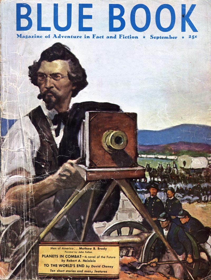
From Walt Reed's book, The Illustrator in America, I learned that John Russell Fulton was born in Valley Center, Kansas in 1896, and that he grew up in the Oklahoma Indian Territory "with all the youthful adventures of frontier life."
He began his career illustrating for various Mid-West newspapers before switching to advertising illustration, with Redbook and Blue Book as his chief clients.
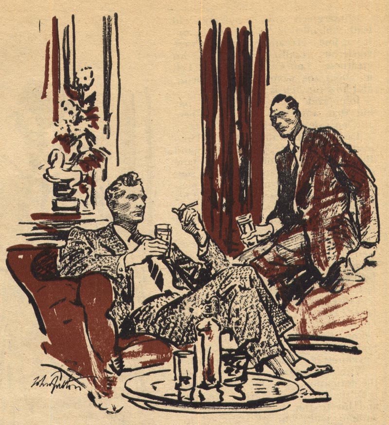
For Redbook, Reed tells us, Fulton did oil paintings in the manner of Harvey Dunn. But for Blue Book, he developed the drybrush inking style you see here. I think you'll agree, its a gutsy and effective technique.
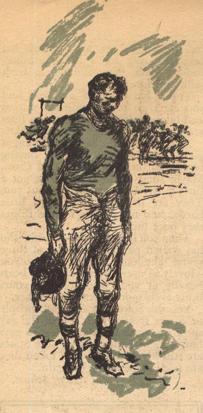
Fulton often added a second colour, also done in drybrush ink, to give his work greater depth. Blue Book was printed on very rough, cheap newsprint, so Fulton was, I think, trying to find a way to get the most out of his work to offset the poor reproduction quality of the magazine.

Blue Book was very much a man's magazine. Its pages are filled with tough-guy fiction in a wide variety of settings and time periods.
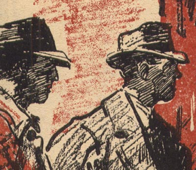
When I acquired my small collection of Blue Books, I had the good fortune to get issues that bridged a transition period in the 'look' of the magazine's visual content. Fulton's work (and the work of the other artists we'll focus on this week) is very much from the old look of Blue Book.

When I look at these illustrations, I could imagine that they might be from the 1930's - or even earlier. In fact, they are from the October 1944 issue. From previous posts showing work by many other illustrators during that period, you'll know that the general look of magazine illustration was far more modern than what you see here!
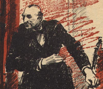
That makes Blue Book kind of a fascinating oddity. An island of really old school styles in an industry that was fast forwarding into the space age. I doubt John Fulton and his fellow Blue Book-ers could have hoped for many assignments from any other mainstream magazines. Fulton was still working in this style for Blue Book right up to and including 1951 - when Don Kennicot moved up the ladder to Associate Publisher and Len Romagna took over as Art Director.
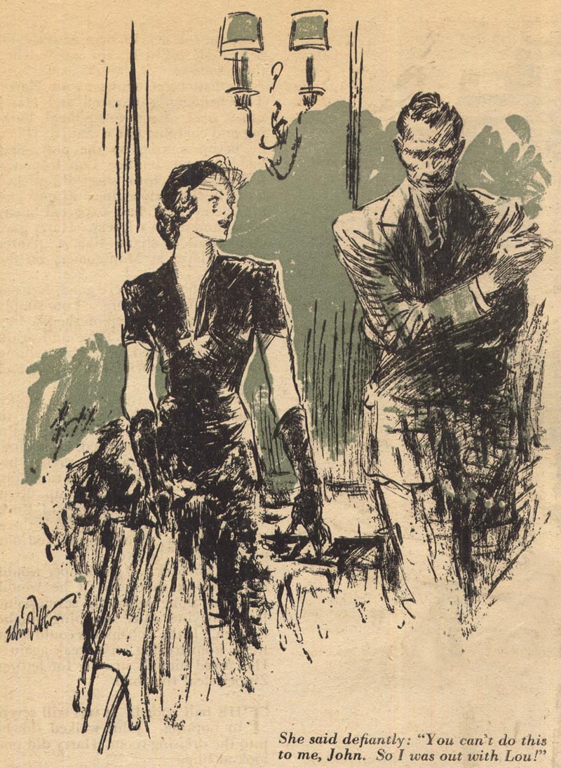
Considering everything you've seen in previous posts, can you imagine John Fulton's work still finding a home in print in the early 50's? It hardly seems possible. What this reinforces once again is the fickle nature of the illustration business. Styles come in and go out of fashion and - no matter how good you are - if you can't adapt, you get left behind.
My John Fulton Flickr set.
I´d like to sintetice lines like him.
ReplyDeleteI was barely familiar with Fulton's illos. and only within the past 5 years. The cover painting for Blue Book by Fulton, seems more contemporary than the dry brush illos. At one time Blue book was a training ground for up and coming illustrators. It gave them a chance to develop their talent before moving on to the slick publications.
ReplyDeleteAn interesting thought: What was the engine that drove style and taste in illustration... the public, social conditions, the fine art world, fashions, or perhaps Hollywood?
Tom Watson
An interesting question, Tom. One I would probably answer with "all of the above" ;^) -- more accurately I would venture that illustration was such an integral part of this milieu that they were all influencing each other.
ReplyDeleteWe already know, for instance, that Al Parker's 'Mother/Daughter' covers for LHJ launched a nation-wide fashion movement of mother/daughter outfits. And with Hollywood celebrities hobknobbing at the Stork Club with Albert Dorne and Jon Whitcomb (and then appearing in their illustrations) the interconnectedness of the various popular cultural elements of the period is again demonstrated.
Regarding Fulton and Blue Book: I think the magazine was something of a training ground (for the likes of Austin Briggs, as we now know) and a sort of retirement home (for artists like Fulton and some others I'll be showcasing this week). The cover painting is among the last pieces Fulton may have done for BB (dating from 1951). In 1952, the magazine underwent a complete visual makeover and artists like W. David Shaw and Howard Willard became mainstays. All the Fultons were shown the door.
I didn't know Fulton at all, thanks for sharing Leif.
ReplyDeleteHey,
ReplyDeleteThanks for highlighting the work of my grandfather, John Fulton. I've looked at his work all my life, but you have put it into context magnificently. This was a fascinating post.
thanks,
Steve Fulton
I own that oil painting and I'm trying to get a value on it, any suggestions who would know?
ReplyDelete