Friday, July 31, 2009

Ray Prohaska: "the more he fished, the more he painted."

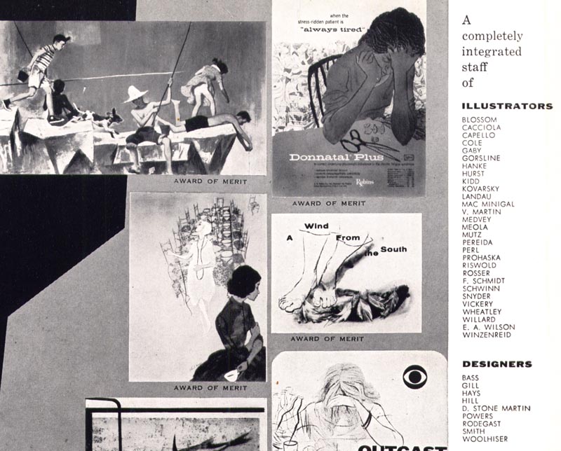
A Ray Prohaska illustration recognized for an Award of Merit by the New York Art Directors Club, 1947...


... and another, from a decade later.


I asked Ray's son, Tony, if his dad felt obliged to experiment with new styles during the 50's, to keep up with changing trends.
Tony replied, "I think the Art Directors kind of dictated that (the style thing)."

"I remember Ray saying, in the late fifties and sixties, that all they wanted was Bob Peak. He also refered to some of that loose later style as the "it's raining all the time", style. "


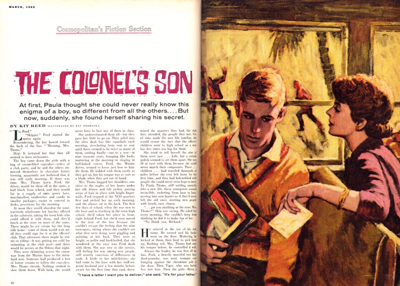
In spite of that (and from what we've seen, Ray did enjoy experimenting with style now and then) he seems to have still found a certain amount of work from the magazines for his more tradititional approach, even in the late 50's-to-early sixties.
The pieces above and below are from 1959 and 1962, respectively.

As well, Tony writes, "as the business declined in the sixties, two clients that he found were the AMA Journal, and Standard Oil's house organ.., he did a few covers for each one as I remember, and they were good."


Tony writes, "I'd probably be right in saying that Ray felt that he, Ray, and Wally Morgan (another old guy that my father was great friends with), were the best draftsmen around....Ray used the term draftsmen alot, to connote drawing." That's a statement that makes me wonder, in conjunction with Ray's somewhat frustrated sounding comment about all art directors wanting Bob Peak and the "rainy day" look, if he didn't feel somewhat demoralized by the decline of the illustration business as it had been until around 1960.

But in his biography of his father at rayprohaska.com, Tony describes a far happier situation:

"When not illustrating, he was busy painting portraits, until, that is, he discovered the East End of Long Island. Then the sea began to demand his attention, and he began to divide his time between painting and fishing. At first his paintings were realistic, rock pools and the driftwood and skate eggs that line the shore, but they became more abstract, more rhythmic, and more involved in the action of fishing. And the more he fished, the more he painted."


And this final bit, from one of our correspondences: "... he had a pretty content old age, as far as it went."

* Tony Prohaska has put together an extensive website devoted to his dad's life, where you can read a very thorough biography and see many more examples of the artist's work. Go to The Art of Ray Prohaska for more.

* My Ray Prohaska Flickr set.

Thursday, July 30, 2009

Ray Prohaska: Art Reps & Art Directors

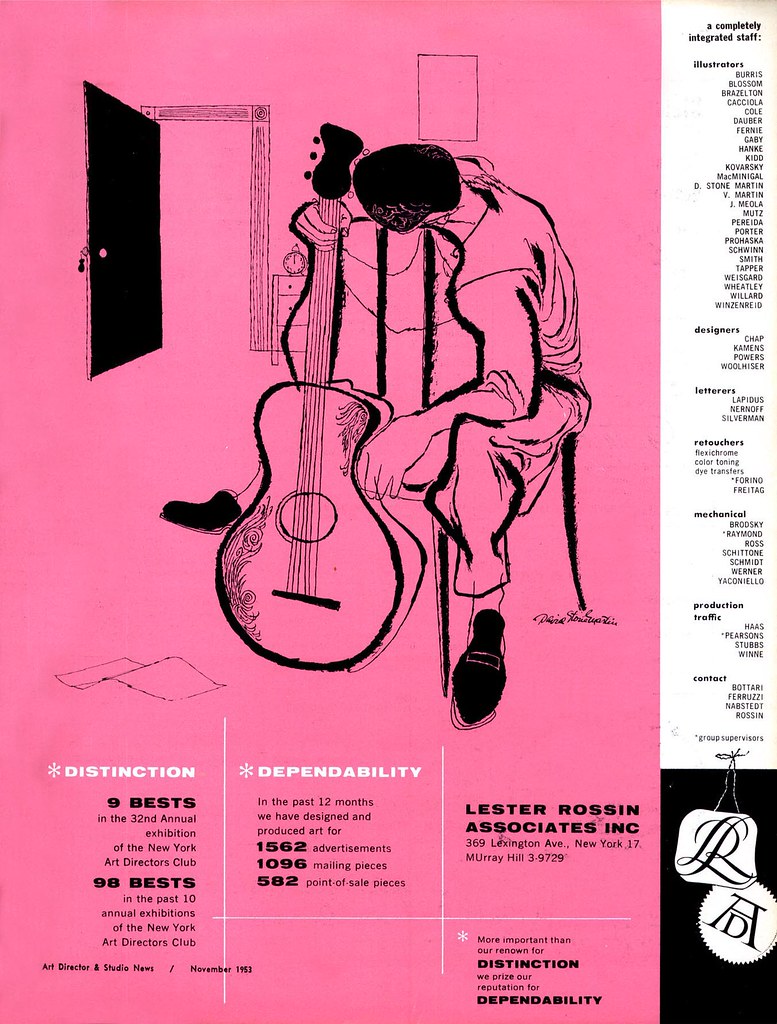
Ray Prohaska was represented by Lester Rossin Associates - the same studio that represented David Stone Martin. Though Rossin had quite a few high profile artists (including Ray) in his 'stable', almost every Lester Rossin ad I've seen from the early 50's features Martin's art ( as in the example below).


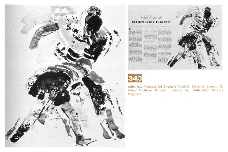
In 1956 Ray Prohaska received an Award of Merit for the piece below from the New York Art Directors Club. (Tony Prohaska writes, "I remember posing for one of the kids on the jetty.")


That year, Ray's illustration was at last featured in the top spot of a Lester Rossin group ad in the back pages of the '56 Art Director's Annual.


Tony had a summer job one year at Rossin's studio. He describes what it was like:

"Lets see...Rossin's was one floor... a receptionist, and maybe six people in the bull pen, including one very good letterer, another guy who did airbrush, and several people who did layouts, spots, and retouching. I think there were either three or four salesmen, maybe more, but I don't remember... and Rossin did sales too. I was in the production department, and did deliveries, mattes, wrapping packages, that kind of stuff. There were two of us gofers and a production manager, named Charlie Stubbs. My fellow gofer was Fred Travelena, who became a well known comedian, and died just a couple of weeks ago."


"I'm not sure if Ray ever had an other full time agent in N.Y., beside Rossin. He thought that all agents were crooks, but that you had to find a crook that wasn't too bad. Rossin occassionally would have one of his in-house studio people do a fake Ray Prohaska. I found that out when I worked that summer job for Rossin. Ray said he knew about it, figured it wasn't out of control."

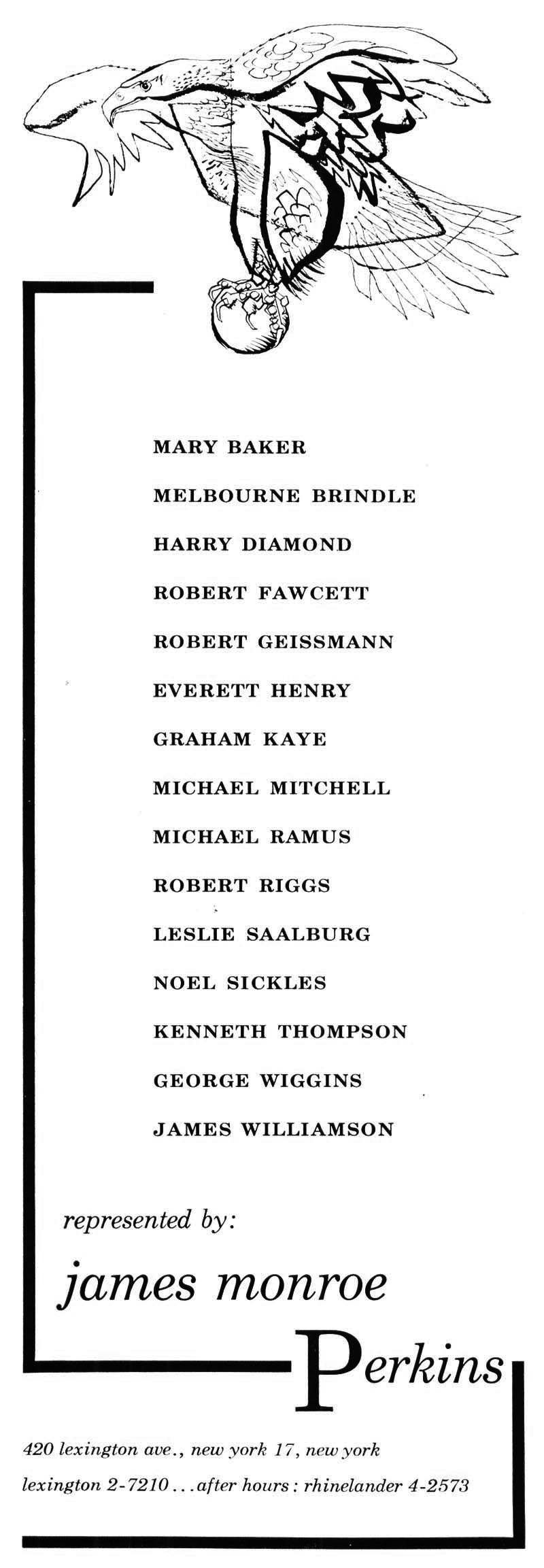
"He was friends with a guy who'd been an agent and who moved out to Amagansett around the time we did, named Jim Perkins."


Looking over James Perkins' and Lester Rossin's artist lists, we can see some of the biggest names in the New York illustration scene of the day - and see also how close knit the entire community of graphic arts professionals were, socially and professionally.

But did Ray get all his jobs by way of his rep, or did he also take his portfolio around to show to art directors?

Tony writes, "He did get quite a few jobs direct, without Rossin, but I suppose he'd pay him anyway, I'm not sure. Also, his relationship with J. Walter Thompson was an old one, and he kept that up, went up to their offices quite a bit. I think he felt that he was treated o.k. by [Saturday Evening Post AD] Frank Kilker..."

"I'd have to say that one of his favorite jobs was a job he did for Frank Zachery, who was then at Holiday, I'm sure you know of him... it was an illustration of an African scene. He loved Frank. Frank rented the house next door to us one summer, and after that, rented down at the beach every year for several years."


"In general though, art directors were the bane of his existence, and we were under strict orders not to tell them he was fishing, or they'd think he wasn't busy."


"You had to be busy or you were dead, was how he put it."

* Tony Prohaska has put together an extensive website devoted to his dad's life, where you can read a very thorough biography and see many more examples of the artist's work. Go to The Art of Ray Prohaska for more.

* My Ray Prohaska Flickr set.

Wednesday, July 29, 2009

Ray Prohaska and Friends, Part 2

Tony Prohaska writes, "Ray was a member of the Society of Illustrators from the time he moved permanently from Chicago to New York, sometime after the ‘29 Crash. Through the S.I., Ray became friends with all the illustrators in N.Y. at the time, but his particular favorite, almost a father figure, was Arthur William Brown. Ray and Carolyn were constant companions with “Brownie” . He was a frequent visitor in the early day’s of their life in Amagansett."

"Their particular friends in those days included Al Dorne and his wife Edna, Bob and Aggie Fawcett, ……and I’ll think of the others as I go along."


"Al Dorne though, would not go below 14th St. Carolyn said she thought it had something to do with not going out of his father’s precinct. Supposedly, his father was a cop."


"Ray was also friends with many of the artists at the 10th Street Studios, where he kept a studio. (They had an apartment across the street, where I lived as an infant.) Ray became buddies at 10th Street with John Alan Maxwell. Ray liked to drink and chase women... [and] was accused by Johnny’s wife of leading him astray."


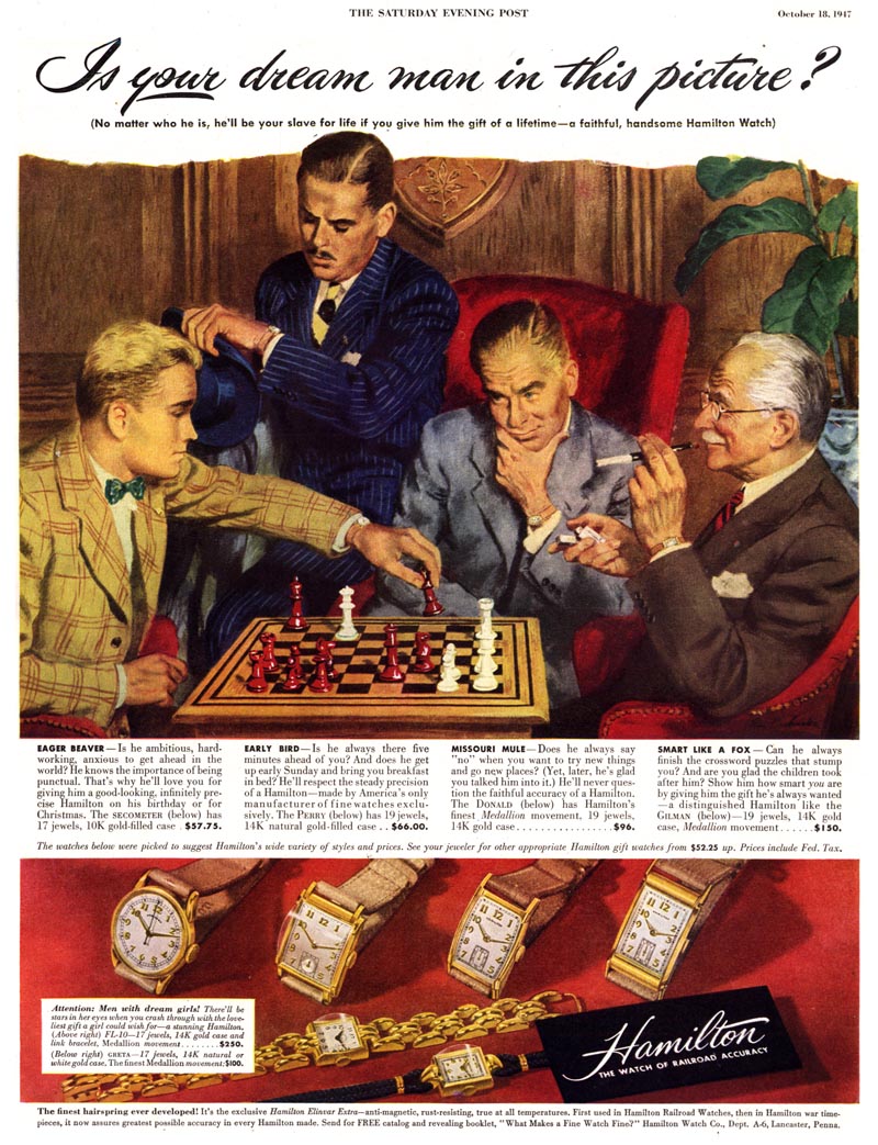
When I found this ad it occurred to me that Tony's dad might have pressed some of his illustrator friends into service to pose for the reference photos. Tony replied, "I'm pretty sure the young man on the left was a local kid,"


"... but he may have also used a professional model or two, or even as you say, one of his friends, for one or more of the older guys..."


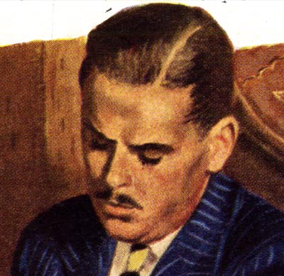
"The guy with the pencil moustache looks like Johnny Maxwell."


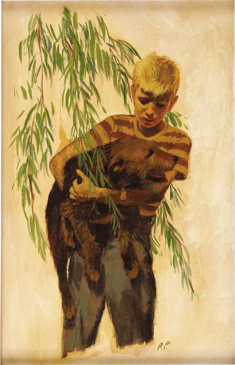
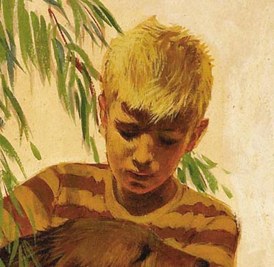
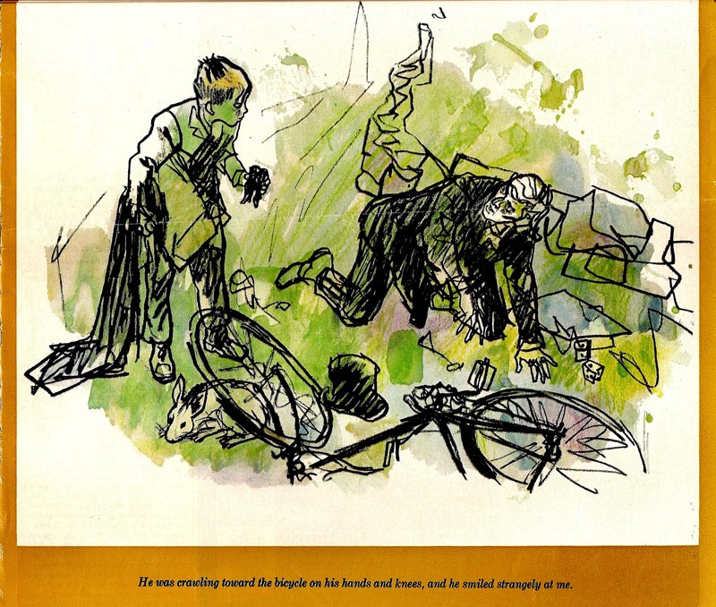
Then I found the scan below of a Ray Prohaska original, from a 1950 story for the Saturday Evening Post on the Heritage Auctions website. I had to ask Tony... did he pose for this piece?

He replied, "Yeah, the posing. I hated it. Seemed like I was doing it all the time. I sort of felt that every one of his jobs had a kid who just happened to be my age. He had big, old fashioned lights, including one that was like a theater light. It was..., "hold still, just one more.." and then, another roll... and of course there was sitting on some stranger's lap, male or female.., balancing on one foot to look like I was running, of course there were telephone books as props..."


"No, there were no other illustrators that used me, ....other than after I was grown, when I did a few posing jobs for Al Moore, (a teriffic guy!) who had the studio across the hall from the one that Ray inherited from Brownie, at 33W. 67th. (I eventually got him kicked out of there for a couple of parties I gave... and some rowdy visitors, to put it mildly)."

"That boy with the dog was both me and my friend Mickey Miller... He just turned 67 and is a commercial fisherman."


Tony adds, "My parents were great friends with Leonard Starr. My father and I modeled for two of his characters, circus performers... my character was Tony Abbott. For years afterwards my friends called me 'The Boy Cartoon'."

* Tony Prohaska has put together an extensive website devoted to his dad's life, where you can read a very thorough biography and see many more examples of the artist's work. Go to The Art of Ray Prohaska for more.

* Thanks to Heritage Auctions for permission to use the scan of Ray Prohaska's original art above.

* My Ray Prohaska Flickr set.

Tuesday, July 28, 2009

Ray Prohaska and Friends, Part 1

* I asked Tony Prohaska if his dad socialized much with any other big name illustrators and - wow! - the stories! As well as being immensely entertaining, these anecdotes shed some light on the status enjoyed by illustrators of that time as legitimate celebrities in their own right.

From Ray Prohaska's son, Tony:

"When Ray first came to New York he became friends with James Montgomery Flagg, who took him on as kind of a protégé.


My parents met at a party at Flagg’s house, in 1935. Several other illustrators were at this party, as well as members of the press, both radio and print. Most of the revelers belonged to one, if not all, of the following clubs; The Society of Illustrators, Artists and Writers, and The Dutch Treat Club."


"Carolyn, who knew many of the revelers, told it to me this way: There was a guy named Jimmy Stranahan, who was always in the picture. He had a girlfriend, and they were draped over a sofa."


"Ray was in the kitchen and everyone was jumping with the red wine, and suddenly he, Ray, emerged from his labors. He was doing the cooking. He said to Carolyn, “What are you, the intellectual type?” No, [ she said, ] she wasn’t going to play that game. Instead, she countered with, “Read any good books lately?” and Ray started telling her about The Natives Return, Louis Adamic’s book. Carolyn said, “Well, I’ve read The Return of the Native,” but Ray brushed that aside. “ I am a peasant! I’m going back!” he exclaimed. He was going back to Yugoslavia. They must have hit it off, because the rest of the party they both remembered as boring."


"Carolyn later remembered Carl Muller’s girlfriend, Ruth, complaining because Merrill, Carl’s son, who was all of eighteen then, had run up a $15 dollar a month dry cleaning bill! She always remembered that every time, years later, she watched Merrill on the news. ( By the time of J.F.K.’s presidency, he had become an anchor for NBC News.)”

"After Ray and Carolyn met, they sort of went steady for a few years, before getting married, and they “partied” a lot. Ray had a cast iron stomach, and never became an alcoholic (at least as I understand the term, clinically)."


"Another 'drunk vs. cast iron stomach' was Ray’s friend Bob Fawcett. Fawcett got drunk at our house in Amagansett a few times, and once, when I was about six or seven, took me into the studio and gave me a drunken lecture about what an obnoxious brat I was. I might have been, but he’s the only one who ever told me I was."

* Tony has put together an extensive website devoted to his dad's life, where you can read a very thorough biography and see many more examples of the artist's work. Go to The Art of Ray Prohaska for more.

* My Ray Prohaska Flickr set.

Monday, July 27, 2009

Ray Prohaska (1901-1981)

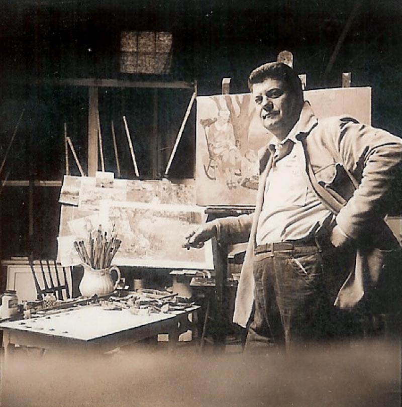
Recently I received a note from Tony Prohaska, the son of prominent mid-century illustrator Ray Prohaska - another artist I've been meaning to devote some time to on the blog. Prohaska was born in Mulo, Yugoslavia and came to the U.S. as a child. He studied art in San Francisco and found work on the West Coast and Chicago before moving to New York in 1930. There he established a successful career illustrating for all the major magazines and for advertising clients. He won many exhibition awards and served as president of the Society of Illustrators in 1959-60.


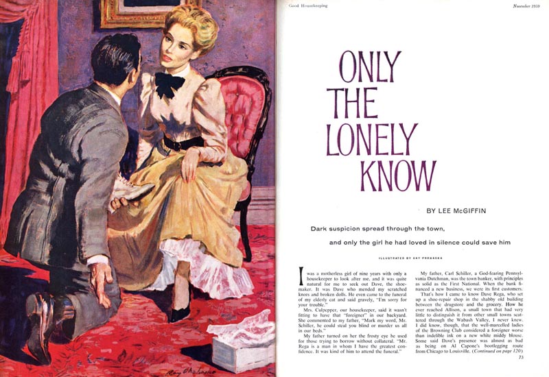
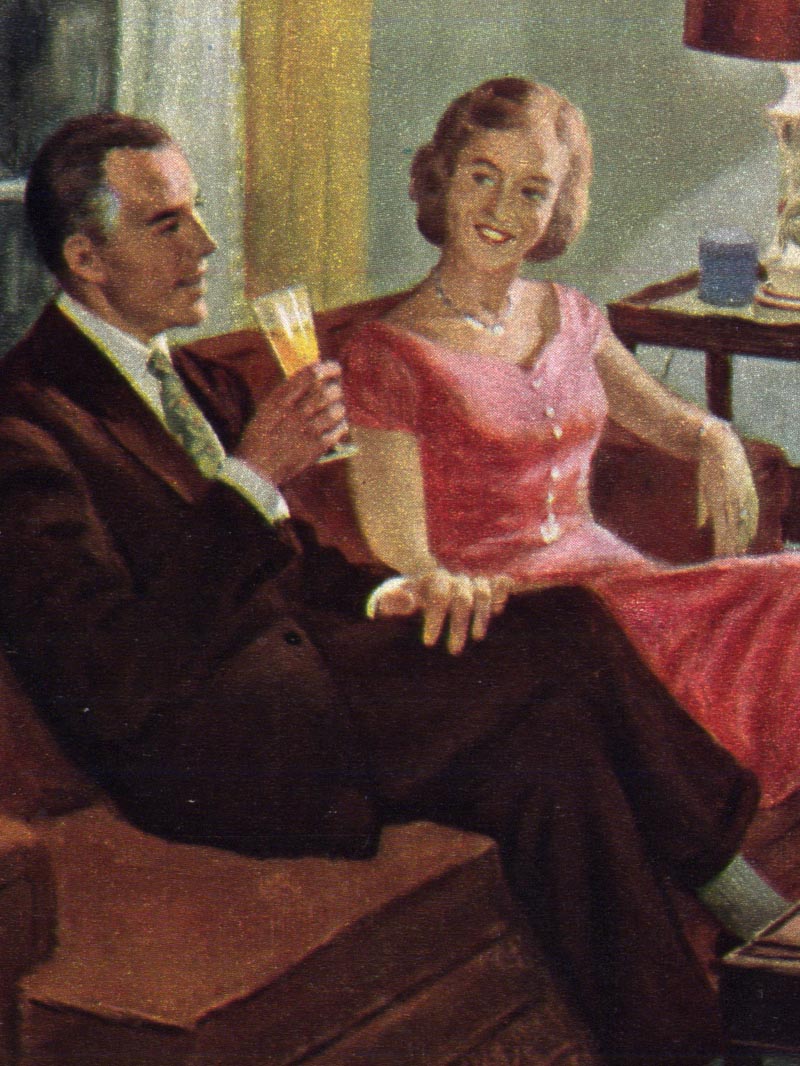
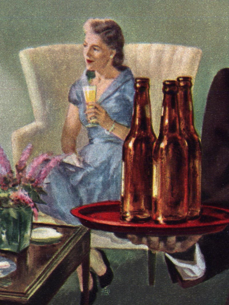
Looking at this small sampling of Prohaska's work, I'm fascinated by the tremendous variation in styles. You may be surprised to hear that the top piece was done in 1950 while the middle piece was done seven years later. You'd almost expect the reverse, wouldn't you?


And then this piece below, which was contributed by Charlie Allen, suggests even more that Prohaska was what I have dubbed a "restless illustrator" - one who enjoys searching... trying new things... is not content to settle into one 'signature' style. I've asked Tony Prohaska about this and several other aspects of his dad's career, and he promised to write back with some answers.


Meanwhile, Tony has put together an extensive website devoted to his dad's life, where you can read a very thorough biography and see many more examples of the artist's work. Go to The Art of Ray Prohaska for more.

* My Ray Prohaska Flickr set.

Friday, July 24, 2009

William A. Smith's Coke Ads

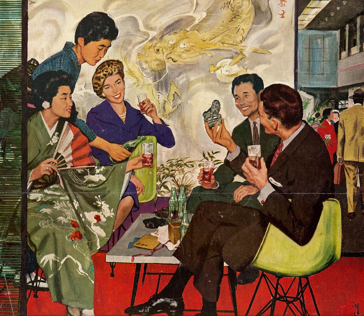
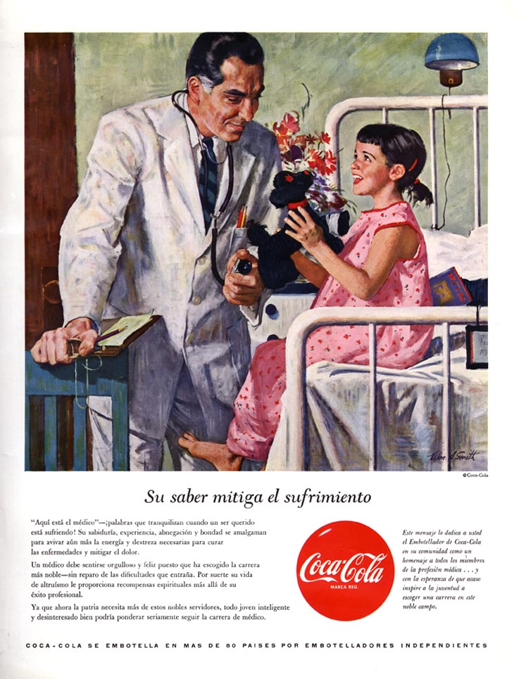
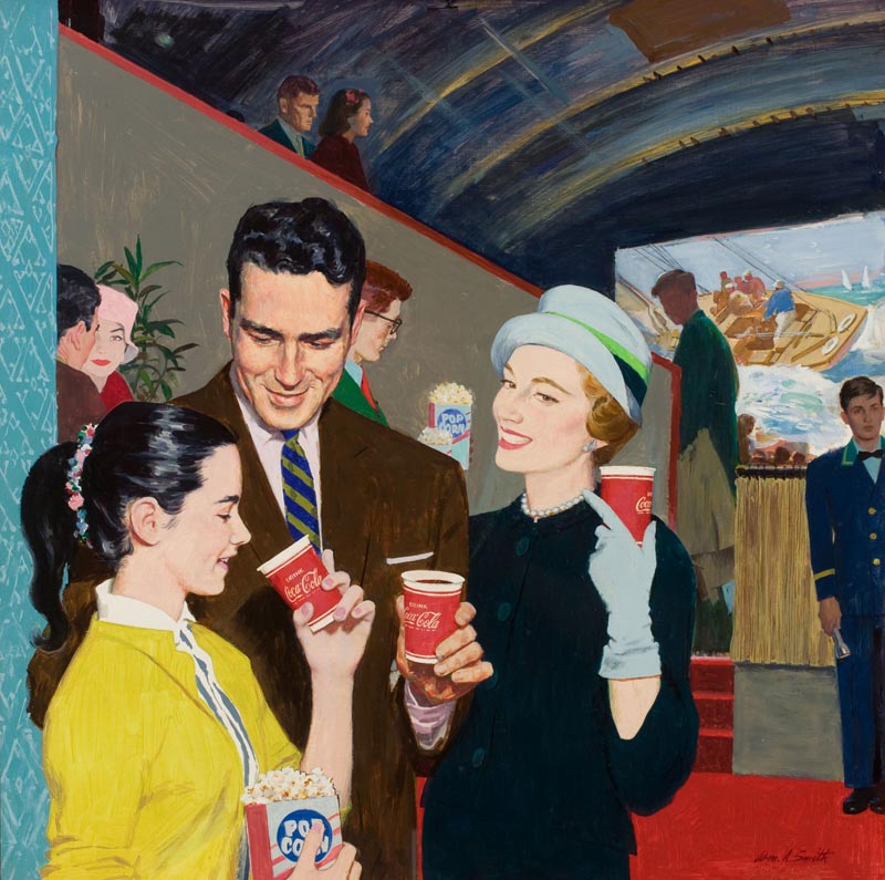
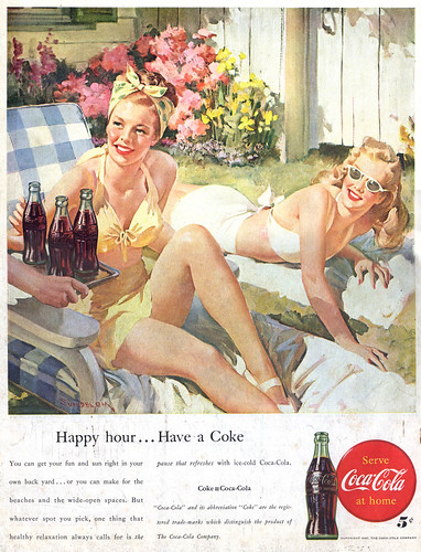
You may recall seeing the Coke ad below in a previous post on William A. Smith, but that ad wasn't a one-shot job for the accomplished painter...


Smith's daughter, Kim, sent a scan of this great piece below, along with an amusing anecdote about what must surely have been one of her earliest professional modeling assignments:

"I was the model," wrote Kim, "along with my favorite stuffed animal (I still have it, and it is probably a poodle) whom I nevertheless called Lambsey-Dysey. After "Mares eat oats and does eat oats and little lambsey dysey".


"The third model was a man on whom I had a huge crush, very handsome, named Bob I-can't-remember-his-last-name-but-will. He played a doctor, and I am about 3 1/2 years old. The version of the ad I have is in Spanish, though it was also probably in English somewhere here. My hair color, and Lambsey-Dysey's was changed for the painting to brunette!"


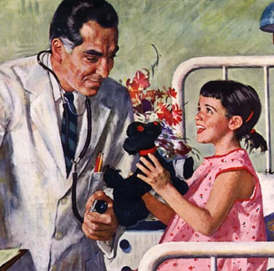
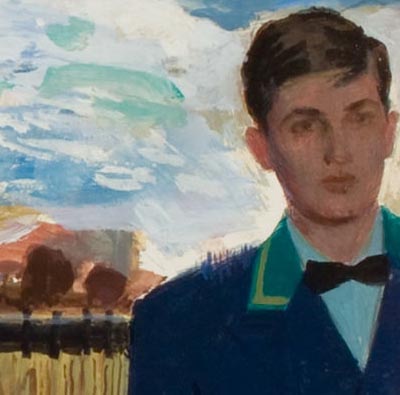
Recently a third William A. Smith Coke ad surfaced... this time in the form of a piece of original art up for sale at Heritage Auctions.

I sent a note around to the Smith family members alerting them to the sale. Kathlin Smith was the first to reply. She identified her older brother Rick as having posed for the role of the usher standing at far-right of frame in the middle distance. "It’s actually amazing how much he looks like a young version of my father," wrote Kathlin.


When I asked Rick Smith if he recalled anything about posing for this ad he replied, "It's me alright but I was an ADHD kid, hated keeping still for any length of time so I may have repressed that particular adventure."


Rick adds, "Thanks for your interest in dad's work. I still think he was vastly underrated/underappreciated/under-recognized."

* This post was published simultaneously on the William A. Smith blog

* Thanks to Charlie Allen for providing the top scan, Kim Smith for providing the middle scan, and Heritage Auctions for allowing me to use the bottom scan.

* My William A. Smith Flickr set

Thursday, July 23, 2009

Whodunnit?

Calling all art detectives: this mystery needs solving.

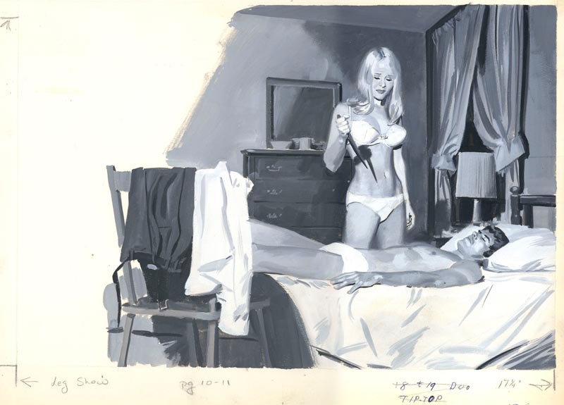
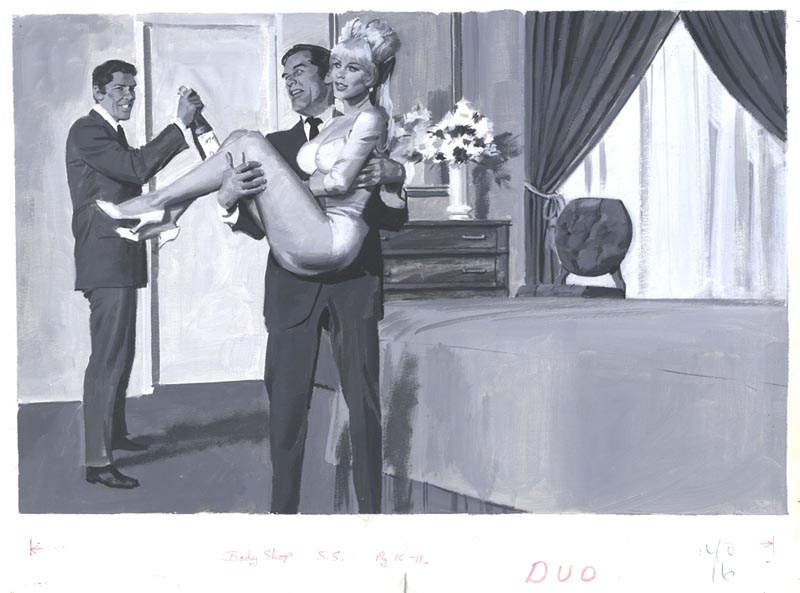
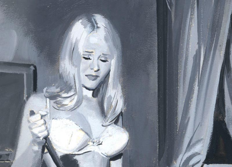
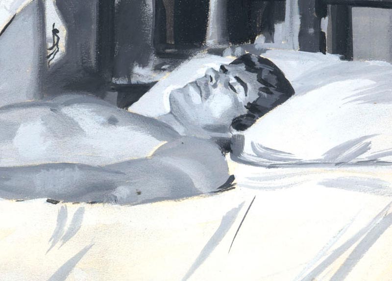
TI list member Chris Turner sent me these scan the other day. They are two of six originals he purchased a dozen years ago at a convention called Glamourcon. Chris writes, "Looks to be mid 60’s to early 70’s style-wise, but no publication info on what magazine."


"The guy is pretty good," writes Chris, "I loved the cheesiness of the subject matter. I bought 6 in all, should have bought more, the seller had 50 or 60. He didn’t know any other info (or wouldn’t tell!) If you don’t recognize the artist, would you be willing to post them on TI and see if your public can I.D. this guy?"


I'm only too happy to do so, Chris.

Personally, I have no idea - but yeah, the guy was pretty good! The confidence of his gouache painting and the quality of the tonal values, and the accuracy of the underlying drawing all suggest a seasoned pro with classical training did these great little exploitation scenes.


On a pure art geek level I gotta say, seeing how the anonymous artist was able to create a coherent picture by dashing down a few strokes of paint here and there really gets my juices flowing!

Just look at the woman's hand hanging by her side. Its nothing but a sqiggle of dark paint... yet it works. And the pillow and sheets are little more than white illustration board. Amazing.


Skills like this were taken for granted back then... today they are so rare they are worthy of this kind of attention and praise. Back when he did this assignment (and likely for a relatively lousy fee, this clearly being art for some sleazy men's sweat mag) our anonymous illustrator thought so little of it that he didn't even sign his work.


If there is one clue of style, it might be this particular man's face, which looks slightly "caricatural".


If you think you know whodunnit, please speak up!

* Just a note to everyone who has continued to leave words of encouragement and comments of congratulations on my reaching one thousand posts. Many thanks to you all - I really appreciate hearing from you!

*ALSO* Are you using Corel Painter to do your illustrations? Australian storyboard artist Maria Peña has just written a great post at my other blog, Storyboard Central explaining why she's had it with Painter's quirks. Go take a look at Maria's fabulous artwork -- and join the discussion.

Wednesday, July 22, 2009

Len's Lovely Lady Lounging in Luxurious Linens

Thanks to everyone for your kind words of encouragement on yesterday's post! Its great to know so many people enjoy the material I present here - and especially gratifying to read the comments of those who spoke up for the first time. Thank you all very much!

Since I mentioned Len Steckler yesterday, let's look at another piece by this talented illustrator.


As mentioned, Steckler was a member of the Charles E. Cooper studio.


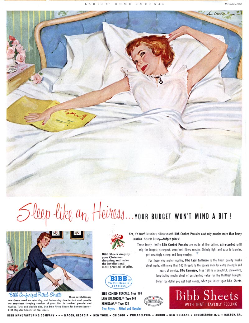
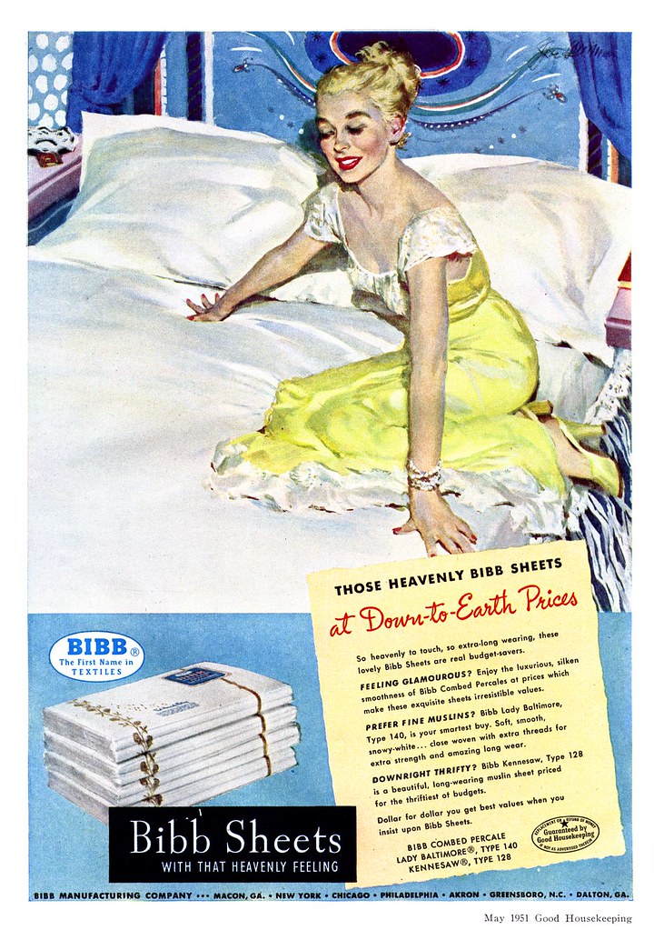
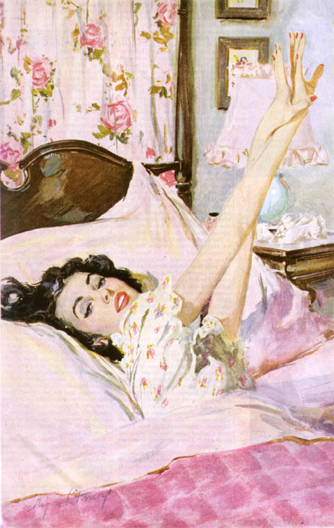
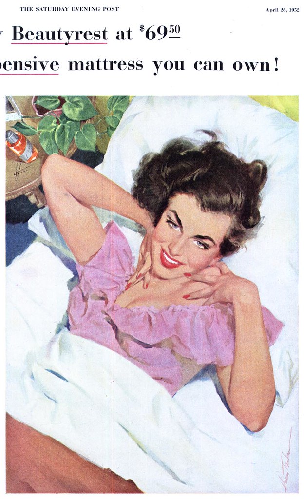
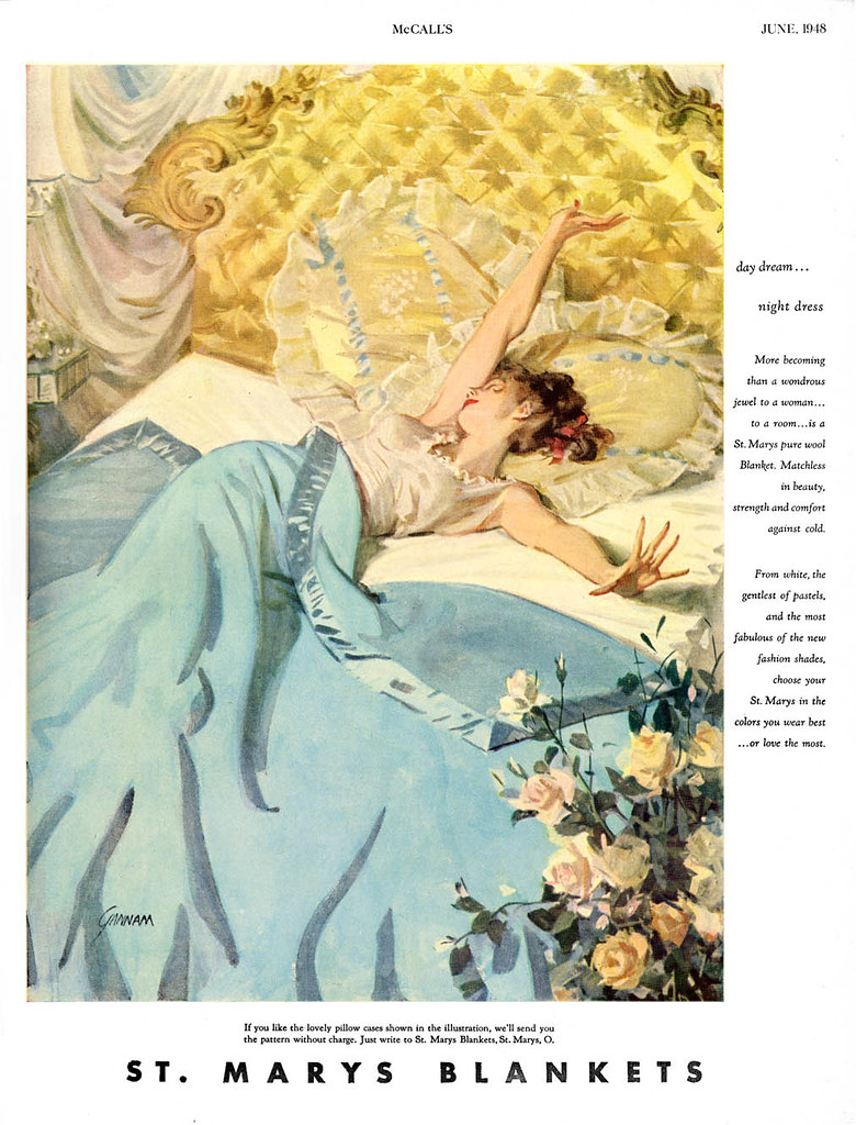
Just for fun, I pulled a few images from my Flickr archives by other illustrators of "lovely ladies lounging in luxurious linens".

First up, Joe De Mers, also of the Cooper Studio, from 1951...


... another Cooper heavyweight, Coby Whitmore, did a ton of these ads (several more in my Coby Whitmore Flickr set).


Here's one by Harry Fredman, co-owner of rival studio, Fredman/Chaite, where Bob Peak got his start.


And finally, perhaps the most loungin'est lovely lady of all is depicted by the great John Gannam.


* As we ease into the new, less wordy Today's Inspiration, I encourage those who enjoy a substantial hit of information with their art fix to head straight over to Charlie Allen's Blog for a look at this week's CAWS. Its a doozy!

* And don't forget Storyboard Central, where German illustrator Arne Reismueller shows us some terrific examples of his advertising storyboards.

Monday, July 20, 2009

Some Thoughts on the First Thousand Posts


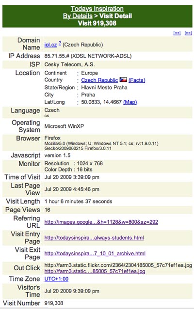
Yesterday, while I was writing this sentence, someone from the Czech Republic found this blog via Google Image Search. That person was the 919,308th visitor to Today's Inspiration. Imagine that!


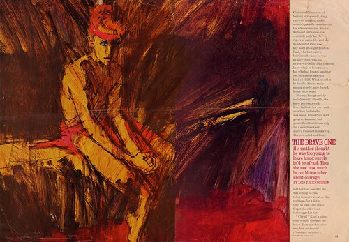
Here's the image, a piece by Robert Fawcett, that brought this visitor to the blog...


Out of curiosity I tried typing "Robert Fawcett book" into Google Image Search. The piece, from my January 19, 2009 post on Fawcett, is the first result. Clicking on its thumbnail in GIS takes you to that day's post.

The Czech visitor subsequently stayed on the blog for 1 hour, six minutes and 37 seconds. They looked at sixteen pages of content. The last thing they clicked on before leaving was this piece by Bob Peak.


And then, without leaving any comment, they were gone. That sort of thing used to frustrate me; people who would visit who clearly had a genuine interest in the material I present (spending a substantial amount of time, perusing several pages). I'd wonder, why does this person, who must surely be a kindred spirit, not reach out? But then, I do the same thing all the time, visiting blogs, reading interesting content or perusing the images there and leaving without comment, so who am I to talk? The Czech visitor has excellent taste. Beyond that, I have no idea if they were male or female, old or young, an illustration professional or not -- and no way to contact them.

Frankly, when I started this blog in November, 2005 I never dreamed it would get nearly a million visits in less than 4 years. But then it never occurred to me that there would be a thousand posts here in that time span, or just how much information and artwork I could amass in just three and a half years of steady posting.

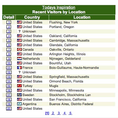
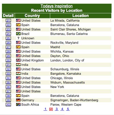
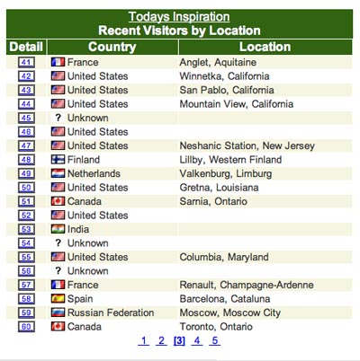
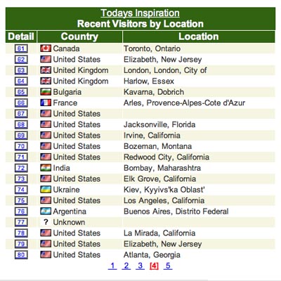
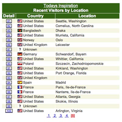
Since most readers, like our Czech visitor, are "blurkers" I must rely on my Sitemeter stats to give me an idea of who you are, where you come from, and what your interests are.

Here's a snapshot of a hundred visitors who dropped by at one point during the day yesterday (perhaps you will recognize your own visit on this list).


That certainly demonstrates the remarkable power of the Internet, doesn't it? Its wonderful to know that people all over the world are discovering - or rediscovering - the work of these great mid-century illustrators.

Of course a lot of those who arrive via Google Image Search aren't actually hoping to find art or info on 50's illustrators. Try typing "Esquire Girls" into GIS and see what comes up. Go ahead, I'll wait 'til you get back.


Interesting, huh? Yeah, after all these years (as we in advertising have always known) "sex sells".

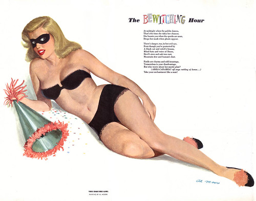
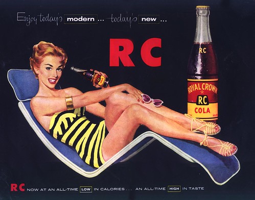
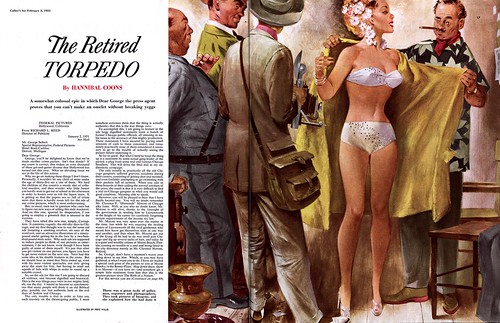
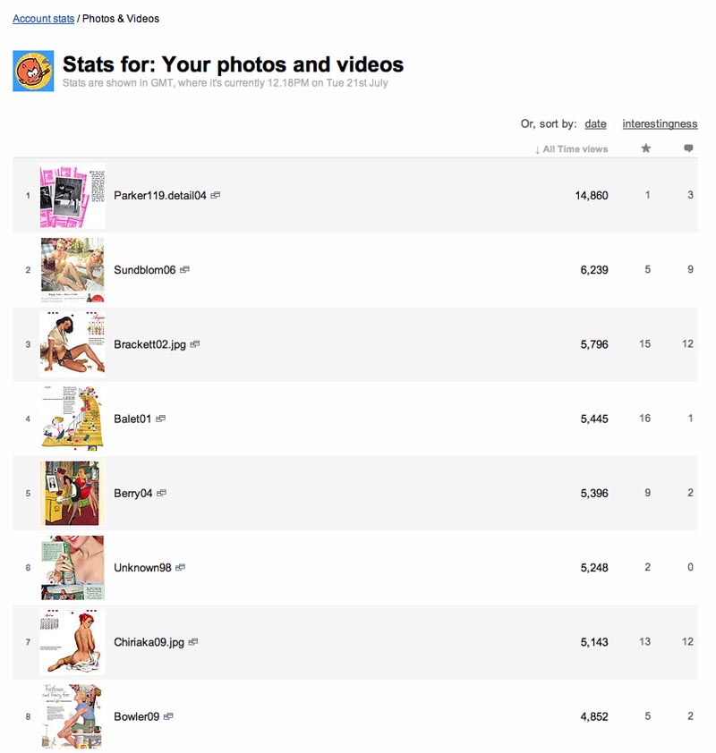
In fact, checking the stats on my Flickr archives, I discovered that the following ten images were all in the top twenty most viewed in my archives. See if you can spot the commonality:


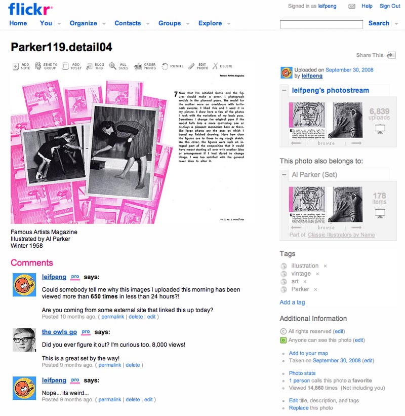
All of those images had over 4,000 views each. But here's a quandary: the single most viewed image in my Flickr archives? This page from an Al Parker step-by-step demo I posted 10 months ago has been viewed nearly 15,000 times!


What's up with that?!


Compared to the next most popular images in my collection, that image has more than twice as many views!


I even asked at the time when I first posted the image and noticed immediately that its view-count took off like a bat outta hell, but so far no one has commented on where they found the link that brought them to this image.


And here it is again, climbing the daily rankings, beating out other more recent (and, I think, more interesting) images.


Incidentally, did you notice that stat for how many times my entire image archive has been viewed? Wow!

There are nearly 7,000 images in my Flickr archives, organized by artist name or general subject (auto ads, sports, etc.) and all but a hundred or so are mid-century illustrations.


Recently I've been corresponding with a researcher from England who's conducting a study comparing the stats of *official* institutional websites that provide digitized visual content to the sites of "amateur enthusiasts" (people like me) who provide similar content "in our spare time" (ha). I gave her access to my sitemeter statistics and she was blown away. Apparently some of these well funded full-time organizations get a fraction of the traffic in a year that Today's Inspiration gets in a week. Huh.

The researcher asked me if I would be doing this ( researching information, collecting and scanning images, and writing related content ) if no one was watching; and I had to think about that for a minute. Ultimately, I suppose I would... but I doubt it would be with such regularity. Its the many friends and acquaintances I've made by providing this "place for those with an interest in 40's and 50's illustration" that motivates me to invest the time, effort and money to pursue this endeavor so vigorously. And without the generosity with which so many have shared their knowledge, their resources and their moral support, this blog would be a pale shadow of what it is today.

Years before the TI blog there was a Today's Inspiration daily mailing list. Here's one of the scans I sent out to the group back then, when that list had less than a hundred people on it. Its by Len Steckler, a former Cooper Studio artist.:


I couldn't have imagined that one day a few years later I'd be getting an email like this:

Hi Leif
My friend Tom Sawyer sent me the image I did... I can't remember the date, and I even forgot about painting it. I want to thank you for your interest in this work it's extremely gratifying. For your information I am still creating images, as I have almost all my life .

THANKS AGAIN
LEN


Isn't that cool? And the friend Len referred to is another artist whose career has been showcased here on the blog, Thomas B. Sawyer. This past spring, while attending the NCS Reubens Awards in L.A., I had the immense pleasure of meeting Tom in person when he graciously invited me and my wife, Wendy, to join him and his lovely wife Holly for lunch at their beautiful home.


There, in the presence of one of my illustration idols, I was shown a portfolio of the actual originals of illustrations like the one below, which Tom drew back in the 60's and 70's.


Such are the priceless rewards of maintaining this blog from week to week and year after year.

But in spite of the pleasure I derive from this daily, um, obsession?, the day has come when I need to admit that I devote more time to TI than I ought to. Like most every other illustrator I know, the last few months of this recession have kicked the crap out of my business. Illustrators are struggling more than ever to make a living and I'm determined not to become a casualty.


That means investing more of my time to producing new samples and figuring out new marketing and promotion strategies - time I would otherwise rather devote to this blog.

So for a while, Today's Inspiration will return to more of what it began as: a scan a day, intended to inspire - but presented without commentary. Well, maybe just a little commentary. Occasionally, I'll still do a complete week on a specific artist (there are already plans under way for several such weeks) and I have enlisted several contributors to guest-author the blog now and then. This will give me some breathing room to focus more of my attention on my "real" job; being an illustrator.

There will be another thousand posts on this blog... there are too many artists whom we have not yet celebrated... too much history still left undocumented. I hope you'll join me on the journey.

Saturday, July 18, 2009

Al Parker: "... ideas of quality that are echoed in the work of today."

"I think one of the things I like best about illustration is the fact that things are always changing. It's always tomorrow."
-- Al Parker, 1964


"The magazines of the early 1940s concentrated on new formats for entertaining their most important reader: the young housewife and mother. The need was met in editorial art by depicting an idealized world peopled with handsome men and gorgeous women."
-- Al Parker


"Prettiness prevailed, and warts and all were a no-no."
-- Al Parker


"Art involves a constant metamorphosis . . . due both to the nature of the creative act and to the ineluctable march of time."
-- Al Parker


"The old style was dead and the problem was not of finding a new one to supplant it, but one of somehow breathing life into the inert gesture."
-- Al Parker


"While one gleans from his output so many escapists pictures, with an air of consciously-sought charm and a craftsmanship to the point of prodigality, these escapist illustrations had ideas of quality that are echoed in the work of today."
-- Al Parker ("[writing] in defense of himself, using the third person as if describing another")


This is the 999th post on Today's Inspiration. Tomorrow, some thoughts on the first thousand and (hopefully) the next thousand.

* The third and fifth images are courtesy of Marvin Friedman. The other four are courtesy of Charlie Allen. Many thanks to both gentlemen for generously sharing these images from their personal files with us.

* The Al Parker quotes are taken from the program book of the NRM's 2007 Al Parker exhibition, "Ephemeral Beauty" (which is still available at a very reasonable price) and from the exhibit text reproduced at the Traditional Fine Arts Organization website.

* My Al Parker Flickr set.

Friday, July 17, 2009

Al Parker: "each of his characters... a believable human being."

The January 1952 issue of American Artist magazine contains "a demonstration presented courtesy of the Famous Artists Course, Westport, Connecticut." The accompanying commentary is provided by Henry C. Pitz:

"While it is true that Parker has prepared a set of lessons for instruction by correspondence, he has not been assiduous in spreading his gospel; he is not a crusader, nor is he disciple-hungry. So it must come as a surprise to find himself the head of a dominant school of illustration."


"Most of his imitators... have neither his ingratiating skill as a draftsman nor his inexhaustible enthusiasm for finding a fresh solution. Least of all do they have the human warmth that makes each of his characters a believable human being."

"[Al Parker] has never been spoiled and ... has transmuted the enthusiasms of his Midwestern youth into a pictorial language that has meaning for millions of Americans."


(Click the image for a larger version to read the text)


* the Modern Graphic History Library at Washington University in St. Louis is currently hosting an Al Parker exhibit, Double Exposure: Al Parker’s Illustrations, from Model to Magazine. which "explores the art-making process of magazine illustrator Al Parker. The display features original artwork and tear sheets from popular magazines published in the 1940s, 50s, and 60s. The illustrations are presented alongside photographic studies taken by Parker, depicting women, men, and children from various viewpoints and poses. Through the juxtaposition of these images, we catch a glimpse of Parker's creative process, from his compositions captured in photos to his interpretations realized in print."

The exhibit runs from July 6th to September 29th, 2009 at the Olin Library, Washington University in St. Louis

* Many thanks to Marvin Friedman for the gift of Al Parker tear sheets from which the image at the top of this post is scanned.

* My Al Parker Flickr set.

Thursday, July 16, 2009

Al Parker: "His design inventions seem to be inexhaustible."

The January 1952 issue of American Artist magazine contains "a demonstration presented courtesy of the Famous Artists Course, Westport, Connecticut." The accompanying commentary is provided by Henry C. Pitz:

"The quality most of [Parker's] followers reach for is his most obvious one - his visual impact. His pictures always greet the eye with pleasant excitement and perennial freshness; his design inventions seem to be inexhaustible."


"Al Parker will probably escape the fate of many who have become first the beneficiaries and then the victims of a vogue. He has grown with the years and he has many new things to say. His experiments with pure line are indications of what might be an entirely new Parker school."


Continued tomorrow...

* the Modern Graphic History Library at Washington University in St. Louis is currently hosting an Al Parker exhibit, Double Exposure: Al Parker’s Illustrations, from Model to Magazine. which "explores the art-making process of magazine illustrator Al Parker. The display features original artwork and tear sheets from popular magazines published in the 1940s, 50s, and 60s. The illustrations are presented alongside photographic studies taken by Parker, depicting women, men, and children from various viewpoints and poses. Through the juxtaposition of these images, we catch a glimpse of Parker's creative process, from his compositions captured in photos to his interpretations realized in print."

The exhibit runs from July 6th to September 29th, 2009 at the Olin Library, Washington University in St. Louis

* Many thanks to Marvin Friedman for the gift of Al Parker tear sheets from which the image at the top of this post is scanned.

* My Al Parker Flickr set.

Wednesday, July 15, 2009

An Al Parker Step-by-Step

The January 1952 issue of American Artist magazine contains "a demonstration presented courtesy of the Famous Artists Course, Westport, Connecticut." The accompanying commentary is provided by Henry C. Pitz:

"Al Parker is a great popular illustrator who deserves his success. He is one of a very small and elect company -- those who are applauded by both the huge American magazine audience and their fellow artists."


"The illustrations reproduced on the following pages show variations on a detail of a picture for Good Housekeeping magazine. They record the kind of orderly thinking and working which underlies all of Parker's illustrations."


"The halftones (below) do not represent actual painting procedures. They were made as a part of a demonstration for his students."

"Importance of silhouette is suggested in the first step. Even in Parker's most complicated pictures we can see how the figures and props have been designed so as to form a dramatic and pleasing silhouette pattern."


"The second step demonstrates the basic lighting treatment in simple flat areas that assure maximum form legibility. Naturally, these flat forms are broken up somewhat in the finished work by variations of color and the accidental play of light, but not sufficiently so as to impair the easy "reading" of the forms."


"In the third step we note yet another simple statement of texture analysis which, of course, has to be integrated with the light and shade aspect of the rendering."


"It will be noted, in studying the other procedure steps, how this analysis of form representation is applied in actual rendering with the brush and - in the final drawing - how the interpretative studies of silhouette, light and shadow, and texture have contributed to the realization of a unified and legible expression."


Continued tomorrow...

* the Modern Graphic History Library at Washington University in St. Louis is currently hosting an Al Parker exhibit, Double Exposure: Al Parker’s Illustrations, from Model to Magazine. which "explores the art-making process of magazine illustrator Al Parker. The display features original artwork and tear sheets from popular magazines published in the 1940s, 50s, and 60s. The illustrations are presented alongside photographic studies taken by Parker, depicting women, men, and children from various viewpoints and poses. Through the juxtaposition of these images, we catch a glimpse of Parker's creative process, from his compositions captured in photos to his interpretations realized in print."

The exhibit runs from July 6th to September 29th, 2009 at the Olin Library, Washington University in St. Louis

* My Al Parker Flickr set.

Tuesday, July 14, 2009

Al Parker: "more freshness, charm and vitality... than any other living illustrator"

This is the 995th post on Today's Inspiration. When it occurred to me that we were just one topic away from reaching a landmark for this blog, I struggled to determine what should be the final series of the first thousand posts.

After Tom Watson's excellent series last week, in which he declared, "I'm not ready to admit that Rockwell was the single greatest illustrator that ever lived, but he certainly has to be in the top of the list," I felt that the only suitable artist to feature next would be Al Parker. I think I can honestly say no other illustrator has so profoundly affected my thinking about illustration as Parker has. He is my single biggest inspiration and must certainly occupy a spot alongside Norman Rockwell in that list of "the greatest illustrators that ever lived."


And I know I'm not alone in believing this. At least one other illustrator felt the same way about Parker: Norman Rockwell.

In 1948, Rockwell wrote the "fan letter" reproduced below to his friend, Al Parker...


"This is the second fan letter of my long career. It is prompted by your superb illustration on page thirty-four of the current Ladies Home Journal."


"It is simply extraordinary; your amazing creativeness, taste, and versatility. While the rest of us are working knee-deep in a groove, you are forever changing and improving."


"You have brought more freshness, charm, and vitality to illustration than any other living illustrator. Now at last I have said it and I feel much better because I have been believing this for a long, long time."


Six decades later, when the Norman Rockwell Museum presented a show of Al Parker's work, NRM Director/CEO Laurie Moffat wrote in the show's catalogue that Parker was, "a fearless artistic innovator whose imagery was admired and emulated by artists and by millions of readers who were captivated by his work..."

"A celebrity in his time," Moffat continued, "Parker is today virtually unknown to general audiences." Which I think is a terrible shame.

That Al Parker is virtually unknown to most modern day graphic arts professionals and students is a tragedy.

Happily, we all have another opportunity to rediscover Al Parker's genius. Just yesterday Ms. Skye Lacerte, Curator of the Modern Graphic History Library at Washington University in St. Louis, where the Al Parker collection has a permanent home, sent me a note:

"I wanted to let you know about an exhibit that’s currently on view here, Double Exposure: Al Parker’s Illustrations, from Model to Magazine."


Skye wrote, "I’ve attached some information and a cool picture of Parker with his photographs."

And very cool it is, indeed! From the information Skye sent:

This exhibit, from the collection of the Modern Graphic History Library, explores the art-making process of magazine illustrator Al Parker. The display features original artwork and tear sheets from popular magazines published in the 1940s, 50s, and 60s. The illustrations are presented alongside photographic studies taken by Parker, depicting women, men, and children from various viewpoints and poses. Through the juxtaposition of these images, we catch a glimpse of Parker's creative process, from his compositions captured in photos to his interpretations realized in print.


If you are in the St. Louis area - or are able to travel there - this is your chance to experience what is without a doubt a remarkable show.

For the rest of us, this week will attempt to provide a small taste of the same. From the January 1952 issue of American Artist, we'll look at an extensive Al Parker step-by-step that will take us to the conclusion of the first thousand post on Today's Inspiration.

* My thanks to TI list members Tom Johnson for sharing the scan of Norman Rockwell's letter to Al Parker and to Marvin Friedman for the Parker tear sheets I scanned for today's post.

* The program book from the NRM's 2007 Al Parker exhibition, "Ephemeral Beauty" is still available and well worth the very low price.

* My Al Parker Flickr set.

Saturday, July 11, 2009

Norman Rockwell's Tom Sawyer, part 6

* TI list member Tom Watson takes over this week as I enjoy a short break from the blog - thanks Tom!

Concluding Tom's analysis of Norman Rockwell's illustrations for Mark Twain's Adventures of Tom Sawyer...

Illustration #8

The last full color illustration in the book shows Tom and his friend Becky Thatcher at the moment Becky realizes they are lost in a large cave, with only a few candles for light. Rockwell seemed to have natural instincts in portraying the human nature aspect of our lives. He has depicted Becky as much smaller than Tom, with a tiny little face that expresses the drama of that moment, when her fear has suddenly overwhelmed her. Becky looks frail and helpless, while clinging tight to Tom. A wide eyed Tom strains to look beyond the limited candle light, without a clue where they are headed. They both look small and helpless in a frightening situation. Tom's body language is rigid, emphasizing the tension and fear of the moment.


Rockwell has developed a threatening composition, that emphasizes the situation in a dramatic theatrical manner. He effectively uses counter change in the figures to add to the mood.. Tom looking straight ahead in full profile with his back arched back against Becky, and Becky leaning forward against Tom, looking back toward the opposite direction, as though something was going to reach out and grab her. They are effectively enclosed (surrounded) by threatening jagged shadows and rock formations. This isolates the two figures, and visually keeps our eye moving back to the center of the composition.


Through visual means, Tom and Becky are psychologically entrapped in the dark shapes of the cave. The large pointed triangular shaped ledge on the right is like a menacing monster reaching out for Becky.


The large diagonal rock formation, mostly in shadow on the left, functions as a visual roadblock. It immediately blocks Tom from looking out of the painting, and reinforces all the shadows that collectively create a large triangle around Tom and Becky. The connected shape of the two figures, again create another triangular shape.


Once again, Rockwell plays light against dark patterns, for clarity and in this case, to emphasize the mood. Rockwell limits his pallet to reds and green hues. Notice the suggestion of reds in Becky’s greenish dress, bonnet and Tom’s greenish coat and hat.


He also reverses the color combination in portions of the cave, subtly working soft hints of green hues into the reddish brown colored rock, using the complimentary colors to relate and tie together the entire illustration. Rockwell is careful not to overdue the glow of the candle, which only gives out enough light for subtle definition. Tom’s hand cupped around the flame is virtually a dark silhouette, contrasting the pale yellow flickering candle light.


While researching in Hannibal, Missouri, Rockwell requested and was guided into the actual cave in the novel, to make some sketches and get a first hand feel of it. After passing through a maze of passages, the guide left Rockwell with a lantern and told him that he had to get back home, because his wife was pregnant and due to give birth that day. He said he would be back in a few hours. Rockwell reluctantly and nervously stayed and sketched, but soon forgot his concern, once he got into his work. The guide returned and escorted Rockwell out without any incident, but I imagine the experience helped him considerably with his approach to the illustration. As I mentioned before, Rockwell would go to great lengths and inconvenience to create a better illustration. In my opinion, it paid off in keeping his tremendous popularity and constant demand for his illustrations, decade after decade. I can’t think of another illustrator that achieved all that Rockwell did in their entire career as a working illustrator. And, I don't believe that came by mere accident, coincidence or chance.

I want to thank Leif Peng for offering me the opportunity to express my thoughts and post the reproductions scanned directly from one of my favorite old books. Although Leif primarily focuses on the 50’s illustrators for TI, he has a broad appreciation and understanding of illustration throughout American history, and on occasion, extends the focus to other periods, as a change of pace. And, thanks to all the TI viewers. Hopefully in the future, I can provide Leif with another break, with comments and scans from Mark Twain’s “The Adventures of Huckleberry Finn”.

* Note from Leif: Thanks Tom - and yes, you bet! I know we'll all be looking forward to a repeat performance from you some time soon!

* Tom Watson is a retired West Coast illustrator, art director and educator. He has been a frequent contributor to Today's Inspiration and his storyboard work for film was a subject of a post on my other blog, Storyboard Central.

This week's images are © MBI/Heritage Press, Date (1936 or 1940) and are used with the permission of the Norman Rockwell Museum. This past weekend the museum featured the grand opening of a traveling exhibition, American Chronicles: The Art of Norman Rockwell.

Stephanie Plunkett, Chief Curator of the Museum would like readers to know that the Museum does travel an exhibition of signed lithographic prints from the Tom and Huck series to other museums and cultural centers. Stephanie writes, "We do have two upcoming bookings for that exhibition are listed below, so perhaps your readers will have the opportunity to visit if they live in the region."

Here is the information about the traveling exhibition:

Norman Rockwell's Tom Sawyer and Huckleberry Finn

Nova Southeastern University, Fort Lauderdale-Davie, Florida
November 14, 2009 through January 29, 2010

Averitt Center for the Arts, Statesboro, Georgia
March 12, 2010 through May 7, 2010


"It also might be interesting to note that the original paintings for the series are in the collection of the Mark Twain Museum in Hannibal, Missouri. The originals are beautiful. A study from the series will be on view in our upcoming exhibition, Norman Rockwell: Behind the Camera, which opens on November 7, 2009."

Friday, July 10, 2009

Norman Rockwell's Tom Sawyer, part 5

* TI list member Tom Watson takes over this week as I enjoy a short break from the blog - thanks Tom!

Continuing Tom's analysis of Norman Rockwell's illustrations for Mark Twain's Adventures of Tom Sawyer...

Illustration #6

This illustration immediately reminds me of when I was a boy, my mom gave my brothers and I a spoon full of Cod Liver Oil and a spoon full of Castor Oil every morning. The taste was pretty bad, and I have no idea if it was really a benefit to our health or not.. although it wasn’t harmful. But, I never quite understood at the time, why just kids were fed such “yuckie” tasting stuff! I can certainly relate to Tom’s expression of bracing himself for his “torture”, and his Aunt Polly determined to get it down his gullet. Actually he wasn’t really sick in the story, just depressed because he was worried about Becky Thatcher, who had been home sick in bed for several days. But, his Aunt was obsessed with quack remedies, and was trying everything in her arsenal to bring Tom back to his normal self.


Rockwell believed that a story illustration had to stand alone, even without a caption. It had to be clear and understandable what was taking place. That is the way he approached his magazine covers, which generally had no captions, and that is how he approached his advertising and story illustrations. And, in typical Rockwell fashion, with simple clarity and touches of humor, he describes a scene that many of us can relate to in our own lives. Rockwell had the understanding and skill to tie his main elements together, connecting them physically and emotionally. Aunt Polly’s body bent at the waist, is in an upside down “L” shape, vertically and then horizontally. Her forearm is parallel with her upper body, and the spoon is nearly connecting with Tom’s mouth. Tom’s body is also an ”L” shape, but reversed .. vertical upper body, horizontal lower body, bent at the knees, then diagonally back to the chair. Both figures are rigid, adding to the tension of the moment. The cat is curiously observing, probably wondering if he/she will get a spoonful, also.

The use of white is also particularly effective in connecting the two figures. The white apron connects to the white tablecloth, which connects to the white towel on Tom’s lap. Everything is rendered in solid muted colors, except for the blanket wrapped around Tom, which gives an accent in both color and pattern. It also helps avoid the larger shape of Aunt Polly’s dress from dominating the scene.


To avoid drawing too much attention to the cat, who was described as being “a yellow cat” in the story, Rockwell echoes the same color for Aunt Polly’s dress.


Picking out the right characters and props and then posing them, came after Rockwell had carefully composed the entire scene, by experimenting with a variety of approaches on paper first. Tying elements together and balancing the dark and light patterns to lead our eye, and counter change elements for clarity, were the less obvious ingredients.. yet every bit as important. And, they required a more subtle and sophisticated knowledge and understanding, that I find primarily in the truly great illustrators.

Notice the thicker paint texture on the floor, giving a rustic effect to the well used wood floors. Many illustrators would be tempted to show wall paper and more props that could be in the kitchen, but Rockwell distills it down to only a suggestion of the kitchen.


He uses his props to suggest the period in history, a sense of place and as a compositional device. He carefully places them in the composition to avoid distraction, and give visual balance. Notice how the chest behind Aunt Polly’s skirt is blended into the dark wall


... and the clock above it is just hinted at, nearly unnoticeable.


There is no horizontal baseboard showing where the floor meets the wall (purposely obscured in shadow) on the left side.. just a hint of baseboard under the table. All these decisions function to focus our attention on the important action of the scene. So many times I see illustrations that are over rendered with detail from corner to corner, an overabundance of dramatic color effects, and so much to look at that it boggles my mind and my eyes. Rockwell is an excellent example that when composing a picture “you can say more with less”, providing that you are selective and have a firm understanding of effective design.

Illustration #7

Well, I guess a lot of us can relate to this “universal” scene. My neighbor friend and I got caught smoking Sycamore leaves in our homemade tree house, when we were about 10. I was warned by my Dad if I ever did it again, I would “feel his belt across my bottom”! Later when I was an adult, he told me he was more concerned of the danger of starting a fire in the rickety tree house. My friend's Dad made him smoke a whole cigar as his punishment. Neither one of us were ever caught smoking again. Generally speaking, I guess that has always been a temptation for kids to show off by smoking with their friends and act like it’s no big deal.

Rockwell portrays a worldly wise Huckleberry Finn, enjoying a pipe full of tobaccy, which he did regularly.. and Tom and a friend are not feeling so great from not being accustomed to smoking. Again, Rockwell cuts right to the chase and only shows what is necessary to illustrate the moment.


The composition runs in a strong left to right diagonal and to relieve the movement, the boy on the left (I think is Tom) leans over, face in hands, giving subtle opposition to the strong diagonal direction.


The two boy’s pipes lay on the grass, as they are in obvious misery. Instead of becoming intrigued with the characteristics of the limbs and branches of an interesting tree (like in a landscape painting), Rockwell simply suggests a large gnarly trunk leaning strongly to the right. He has even avoided the temptation of including the detail of bark, or a hole from a dead limb. The focus is smack dab on the boys, specifically Huck.


Rockwell adds reflective green from the grass and leaves, into the tree trunk, clothing and subtle suggestions in the flesh tones. The well placed unit of the straw hat and stick, point into the composition, and break up an otherwise large mass of green grass.


Even the pipe stems point inward toward each boy, keeping our eye from wandering away from the subject.

I could comment that Rockwell was a master at facial expressions, which he was noted for, and I could also point out that he was brilliant at painting expressive feet and hands. But, unless this is your first look at the many Rockwell illustrations reproduced in his lifetime, you will already know that. That was his stock and trade, animated expressions, bare foot kids, expressive hands and a variety of lovable and very real looking dogs and cats.


Notice the red handkerchief shows up once again as a compliment and accent to all the green tones. And, once again, we see the cloth wrapped around the big toe of the boy on the right.. must have been before the invention of the Band-Aid.


Rockwell was quite clever at connecting his figures together, knowing how to give variety and develop interesting shapes. He analyzes every pose and every shape, determining the clarity and benefit to the overall design. Working out the concept, composition, costumes, props, models, careful drawing and a variety of color roughs, were all crucial in solving as many problems as possible before doing the finish painting. He insisted on it. For many illustrators, so much planning ahead would be too time consuming, and they would lose patience and inspiration. But, Rockwell never cut corners, and seemed to thrive on his exhausting procedure. His work ethic was amazing by anyone’s standards, and illustrating was literally his life. He was quoted as saying that there was nothing else he was good at, except doing illustrations. I would say, that in its self, is a mammoth accomplishment.

* Concluded tomorrow.

* Tom Watson is a retired West Coast illustrator, art director and educator. He has been a frequent contributor to Today's Inspiration and his storyboard work for film was a subject of a post on my other blog, Storyboard Central.

This week's images are © MBI/Heritage Press, Date (1936 or 1940) and are used with the permission of the Norman Rockwell Museum. This past weekend the museum featured the grand opening of a traveling exhibition, American Chronicles: The Art of Norman Rockwell.

Stephanie Plunkett, Chief Curator of the Museum would like readers to know that the Museum does travel an exhibition of signed lithographic prints from the Tom and Huck series to other museums and cultural centers. Stephanie writes, "We do have two upcoming bookings for that exhibition are listed below, so perhaps your readers will have the opportunity to visit if they live in the region."

Here is the information about the traveling exhibition:

Norman Rockwell's Tom Sawyer and Huckleberry Finn

Nova Southeastern University, Fort Lauderdale-Davie, Florida
November 14, 2009 through January 29, 2010

Averitt Center for the Arts, Statesboro, Georgia
March 12, 2010 through May 7, 2010


"It also might be interesting to note that the original paintings for the series are in the collection of the Mark Twain Museum in Hannibal, Missouri. The originals are beautiful. A study from the series will be on view in our upcoming exhibition, Norman Rockwell: Behind the Camera, which opens on November 7, 2009."

Thursday, July 09, 2009

Norman Rockwell's Tom Sawyer, part 4

* TI list member Tom Watson takes over this week as I enjoy a short break from the blog - thanks Tom!

Continuing Tom's analysis of Norman Rockwell's illustrations for Mark Twain's Adventures of Tom Sawyer...

Illustration #4

I guess today the schoolmaster switching Tom would be suspended and investigated for child abuse, but in those days the schoolmaster was appropriately named. He maintained discipline with an understood authority. Rockwell was able to choose the scenes in the books according to whether they would make a good illustration or not, and making sure they were spread out evenly throughout the story. He noted that in Mark Twain’s stories, there was a good scene to illustrate on every page. He commented that it made his job easy and enjoyable, because Mark Twain was such a great writer.


The action in this scene is intense, compared to the rest of the illustrations, and Rockwell conveys that feeling perfectly. The large triangular shape of the dark jacket of the schoolmaster, is menacing and adds to the tension. It also functions to counter change the light background. As I look at this illustration, I can almost feel and see real movement in the two figures. It is so convincingly portrayed, that we can hear and feel the switch slapping against Tom’s pants and a convincing yelp. If the schoolmaster used his hand instead of a switch, Tom would hardly feel it, as his loose pants would shield him, having little effect. The humiliation of being switched in front of the whole class, was probably worse than the sting of the switch. Notice all the switches broken on the floor.


Again Rockwell uses the combination of angled figures (organic forms), and a flat background of horizontal and vertical lines (geometric forms). He liked the combination, and used it over and over to perfection. The lamp, the globe and the book on the floor create secondary visual interests. Rockwell never added props that were unnecessary, and never left out props that would explain the scene better. His understanding for clarity and authenticity, and his understanding of composition and design, were always compatible.


Rockwell combines an effective pattern of warm tones (map on wall, windows and frames, bench, schoolmaster’s pants, book on floor, the globe and the hair and skin tones).. cool tones are (the wall, lamp shade, Tom’s shirt and pants, schoolmaster’s jacket, student’s shirt and the floor). Warms and cools also function to counter change and separate the various shapes from each other. Again, he used the red handkerchief and the girls dress as red accents. Every decision Rockwell made was vital and functional.


Illustration #5

Norman Rockwell commented in his biographical book “My Adventures As An Illustrator”, that he didn’t always choose to illustrate scenes that were of major importance to the story. As mentioned in the previous illustration, he said he “picked scenes that would make good paintings”. That may sound odd, but often a key scene in the story, does not always come off visually. Rockwell instinctively knew what made a “good picture”. He said that sometimes it would, in fact, be a scene that was described in just a few short sentences, and rather insignificant to the story. The scene of Tom climbing out of the window is but a brief moment in the book. But, it says volumes about the kind of boy Tom Sawyer was, and his mischievous adventuresome ways. He had the ability to convey that, perhaps better than almost any other illustrator. Rockwell’s ‘cut to the chase’, ‘straight ahead’ point of view in most of this compositions, leaves no doubt what is being depicted. In my opinion, he was a master at visually communicating an idea.


Rockwell painted from live models and stubbornly refused to use the camera that would later (after 1939) give him more flexibility and latitude for his compositions. This scene was obviously painted from a model in his studio, in a situation where he had complete control of the pose and lighting. Maintaining the right expression enabled him to more easily change his point of view by looking at the scene from below or from above the subject. But would that have really improved this illustration? Since it wasn’t a tension-filled moment, like Tom falling to the ground, being caught sneaking out, or getting stuck climbing down to the ground, etc., a dramatic approach to the composition would have been overkill and misleading.

Even in the soft cool cast of moonlight, Rockwell shows as much clarity and resolve in the figure and clap board house as if it were broad daylight. He simply adds blue and green tones to all the hues, complementing them with an accent of bright yellow from the neighbor’s window and a hint of the angle on the neighbor’s roof, creates subtle opposing diagonals.


This helps relieve the stronger diagonals of the eves, the pipe and the tree shadows on the house. For the most part, the house and window are depicted in patterns of geometric horizontal and vertical lines, which Rockwell often used in his compositions.


The water pitcher, wash basin, soap and the strip of cloth wrapped around Tom’s toe, are typical descriptive subtleties that Rockwell became identified with for most of his illustrations.


* Tom Watson is a retired West Coast illustrator, art director and educator. He has been a frequent contributor to Today's Inspiration and his storyboard work for film was a subject of a post on my other blog, Storyboard Central.

This week's images are © MBI/Heritage Press, Date (1936 or 1940) and are used with the permission of the Norman Rockwell Museum. This past weekend the museum featured the grand opening of a traveling exhibition, American Chronicles: The Art of Norman Rockwell.

Stephanie Plunkett, Chief Curator of the Museum would like readers to know that the Museum does travel an exhibition of signed lithographic prints from the Tom and Huck series to other museums and cultural centers. Stephanie writes, "We do have two upcoming bookings for that exhibition are listed below, so perhaps your readers will have the opportunity to visit if they live in the region."

Here is the information about the traveling exhibition:

Norman Rockwell's Tom Sawyer and Huckleberry Finn

Nova Southeastern University, Fort Lauderdale-Davie, Florida
November 14, 2009 through January 29, 2010

Averitt Center for the Arts, Statesboro, Georgia
March 12, 2010 through May 7, 2010


"It also might be interesting to note that the original paintings for the series are in the collection of the Mark Twain Museum in Hannibal, Missouri. The originals are beautiful. A study from the series will be on view in our upcoming exhibition, Norman Rockwell: Behind the Camera, which opens on November 7, 2009."

Wednesday, July 08, 2009

Norman Rockwell's Tom Sawyer, part3

* TI list member Tom Watson takes over this week as I enjoy a short break from the blog - thanks Tom!

Continuing Tom's analysis of Norman Rockwell's illustrations for Mark Twain's Adventures of Tom Sawyer...

Illustration #3

When I think of a Rockwell illustration, I think mainly indoor scenes, unless it was for a calendar, perhaps. Landscape paintings were not his specialty, and I suspect he may not have been as comfortable painting them. But, the background in this scene is rendered ideally for the situation. He has kept it simple and impressionistic, so it doesn’t compete with the literal detail in the figures. The scene is warm, inviting and just about everyone can relate to the atmosphere he has conveyed, either directly or indirectly... two boys, on a warm summer day in a grassy meadow, involved together in something very important to them.


Rockwell echoes the poses and attitudes of the figures from the first illustration of the boys whitewashing the fence. Instead of overlapping them, he separates them facing each other, but both visually complementing each other, in virtually the same manner as the first illustration. Never the less, whether overlapping or separated, Rockwell created one large effective shape of both boys combined.

The lighting is somewhat unique for Rockwell, showing an edge lighting effect from the bright sunlight. For the most part, the figures are in the shade as well as the upper half of the background, which gives special emphasis to the sunlit areas.


The dark shadows of the background counter changes the reflective light in the boys skin tones, their shirts and where the sun catches the edge of their forms.. dark against light and light against dark. Rockwell understood color and value relationships, and he masterfully created a mood and a sense of time and space.

The green from the grass reflects up into virtually every part of the figures and their clothing, tying the color scheme together throughout the entire illustration. The red handkerchief is a nice complementary accent, and a relief to the various tints of green throughout.


In his biography “My Adventures As An Illustrator”, Rockwell tells how he bought a tattered old straw hat off the head of a local farmer in Hannibal, Missouri, and I suspect the straw hat Huck Finn is wearing in the painting is that very hat.


Notice how Huck’s baggy ill fitting clothes add to the curved gesture of his body. Rockwell was able to include three props for Tom Sawyer, his hat, a chalkboard and a stick, and only show one arm and hand. That is vintage Rockwell, knowing how to add interest and credibility to his illustrations, and at the same time, strengthen the overall layout.


The spindly little foliage in the lower left corner helps direct us into the scene...


... and the wild flowers at Huck and Tom’s feet help anchor them to the ground.


Even Rockwell’s initials “nr” are carefully planned in the composition for balance on the lower right side. The sense of depth between the figures and the background is achieved through sunlight and shadow shapes and faint suggestions of light catching limbs, and sunlight gleaming between the leaves.


Once again, you can’t move, eliminate or add to a Rockwell composition, without negatively effecting the whole illustration, which was always a carefully planned, fine tuned, well balanced design.

* Tom Watson is a retired West Coast illustrator, art director and educator. He has been a frequent contributor to Today's Inspiration and his storyboard work for film was a subject of a post on my other blog, Storyboard Central.

This week's images are © MBI/Heritage Press, Date (1936 or 1940) and are used with the permission of the Norman Rockwell Museum. This past weekend the museum featured the grand opening of a traveling exhibition, American Chronicles: The Art of Norman Rockwell.

Stephanie Plunkett, Chief Curator of the Museum would like readers to know that the Museum does travel an exhibition of signed lithographic prints from the Tom and Huck series to other museums and cultural centers. Stephanie writes, "We do have two upcoming bookings for that exhibition are listed below, so perhaps your readers will have the opportunity to visit if they live in the region."

Here is the information about the traveling exhibition:

Norman Rockwell's Tom Sawyer and Huckleberry Finn

Nova Southeastern University, Fort Lauderdale-Davie, Florida
November 14, 2009 through January 29, 2010

Averitt Center for the Arts, Statesboro, Georgia
March 12, 2010 through May 7, 2010


"It also might be interesting to note that the original paintings for the series are in the collection of the Mark Twain Museum in Hannibal, Missouri. The originals are beautiful. A study from the series will be on view in our upcoming exhibition, Norman Rockwell: Behind the Camera, which opens on November 7, 2009."

Tuesday, July 07, 2009

Norman Rockwell's Tom Sawyer, part2

* TI list member Tom Watson takes over this week as I enjoy a short break from the blog - thanks Tom!

Continuing Tom's analysis of Norman Rockwell's illustrations for Mark Twain's Adventures of Tom Sawyer...

Illustration #2

A boy and a dog was a familiar pair in many Rockwell Saturday Evening Post covers and calendar illustrations. Until the late 1930’s, he exclusively used live models to directly draw and paint his characters, sometimes including animals and birds, if they didn’t move too much. It was an important step in his procedure to get just the right pose and draw and paint directly from his models. Posing the dog just right with the right expression for the situation was paramount. He observed the gesture and body language of animals as well as people, with great care and concern.


I grew up with family and neighborhood dogs in my life, and over the years my wife and I also had dogs and cats as part of our extended family. Many times I have seen that gesture with the rear end up and the head and chest on the floor, and eyes wide open with curiosity. Once again, Rockwell wove a tight-knit cohesive composition that rapidly connects Tom Sawyer to the dog, which are the two main subjects. The entire composition could be a scene on a stage for a play, as though we were sitting in the front row of the theater. There is virtually no linear perspective, but we still get a literal sense of depth and space through a careful and accurate arrangement of tonal values. There are essentially three major levels of depth, the foreground (floor and dog), the middle ground (the pews, Tom and the man behind him), and the background (the two ladies next to Tom, the wall and window blinds). Tom’s body quickly leads us to the dog and visa versa.

Notice how vague the features of the two ladies are, as the bonnet nearly cover their faces. The blinds on the window also help obscure their faces so we don’t visually linger in that corner of the scene. The dark strip on the right at the end of the pew and the man on the right, effectively brings us back into the scene. Rockwell has cleverly connected two points of interest. Tom’s expression and the dog’s expression are both important to the scene, yet they don’t compete for attention.


Notice the clarity he painted in Tom’s face, showing a typical reaction of a boy being entertained by the dog eyeing the beetle. I sense he can barely hold back even a giggle.


Rockwell has distilled this scene down to it’s simplest and most direct form of communication. There is nothing superfluous or extraneous in a Rockwell illustration. It all functions to quickly and clearly describe the scene, with great visual interest and fine artistic taste. It takes sophisticated understanding of layout, design and composition, and Rockwell had an abundance of those qualities.

The colors are primarily mid and dark tones, rich in browns and grays, with muted dark cool reds in the bonnet, and brighter warmer reds in the carpet. The red carpet helps bring attention and contrast to the mostly white dog. Rockwell seemed to be attracted to the texture and modeled color of old worn wooden structures, such as the pews.


He obviously enjoyed bringing out the character and age of the pews with plenty of rustic detail. They were painted from sketches of the original pews in the church in Hannibal, that was described in Mark Twain’s book.

* Tom Watson is a retired West Coast illustrator, art director and educator. He has been a frequent contributor to Today's Inspiration and his storyboard work for film was a subject of a post on my other blog, Storyboard Central.

This week's images are © MBI/Heritage Press, Date (1936 or 1940) and are used with the permission of the Norman Rockwell Museum. This past weekend the museum featured the grand opening of a traveling exhibition, American Chronicles: The Art of Norman Rockwell.

Stephanie Plunkett, Chief Curator of the Museum would like readers to know that the Museum does travel an exhibition of signed lithographic prints from the Tom and Huck series to other museums and cultural centers. Stephanie writes, "We do have two upcoming bookings for that exhibition are listed below, so perhaps your readers will have the opportunity to visit if they live in the region."

Here is the information about the traveling exhibition:

Norman Rockwell's Tom Sawyer and Huckleberry Finn

Nova Southeastern University, Fort Lauderdale-Davie, Florida
November 14, 2009 through January 29, 2010

Averitt Center for the Arts, Statesboro, Georgia
March 12, 2010 through May 7, 2010


"It also might be interesting to note that the original paintings for the series are in the collection of the Mark Twain Museum in Hannibal, Missouri. The originals are beautiful. A study from the series will be on view in our upcoming exhibition, Norman Rockwell: Behind the Camera, which opens on November 7, 2009."

Monday, July 06, 2009

Norman Rockwell's Tom Sawyer, part 1

* TI list member Tom Watson takes over this week as I enjoy a short break from the blog - thanks Tom!


Two books by one of my favorite illustrators, sit on my bookshelf, well aged and nearly worn out from decades of use. I can’t begin to fathom how many times I have looked at those illustrations, and to this day they remain an inspiration to me in every respect. Their timelessness never ceases to amaze me. I am referring to Norman Rockwell’s illustrations commissioned for Mark Twain’s classic novels, ‘The Adventures of Tom Sawyer’ and ‘The Adventures of Huckleberry Finn’. As far back as I can remember, those two beautifully illustrated books were part of my fife, and was a major factor in my choice to become an illustrator, over 50 years ago.


They were originally part of my parent’s small collection of treasured classic American novels, and symbolize a part of my past. My parents loved Mark Twain’s writings and they loved Norman Rockwell’s illustrations, whether on the cover of The Saturday Evening Post or on the pages of Mark Twain's two classic novels. The combination of two of America’s most popular and beloved icons in literature and art, could only produce what I consider, one of the all time great illustrated stories in print... the perfect combination, Twain and Rockwell.

I am certain that Norman Rockwell was destined to


illustrate Tom Sawyer and Huckleberry Finn, and the only scenario that could never come to be, was to get Mark Twain’s reaction to Rockwell’s depiction of scenes from the novels. My instincts tell me he would have been completely delighted, as many readers have been by the combination of Mark Twain’s storytelling genius with literary pen and pad, and Norman Rockwell’s storytelling genius with pallet and brush.

Let’s first take a close look at the illustrations for ‘The Adventures Of Tom Sawyer’. Norman Rockwell did eight major illustrations for Tom Sawyer, published by Heritage Press in 1936.


They were all painted in oils on canvas, which was Rockwell’s typical medium. He pulled no punches in taking on what must have been an enormous awareness of illustrating such a famous and revered storyteller as Mark Twain. That must have been intimidating, even for the seasoned veteran that Rockwell was at the time. Like virtually all of his major illustration assignments, he dove into the project with both feet, and even made a trip to Hannibal, Missouri, to make sketches, buy tattered old clothes and hats from the locals and soak up the atmosphere where Mark Twain and “Tom Sawyer” grew up. Of all the illustrators (and there


were quite a few) that illustrated those novels in the past, Rockwell was the first to visit Mark Twain’s home town. In typical Rockwell fashion, no amount of detail or research was ignored, faked or quickly glossed over. Simply stated, he created visual reality to a charming study of characters, their dress, mannerisms and physical appearance, so humorously and eloquently described in the words of Mark Twain. And, no one could interpret and illustrate the human condition like Norman Rockwell. However, he gave Mark Twain full credit for making his stories easy to illustrate, by providing plenty of visual detail in his writing.

Illustration #1.

The first painting in the book epitomizes the entire book, and is fitting to be the frontispiece. It is a tight-knit perfectly balanced composition typical of Rockwell’s style in the 1930’s. I can’t imagine this scene being portrayed in any other way, and be more effective.


Using an interesting combination of theatrical straight ahead profile for the figures, contrasted by a three dimensional linear perspective foreground and background, Rockwell cleverly and effectively stages a compelling and important opening illustration . The background is deceptively simple, suggesting a corner of a rustic small town clap board house, attached to the house is a crude homemade planked fence and just a little suggestion of clothes drying on the line in the backyard.


To stop the eye on the right side of the composition, is a corner of an old wooden barrel with a board covering the top. These simple yet charming touches are quite important in depicting period and location, yet not taking away attention from the main subject. No illustrator did that better than Norman Rockwell. He researched and selected props that not only tie together his finely tuned compositions, but created just the right atmosphere of time and place.


Rockwell knew the mannerisms and attitudes that kids normally display . Both Tom and his friend are convincing as typical boys, with convincing typical boy gestures. Rockwell’s powers of observation was truly remarkable, always finding the characters and the perfect gestures for a given situation. He was not afraid to exaggerate a pose or attitude of the character, in order to communicate his idea as clearly as possible. Throughout his career, he had a constant gnawing concern with virtually every illustration he did, worrying whether or not his concept would be clear to the viewer, which drove him to often correct, revise, change and even redo an illustration.


In profile, the two boys overlap creating one combined shape that dominates most of the painting. The extended direction of the arm and paintbrush in Tom’s hand holding the paintbrush, is emphasized by the two boys looking directing down Tom’s arm. Both are concentrating and looking very serious. Their body language complements each other, giving a strong design to the combination of the two figures, one semi-crouched and the other standing with his back arched, and both boy’s heads are perfectly level. It is certain that Rockwell planned every inch of his composition for design, balance and effective use of directional devices.

The background and foreground, for the most part is in full bright sunlight, depicting pale soft tones. And, the two boys are in a full range of rich tones that draws our attention to them. The freshly whitewashed fence directly behind the figures is very light in contrast to the deeper rich tones of the figures, adding even more emphasis on the boys. The shadow on the fence under the paint brush, cleverly leads down to the shadow on the ground, which leads to the boy’s feet. Even the corner of the board covering the barrel points to the two boys like an arrow. There is a nice balance of vertical, horizontal and diagonal lines and shapes, all working together to create interest, reality and strong compositional devices.


Rockwell effectively painted the figures in a more literal fashion while leaving the rest of the painting more simply implied. He applied semi-loosely painted strokes, with just enough detail to satisfy most lovers of literal realistic illustrations. Rockwell’s paint strokes are consistent and accurate, yet free from tight over-rendered polished realism.


As with many of Rockwell’s paintings, they convincingly dispel the myth that illustration and fine art (museum art) can not blend and be on the same level.

* Tom Watson is a retired West Coast illustrator, art director and educator. He has been a frequent contributor to Today's Inspiration and his storyboard work for film was a subject of a post on my other blog, Storyboard Central.

This week's images are © MBI/Heritage Press, Date (1936 or 1940) and are used with the permission of the Norman Rockwell Museum. This past weekend the museum featured the grand opening of a traveling exhibition, American Chronicles: The Art of Norman Rockwell.

Stephanie Plunkett, Chief Curator of the Museum would like readers to know that the Museum does travel an exhibition of signed lithographic prints from the Tom and Huck series to other museums and cultural centers. Stephanie writes, "We do have two upcoming bookings for that exhibition are listed below, so perhaps your readers will have the opportunity to visit if they live in the region."

Here is the information about the traveling exhibition:

Norman Rockwell's Tom Sawyer and Huckleberry Finn

Nova Southeastern University, Fort Lauderdale-Davie, Florida
November 14, 2009 through January 29, 2010

Averitt Center for the Arts, Statesboro, Georgia
March 12, 2010 through May 7, 2010


"It also might be interesting to note that the original paintings for the series are in the collection of the Mark Twain Museum in Hannibal, Missouri. The originals are beautiful. A study from the series will be on view in our upcoming exhibition, Norman Rockwell: Behind the Camera, which opens on November 7, 2009."

Friday, July 03, 2009

Fred Ludekens: "...the trees grew tall enough to see."

Fred Ludekens was both a renowned illustrator and co-creative director of one of the world's most prominent ad agencies, FCB. He was also a founding faculty member of the Famous Artists School. In the following concluding interview excerpt from the Summer 1964 issue of Famous Artists Magazine Ludekens shares his expertise - advice and learned opinion that would benefit both illustrators and art directors today every bit as much as it was intended to benefit creatives nearly 50 years ago...

Q: If you were to define the single quality which a good picture possesses and a poor one does not - what would it be?


A: The right content designed to communicate attractively the meaning, clearly and convincingly to people. If it doesn't do this it isn't working. This is the objective, and the way to achieve it is wide open to any illustrator. It depends on you. An illustrator, as I said before, should have more than talent. A few brains, understanding and judgement also help. These are required to make successful pictures.


Q: How carefully do you plan a picture? Is your response to a subject emotional, intellectual, or a combination of the two?


A: Very carefully. I believe composition is the most forceful part of a picture. I try to make a cohesive whole out of many elements - the idea, mood, action, arrangement, color, and so on - as I interpret the problem. If I am illustrating a piece of fiction, I believe my response is emotional, influenced by some reasoning as to my audience and the publisher. With non-fiction illustration, I believe my response is just the reverse.


Q: What satisfaction have you gotten from art as a career? Can you imagine yourself in any other profession?


A: I wouldn't trade my work or do it differently if I had another try. There are problems of self discipline, control of work, the kind of work, and so on, but, all in all, the illustrator is "out of sight" and can pretty well control his time and energy. I have managed to do so.


Q: You have said, and I quote, "You make your own luck. Timing does it, so don't get ahead of yourself." Can you explain this further?

A: I guess I mean you don't get many chances to be wrong. To use a familiar expression, an illustrator is only as good as his last job. Now that is not quite true but pretty close. In my opinion many young artists make a mistake by trying to get the big jobs before they are really ready for them. One job hardly counts unless it will produce another. The immature artist, if he fails, seldom gets another chance with the same publisher.


With limited good outlets for illustration this is hardly something he can afford. Doing well means good selection and interpretation of the manuscript's most effective illustrative possibilities. Two fundamentals are necessary. First, to know what an effective illustrative situation really is. Second, the ability to draw it, regardless of the subject, its complication, its simplicity, or the time required to do it well. Without this approach the illustrator's chance of success over a period of time is doubtful.


An illustrator never knows what he may be required to do on his next assignment. His experience as a keen observer, a person of broad experience in travel, work, sports and so on helps him bring his understanding and feeling to the job. This is a requisite to success.


Q: You have also said, "If you plant the seeds and the trees grow tall enough someone will see them.: What did you mean?

A: I'll try to explain it. Many years ago I illustrated a book of yarns written by one of my friends. I did twenty-two full-page pictures and twenty-one small chapter headings, designed the hard cover and did the jacket in full color for a total sum of just three hundred and fifty dollars. This started me on my career as a fiction illustrator.


Here I believe "the trees grew tall enough to see." Directly from this group of illustrations I received an unsolicited assignment to do an eight-part serial for the Curtis Publishing Company. This was important in numerous ways, and was directly responsible for many years of good assignments on varied subjects.


Good assignments allow an illustrator to demonstrate his consistent ability to handle effectively a wide variety of subject matter which in turn furthers his experience and broadens and extends his career.


A career isn't a career unless it lasts. An illustrator isn't an illustrator unless he's illustrating. It's that simple. It takes years to get the right opportunity. Recognize its value and its hazards. Don't throw it away.

* My thanks to Harold Henriksen for providing the scans above from The Ranch Book and to Bruce Hettema for the photo of Fred Ludekens from April 1981. Fred Ludekens, born in the year 1900, passed away in 1982.

* My Fred Ludekens Flickr set.

Thursday, July 02, 2009

Fred Ludekens: "Don't complain about the world being wrong."

Fred Ludekens was both a renowned illustrator and co-creative director of one of the world's most prominent ad agencies, FCB. He was also a founding faculty member of the Famous Artists School. In the following interview excerpt from the Summer 1964 issue of Famous Artists Magazine Ludekens shares his expertise - advice and learned opinion that would benefit both illustrators and art directors today every bit as much as it was intended to benefit creatives nearly 50 years ago...


Q: Why did you choose art as a career?

A: Because I like to make pictures.


Q: Must an artist have talent?

A: Yes. Most children have talent and like too make pictures. Its a desire to record what they see. Its a desire to say something. I believe talent is fundamentally a desire. If the desire is strong and compelling, the talent develops. To learn to draw and paint is hard, and to do so, the desire must be strong enough for the artist to go through the effort of development.


Q: What kind of training did you have?

A: None. If there is such a thing, I am self-taught. I had a strong desire to make pictures. My talent was limited. I simply developed it as best I could by plain hard work.


Q: Was there a turning point in your career?

A: I don't think there was a turning point. I just climbed the long ladder one rung at a time. I married young and had to make a living. I felt I could be a successful artist if I could make saleable pictures. I did. The career developed. At the time you were supposed to learn how to draw. No one I knew drew from photos. You thought it out and drew it. You learned to study objects and people and to transpose what you saw into pictures you made. Experience taught me the requirements. I formed very objective opinions as you can tell by the answers to these questions. And I have pretty well lived by them. This is hard work, but I survived.


Q: What illustrators influenced you most as a young artist?

A: When I started, Harvey Dunn, Dean Cornwell, Pruett Carter, Walter Biggs, Henry Raleigh, John LaGatta, Frank Hoffman and Gruger were the major illustrators. This was in the twenties. They influenced every young illustrator. How much I was influenced, others can tell better than I.


I think all of them influenced me in different ways.


Q: How did your style develop?

A: I really think it developed as I solved printing and mechanical problems.


Q: How important is originality?

A: I think you have to be yourself. Originality is not a specific term. I feel you have to rest your case on how you think. If you think good, you'll make it. If you are not progressing, you'd better re-evaluate yourself. Don't complain about the world being wrong.


Q: What does the illustrator communicate to his audience? More particularly, what do you try to communicate?


A: I try to communicate to the best of my ability the advertising or selling requirement clearly and convincingly. In fiction illustration, I believe the success of the picture usually lies in the selection of what you illustrate. It should be in character and show feeling for the story and be compelling in concept and treatment.


To deviate from this, I feel, is to be dishonest to the reader.


Concluded tomorrow.

* My Fred Ludekens Flickr set

Wednesday, July 01, 2009

Fred Ludekens on Illustration: "a business of being right to the right people at the right time"

Fred Ludekens was both a renowned illustrator and co-creative director of one of the world's most prominent ad agencies, FCB. He was also a founding faculty member of the Famous Artists School. In the following interview excerpt from the Summer 1964 issue of Famous Artists Magazine Ludekens shares his expertise - advice and learned opinion that would benefit both illustrators and art directors today every bit as much as it was intended to benefit creatives nearly 50 years ago...


Q: What trends have most influenced illustration in the last thirty years?

A: I believe contemporary painting has had influence in illustration, especially recently. The technique of modern art is contagious and so it gets mixed up with business. I think the illustrator's effort now is to be "different." I question the understanding of the public of this differentness. There is nothing wrong with modern art. But it is personal and quite restricted in audience. It seems to me the illustrator's job in business and publishing is to reach the public clearly.


Q: How would you describe the meshing of the artist's talent and the client's needs when an advertising illustration is being created?


A: The mechanics are such in advertising that the responsibilities are in the hands of copy and art people. Often the best is not gotten and the illustrator's contribution is so controlled it is not all that it should be. In my opinion, the ideal way is for art director, copy writer and illustrator to have a serious discussion as to how the picture problem can best be solved before the advertisement has been decided and sketched by an art director and submitted to a client. Unfortunately for the illustrator, the procedure is usually the reverse of this.


Q: You feel that the person who makes the picture would make more of a contribution if he were included in the early planning sessions?

A: Yes, I do. But this is very difficult because of the structural setup of the advertising business. There is no provision in the structure for "outside" people to get in at the planning and concept stage and make the contribution many of them could make. a few years ago, I was fortunate in being able to do this for a large advertiser with positive success, but it took a real all-out effort.


Q: What, in your opinion, are the three most important qualities a successful illustrator must have?

A: You must know three things...


How to draw - if you cannot draw you restrict what you can say.

What to draw - if you do not know what to draw you won't say anything.

Who the Audience is - if you don't consider who you're talking to and what they understand, you won't reach them.

The whole idea is to "talk to people visually."


Q: What essential training must the illustrator bring to the jobs?

A: Assuming he has talent, likes to draw and paint, the most important thing for him to have is a knowledge of the business he is in. Most illustrators know very little about business or writing. They just like to make pictures. This isn't enough. They should know what the picture is specifically required to do and why. They must be interested in the why and make an all-out effort to make the picture work. This is what they are being paid to do.


Q: If an illustrator develops a distinct style, how does this help (and sometimes hurt) his career?

A: A distinct style is all right if you have a fluid and alert mind. Pictures all ought to solve communication problems in a certain way. If the style becomes more important than the problem solution, the illustrator obviously has failed. Often a distinct style is only a fad of differentness and is junked when a "fresh new style" comes along. To be concerned only with manner is superficial. I do not believe this is a business of being different. It is a business of being right to the right people at the right time.


Continued tomorrow.

* Charlie Allen (who knew Fred Ludekens from his days at P&H Studios) previously shared his thoughts and some excellent Fred Ludekens scans in this post. Charlie celebrates his 1st Anniversary of bringing us the CAWs once each week on his always excellent Charlie Allen's Blog -- be sure to check it out!

* My Fred Ludekens Flickr set