In an old Watson-Guptill book called "Forty Illustrators and How They Work" I found a step-by-step of Al Dorne's painting technique.
* Warning: Its unfortunate that the specific subject matter of this step-by-step demo uses some language and visual stereotyping that would be considered racist by most people today. Keep in mind that this was produced more than half a century ago and was not intended to be offensive ( rather the opposite, since it was a national advertising piece ). For those who cannot view this type of material in an objective manner, it might be best to skip the whole thing.
The demo concludes with an addendum that emphasizes Al Dorne's mastery of his painting technique:
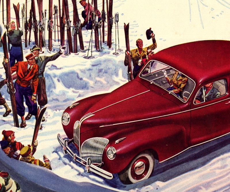
"Dorne scorns the use of airbrush; with his sable brush he can put the highest polish even on automobiles and other objects demanding the smoothest textures."
Recently my friend, illustrator/historian Kent Steine, sent a note referencing the unfortunate nature of the materials Al Dorne used for his technique:
"Although we can see tear sheets and good examples of Mr. Dorne's work, it has been my understanding the originals have not weathered time very well. Years ago, Fred Taraba and I were talking about various types of media, and he brought up some of the examples they had of Albert Dorne's work."
"As I recall, he worked with colored inks which, at the time, were likely quite "phantom". I understand some examples have faded. That's a shame. However, it was created to be commercial art. I used to occasionally use Dr. P.H. Martin's Synchromatic Transparent Watercolors. Most of that work has faded to a dull monochromatic local hue."
Kent's words struck me as particularly poignant. Albert Dorne was truly a giant of the mid-20th century illustration field. His tremendously skilled work, his admirable generosity and kindness, his opulent lifestyle preceded by years of astonishing struggle, his accomplishments as the founder of the Famous Artists School and how far-reaching its affects were on countless thousands of lives, the tremendous wealth and fame it generated, all speak of a life lived with unparalleled vibrancy. Like the coloured inks he preferred, all that has now faded away. That just seems so unfortunate and wrong to me.
Hopefully these posts will in some small way return some of the vibrancy to the memory of a colourful man who lived a colourful life.
* My Albert Dorne Flickr set.
And how ironic that his diametricly opposite but comparably skilled colleague,Robert Fawcett,used these same dyes; leaving the integrity and quality of both men's draughtsmanship as a final testimony to their talent.
ReplyDeleteA very thought-provoking thread.
Hi! I just wanted to assure you the memories of these artists have found new life in at least one person: Me! I discovered this blog and it's wealth of inspiration months ago and both my work and myself haven't been the same since. Their memories live on. Amazing work, both by these titans of illustration and yourself. You are doing a great service. Thank you!
ReplyDeleteChad; I very much enjoyed our discussion this week - thanks for presenting your challenging point of view on the subject. As a final thought on the ironic nature of the two men and what may seem like their opposing philosophies, let's also remember that they were not only colleagues but, As David Apatoff pointed out, good friends who had tremendous respect for each other. I find that notion very reassuring.
ReplyDeleteCasey;
ReplyDeleteYou just made my whole weekend - many, many thanks for speaking up! :^)
In many ways Leif,Dorne is my favourite illustrator,he was unbelievably good so often.Just the quality of his drawing sends my head spinning at times.
ReplyDeleteJust like Today's Inspiration,in fact.
I sense a cameraderie borne of mutual regard united these two giants and I'm sure we would all like to keep their memory from fading.
And I wasn't joking about that Dorne book!:)
as usual great stuff,Leif.....regarding Dorne....walt reed once showed me the famous artists course with the "individual" illustrators binder set from 1949...briggs did a separate volume,fawcett,parker,rockwell....walt then showed me an empty loosleaf where dorne's book was supposed to be...i believe walt said dorne was so busy,he never got to finish his....but you can see many of dorne's drawing and painting lessons in the later 1950,1954,and 1960 famous artists "combined" sets....
ReplyDeleteThose sound like some juicy morcels!
ReplyDeleteI'm not too familiar with colored inks. Are they similar to Dr. Martin dyes? Are they thinned with water? How do they react when re wet? Any more information on his technique would be greatly appreciated.
ReplyDeleteThanks
Joel,You can thin colored inks with water,but they dry waterproof.You can add a wash-layer on top of a another without disturbing the color underneath.I've used Pelikan colored inks.Rotring and other companies make them.They go on like watercolors mostly.
ReplyDeleteAccording to Dorne's 1960 Famous Artists demonstration,he would put a coat of Damar varnish over a finished painting to keep the colors from fading over time.Maybe the faded originals mentioned in the earlier post didn't have the varnish coating,or maybe it wasn't effective enough.
If one had a scan of the original, but faded, artwoirk, plus a printed reproduction made at the time, it would probably be possible to restore the colors in Photoshop.
ReplyDeleteThe original would be sharper than the print, but a bit of blur on colors is not noticeable.
Thanks, Steve. I may just give them a try.
ReplyDelete