
Monet worked at the Rahl Art Studio in New York and was apparently quite a woman as well as being an exceptional illustrator. Here's what Anita Virgil, who worked at Rahl during the '50s, once wrote to me about Dorothy Monet:
"I always thought of her as the heroine of a loooooooong and lusty French novel. She was quite gorgeous, like Vivian Leigh with more nose to her. And petite. Intelligent. Literate. Adventuresome. And quite the actress, innately. Donned all kinds of elegant clothing to fit "the role of the moment" . . . and likely did a few Goyaesque Maja Desnuda numbers on her fainting couch -- and anywhere else."

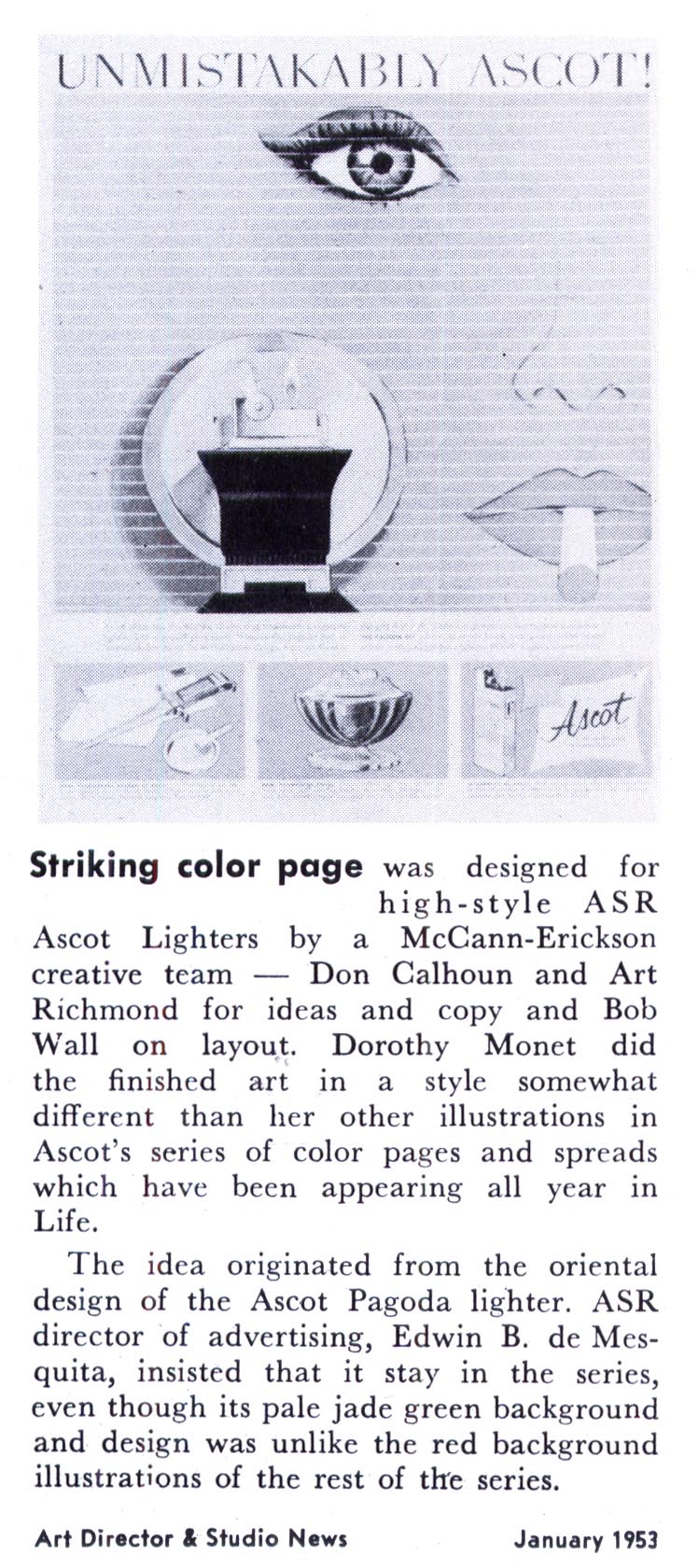
Monet's illustrations for this Ascot campaign garnered some positive mention in a trade magazine of the day. For any illustrator that kind of thing has to be good for your ego (not to mention your profile in the business), but I think especially so because Monet, being a female illustrator in a highly competitive, male dominated industry, was showing the 'old boys club' that they better watch out - anything they could do she could better.
And Dorothy Monet really could do it all. I've been setting aside examples of her work whenever I can find them in anticipation of writing a week-long series on her some time. Here are a couple of funny Old Gold ads Monet did in the mid-'40s.
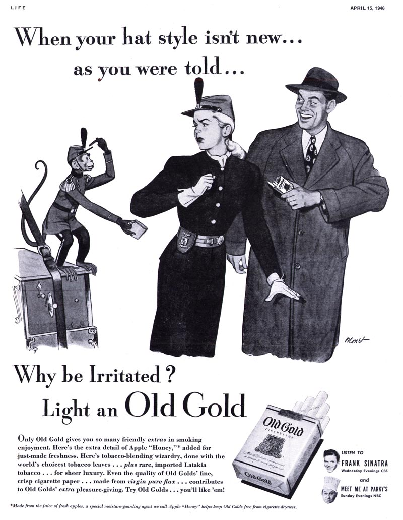
Notice her style here is quite different. Its more typical of a 'straight' advertising style from that period... but she manages to convey just a slight touch of humour without getting all 'big foot' and 'cartoony'. Not an easy balance to achieve. Based on what I interpret of Old Gold's strategy for these ads I'd say they were trying to appeal to both male and female customers. Monet's approach seems to really hit the mark; broad enough to appeal to guys while still gentle enough to not alienate the ladies.

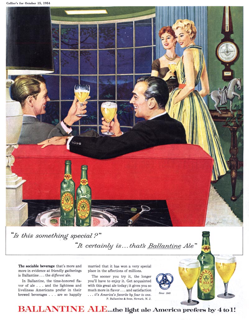
Here's another ad piece by Dorothy Monet, from a 1954 campaign she did for Ballantine Beer. Its a great example of Monet's straightforward literal realism style - so drastically different from the Ascot ads - but so perfectly professional for the subject matter and client expectations.
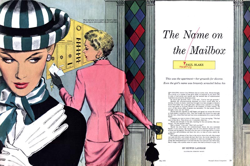
And here's the food for thought: according to the AD&SN article above, Dorothy Monet's Ascot ads were appearing all year (1952) in Life magazine. I only have the one, unfortunately, but look at this story art Monet created for the May '52 issue of Woman's Home Companion. Was it the Ascot ads that put her in the frame of mind to design the WHC piece as she did, with a strong emphasis on flat, graphic shapes and a focus on hands and faces? Remember, this was not the way she typically worked (the Ballantine ad is closer to her most familiar style).
And if the Ascot ads lead to the WHC illustration, why was Monet chosen for the Ascot ads? Could it have been this piece Monet did two years earlier, in 1950...?
We will likely never know. But we'll definitely revisit the "gorgeous, literate, adventuresome" - and talented - Dorothy Monet. Some time soon.
* My Dorothy Monet Flickr set.
Anita's recollection of DM is a gloriously nuanced piece of character description...I'm left feeling that what is not being said is as important as what is.
ReplyDeleteStill, a talented and versatile artist.
Chad; That's an astute observation. I wish Anita would allow me to say more. ;^)
ReplyDeleteMonet is great, but when tackling the Al Parker look she lacks his sensitivity.
ReplyDeleteI knew it!
ReplyDeleteWaited for years to find out who did the Ascot ads, I've got a great copy in a September 1952 LIFE Magazine. The same mag features Suzy Parker in red sequins. I'll be seeking more Monet illustrations now!
ReplyDelete