Bob Foster would bring in examples of the latest illustrations from the popular women’s magazines like McCall's, Ladies Home Journal, Cosmopolitan, Redbook, Good Housekeeping and others. He would point out the avant-garde compositions of Coby Whitmore...

Joe De Mers...
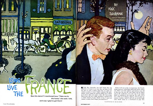
... and Joe Bowler, cropping into figures like Degas did over 60 years before,
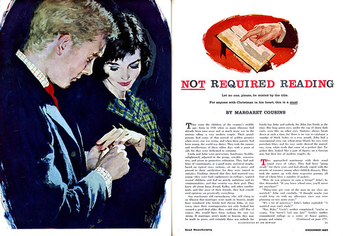
... or Al Parker, designing and incorporating the story title into his illustrations as a single flowing unit.
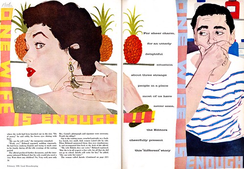
He was intrigued by Bob Peak’s unusual color combinations and sense of high fashion, that was rapidly coming into vogue.

He would point out the sensitive and expressive fluid line of Austin Briggs...
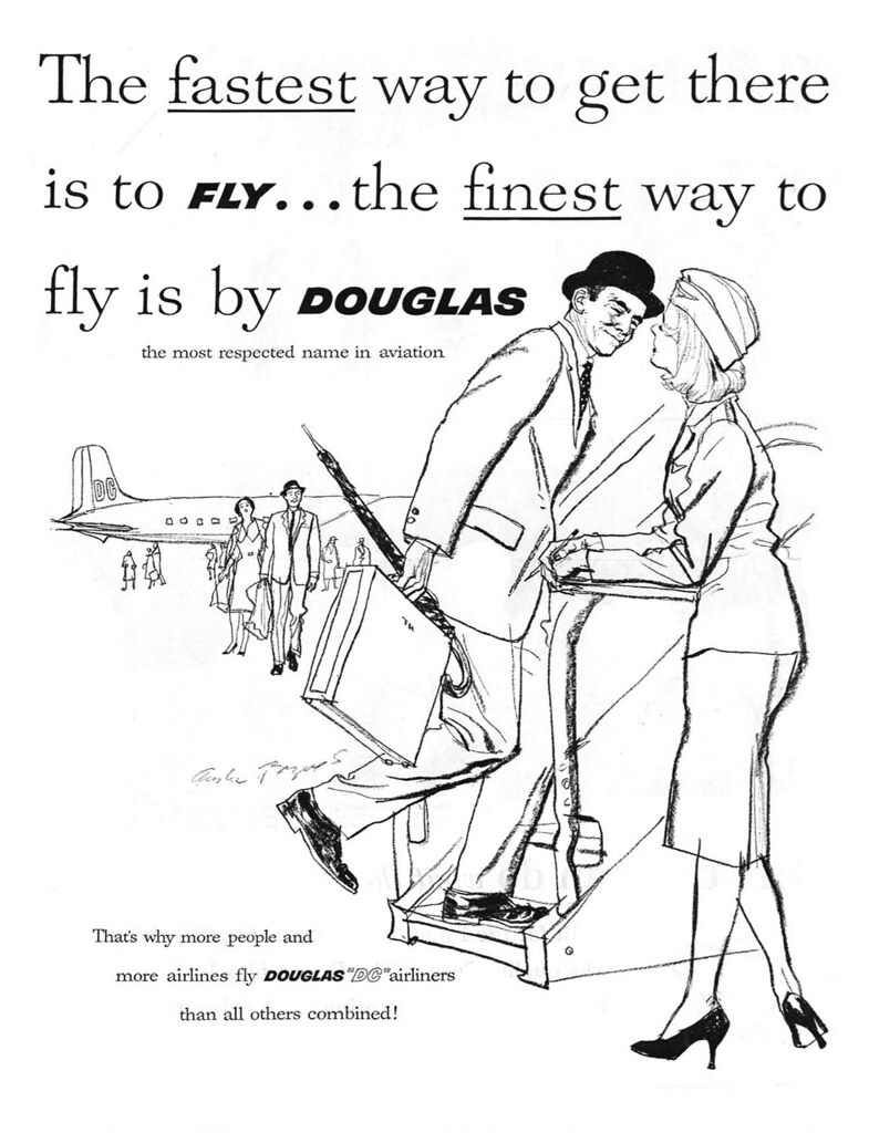
... whom he thought was one of the top draftsmen of the day. He also admired Robert Fawcett’s skilled stylized draftsmanship, his theatrical lighting and staging, and his dramatic compositions...
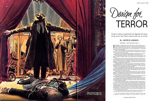
... particularly for the Sherlock Holmes series. While thumbing through the magazines, he would come across perhaps a new Al Parker illustration that would particularly inspired him, and he would get a twinkle in his eyes, and a big smile, remarking to the class, ‘this guy always comes up with something unique, look at that design.. just great.’

His enthusiasm in the new creative directions of editorial illustration captured our attention and left us hungry for the next batch of magazines to hit the news stands each month. It was like waiting for the grand opening to an epic Hollywood movie.

In those days teachers dressed as if they were interviewing for a job... matching suit or sports jacket, slacks and tie. The average illustrator was fashion conscious, and took pride in having good taste in their appearance and choice of clothing, as they would in their illustrations.. and Bob Foster was no different in that respect. He usually wore a dark matching three piece suit that was carefully tailored, and his shoes were always polished. He conveyed credibility, success and respect as an instructor and a professional. He worked out with weights regularly, and kept himself in good physical shape.
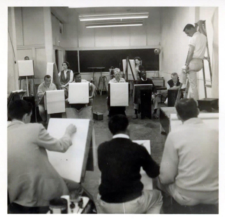
I never saw Bob angry, irritable or grumpy. He always seemed happy, energetic and extremely generous in sharing his vast skill and knowledge with his students. His natural ability to inspire and motivate his students in a “down to earth” manner was one of his major assets as an instructor.
As part of the process of developing an illustration, Bob would set up a photo shoot in the studio using a few selected students as his models to avoid outside model expenses. Most of us were cash poor and art supplies took most of our extra money. He asked me if I would be willing to be one of his regular models, and I jumped at the opportunity. Not only would I learn the procedure of developing an illustration, I would experience it as an actor experiences the character he plays.
While modeling, he would maneuver us in various positions, as though we were in a stage play, and when everything was just right he would click the shutter. He would take numerous variations of the same scene for students to choose from, sometimes with only subtle changes and sometimes obvious changes. I recall some of the poses were somewhat uncomfortable and felt unnatural, Bob assured us that what seemed to ‘feel’ natural often didn’t translate well in an illustration, and a pose that was awkward and uncomfortable, often looked natural in an illustration.

He emphasized that it was the job of the illustrator to convey the right attitude of the figure, for each situation. The photo only gave the information we could not possibly store in our head. Usually the props were photographed separately from the figures, especially when the props were not conveniently available.The scenes usually consisted of two figures, a male and a female.
In one scene, which emulated a cigarette ad, I posed as though I were lighting a beautiful woman’s cigarette. Since it was to be a beach scene, I was bare from the waste up, with a towel around my neck, and she wore a swim suit top, and a thin transparent blouse that was unbuttoned and flowing in the breeze. In this case, we would have to research and create a beach background from our clip files, etc. We used a fan to create a sea breeze effect. Bob preferred overlapping figure shapes, which created strong design units.
In another scene I posed as if in deep thought, dressed in Victorian period clothing and a very attractive female student model sat in the foreground in front of me in a white wicker chair. She was wearing Victorian undergarments that indicated perhaps a bedroom scene.
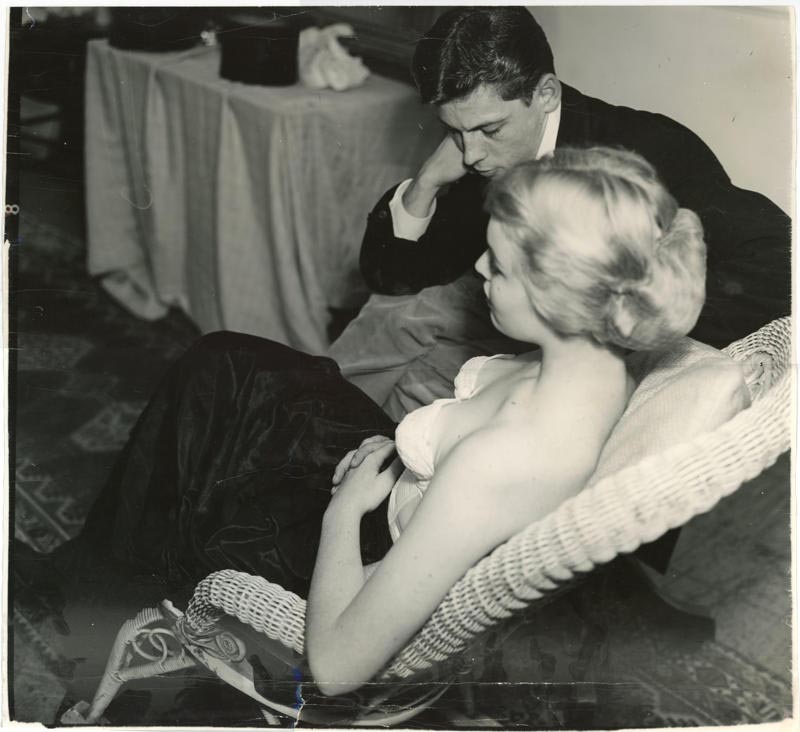
Above is a copy of the original photo of that scene.
Continued tomorrow.
* Tom Watson is a retired West Coast illustrator, art director and educator. He has been a frequent contributor to Today's Inspiration and his storyboard work for film was a subject of a post on my other blog, Storyboard Central.
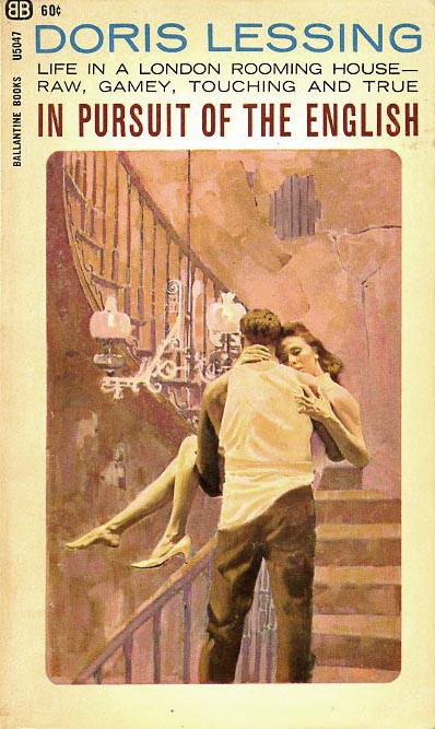
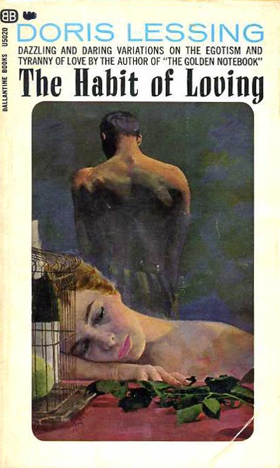
* Many thanks to Kyle Katz for allowing me to use the Bob Foster paperback cover scans above. The original art scan is courtesy of Heritage Auctions.
Wonderful, wonderful work. His work fits so well with his contemporaries of the day, Al Parker, Joe Bowler, Coby Whitmore. I love that period of illustration.
ReplyDeletelove, Love LOVE your blog. The name is perfect -- Inspiration! Thank you sooo much for these treasures. I remember being inspired by these illustrations when I was a kid -- the facile lines, the casual play of light and dark, the fluidity of the paint strokes, the intriguing layout and the impecible anatomy. Just wonderul.
ReplyDeleteThank you.
Big fan of your blog --- the spanish illustrator Segrelles might make a nice entry , or Morgan Kane - Kane has a nice site and interesting life - president of a hypnotist org.
ReplyDeleteThank you all for your encouraging words! I'm delighted that you're finding inspiration in the art and stories presented here at TI. I owe a huge debt of gratitude to people like Tom Watson and David Roach and the many others who have so generously shared the knowledge, experience, recollections and passion for the art and artists of the mid-century period. Many thanks to you all!
ReplyDeleteAnonymous; you just blew my mind -- Morgan Kane has a website?! I've been meaning to do a week on him for years now. I'll certainly investigate further - thanks for the heads-up.
ReplyDeleteTOM.....Late to the party here....busy times. Thanks for the Bob Foster blog. After checking out TI now for some two years, I'm still amazed how much I didn't know about the profession I was in. Don't know why I, and my illustrator friends, weren't aware of Foster. He obviously didn't compete in the S.F. area. There were others as well. Some very good illustrators came and went, and few knew them. I suppose we were very busy and stuck to our 'grooves'. As the 70's came along, there were dozens of new eastern cats, excellent illustrators, who were impressive. Same thing happened out here....and by the 80's, the biz was 95% over with. Thanks to Leif and the other contributers, we're all learning a lot.
ReplyDeleteFantastic work, best of the best. Give me Robert Fawcett any time, or any of these other guys for that matter.
ReplyDeleteGreat post as usual.
Btw, the magazine 'Trinca' as such (Spain early 70's) and its artists (V de la Fuente, A H Palacios, etc)could make a nice entry, maybe you would like to take a quick look...
ReplyDeletehttp://comicsenextincion.blogspot.com/search/label/TRINCA
cheers!
Great job pulling this together Leif. And Charlie, you are always welcome to the party. ;-) Bob Foster did some ad illos while he was teaching in the late 50's, but most of his time was spent teaching full time. It was a way to have an income, and work on a portfolio to take to N.Y. That was his overwhelming desire from the day I met him. Charlie, with the workload you seemed to have maintained through your career, I'm surprised you were able to take a vacation, let alone socialize with all the illustrators that came and went. As I remember San Francisco was pretty darn competitive, and everyone was working hard to break into the market, or stay in the market. I was told that there was more commercial artists looking for work in S.F. than was work available.
ReplyDeleteI believe it!
Tom Watson