
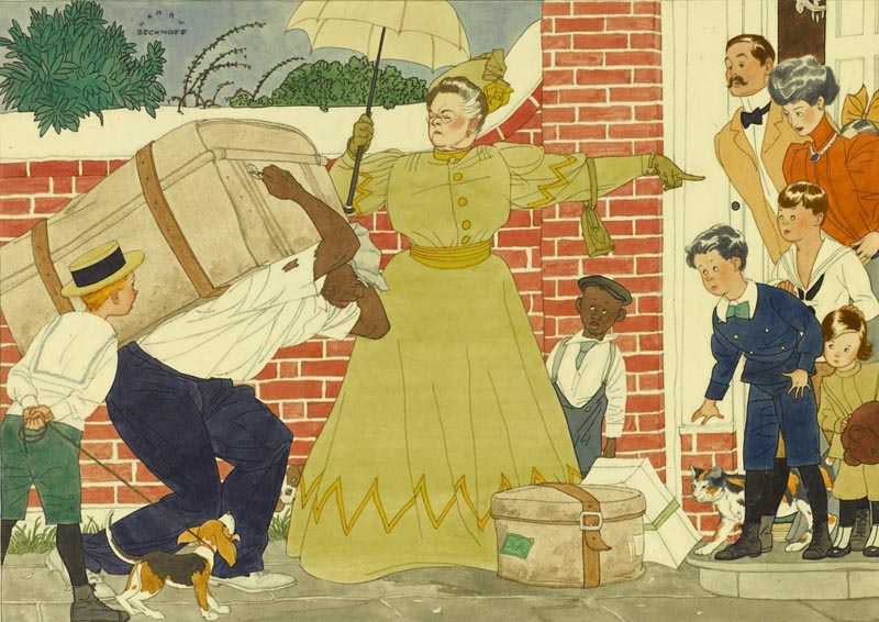
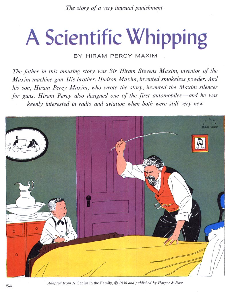
Above, a Beckhoff illustration from a 1936 Collier's magazine, courtesy of Heritage Auctions. Just seven years earlier Beckhoff had his first magazine illustration published in The Country Gentleman. His style was so entirely appropriate for the times, wasn't it?
Not surprisingly, he soon began receiving commissions from all the major magazines, but was especially closely associated with Collier's.
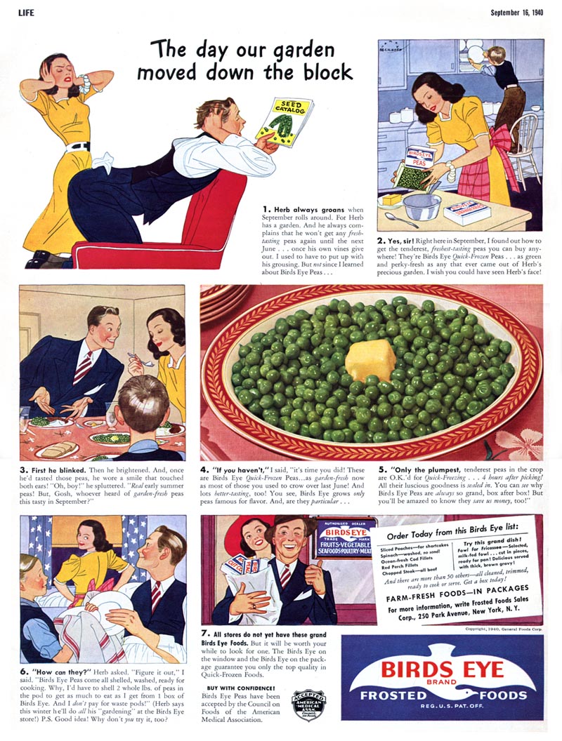
In the early 1940's Harry Beckhoff illustrated what must have been an extremely lucrative series of ads for Birds Eye frozen foods that regularly appeared in the front pages of Life magazine. Beckhoff had a unique approach to executing his work: he would do small but very accurate thumbnails ( that even included clearly defined facial expressions ) which he would blow up to about five times their original size...
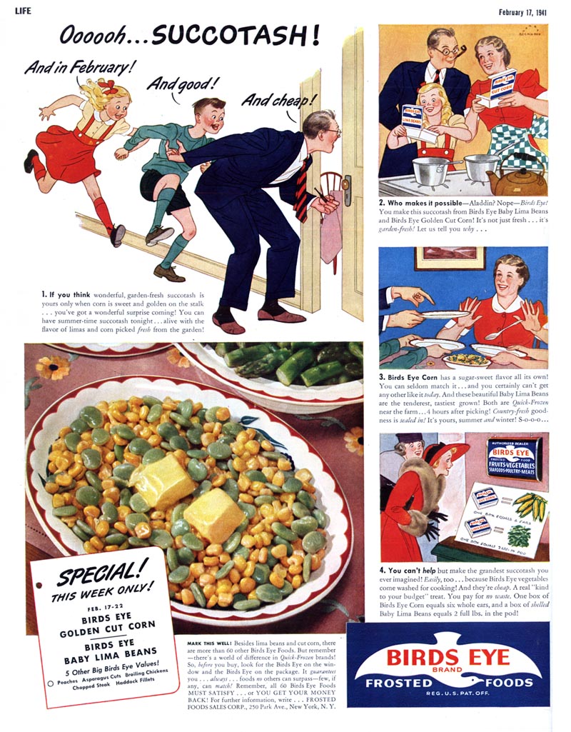
... and then ink in their outlines. He then added tone and colour with flat washes.
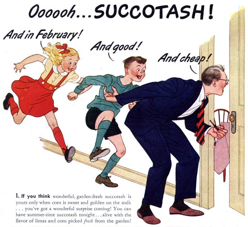
This may have been a time saving measure on Beckhoff's part, working from blown-up thumbnails instead of having to execute a complete full-sized pencil drawing, but I suspect it was more about capturing the energy and gestural qualities in that original thumbnail sketch...
... something that many artists feel is lost when a first rough is refined over and over.
I've loved Harry Beckhoff's work since the moment I first saw it, but what has always fascinated me is how his style never seemed to change or advance or evolve with the times. It looked like it came from (and belonged in) the 1930s and even as other illustrators adapted their styles to changing trends, Harry Beckhoff's style remained firmly entrenched in the '30s. Here's another piece from Heritage Auctions, from Collier's, 1950.
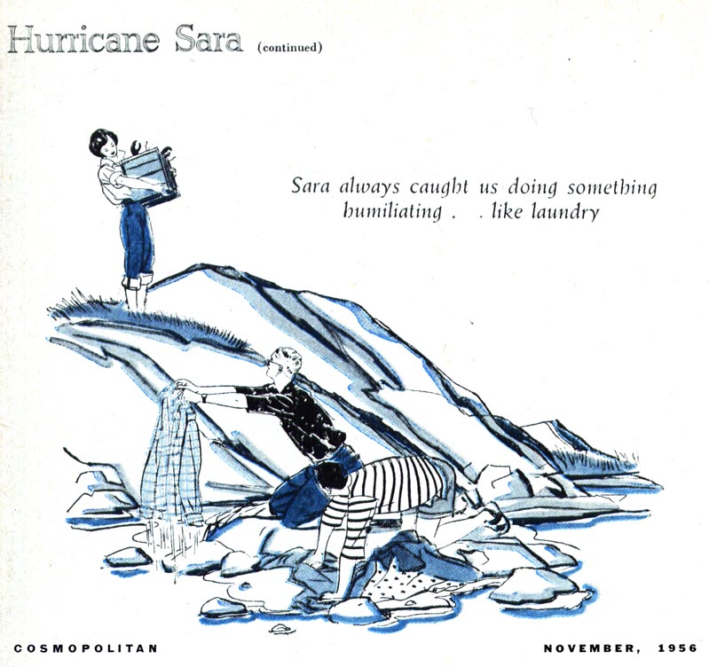
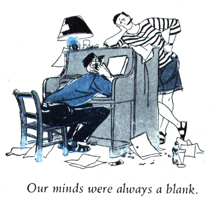
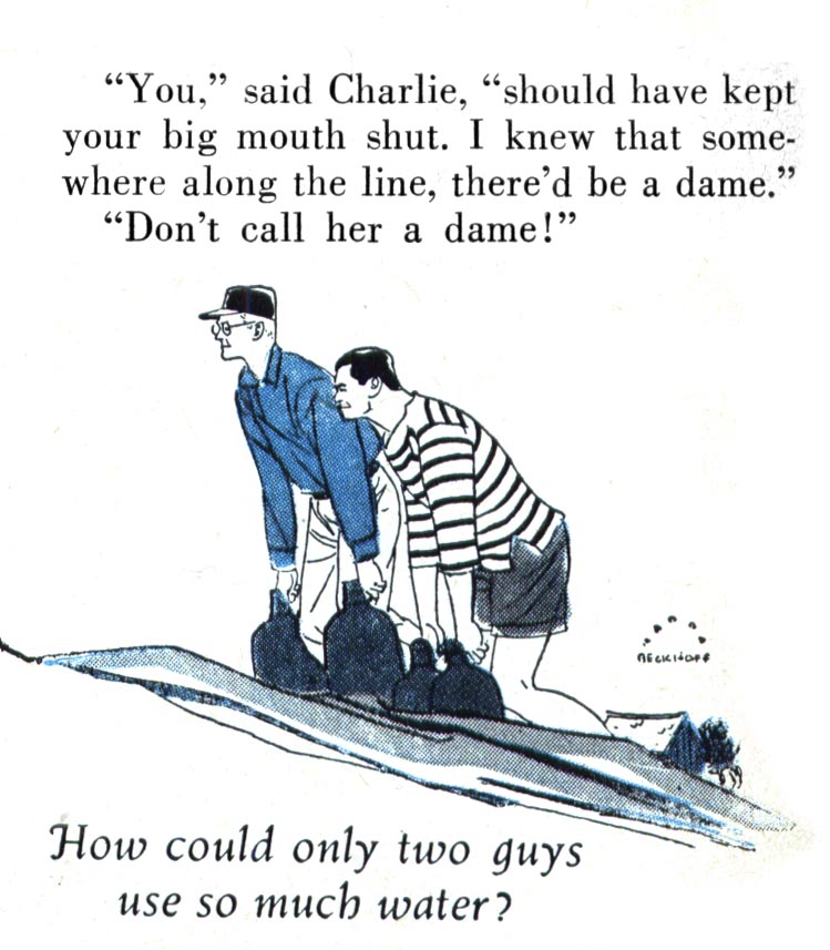
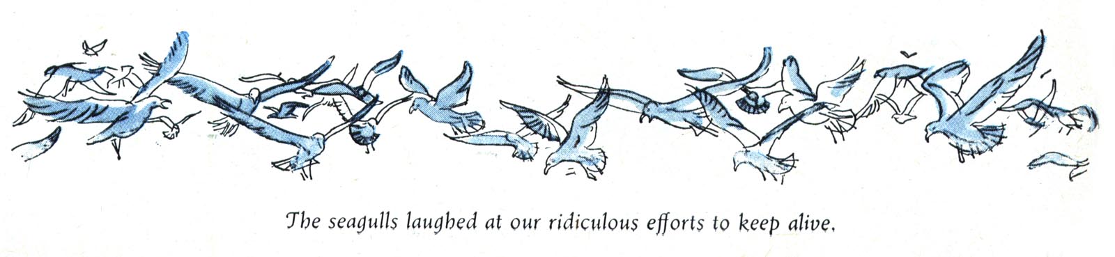
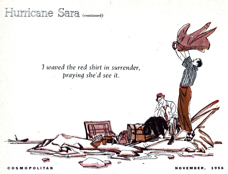
Then, much to my surprise, I discovered this 1956 story in Cosmopolitan magazine, illustrated by Harry Beckhoff. This was really exciting. Here was Harry Beckhoff art looking really contemporary for the times!
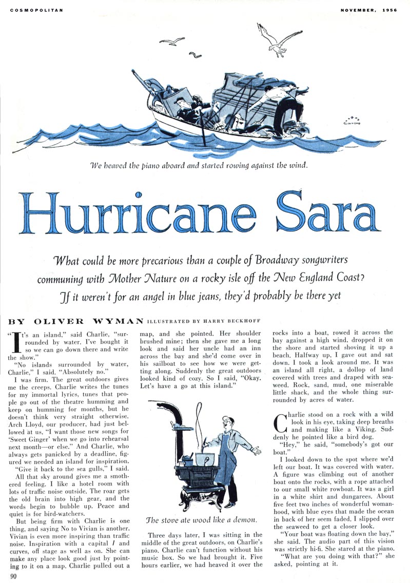
I've written before in praise of Cosmo AD, Robert C. Atherton. Was he the one who encouraged Beckhoff to push the envelope?
Or was Beckhoff finding it harder to land enough work because his style was, perhaps, simply not modern enough for most clients' wishes?
Whatever the case may be, this series from 1956 stands, for now, as the only one I've seen where Harry Beckhoff art didn't look like the typical Harry Beckhoff art.
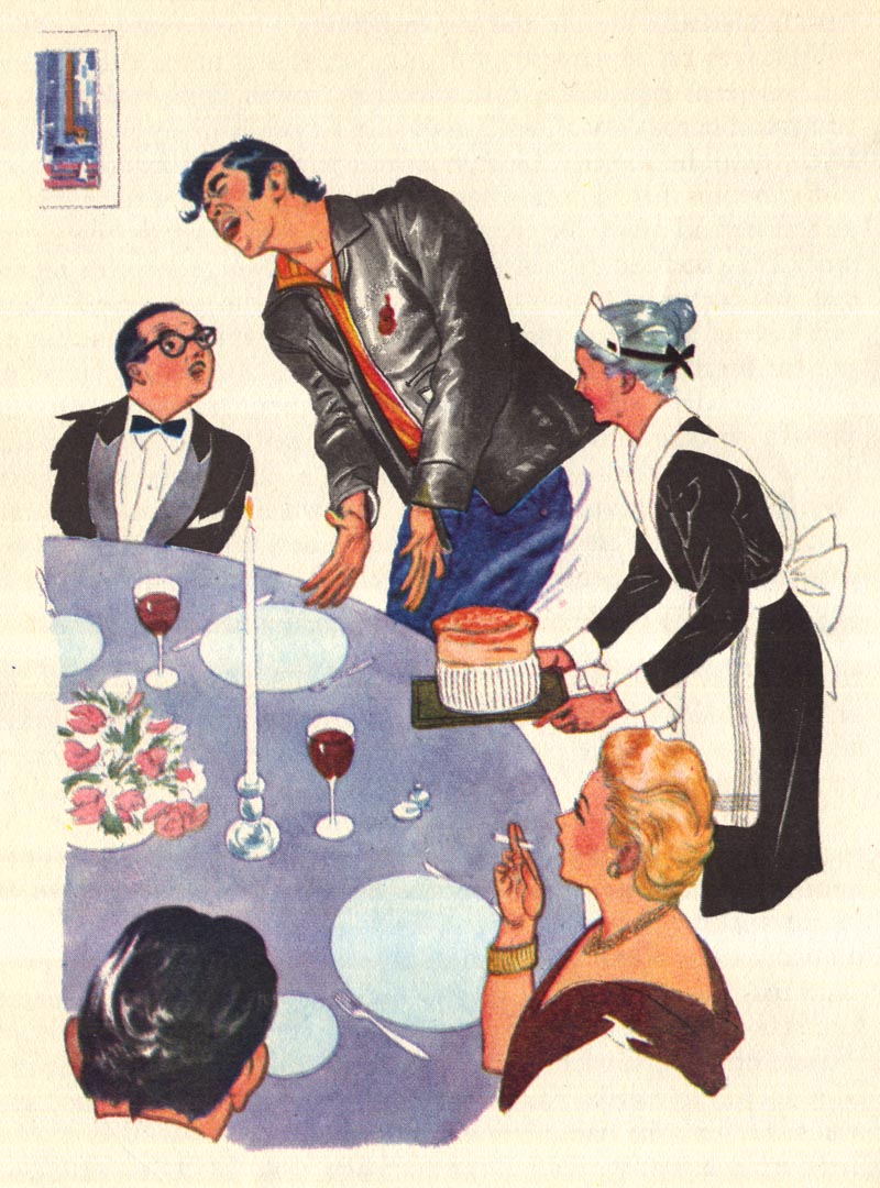
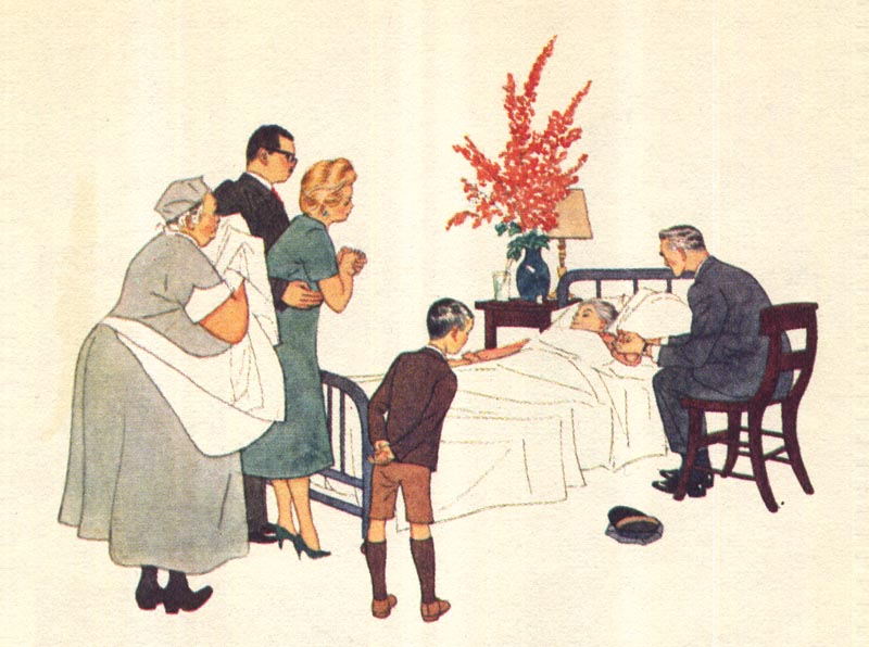
And who knows? Maybe its just best to stick with what you're good at. By 1960 Harry Beckhoff was back doing his thing, this time for Reader's Digest Condensed Books. Although the reproduction quality on the cheap paper used by RDCB doesn't do Beckhoff's delicate line work and attractive colour schemes justice...
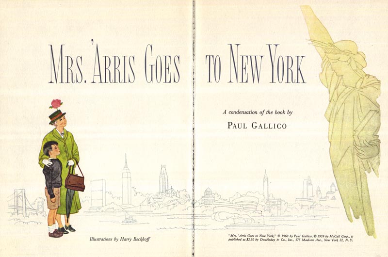
... this series from the then 60 year old illustrator is as lovely as anything he had ever done before.

Still, consider the work we've looked at so far... consider that the Cooper studio had come and gone... consider that Bernie Fuchs and Bob Peak where reinventing the look of mainstream illustration... and then look at what Beckhoff was still doing.

Of course the quality of the work is admirable...
Beckhoff's abilities unquestionable...

... but the word that comes to my mind is "quaint."
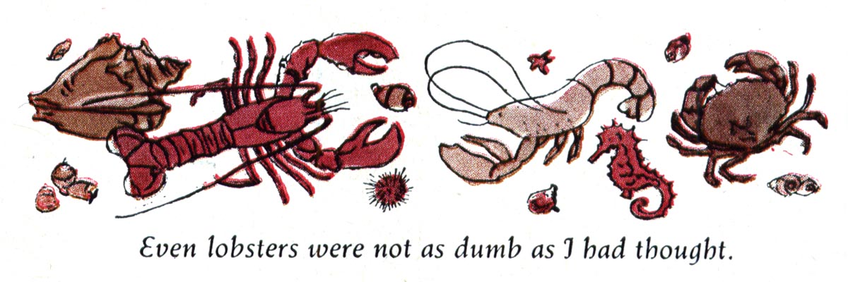
The latest piece by Harry Beckhoff I've ever found: from the 1963 book, Reader's Digest Treasury for Young Readers. By coincidence, Beckhoff was assigned to illustrate a story originally published in 1936 - the year he illustrated the Collier's piece at the top of this post. I don't doubt that the editors felt he would be perfect for this article because his style, like the story itself, was so dated.
Sometimes, if you stick to your guns long enough, you outgrow being considered "dated" and become a "specialist" - that rare commodity that is highly prized for having the expertise to do a certain thing better than almost anybody else. Let's hope that was the case for Harry Beckhoff, a wonderful illustrator you should definitely know.
* My Harry Beckhoff Flickr set.
One of my all time faves. Love his work.
ReplyDeleteP.S. did you get those jpegs?
Cheers, Dom
Yes I did - and many thanks, Dom! :^)
ReplyDeleteLP--thanks for the follow up on Harry Beckhoff. I've got a tearsheet in my collection from the early 70s, so he was still at it.
ReplyDeleteIn regard to other guys who might have fallen through the cracks, how about ROBERT O. REID? DENVER GILLEN? GEORGE HUGHES? GILBERT BUNDY?
More contemporarily, DON DAILY, a wonderful talent who seems to have been born out of time.
Again, many thanks for the wonderful stuff--and yeah--DAVID GROVE! I have THE OUTSIDERS original in my collection, a genuine prize--but I'd kill to get my hands on CAPTAIN BLOOD.
Best,
HVC
My daughter gifted me one Christmas with two of Beckhoff's miniatures, artfully framed. They stop people in their tracks, not just because they are so small, but because they're exquisite, like Persian or Indian miniatures. But unlike the asian masters, Beckhoff was a limner, a master of line, not colour. (Im not sure he even bothered to colour his drawings). The viewer finds his execution so flawless that the drawings are literally hard to believe!
ReplyDeleteThis open line style,like the continental ligne clair is a timeless modernist style that often seems to run in parallel to illustration trends.
ReplyDeleteThere have been many great exponents over the years and it certainly seemed to serve Beckhoff well.
Oh, thank you Leif for the Beckhoffs. Boy when you try to reduce what you do down to such elegant minimalism, you realize how tough what he achieved was to do!
ReplyDeleteYES! Robert Reid! I have a fair amount of his stuff, highly underregarded, great designer draftsmen with sly sense of humor
Howard; I'm only too happy to have had an excuse to showcase Beckhoff. Thanks for the suggestion. You'll find lots on Denver Gillen (as narrated by his daughter, Jen) if you type his name in the small 'search this blog' window near the top left corner of the front page. Bundy too. I'll make a mental note regarding those other artists you mentioned - and thanks again. :^)
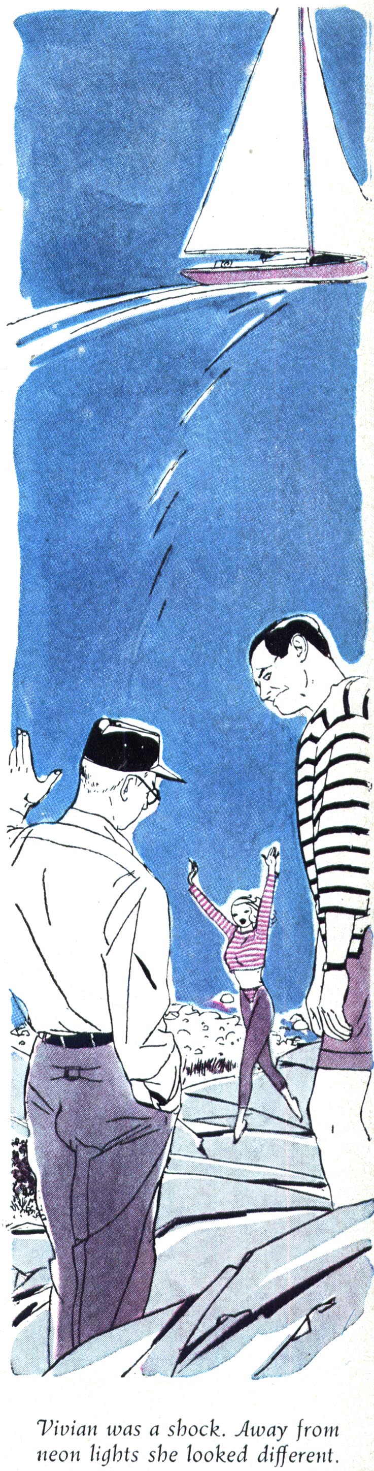
ReplyDeleteAntonin; I think you're right on the money with that reference to the ligne clair style. The difference being that Beckhoff's characters seemed to continue to be dressed in period clothing and inhabit an earlier time - even his one foray into a more contemporary 'look' - the 1957 Cosmo article - the fellow looks to be wearing a striped shirt in a style one would wear to the beach in the '20s or '30s - and the girl looks like an Enoch Bolles variation. You see what I mean? While many european artists took ligne clair and updated the fashions and hairstyles ... and even the 'look' of ligne clair in an way that is difficult to put one's finger on. Anyway, its all good! Just a point of interest... and just my opinion. :^)
ReplyDeleteBob; I envy you for having such treasures - you have a very thoughtful daughter.
ReplyDeleteChuck; on the Beckhoff, you're most welcome - I may tap you some time for some Robert Reid scans, if you don't mind. ;^)
most certainly. And of course David Grove can always use a little more revival. He was the local god we all worshipped when I was in school, and he even had the deeply oracular voice and sense of mystery about him to back it up.
ReplyDeleteI happen to have that '63 Reader's Digest Treasury book, bought new by my parents. I've always thought the kid looked very much like Tintin. Seeing it here is like seeing an old friend.
ReplyDeleteI was thrilled to come across this blog on Harry Beckhoff. I've just begun research on this artist as I am in possession of one of his originals 'Lily and the green thumb'. It was discovered under another picture I just reframed. Personally signed to my husband's grandfather. I'll try to send you a picture! Look forward to learning more....
ReplyDelete