Those who regard advertising as crass and devoid of artistic merit should take a good look at these ads. This is realism, and it is idealized, but its a distinctly stylized version of the perfect world. Unlike the more typical Madison Avenue eye candy of that era, White's interpretation of his subjects was as personal as a fingerprint.
Now I hope Nat's daughter and grandson (who may end up reading this at some point) don't take offense at where I'm going with this - because I really do love the artist's work - but over the years, as I've collected these ads, I've been intrigued by the unusual look of what I presume was White's efforts to portray cuteness in kids.
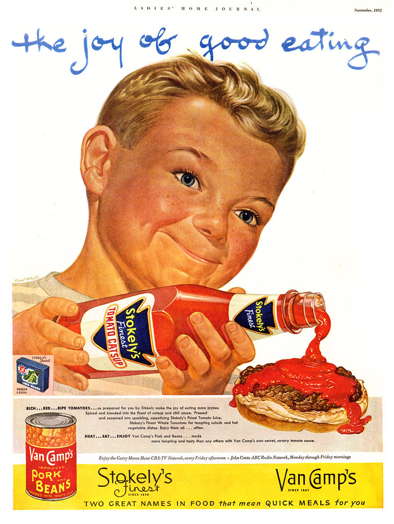
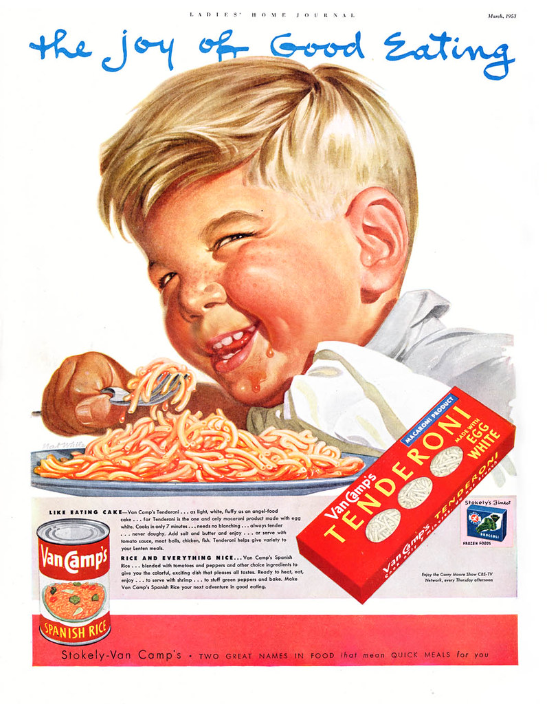
On occasion, as we see below, he pretty much hit the mark. This handsome little feller (though stylized in that very specific Nat White way) is the epitome of all-American boyish cuteness. Why I'll bet, after he finishes his burger, he's gonna go right out and throw a baseball or whittle a stick or something.
But then there's this kid, who is starting to look a little... odd...
And this guy... what's up with this guy? He looks like a 55 year old card shark who just swindled you out of your paycheque in Atlantic City.
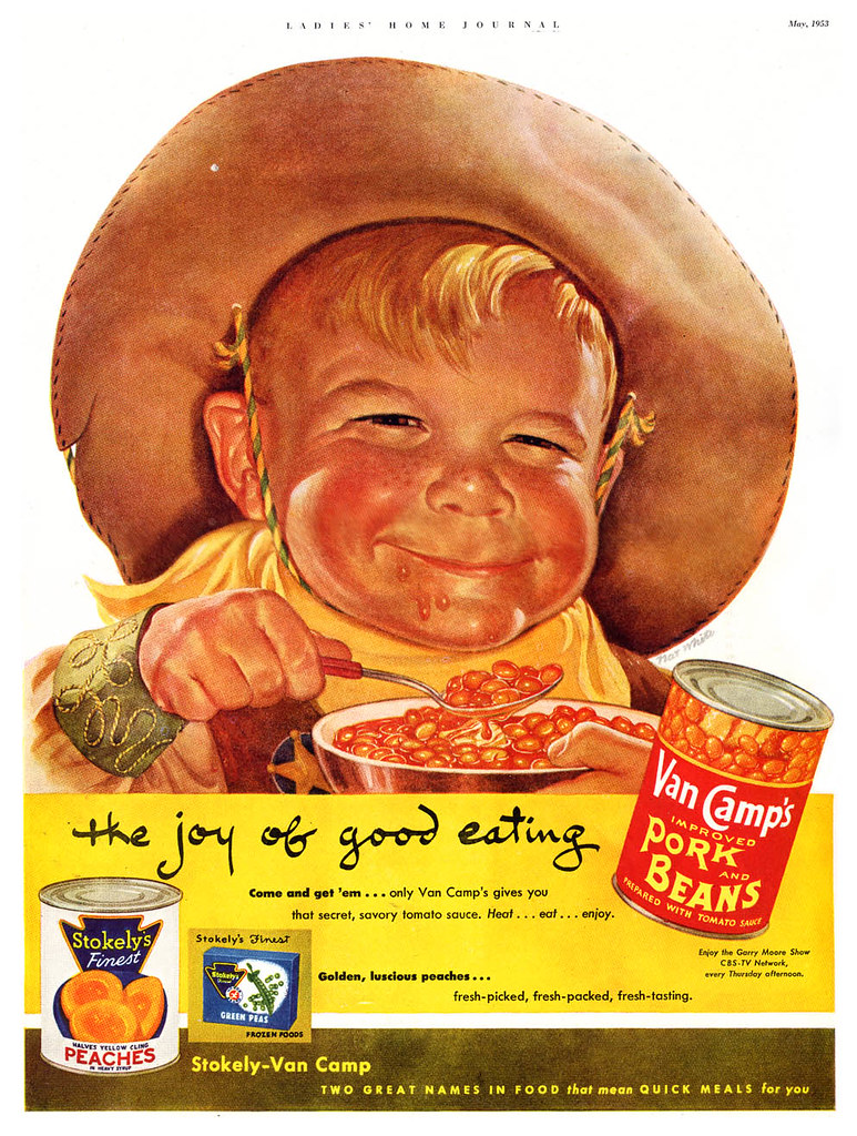
And this kid - yikes! I call him "Nat White's Bean Eating Demon Child."
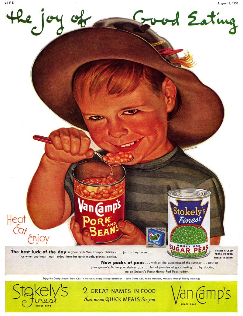
Just stare into those eyes for a minute and tell me you don't get the willies. And I didn't adjust the colours on this either - White actually painted Damien here with the glow of hellfire bottom-lighting his terrifying visage.

Again, I don't mean to disparage Nat White. I really do love his work. How he started out with the best of intentions and ended up painting pure evil will probably never be resolved. But the bigger mystery is...
... how the H-E-double-hockey-sticks did the art director, the ad agency and Stokely Van Camp all give their approval to print this scary artwork?!
* My Nat White Flickr set
Yes, Leif. I would agree that the first kid sure is 'cuter' than his siblings, but did you notice that he looks a little like ET?
ReplyDeleteRichard
Hah... yeah, I noticed, Rich - but I'm going to chalk that up to the Nat White-ish stylization I so love in all his work. (Gotta watch myself here... I feel like I'm walking on eggshells with this post)
ReplyDeleteSatan loves Van Camps
ReplyDeleteFound myself agreeing totally with the way that the kids look almost demonic and very scarey maybe wqith the effect beans can have on your digestive gasses and the release of them maybe this is why the kids look the way they do .... have they just let one go? ;)
ReplyDeleteThese remind me a bit of Frank Kelly Freas's work, especially his MAD stuff. Maybe even a hint of similarity to some of Will Elder's painted material . . . or maybe my frame of reference is simply much to "cartoonist-centric"!
ReplyDeleteThe last kid is definitely an incipient serial killer but they all have such great character in the faces! I love it.
As always, thanks for all the effort you put into this blog, Leif.
Huw Evans
EYECATCHER Graphics
http://www.eyecat.com/
You know, I wondered early on about those strange hands for Union Carbide....and even more so now after seeing these examples. Several things. I never noticed the guy or his illustrations back in my time. He almost defies description. Why would art directors or companies really go for this? In what medium did he work? Looks like tight oils. Tight fits....his work is tighter than a ducks ass, and they're waterproof! His interpretations don't seem satanic or diabolical to me. Just a bit primitive and quite strange. Hey, I guess illustration and art are in the eye of the beholder! Thanks, Leif, for an interesting blog.
ReplyDeleteCreeeeeeeeeeeeeeepy
ReplyDeleteOK Lief, I agree the kid is creepy, but looking at the whole ad I begin to wonder if between the concept and the printing something was deleted. Let me explain. The kid is wearing a hat with fishing lures hooked to the band and eating his beans directly from the can. So, we can assume that this activity was probably not taking place at his Mom's kitchen table. What if the original concept was suppose to have been a camp fire in the picture as though this was situated at the campsite at the end of a day of fishing, then the reddish glow coming from below the kid's face would be prefectly acceptable. Without the image of the campfire, all we are left with is an amazingly weird looking kid. Supporting my interpretation, is the first line of the ad's text which reads, "The best luck of the day . . ." which would support this interpretation.
ReplyDeleteJoyce; I think you may be on to something. That would make sense... its a leap that doesn't quite work, unfortunately, because I suppose the art director/client wanted to keep a consistent theme in their ads of a white background.
ReplyDeleteAnd for the benefit of all ( and to clear my guilty concience ) - please all keep in mind that I was only poking fun ... I really am incredibly fond of Nat White's work.
* And Charlie, I think "tighter than a duck's ass" should be logged as an official term in the lexicon of artistic expressions! ;^)
That last kid looks like he's wearing eyeliner-like Ozzy Osbourne or something.I think they are technically competent pictures, but on the evidence of these,I don't see that he had any particular talent for faces.
ReplyDeleteThere's not a single one I'd call 'good'.'Weird',yes.
One more.....Let's face it! The guy couldn't draw. The hands and faces and compositions are lousy. He was not ready for prime time.
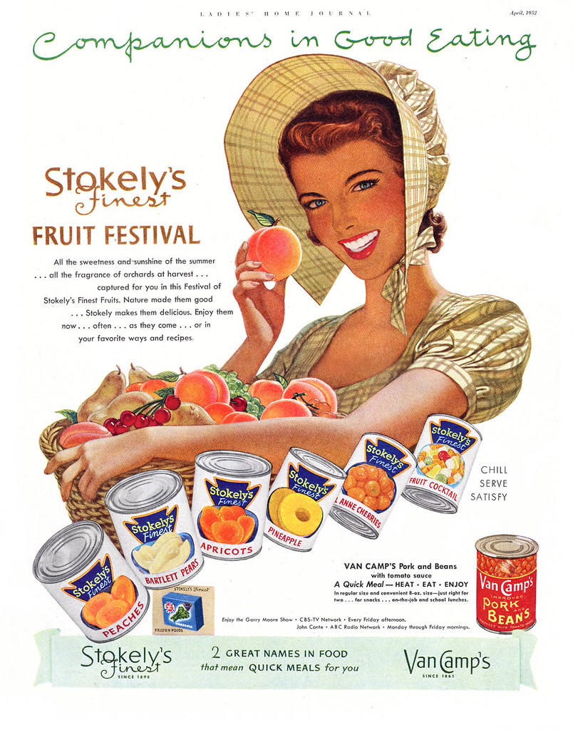
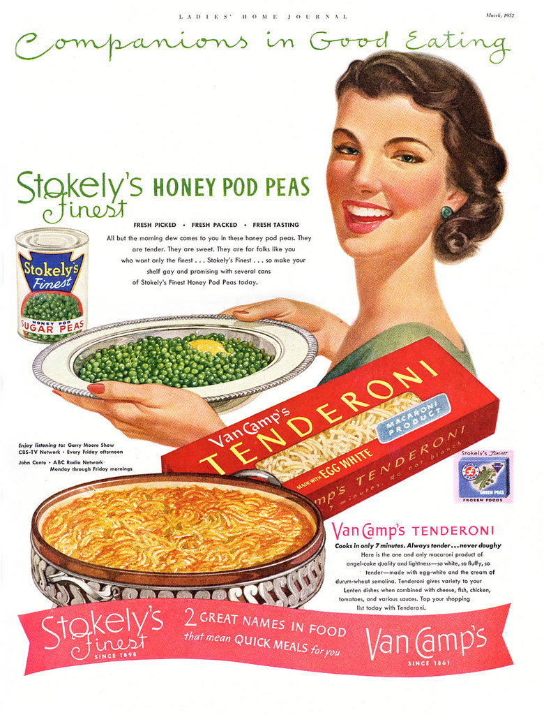
ReplyDeleteOh no, Chad and Charlie; please give poor Nat White a break! I think his work is charming in its oddness. And Van Camps and Union Carbide (and who knows how many others) must have agreed... not to mention their ad agencies. That's not to say advertisers haven't had poor judgement thoughout the ages, but still, just look at those top two ads with the ladies... I'm happy they didn't go for the Hollywood glamourized Cooper studio look -- White's stylized approach is so much more personal and charming.
ReplyDeleteJeez Louise, spring starts tomorrow - why so cranky, gents?
I like those peaches, and the peas as well.
ReplyDelete"Charming in its oddness": like that phrase of Leif as well. How eloquent you are!
Charlie's remark on tightness is equally interesting: When is an illustration too tight? When is it bound to be too loose?
I agree with you Leif, it's an anti-Madison Ave look aimed at it's target demographic, middle Americans who eat Pork and Beans or spaghetti out of a can. Even the miners costume and fishing hat tell us who their audience is. Having said that, I think he made some poor choices in casting an executing those last three kid jobs.
ReplyDeleteThe interesting thing to me about Nat's paintings of children is that although they don't look much like the stereotypical Norman Rockwell kid they were meant to imitate, they DO succeed in looking like real children. Real children, like babies sometimes, do look like little old men. Try watching an old episode of "The Little Rascals" or "Our Gang," vintage 1936 or so, if you don't believe me. Kids do sometimes look evil while doing the most innocent things, a la Stokely's bean eating demon child. I saw a photo of a young second cousin just a few days ago, and, complete with straw hat and fishing pole, he had a look on his face that only a can of beans could complete. I don't know if any of this was done on purpose by Nat White or not, but to me there's a ring of truth to these unusual little kids.
ReplyDeleteTesty? You ain't heard testy yet! And, yep, our spring weather has been gorgeous lately. Here's the point, to me. People can't fairly judge history by today's knowledge and standards. Doesn't work. Today, Hiroshima, internment camps in the USA, mass atrocities in Europe and Asia, and much more, are judged by most who did not live and experience those times and those events. Perspective always changes....it's a constant, remember? Back to illustration. I think White would have been laughed out of town here in the 50's. I knew at least four young illustrators, far better than White, who had to leave for the midwest and east to get work. Three I know did well. 'Oddly charming' didn't cut it. I'll leave (I hear applause!) with a couple of quotes, maybe repeats. Edgar Whitney, well known watercolor teacher, said in effect, 'you get facts from photos....you should get art from artists!' White flunked on both counts. The second, in an interview with Edward R. Murrow, Louie Armstrong was asked what kind of modern music he thought the best. He answered, 'Daddy....there's just two kinds of music. There's good music, and there's bad music!' White's was bad. Is that cranky enough?
ReplyDeleteYes, standards change. No one in 1950 would ever have foretold today's widespread crap produced by the music industry.
ReplyDeleteI wonder if those bean illustrations did their job; may be they had some general appeal. But anyway; is the sales success of an illustration a measurable quantity?
Here we have a saying, that half the money spent on an advertisement is just tossed out of the window. The problem is - you don't know which half...
I don't know, I don't know... with respect, Charlie (and you know how much I respect your work and your opinion) there's another saying: "you can't see the forest for the trees."
ReplyDeleteNot to devalue the anecdotal evidence of your first-hand experience, there is also value in being able to see a large body of work from a distance and assess it comparatively.
White's long-running success on multi-year campaigns for major national advertising accounts (at least two that we're aware of) suggests that his artwork played a role in sales and marketing success of their products, doesn't it? Something about his style appealed to the ad agency, the client(s) AND most importantly, the buying public - or he would have been shown the door in favour of other talents, no?
By contrast, look at the also long-running Pepsi "Sociables" campaign I showcased a couple of years ago. Many of those ads were done in that gorgeous glamorous Cooper studio style... but by many illustrators - not one specific artist. Because they were all such masters of that perfect Madison Avenue idealized reality, they were, to Pepsi and the ad agency running the campaign, essentially interchangeable. Not so for Union Carbide or Stokely Van Camp's. They stuck with Nat White. Seems he had "the right stuff".
Maybe Leif and Charlie are both right.
ReplyDeleteWe could tell if White was any good if there is other work where he showed he could paint a 'nice-looking' person; something to show that he deliberately skewed his work in this odd direction intentionally ( I could believe this if it were Harry Anderson or Charlie Allen) or whether it was just technical deficiency.
If it were the former, I'd respect his original thinking, I dont believe in respecting incompetence.
Now it may be the AD saw something in this and harnessed it to the service of his product.Which would make HIM the genius/Don Draper figure.
I suspect it was more likely the latter.
Interesting conundrum.
from Nat White's daughter, Chris White Jorgensen (erikchris@embarqmail.com):
ReplyDeleteThanks for your charitable comments, Leif!
Yet I have to agree that those boys' expressions are creepy, and can't figure out why, when they don't reflect Dad's personality at all. His facial illustrations of women and men are better. He used my gorgeous Mom's face and graceful hands for his decades of Crane Stationary ads, for instance.
It might also be good to research further as follows:
1. 30 yrs. of Gulf Oil posters;
2. Two Readers' Digest Covers: one of the Olympics in Japan, and one of the Zodiac;
3. The first Korean War poster of a man with hundreds of parachutes coming down behind him;
4. His volumnous later work for Reproducta Company in Manhattan including beautiful greeting cards, a booklet on the Stations of the Cross for Sacred Heart Monastery in Walls, MO, a booklet on national monuments for Book of the Month Club.
Dad simply loved painting, and was so meticulous that he often ran through one tiny camel hair paint brush per illustration. The lights on his Christmas trees had 5 layers of paint, and so had a luminescence that was beautiful.
As a little girl standing silently, slightly behind him as he worked nights in the studio at home, classical music in the background, my heart would fill with joy as I'd notice Dad was often smiling faintly, his eyebrows raised. At times he'd swish his brush in the glass of water on the table on his right. Then he'd flick it, and the point would be restored. We were all so proud of him.
Later, after becoming a Jesus-follower, I had a vision of a hand picking up a paintbrush which was totally dry and askew, a smooshed mess. The hand slowly dipped the brush into living water and flicked it. The brush shone with fresh life, pointed and focused for some work of art. The application was and is clear to me.
Have a blessed day and heavenly future.
They're all creepy and crass. Maybe Nat pulled off a satiric/ironic coup on his employers? But the demonic bean child is now saved on my hard drive, it's first rate creepy.Creepy for the ages.
ReplyDeleteThe gestures and and body anatomy are good, but the expressions and facial anatomy descend into the uncanny valley.