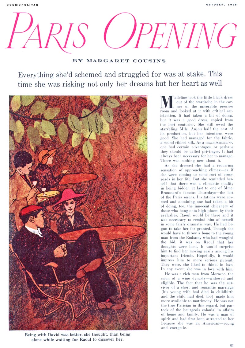
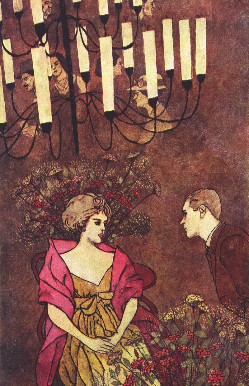
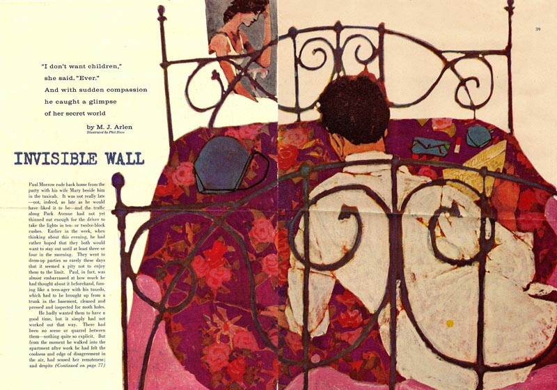
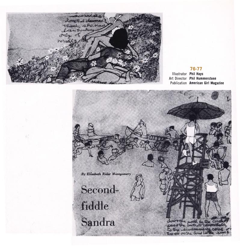
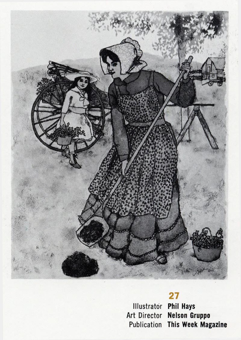
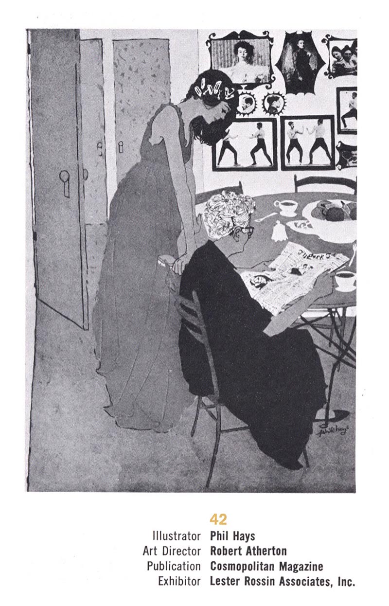
I really like Hays' work from the 1950s, when he was doing artwork like the examples shown here. On Alex's new Phil Hays website, you'll find a few examples from this early stage in the illustrator's career, but for the most part, the site showcase's Hays' later period, when he had dramatically altered his style.
The change is quite startling and curious. Off the top of my head I can't think of another mid-century illustrator who's style underwent such a radical overhaul. If there was a transition period, it isn't documented in the site's gallery.
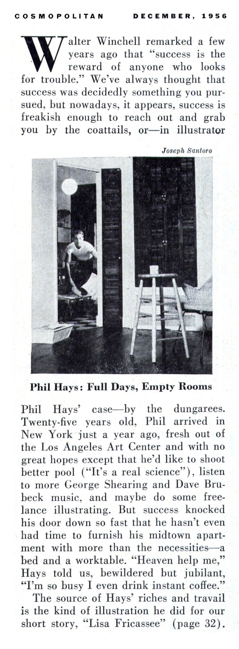
Hays seems to have made a big splash when he arrived on the scene in New York in the mid-'50s, as this little article from the December 1956 Cosmo would suggest:
Below are a group of scans courtesy of Tom Watson, from the 1959 NY Art Directors Annual. That Hays was having so many entries accepted to the AD show in one year certainly confirms his mercurial ascent in New York's illustration circles.
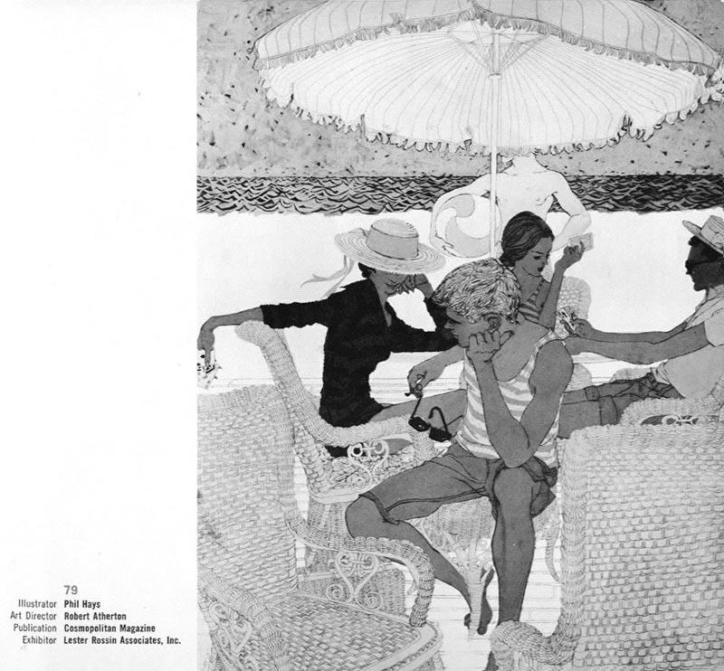
If Hays' work from this period reminds you a little of Jack Potter or even early Bob Peak, you're not alone. I'd say that between the three of them, Peak, Potter and Hays pretty much 'cornered the market' on this style for a few years in the late '50s.
When Tom and I first corresponded about this group of artists, he astutely wrote, "...not sure who stole who's style... my guess is Peak stole Potter's style. Potter's work was more consistent in style than Peak's work. Peak seemed to be always trying something new..."
Tom continued, "In my opinion, Phil Hays was a good illustrator, and showed occasional moments of brilliance, but was not on the same level as Potter and Peak. Hays may have been stealing ideas from both Potter and Peak. But then, I guess no style is 100% uniquely yours."
Certainly a reasonable conclusion - and it might explain why Phil Hays didn't stay committed to this style over the long haul. The website doesn't provide any explanation of why Hay's work changed so dramatically, but there are plenty of other interesting facts about Hays and some really great vintage photos of the artist. Well worth a look!
Many thanks to Tom Watson for providing the b/w scans in today's post and - I apologize to whomever contributed the colour, horizontal format scan near the top - I've forgotten who it was, but thanks!
Check out The Art of Phil Hays website
* My Phil Hays Flickr set.
Never been too keen on Hays' rendering but his compositions were consistently good.Love the interplay of shapes and tones in the beach scene.
ReplyDeleteI think Potter and Peak were a notch above however.
Hays was Illustration Chair during my time at the Art Center, and one of m teachers. When showing his work, he once said he wanted it to look like no hand had touched it-- no brushstrokes, no evidence of the tools used to make it-- as though it wasn't made by a person. If you look at his late work he didn't sign it, he used a rubber stamp instead. I never heard him go into more detail about his style change.
ReplyDeletePhil was a great guy, and responsible for educating some great modern illustrators. He worked very hard to teach us to find non-verbal solutions to our illustration problems.
Hays' later work resembles airbrush illustrator Dave Willardson's stuff.Hays must have influenced Willardson.Considering he taught at the Los Angeles Art Center and Willardson was a student there,I guess it follows.That was a hot style in airbrush album cover and magazine art in the 80's.
ReplyDeleteLeif-
ReplyDeleteI can't remember but I think Phil may have been a student of Potters. Jack started teaching early on in his career.
I know he told me but my memory on it is fuzzy.
I just looked at the website and it says Phil attended Art Center in 1952. That would be around the time Jack taught there.
ReplyDeleteI'm am amateur writer and when I read the lame text that accompanies some of the illustrations here I can only think of how fortunate those authors were to have such talented artists depicting their work.
ReplyDeleteLove your site, by the way, and wouldn't miss a post.