"It was apparent to me that an artist should not spend years developing a style which, in terms of demand, would quickly pass. In other words, he should not be an artist 'from the wrist down'."
"Also, he isn't wise to allow his work to be pigeon-holed so that he becomes known as a fashion or sports or editorial specialist. Creativity depends on variety."
"For me, drawing comes first. I like to draw, and I believe in being a good draughtsman."

"Though I use many media and techniques, I don't approve of using a technique for its own sake by pushing it as far as possible to see what interesting effects can be achieved. Each problem will have its own aspects. I choose the technique and medium which will be most expressive and accurate."
"Recently I've discovered I love to paint, to work with forms."

"I use a variety of media: charcoal, grease crayon on acetate, oils, dyes and designer's colors, crayons, and, for texture, salt on wet washes."

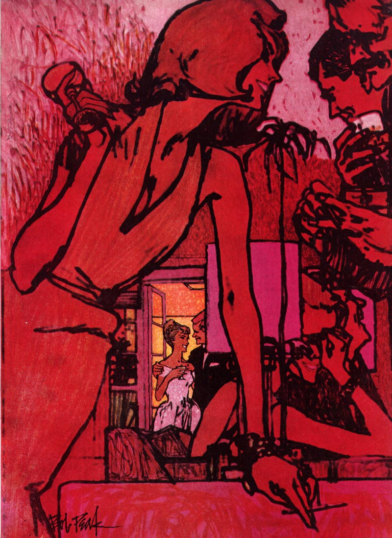
I use color for mood and expressiveness. Some of the things I do are calm, but most are not, so I prefer strong colors. Grays don't work too well for me."
"If things are bright, it is a time for brightness."
~ From an interview with Bob Peak in the September 1962 issue of American Artist magazine.
Conluded tomorrow...
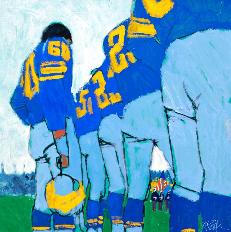
* Many thanks to Heritage Auctions. The football image and parrots image are from their archives and used with permission.
* My Bob Peak Flickr set.
* Bob Peak official website
* Bob Peak official blog
* the Sanguin Fine Art Gallery
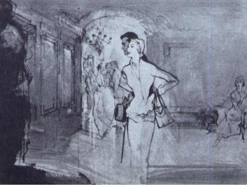
This sounds more like the Bob Peak I expected. I think he did those "Peak-a-boo compositions (from the third illo down), better than virtually any illustrator I can think of. Weaver used it occasionally as well.. looking through or between props at the center of interest for example. It is also called a tunnel composition, which was rather unique in illustration back then, but usually not very applicable to most advertising assignments. I tried it a few times in rough concept presentations for my advertising assignments, but the 'tried-and-true' approach would eventually win out over the unorthodox more innovative approaches. ADs loved it, but a tough sell to their button down nervous clients, who had to answer to an even more button down corporate V.P. or President.
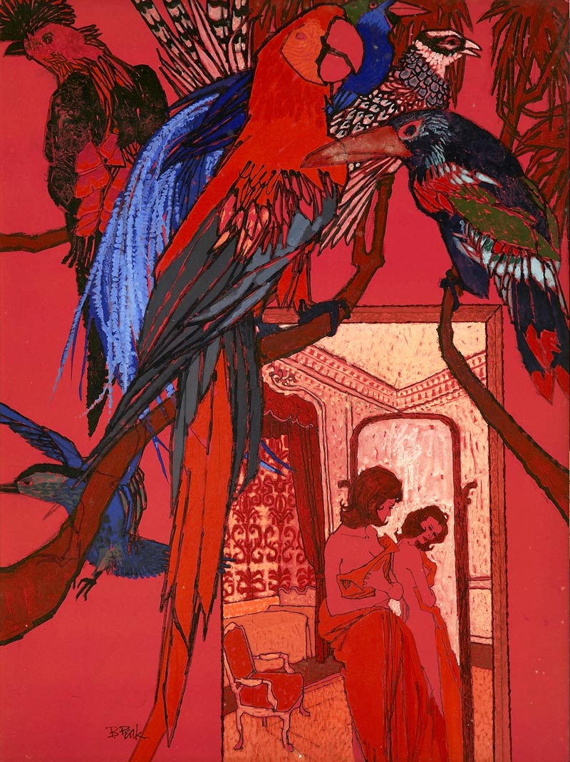
ReplyDeleteThe parrot illo has wonderful color and a very unique flowing design. Birds and bird cages make great props, and in retrospect, I think that is what distinguished the top late 50s' and 1960s' illustrators, from other illustration periods in history. Al Parker, Joe Bowler, Coby Whitmore, Joe DeMers, Robert Fawcett. Austin Briggs, Bernie Fuchs, Bob Peak, Mark English, etc., all had tasteful and creative props that were used as strong design elements, mood and added interest to the illustration.
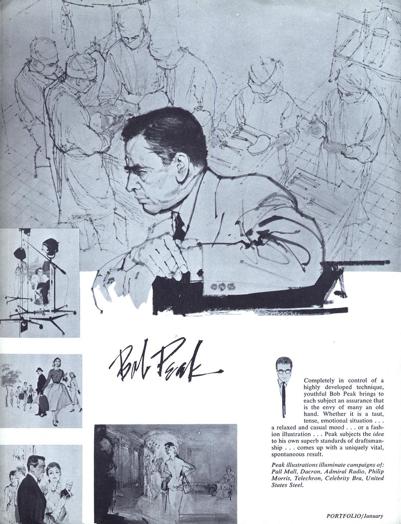
Even though Peak wasn't a hard-nosed literal draftsman, he understood the importance of good drawing skills (as quoted in the interview), and perhaps that kept him from straying too far away from solid representational illustration.. but, always added his unique flair of course.
Once again, you're taking me down memory lane, thanks Leif
Tom Watson
I never cease to be amazed at Peak's work. Yesterday, was mostly a downer. Didn't agree with the examples, nor the quotes. Today....once again, wow! No doubt....the guy was a creative genius. Interesting that most of the illustrations posted recently were not widely seen. I really don't recall any.
ReplyDeleteSo wise and so true. A very good advice for any illustrator today. Never understood why would one want to draw in one and only one style for ever.
ReplyDeleteAll these peices are so stunning.
ReplyDeleteThanks for sharing. Although the quality may vary in his work (this can be due to the client!) what comes through is the power of drawing and the dynamics of the design. All look fresh and vigorous - those were the days!
ReplyDeleteBeautiful illustrations. Thanks for sharing.
ReplyDelete