
"The unfortunate aspect is the intention of the work. It's not even painted to last. Good commercial art doesn't pretend to be something it isn't."
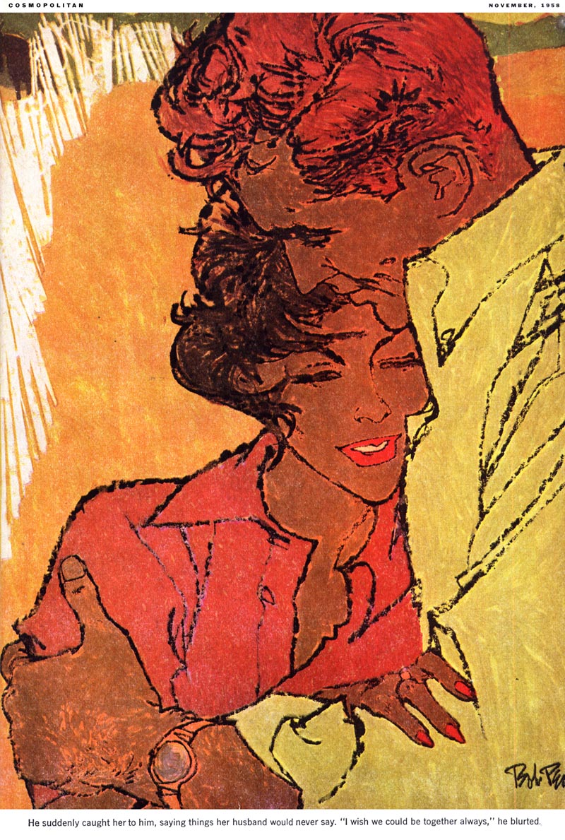
"Only a small portion - a very small portion - of the total will enter the realm of greatness."
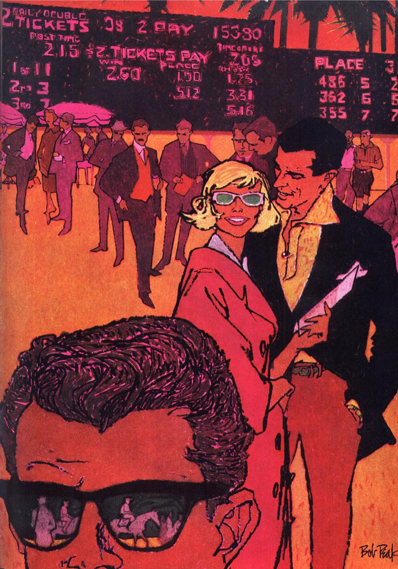
"There is a very tenuous line between commercial art and fine art."
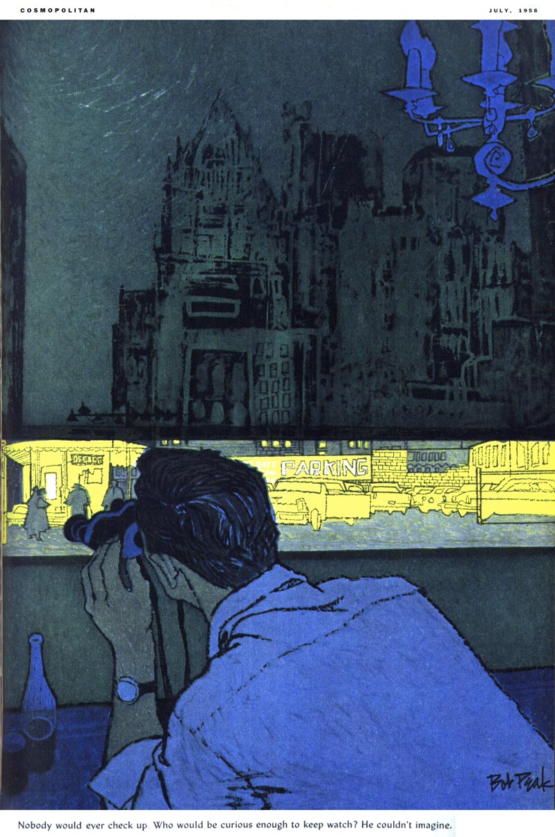
"I suppose the best way to define it is to say that in commercial art, you are solving somebody else's problem; in fine art, you are solving your own."
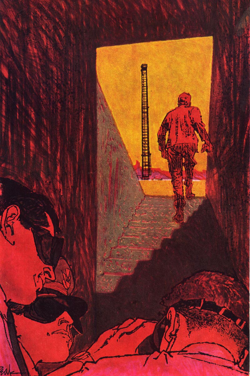
"Of course its not quite as simple as it sounds, especially at a time such as ours when we are so aware of ambiguities. Everything is tempered with pros and cons."
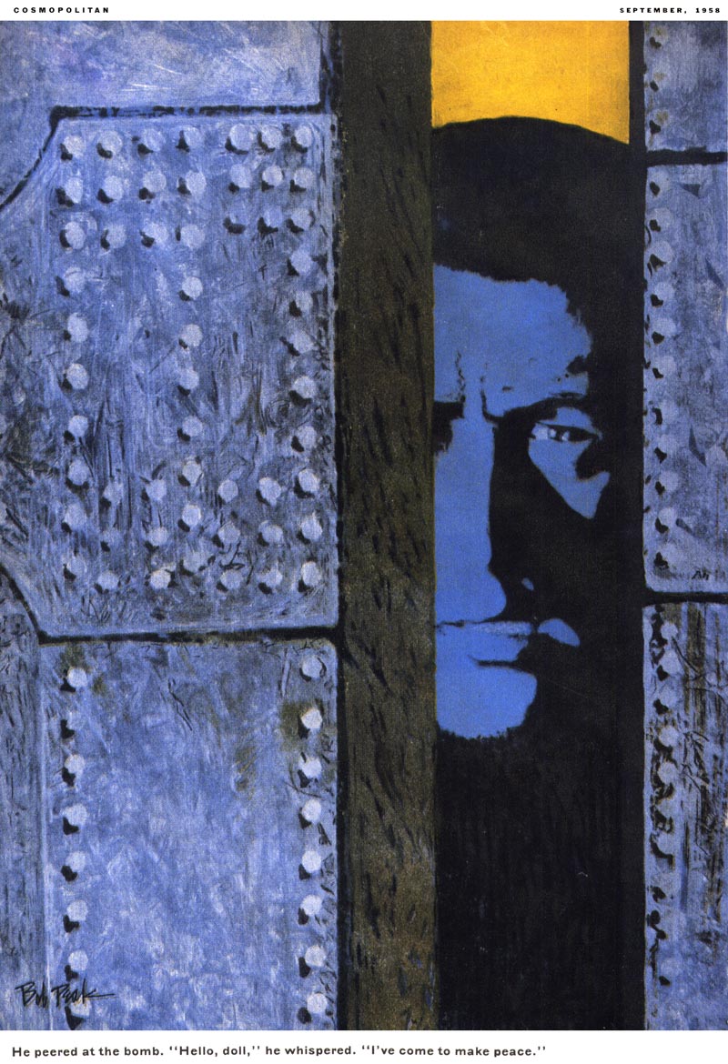
"For example, in editorial illustration ( which is a form of advertising since it involves selling a book or story), the artist must know first of to whom he is appealing. This means being close to his contemporaries."
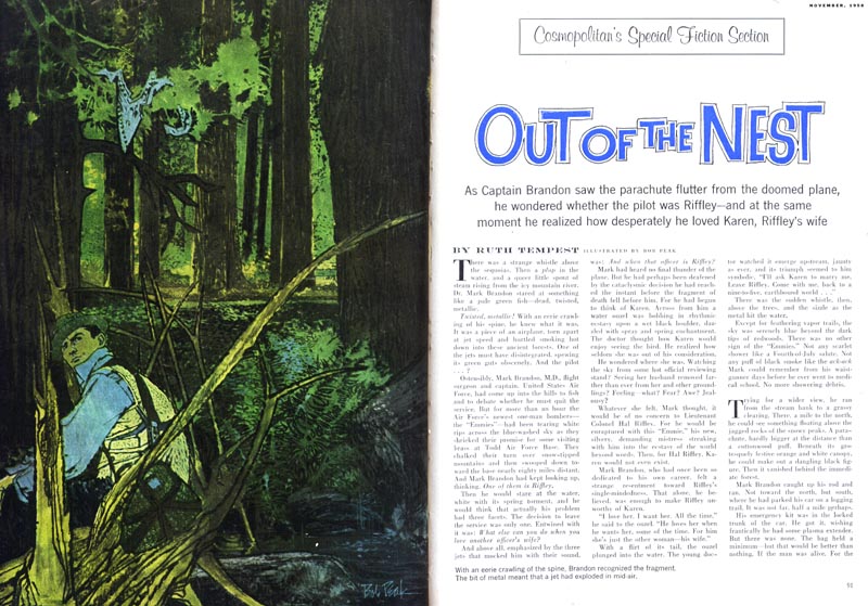
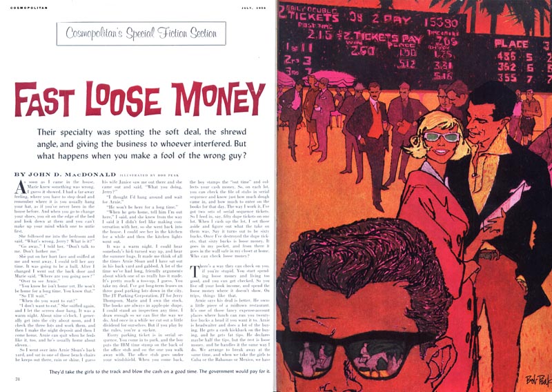

"After that, he must know what it is in the story that is desirable to communicate. Whatever the assignment, he must know what he is here for and why he does what he does."
~ From an interview with Bob Peak in the September 1962 issue of American Artist magazine.
Continued tomorrow...
* My Bob Peak Flickr set.
Note: I just found out this morning that Bob Peak's son, Matthew has recently started a dedicated Bob Peak blog where you'll find plenty of nice large scans of Peak's work - go have a look. Matthew just sent back a note asking that I also mention the Sanguin Fine Art Gallery "where," writes Matthew, "my dad's originals and editions are availible (at reasonable and realistic prices)." He adds, "I am in the process of contacting some other illustrators in my dad's circle to join the gallery."
* Bob Peak official website
Wow!....Very different Peak examples. With the exception of the second scan, obviously advertising (including the clips in my file), the work is editorial in subject, style, and originality. Very different....very creative....and most not looking at all typical of Peak's work. The guy was great....no doubt about it....and his attitude and thoughts on illustration were so logical. Thanks, Leif.
ReplyDeleteI had exactly the same reaction to Peak's editorial illos as Charlie.. dare I be facetious here, and say great minds think alike? ;-)
ReplyDeleteHis advertising illustrations seemed to me to be more flamboyant and energized.. like the excitement of a Mardi Gras parade, full of energy, flair and fun color combinations. I wonder if he didn't feel more comfortable doing ad illustrations and Sports Illustrated assignments, which were more lively. However, I 'm not implying that most of his editorial stuff wasn't great too. I always thought he had a real sense for dramtic elegance and fashion, and it would show up in virtually all his illos.
Tom Watson
Thank you for showing these I really like his early work with the great
ReplyDeletedrawing. The color schemes he used were his own and untypical. I haven't seen the examples shown today and I like them a lot. All of these are about 50 years old
and still exciting to look at.
Hello,
ReplyDeleteWe recently got a western art drawing by an Owen Peak and were wondering if he was Bob's father. it is a picture of a Canadian Mountie with an Indian attacking him. Do you know if Owen is related in some way?
Thank you Angie Blubaugh tazbuster@hotmail.com