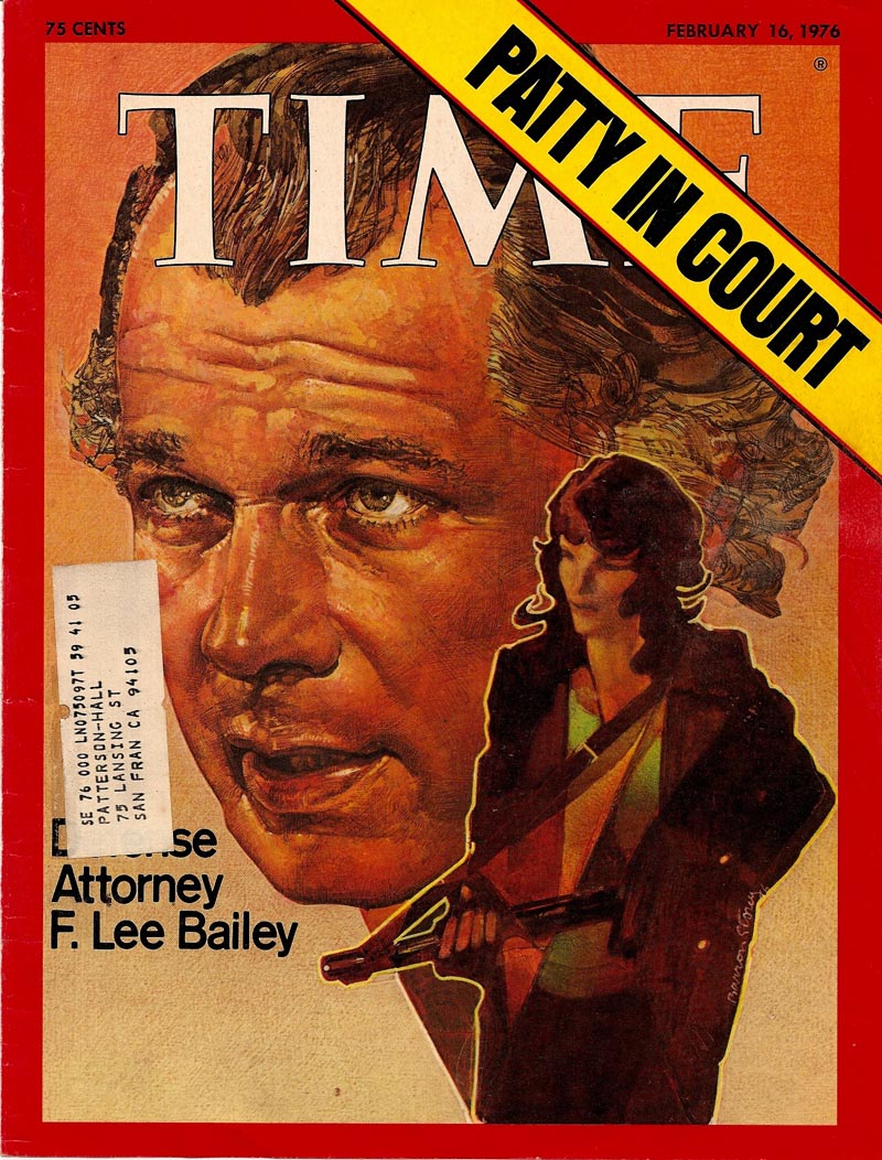
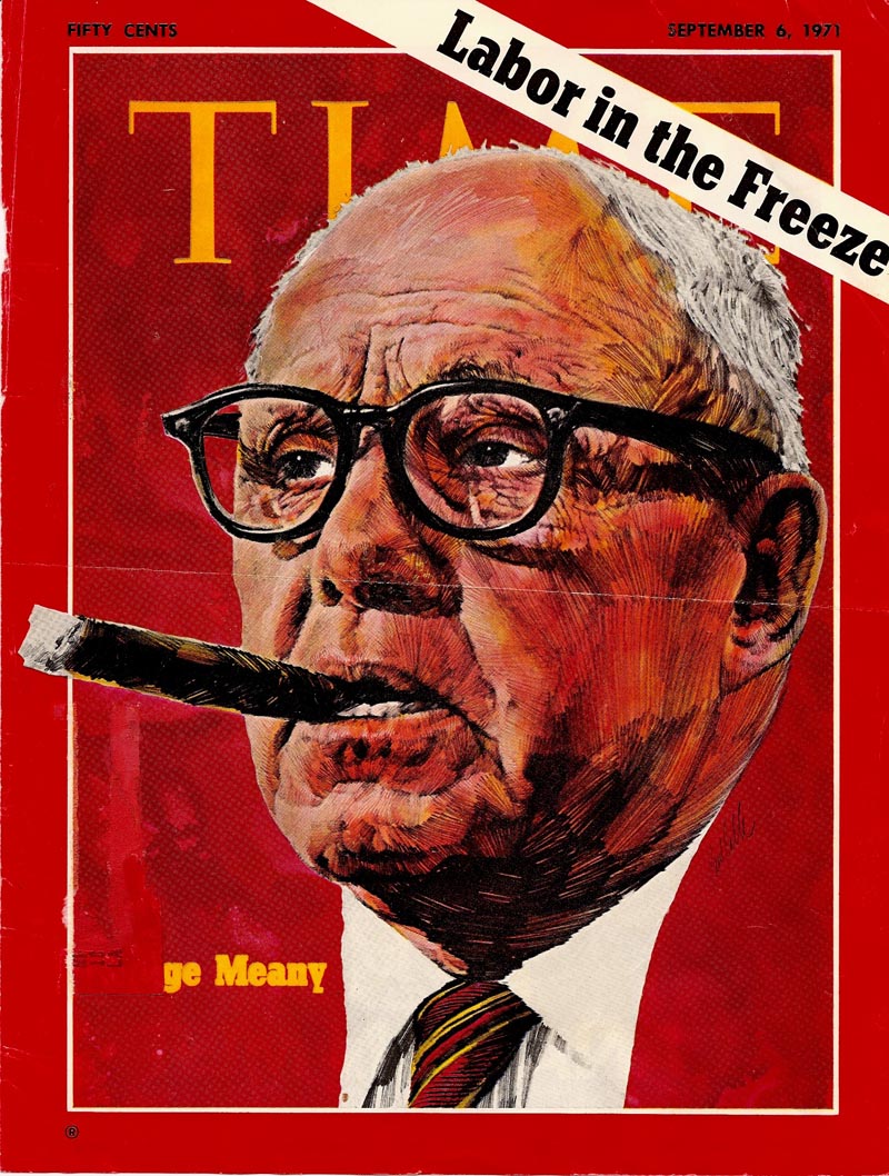
Another illustrative era I miss greatly....those few short years in the 70's when Time magazine had an enlightened art editor who bought bright bold illustrated covers. Enclosed are three from the old ad file. I wish I had saved more.
Time used top people also... and of these examples, one by Barron Storey (below), one by Paul Calle (at bottom)... not exactly shabby performers.

The Arab theme cover also very proficiently done... don't know who.

* The signature seems to read "Roy - or Ray - Anderson" ~ Leif
In my youth Time covers were all art....very square, boring illustration. From a stable of a few artists....but it was a very conservative age. Post WWll I think they alternated between photography and illustration. But it was in the 70's when they had the fine bold stuff.

I should think Time would have records even today on the past covers... but again, maybe not. Certainly worth a blog if these can be fleshed out a bit.
Cheers... Chas.
"I should think Time would have records even today on the past covers... but again, maybe not."
ReplyDeleteTime does have an archive of their covers,indexed by year. You can also do a search of themes, specific people, events and artists.
http://www.time.com/time/coversearch/
LP--
ReplyDeleteThe Saudi cover is by ROY ANDERSON, a terrific illustrator who, speaking of enlightened art directors, did the MAX BRAND covers for Warner Books' GENE LIGHT.
Those covers--along with the slighly less interesting work he did on the DIRTY HARRY novels--were brilliant miniposters, that used the limited space of the paperback to achieve astonishing deep space and graphics.
I recall a meeting with Light, in which he ruefully acknowledged the brilliance of those covers--along with the pieces he bought from DON DAILY, another unsung giant--and that they were commercial disasters.
The western market, as he learned, wanted traditional brown. He replaced Anderson with Luis Dominguez, I believe, whose mainstream stuff outsold the Anderson stuff astronomically.
Find those Max Brands--you'll see what I mean.
And yes, I've got tear sheets on those amazing TIME covers, by Barron Storey, Bob Peak and other gods. They were textbook examples of weekly excellence.
Best,
HVC
Charlie, I agree that the time covers from this era were wonderful and bright and bold (Bob Peak did some great work for Time during this era). But I also think if you go back and look at some of those earlier covers by the brilliant Boris Chaliapin, Artzybasheff, Arthur Szyk and others, they could be pretty breathtaking as well.
ReplyDeleteMost of the originals are now in the collection of the National Portrait Gallery in Washington.
There are a million great stories surrounding those weekly Time covers. In the early 1960s, Time asked Bernie Fuchs to do a cover. He quickly discovered that they were only paying him half of their standard fee. When he asked why, they explained that he was getting paid less because he was still young and just starting out. (Fuchs had just been named "Artist of the Year" by the NY Artists Guild at the ripe old age of 30). He told Time to get stuffed, turned down the assignment and never worked for them again.
Charlie, The first Roy Anderson illustrations I saw was a beautifully illustrated series on dinosaurs for National Geographic magazine (I think in the 70s') all in transparent water color.. realistic and detailed, but fresh, contemporary with a distinct skillful style.. outstanding! Since then, he has become quite successful creating early western Indian paintings in oils on canvas, for the fine arts gallery market.
ReplyDeleteI remember those WW2 Time covers by Boris ______? (I can't remember the last name.) They were painfully detailed with very little color.. almost a sepia toned effect.. a far cry from the samples you are showing today.But, they did conveyed the atmosphere of the war years.
On the other hand, Leyendecker, Rockwell and other illustrators that did Saturday Evening Post covers had major challenges that took them sometimes a month or longer to complete a cover, in contrast to those 70s' Time covers that probably were created in a fraction of that time.
I was looking at a recent Sports Illustrated magazine full of numerous photographs on each page, including the cover, and not one single drawn or painted illustration, either traditional or computer generated.. not even in the ads, nothing but photography and type! Today, with high tech digital cameras and photo enhancement software, anyone can take a picture.. unfortunately they are recording objective bits of facts only. They lack hands on creativity. Most magazines today are just a massive collection of photos squeezed between tabloid style bits of copy.
Tom Watson
Great comments....thanks to all. Haven't been able to locate any Bob Peak Time covers, even on Time's web address. I hope I'm not the only guy who clipped stuff in those days....it would be nice to see more. David, I do remember Artzybasheff, Chaliapin, and that period....and, not bad, as I remember. There was a Time artist back in the 30's, though, before the above, whose portrait covers would make peeling paint seem interesting in comparison. Tight, boring art. I agree Roy Anderson was a terrific illustrator. And I do remember that fine dinosaur series he did, Tom. Yes, on today's magazines....how sterile, devoid of creativity, of imagination, the cold personality of a computer or camera. Rats, drats!!!
ReplyDeleteCharlie, you can find all of the Bob Peak Time covers on the Bob Peak web site (http://www.bobpeak.com/artpage.cfm?artid=46). The reproduction ain't great, but it is enough to give you a sense of what Peak was up to.
ReplyDeleteAs for that...ummm.... boring Time cover artist, could you mean Ernst Hamlin Baker?
Just wanted to say thanks. Such brilliant work-- what a testimony to the power of illustration. Makes today's photo-driven covers look positively anemic. Truly inspiring-- that'll keep me going for awhile!
ReplyDeleteI thought the recent Aug 2 cover was really good: click
ReplyDelete