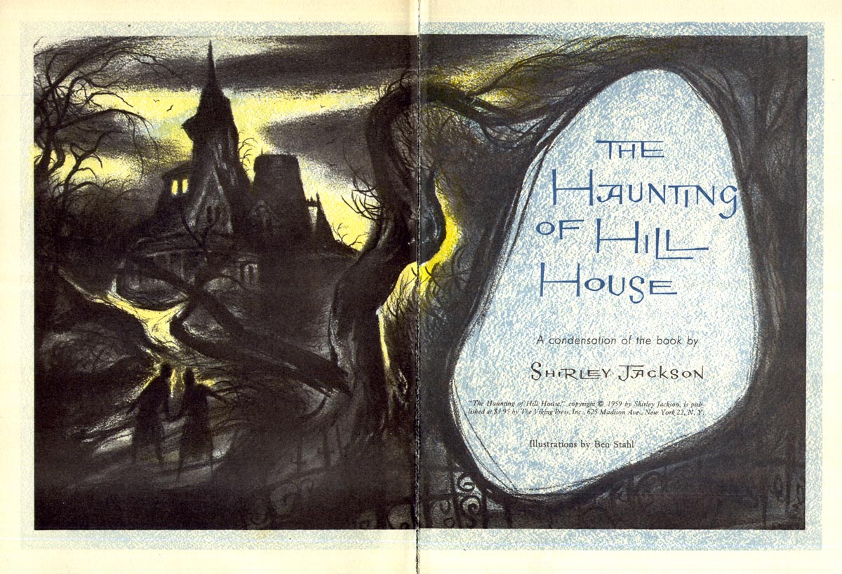
Stahl certainly had a flair for creating a moody, atmospheric sense of foreboding in his work, didn't he?
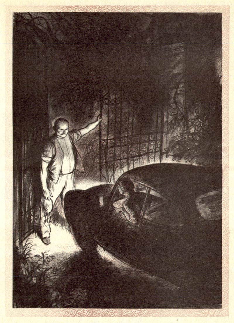
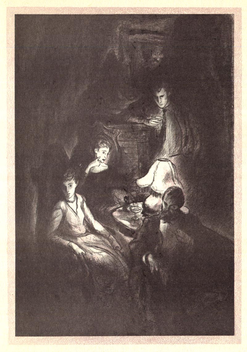
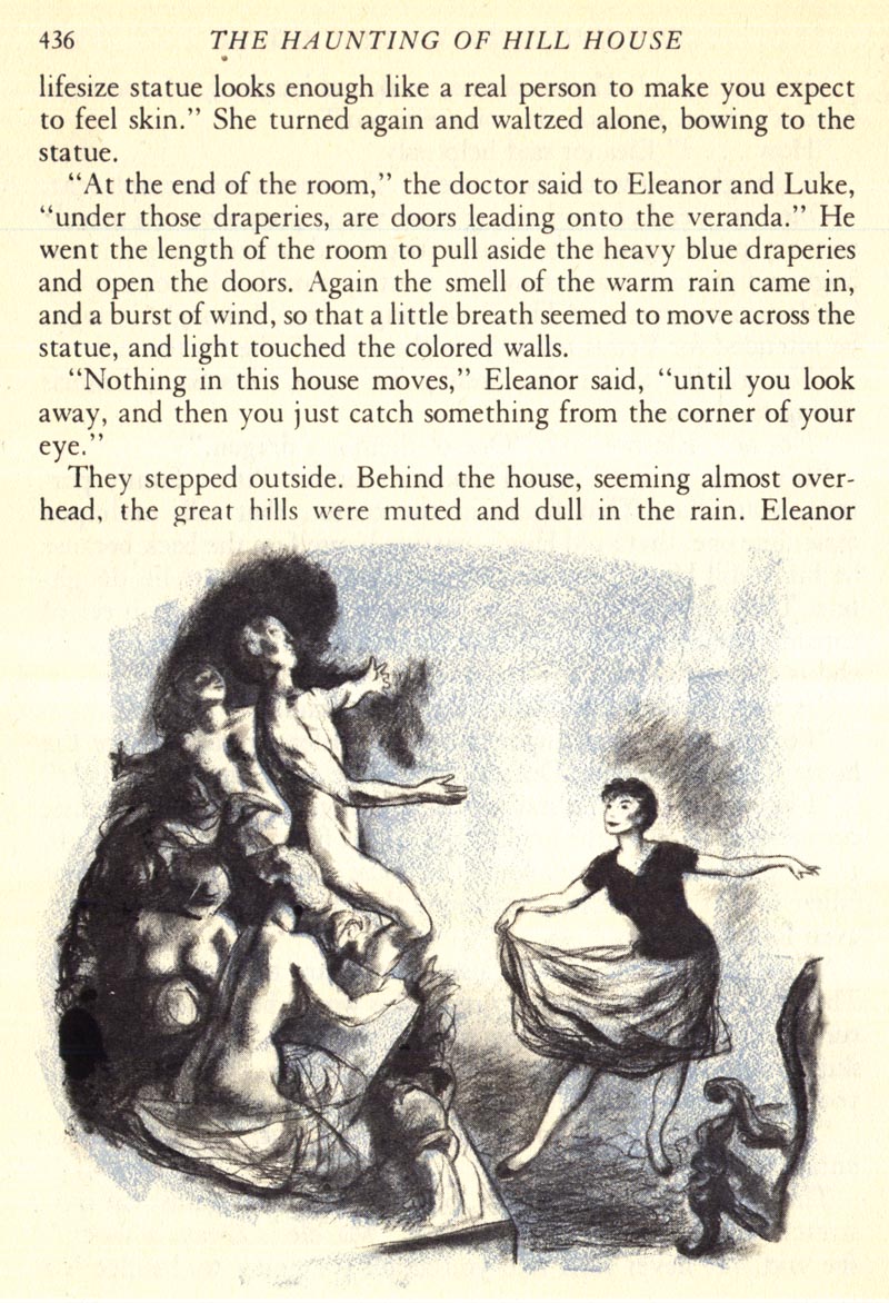
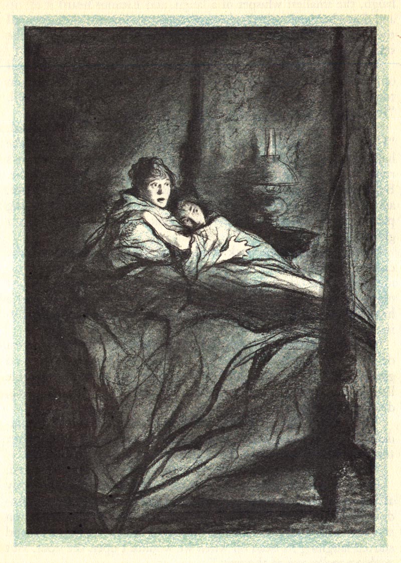
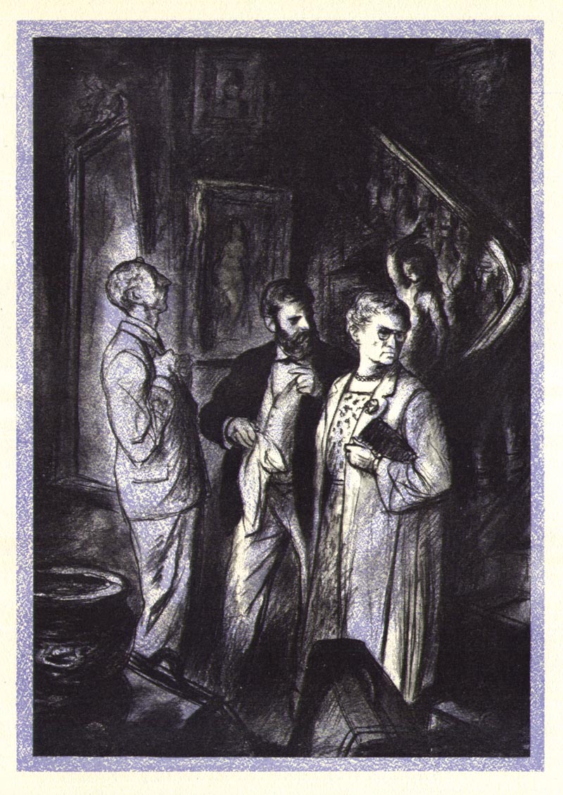
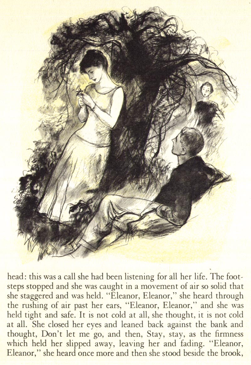
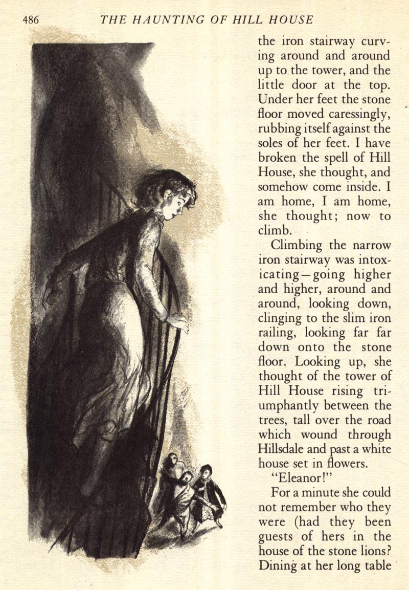
Ben Stahl's expertise at creating mood made him the obvious choice to provide that particular lesson in the Famous Artists Course.
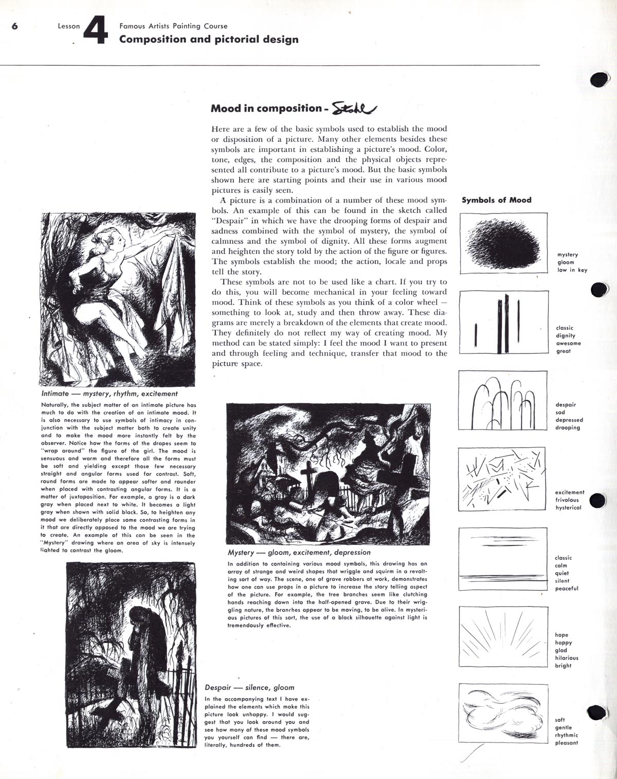
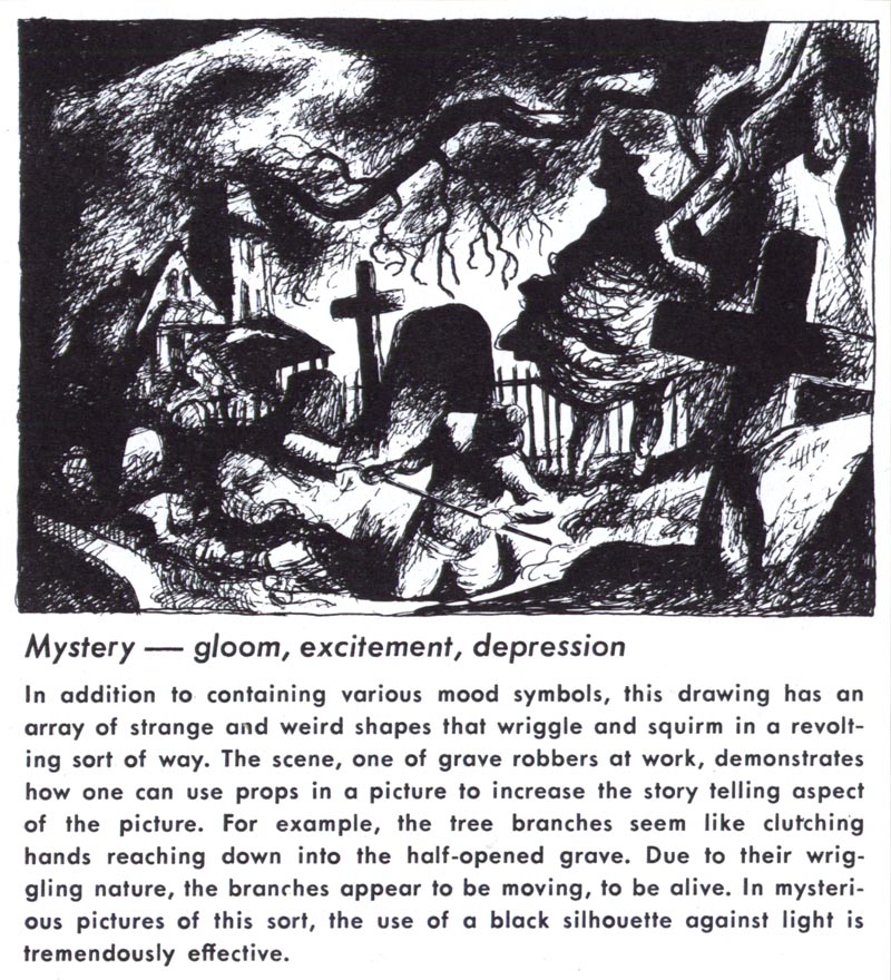
This week we'll take a closer look at the life and work - and many moods - of Ben Stahl.
* my Ben Stahl Flickr set
Ben Stahl's solid drawing and strong design remind me of Daumier - this should be a fun week.
ReplyDeleteThanks Leif
Great stuff! Compares favorably with the Robert Wise movie. (The less said about the Jan de Bont remake the better.)
ReplyDeleteVery interesting. I bet anything the producers and art director(s) of the 1963 movie took some very serious cues from this work. The mood is so similar, and some of these illustrations look nearly like a storyboard for certain shots in the movie.
ReplyDelete"Highlighting" the dark.
ReplyDeleteEach illustrator has his very own individual handwriting. That's what came to my mind, looking at TI's recent posts.
This one of course concurs with Hallow'en;-)
These are great illustrations. I found this RD a few years ago and tore out the very scenes you posted. The colors are lurid and as spooky as they can get. The old movie version scene with the women huddling on the bed was terrifying -- as they listened to pounding footsteps down the hall and scratching at the door. It absolutely horrified this 10 year old. I have never seen the movie since. When I found these illustrations in the RD a tingle went up my spine, as they closely match the horror of the movie. Wes (no longer 10 but still scared).
ReplyDeleteActually those Ben Stahl's lessosn are in my binder# 2 about composition... !
ReplyDelete