Thursday, April 29, 2010

Another Look at Charlie Allen

Early in my correspondences with Barbara Bradley (who was then the retired head of the Illustration Dept. at the Academy of Art University in San Fransisco) we discussed the work of a mid-century illustrator from the West Coast named Charlie Allen. Bruce Hettema of P&H Creative had sent me a cropped scan of just the hands from the ad you see below and Barbara and I marveled at the quality of this amazing illustration.

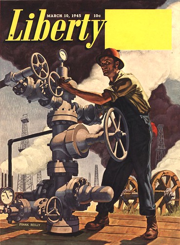
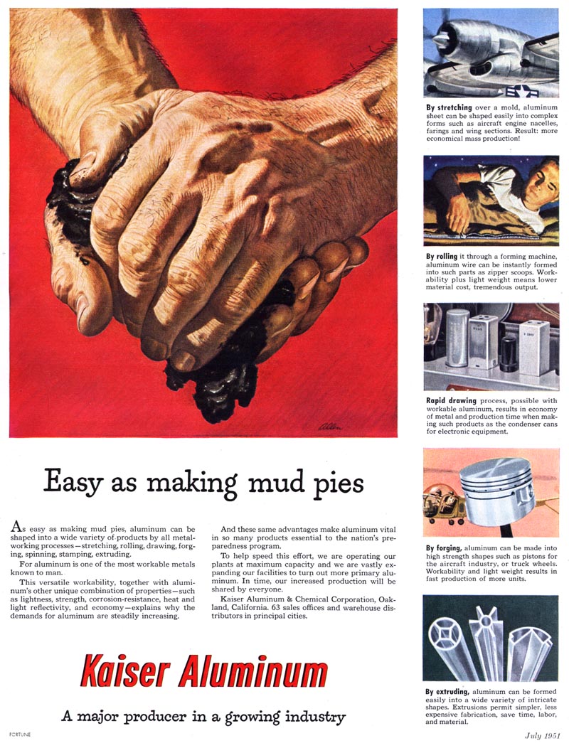
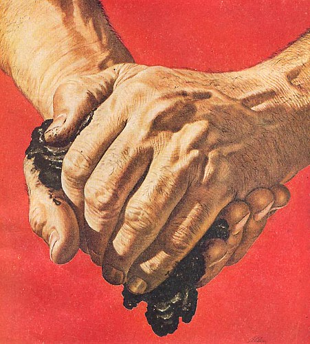
Barbara mentioned that the original was in the Academy's collection - a gift from Patterson & Hall owner Chet Patterson. Barbara wrote: "[Its] an amazing illustration of hands holding oil. I bring it out when I want to show students what constitutes a REAL understanding of hand structure."


Not long after that I began corresponding with Charlie Allen and, with Bruce Hettema's generous assistance, featured Charlie on Today's Inspiration. Charlie enjoyed reminiscing about the mid-century period and began sending me scans from his 'morgue'. He'd send them untitled and quiz me on who I thought the artist was. After I correctly identified several in a row I think I passed some sort of test. Not long after that he agreed to begin a blog of his own, with me doing the posting of whatever scans and writing he felt like presenting each week. Many of you became regular readers of Charlie Allen's Blog until he concluded his postings in December of last year.

Today I just wanted to remind everyone about this magnificent illustrator (and wonderful human being) who very much deserves another look; my friend, Charlie Allen.


"From the git-go I enjoyed drawing."
Originally presented on September 18, 2007

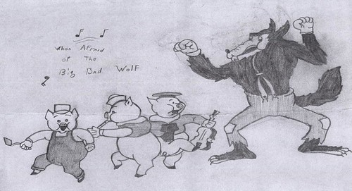
"I was born in 1922 (85 this year) in Fresno, CA", writes Charles Allen. "From the git-go I enjoyed drawing. A couple of efforts, at age 9 when I was fascinated by comic strip artists, are enclosed."


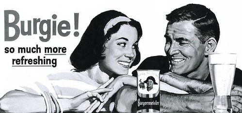
"Like Chet Patterson of P&H (whom you've covered recently) I enlisted in the Army Air Force in 1942 while in college. Served for three and a half years as a pilot during WWII...but unlike Chet, shot down no enemy aircraft. Hard to do in an unarmed PBY Catalina in an air-sea rescue group, Pacific theatre. Main accomplishment, surviving."


"Returned home in 1946, finished college, got married, worked as an ad illustrator for the Fresno Bee, a McClatchy newspaper. Attended Art Center College in L.A. for a year, got a job in 1948 at Patterson & Hall in San Francisco as an illustrator, at the princely salary of $275 per month. In those days, a new car ran about $1,200 and a new home, $10,000 to $12,000, so all was in proportion."


"I learned all along the line...high school, college, Art Center, an ad agency job during college, the newspaper job, and a crash course at P&H in San Francisco, where competition with 'the best in the west' was very, very real. The 'crash course' was actually learning on the job...and in between jobs, practicing on samples. Busy times."


"One of the many reasons I decided to remain in the west with advertising illustration, instead of heading east and editorial illustration [was that] there were so many good illustrators back there, all wanting to do editorial. Advertising actually paid better, and if you could stand the deadlines and pace, almost as much fun. Well, sometimes as much!"


Patterson & Hall was a great learning place and launching pad. I worked for the first ten years at P&H offices in San Francisco, then moved out to my small home studio, mainly to avoid the two or more hours of commute each day."


"Over a roughly 45 year career, about two thirds of my work came through Patterson & Hall, the rest freelance, but P&H was always a loyal sales, support and promotional group over those years."


"I did no editorial or story commissions.....all corporate ads from ad agencies or direct with the company. I was impressed by all the good illustrators and tried to 'think' like Al Parker, Rockwell, Jon Whitcomb, Austin Briggs, etc. Found it way too tiring, and with short deadlines, just did what came naturally. That way you develop a style all your own."

* There's so much more... and the best place to discover it again (or for the first time) is at Charlie Allen's Blog.

*Addendum: Bruce Hettema just sent a note to inform me that today's post inspired him to write about his first experience working with Charlie on the P&H Creative Blog

* All of today's images can be found in my Charlie Allen Flickr set.

Wednesday, April 28, 2010

Another Look at Ernest Chiriaka

Sad news arrived this morning that Ernest Chiriaka passed away yesterday, April 27, 2010, at age 96. His obituary is at David Saunders' Pulp Artists website.


This seemed like the right time to take another look at our previously presented series on the artist from 2006, which was made possible thanks to the generosity of David Saunders and Illustration magazine's Dan Zimmer...

Ernest Chiriaka


I always have a link in my sidebar to Dan Zimmer's Illustration magazine, but this week I really need to highlight this great publication because Dan has kindly given me permission to except the Chiriaka article from the 8th issue of Illustration (which you can still order!) written by Norm Saunders' son, David. Many thanks to Dan and I encourage everyone to consider getting a subscription to Illustration ( especially if you have a birthday coming up soon and your wife's not sure what to get you - are you reading this, Wendy? ;-)

The following text is © 2003 David Saunders:

Ernest Chiriacka was born Anastassios Kyriakakos in New York City on May 11, 1913, and lived at 42 Madison Street on the Lower East Side. To imagine the living conditions of this ghetto at the turn of the century, look at the heart-breaking photo-essay by Jacob Riis, “How the Other Half Lives,” which revealed the astonishing hardships of children growing up in these shamefully squalid tenement buildings. His parents, Portia and Herakles Kyriakakos, had emigrated from the mountain village of Xero Cambi in the Sparta region of Greece in 1907. Herakles was an educated young man who had studied to be a Greek Orthodox abbot, but could not adjust to the harsh reality of the bustling slums of New York, where the only jobs for a non-lingual immigrant were unskilled menial labor. Although Hercules performed his 12 heroic labors, Herakles refused to lower himself to work as a dishwasher, shoeshiner, or push-cart laborer. He changed his name to “Harry Chiriacka,” but made no further effort to become an American or learn English, and he fell into the languid despair of drink. Fortunately, his wife Portia was an industrious person who raised six children, supervising their public school educations as well as their attendance in Greek school to learn their native culture and language. Anastassios was their third child. He was called “Tasso” for short, which is pronounced “dah-so,” and is transliterated as “Darcy.”

This was part One of a week-long series origially presented in 2006. If you'd like to read the rest of the series, here are the links:

Chiriaka and "The Slicks"
Chiriaka: "A Serious Artist"
Chiriaka's esquire Girls
Chiriaka's Movie Poster art

*Also, be sure to check out UK Vintage's Ernest ("Darcy") Chiriaka Paperback Cover Gallery on Flickr

Tuesday, April 27, 2010

Another Look at Bob Peak

I know I said I was only going to present one new scan each day this week... but these Bob Peak illustrations for 7-Up from an early 1960s ad campaign are SO cool, I couldn't resist sharing a few.


Art directors and brand managers; why why why won't you invest yourselves in seeking out today's Bob Peaks and assigning them to major national ad campaigns like this? Why the same old photo solution as all your competitors again and again and again? Isn't the idea to stand out from the crowd and grab the public's attention?


Today's Inspiration isn't just for illustrators to learn about the history of their industry... my hope is always that our clients also will see potential in these examples for whatever they happen to be working on today. I know many of you read this blog... it would be interesting to get your perspective on this situation. I invite you to take a good long serious look and then leave a comment.


Bob Peak - "the envy of many an old hand"

By the time the ad below appeared in a Fredman-Chaite Studio promo pamphlet in January 1954, Bob Peak's art had already graced campaigns for Pall Mall, Dacron, Admiral radio, Philip Morris, Telechron, Celebrity Bra and United Steel.

At that point the young artist, just 27 years old, had been in New York for less than one year.


In his article in Illustration magazine #6, Thomas Peak, the artist's son, writes about his father's determination to make it in 'the big time'. Peak had just married his art school sweetheart, Lucille Tedesco, in 1952. The two had met and fallen in love while they were both attending Art Center School in Los Angeles.


Barbara Bradley, who attended Art Center School in the years just before Peak, remembers, "One of our scholarship jobs at Art Center was to re-pack portfolios that had been submitted for acceptance. [I was] on duty when we packed one that was so outstanding, we took note of the name. Sure..it was Bob Peak’s. Even pre- Art Center, he packed everything into a piece. I still remember one about Hollywood or Hollywood Blvd... that was probably composite-like. And that became the Peak who so successfully did movie posters, packed with everything!"


But long before he would produce those well known iconic movie posters for Apocolypse Now, Roller Ball, Star Trek, Superman and so many other, this young Bob Peak was attempting to distinguish himself in the most competitive illustration market in America.

Tom Peak writes, "my dad spent three solid months assembling a sizeable portfolio of his work while my mother worked a full-time job to support them. He took the satchel with him when they left for New York City in 1953."

"Armed with little more than self-confidence and ambition when he arrived in New York, Bob was able to land a job at the [Fredman] Chaite Studios. Though he made very little money, he was working in the company of a number of other fine illustrators."


Its those early years of Bob Peak's career that most interest me, so this week let's look at the artist Fredman-Chaite described as the "youthful Bob Peak... envy of many an old hand."

* I have many people to thank for assisting me with this week's topic: Barbara Bradley, Charlie Allen, David Apatoff, Tom Watson for their advice, opinions, information and scans, and Dan Zimmer for allowing me to excerpt passages from Tom Peak's article in Illustration magazine, which are ©2003, 2008 by Tom Peak, Dan Zimmer and The Illustrated Press, Inc., and all artwork © The Estate of Robert Peak.

There is much, much more on the artist at Bob Peak.com

* This was Part One of a previously presented series on Bob Peak. If you'd like to read the entire series, here's Part 2, Part 3, Part 4, Part 5 and Part 6

My Bob Peak Flickr set.

Sunday, April 25, 2010

Another Look at Frank Reilly

* You may have noticed that lately my posts have been somewhat sporadic. My new career in teaching is taking up more of my time than I had imagined - not that I'm complaining, because I'm having a blast! But in an effort to get back to posting every weekday, I've decided to present some "reruns" - posts from past years that are worth a second look (and will actually be brand new to more recent followers of this blog). I'll begin each day with one new image before moving on to previously presented material. First in this series is another look at Frank Reilly...


Frank Reilly: "highly intelligent, complex, and really interesting"
Originally presented on May 6, 2008

Turn to Frank Reilly's biography in "The Illustrator in America" and you find this first sentence:

"Frank Joseph Reilly was a great teacher."

Having heard now from several of Reilly's former students, I continue to be impressed by the almost reverential tone they use to describe him.


Yesterday I received this email from an artist named Candido Rodriguez:

"I was one of Reilly's class room monitors for two years," writes Candido. "During that time I came to know Mr. Reilly (as all the students always addressed him) quite well, he was a highly intelligent, complex, and really interesting person, I've never forgotten him."

"The most vivid scene I remember with Frank Reilly was his first critique of my work. I met Mr.Reilly at his morning drawing class at New York's Art Student League in the fall of 1954, I was 17 and he was 47."

"Reilly would critique the drawing classes once a week on Tuesday. These classes (morning, afternoon, evening) were huge and Reilly never had enough time to see every student. It took a few months before he finally got to me. By this time I had a pile of drawings done in class and at home. Reilly quickly scanned through them, turned to me and said, "Son, if I told you everything that is wrong with these drawings you will need a physcharist". With that he took my pencil, broke it to an appropriate length, showed me how to sharpen and hold it. He then demonstrated his famous six-line figure. All this took about five minutes, he moved on and he didn't get to me for another few months."


"Years later I asked him about this first critique (I don't believe he remembered it) "wasn't it a bit tough?" I said. Reilly's answer was cryptic, (remembered that Frank Reilly was one of George Bridgman's star pupils, became his teaching assistant and took over his class at his death), "Bridgman introduced me to Dean Cornwell. I took that introduction as an opportunity to show Cornwell my work. Cornwell looked through the portfolio and said 'you are ready to learn how to draw'. He took me under his wing". Reilly said no more on the subject."


Continuing, Candido writes, "The reference to the Frank Reilly "Method" is a bit of a misnomer, as is the statement that he was an illustration instructor. Reilly taught the craft of drawing, painting, and Picture Making in the tradition of the French Academy. Reilly had in his possession school paintings done by J.C. Leyendecker at the Academy Julian, these paintings could have come straight out of the Reilly class."

"Reilly's great innovation was his use of the Munsell Color Notation System to quantify the natural world. In addition he developed a clear, rational vocabulary to explain what a student should do in the areas of drawing, painting and picture making (no artsy talk or mystic references). Reilly always showed up in a three piece business suit and he was all business."


"Reilly died in 1967 and his surviving students are getting long in the tooth. And sadly so much of what he taught is slipping away."

* My thanks to Tom Palmer for providing all the scans for today's post and to Candido Rodriguez for sharing his recollections of Frank Reilly.

* This was Part Two in a week-long series on Frank Reilly. If you're interested in reading the other previously presented installments, here are Parts One, Three, Four, and Five.

* My Frank Reilly Flickr set.

Saturday, April 24, 2010

Album Covers: "sophisticated, enlightened artwork"

Robert M. Jones, Art Director, RCA/Victor Records, writing in the November 1960 issue of American Artist, concluded:

Though color photography presently dominates album cover art...


... there is evidence that the taste of the record buyer is maturing.


He is demanding a sophisticated, enlightened art work.


Musical content is also becoming increasingly important.


Fortunately, a semi-nude pretty girl is no longer enough to sell the product...


... to an audience whose taste in music is constantly being upgraded by quality recordings.


* My Illustrated Album Covers flickr set.

Friday, April 23, 2010

The Mad, Mad, Mad Mad, Album Cover Art of Jack Davis

Below, from the book "The Art of Jack Davis", the legendary cartoonist's first album cover , from 1957.

(You can view a scan of the actual album cover here)

AoJD author, Hank Harrison wrote, "With his first black and white album cover... Davis started an avalanche of top quality album art which no single artist has been able to match."

Harrison lists nearly a hundred albums featuring Jack Davis art - and that's not including movie soundtracks like the example below.

(click the image to go to a larger, right-reading scan)
Davis03.version
Davis is quotes as saying, "I remember when I picked up my first album cover for RCA. [They] paid about $300 per cover. I enjoyed doing them all."


This quote gives us a potential clue to what labels typically paid per cover at that time. If $300 was typical, it shows us the dilemma faced by many of the top name magazine illustrators of the day. Though hardly a pauper's wage, $300 must have seemed pretty spare when compared to the $1,000 to $2,000 many of the artists we've looked at this week were used to getting from their editorial and advertising clients.

Davis01.version
Even paperback covers would have been substantially more lucrative. When I spoke to Mitchell Hooks about his career illustrating paperbacks he told me the publishers had been paying around $300 when he first entered the field in the early '50s... but through the efforts of the Graphic Artists Guild the price was pushed up to around $800 per cover within a few years. Harry Borgman remembered getting about $900 per cover in the mid-'60s to early '70s.

Jack Davis 3
Of course money isn't everything - and we're fortunate Jack Davis enjoyed doing album covers to the extent that his output was so prolific. Today, thanks to album art enthusiasts on Flickr, many of these obscure old covers are being scanned and archived for the benefit of all.

I'm very grateful to Glen Mullaly for allowing me to include the scan directly above from his Vintage Vinyl set. Be sure to check it out for many rare treats, including some beautiful Jim Flora covers and another Jack Davis piece.

Also thanks to Flickr member anyjazz65 for the Mad, Mad, etc. scan. His Record Jackets set has more mid-century visual delights in it than you can shake a stick at. I encourage you to peruse it.

And of course, if you're enjoying this series, please visit my own Illustrated Album Covers set for many more examples by a wide variety of artists.

Wednesday, April 21, 2010

Album Covers Artists: "a long and impressive list"

Robert M. Jones, Art Director, RCA/Victor Records, writing in the November 1960 issue of American Artist:

The list of artists and photographers who have contributed to album cover art is long and impressive. Among the better known names are the painters: Rufino Tamayo, Eugene Berman, Joseph Hirsch, Ben Shahn, Doris Lee, Buk Ulrich, Eugene Karlin, and Herschel Levit; the printmakers: Antonio Frasconi, Fritz Eichenberg, and Joseph Low; the graphic designers: Saul Ball, Herb Lubalin, Alex Steinwweiss, Mathew Leibowitz and Erik Nitsche; the illustratrors: Robert Osborn, James Flora, Constantin Alajolov, John Groth, Jon Whitcomb, Austin Briggs, Al Parker and Robert Fawcett; and the photographers: Carl Fisher, Ben Somoroff, Rolf Tietgens, Bert Stern, Dan Wynn, Hugh Bell, Richard Avedon and Karsh of Ottawa.

To that list I would add Mike Ludlow, one of the mid-century illustrators whose work I have found most frequently on album covers. Clearly this niche became an important part of Ludlow's client roster after the decline of magazine assignments at the beginning of the '60s.


Arthur Sarnoff... some readers will remember him as the artists responsible for all those cute kids in the Karo Syrup ads of the 1940s.


Victor Kalin... his artwork was featured at the top of the last post. He was also among the artists we looked at during our series on the Merrill Co.


Others include Ken Dallison...


... Bob Peak...


... Bob Jones (who created the Esso Tiger)...


... James Dwyer...


... Stan Klimley...


... and here's a an amazing stroke of good luck: I found this Sheilah Beckett just yesterday at a local thrift shop... for a dime. It happens to be the same album cover I presented at the beginning of this series - though I had only a small b/w reproduction of it. Click the image to see an extra large scan.

* Worth noting: the last four artists were all represented by the Charles E. Cooper studio (granted Klimley had moved on earlier) and these albums were all executed around '59 - '60. Clearly Cooper's salesmen were pursuing album cover commissions for their artists as magazine (and advertising) assignments diminished.


Finally, this odd yet beautiful piece. Its one of the first album covers I ever found... I've had it for years and wondered who had illustrated it. Just yesterday morning a friend forwarded a link to legendary designer/illustrator David Klein's website. During the mid-century period Klein created a series of magnificent travel posters for TWA. As this album was part of some sort of TWA promotion, I decided to investigate and lo and behold, I found the travel poster version on the site!


As Jones wrote in his 1959 article, a long and impressive list. Even then, we have barely begun to scratch the surface. I have a few more treats to share with you this week. For now, be sure to visit my Illustrated Album Cover Flickr set.