Hurst once wrote, "How [an artist] works and the materials used are not so important. You may use oil or tempera; you may paint in tone, or you may use only line - that is irrelevant to your problem. How you think is most important."
"It's no wonder that the art student is so often confused," wrote Hurst. "If art schools spent more time teaching students how to organize their thinking process, much art material could be saved."
"Learning to draw is easy. Any art school can do a fair job. It's learning to think that is important."
Last year Earl Oliver Hurst was inducted (posthumously) into the Society of Illustrators Hall of Fame. For those interested in learning more about the artist, there's a terrific Earl Oliver Hurst biography written by Fred Taraba at the SI website.
Also late last year, Toby Neighbors gave Hurst 'the Illos Tribute treatment'!
I've mentioned Toby's illostribute.com website before. Toby invites contemporary illustrators to create tributes to a particular classical "master" illustrator "by seriously investigating their work, through interpretation." And there are some gorgeous and fun interpretations of Hurst's work at Toby's site.
As Hurst wrote, how an artist works is not so important as how he thinks. Toby's site creates an opportunity for today's illustrators to learn from masters like Hurst... and perhaps, through investigation, gain a greater understanding of how artists like Hurst thought out their work.
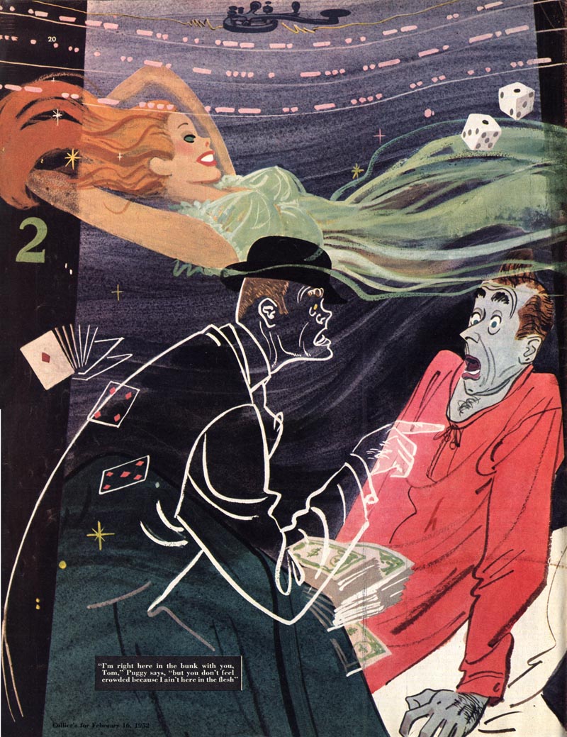
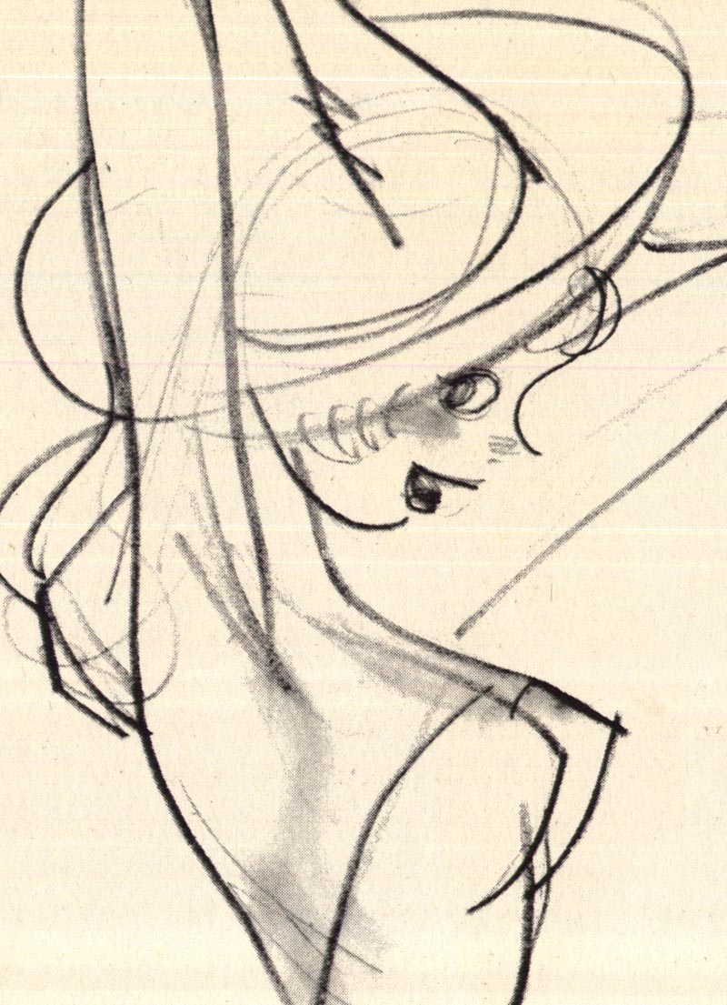
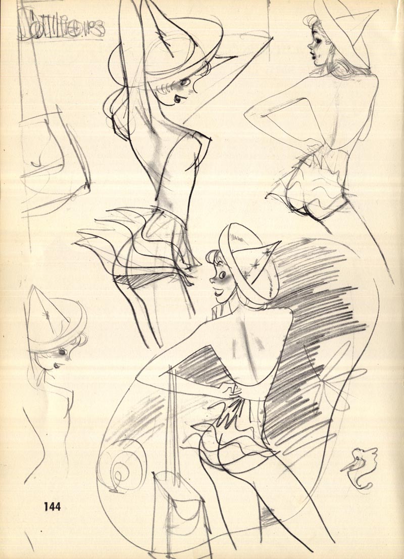
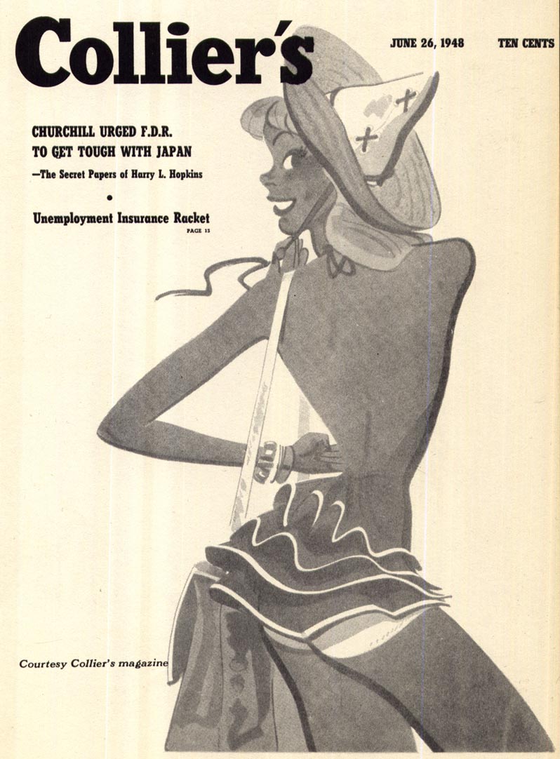
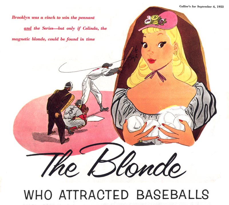
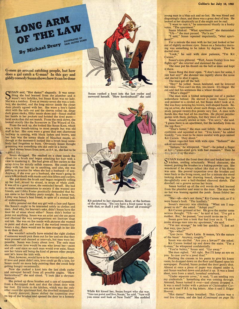
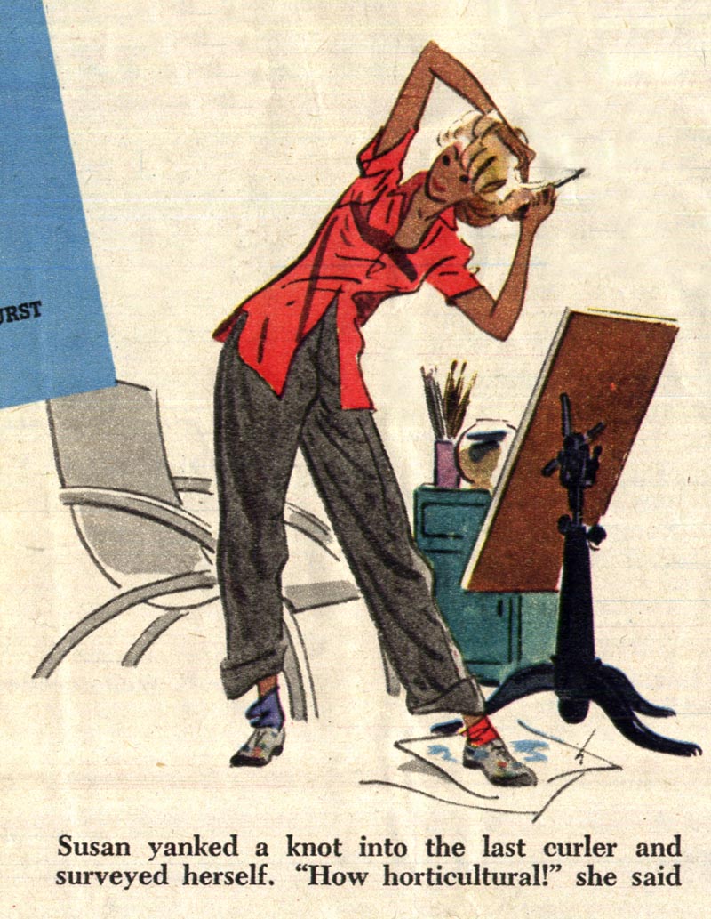
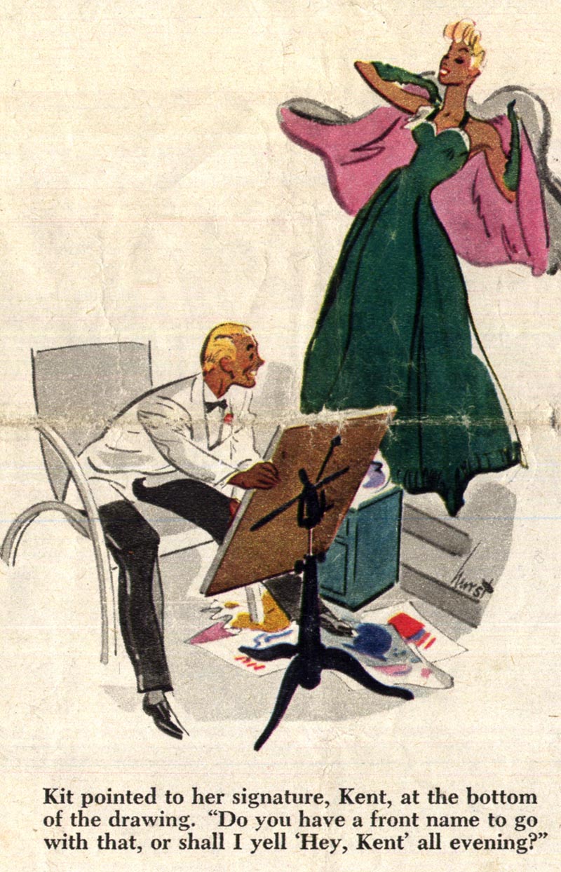
Here are a few more pieces by Earl Oliver Hurst - you'll find some more at illostribute.com - and of course many Hurst-inspired tribute pieces by Toby and other talented artists.
* These last few Hurst pieces above were a gift from TI list member Maureen, "The Art Gal" - many thanks, Maureen!
* My Earl Oliver Hurst Flickr set
Well done Leif. A great way to start the year !
ReplyDeleteGreat stuff Leif, I love Hurst's work. He was so right about the thinking aspect of art. I'm sure that you are hammering that thought into your students.
ReplyDeleteHarry
Lief, I agree with Hurst, but a lot of ADs shopped technique, particularly back in the 1960s'. Often with advertising assignments, the AD came up with the concept and the illustrator was merely a hired wrist to execute their idea. An illustrator was chosen by the technique that the AD thought would be most effective for the ad.. or that they personally liked. However, the more assignments the AD gave an illustrator, usually the more trust and input the AD would have in that illustrator. But, it was still usually heavily driven by technique. For that reason, I developed different styles and techniques in my portfolio, which gave me more flexibility when looking for assignments. It was always a pleasant surprise to me if the AD said, "Do it in any style you want." Magazine and book illustration allowed me more freedom and flexibility to come up with my own ideas, and truly collaborate with the AD. That is one of the reasons myself and my illustrator friends took lower paying editorial and book illustration assignments, but were more creative and self-satisfying.
ReplyDeleteTom Watson
Thank Larry!
ReplyDeleteHarry; you bet - I emphasize on every project I give my students that they need to use their brains as well as their hands when executing their work. A very few actually get it - which always reminds me of my own creative struggles back in art college.
Tom; you're right on the money - very much like my experience over the last 20-some years. I think if nothing else, a portfolio that shows good thinking as well as strong technical skills might impress a certain number of potential clients. Its always a little frustrating when they then turn around and choke the creativity out of the assignment. I have occasionally turned down a gig when I realized I was being treated like a 'wrist' but not being adequately compensated for it. Generally, with ad work, the pay is the sugar that helps the medicine go down. ;^)
Leif - what I occasionally find in the kids book market is that they will pitch you the idea and it sounds great so you sign on. Then you happily get to work on the first round of roughs and that's when they let the air out of your tires as they ever so subtly steer you down the path of the predictable and banal. By then it's too late and you've got a bunch of paintings to do - ugh !
ReplyDeleteOne thing that's important to note is that "Thinking" doesn't necessarily mean "Conceptual".
ReplyDeleteAn artist with a good sense of "organized thinking", as Hurst put it, could mean the way he composes a picture, simplifies an image, exaggerates a pose, etc.
Good point Daniel, and those are the skills most illustrators learned and absorbed while in art school and apprenticing in a studio. A well known posthumous east coast fine artist was quoted as saying to his students, "It takes a thousand decisions to do a good painting." Imagine how many decisions a good illustration takes.
ReplyDeleteTom Watson
Been visited this blog daily, it's in my open menu. Just wanted to say: I really enjoy what you have done here.
ReplyDeleteWhat a concept Hurst had: classes on thinking..
could use a few of those.
Leif, this is great! Sort of a nice little bridge between 2010 and the new year. Thanks for mentioning illostribute again as well. I really appreciate! I'll be in touch about the next post very shortly. Hope you're doing well!
ReplyDeleteToby
Hurst is one of my favorite illustrators. I stumbled across his work while collecting period magazines and fell in love with the spare line and smart use of color. Nice to hear about some of his thoughts on working and technique.
ReplyDeleteDaniel; VERY good point - thanks for clarifying that point. Maybe I'll do a follow-up post with some more elaboration by Hurst on what he meant by 'thinking'.
ReplyDeleteThanks for commenting SajiNoKami; yes, thinking is something I've found many of my students struggle with. I actually had one student ( who is actually quite talented) admit she doesn't enjoy having to think - she would rather I just tell her what to draw exactly as I want it. Go figure!
ReplyDeleteThanks Tom - and thanks Toby and Sam :^)
ReplyDeleteI saw my first Earl Oliver Hurst drawings on the ASIFA-Hollywood website and it really attracted me to its simplicity because his style reminds me or in my opinion goes VERY well with animation designer Maurice Noble's bg layouts.
ReplyDeleteThanks Mr. Peng for highlighting Earl Oliver Hurst's work here at Today's Inspiration he's always my constant reminder that as an artist detail isn't always everything. Usually i always felt intimidated and guilty that my style is more inclined to a minimalist or simplified style and whenever i look at a Fawcett, Rockwell or a Leyendecker i always feel guilty and that i should strive to align my art style similar to these great artists. But over the years i've learned that detail isn't always everything and Earl Oliver Hurst for me is a great reminder that in art there's always a place for everything. I do hope you can do another Hurst post just like your previous Sundblom post.
Again thank you! so much! you just made my New Year!
Lloyd, your insightful comment reminded me of myself in art school, only in reverse form. It was at the end of the 1950s' and the beginning of the 1960s', and I always loved the detail in N.C. Wyeth, Rockwell and Leyendecker's illuatrations, but the focus on illustration at that time was 'the less detail the better'.. trendy solutions, loose line and loose brushstrokes was the big push. The traditional look was considered passe', and Rockwell's work was actually ridiculed and scorned by many of the illustration elites of the day.
ReplyDeleteThe silver lining for me was that I learned traditional skills first and eventually, by the 1980s' and 90s', realism with detail finally came back.. especially in advertising illustration. Ultimately I had more demand doing detailed illustration than the loose avant-garde style that was particularly hot in the 60s'. Although, I never really liked nor did airbrush art, I think the popularity of the airbrush style in the 80s' influenced the return of detailed illustration.
Anyway, don't feel guilty Lloyd, follow your heart in illustration, and it will serve you well.
Tom Watson
Tom
ReplyDeleteThank you sir for the art history lesson although i didn't actually know about that particular detail in the art world during that era that traditional style was really that scorned during those times. I thought that the stylized approach was just a fad or an artistic improvisation because it could go toe to toe with the ever hectic deadlines of the print media since its simplicity.
But even though my art preferences now were inclined more on stylization rather than traditional. I started art on a traditional foot and it consumed most of my time copying, understanding and finding the best and easy way for me to draw until as i grew older i got myself exposed to a lot of art concepts and styles and the stylized approach was a very inviting playground. At first it was out of frustration, since i really had a hard time keeping my head above water in terms of being able to draw the traditional style efficiently and i really felt at home with the rich and fertile imagination of stylization.
At some point i felt i cheated myself thus the whole point in my previous post but Hurst and many other similar artist that i have come across gave me a valuable lesson that it's not really the technical skills of being able to draw a god damned good hand with realistic hairs and shading but it's the way an artist think of his work and the subject of his choice. Stylization for me is exaggeration injected with a healthy amount of your own panache
But in the final analysis stylization for me is merely a satirical approach to realism. So how can an artist draw a stylized arm if he himself can't draw a real traditional arm or have a good grasp of the mechanics and anatomy of a real arm. Same with basketball how can we do all those fancy behind the back or crossover moves if we ourselves can't frickin dribble the ball correctly.
Lloyd, I hope I didn't give you the impression that by academic realism, I meant rendering every little wart, freckle and the pores of the skin. Even Norman Rockwell stylized, simplified and exaggerated gestures and expressions, yet they were quite traditional, implying a sense of basic visual reality.
ReplyDeleteI agree that learning to draw academically first, as you said you did, gives a better foundation to express your personal way of drawing and painting. However, that has been a topic of debate, going back to my art school days. Some art teachers feel that self expression is the most important ingredient an artist needs.
Unfortunately, many very good academic illustrators, who had been very successful during the 50s', faded because they wouldn't or couldn't change their approach, and some just dropped out to paint for galleries. However, academic realism in illustration didn't just disappear off the face of the earth, in the 60s'. It did diminish dramatically, compared to the 50s' and before. Your right that when loose simplified illustrations were popular, it helped meet those tight deadlines. But, what actually promoted the change in illustration styles, particularly in advertising, was the improvement of color photography, improved reproduction methods and the print market being squeezed out by the boom in TV commercials. So, art directors were looking for illustrations that wouldn't compete with photography.. more design oriented, less realistic. The reason that some in the art world scoffed at traditional realism is because it represented another era to them. Some art teachers gave little value or appreciation to those past illustrators, and discouraged students from showing much interest in them. They felt it was more important to be "creative", be an innovator and follow the trends.
For many illustrators, it actually made a difficult field even more difficult to compete in, during an unpredictable period. It helped my career to have a diversified portfolio and background, in both illustration and Art Direction.
Tom Watson
brilliant!
ReplyDeleteTom:
ReplyDeleteYes..i meant academic realism and/or illustration that's exactly what i was poorly emphasizing.
Oh yeah..i completely forgot about the topic when photography slowly gained its prominence in the art world. Indeed, stylization became a preferred style because it was completely in a different playground and photography could only do so much than compete with academic illustration in terms of detail and realism.
When you said that, and i qoute "..it actually made a difficult field even more difficult to compete in." it really made me realize just how really difficult becoming and working as an artist during that time you must have to prove yourself and artistic knowledge is really very valuable and hard to find unlike today that you can download or buy every kind of art tutorial that you want to learn. Though i am very grateful for the accessibility of these stuff out there but i just want to point out that when to much access is available it really changes the landscape of anything involved.
well again it is a great pleasure to have had this little conversation with you sir. im sure you have so much to tell about art and i hope we (I, to be very precise) could hear more about your ideas in regards to art and everything that is involved with it. Thank you very much!
Lloyd,
ReplyDeleteI appreciate your interest and intelligent response, and glad you enjoy the conversation. You sound like you have a good understanding of your craft and stay well informed. Yes, the Internet is a great place to find input about illustration, both past and present. Back then, there were virtually no books specifically on the subject of illustration, and most of what we knew about the subject was through our instructors and observing the latest ads and story illustrations in the magazines.
One of my freelance clients, Mike Dolas, was an art director for a large printing company in S.F. during the mid 60s'. He was a former illustrator who (as a young man) had done quite a few Saturday Evening Post magazine cover illustrations during the 1930s'. He had a reputation of being able to emulate many styles, including Norman Rockwell. Anyway, he owned quite a few original J.C. Leyendecker illustrations, and also some Leyendecker preliminary studies that he showed me. That was one of the first times I had ever seen an original illustration by one of the giants in illustration. I was blown away by Leyendecker's amazing talent that was dramatically revealed in his original oils on canvas. He would go through an extensive trial and error process, and in the final painting he left nothing for chance. The originals were absolutely stunning to me. Each time I would meet with Mike, I would pump him for information about when he was an active illustrator in N.Y. I learned a lot about the early illustrators from him, and most of what he told me was verified in books I read years later.
A few of my classmates in art school, had gained early knowledge from the Famous Artists mail order art course. Another source of information was through the S.F. Society of Illustrators, which I joined in the mid 60s'. Al Parker was one of the guest speakers along with other veteran illustrators, and that was very informative. Earlier I had visited him at his home in Carmel Valley, CA, while I was still in art school.
I agree that sometimes there is too much information, and it can be overwhelming and even confusing. Today we have a lot of high tech luxuries, and in the long run, it's better to have the easier access to our interests, and sift out what works for each of us.
Tom Watson
Tom,
ReplyDeleteMy interest in this kind of style (stylized) was also sparked by my early exposure to classic Reader's Digest. When i was very young my mum inspired me to read and since we can't afford brand new books she and i would go to this 2nd hand antique bookshop uptown and i would get to choose cheap picture books and other stuff while she would buy several old Reader's Digest and that was during the early 80's so much of the old RDs she bought were in the 50's-70's edition. Whenever im done with my picture books i would peruse those old RDs and be delighted with those really quick illos that go with the articles.
Those simple quick drawings didn't mean much to me back then but their visual appeal was there and i never really forgot about those drawings and usually whenever i saw those kinds of illos Reader's Digest would spring to my mind.
I just discovered Leyendecker recently while i was hunting for more Hurst drawings on the net. I found this blog where almost all of his Saturday Evening Post covers were scanned and posted and i was really blown away!..Norman Rockwell and the other academic illustrators were good and all but Leyendecker's was a bit more refreshing in terms of composition and posture and (correct me if im wrong)to think that Leyendecker came before Norman Rockwell. I idolize most of the academic illustrators and their attention to detail and all is very impressive but sometimes i find them boring especially when they go ALL ACADEMIC in their illos if you get my drift. Well i guess exaggeration, stylization is really my cup of tea.
I have a few scanned copies of Leyendecker preliminaries and boy! those were amazing is already cover worthy. To think that Leyendecker has to do a lot of trial and error?..i really can't imagine that..or perhaps he'd do some color keys first before he decides to go for a certain color palette. Well, i believe Mr. Peng doesn't have a Leyendecker post?..or has he?.
Geez, if only i was anywhere near from where you are right now i'd love to spend an afternoon with you sir and educate some poor art slob such as myself and share some of that knowledge that you have amassed all those glorious years in the business.
Cheers!
Lloyd
Lloyd,
ReplyDeleteI understand your appreciation of the simplified, exaggerated and stylized approach to illustration. I got hooked on it too, while in art school. I felt torn between which direction to go. I admired the skills of both the academic and the innovative approach, depending on the subject. I did a lot of concept development and TV storyboard sketches, which had to be more innovative and simplified, often drawing out of my imagination, therefore relying on my knowledge of anatomy, etc. So, having the chance to do academic finished illustrations, using models, etc. for ad assignment, came as a nice change of pace. Working in different styles also provided me with more freelance work.
J.C. Leyendecker was actually Norman Rockwell's idol, and they became friends when Rockwell was first getting started. Leyendecker had been one of the top ranked illustrators while Rockwell was still in art school. Actually some of Rockwell's early work was very close to Leyendecker's style.
Leyendecker's trial and error sketches depicted different variations on the gestures of a figure, variations of the hands or variations of expressions. A lot of hard work went into coming up with just the right final drawing and the color treatment as well. Sometimes Leyendecker would paint a preliminary study when he wasn't sure how he would handle a difficult area in the finished painting. It was important to keep the style consistent throughout the painting.
I agree with your comment that some academic realistic illos tend to look boring. They need more than just accuracy and realism, that is why it is important for the illustrator to also be subjective, and put their personality into the rendering. I think Leyendecker did that very effectively.
One of my instructors who did beautiful oil paintings, was asked by a student, "What does it take to learn to paint so well". His answer, "Miles and miles of canvas". That also applies to illustrators like Hurst. Rockwell was virtually a slave to almost all his Saturday Evening Post cover illos. He and other top illustrators were tireless workers, who would go to any lengths to make their illos as good as they possibly could. It has always been a competitive field, and like the Olympics, only the best could compete at the top level. There was a slogan when I began my career, "Your only as good as your last Job."
Tom Watson
Tom,
ReplyDeleteWOW!! indeed! you are SOOO right on the money! ("Your only as good as your last job") and of course the answer to the student's question, indeed! miles and miles of canvass..actually im quite guilty of that answer. You see I'm a HUGE reference rat and i think i have quite an archive of the images that Lief posted in his blog. Well, I don't know if you call it a handicap but for me to get fired up i need to have something nice in front of me so that i'd get jazzed up to draw.
Most of the time i just turn on my pc and leaf through my "extensive" archive for inspiration or just have a nice drawing of someone for the whole afternoon stuck in the screen to just keep the momentum going.
Indeed, the degree of devotion to your craft really does show in your work. Leyendecker and others were soo engrossed to their work that no matter how you see the final product there's still this regret or feeling that you could've done it way better.
Well i've also read some articles about Leyendecker being one or is Rockwell's influence of sorts. What i love about Leyendecker's stuff is that how he composes the gestures of his subjects i mean technique wise it's already impeccable but i think it's the gestures that really gives that "oomph!" i think without the gestures i would say that it's a technical masterpiece. I guess it's what you said about pouring your essence into an illo because i think if Leyendecker didn't push his suhjects' gestures i think it would be just a nicely executed academic illustration worthy of academic praises. I would even think that stylized illustration would be tad more difficult than regular academic illustration, for one stylization relies heavily on the artist's mastery of his subjects anatomy be it human, animal or insect. He should be able to pull off the stylization but still make it believable and interesting to the "regular joes" and there's the composition and all others. In academic illustration all you need to worry is how your chosen media would help you illustrate realistically the subject you want to illustrate. So there's not much less to worry about other than composition but other than those things trying to make it look real is basically your main problem.
geez..i hope Lief doesn't mind us using his blog as an "email" of sorts. lol! i hope you don't mind Lief!..
Lloyd
Lloyd,
ReplyDeleteLooking at art that inspires you, is a great way to motivate yourself while working on a project.. I frequently do that, also. You bring up an interesting point about stylized realism versus straight academic realism. That's a hard one to separate in black and white terms. I have known illustrators that did fantastic stylized illustrations much like Hurst, Jack Davis and some of Al Dorne's later illos. But, they struggled when they tried to do a tight, buttoned down academic drawing of a model, without exaggerating, destroying or simplifying the rendering. It was just their personality that kicked in and it would show in their drawings and paintings. Sometimes they wouldn't even realize it until it was pointed out to them. They told me that their way of drawing came easy for them and straight academic drawing had always been difficult. That's why they did not even attempt to sell themselves as realistic academic illustrators. They did what felt natural, and built their reputation on that. It was natural for Rockwell to do humorous character types, but in a realistic technique, and that is what set him apart and made him popular.
Some illustrators are known for their beautiful appealing woman and handsome men like Charles Dana Gibson, Howard Chandler Christy and Harrison Fisher and at the same time there were others like N.C.Wyeth, Harvey Dunn, Frank Schoonover and Herbert Morton Stoops who were known for their adventure and historical story illustrations. In the late 50s' and 60s', Al Parker, Coby Whitmore, Joe Bowler, Joe DeMers Bob Peak and Bernie Fuchs were well known for their contemporary well dressed sophisticated women story illustrations, and at the same time Austin Briggs, Robert Fawcett, Noel Sickles were known for illustrating common pedestrian subjects or historical, mystery and adventure subject matter. Some were able to do a variety of subjects equally well, but most excelled in the area they were most comfortable in. But, they all found fame and fortune in their respective categories.
I think it is a matter of personal taste and individual personality rather than one approach being more difficult or more creditable than the other. High quality is not restricted to one type of illustration or painting style. But, I don't think an illustrator can compromise quality for personal style or technique. I think they have to go hand in hand. There are certain "truths" that go into a high quality representational piece of art, and that needs to be evident regardless of style, etc.. in my opinion.
Bottom line is that I think we struggle with those elements that don't come natural or areas we have had little experience or knowledge.. perhaps color, or values, or perspective, or anatomy, or composition or design. Those fundamental "truths" are the ingredients in the cake, and style / technique is the frosting on the cake.
Tom Watson
Tom,
ReplyDeleteVery nice post Tom, I can see your point and i think mine focused more on the technical aspect. In connection with the recent Hurst post by Leif, Hurst, who utilizes a very skillful approach at stylization had to go through a mound of paper sketches just to get the right pose, line quality, color, composition, and anatomy. Well im sure that academic illustration also has its own hurdles to go through. But in the final analysis it really all boils down to ones own understanding of art and how you express it through your work.
Recently i've come across a BBC document entitled "How art made the world" it basically explains how art has shaped the lives of humans since the beginning and I can't help but agree on the idea on exaggeration, that it's inherent in us to push realism, nway i won't bore you with the details but i can't help but connect that thought with common trait or attitude most memorable artists of our time have. It's how these amazing artists approach their work their minds are as busy as their hands. Busy, that in the sense that they seem to get really involved in their work and that their mind is busy not just in the technical aspect but much more and the most obvious manifestation of that thought process is the recognizable thing be it rendering, line quality etc. that is ever present in each of their work that is screaming for their name and for me that's what set them apart from the others it's the personality they infuse in their work.
Perhaps what i was trying to point out from the very beginning, is my own taste on how artists interpret realistic technique rather than branding it as pure academic illustration. Im starting to see it clearly now and perhaps i was too preoccupied on the technical aspect of each artistic approach and the last parts of your post helped me clear some of my, perhaps misguided thoughts on the matter. Thanks Tom.
Lloyd