Since Mike Ludlow didn't have a particularly unique style for that era I may have seen many examples of Ludlow-illustrated advertisements and not realized it was him and not, say, Lynn Buckham.
What makes it even tougher to determine Ludlow's career trajectory is that, while I've got a good selection of ads placed in trade publications by mid-century art studios, none list Mike Ludlow on their roster.
Since the Charles E. Cooper studio always made a point of listing who their artists were, the one thing I can say with certainty is that Ludlow wasn't a Cooper artist. He certainly had the chops to be... but he clearly wasn't among that "best of the best" group.
Because of Ludlow's long association with paperback cover art for certain publishers, and because he was among a small group of artists who regularly did covers for Bantam Books AD Len Leone, and because other members of that small group were regulars of the Fredman-Chaite studio, I can't help but wonder if Ludlow was also an FC artist. Since Fredman-Chaite never listed their artist roster, there's just no way to say for sure.
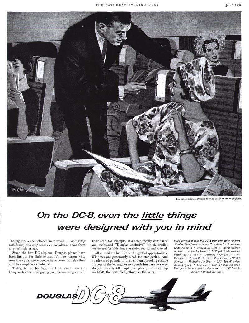
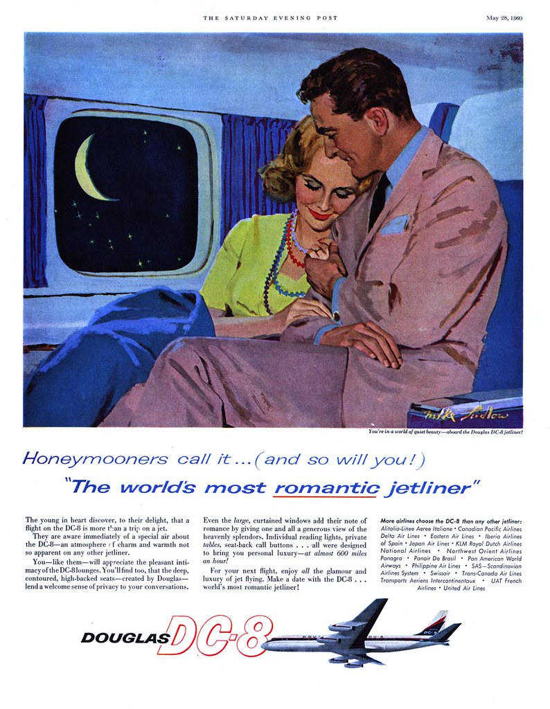
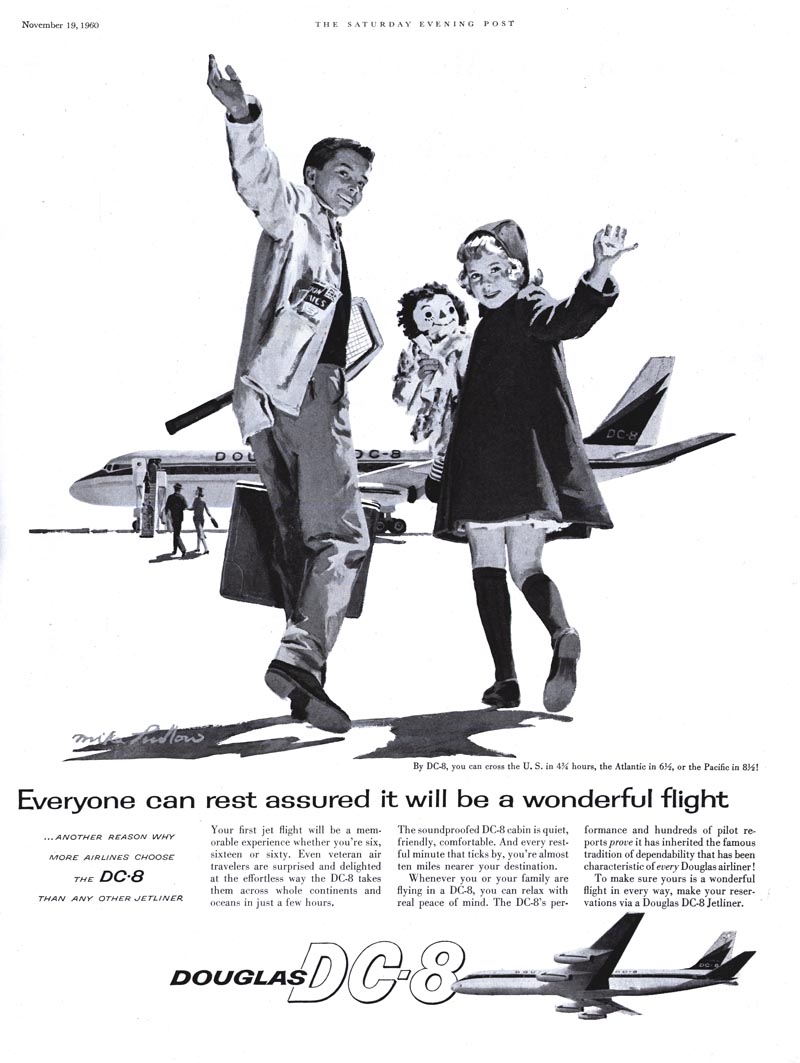
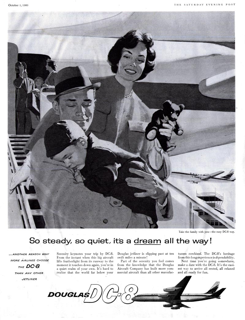
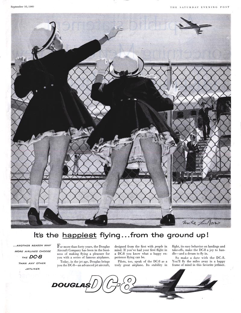
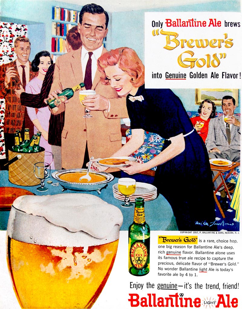
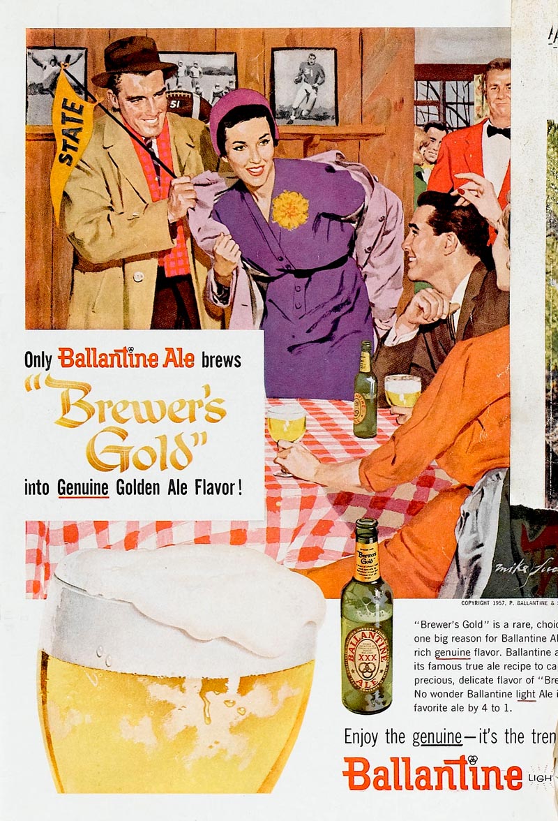
What can be surmised is that, just as Mike Ludlow became more prominent in story illustration during the later part of the '50s, so too did he become a more prominent advertising illustrator. The series above for Douglas DC-8 seems to have been a steady monthly assignment throughout 1960, and the two Ballantine Beer ads below are from 1957. All of this work is signed - and this is all the Ludlow advertising art I've ever come across.
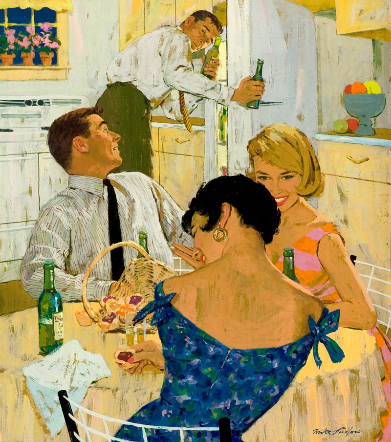
Finally, here's an absolutely gorgeous original, again for Ballantine Beer, clearly from a few years later than the two ads above. Ludlow's style here has evolved and matured to a masterful degree and shows the influence brought on by mavericks like Bernie Fuchs and Bob Peak. If Ludlow was still doing Ballantine ads several years later it bodes well for how his career was going at that time.
During the '60s, like many other illustrators, Ludlow was supplementing his income by tapping into new markets. In his case, based on the many Ludlow-signed record jackets I've found (and continue to find) album cover art for RCA Records became a significant component of his workload.

* Many thanks to Flickr member Paul Malon and Ozepic and to Heritage Auctions for the use of their scans in today's post!
* My Mike Ludlow Flickr set.
Thanks Leif. I loved this week. Ludlow had a gift for drawing beautiful people and capturing the emotion and connections between them. That Ballentine ad, the Post illo and those Esquire girls are killers.
ReplyDeleteLeif, when I began my schooling at the Academy of Art in 1958, Ludlow wasn't one of the big super stars at that time, but his technique (chunky brush strokes supported by linear accents and linear passages defining hair, garment folds and creases) was very much in keeping with the style then. He was considered very competent and one of quite a few busy top quality N.Y. illustrators. His work was consistently well done, and he used popular color combinations very effectively, which began emerging in the late 50s'.. red and orange, orange and pink, pink and purple, and blue and green, which contrasted surrounding neutral pastel shades. Combinations like he used in the featured original art posted today.
ReplyDeleteMy theory is that since Coopers Studio had Jon Whitcomb, Coby Whitmore, Joe DeMers, Joe Bowler and others that had similar skills as Ludlow, they didn't want to add him or others like him to their bull pin. By the late 50s', Whitmore, DeMers and Bowler were attracting award winning editorial work for their innovative avant-garde direction, while Ludlow remained more traditional in his approach. By the time I finished my schooling in 1963, some of the frequently seen 50s' illustrator's work had tapered off, or just disappeared. If there was any stability or sense of security in illustration, it vanished by the 60s'. In some ways, it became a "double edge sword" for illustrators.
Tom Watson
Leif,
ReplyDeleteEach of these Ludlow posts has been a real revelation. This last one, for instance, displays a lot of work that was obviously the inspiration for the ad art in the first episode of the 2nd season of Mad Men -- artwork (and ad copy) around which much of the episode was built. Around a desperate search for that same security that Tom points out was vanishing if not already gone in the early 60's corporate, and family, life.
Fascinating to put this all into context.
John, if I read you correctly, you are saying that the rapid changes of the time, not only in advertising and illustration, but the whole country, was a culture driven change. I agree, and I think it was a "social revolution", mostly by young people who wanted to be free of traditional expectations and responsibilities that their parents and grandparents adhered to. The sometimes radical changes were manifested in many avenues of society, including illustration. After all, illustration has always been a reflection of changes in past eras. Like any major movements, it came on strong and even radical, with the intent to eradicate "out-of-step" traditions of the past.. and that concept also crept into advertising and illustration.
ReplyDeleteAlthough, still in my 20s' at the beginning of those changes, I didn't buy into the concept, as I married young and had adult responsibilities. While criticizing, demonstrating and besmirching established society as "a bunch of hypocrites", the advocates of social "change", were practicing their own form of hypocrisy. Like illustration, eventually it returned to a more moderate form, based on much of the academic traditions of the past. And, many of those "social revolutionists" of the 60s' and 70s', have since taken on much the same responsibilities and values as their parents and grandparents did.
Tom Watson
Does anyone know what medium the last two pictures are done in? I figure acrylic or oil but I have a really hard time differentiating.
ReplyDeleteFor new comer painters and photographers on line selling provide best platform for showcasing their work. Because on line selling no one want to know your experience, peoples just know your work.
ReplyDeleteAdvertise online free