You could see hints of this sketchy style in the mid-to-late '50s paperback covers we looked at yesterday, couldn't you?

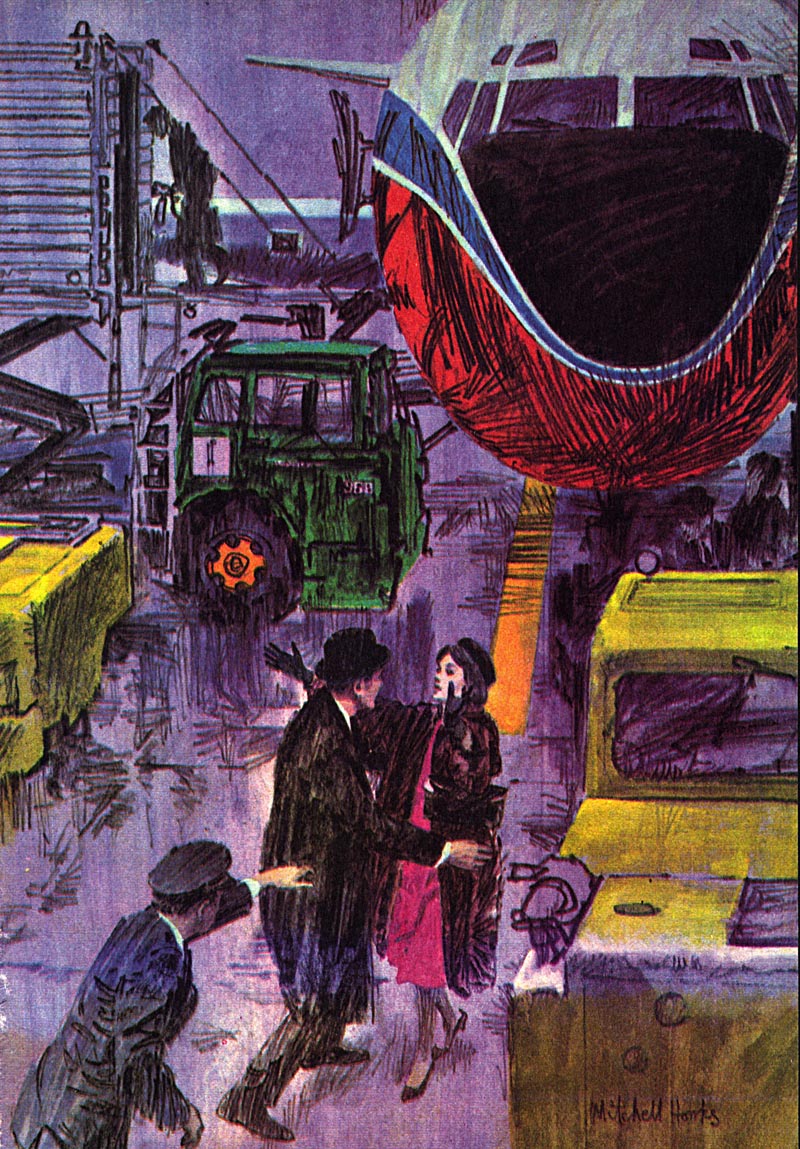
Frankly, I so love the technique Mitchell used for this series...
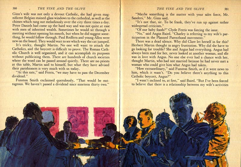
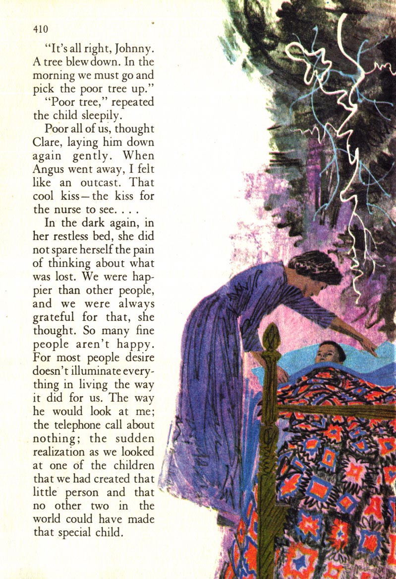
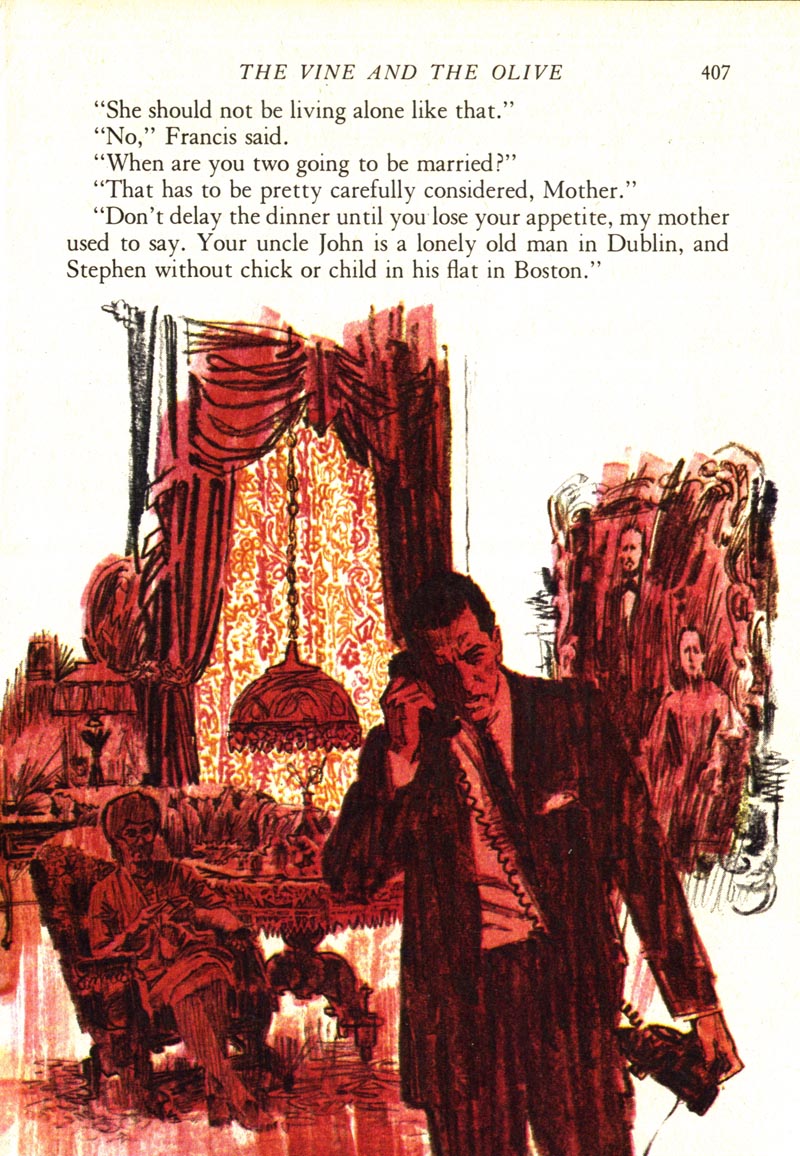
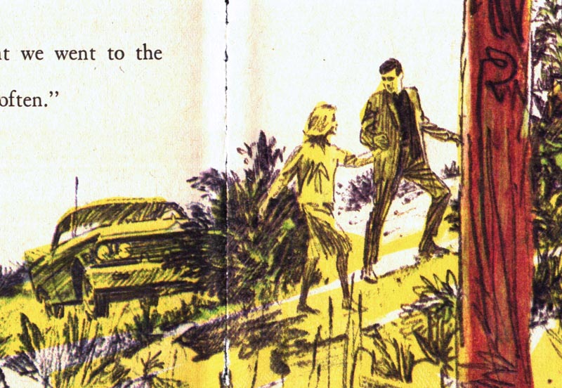
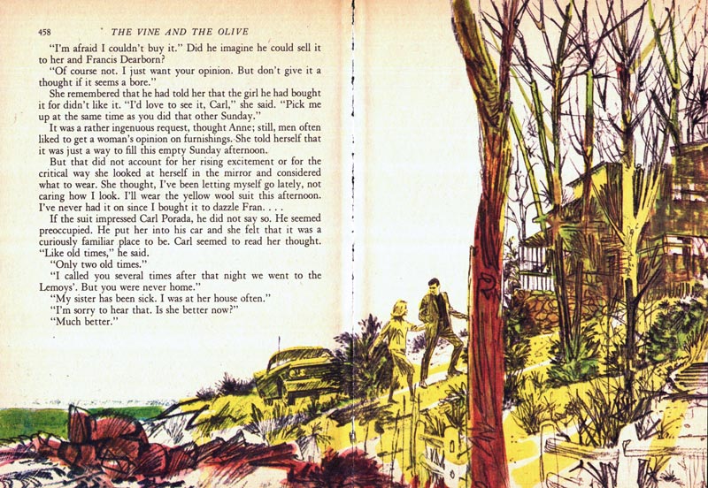
... that I had to include several close-cropped excerpts today. I wanted you to be able to see the detail; the lively action in that gorgeous sketchiness.
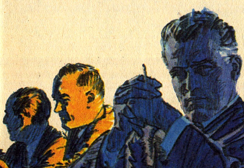
Also note the riotous use of strong, bright colour. Isn't it fantastic? A reflection of the times, I would guess (it was, after all, the '60s).
So who inspired all this sketchiness and these candy-bright, unnatural colour schemes?
No doubt there were many factors...
But I'll bet one major influence (not just on Mitchell, but on the whole industry) was Bob Peak.
* My Mitchell Hooks Flickr set.
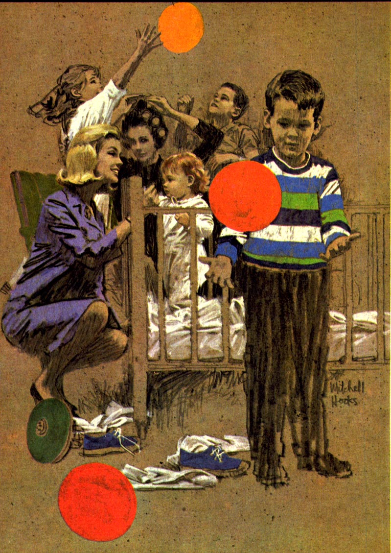
These are breathtaking! Hook's work is so alive and exciting! Like that storm of scribbles above the sleeping boy's head. It's crazy, but wonderful!
ReplyDeleteI loved RD Condensed Books when I was a kid! I never read the stories, instead I took in all those fantastic illustrations!
ReplyDeleteI agree with Jori, WOW!
ReplyDeleteMitchell Hooks was a great inspiration.. solid draftsmanship, progressive compositions, a modern flair, and as Leif pointed out, those gorgeous dramatic color combinations. Keep in mind illustrators were highly motivated to produce what a camera could not, and that included sketchy drawing and bright avant-garde color schemes. I also thought that Hooks was probably looking over Peak's shoulder, as Leif alluded to. Few illustrators, back then, worked in a bubble. ;-)
ReplyDeleteTom Watson
This comment has been removed by the author.
ReplyDeletethat picture with the children and the balloon and cot was one of the first that inspired me to want to become an artist.
ReplyDeletethanks.
I kept it but never knew who it was by.