1961
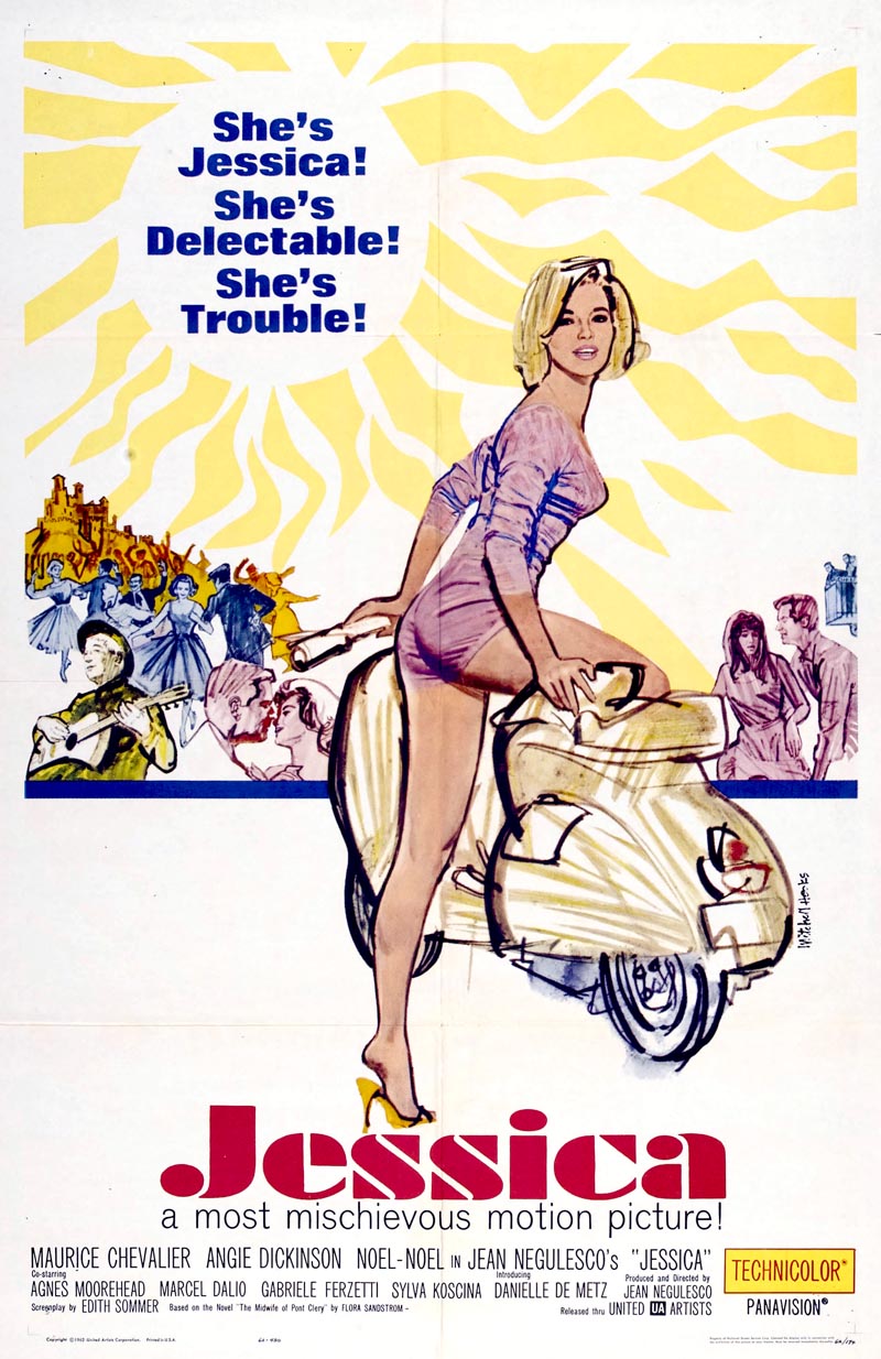
1962

1963
1965
1966
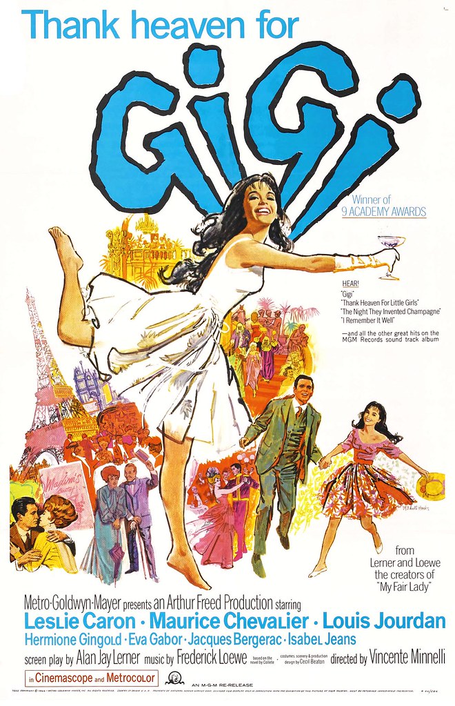
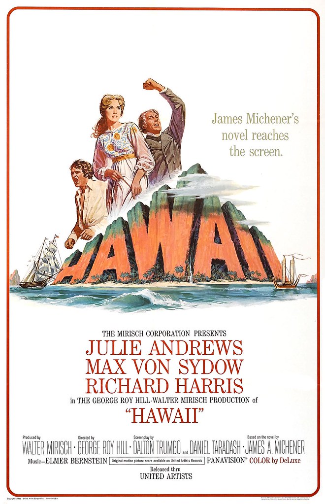
1967

1968

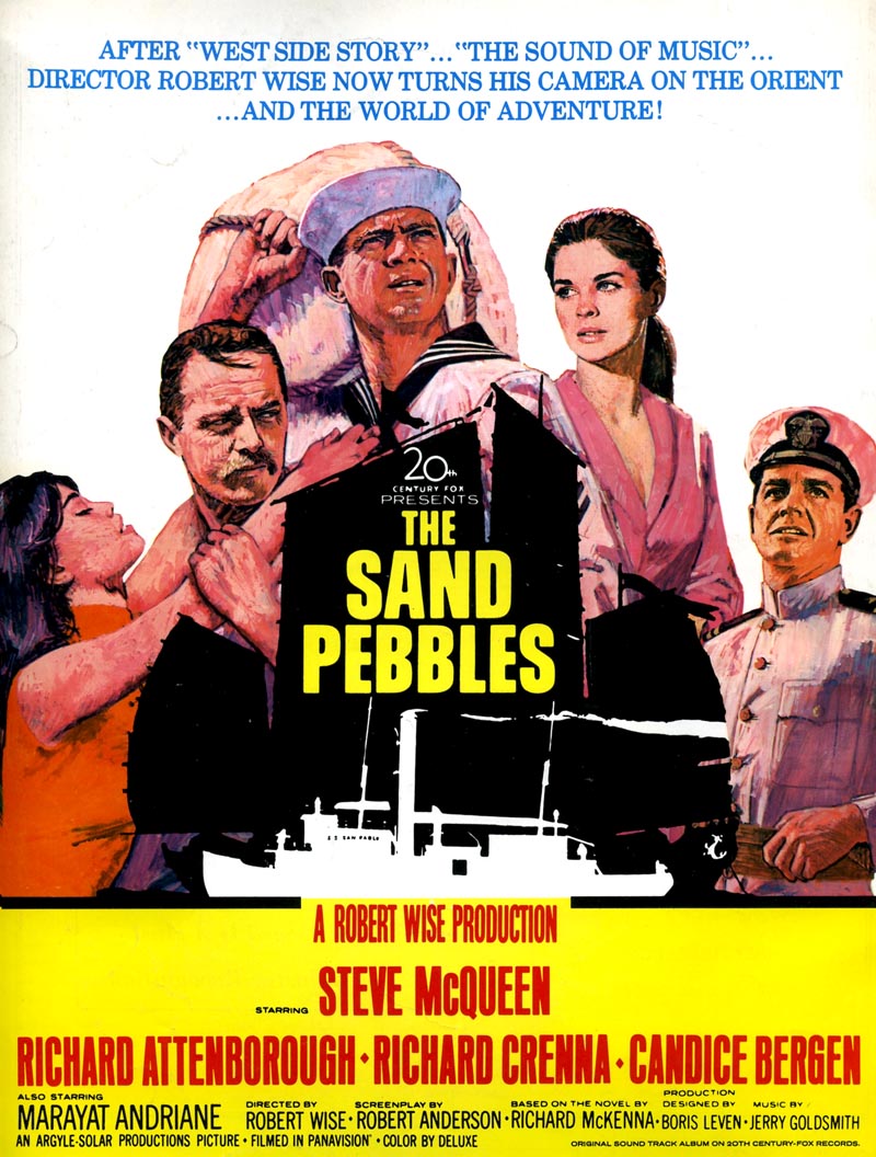
Many thanks to Crispin Garcia of thesandpebbles.com for providing the scans of Jessica, A Flea in Her Ear and, of course, The Sand Pebbles. Crispin wrote, "My initial interest in Mr. Hooks was that he is the artist who did the original artwork for The Sand Pebbles (1966)."
"His poster version was eventually replaced by one created by another great artist, Howard Terpning, only a few months later. However it is Mr. Hooks' artwork that graced the recent Varese Sarabande CD." (below)
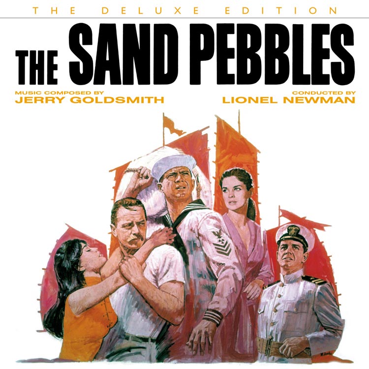
Crispin continues, "After The Sand Pebbles was released to critical acclaim there was an Oscar buzz generated by Steve McQueen's performance in the movie. To capitalize on this (and studios being studios) they decided to more prominently feature McQueen's character on the poster plus give it more of a war-like appeal. However, the movie is not a war film (although it has that element) but a character driven drama and romance. So to me Mr. Hooks captured the essence of the film better than did the more macho look of the recommissioned poster by Mr. Terpning (although I am also a big fan of this artwork as well). I am not sure when Mr. Hooks completed his artwork for the film but it was used in advance advertising and when the movie premiered on December 20, 1966. The Terpning version was completed in February 1967. The silhouette overlay with the Chinese junk and the U.S.S. San Pablo on the Hooks movie poster was created by another famous poster artist Tom Jung."
* Thanks also to Heritage Auctions for allowing me to use their scans of the Dr. No and Fu Manchu posters.
* My Mitchell Hooks Flickr set.
Man...could he get fun with it? Excellent stuff. I love this era.
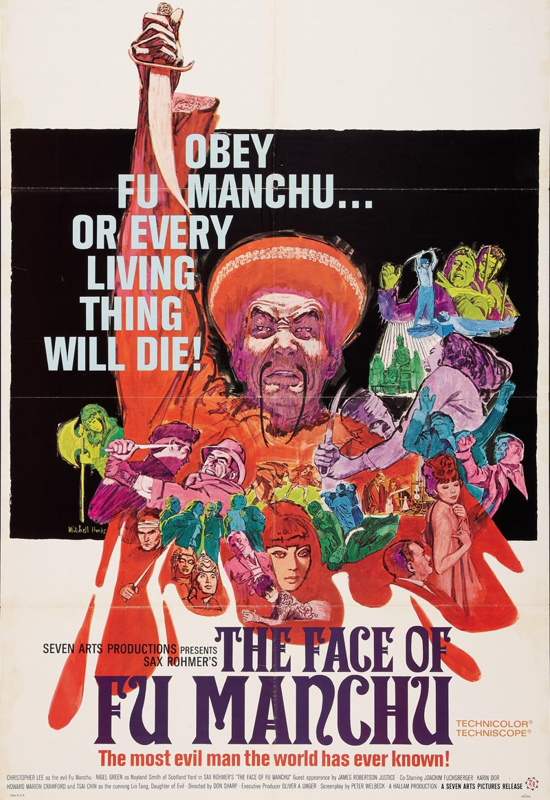
ReplyDeleteThat Fu Manchu poster...looks like marker.
=s=
This is the artist that did the Dr. No poster?? I own an original "quad" poster of the wider yellow version of it. It's from England and it's the showpiece of my studio! I was dating a woman for about a year and we were having a few problems. One day she was in a bad mood and randomly began criticizing that poster saying it was poorly drawn. HA! That was the final straw. When she got home she found a message from me on her phone machine saying we both needed a break from each other.
ReplyDeleteFabulous...Mitchell has the gift to keep the freshness of characters synthesizing them (it's not a photo, is a drawn poster)...it looks something obvious, but only the best get it. Great. What a good contribution to illustration history this blog is! Thank you!
ReplyDeleteWOW! Hooks was really great, I had never seen any of these illustrations before, I'm amazed.
ReplyDeleteHarry
Holy cow. That Fu Manchu poster is astonishing. The composition of each of the individual vignettes is perfect, and then he blends them all together so perfectly. I would be hard-pressed to do a collage with just 3 or 4 of those. Yet there's gotta be 15 or more individual illustrations that make up that one single piece. Amazing.
ReplyDeleteAlso,James Bond is the wrong color.The girl in yellow pops and distracts the eye away from Bond.That dull green was a mistake.
ReplyDeleteWow, Taylor; who pissed in your cornflakes this morning? You know, I've been doing this for a few years now so I sometimes feel like I've probably seen it all. But I'm still always kind of amazed that, when confronted by so much beauty and so much good intention; and having the choice to say something nice or to say nothing at all, there are people like you who choose to say something negative that adds no value to the conversation.
ReplyDeleteGo take a look in the mirror, my friend. I fear you will find a troll staring back at you.
Since when did you take responsibility for Mitchell Hooks work?
ReplyDeleteIf all you want from this blog is for everyone to cheer and applaud everything created by every illustrator you showcase,that's fine, just say so.
But if this is supposed to be a forum for opinions then I think I have a right to give my opinion,
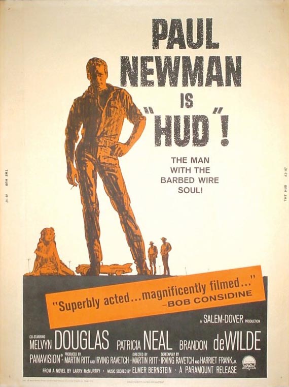
1. Paul Newman is posed in a very effeminate manner.NOT the essence of Hud, a great film with the beautiful Patricia Neal.
2.IMO Hooks chose the wrong colors to highlight the figures on that poster.Bond could have been red, signifying 'danger' for example.
So there you go.Opinions justified.Or should I just say
"Wow, man.Great work.This stuff really rocks." Is that all you want from contributors?
My God , be VERY careful you don't ever rest your hand on your Hip. It could be an early sign of "Faggishness" ...oh Dear No
ReplyDeleteThanks for your sharing, download Brasil TV New free for Android to have the best movie viewing experience. Link download https://techbigs.com/pt/brasil-tv-new.html
ReplyDelete