The cover of the February 1953 issue of Fortune describes how this issue contains an in-depth look at the Soviet military/industrial complex.
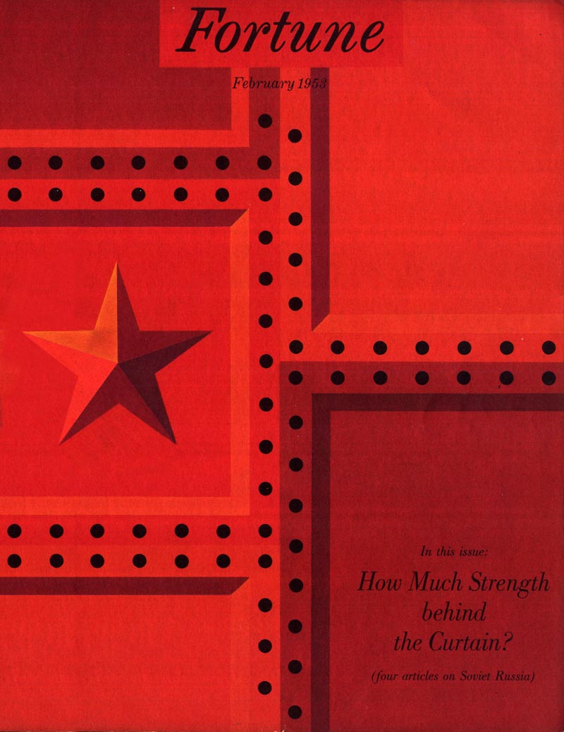
Ironically, those 4 articles on Russia share space with an ad campaign unlike any I've ever seen - in Fortune or any other magazine.
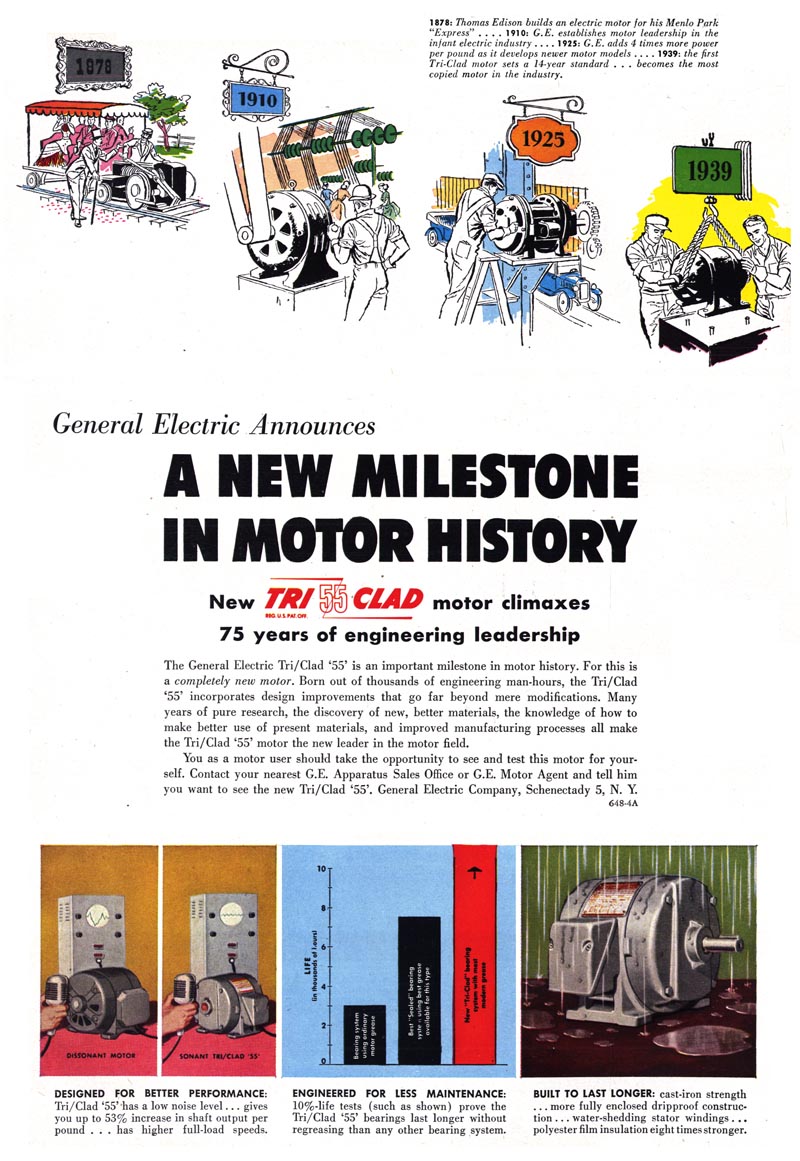
General Electric chose that issue to present a multi-page ad campaign extolling their seemingly limitless accomplishments in industrial innovation.

The design esthetic GE employed for this campaign - a multitude of propaganda-style mini-posters - is so similar to that seen in Russian Constructivist art, one could easily imagine these posters being produced behind the Iron Curtain by some Soviet "Ministry of Machine Parts."
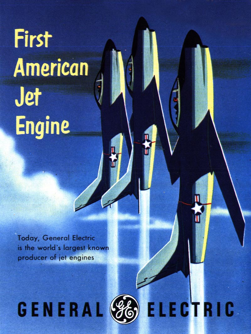
Sometimes the imagery (and the message) is fervently militaristic.
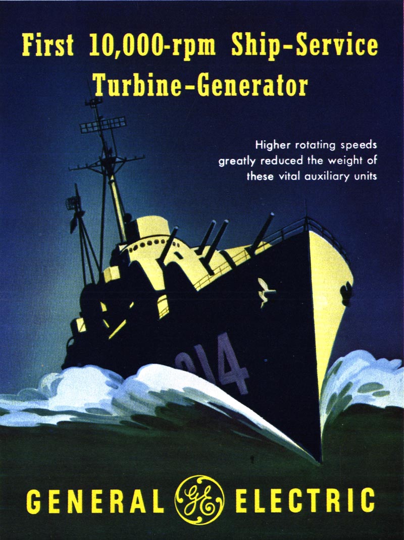
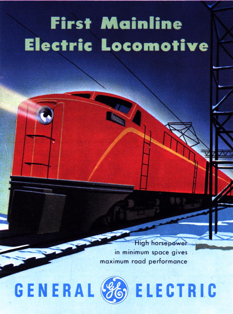
Sometimes it is aptly industrial.
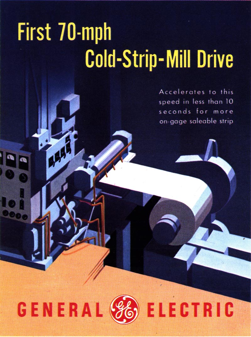
Often it is remarkably pleasing, despite some really dull subject matter...

... and sometimes its amusingly obscure (to anyone but the hardcore technician, that is).

But what really impresses me is how consistently visually excellent it is. I could stare at these posters for hours. I could see hanging them on my walls!
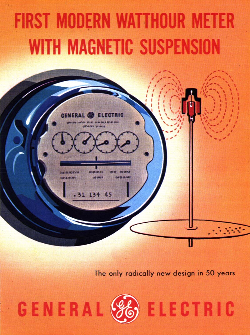
Page after page after page of clean, colourful, simple, beautiful poster design - about subject matter I (and I'm guessing most other people) have absolutely no interest in!
These posters make the dull, utilitarian mechanisms of industry seem like something actually worth celebrating!
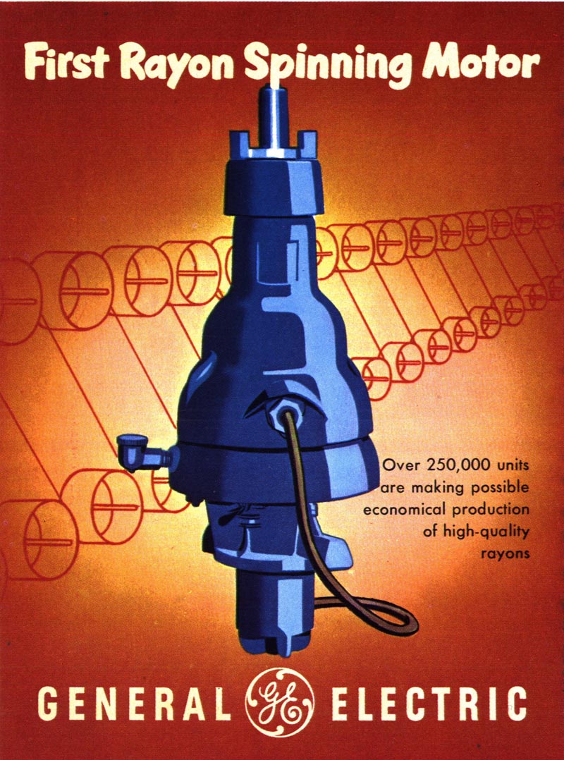
But then, isn't that the role of advertising... and propaganda?
* You'll find many more examples of mid-century 'industrial propaganda' in my Industry Flickr set.
Fascinating stuff. It's intriguing just how pervasive the influence of Soviet graphics in consumer economies was. Take a look at the great Antonio Petruccelli's epic heroes of labour welding together a Christmas star for the cover of Fortune in December 1938.
ReplyDeleteThose are absolutely marvelous. Fantastic colors and lines, love the composition and I really love the strong forms and value. I also love how they're sort of vaguely ominous, fantastic!
ReplyDeleteDo you know who did the ads?
ReplyDeleteThese wonderful ad graphics represent one of the four legs of early Populuxe culture: industrial production might, American scientific know-how (captured perfectly in your earlier "Hand of God" series), grilled red meat, and shiny new cars.
ReplyDeleteThe America of the '50s and '60s was built on these foundations, and I say that with only a whisper of irony.
So while the specific subject matter of motor armatures or transformer coils might put a non-engineer to sleep, the artist's ability to portray these inanimate objects as nothing less than heroic says much about the times in which these ads were born.
I too could read these ad for hours.
Wow, more stuff for Shepherd Fairey to use as a resource ...
ReplyDeleteWhat these posters remind me of, more than anything, are the posters you often find being produced by the WPA in the 1930's.
http://memory.loc.gov/ammem/wpaposters/highlights.html
As for propaganda ... one person's propaganda is another person's truth. And of course, what we believe is the truth, right? Otherwise "our group" wouldn't advocate it. Propaganda always comes from those "other people." Humans are funny that way.
There seems to be a thin line separating advertisement from less charming propaganda.
ReplyDeleteThat struck me reading this issue of Today's Inspiration.
On an artistic level these show that good design transcends mundane subject matter.
ReplyDeleteKind of sad so many minorities--men and women--gave their lives and to protect America (and freedom in general), but weren't allowed to be represented in these beautiful illustrations by some of our greatest artists. I'm sure many people just didn't associate people like my grandfather, who was a decorated captain in the Army during WW2, as being an upstanding American hero because they never really saw African-Americans in these propaganda images--as well as the moral-boosting war movies of Hollywood. But I guess that's the entire point of propaganda. Put a strong, handsome American face out there to represent the pride of our country.
ReplyDeleteIt's ironic Leif, because when I saw the "They Also Serve" banner at the top of that old illustration, I actually assumed the concept would be to show people of different ethnicities and cultures in that crowd of saluting Americans that serve. And what's ironic is they weren't even talking about those that serve in the military but those that serve here in the homeland! LOL
As usual, thanks much, much, much for finding and sharing these beautiful and important images, Leif. Aesthetically and historically they're vital.
Great stuff, Leif!
ReplyDeleteAnd thanks for the great link Micheal!
I think my first question is, are ads for GE automatically pro-capitalist propaganda?
Are the ads that we get nowadays which completely avoid the question of the value of industry any better? In 1950 BP would have given us a beautiful ad explaining how their huge, complex machines get the necessary jobs done to provide oil, the lifeblood of civilization. Now a BP ad is a hot young girl running through a field picking daisies in the sunshine. Rebranding has become fantastical, absurd, through the looking glass.
The overarching problem I see with artists working for political causes is, what if you're wrong politically? It is so easy to be wrong because we are all being constantly bombarded with memes and peer pressure and emotional pleas and being told that the other guy is evil and lying and insane. As the CIA fellows used to say, its a wilderness of mirrors.
Thanks everyone, for the great comments. I hope that this week's series doesn't give you the impression that I'm opposed to the imagery I'm presenting - or that I'm trying to characterize it as 'evil corporate manipulation' or something. I just find it fascinating because it does use the visual motifs and messaging I would typically associate with propaganda. But as I wrote yesterday, that word has gotten a bad rap by association during the last century.
ReplyDeleteOne thing Les points out - a very valid point, imo - is how intentionally absent minorities are (in these images and in mid-century visual materials in general). In that sense, these materials really do fit Richard Alan Nelson's definition of propaganda as being "... the controlled transmission of one-sided messages (which may or may not be factual) ..."
Phil Beard, I appreciate your comments regarding Antonio Petruccelli's epic heroes of labor. I had a friend who owned 2 original paintings. Upon viewing these wonderful pieces, I experience the wonderful Christmas scene, the intense cold and the intensity of the worker's labor.
ReplyDeleteThis is a perfect book review guide https://eduessayhelper.org/blog/book-review. I hope you would be fine.
ReplyDelete