White Rock certainly set themselves apart from other soft drink companies with this campaign... and no doubt grabbed the attention of more than a few consumers. I'm just not sure if an ad series featuring a topless girl was the way to do it.
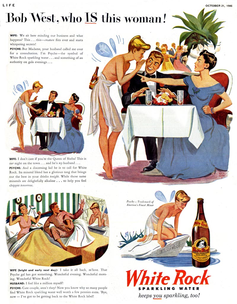
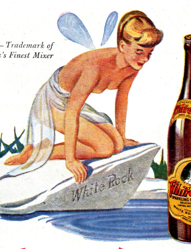
Sure, it probably sounded like a great idea when it was pitched (or maybe the three martini lunches made it sound more reasonable). The company logo featured its mascot, Psyche, a mythological/fairytale character who appeared on White Rock's product labels in what looks to be an old engraving from the 1800s.*
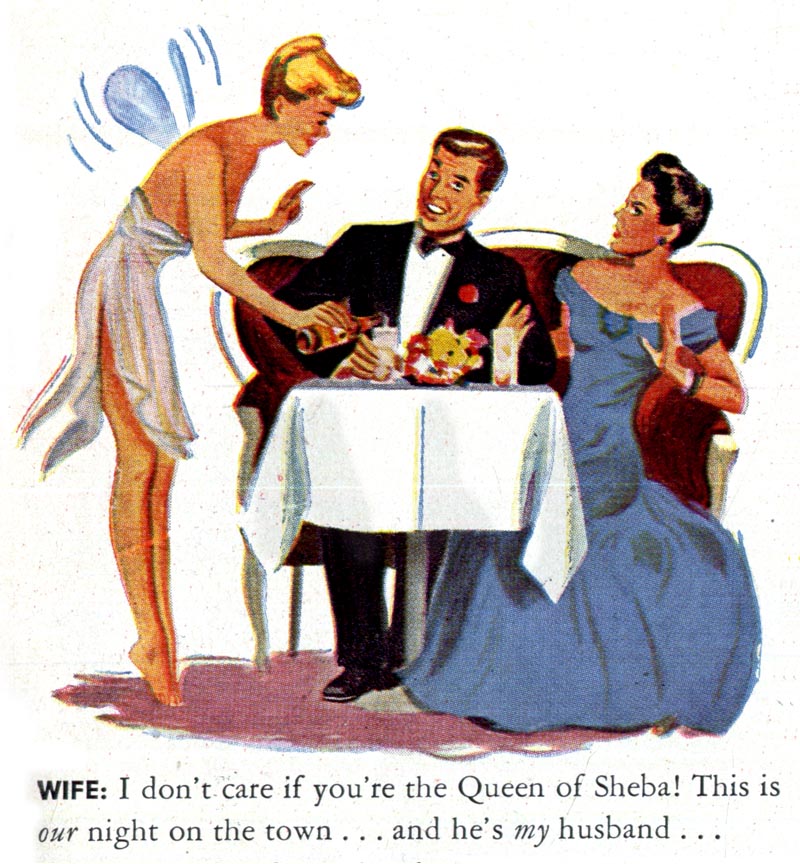
Unfortunately that image of Psyche doesn't quite translate seamlessly into a then-modern context just because the illustrations always showed her with an arm obscuring her bare breasts... or even worse, pretended they weren't bare breasts because they were rendered without nipples!
The audacity of these ads very nearly leaves me at a loss for words. Consider this February '47 offering below, for example. The headline suggests its a classic wife-catches-cheating-husband scenario.
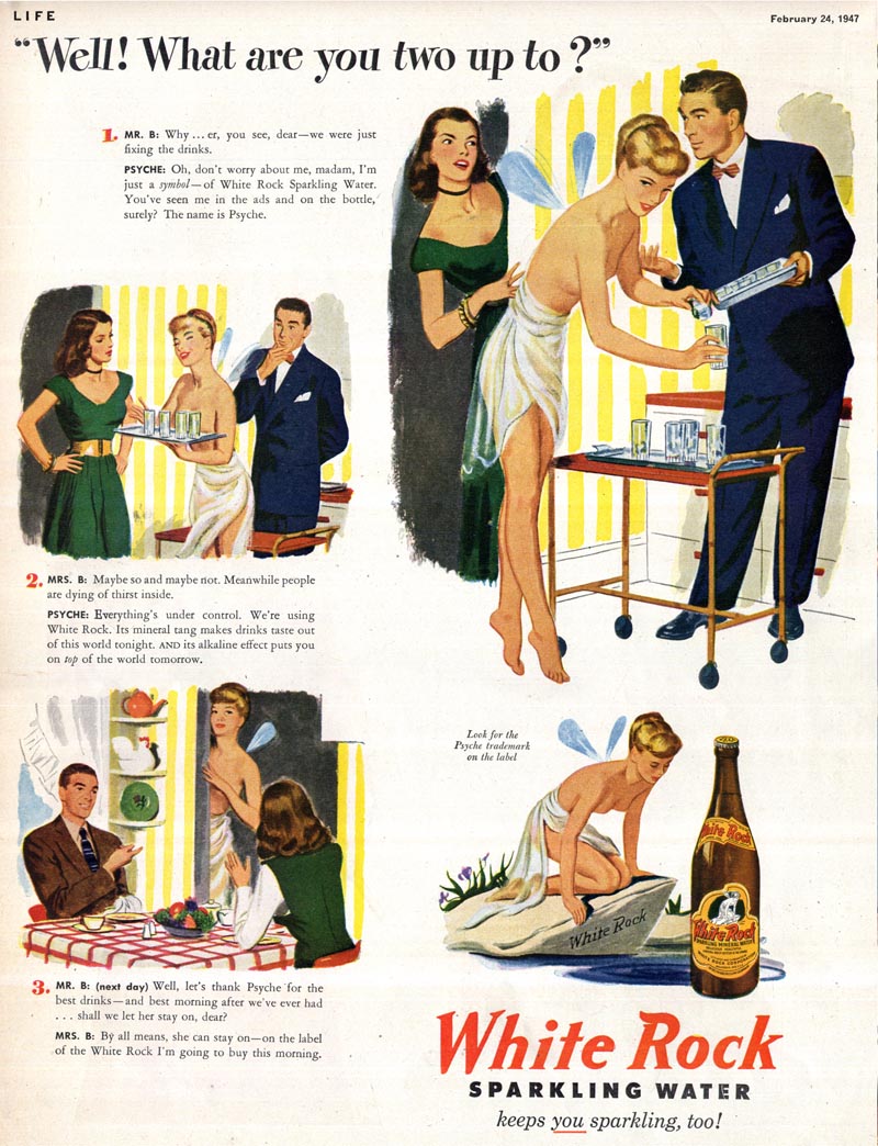
The husband's stammering response confirms he's feeling caught in the act:

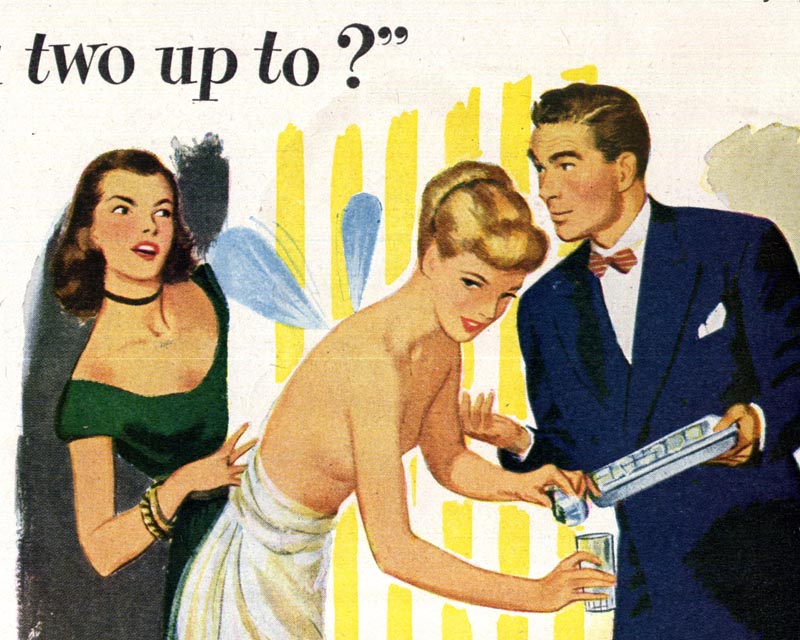
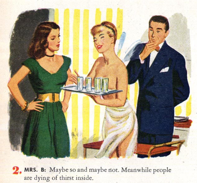
The explanation proffered by Psyche is of the sort that would only make sense to someone who had already enjoyed several stiff drinks (mixed with White Rock Sparkling Water, of course).

Ooohhhh, I see.... she's not actually a semi-nudist at a party for people who own clothes - she's a symbol! Amazingly (and only in a White Rock ad) the lady of the house buys it. Sort of.
Apparently the missus is willing to set aside her concerns about her husband hiring a stripper for the dinner party so long as the guests are well lubricated. Just look at the expression on hubby's face. He can hardly believe he's going to get away with this. Priceless!
Long before the streaking craze of the early '70s, White Rock's topless tinkerbell could be seen in all her glory, working her magic...
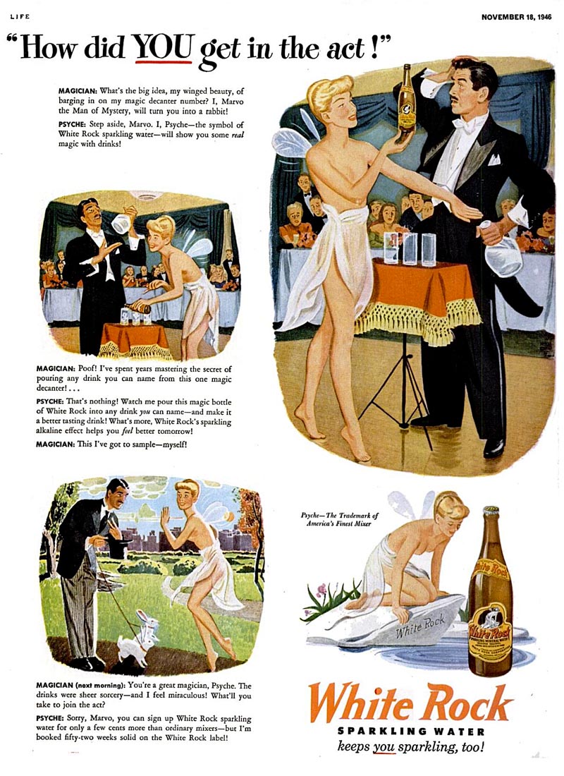
... from the stage...
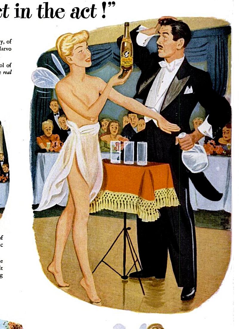
... to the screen...
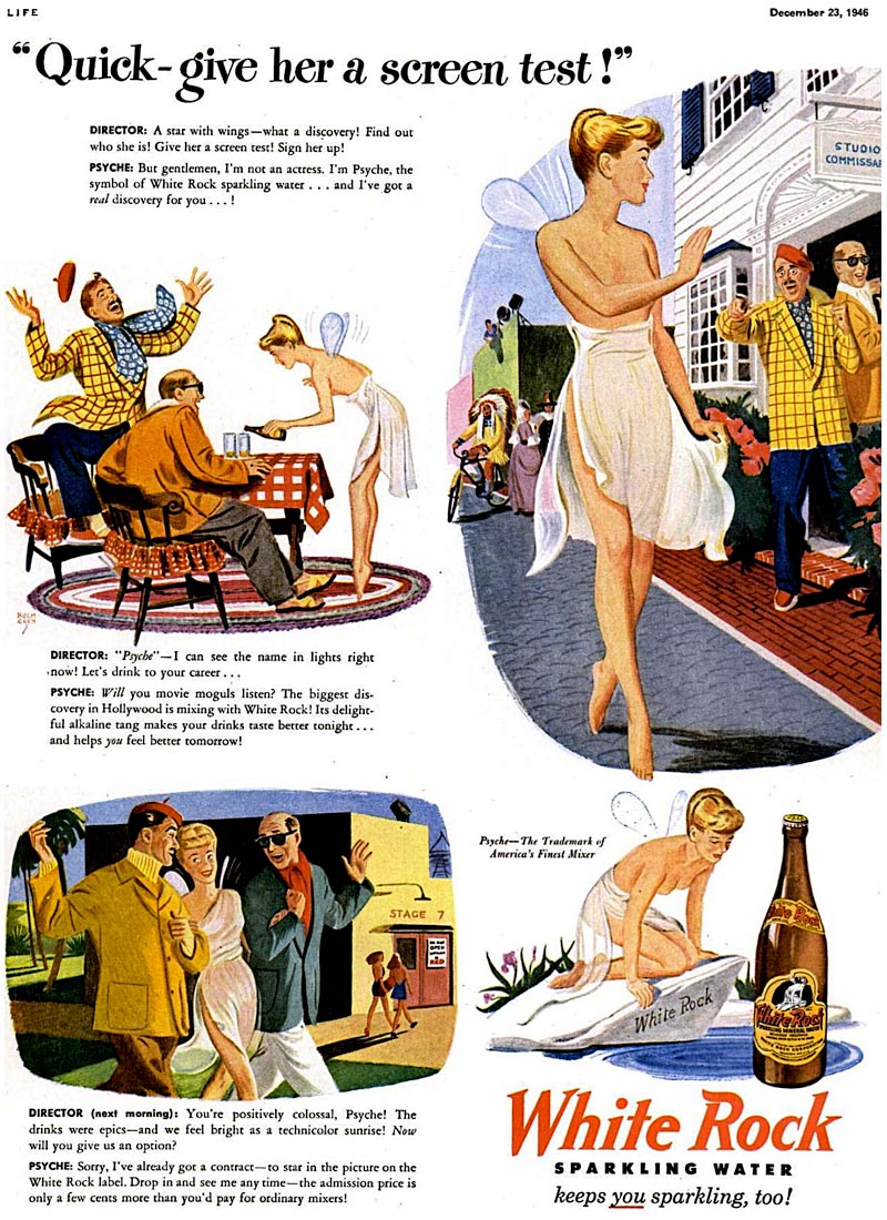
... to the streets.
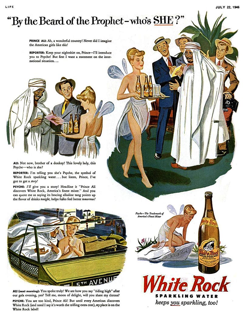
Thankfully, by mid-1947 Psyche had discovered that her gauzy toga bottom came with enough material to fashion a top.
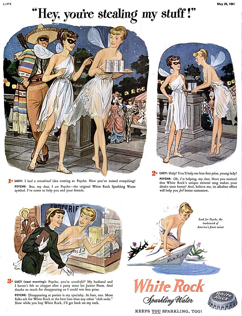
And by early '48 it was actually safe to have her in the same room with the kids!
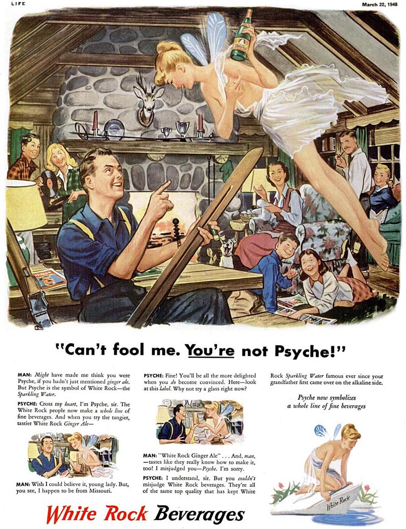
In reality, I suspect that someone higher up at White Rock was getting tired of fielding letters of complaint from irate church and PTA groups! (But that's just my sneaking suspicion).
* An article in a 1971 issue of the Journal of the American Institute of Graphic Arts describes how Psyche became the symbol of White Rock beverages:
In the 1890s the executives of the White Rock company were looking for a trademark that would reflect the "clear sparkling purity of their products." At the Chicago World's Fair of 1893, they saw the painting "Psyche at Nature's Mirror" by German artist Paul Thurmann. It was exactly what they wanted. They purchased the trademark rights to the painting and Psyche became "The White Rock Girl."
Skin sells - then and now. Still, when an ad campaign had to rely on tons of copy to explain the point I question just how effective the campaign really was. Psyche? Were mid-century folk just more up on mythology than we are? By the way, I've seen lots of these and never before noticed that Psyche was topless. Jaded 20th/21st century eyes, I guess.
ReplyDeleteI once saw a Charles Addams cartoon with an empty "white rock" and I had no idea what it meant til right now.
ReplyDeleteSomehow I think the Old Boys of 1893 didn't foresee Psyche being turned into the Other Woman...But I can see the problem for the 1940s marketers: what do you do to update a tired old brand that relied on something as Victorian as an allegory?? Yet their solution was already dated. This hotsy-totsy approach is very 1930s. But the uptight 1950s were almost upon them! I'm not surprised they clothed her. I bet she was totally retired by 1950.
ReplyDeleteJaleen; and according to my research you are absolutely correct. :^)
ReplyDeleteJennifer; I agree - these ads consistently relied on multiple explanations of who and what Psyche was, clearly hoping to ward off the inevitable protests from those who might take offense. That sort of back-peddling and justifying only serves to reveal an inherent flaw in the underlying concept behind the campaign. It simply couldn't stand on its own merits without constant verbal reinforcement that "everything's ok here."
ReplyDeleteBut all that aside, I have to say the ad agency and the client had some balls putting these out there for as long as they did. Even in these so-called 'anything goes' times, I'd be astonished to see any advertiser daring enough to sell soda pop in a mainstream magazine with a reoccurring character who is topless!
I remember the soda -- too sweet, as I recall. I vaguely recall my parents substituting buying it because it was cheaper that Coke or Pepsi. I think I thought it was the poor people's soda. Doesn't really make sense, does it?
ReplyDeleteAs for her outfit, its her skirt that's most sexy,not that I'm attracted to skinny blondes in see-through lingerie . .. .
wes
was the model ever identified? Looks like the same 'Psyche' in every ad - I'm surprised Mad Men hasn't stolen this campaign for their TV show, ha ha
ReplyDeleteLooks like the guy in the last ad was definitely psyched to see her!
ReplyDeleteLove those!
ReplyDeleteSo, who was the artist?
ReplyDeleteT Arthur Smith; The earlier pieces were by john Holmgren and the later ones are (my best guess) by an artist who signed his work "H. Miller" - although these are unsigned.
ReplyDeleteLeif, in your tongue in cheek yet derisive comments, you managed to solve the mystery behind those oddball White Rock campaigns. Tongue in cheek?.. well maybe not. Of course I was only about seven or eight years old then, and my parents probably cut the Psyche ads out of the magazines, so it wouldn't corrupt my delicate "psyche." Yes, it's apparent that everyone working on that campaign got ripped on martinis including the illustrator, and came up with that nonsensical campaign, with shocking sexual implications that probably caused White Rock sales to plummet, not to mention the church groups and the PTA picketing White Rock's corporate headquarters. But, I was probably playing with my friends in my tree house, and you weren't close to being born yet, when all this took place, so our insight is based on our personal perspective and perhaps just a touch of badinage. It's hardly based on reality of that time period. I find it ironic that the White Rock executives came up with the Psyche logo, and not the ad people. Sometimes when we make assumptions about ads and illustrations that appeared in another era, it's not always the way we think we see it, visually or other wise.
ReplyDeleteTom Watson
And sometimes when it looks like a duck and quacks like a duck, guess what? Its a duck. And you don't have to have witnessed its birth to figure that out.
ReplyDeleteTom, your repeated attempts to dismiss any of my analyses of old ad campaigns with the argument that "you weren't there so you couldn't be right" is nonsensical. Taken to its logical conclusion we can do away with all history books and the entire fields of anthropology and archaeology.
I don't have to have been present in the room to make observations on cultural artifacts. Give me a little credit - I've had decades of related experience and done my research, both from accepted texts and from personal interviews with people who were in the business at that time. The stories I've heard suggest not every person in the business back then was an earnest boy scout. Far from it.
And if I feel like poking a little fun at something as inconsequential as this hokey ad concept, so what? If my commentary offends you I suggest you skip it and just enjoy 'the eye candy'. That's why you're here anyway, right? So relax and enjoy! :^)
Anton; I was wondering if anyone else would catch that strategic placement of the ski. Although I'm sure Tom Watson will now tell us that, having the opportunity to place a huge rigid phallic symbol in any location in the composition - or leave it out entirely, it ended up in that most suggestive spot entirely by coincidence! ;^)
ReplyDeleteMe as well, I caught that "ski's strategic placement" at once, the bar pointing towards...eh that bottle...
ReplyDeleteImagine Psyche without those winglets! Scandalous! They seem to serve as a kind of fig leaves.
Because from an aerodynamical point of view - what purpose could they serve?;-)
I think Tom has a point.The ad people weren't boy scouts,nobody would argue that.Life magazine had some pin-up photos,back stage chorus girl shots,girls dressing/undressing photos,movie starlet cover pics,and sexy-girl ads during the war years and before that,and so it's not surprising that this stuff appeared.Sex sells,when didn't it?When won't it?
ReplyDeleteBut there's a sort of nudge,nudge,wink,wink,feel to your comments that make some of your assumptions sound overeaching.They were obviously trying to spice up the old mascot with a little sex appeal,but it never went beyound mild flirtation and mild nudity.And they were showing some mature restraint,rather than trying to pull a fast one on the readers.If Doris Day movies are shocking,then this stuff qualifies.
I also think that 'find the phallic symbol' is pretty glib analysis,since any bottle,hotdog,pipe,cigar,and now a ski-pole would qualify.Did that ski-pole get anybody hot?I didn't notice it until it was pointed out,but then I don't have your trained eye.
I notice your mascot has a cigar in his mouth.Are you going to tell me that's a coincidence?come on now...
I hope I'm not being too much of a know-it-all with these comments.My point here is that I think we can appreciate the sexyness and nice art without summoning doctor Freud every time.
I didn't notice the ski pole as phallic either until it was pointed out, but it's pretty obvious, isn't it? You'd have to suspend common sense to think otherwise, or dismiss it out of hand.
ReplyDeleteThese aren't really very sexy ads now, but they would have been at that time, and playfully intended (like Mae West innuendo), and well, banal too, because its soda pop, for crying out loud. Wouldn't an artist -- well versed in clever imagery and mildly titillated by the bland assignment -- attempt to add variations on the theme of sexual imagery for their own amusement, hoping to sneak it by the boss?
Of course.
Wes
Wes,
ReplyDeleteThe artist would have had to sneak it by more than one person.
Those ads weren't the work of one man.They were done by a team of craftsman,following a copywriter's text,others'ideas,and approved by the ad agency,the clients,Life magazine's advertising handlers,and who-knows -who else.The illustrator could have worked from someone else's rough layout,and then he would have to go through quite a few layers of approval to sneak something in.Why would he risk his chances for getting more work by sneaking that in?
Steve,
ReplyDeleteI defer to your greater experience. But a crotch to crotch phallis seems intentional to me. Maybe all the conspirators got a big laugh out of it when published.
Wes
Leif, your assessment is not unreasonable at all. Risque material had been going mainstream since WW1, due in large part to the culture of the illustrators themselves, who promoted their talents to clients by hosting girly shows with topless models in fleshtoned g-strings - at a time when strippers had to wear pasties. The skits were quite shocking (I've read scripts and seen photos).
ReplyDeleteA topless Vargas Girl in Esquire, seen from the back, caused the USPS to lay charges of obscenity - that got defeated in court in the 40s; this series is clearly taking advantage of that ruling.
Mind you, there was a double standard. "Nice" people pretended not to see such things, and Ladies Home Journal had strict rules that would have made it impossible for this series to have run there. So, for those who wanted, they could pretend this other stuff didn't exist.
Remember, Life had been a humour magazine until about 1938, when it became a photojournalist magazine. By the 30s it had become very salacious, and so its title would have still carried a whiff of "men's magazine". That's the demographic the marketers were after here. I recall once seeing a photo spread in an early number giving a how-to to women on how to undress sexily for a man.
It's possible for a "nice" person to miss the ski - but I doubt the art editor would have. The "tastefulness" radar would have been on high alert already for this series, and it was his job to catch such things.
Ladies and gentlemen of the court,
ReplyDeleteI think we both laid out our cases pretty well,so I can now sum up mine.I can't prove it wasn't intentional,and you can't prove it was.After all,we weren't there(sorry Leif,I couldn't resist...I'm such a stinker).
I think I already made the pin-up connection,but Esquire was totally for guys.After it became a photo-journal and by the 40's,Life catered to both sexes,as did those White Rock ads(exhibit A).And the 50's really pushed squeaky-clean domesticity and politeness throughout the media.
Mae West,eh?Psyche's a little petite for that."..why don't you come up and drink me some time?"
By the way,did anybody else notice a slight resemblance between Tinkerbell and Psyche?Although Tinkerbell is way hotter.
Steve F., I think you hit the nail on the head, and your analysis of the layers of approvals, etc. is in line with my experience with large agencies back to the early 1960s'. And, you don't come off as a know it all, you come off as someone who is reasonable and knows what he's talking about. Leif, I am very aware of sex in advertising, and how it was handled back then. I just think your comments are, as Steve F. aptly put it, "over reaching". Out of all the ads back then, I saw only a small percentage that were depicting sexual connotations. And, I am very careful about people who tell me about dramatic or shocking stories in the business, as though it happened all the time. It's much more interesting and entertaining to elaborate on a true story and throw a lot of spice into it, than to disappoint an anxious audience that wants to hear something sensational. Yes, I know dramatic sensational and even shocking things did happen in the business. I witnessed some of it, but to gleefully declare all these innuendoes about the White Rock ads, is going overboard.. and that's my opinion.
ReplyDeleteTom Watson
Having another look:
ReplyDeleteIs the man waxing that ski?
Not gleeful; just funny:-)
"...but Esquire was totally for guys."
ReplyDeleteActually Esquire during the War had a very large female readership and intentionally cultivated female readership. There's an excellent bit of scholarship on that by Maria Elena Buszek.
Tom; the only overreaching going on here is in the degree to which you constantly feel the need to defend the integrity of every piece of advertising produced during the era in question.
ReplyDeleteYour descriptions of my intentions when writing these posts uses language I'm beginning to find insulting. There's nothing "gleeful" or "derisive" about how I chose to describe the White Rock (or other) ads in my recent posts. I have no malicious intent about any of this stuff - just amusement at their audacity and genuine fondness for the hutzpah of the people who put them out there.
A comment like "I am very careful about people who tell me about dramatic or shocking stories in the business, as though it happened all the time. suggests to me that you think I'm a liar. Besides, where did I say I thought it happened all the time? I simply don't believe, as you have previously asserted, that it never happened. Again, you're 'overreaching.'
99.9% of the 1000+ posts on Today's Inspiration are an entirely uncritical appreciation of the subject matter. Once in a while I like to poke a little fun at things I've found that strike me as odd or hokey or dated. Can you allow that? Or is every bit of commercial art from the '40s, '50s and '60s simply so precious to you that it must be defended at all cost?
Have you ever considered that I may occasionally be right or are you just not capable of showing me that much respect?
(And Steve, I'll say thanks for at least giving me the benefit of that doubt in your last comment)
Leif,Tom Jaleen,Wes,Rich,and everybody,
ReplyDeleteCould I just muddy the waters by adding some more stuff?Let me hi-jack your blog for a few minutes.
After reading everybody's comments it occured to me that...maybe it could have been a deliberate sneak placement,perhaps as gag or whatever,just like Wes laid out.And if anybody at the time noticed it(I didn't)and pointed it out,the culprit/s could have covered themself/ves by saying"...it's just a ski,for God's sake!Get your mind out of the gutter!"
But my guess is that there's about a 25% chance of that being the 'true' story.So my guess would be 75% for the just-a-ski option.
And I must confess,it grated on me a little that my esteemed opponents couldn't believe that it wasn't a phallic symbol,that I was denying common sense to suggest it(Although Wes did gave me some credit.Thanks Wes).It's a ski...coming from the region of the guy's zipper,and pointing at the girl's...crotch.How can I deny the evidence(the ski-phallus) of my own eyes?Because it could plausibly be a coincidence,is why.
And Rich,somewhere around that time the phrase:"polishing the wood" popped into my head.
And Jaleen,I felt flushed when you suggested that I was wrong about Esquire,but I was too tired to google"esquire".
But I started these comments because I thought Tom had a point that I happened to agree with,not implying that we're infallible.Perhaps some of these calls are good ones,and some might ocasionally be a bad call.But questioning someone's call is not the same as calling them a liar.And I was the guy who first used the word "overeaching",which I found out later actually has two r's in it.How I wish these blogs had spellcheck!
So I'd like to make a suggestion(which I'm stealing from a Steranko quote)Why don't you two shake hands...and come out fighting!
Leif,
ReplyDeletePoint #1. I did not accuse you of lying or suggest it. I suggested that people (not many) in the business would tell me and others about their risque' escapades and wild stories that were probably not lies, but partially true, and they certainly embellished on them. If they implied these stories happened all the time during their career, I became suspicious. In the past, you have accused me of being naive and in denial about what went on in advertising back then. Well, I'm not so naive, nor gullible as to believe every story I ever heard about an industry I spent 40 years in. If you want to believe that MOST of the ad men were "Mad Men," and write about it, then knock yourself out, it's your blog.
Point #2. I'm simply responding through my lens at YOUR words: "Once in a while I like to poke a little fun at things I've found that strike me as odd or hokey or dated".. which is perceived through your lens. It comes off to me, more as scoffing at the polite, well mannered, demure ladies and gentlemen of the mid century, than "poking fun." Yes, it was a hell of a lot different then than it is today in a lot of ways, some positive and some negative.
Point #3. I don't think the mid century was so precious that it can't be criticized or poked fun at, however. No time in history is. But, I think there is a generation gap at play here. I think I have a more accurate perspective by experiencing both the mid century and the world today.. and the decades in between. Leif, you have a lot of accurate knowledge and good analytical skills, but I do think you tend to look at the mid century with a negative light, at times. That's what I meant by "over reaching."
Point #4. I tell you when I think you are right, and I have done it far more often than to tell you when I disagree with you. I've given you many compliments on your insight and accuracies. I kinda thought you encouraged a difference of a opinion, but maybe it only applies if it is directed to someone else.
I agree that the White Rock ads are odd ball and fun to look at. I also agree that they were somewhat surprisingly sexual in nature for the times, but very discreet by today's standards. And, I'm sure that there were groups and individuals that were very upset by showing a partially naked nymph / ferry in a public ad. There were also those that probably wanted to see her completely nude with all the private parts elaborately illustrated, and far more annimated. But, I think we plowed that ground, already.
P.S. Just now read your last comments Steve, and you put a smile on my face with your last sentence.
Thanks. ;-)
Tom Watson
If I may add my own 2 cents of opinion to the debate:
ReplyDeleteLooking at these White Rock ads, the first thing that strikes me is not Tinkerbell's eroticism. It is once more their overall quality and artistic skill and design. I love the interior design of that Après Ski scene: The cozy atmosphere, the way the people are grouped and rendered, the perspective, and yes, hovering Psyche and the ski blend very well with those roof beams in their triangular setting...
What struck me on top of it is a sort of uniqueness these ads incorporate - at least I haven't seen such a thing before:
Sex sells - has always been. Nothing exceptional meeting seductive, allusive, sexy dressed ladies even in ads of those times.
"Who IS this woman!"
"What are you two up to?"
Only the titles of the first two ads here surprise me: The illustrations themselves depict a jaleous wife and a husband with an expression, well, not exactly caught in the act; I leave it to you to verify;-)
In short: I find these ads flirting with unfaithfulness, adultery, cheating; at least for me a surprising way to grab my attention for a simple advertisment!
As to the theory of coincidence about that ski's presentation and position: I might have agreed, had it not been presented in line with all the preceding pictures.
But as I said: I just keep on being impressed by the unwavering quality of all this mid-century stuff being shown to us thanks to Leif's assiduous work here.
And I very much concur with Tom's views about things we may have gained in our times (for instance the ability to discuss things as we actually do via the internet); and a lot of things we have lost since then. The list would be endless; from pocket calculators and the loss of mental arithmetics ability of our kids at school to the poor quality, degree of mechanization and arbitrariness of illustration we find in today's monotonous ads.
And Steve: What does the phrase "polishing the wood" imply?
Dunno...
Great debate about a good mystery!
ReplyDeleteThere's at least one more image in the set that is quite suggestive of sexual innuendo, but you'll have to look for this magic very very carefully to see it, because the image is small. It kind of puts to rest any debate that the additional sexual imagery is a coincidence.
The crotch-to-crotch phallis, the guy "waxing his ski", the other hidden image, the topless Psyche,and scantically clad on the bottom, the suggestions of adultery, all result in an obviously sneaking clever art campaign that probably amazed the creators once they got it published. What Fun!
Leif, your blog does for illustration what Simon Schama did for Dutch art in his "An Embarassment of Riches" -- show us the hidden messages in the most ordinary of imagery. Keep up the good work!
Wes
Wes, assuming that these are hidden sexual messages as you suggest, how did the White Rock execs perceive these ads when they were presented to them? Did they not notice the hidden sexual messages and therefore innocently approved them as just light hearted fun, or did they notice them but bought the pitch behind the admen's presentation? Or maybe it was the White Rock execs that suggested the hidden sexual messages from the start, discarding a very likely negative backlash from at least some influential individuals and groups in society? Either way, it implies that the White Rock people were naive, ignorant, dumb or maybe had a penchant for sex. Seems like each guess as to what these ilos might have been trying to accomplish, communicate, imply, etc., brings up yet another question. My biggest question is, "Did this campaign increase the sales of White Rock soda, decrease or not have much effect on their sales? After all, ultimately isn't that what all this is really about?
ReplyDeleteTom Watson
For those who want to check out Buszek's arguments for women reading Esquire: http://www.amazon.com/Pin-up-Grrrls-Feminism-Sexuality-Popular/dp/0822337460/ref=sr_1_1?ie=UTF8&qid=1301949979&sr=8-1
ReplyDeleteSee Chapter 5. Believe me, I was surprised too!
Tom,to each of your questions, I answer: Dunno.
ReplyDeleteAs to this comment: "Either way, it implies that the White Rock people were naive, ignorant, dumb or maybe had a penchant for sex."
I don't know if any of these apply, except the last -- they clearly had a penchant for sex. That's certainly the thrust of the ads, even without any hidden messages. That part is obvious.
Are there hidden messages? I think so. How did it happen, if it did, I dunno; artists are clever, clients are sometimes clueless to their cleverness. I think probably what happened if anyone noticed the hidden messages was what Steve pointed out: "if anybody at the time noticed it(I didn't)and pointed it out,the culprit/s could have covered themself/ves by saying"...it's just a ski,for God's sake!Get your mind out of the gutter!" That would have been an effective indignant response squashing any suspicion -- maybe.
Even on the surface, ts a snickering, titillating ad. How can you assume that the artist would stay within bounds? The ad itself crossed the boundary . . .
Wes
Wes, you may be right. I dunno either. With the variety of clients I worked with, on several occasions, they had a paranoid reaction to something they manufactured in their mind. They read into my comps or the copywriter's copy, stuff that was never intended. I thought it was a real stretch at best, but rather than risk insulting them or aggressively challenging their concerns, I would pay them the respect they deserved. After all it was their product, and their butt if it had negative fallout or the ad bombed in any way. If the ad people pushed those ideas on White Rock, they were running a huge risk IMO. It was my experience that even by the 1970s', when ads became very aggressive with sexual content, etc., the bigger the client, the more careful they were with their public image and their jobs. They didn't want to take a risk and screw up, and neither did the ad agency. I found the typical approach on both sides to be, "better safe than sorry."
ReplyDeleteTom Watson
Hi again,
ReplyDeleteI just wanted to clarify my take on the ads:
I guess I started the argument about the ski-thing(which could now be considered a euphemism for...),so here goes:While I thought there might be a slight chance that the ski was a gag placement(I gave it a 25% chance/guess/hunch),I would call the alleged plant a hidden in-joke,in other words,something for the fun of the culprit or culprits,and maybe a few guys reading the magazine who would catch it.I don't think it would be a subtle,secret tool planted to penetrate the unconscious minds of the unsuspecting readership,causing them to associate buying White Rock with sexual gratification.I assume it wouldn't be planted to trigger a Pavlovian response in the readers' saliva glands,causing a powerful thirst, or stir up long forgotten childhood traumas or oral fixations.I think it would have been a joke that was supposed to go over the heads of everybody else,not entering their heads at all.
In other words,if it happened at all(Which I still doubt),I'd label it a wiener joke,instead of a phallic symbol.I suppose that might sound to some like I'm splitting hairs,but what the heck.
But even if it did happen,my overall take on the ads is that they were done in good taste,because it only happened(if it happened) in one ad,and they would have hid the gag well enough to not offend any readers,clients,Life,church groups,the law,my mom,,etc,etc...And even if they did this to avoid client trouble or reader protests rather than from the goodness of their hearts,they used some common sense, and it prevented them from crossing the line(or what I consider to be "the line").All the other stuff about the "are you stealing my man",all the little story-lines in the ads were meant to provoke some curiosity,provide some playful but harmless sexyness,and ultimately be taken humorously,and at face value.And all those gimmicks were used in the romantic comedies and musical films of the time:the babes in the skimpy costumes,misunderstandings happening,but it's totally innocent and in the end the true lovers get together and they live happily ever after.
But I confess I was surprised about the topless mascot deal,even though her missing-nipples area was obscured most of the time.And they probably raised some eyebrows in their day,or at least one eyebrow,possibly the left eyebrow.
Leif and others a pretty good job of lampooning and poking fun of the awkwardness of bringing the old mascot up to date,the over wordiness of the copy and stuff.
But while I wouldn't call them award-winning,they're ok for the time period.Wes made mention of appreciating the ads for the nice craftsmanship and compositions,which I agree with.They have a nice upbeat feel to them,even if it's not always ground-breaking.
I wonder if they could do a similar ad campaign today,using the Starbucks mascot walking among us.I suppose it would differ somewhat in style from the Psyche ads.Imagine the hi-jinks and confusion that would ensue!
I'd also stick with the "overhead joke":-))
ReplyDeleteHow would such a congenial contemporary Starbucks figure figure out nowadays?
Good question, Steve!
Perhaps not overreaching, but stretching my imagination.
But now it's time to discuss Leif's latest entry:
"Guess who dunnit? Part 3"
In "Forced Gigolos" Leif asks:
"Why does the guy there look so anguished?"
Another subject deserving to be taken up and dealt with in greater detail...;-)
Hey thanks for that last comment, Steve! I think your moderate stance ( "it could have been" as opposed to "no way!" is exactly what I was looking for from the start.
ReplyDeleteY'know, only since the Internet has it been possible for a group of (what should be) kindred spirits to engage in a battle royale over such an inconsequential subject as a White Rock ad campaign from six decades ago. Sheesh!
Hilarious when you consider the big picture (so to speak).
Fwiw, I already have my next "Oddball Ad Campaign" in the pipe and ready to go. No doubt it'll be just as incendiary and offensive to certain parties as my previous efforts. But what can I say? As a mean-spirited, overreaching, ideology-driven cynic whose opinions are less-well informed because I didn't live during those times, I simply can't resist another opportunity to gleefully and derisively mock the efforts of the well intentioned and genteel men and ladies of the mid 20th century.
Luckily for those who like to get on a high horse, I do welcome a difference of opinion. No one who leaves a comment on TI has ever had to have their comments approved by me before they were published and, as long as this blog remains my blog, nobody ever will.
(Just realize your opinion won't go unchallenged).
I ran across this interesting article and discussion because I did a web search for more background about a White Rock story on NPR. It might add more insight/fodder for this conversation. (Sorry for the late post.)
ReplyDeletehttp://www.npr.org/2011/12/05/143059854/white-rock-beverages-still-thirsty-after-140-years
Many, most, ads of that time ran a lot of copy. People like stories, and advertisers told stories. Over time, companies have slowly realized that since sales is about getting the mark's attention and closing the deal as quickly as possible, it's to their advantage to tell short stories. Images, hints, suggestion get the idea across more quickly than several paragraphs of text can.
ReplyDeleteNudity, at that time, was seen somewhat differently than it is today. All babies were breast-fed, always had been. Breasts meant motherhood, with all the significance and sentiment that goes with it. Since the late '40's we've successfully divorced breasts from maternity and now see them as being exclusively sexual in function. This current perception colors what we see in art and ads from an earlier time.
Thanks for your perspective Dialysis Patient, but I don't think I can agree. The breast feeding movement in the last 25 years has very publicly and aggressively worked to instill a message that breasts are primarily for feeding babies. Women now openly feed their babies in public and all are expected (by law, even) to treat this exposure of the breast as normal, natural and non-sexual.
ReplyDeleteIn the first half of the century the breast would never have been exposed in this manner. Why? One would probably say "modesty". But modesty about what? If the breast (and by extension, female nudity) was at that time accepted as primarily something non-sexual (as it more clearly was in aboriginal cultures the world over) then there would have been no need to hide women under layers of modest clothing (even beach wear was much more covering).
So no, I'm afraid I don't buy that argument. These ads were, imo, very much intended to be provocative to the sensibilities of that time and nobody was equating the White Rock Topless Tinkerbell with motherhood or breastfeeding.
Many years ago my Dad told me he did a White Rock label...he was a commercial artist who worked in Manhatten. He also worked on Bert and Harry Peils beer and Smirinoff's vodka.
ReplyDelete