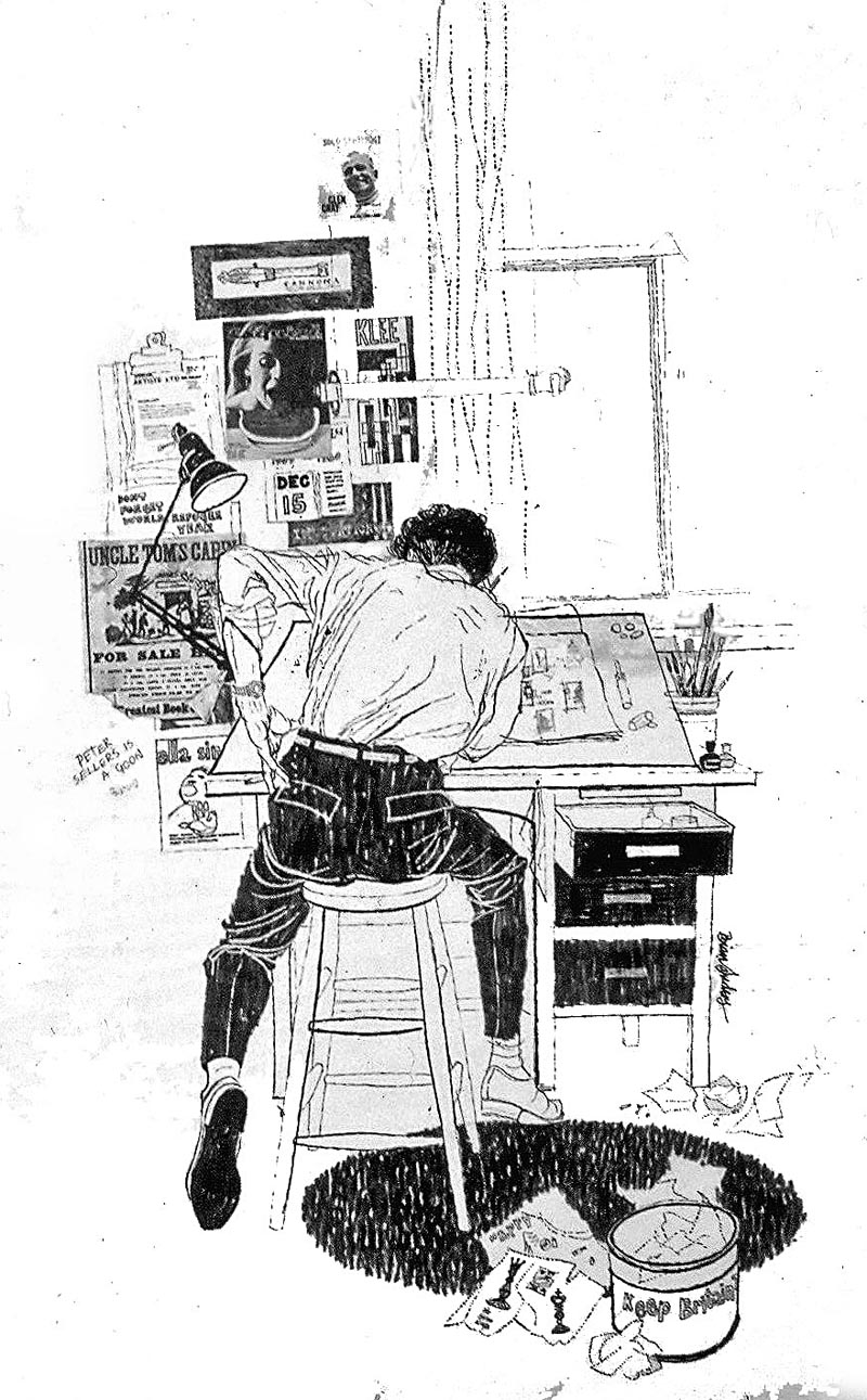
Heavily influenced by Ben Shahn and David Stone Martin he found it difficult to advance stylistically away from what they did so brilliantly. Much to his agent’s consternation he collected his samples, destroying all bar the one shown below, of him preparing ideas for his first printed Christmas card in 1959.
He went drawing in a breaker’s yard at the Elephant and Castle and at Billingsgate Fish Market, which was then between London and Tower Bridges – the stamping ground of his youth.
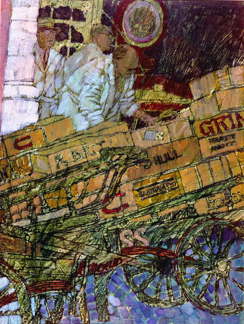
(Above: Billingsgate Fish Market. Brian’s grandfather was a wheelwright and may well have made one of these barrows.)
I always admired Joy Hannington’s work as the art editor of Homes and Gardens, in particular the way she encouraged illustrators, giving them considerable freedom to work in the way which most suited them.
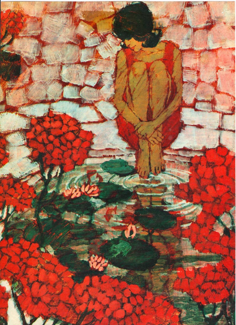
(Above: The Red Geraniums. The first piece Joy Hannington of Homes and Gardens commissioned from Brian, was a stark ‘kitchen sink’ story about two old people. This was the second.)
The earliest commissions Brian received from this ‘gutsy’ work came from Homes and Gardens, and he thanks Joy Hannington, for the confidence she showed in him, and for the opportunities that followed.
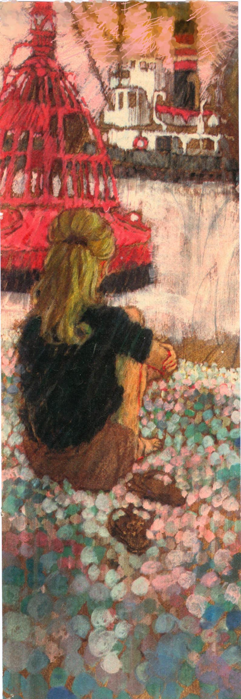
(Above: Joy Hannington had been expecting a horizontal half page but didn’t complain when Brian delivered this vertical illustration.)

(Above: Yet again, Joy Hannington provided an opportunity to increase Brian’s subject range when she commissioned four pages of drawings of garden furniture.)
Readers Digest also began to give him work and he formed a working friendship with its art director Ken Ellis that lasted until Ken’s death forty-five years later.
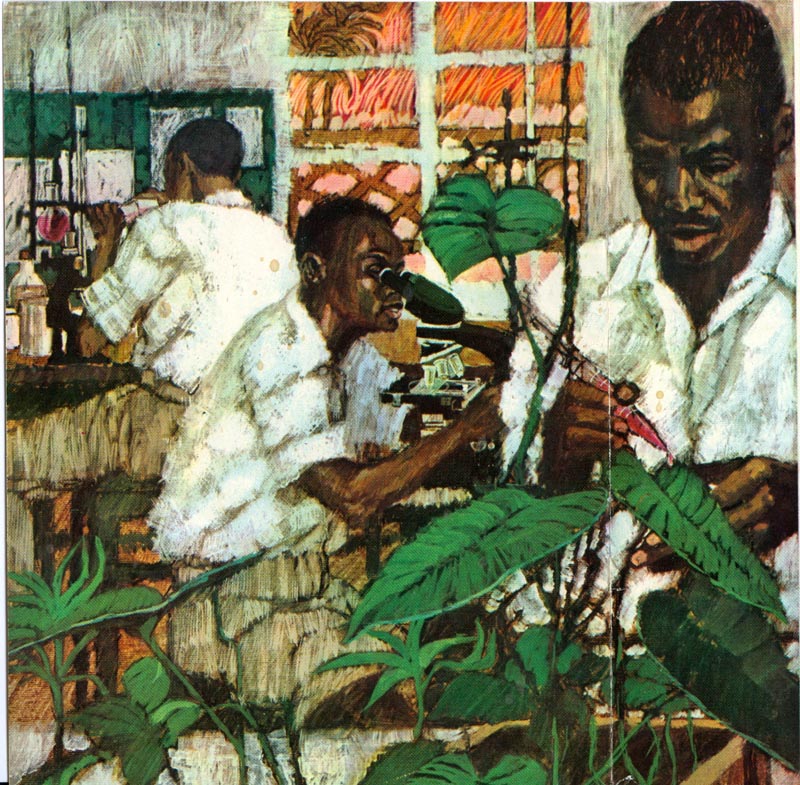
(Above: An early commission from Ken Ellis at Readers Digest. Brian had completed four covers for a Nigerian edition of the magazine, when political events caused the project to be aborted.)
Continued tomorrow...
That's really terrific work. I've never seen any of his art before, thanks for posting it.
ReplyDeleteHarry
These are wonderful, thanks for sharing!
ReplyDeleteThanks Harry and Ryan. Just wait until tomorrow's post. We're just getting started... ;^)
ReplyDeleteWow, brilliant work by this artist. Thanks for posting, I'm putting Brian Sanders on my list of artists.
ReplyDeleteThese illos are very well designed with strong composition, texture and decorative patterns. He definitely captured the avant-garde look of the 1960s' illustrations.. moving as far away from photo realism as possible. Some are quite abstract, yet they remain representational. I see a lot of Bob Peak and Phil Hays in Brian Sander's work, a bit of Bernie Fuchs and maybe even a touch of Jack Potter. At that time, I wasn't aware of these very impressive U.K. illustrators, but in retrospect, I would occasionally see an unfamiliar illustrator pop up in a magazine or book and say to myself.. WOW, where did this guy come from? I assumed they were probably from Chicago or another major city in the U.S., other than N.Y, S.F. or L.A..
ReplyDeleteTom Watson
Some very beautiful stuff, thank you for sharing.
ReplyDeleteWow! Really inspiring.
ReplyDelete16Is this the same Brain Sanders who illustrate the James Herriot 1978 calendar?
ReplyDelete