The '50s
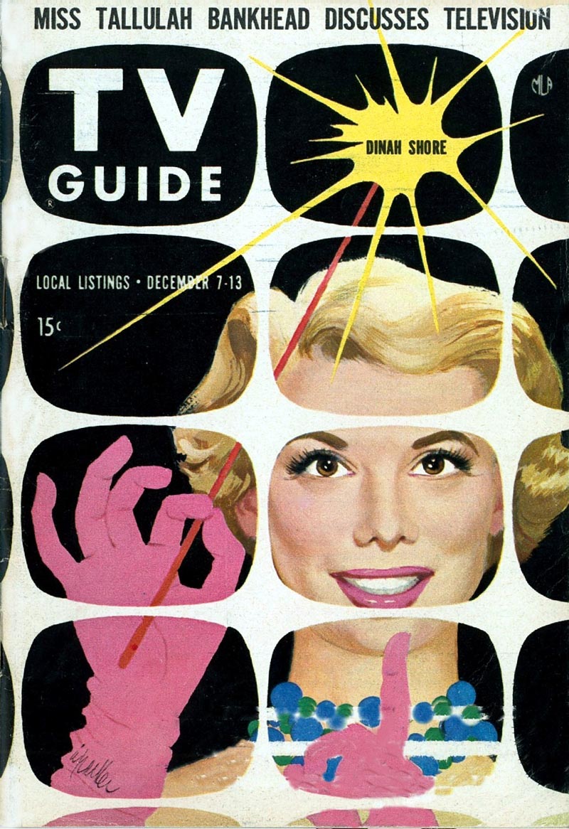

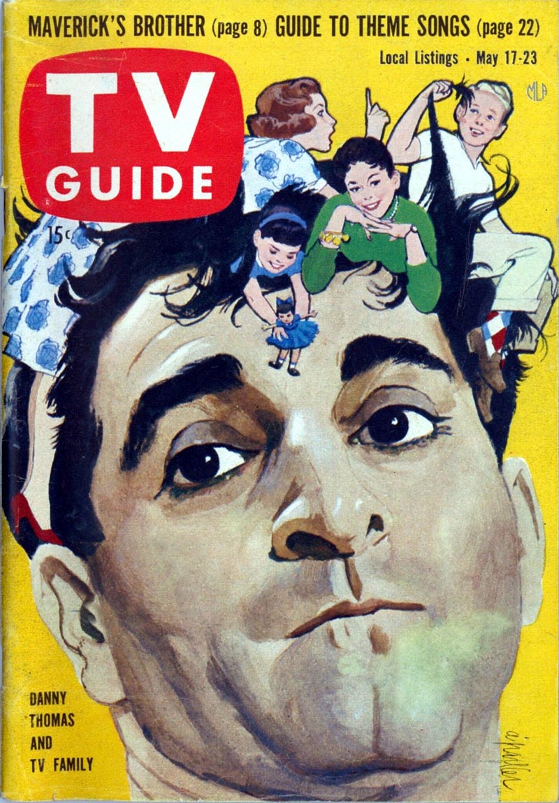
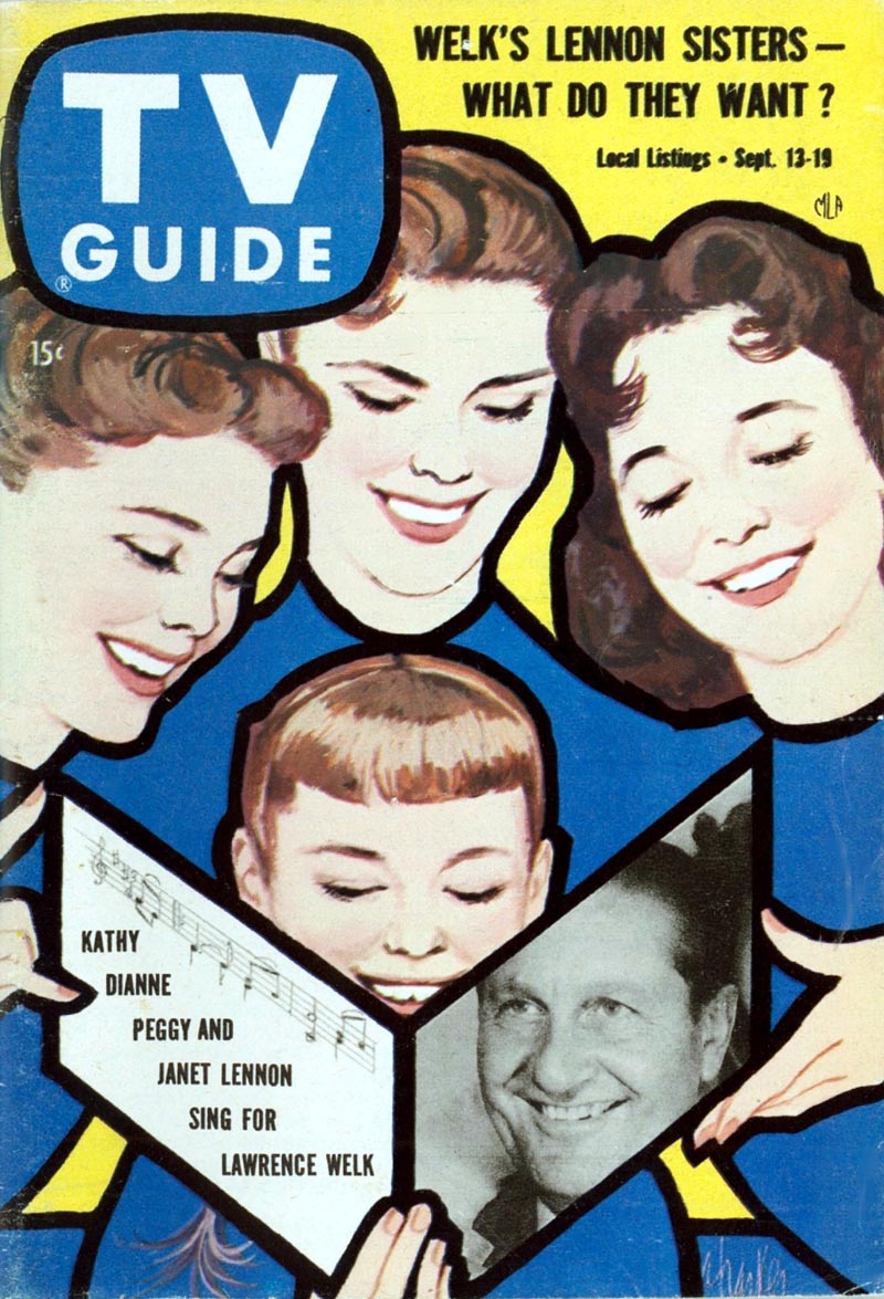

The '60s

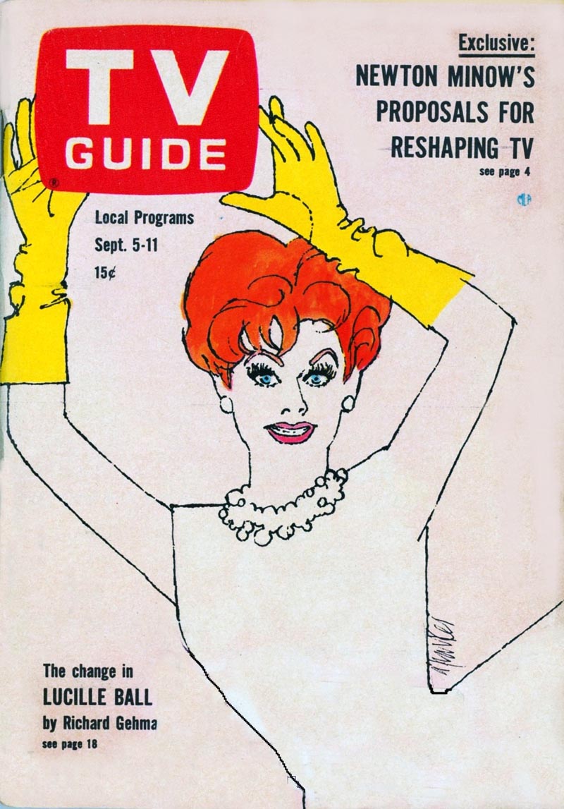
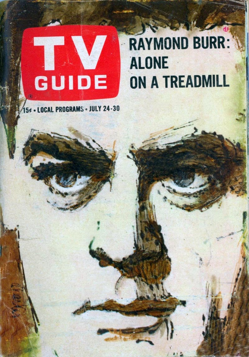
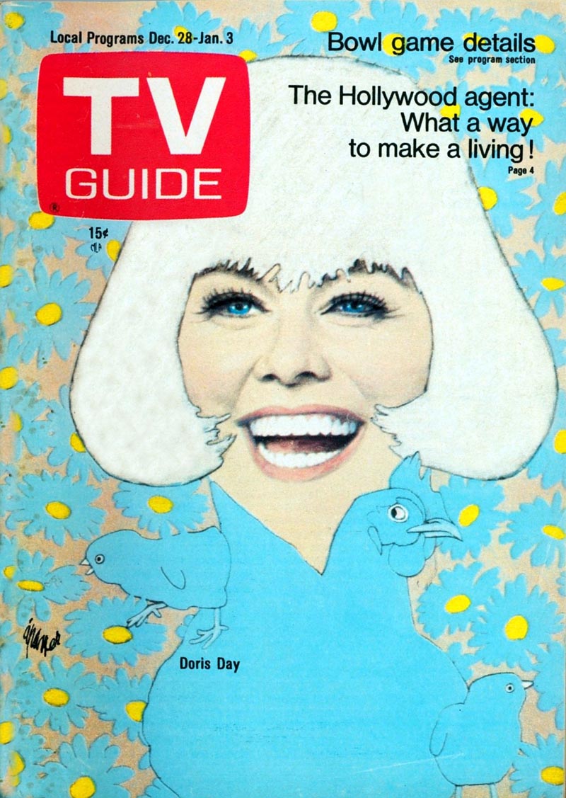
The '70s
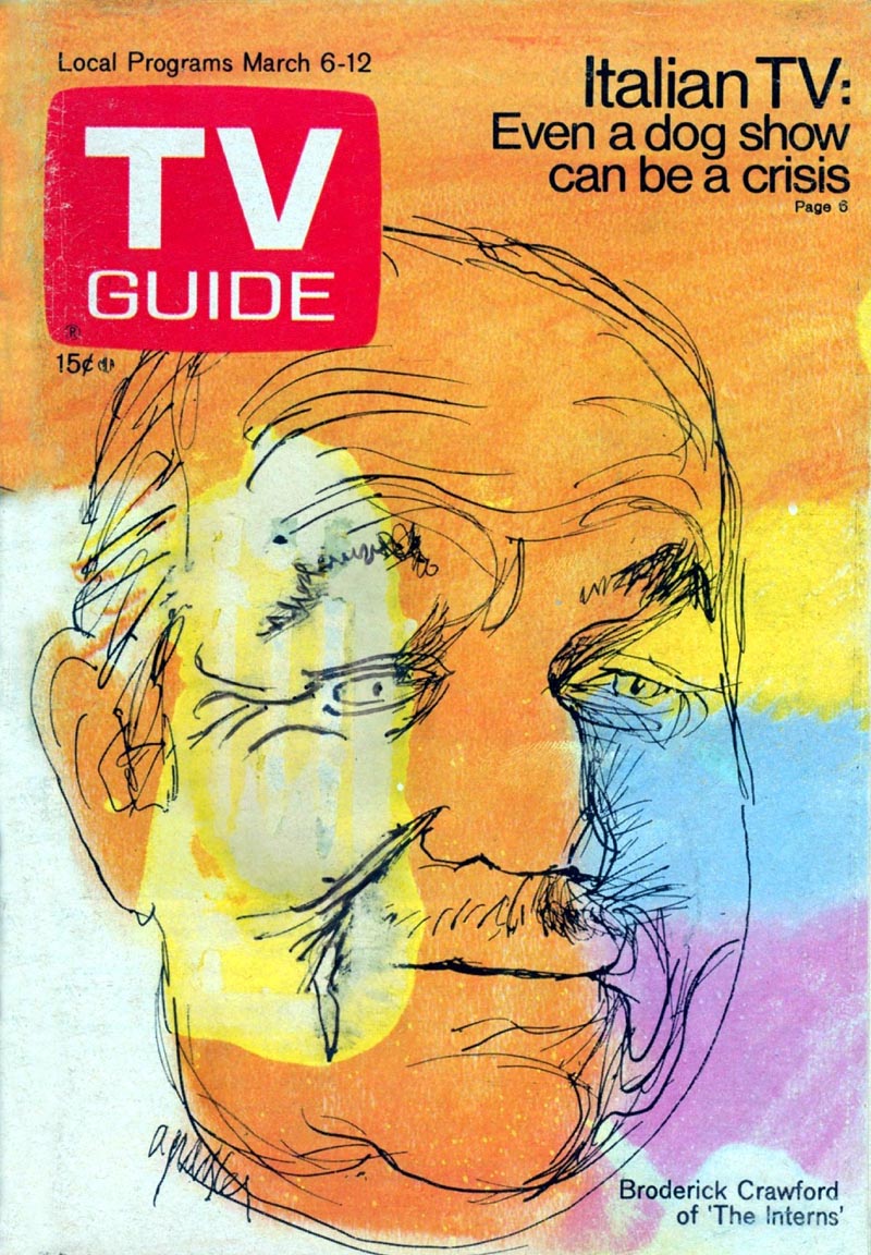
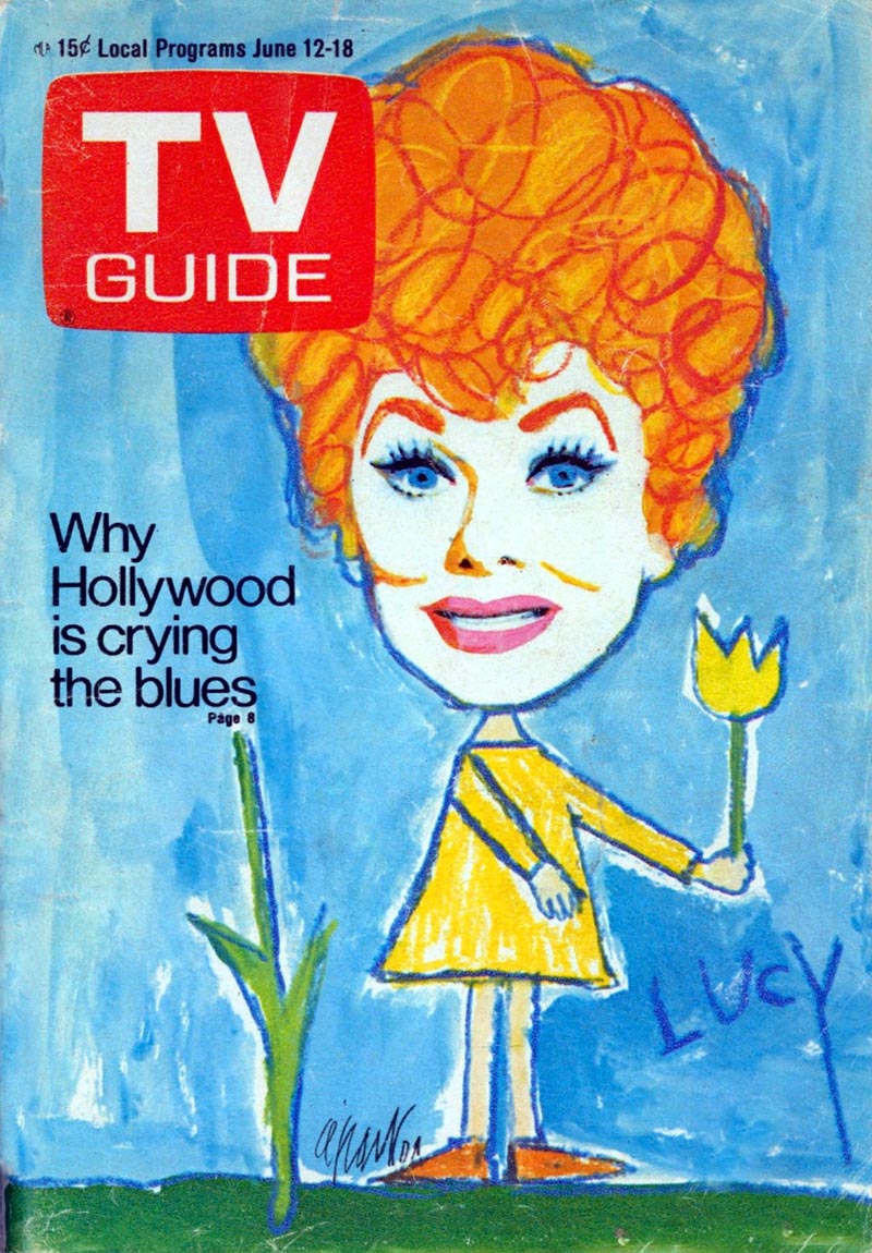
* Many thanks to TI list member Tom Johnsonn who, out of the blue, sent all of today's scans one day last week. I always like to include a link to a contributor's website as a way of saying thanks. Since Tom doesn't have a website, he suggested I include one to his son Ted's site Pilates Any Time. "Ted's doing really well with this site," writes Tom. "Maybe there are some sedentary artists who might be interested in getting fit?"
* My Al Parker Flickr set.
Wow! These are great illustrations! Thanks so much for sharing.
ReplyDeleteAl Parker was so versatile in his technique, and always had a unique innovative design solution. Overall, he may have been the single most influential illustrator of the entire mid century. Few other illustrators had his enormous sense of design and creative prowess, and most of them were looking over his shoulder. He was also one of the nicest super stars, you could ever meet.The greatest experience as a young illustration student, was visiting four hours with Al Parker in his studio in Carmel Valley, CA, April 5, 1959. I only wish I had thought to bring a camera.. and a tape recorder. ;-)
ReplyDeleteTom Watson
nice illustrations!!!!!
ReplyDeleteYou can see the genetic code for the following two decades of illustration in those 1950s covers. The first spark of Bob Peak is in that Lucille Ball cover, the Amsel in that Doris day cover, the Bernie Fuchs in that Vince Edwards cover. And of course Weaver, Martin, etc. etc. A lot of artists made careers from ideas that Parker picked up and put back down on the road to somewhere else.
ReplyDeleteMy only question is, what in the WORLD was he thinking with that dog cover of Dinah Shore???
Thanks for the excellent collection!
ReplyDeleteThe blogger version of retweeting:
http://catherinelapointe.blogspot.com/2011/05/outstanding-illustration.html