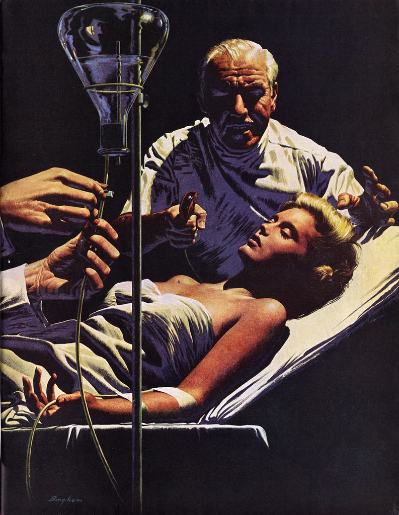
"Impactful."
Bingham had the innate ability to take any scene, from the most benign...
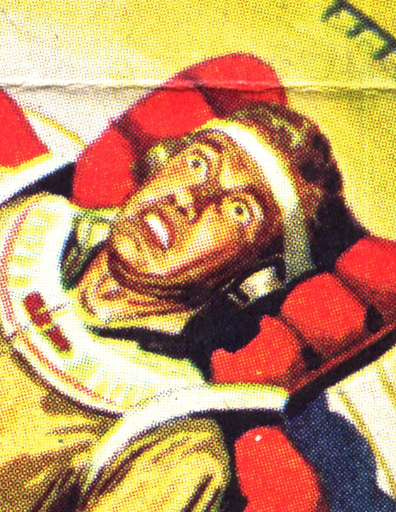
... to the most ferocious...
... and give to it a sense of drama that transcended the work of most other illustrators.
That's because James R. Bingham could do so much more than just draw and paint well. Bingham had a masterful understanding of all the elements that make up a great picture. It takes more than the ability to render well; a great picture must have great lighting, staging, and colour.
Bingham may have considered himself an illustrator...
... but I believe he was, at heart, a designer. Bingham's attention to the essential elements of composition...
... his thoughtful choice of colour palette...

... his conscious decision to employ strong silhouetted shapes and to arrange them as effectively as possible...

... his love of dramatic lighting and contrasting values...
... all speak to the kind of picture making one expects from the best designer/illustrators; the Rockwells, the Leyendeckers, and the Pyles.
Great design is the key to great illustration - but its something many artists often overlook because they are caught up in the pleasing (and perhaps challenging) act of rendering forms in pencil or paint. Bingham understood the importance of design and always employed it to great effect.
This week, let's take another look at the always impactful art of James R. Bingham!
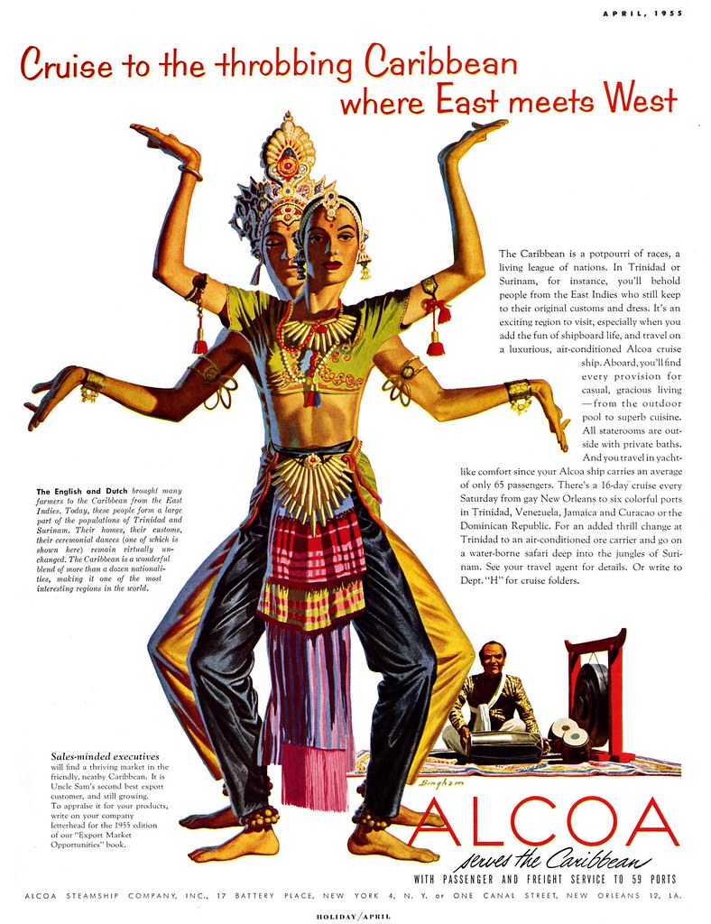
* This week's subject is a result of my having recently received a wonderful gift in the mail. TI list member Bruce Hettema, owner of P&H Creative Group, sent me a huge package of old tearsheets from the early days of his studio, when it was known as Patterson & Hall, a San Francisco-based advertising art studio. Among those tearsheets was the image at the very top of today's post -- and many more that I'll be presenting this week will also come from that pile. So many thanks, Bruce, for sharing this treasure trove of wonderful artwork with me and the rest of the TI readers!
What wonderfully dramatic illustrations! He is really one to studio for effective use of light. Looking forward to learning more about Bingham.
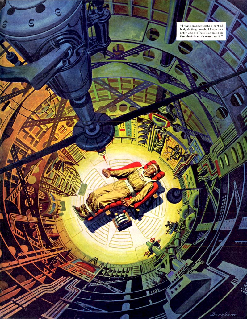
ReplyDeleteI really like Bingham's work and the first thing I thought when I saw that spaceship interior was, "looks like a Wally Wood rocket"! I notice you had the same reaction, Leif. It really makes me wonder if it was an influence on Wood.
ReplyDeleteHuw; I have often wondered if Bingham was an influence on Steve Ditko -- and now I can't help but think this piece must have been seen by Wally Wood. Also, the last piece today and one that accompanies it in my James R. Bingham Flickr set look all the world like Frank Miller's artwork ... the resemblance is uncanny. Click on that last image in today's post and then on the thumbnails in the sidebar of my Flickr set to see what I mean!
ReplyDeleteHi Leif. I can see the Ditko similarities a bit too and, yes, that one image of the guy digging a hole could almost be by Frank Miller, although perhaps slightly better-drawn (imho). I can appreciate Miller's stuff but I feel he's been drastically overrated in some quarters and I'm afraid I'll NEVER be able to forgive him for the movie version of "The Spirit" (probably the only movie I've come close to crying at since Bambi when I was a kid!). Such are the grudges we "comic book geeks" hold.
ReplyDeleteAnyhow, thanks for the Bingham stuff, You are a great Canadian!
really great action packed saturated bold art. awesome sauce. i feel like going there, having a cocktail with a them. stepping into that moment.
ReplyDeleteGreat work! So much one can learn from compositions and lighting alone! Thanks for the posting!
ReplyDeleteHis lighting and composition is impact perfect. Nothing is added or taken away for mere overkill effect. Lean and mean. Textbook!
ReplyDeleteDouglas............los angeles.
to comment on the Frank Miller influence i doubt it. He is all about comics and he really wears his influences on his sleeve. once once you see them you know who he is looking at for sin city -his high contrast art is from European artist - ie. Jose Munoz or Hugo Pratt.
ReplyDeletefor ronin- mix moebius and lone wolf and cub (forgot the artist name i know...)
for his DD run there were a lot- Eisner for one, Bernie Krigstein, and a few others i forget off the top of my head. hope that clears up or opens some peoples eyes to some great art.
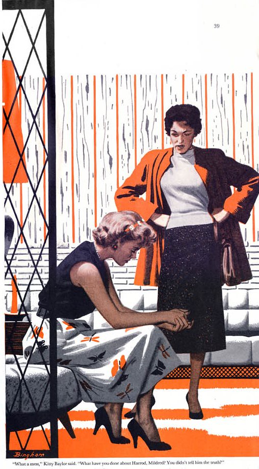
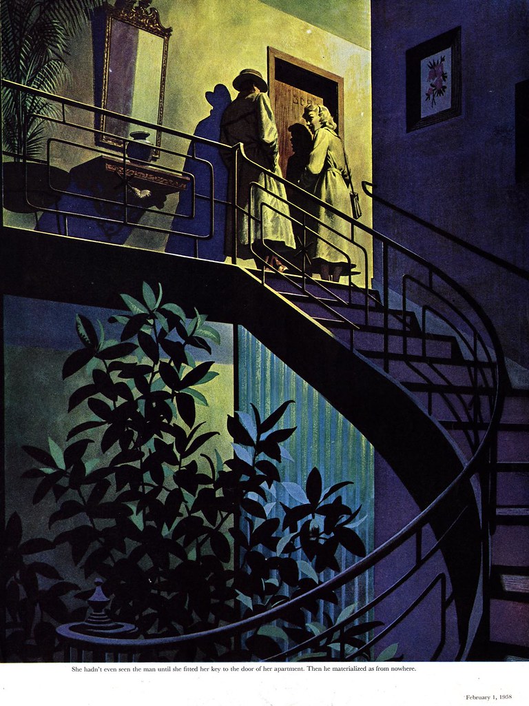
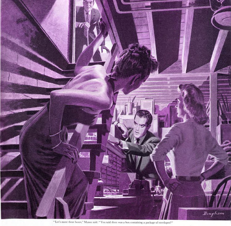
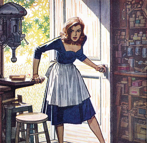
oh AND Brigham's work is great. i love the 2 woman (one seated the other standing and scolding/angry at the other) as well as the guy pointing at the other and the composition of that winding staircase! all of them have powerful design.
ReplyDelete