Erle Stanley Gardner's "Perry Mason."
Here Bingham's work truly captured the sumptuous atmospheric stylings of the best of film noir.
Bingham's flair for portraying all the grit and guts of classic hard-boiled crime fiction makes this decade-long series of illustrations, in my opinion, one of the finest - yet most under-appreciated - of the genre.
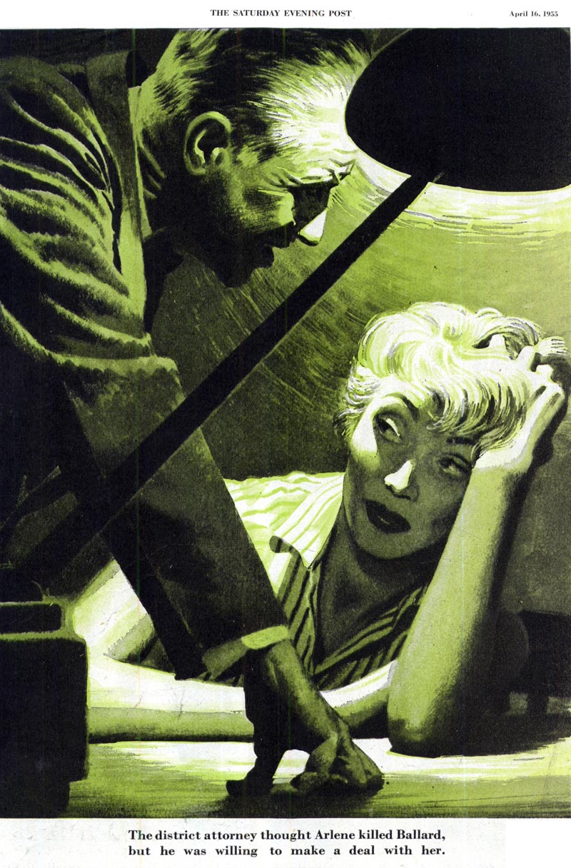
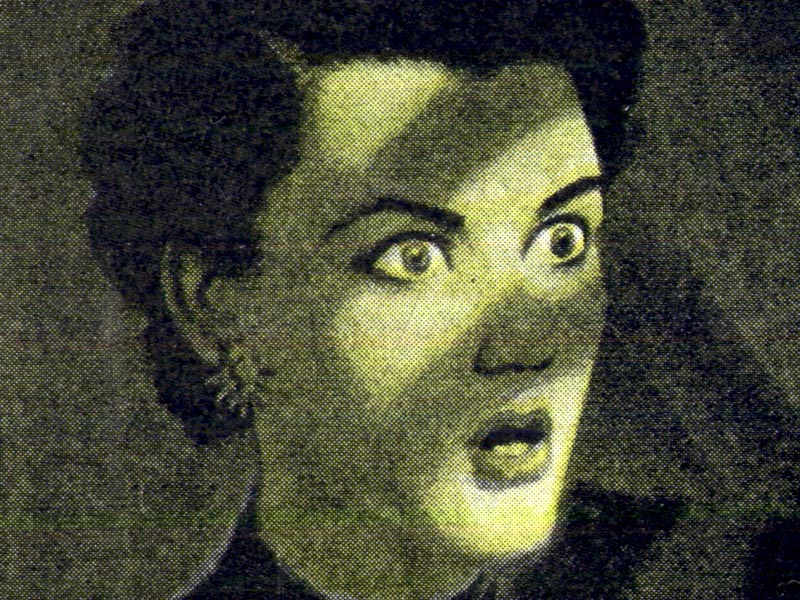
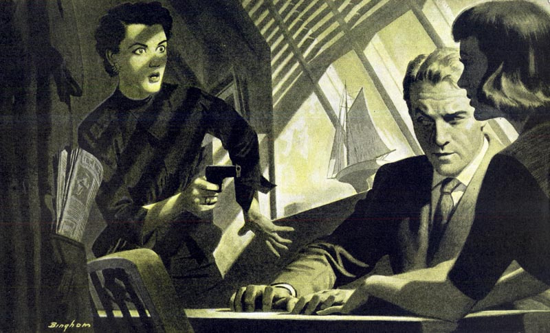
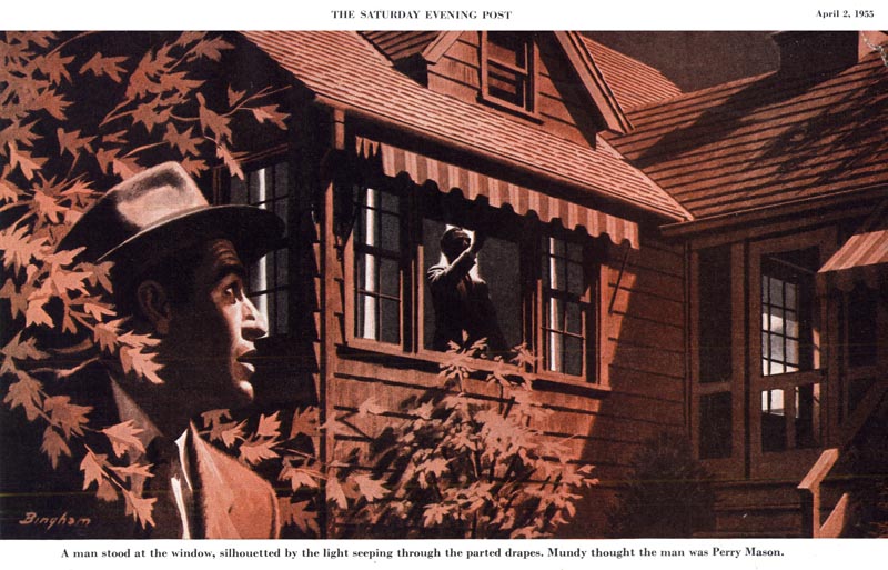
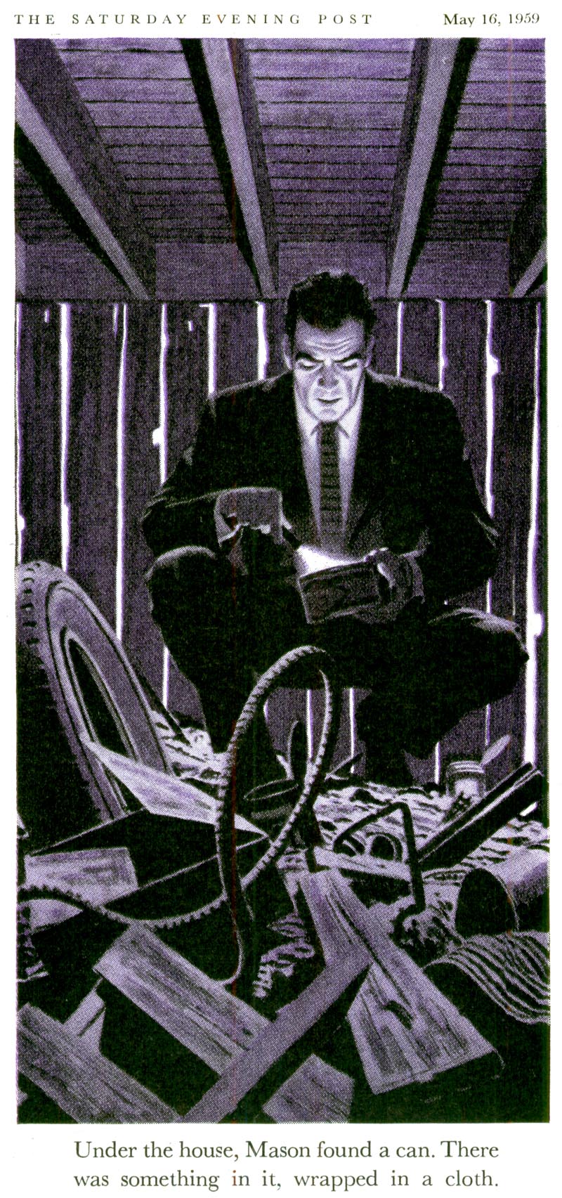
But there's another deeper wrinkle - and one I'd only recently considered - in Bingham's Perry Mason art. Have a look at this dramatic piece by Bingham. Once you're ready to move beyond the obviously disturbing events unfolding in the subject matter of the story Bingham is illustrating...
... you discover a composition - really, a work of art - worthy of far greater contemplation. Here I see such careful consideration of the picture elements, such sophisticated appreciation of how to create a sense of ambiance, so much more than just a captured moment of a pulp fiction story... I'm floored by Bingham's masterful juxtaposition of the necessary violence of the story within a larger scene that quietly breathes with a strange sense of serenity.
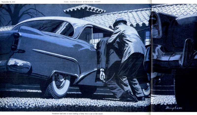
I find there is an Edward Hopper-esque quality to Bingham's work during this period that I had not previously noticed. Set aside the crime drama subject matter and you will see in this series a quiet, contemplative examination of some intriguingly familiar urban landscapes.
This quality is, I think, the real genius of much of James R. Bingham's Perry Mason art, as seen in these examples below.
In the early years of the series, Bingham seems to have created his Perry Mason from personal vision. In fact his son, Jim Jr., told me "because he didn't have anything but a story line to work with, he developed [the look] on his own from the story and it seemed to work. Dad had very few corrections. And I know he enjoyed it, in fact in a lot of the work he used family faces & postures (but didn't pay fair rates, often in ice cream & movies)."
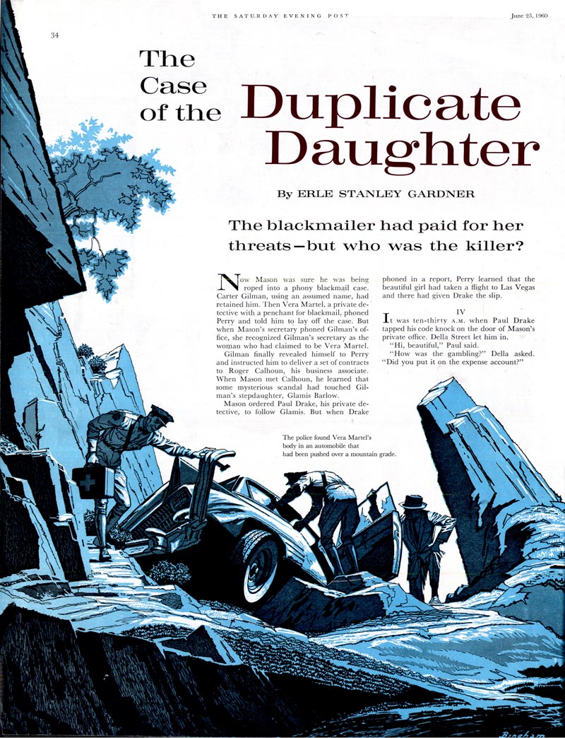
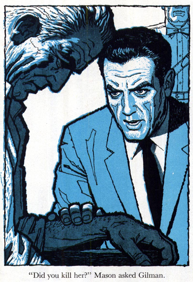
But around 1957, Bingham's Perry Mason began to look very much like the actor, Raymond Burr.
This only makes sense, as Burr had begun portraying Mason that year in what would become a popular television series that ran until 1966.
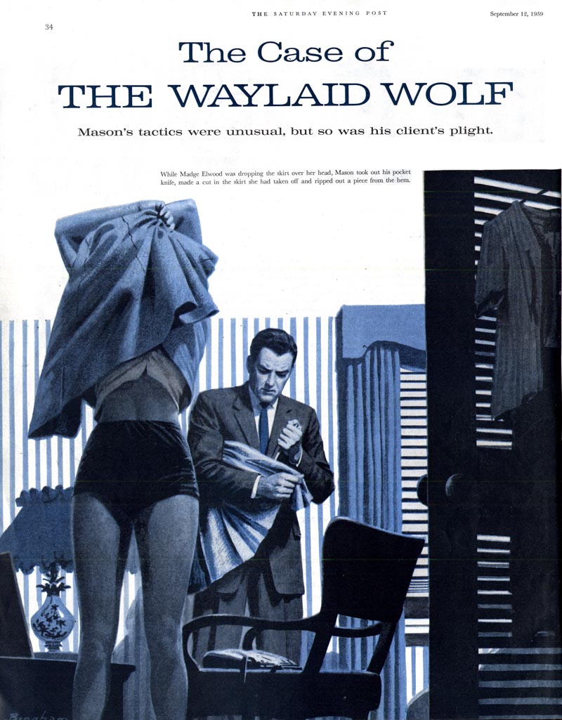
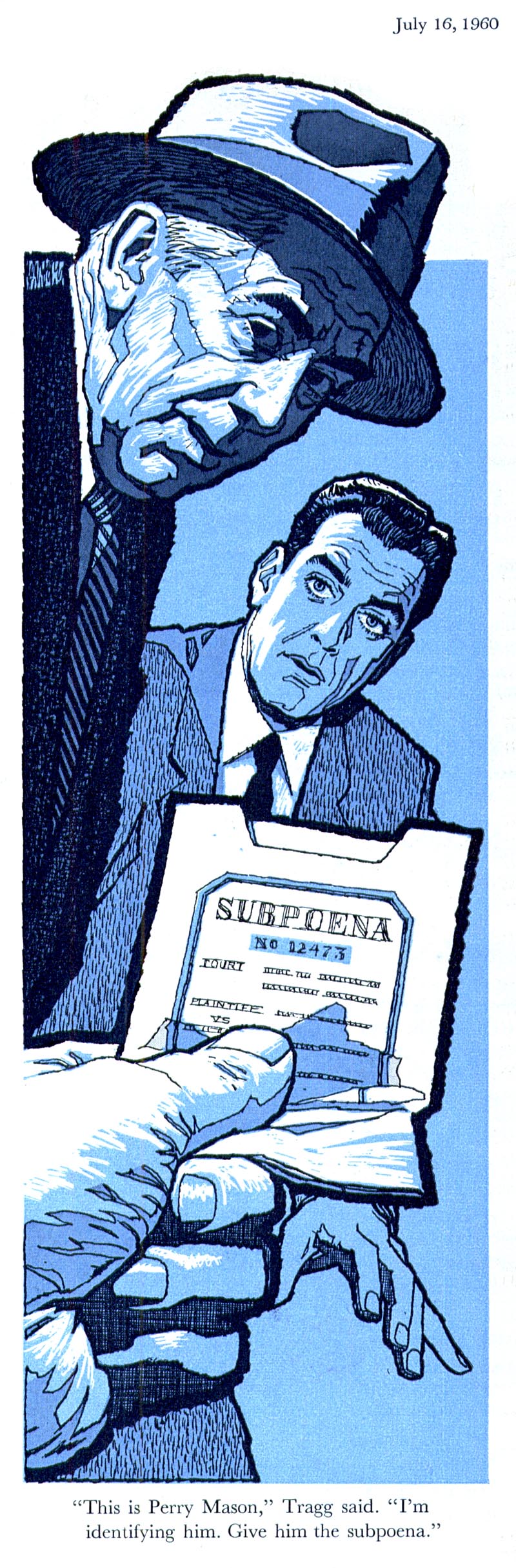
Bingham continued to employ his successful fully-painted style to these illustrations until 1959...
... when he abruptly switched gears and introduced readers to an impactful, modern line style he seemingly created out of whole cloth.
Whether this change was self-motivated or a request from the Post's editors is unknown.
But it strikes me as obvious that Bingham's earlier, painterly style was becoming dated and that this new look was an attempt to keep the series looking fresh, stylish and contemporary.
After all, illustrators and the magazine business were facing a new decade and new challenges. Tomorrow, we'll see how James R. Bingham fared in those changing times.
* Many thanks to TI list member Bruce Hettema, owner of P&H Creative Group, who sent me a huge package of old tearsheets from the early days of his studio, when it was known as Patterson & Hall, a San Francisco-based advertising art studio. Among those tearsheets were some of the images you see in todays post - most importantly, the full colour piece which was so revelatory for me.
* Thanks also to Bill Peckmann, who sent a note the other day - perfect timing! - pointing me to an Edward Hopper post he contributed to Michael Sporn's Splog. Check it out and see if you agree with me that Hopper may very well have been an influence on James R. Bingham.
You know, the later style with the line work reminds me of the sort of thing that would have fit in better with Reader's Digest condensed books. I wonder if there's any correlation?
ReplyDeleteHow can there be only ONE other comment on this??? This stuff is so sophisticated, just beautifully executed. Perhaps too 'smart' for the genre. Thanks, leif!
ReplyDeleteheh... The images 'Bingham64' and 'Bingham68' look like Bogart, not Burr... ;o)
ReplyDeleteGood stuff; thanks for posting Leif!
-David
Thanks so much for posting these examples of Bingham's work! Wow! Prolific doesn't even come close!
ReplyDeleteThese are just amazing. So dark yet fascinating to look at. Love them. Emma
ReplyDeletelove the art.
ReplyDeleteTRUE STORY:
did you know that Hugh Grant's brother is deathly afraid of the word "ironside"?
his brother is a high powered attorney and the word ironside can undo him and bring him to his knees.
Great stuff and good insights.
ReplyDeleteThanks!
kev
I was wondering what sort of paint Bingham used for the earlier pictures, and was surprised to find one of his mystery illustrations auctioned on ha.com done in oils at a fairly large scale (around 21x27). The colours were flat and even, as if he was using gouache, but he seemed to prefer oils. Interesting.
ReplyDeleteLeif,
ReplyDeleteReally, really beautiful stuff.
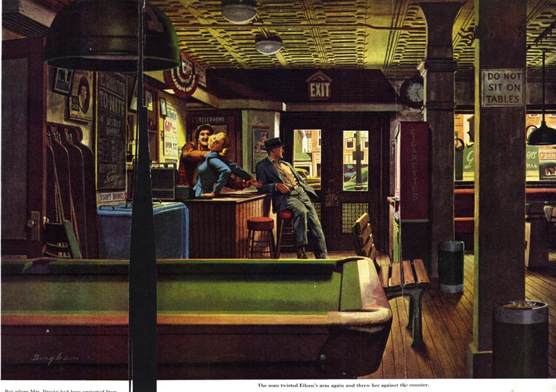
The pool hall shot reminds me of the art ideas in a book about Dutch interior scenes -- An Entrance for the Eyes: Space and Meaning in Seventeenth-Century Dutch Art. We need to see more of Bingham's art.
Thanks for posting. Very inspirational.
Wes
Such an interesting stuff to read.
ReplyDeleteI just loves the dark styled insights !
Thanks for share this posting ... !
I keep coming back to the pool hall painting. Where was this published? I'd love to get a closer look at the whole thing. Simply outstanding.
ReplyDeleteThanks!
I'm slowly but surely catching up Leif, I really enjoyed this one. Bingham's work is so intense, so beautiful, it's mesmerizing. This blog truly is inspiring. Thanks so much.
ReplyDelete