To its creator, George Giusti, it was simply art. Giusti disdained the labeling of work as either commercial or fine art. "Art is art," said George Giusti, whatever its expressed intention.
George Giusti was born in 1908 in Milan, Italy of a Swiss father and an Italian mother. He studied art at the Brera Academy of Fine Arts with the intention of becoming a painter... but upon graduating he was offered a position at a Milanese ad agency, and found the work to his liking. He stayed for three years doing graphic design and illustration. Giusti then moved to - first one, then another - Swiss advertising and design firms before opening his own studio in Zürich, which he operated for seven years.
In 1938 Giusti came to America...

... where he immediately received several excellent commissions, convincing him to stay. The artist's design-inspired brand of realism quickly became popular with advertising, book and editorial clients.
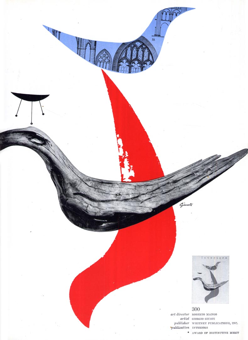
Below: Award of Distinctive Merit, NY Art Directors Club, 1946
Below: Award of Distinctive Merit, NY Art Directors Club, 1953
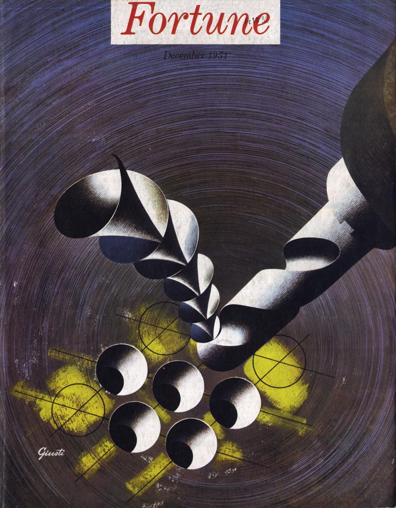
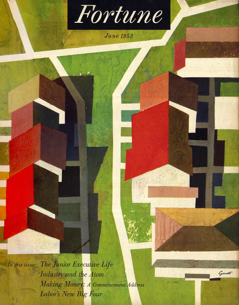
Giusti is perhaps best remembered for his many covers for Fortune...
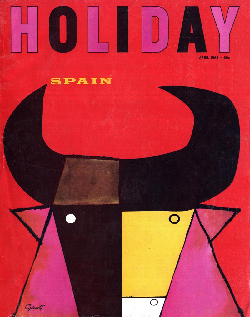
... and Holiday magazines.
He was also a sculptor and an architect. He built his home in Connecticut from Weathering steel and glass, with only man-made materials throughout. Steel and other types of metal fascinated Giusti.
Many of his drawings and painting were of metal objects...

... or incorporated photographs of metal sculptures he had built.
For a time he actually crafted metal caricatures of famous people like Pope Paul VI, Richard Nixon, Mao Tse-tung, Edward Heath, Golda Meir and Mick Jagger.
There's no denying that George Giusti had a unique way of looking at the world - and that he invited us, as viewers, to share in his distinctive interpretation of reality.

That interpretation was aptly described in 40 Illustrators and How They Work as a "more than photographic reality."
The article continues, "the artist who thinks of reality in terms of photographic naturalism loses the edge that a skillful artist has on the camera."
"The artist who subordinates design to exactitude is no more than a glorified retoucher."

I've been thinking a lot about illustration, art and design... where its been and where its going...
... and I'm becoming increasingly convinced that artists like George Giusti had it right. At a time when illustration (especially illustration that was largely within the realm of "photographic naturalism") was about to be displaced by actual photography as the default choice for the majority of commercial art assignments, artists who shared Giusti's philosophy of interpreting reality through design-based picture-making not only survived - but thrived.
Half a century later, this is more true than ever. If you want to be successful as a creative today, you can't narrowcast yourself. What do you think?
* Thanks to Sandi Vincent for allowing me to use her "Modern Packaging" scan in today's post. The two Time magazine covers are from the Time Cover Archive.
* There is an extensive George Giusti biography here. There's a nice collection of Giusti's book cover designs here.
I guess it depends on the way the statement of photographic naturalism is framed. Does it include Wyeth? Lyendecker? Dunn? Cornwell? Because if that is who they are referring to then I disagree. I think the golden age illustrators were anything but photographic during the golden age.
ReplyDeleteAndrew Wyeth actually considered himself an abstract painter of sorts. As for the idea of "Art is art", I couldn't agree more. It kills me to hear illustrators talk about their work as if it were something other than art. Where do they get this idea? Even Norman Rockwell had the attitude that his paintings were somehow not "serious" art. He couldn't have been more wrong in his perception.
ReplyDeleteArmand; you say it depends... since the author of the statement isn't available to explain how he would frame it, and since you've decided how you would frame it so that you would disagree, please also tell us how you would frame it so you DO agree. :^)
ReplyDeleteLeif,
ReplyDeleteI hear this a lot in this sort of argument. Basically lumping all things that remotely look like something as photographic or copying nature. Its equivalent would be saying all women are the same because they share common aspects not in men.
I think that some of the artists in the later part of the century tried to compete with photography; either at the behest of ill-informed art directors or because of their own insecurities. Rockwell and to a lesser extent Cornwell and Meade Schaeffer did this and it is obvious when you look at their work from a few decades before. The Union Carbide "Hand o' God" campaign is the pinnacle of this.
Wow, Giusti's art is really bold. I like it a lot.
ReplyDeletePlus his work is highly communicative as was his intent of course. Thanks for yet another introduction, Leif!
As for the ongoing discussion, 'art is art' should be the maxim for every creative. Whether the layperson or experienced art critic realizes it or not, it's as challenging to create pieces of succinct abstraction that communicate as it to create pieces of maximum illustrative veracity.
But you have artists who find that happy medium and leave a portion open to the viewer to engage with the picture. There's abstraction in the use of negative space that buttresses the fully realized figure. And vice versa, a simplified cartoon is strikingl when interacting with a realistic background and props (Just ask the Japanese and European graphic novelists...).
As my fine artist friend tells his painting students, "A camera is one eye and no brain." It's the illustrator's eyes and brain that separates a photograph from a painting. N.C.Wyeth, Andrew Wyeth, Norman Rockwell, Meade Schaeffer, Lyendecker, Dunn and Cornwell, all went well beyond the realism that a photo records.They incorporated a thousand decisions in each painting, to touch our emotions and seduce us into the world they created in their paintings/illustrations. In a nutshell, they tell a story that no camera can, because the camera doesn't have a human brain.
ReplyDeleteAs for Guisti, I always considered him more in the graphic design category, sometimes taking a step into very stylized illustration. Some labeled him strictly a "graphic designer", others labeled him as a "designer illustrator." According to the definition in the dictionary, it's illustration if it explains or makes something clear. Oops, I think that opens up another can of worms. ;-)
Tom Watson
Armand; first, let's not frame it as an argument - but rather a discussion. You're point of view is welcome, but let's consider the data my research unearthed: 'realism' was the order of the day in advertising during the mid-century. Even without the statistical info I found in articles in trade magazines, its apparent from the illustrative content in consumer magazines.
ReplyDeleteGiusti suggests an alternative, as does Ben Shahn. Both emphasize design and graphic representation over naturalism. By the early '60s even those artists who struggled to adapt had at least ventured as far as the 'rainstorm' look - or a variation of whatever Bernie Fuchs and Bob Peak were doing.
But again, most illustrators seem to have realized they would have to abandon naturalism to survive the shift toward clients favouring photography. Giusti was an 'early adopter' - and an extreme example. But I used him intentionally to make this point. I'm going to go into greater detail about this later in the week - and try to relate it to current trends.
Tom, that's the can we will not only open this week, but dump out on the table and dig through the worms!
ReplyDeleteGustie's illustrations are a lot of fun.I don't have any problem enjoying them.You don't need a critic to explain why you should appreciate them.I think Shahn's stuff needs a bit more of an art historical background to appreciate his work(if not always).Gustie's work has a bit more polish to it,even when it's referencing Picasso.
ReplyDeleteAdrian; thanks for adding your thoughts to the discussion. I think you're on to something and I hope you'll continue to participate. :^)
ReplyDeleteit's not that earlier 'realistic' styles look 'photographic' exactly, but that the more realistic the style the more 'transparent' it is. a transparent, realistic style doesn't draw attention to it's own surface / artifice for its own sake. it draws the viewer straight into the scene, the characters, and / or the product.
ReplyDeletethe modernist, post-Picasso, graphic approach (and it influenced the language of animation during the same period) draws attention to the fact that it IS a drawing or design. it seems to say " hey, i'm a drawing so let's not pretend otherwise... here's a thick black line, and here's a block of colour ".
of course, there's a fairly huge middle ground where a lot of interesting work resides.
Thanks for adding your thoughts on the subject Steve. I'm glad you find his work agreeable... but let me ask you this: do you agree with Giusti's personal philosophy of art? That's the thing I want to get at.
ReplyDeleteHi Leif,
ReplyDeleteGuisti was and still is, one of my very favorite artists. It's great to see these dramatic pieces again, his work was very advanced for that time.
Excellent thoughts and great examples, Lawrence! Thanks for joining the discussion. :^) And I think by drawing attention to itself, the graphic design-influenced art accomplishes something the earlier realistic/photographic/naturalistic style didn't (or at least didn't do as well): it invites the viewer to examine and explore the subject matter further - on several levels.
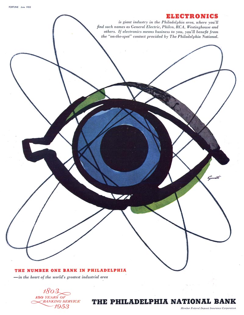
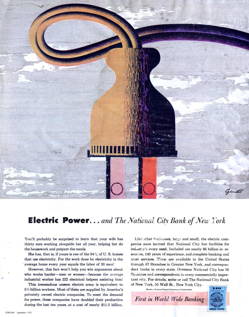
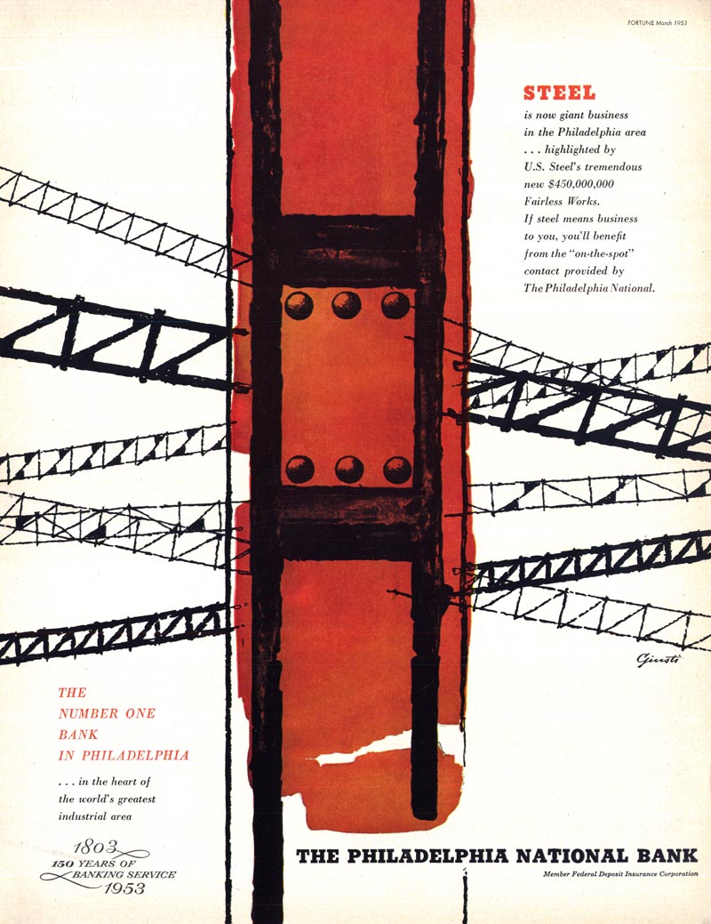
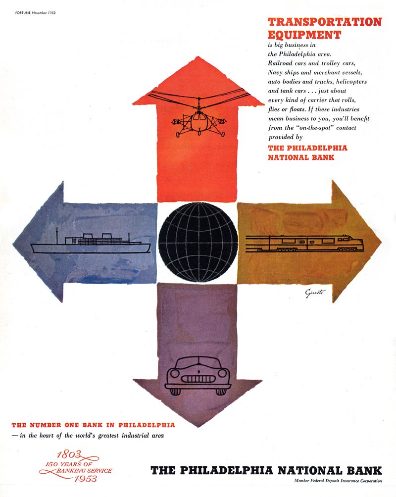
ReplyDeleteInstead of a quick read of the activity taking place in the scene, the viewer of, say, Giusti's oil pipes ad may spend more time studying and analyzing what he is looking at. My own reaction to that ad was first, "Hhmm... bands of related colour and shape." Then, after reading the copy, "Oh, I get it - they're oil pipes - very clever!" Then I spent time examining and appreciating Giusti's technique. So simple, yet also quite involved and overall pleasing - and a visually clever solution to an otherwise mundane subject.
As an AD I would want that kind of reaction from the reader.
thanks Leif,
ReplyDeletemy own response is almost the opposite of yours: i find that the more like graphic design an illustration becomes, the more 'sign-post' like it becomes... the message is read quickly and doesn't reward much further viewing. of course in many situations that is exactly what is required of an illustration.
This was a great post. My views on "what is art" have changed so much in the past few years. I use to be so limited in what I considered "art," but just like beauty, its at the eye of the beholder.
ReplyDeleteCheers!
ryan
http://thismustbetheplaceryan.blogspot.com/
Leif. I've been saying this for years. Call it what you will, but anyone involved in a creative endeavor is a multitude of things: designer, illustrator, artist, accountant, filmmaker, photographer, sculptor, account executive, PR flack, marketer...
ReplyDeleteThe hell with this. I WILL NOT ARGUE with anyone about this post. George Giusti is a true genius in any realm you wish to choose, and whatever you want to call it.
Thanks for posting.
Beautiful stuff, Leif,
ReplyDeleteThose old Fortune covers are always interesting and these are no exception. Giusti seems to have much in common with the "Precisionist" school -- Sheeler, Demuth, Hopper. So regardless of whether the works were commissioned to sell something, they were certainly art. I'm aware that people make distinctions between real art and illustration but I've never seen a distinction that holds up logically. If there was a distinction, though, it could be a cogent argument that most illustrators are far more creative, inventive and flexible in their goals than most fine artists, at least based on the stuff you present daily. It's actually rare to be "inspired" by fine art -- now or in the past, in my experience.
Wes
I do see Illustration, fabulous Graphic Design and Fine Art in all these examples here.
ReplyDeleteThose Awards of Distinctive Merits were well awarded.
How thoughtful and inventive ads can be!
See that United Airlines logo, for instance, with it's colors reflected in the blur of those propellers.
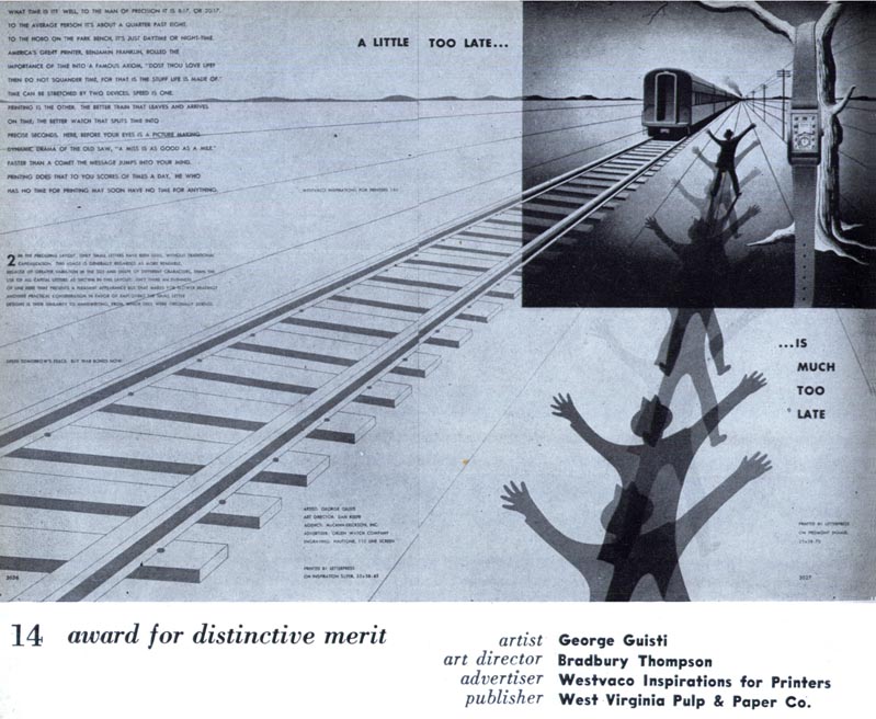
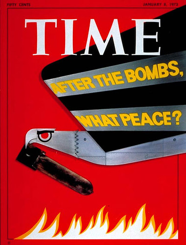
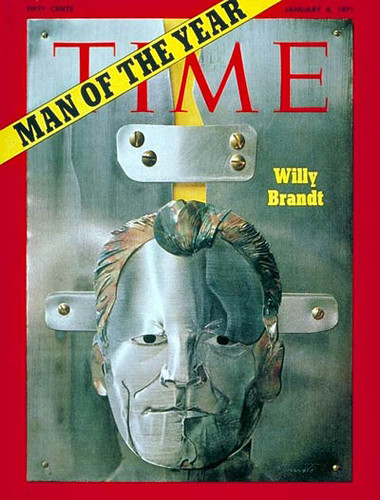
"A little too late is much too late" - how the message has been rendered in this ad, with all the perspective, focus, ghostlike effectiveness - I just keep on watching with amazement - I could go on, see full metal Willy Brandt...
If this ain't Art:
What else?
But you have artists who find that happy medium and leave a portion open to the viewer to engage with the picture.
ReplyDeleteA paint brush is a few bristles and no brain.
ReplyDeleteLeif,could I make the confession that I'm usually enthused about paintings that contain my personal preferences,which are almost completely representational art?I imagine most people's personal preferences determine their choices,and explanations come in afterward.Bingham=great,Giusti=good,Shahn= eh,...ok,he's sincere...
ReplyDeleteWho's an artist?What's art?It seems that representational painting and abstract art are often in a cage match in the comments.I think of graphic design as being like typography,a beautiful skill that can sometimes be appreciated aside from or in spite of it's content/message,but that definition wouldn't be humanist enough to pass critical muster.
I know that french comic artists are considered Artists in France,and I'm sure Swiss designers have been considered Artists in Europe for some time now.
If Giusti had been born in America,I think he would have been considered a talented commercial graphic designer,and would have won a lot of art directer awards.American art directors desperately want the critical approval that fine artists have,while a lot of fine artists would like the financial rewards of commercial art.
I think most "serious" fine art these days must have heavy(or at least some)political,social,or psychological,non-conformist, protest content in it to pass critical muster,and I can't see that in Giusti's examples.He's done covers for Fortune magazine,a capitalist magazine,and Holiday,a frivolous vacation magazine.I wouldn't be surprised if he's socialist,but it isn't immediately apparent from his samples.He's not blatantly political.
I think abstraction had it's first breakthroughs and biggest influence in society in art galleries,universities,critical and news magazines before it filtered down into the illustration.And some fine artists,like Shahn,did some illustration to make a living.
But I suppose artists should strive for thoughtful self-respect,'cause critical respect can be dicey.
Those directors in the industry have neither been called design-directors, graphic-directors, communications-directors, but Art-directors.
ReplyDeleteMay be each one sample here on Today's Inspiration has it's varying extent of artistic content.
According to comments it varies from 1 to 100 percent.
It looks like art to me, if I'm allowed to define it by I'd have it up on a wall! Emma
ReplyDelete