Here's another piece by 1960s landscape/seascape painter, Christopher Davis.
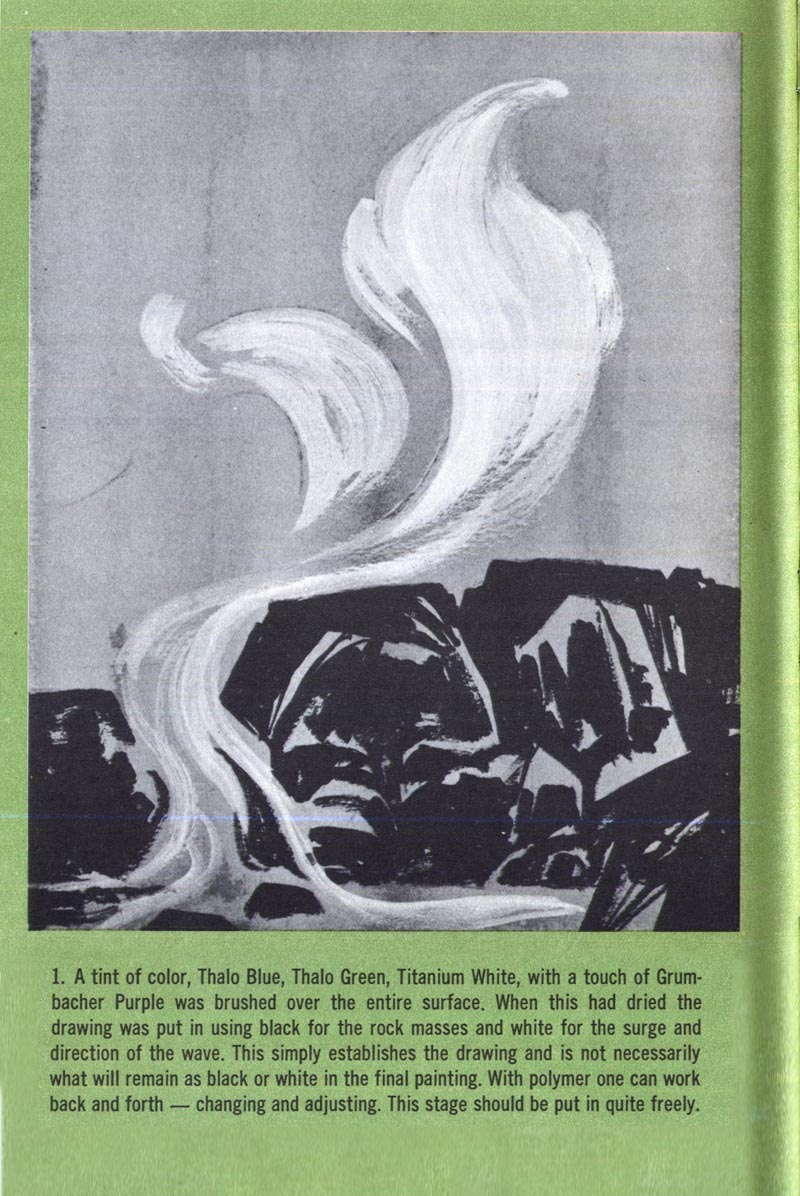
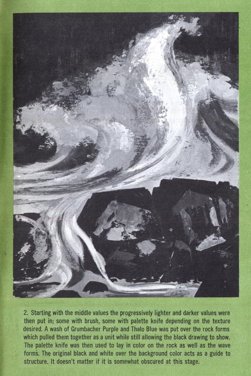
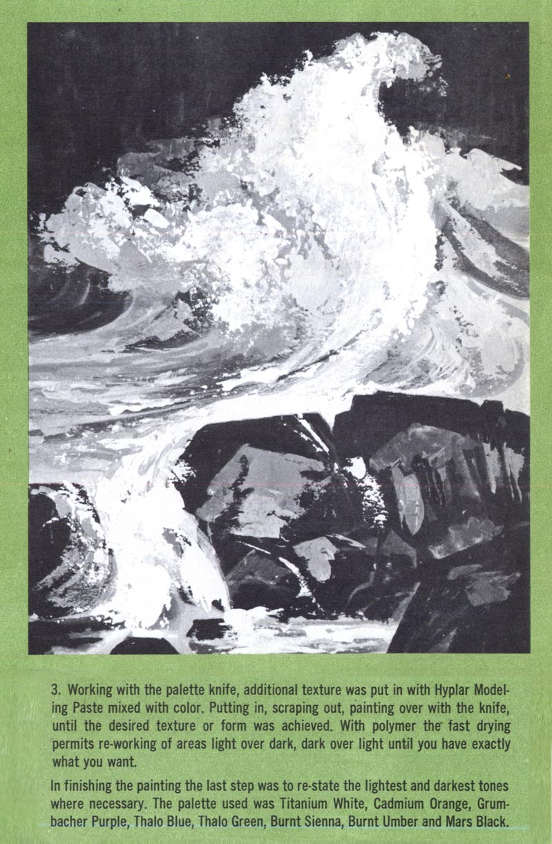
I love this piece for its beautiful stylization of the subject - a stylization that approaches near-abstraction, in my opinion.
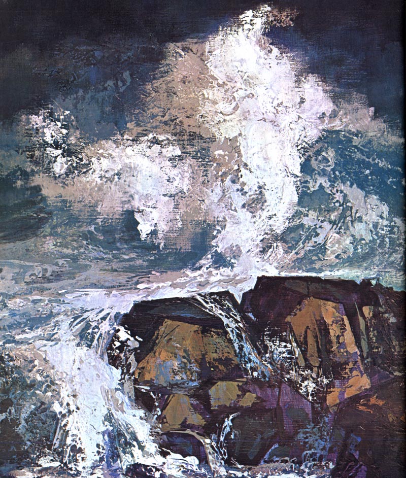
My recent foray into landscape painting has given me a greater appreciation for 'seeing' ... looking that chunk of the world I'm about to paint in a way other than the detailed surface reality that we normally take for granted as we rush busily through the day. Its reminded me to look deeper, more intently at the colour, shape and arrangement of elements as I compose and paint my pictures. These lessons from Christopher Davis reinforce that thinking for me. I hope they inspire you to pick up the sketchbook or paintbrush as well!
I love this piece for its beautiful stylization of the subject - a stylization that approaches near-abstraction, in my opinion.
My recent foray into landscape painting has given me a greater appreciation for 'seeing' ... looking that chunk of the world I'm about to paint in a way other than the detailed surface reality that we normally take for granted as we rush busily through the day. Its reminded me to look deeper, more intently at the colour, shape and arrangement of elements as I compose and paint my pictures. These lessons from Christopher Davis reinforce that thinking for me. I hope they inspire you to pick up the sketchbook or paintbrush as well!
I agree with the abstract quality of the art. While I've never been a fan of out and out abstract art I do like it when it makes it's way (intentionally or not) into illustration.
ReplyDeleteWow your landscape is incredible. I love the sense of movement. Very beautiful and exciting work.
ReplyDeleteThis reminds me a lot of how they were teaching us illustration students to think and approach our paintings in the late 50s' and early 60s'. Using the pallet knife was optional, and even considered looking a little dated by some. "Bold and gutsy" was the look at that time. Different illustrators had their own slant on it, but it was definitely from the same mold.
ReplyDeleteTom Watson