(This is the conclusion of Ken's look at the 1970 George Segal feature film, 'Loving', which was based on the book, 'Brooks Wilson Ltd.')
What makes the film really fascinating is the remarkably accurate depiction of Brooks’ working method. There are no credits at the end of the film for the artist who created this amazing prop, so if any of the members recognize the work please let us know.

We see him shooting reference for what appears to be a spread for a women’s magazine. As usual, the budget sucks so he employs himself and his wife as models - look familiar, folks?

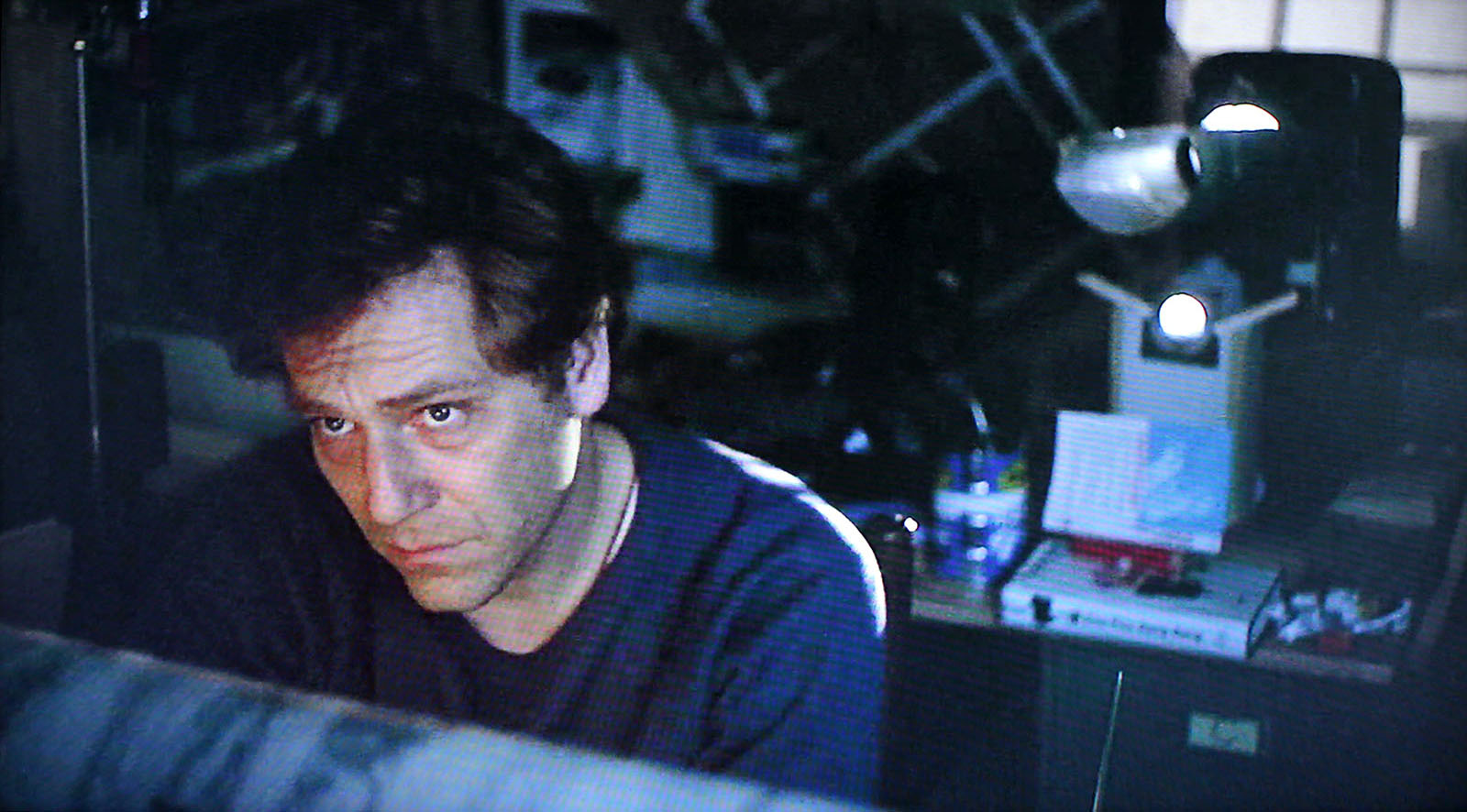
Brooks employs an interesting setup in his studio, using a footswitch operated lazy Luci to project the photographic reference onto his board.


We watch as he slaps on the acrylic (or is it casein?) then outlines the figures with marker.


The lights come on, Brooks raises the overlays, and we see this terrific illustration!


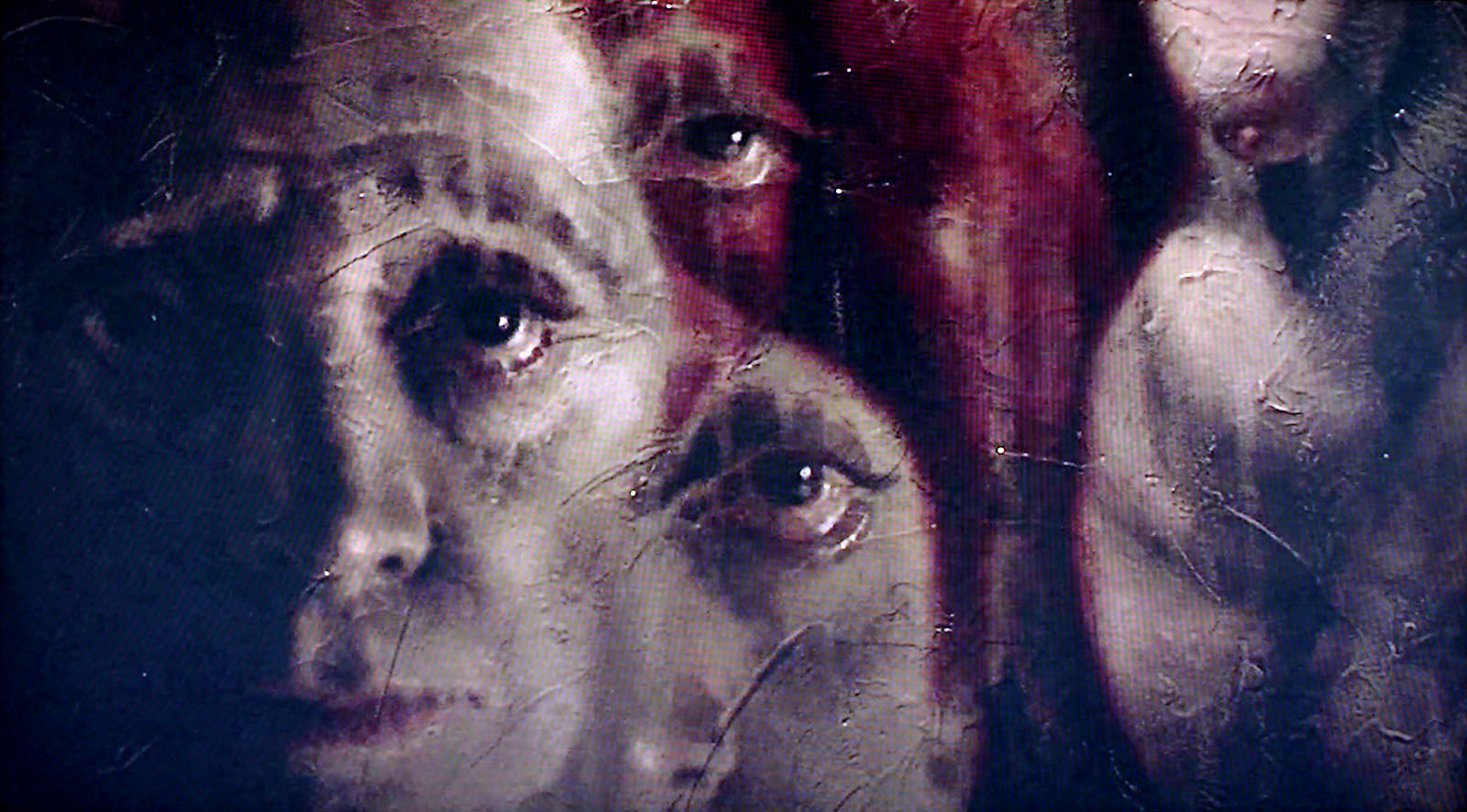
Both the book and the film focus on the difficult career of a freelance illustrator, at a time when technology was forever changing the rules of the game. Neither tells us if Brooks ultimately prevails, but there’s a curious scene in the movie that offers a clue. While passing a midtown gallery, he nervously eyes some very creepy paintings, which glare back with unsettling intensity.


Is our anti-hero contemplating a transition to ‘Fine Art’ as a career move, once photography destroys his livelihood (a decision some illustrators took at the time) or is his guilty conscience simply arrested by these images?
I leave it to you!
* Many thanks to guest author Ken Steacy for a fascinating topic this week. If you can help us identify any of the illustrations in the screen caps Ken provides, please do! Of course any and all other comments are also very much welcome and appreciated ~ Leif
Very interesting stuff.
ReplyDeleteAnd, on a side note, there is s special corner of Hell for Directors that don't credit the artwork that appears in the story. Man, I hate that!
I couldn't agree more, Huw.
ReplyDeleteIt's interesting that they would decide to show him working with that great a detail and that much attention. I'm sure what would happen now would be to show some angle of the actors face and cut to a music video then show the actor lazing around. Or am I just cynical?
ReplyDeleteThe work used in the film looks so familiar.
ReplyDeleteI don't know about the gallery paintings but the illustration looks like Bernie Fuchs to me but a lot of folks were doing that style then.
ReplyDeleteI agree with Joel that a lot of illustrators were working in the "Fuchs style" back then (which is why Walt Reed called Fuchs the "most imitated" illustrator in the book, Illustration In America). But having interviewed both Bernie Fuchs and his wife about the movie (back when I wrote a bio on him for Illustration Magazine) I can say with certainty that Fuchs definitely did not do these illustrations. My understanding was that many (if not all) of them were done by John McDermott (who wrote the original story, "Brooks Wilson, Ltd.) I gather that the originals were for sale at Illustration House Gallery in NY, signed "Brooks Wilson" but done by McDermott. It has been a long time. We'd have to double check with Illustration House to be sure.
ReplyDeleteThanx for the insight, David - I kinda wondered if there were autobiographical elements in the book and the film, but if McDermott did those illos - man, how self-referential can ya get! B^)
ReplyDeleteI'm new to this area of illustration but I have a question.In the period when the SEP and Colliers were using this kind of realistic illustration were most illustrators literally 'tracing' their drawings from photos? And if so were they generally capable of high quality drawing sans photos?
ReplyDeleteApologies if this has been dealt with previously!
Keith; That's a great question -- I can imagine why it might seem that way. But actually, its safe to say that these illustrators could draw like crazy - far better than just about any of can today. They used photo reference to speed up their process or help with tricky details... but no, they didn't actually trace the photos per se.
ReplyDeleteEven if an illustration started with some photo ref being traced, these guys understood how the camera lens distorts proportions and had the chops to modify and revise the traced elements so everything would actually read "correctly."
Being new to all this, I hope you'll come by regularly to learn more - and your comments would be very welcome!
if you check out the Robert McGinnis Documentary Last Rose of Summer you will see this technique by the master himself
ReplyDeletehere is just the painting demo part without the sound
http://www.youtube.com/watch?v=LXROu_KVznY
at the 2:34 min mark you will see he moved his drawing shifting it from the photo to elongate the arm. he did this for other elements as well. as you can see the finish what McGinnis does best.
enjoy.
Matt
Thanks for your comments.I know its wrong but I consider tracing as a kind of cheating! For me there's nothing worse than when you see in the same piece an accurate tracing and then some freehand work that's way below in quality and probably a true indication of the artist's ability!
ReplyDeleteI'll be sure to keep tabs on this interesting blog.
Specially funny was the "correction" request "remove the eyebrows of all indians. Indians don't have eyebrows".
ReplyDeleteQuantum Binary Signals
ReplyDeleteProfessional trading signals delivered to your mobile phone daily.
Start following our trades today and profit up to 270% daily.
Here are a simple but effective tips https://writemyessay4me.org/blog/essay-writing-tips on how to write a good essay
ReplyDelete