Guest author Bryn Havord, following his overview of English illustrator Brian Sanders’ work produced in the 1960s, which we featured in April, continues with samples of Brian’s illustrations made during the 1970s and ’80s.
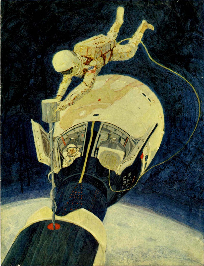
In common with the illustrators working in the USA, the 1970s proved to be a challenging decade for every illustrator in Britain trying to pursue a career in magazine illustration. Television stole away advertising revenue and page counts went down. There was a decline in the interest in fiction in women’s magazines, and for some reason art directors and art editors started asking the illustrators to produce more highly finished work.
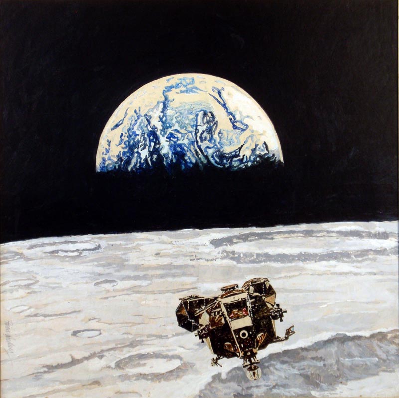
(Above and below: 1969. Weekend Telegraph — illustrations for an article by Werner von Braun.)
They also increasingly turned to photography in place of illustration.
It was also a time of personal change for Brian. He felt that the scumbled acrylic genre (bubble and streak) illustration had run its course, and that the work of many illustrators was taking on a similar look.
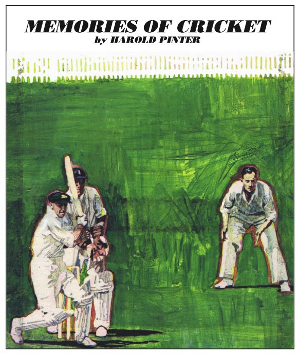
(This was the last of Brian’s use of ‘bubble and streak’ (scumbled acrylic) He was surprised to discover that playwright Harold Pinter was a cricket fan.)
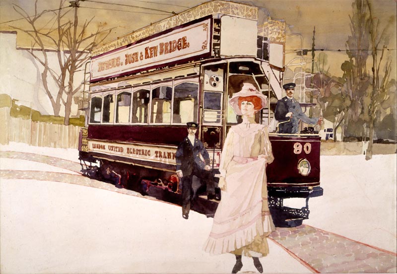
Knowing that figurative illustration was his forte, he began working with traditional methods, beginning with watercolour as taught to him by his earliest mentor, J C Middleton who had been art master at the school he had attended as a boy.

(Changing style: Woman's Realm 1970. This was one of his earliest published watercolours.)
At the beginning of the 1970s there was still a common belief in the graphics industry that watercolour was “wishy-washy” and did not reproduce well.

(Sample to demonstrate that watercolour need not be “wishy-washy”. This was later used on a calendar.)
Brian’s response was “You just need to charge your brush with more colour to allow for the fact that it dries a couple of tones paler than it looks when wet.”
(Double page spread for Woman’s Own.)
Continued tomorrow.
* Brian was very pleased with the responses he received after his first blog was kindly published by Leif Peng back in April. His e-mail address is briansanders[dot]art[at]googlemail[dot]com
In common with the illustrators working in the USA, the 1970s proved to be a challenging decade for every illustrator in Britain trying to pursue a career in magazine illustration. Television stole away advertising revenue and page counts went down. There was a decline in the interest in fiction in women’s magazines, and for some reason art directors and art editors started asking the illustrators to produce more highly finished work.
(Above and below: 1969. Weekend Telegraph — illustrations for an article by Werner von Braun.)
They also increasingly turned to photography in place of illustration.
It was also a time of personal change for Brian. He felt that the scumbled acrylic genre (bubble and streak) illustration had run its course, and that the work of many illustrators was taking on a similar look.
(This was the last of Brian’s use of ‘bubble and streak’ (scumbled acrylic) He was surprised to discover that playwright Harold Pinter was a cricket fan.)
Knowing that figurative illustration was his forte, he began working with traditional methods, beginning with watercolour as taught to him by his earliest mentor, J C Middleton who had been art master at the school he had attended as a boy.
(Changing style: Woman's Realm 1970. This was one of his earliest published watercolours.)
At the beginning of the 1970s there was still a common belief in the graphics industry that watercolour was “wishy-washy” and did not reproduce well.
(Sample to demonstrate that watercolour need not be “wishy-washy”. This was later used on a calendar.)
Brian’s response was “You just need to charge your brush with more colour to allow for the fact that it dries a couple of tones paler than it looks when wet.”
(Double page spread for Woman’s Own.)
Continued tomorrow.
* Brian was very pleased with the responses he received after his first blog was kindly published by Leif Peng back in April. His e-mail address is briansanders[dot]art[at]googlemail[dot]com
Thank you for this amazing blog again Leif !!!! Happy new year 2012 !! )
ReplyDeleteThanks so much Vitalik! :^)
ReplyDeleteWow, nice stuff! I thought the watercolors werree Ted Coconis for a second.
ReplyDelete